AI-generated Fonts. The Future of Typography
What are AI-generated fonts?
AI-generated fonts are typefaces whose glyph outlines, stylistic attributes, or typographic metrics are conceived, synthesized, or transformed using artificial intelligence and machine learning algorithms—rather than having every single node, contour, and kerning value manually drawn by a human type designer.
Overview of generative AI in typography
The introduction of generative artificial intelligence into typography marks a fundamental paradigm shift. Traditional typeface design requires months of meticulous craftsmanship in font design software. Generative AI systems, by contrast, leverage deep neural architectures (such as Deep Convolutional Networks, Generative Adversarial Networks (GANs), diffusion models, and autoregressive transformers) trained on vast corpora of existing font files, vector specimens, and typographic literature.
These neural models learn fundamental relationships governing letterform design:
- Form anatomy: Stem weights, stroke contrast (the relationship between thick downstrokes and thin upstrokes), counter shapes (inner negative spaces), and serif terminations.
- Style transfer: The capability to extract stylistic motifs from an existing character set and apply them across unrendered glyphs or entirely new scripts.
- Text-to-font synthesis: Neural networks interpret natural language prompts (e.g., “70s retro-futuristic geometric sans-serif with rounded terminals and heavy lower stems”) to synthesize novel typeface concepts.
Crucially, typography differs from generic image generation: letters do not function as standalone illustrations. They exist as members of an intricately interdependent system that must satisfy strict optical, mathematical, and ergonomic reading conventions.
Raster image generation vs. true vector font packaging
A widespread misconception stems from confusing generated letterform images with installable, functional digital font files. General-purpose image generators (such as Midjourney, Stable Diffusion, or DALL-E) produce raster images (bitmaps), not font software.
| Criterion | Generated raster images (pixels) | True vector font packaging (.TTF, .OTF, .WOFF2) |
|---|---|---|
| Graphics format | Raster bitmap (PNG, JPEG, WebP) made of pixels. | Mathematical vector outlines (Bézier curves). |
| Scalability | Resolution-dependent; loses sharpness and introduces artifacts when enlarged. | Infinitely and losslessly scalable across any display DPI or print resolution. |
| Interactivity and editable text | Static pixels; text cannot be selected, edited, copied, searched, or typed in editors. | Fully editable live text; supports reflow, text selection, and dynamic editing. |
| Character encoding | No semantic character mapping. | Maps Unicode code points via internal font tables (cmap), allowing keystroke rendering. |
| Typographic metrics | Lacks metric coordinates; requires manual layout positioning. | Contains structured tables for baseline, x-height, advance widths, and bounding boxes. |
| Advanced typography | No programmatic layout capabilities. | Supports OpenType layout features (kerning pairs, ligatures, contextual substitutions). |
A raster image of characters is merely raw visual reference material. Transforming that imagery into an authentic, system-installable typeface requires vectorization, metric calibration, and binary table compilation.
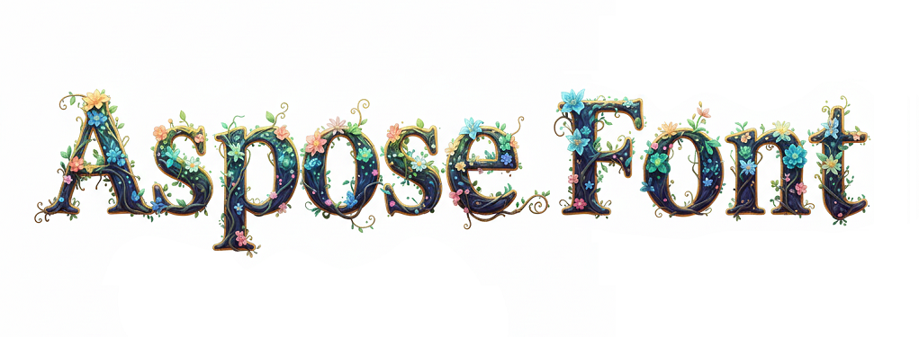
How AI font generation works: Pipeline overview
Producing an installable, high-quality font from generative AI involves an end-to-end engineering pipeline:
1[Prompting and style synthesis] ➔ [Vectorization and path cleanup] ➔ [Metric mapping and assembly] ➔ [Binary packaging]Step 1: Prompting and style synthesis (Generating character sheets)
The workflow initiates with visual style formulation:
- Prompting and style conditioning: The designer defines aesthetic specifications including genre (Serif, Sans-Serif, Display, Script), weight, contrast, and ornamental elements. Alternatively, a small set of seed glyphs provides few-shot stylistic guidance.
- Generating Character Sheets: The generative model synthesizes a cohesive glyph grid or character specimen sheet (typically Latin uppercase A–Z, lowercase a–z, and numerals 0–9). Generating characters concurrently or under shared latent vectors ensures visual coherence across the character set.
Step 2: Vectorization and path cleanup (Raster to SVG Bézier curves)
Pixel outputs produced by diffusion or GAN models must be transformed into clean vector mathematics:
- Automated contour tracing: Edge-detection and boundary-tracing algorithms (such as Potrace or marching-squares variations) process raster edges and generate initial vector paths.
- Path Cleanup and node reduction: Raw autotraced paths are typically plagued by high node counts, jitter, and quantization noise. The pipeline cleans redundant control points, converting jagged pixel transitions into smooth Bézier curves (quadratic Bézier curves for TrueType or cubic Bézier curves for PostScript/CFF).
- Contour direction and qinding rules: Characters containing internal cutouts (counters, such as in ‘O’, ‘B’, ‘P’, and ’e’) require strict path orientation (e.g., outer contour clockwise, inner counter counter-clockwise) so rendering engines correctly apply non-zero or even-odd fill rules.
Step 3: Metric mapping and font assembly (x-height, baseline, advance widths)
Independent vector glyphs must be positioned into a shared typographic coordinate system:
- The em square (Units per em / UPM): Glyphs are normalized and scaled to a standard virtual canvas—most commonly 1000 units (standard in OpenType/CFF) or 1024 / 2048 units (standard in TrueType).
- Vertical metrics alignment:
- Baseline ($y = 0$): The primary horizontal reference line upon which capital letters and non-descending glyphs rest.
- x-height: The height of standard lowercase letterforms like ‘x’, ‘u’, ‘v’, ‘w’, ‘z’.
- Cap height: The vertical ceiling for flat uppercase letters like ‘H’, ‘I’, ‘E’.
- Ascender and descender lines: Boundaries accommodating ascenders (e.g., ‘b’, ’d’, ‘k’, ‘h’) and descenders (e.g., ‘g’, ‘j’, ‘p’, ‘q’, ‘y’).
- Horizontal metrics calculation:
- Every glyph receives a distinct advance width along with its left side bearing (LSB) and right side bearing (RSB). Precise side bearings prevent characters from colliding or forming unnatural gaps during text composition.
Step 4: Binary packaging (.TTF, .OTF, .WOFF2)
The final stage compiles vector paths and metric definitions into standardized binary tables mandated by the OpenType/TrueType specification (ISO/IEC 14496-22):
cmap(Character-to-Glyph Mapping Table): Maps Unicode character codes (such asU+0041for ‘A’) to their corresponding internal glyph indices.glyfandloca(orCFF/CFF2): Encodes the geometric point coordinates, contour endpoints, and curve instructions for each glyph.head,hhea, andhmtx: Stores font-wide bounding boxes, header flags, and horizontal advance metrics.name: Injects crucial metadata, such as font family name, subfamily style (Regular, Bold), unique font identifier, version string, designer, and copyright notices.OS/2: Specifies cross-platform metrics for Windows, macOS, and web layout engines, including weight classes (usWeightClass), width classes, and code page coverage.- Format Conversion and web deployment: Aspose.Font enables programmatic conversion between desktop font binaries (
.ttf,.otf) and highly compressed web formats (.woff,.woff2), ensuring optimal delivery across modern web and desktop software.
Core challenges in AI typography
Despite notable generative advances, translating AI concepts into professional typography faces critical technical hurdles:
Alphabet consistency
Maintaining stylistic fidelity across an entire font family is a major hurdle for generative models (style drift):
- Morphological harmony: Human type designers ensure that serifs on ‘A’, ‘M’, and ‘H’ share identical geometry and that the shoulder curvature of ’n’ matches ’m’, ‘h’, and ‘r’. Diffusion models, however, often produce individual glyphs with conflicting stem thicknesses, mismatched serif brackets, or divergent terminals.
- Rare glyphs and diacritics: While standard uppercase Latin letters (A–Z) are abundant in training data, generative models struggle with accented characters (Ä, Ö, Ü, é, è, č), punctuation, currency marks, and special symbols (@, &, §). These frequently exhibit stylistic disconnects from the primary alphabet.
Optical alignment vs. mathematical alignment
Typography is fundamentally an optical discipline governed by human perception rather than raw geometric measurement:
- Optical overshoot: A circle of identical mathematical height to a square appears perceptually smaller to the human eye. Consequently, curved letterforms (such as ‘O’, ‘C’, ‘S’) and pointed vertices (such as ‘A’, ‘V’, ‘W’) must intentionally extend 1% to 3% above the cap height and below the baseline. Pure AI models often crop glyphs flush against mathematical bounding boxes, causing round characters to look unnervingly shrunken in text blocks.
- Stroke contrast and optical illusions: The human eye perceives horizontal bars as thicker than vertical stems of identical geometric width. Type designers counteract this by making horizontal strokes (such as crossbars in ‘H’, ‘f’, ’t’) slightly thinner than vertical stems. Uncorrected AI-generated characters appear top-heavy or uncomfortably dense.
- Optical weight and balance: Characters like ‘B’, ‘E’, ‘S’, and ‘8’ have visual centers placed slightly above their geometric midpoint to prevent them from looking bottom-heavy or unstable.
Handling OpenType features (ligatures, kerning, and GSUB/GPOS tables)
A functional font is an interactive software program equipped with dynamic layout rules:
- Kerning pairs: Specific character combinations (e.g., “AV”, “To”, “Wa”, “LT”, “P.”) require kerning adjustments to eliminate awkward optical voids. Commercial fonts contain thousands of kerning pairs defined inside the
GPOS(Glyph Positioning) table. - Ligatures and glyph substitutions (
GSUBTable): Adjacent letters such as ‘f’ and ‘i’ frequently collide when set together (the dot of the ‘i’ clashes with the hood of the ‘f’). OpenType handles this through ligature substitutions (‘fi’, ‘fl’). It also manages contextual alternates, oldstyle figures, and small caps. - The generative AI gap: Generative computer vision models process glyphs as isolated 2D images and cannot generate
GPOSorGSUBrelational layout logic. This typographic behavior must be integrated through font engineering software and APIs such as Aspose.Font.
Pros and cons of AI-generated fonts
AI-assisted typeface generation delivers clear advantages while presenting real-world limitations:
| Pros | Cons |
|---|---|
| Accelerated prototyping: Traditional font design requires weeks or months; AI tools rapidly generate initial concepts and thematic drafts. | Risk of unintentional plagiarism: Because models train on copyrighted fonts, outputs can inadvertently mirror existing proprietary designs. |
| Lower barriers to entry: Custom display typography becomes accessible to small studios, independent developers, and freelancers. | Ambiguous copyright status: Purely machine-generated works may lack the legal human authorship necessary for copyright protection. |
| Explorative stylistic variety: Generates unconventional decorative motifs, illustrative textures, and novelty display lettering on demand. | Lack of typographic polish: Raw AI outputs lack professional kerning, optical overshoot, and robust OpenType feature tables. |
| Event-specific customization: Quickly creates bespoke letterforms tailored to marketing campaigns, holidays, or specific game environments. | Aesthetic homogenization: Widespread reliance on shared models can lead to repetitive, generic typographic aesthetics. |
Rather than replacing type designers, AI functions as an assistive accelerator: algorithms handle repetitive drafting and initial vector tracing, while human designers provide aesthetic direction, optical refinement, and technical quality assurance.
Where can AI fonts be safely used?
To deploy AI-generated typography securely and productively, adopt a human-in-the-loop workflow:
Personal and non-commercial projects: Ideal for experimental artwork, non-monetized social media graphics, personal blogs, and academic design exploration.
Commercial use with human oversight and refinement: Use the AI output as an initial creative foundation. Applying manual node editing, custom metric configuration, and bespoke kerning establishes the human creative contribution required for copyright protection while mitigating trademark risks.
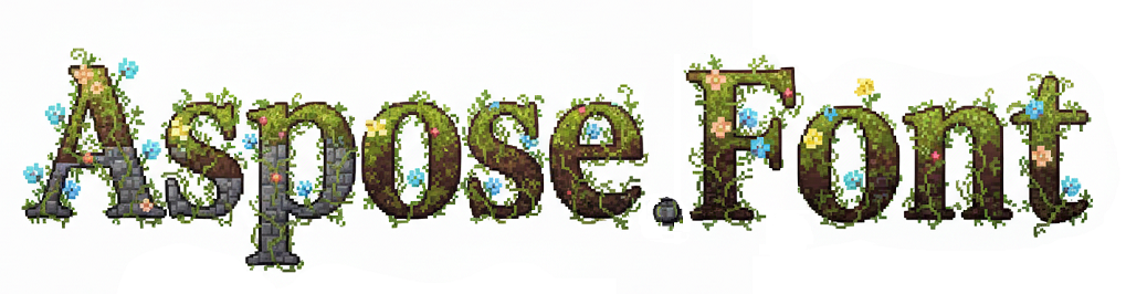
Static image assets: When text is rendered into a raster logo, raster banner, or video graphic, font software itself is not distributed, significantly lowering font software licensing risks.
Platforms with clear IP indemnification: Utilize AI generation platforms that provide explicit commercial usage grants and third-party copyright indemnification.
Always examine the exact Terms of Service and intellectual property provisions of any AI software or service used in commercial workflows.
Future outlook for AI fonts
The integration of artificial intelligence into typography continues to advance:
- Direct vector output (Neural Vector Fonts): Emerging architectures learn to generate parametric curves and Bézier control points natively, bypassing the lossy rasterization and auto-tracing steps.
- Automated optical kerning engines: Machine learning models will compute balanced side bearings and thousands of kerning pairs automatically by analyzing visual negative space distribution.
- Context-adaptive variable fonts: Dynamic fonts that adjust weight, optical size, and contrast in real time based on ambient lighting, viewing distance, or screen dimensions.
- Programmatic font APIs: Developer tools like Aspose.Font for .NET bridge the gap between generative algorithms and software applications by automating font validation, conversion, and packaging at scale.
Conclusion
AI-generated typography brings powerful possibilities to creative and software development workflows. However, transforming a conceptual letterform into an authentic, production-grade font requires moving beyond pixel images into true vector typography. By employing a structured pipeline—prompting, vectorization, metric mapping, and binary compilation using Aspose.Font—developers and designers can translate generative concepts into standard TrueType, OpenType, and WOFF2 fonts.
Need to inspect metadata, tables, and glyph sets of an AI-generated or existing font file? Use the free online Aspose Font Viewer to analyze font properties and structures directly in your browser.