Font styling techniques
The role of typography
Typography is a technique of arranging and designing typefaces, fonts, and other text elements. It involves selecting, arranging, and manipulating various typographic elements to provide visually appealing and effective communication.
Typography includes aspects like the selection of fonts of different types (such as serif, sans-serif, script, or display fonts), determining font sizes, adjusting letter spacing (kerning and tracking), setting line spacing (leading), and applying formatting options like bold, italics, and underline. It can also involve establishing a hierarchy within the text by emphasizing headings, subheadings, and body text to guide the reader’s attention.
Typography is an essential element in design, branding, advertising, publishing, and other forms of visual communication and is aimed to create readable and visually engaging text. Here are some key reasons why typography is important:
- Good typography ensures that text is legible and easy to read. Proper font selection, appropriate font sizes, line spacing, and clear letterforms improve text readability.
- Typography has an impact on the visual appeal of a design. It sets the tone, mood, and personality of the content or brand. The right choice of fonts and typographic elements can evoke emotions, highlight brand values, and enhance the overall visual impact of the design.
- Typography plays an important role in brand identity. Appropriate fonts help create a consistent and recognizable visual identity. Consistent typography across various brand materials helps establish brand recognition and reinforces brand messaging and creates a memorable impression, making the brand or design stand out and be more easily recognized and set apart.
- Typography is a powerful communication tool. It helps convey meaning, emphasize important points, and guide readers through the content hierarchy. Typography also helps to establish the tone of the text as formal, informal, playful, or authoritative.
- Typography also has a direct impact on accessibility. Choosing fonts that are legible for people with visual impairments ensures that everyone, regardless of their visual abilities, can read and understand the content.
Font styling techniques
Font styling techniques are typographic methods and approaches used to modify and enhance the visual look of fonts. They allow designers to add emphasis, create hierarchy, and set a specific aesthetic or tone. Here are some common font styling techniques (this chapter will be illustrated with the pictures made using the help of CSS text generator application.):
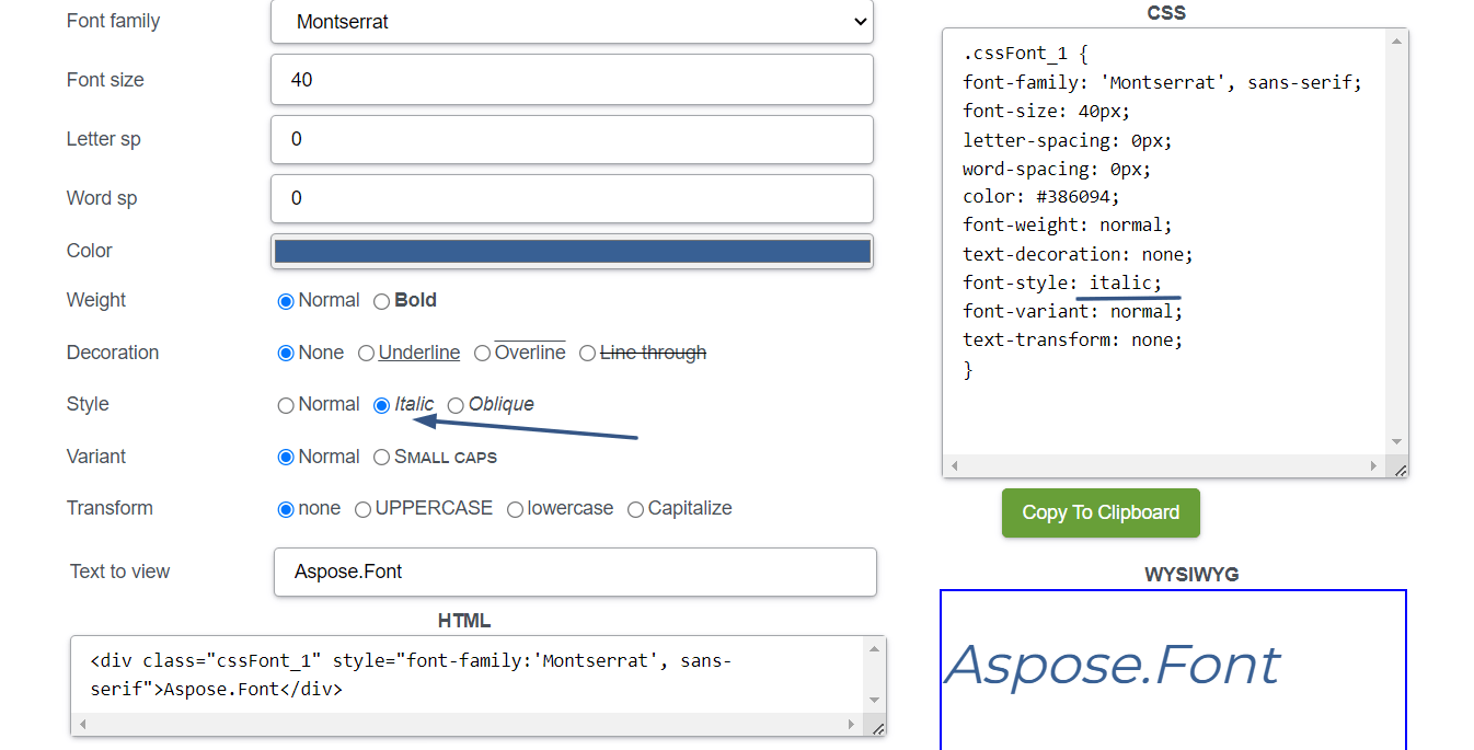
Italicizing text
Italics text (slanted to the right) gives it a more dynamic and stylized look. It is often used for emphasizing words, introducing foreign phrases, or indicating book titles and publications. It can also be used to highlight important keywords, key concepts, or to emphasize a particular point. Italicizing also helps to visually separate foreign words, phrases, or technical terms that may not be familiar to the reader.
To italicize text, you can use different methods depending on the platform or software you work with:
In software like Microsoft Word or Google Docs, you can select the text and choose the italic formatting option from the toolbar or use a keyboard shortcut (such as Ctrl + I or Command + I on a Mac).
In HTML and web design, you can use the
<em>or<i>tags to wrap the text you want to italicize. The<em>tag is recommended for emphasizing text with semantic meaning, while the<i>tag is used purely for stylistic purposes.In CSS you can apply the
font-style: italic;property to the desired text element or create a class to selectively apply italic styling to specific elements.If you work with text within markdown files enclose it with one asterisk
*, like this*text*.
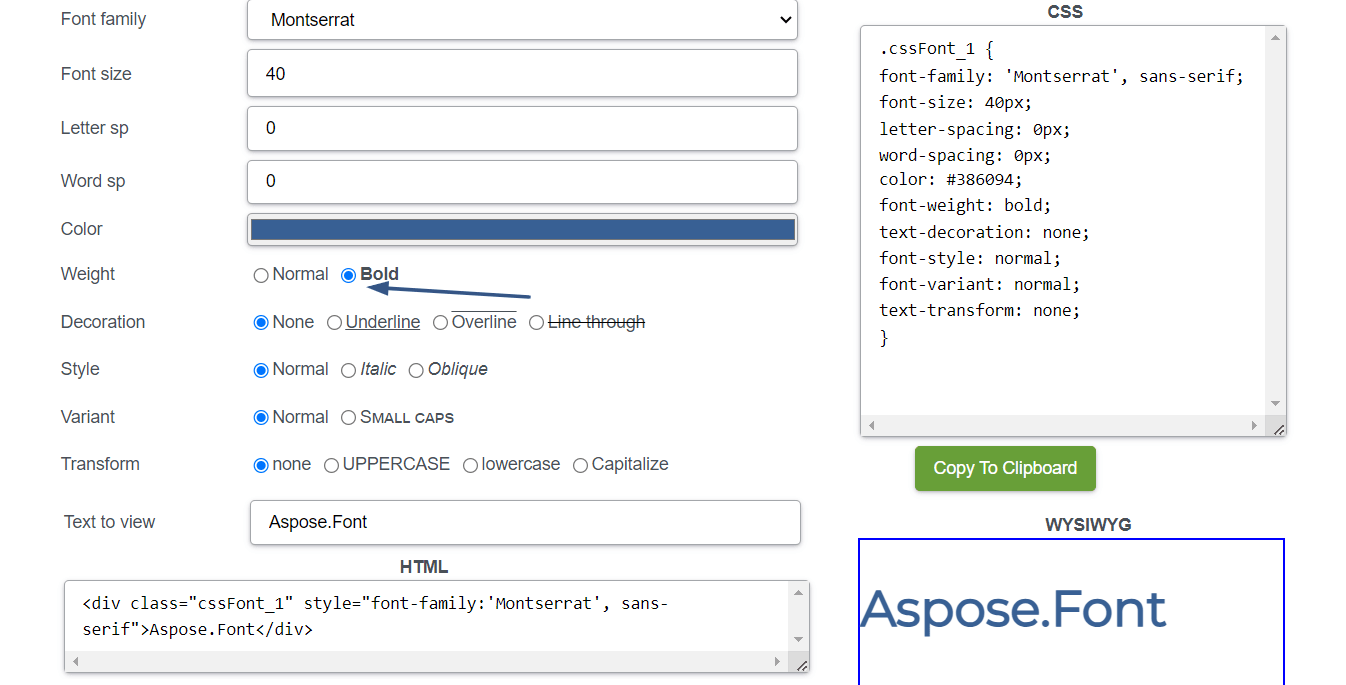
Making text bold
Bold text is enhanced in weight and stands out from the surrounding text. It is frequently used for headings, subheadings, or important keywords to create visual hierarchy and emphasis. Bold text is an effective way to create a visual hierarchy within your content. By using different font weights, you can guide the reader’s attention and convey the relative importance of different elements. But you need to use it thoughtfully and selectively:
- Reserve bold styling for important elements that require emphasis or that you want to stand out.
- Avoid overusing bold text, as it can reduce its impact and readability.
- Ensure that the bolded text remains legible and visually cohesive within the overall design or context.
To make text bold, you can use one of the next methods:
In software like Microsoft Word or Google Docs, you can select the text and choose the bold formatting option from the toolbar or use a keyboard shortcut (such as Ctrl + B or Command + B on a Mac).
In HTML and web design, you can use the
<strong>or<b>tags to wrap the text you want to make bold. The<strong>tag is recommended for text with semantic meaning, indicating strong importance, while the<b>tag is used purely for stylistic purposes.In CSS, you can apply the
font-weight: bold;property to the desired text element or create a class to selectively apply bold styling to specific elements.If you work with text within markdown files enclose it with two asterisks
**, like this**text**.
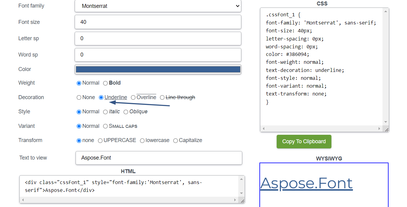
Underlining text
Underlined text (with added a horizontal line beneath it) was traditionally used for hyperlinks, it is now often reserved for special cases, such as indicating keyboard shortcuts or distinguishing specific terms. In printed materials, underlining can be used to mark titles, or to separate subheadings from the rest of the text. But when using underlined text, you should pay attention to the next aspects:
- Use underlining only for specific purposes where it is conventionally expected, such as hyperlinks or designated headings.
- Avoid using styling for general emphasis or for large blocks of text.
- Have in mind potential conflicts with other formatting styles, such as underlined text within hyperlinks, as it can cause confusion for users.
To underline text, you can one of the next methods:
In software like Microsoft Word or Google Docs, you can select the text and choose the underline formatting option from the toolbar or use a keyboard shortcut (such as Ctrl + U or Command + U on a Mac).
In HTML and web design, you can use the
<u>tag to wrap the text you want to underline.In CSS, you can apply the
text-decoration: underline;property to the desired text element or create a class to selectively apply underlining to specific elements.
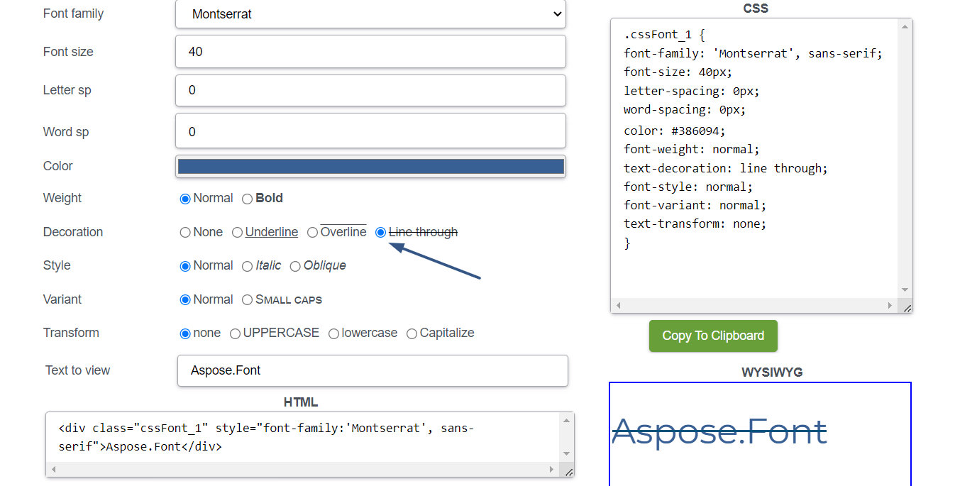
Strikethrough text
This type of text styling involves drawing a horizontal line through the middle of the text. Strikethrough text is commonly used to indicate that a word, phrase, or entire sentence should be crossed out or deleted. It is often used to show that content has been revised, removed, or is no longer valid. This can be helpful in editing, proofreading, or when indicating changes in documents or online platforms. This styling can also be used to display errors or mistakes, particularly in academic or professional contexts.
To make text strikethrough, use one of these methods:
In software like Microsoft Word or Google Docs, you can select the text and choose the strikethrough formatting option from the toolbar or use a keyboard shortcut (such as Alt + Shift + 5 or Command + Shift + X on a Mac).
In HTML and web design, you can use the
<s>or<strike>tags to wrap the text you want to strikethrough. However, it’s worth noting that the<s>tag is now preferred over the<strike>tag, which has been deprecated in HTML5.In CSS, you can apply the
text-decoration: line-through; property to the desired text element or create a class to selectively apply strikethrough to specific elements.If you work with text within markdown files enclose it with two tildes
~~, like this~~text~~.
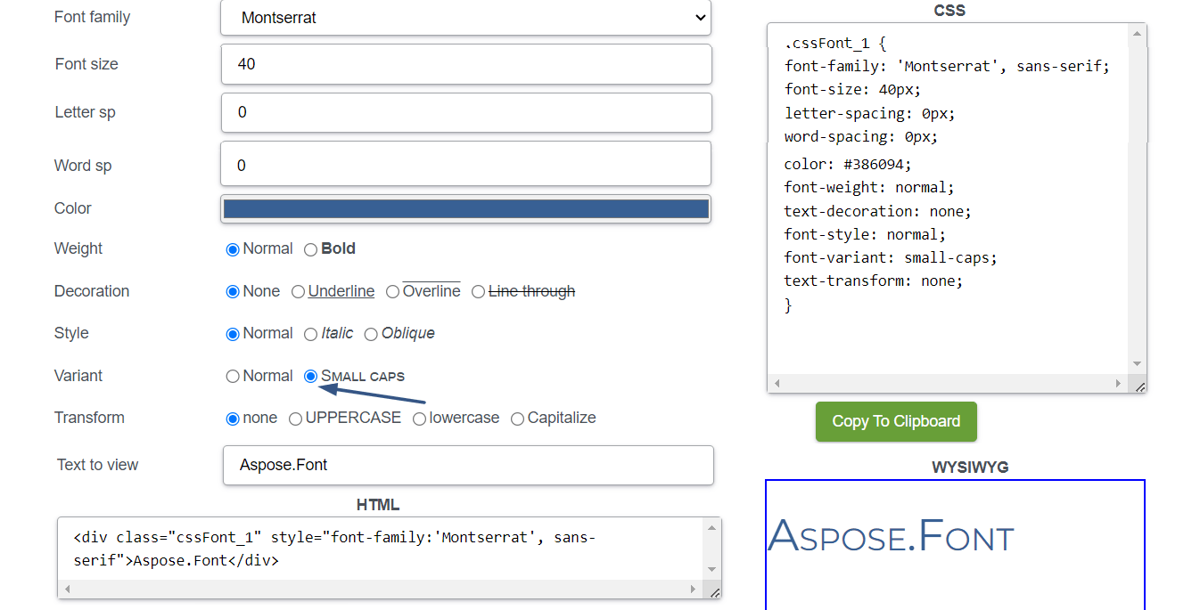
Small caps
Small caps are uppercase letters that are designed to match the x-height (height of lowercase letters) of the accompanying text. This is useful when you want to emphasize titles, acronyms, or important details while maintaining a consistent appearance. Small caps can also help improve the readability of text while maintaining a consistent visual appearance. But it’s important to note that the effectiveness of this technique may vary depending on the font used and the browser’s rendering capabilities.
To make text small caps, you can use various methods like the following:
- In software like Microsoft Word or Google Docs, you can select the text and apply the small caps formatting option from the toolbar or through the font options. This option will convert the selected text into small caps.
- In HTML and web design, you can use CSS to apply small caps to the desired text element. You can use the
font-variant: small-caps;property to achieve small caps styling.
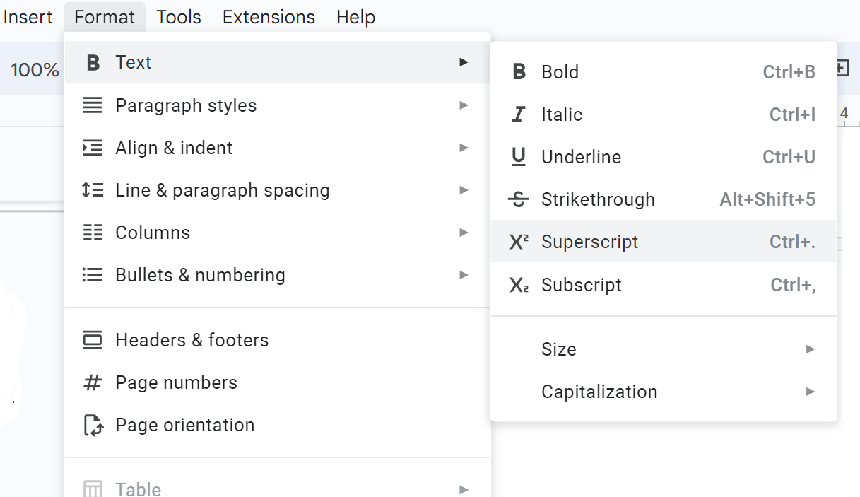
Superscript and subscript
This is a technique when you raise or lower text above or below the baseline, respectively.
Superscript is commonly used for mathematical expressions and scientific notation, where it represents exponents or powers. It is often used to indicate footnotes or references within a text.
Subscript is commonly used in chemistry to denote the number of atoms in a chemical formula or the arrangement of elements. It is also used in mathematical equations and formulas to represent indices, subscripts, or variable labels.
To make text superscript or subscript, you can use one of the methods:
In software like Microsoft Word or Google Docs, you can select the text and choose the superscript or subscript formatting option from the toolbar or use a keyboard shortcut (such as Ctrl + Shift + + for superscript or Ctrl + = for subscript).
In HTML and web design, you can use specific HTML tags to indicate superscript or subscript text. For superscripts, you can use the
<sup>tag, and for subscripts, you can use the<sub>tag. Wrap the desired text within these tags to achieve the intended effect.In CSS you can apply the superscript using
vertical-align: super;orfont-size: smaller;, and for subscript, you can usevertical-align: sub;.If you working with formulas, you can write them in a LaTeX equation editor or other LaTeX editing tool.
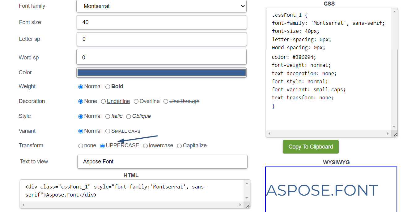
All caps
This styling means using all capital letters for text. This will remove the distinction between uppercase and lowercase letters, adding a visually uniform look. It is often used for headings or short phrases but should be used carefully to avoid decreasing readability.
How can you make text all caps?
In word processing software just select the text and choose the all caps formatting option from the toolbar or use a keyboard shortcut (such as Ctrl + Shift + A or Command + Shift + A on a Mac).
In HTML and web design, you can use CSS to apply all caps styling using the
text-transform: uppercase;property. Just apply this property to the desired text element or create a class to selectively apply all caps to specific elements.
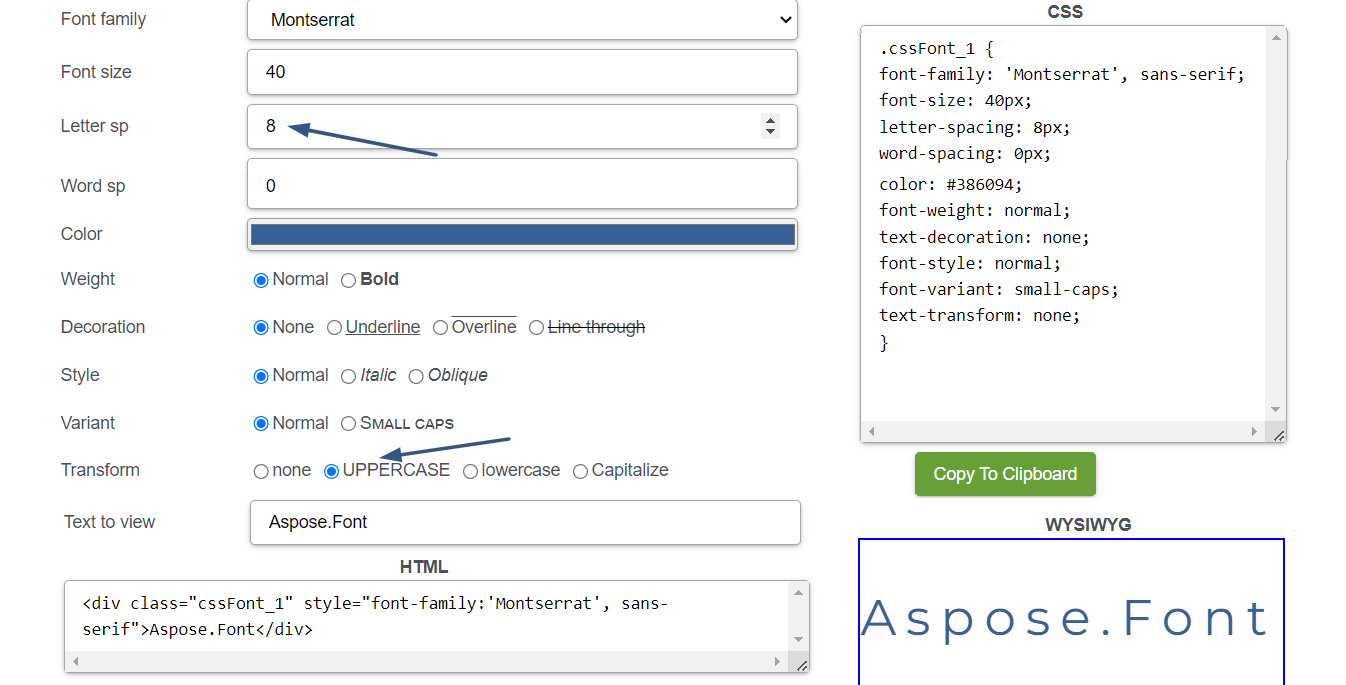
Letter spacing (tracking)
Adjusting the spacing between letters is known as tracking. When you increase tracking this can create a more open and airy feel, when you decrease space between letters - it can make text appear more compact. It can be useful when working with limited space or when trying to achieve a specific visual balance between lines or columns of text. But when playing with tracking pay attention to readability and avoid excessive or uneven spacing.
Use the next methods to change letter spacing:
- In word processing software you just need to select the text and adjust the letter spacing by using the character formatting options. Look for the “Character Spacing” or “Letter Spacing” settings in the toolbar or formatting menu.
- In graphic design software like Adobe Photoshop or Illustrator, you can select the text layer or text object and modify the letter spacing by accessing the “Character” or “Type” panel.
- In CSS for web design, you can use the letter-spacing property to change the letter spacing. Specify a value in pixels (px) or other length units to increase or decrease the space between characters. For example,
letter-spacing: 2px;increases the spacing, whileletter-spacing: -1px;decreases it.
Kerning
Kerning is adjusting the space between individual letter pairs to create better visual harmony and readability. It is particularly needed to get balanced spacing between characters, especially when you deal with combinations that may create awkward gaps or collisions.
Not every font has kerning. While many modern fonts come with built-in kerning pairs, the availability and quality of kerning can vary depending on the font. Professional typefaces designed for print or digital use often have well-defined kerning pairs that address common letter combinations. These fonts are elaborated by type designers who carefully consider the spacing between characters so the fonts have optimal legibility and are visually appealing.
But some fonts, especially older or more basic ones, may lack extensive kerning pairs. They may rely on a default kerning setting, which adjusts the spacing between all character pairs equally. The availability of kerning also depends on the software or platform used. Advanced design software and tools usually provide greater control over kerning. However, in certain contexts like web design or platforms with limited typography options, the ability to adjust kerning may be limited.
Decorative effects
Designers may apply different decorative effects to fonts, such as drop shadows, outlines, bevels, or embossing. They may add depth, texture, or visual interest to text but should be used carefully to avoid overwhelming or distracting from the content and not to give an unprofessional look to your work. The most famous or used decorative effects used to style texts are:
- Drop shadow creates a shadow behind the text, so the text looks three-dimensional and stands out from the background. The shadow can be subtle or bold.
- Gradient is an effect when two or more colors blend into each other gradually. This may add depth and dimension, making the text look more visually appealing.
- Outline is a border around the characters that makes them stand out from the background. It can be solid or have a different color than the text itself.
- Emboss/deboss are effects that create a raised or recessed appearance by simulating the effect of pressing the text into or out of the background. Embossing makes the text appear raised while debossing makes it appear indented.
- Textures orpatterns applied to the text can give it a unique visual appearance. This effect can be achieved by overlaying a texture or pattern onto the text or by using a font that has textures or patterns itself.
- Grunge or distressed text has a weathered, worn, or vintage look. This effect can be achieved through texture overlays, filters, or using fonts specifically designed to have a distressed appearance.
- Glow effect applied to the text creates a soft, luminous halo around the characters. It makes the text appear radiant.
- 3D or dimensional effect makes the text look like it is popping out of the design. This effect can be achieved through shading, lighting, and perspective techniques.
No matter what effect you are going to apply to your text, consider the overall design, the context, and the readability of the text. The balance between visual appeal and practicality should be found.
Effective styling in typography hierarchy
Creating a good typography hierarchy is important for effective communication and visual organization in design projects. Here are some rules to help you make everything properly:
- Create clear and readable heading levels (e.g., H1, H2, H3) to establish a hierarchy. Larger heading levels typically represent higher importance or primary sections, while smaller headings denote subheadings or secondary sections. Consistency in font size, weight, and style across heading levels helps users easily navigate the content.
- Vary the font sizes and weights to create contrast between different levels of text. Use larger and bolder fonts to attract more attention to information of greater importance, and smaller and lighter fonts for supporting or less significant information. The contrast should be noticeable enough to distinguish between hierarchy levels but not too sharp to break visual harmony.
- Use whitespace effectively to create a visual separation between different levels of text. Provide ample spacing between the heading and body text and between paragraphs or sections. Align text consistently to maintain a sense of order and structure.
- Use color and different font styles to differentiate hierarchy levels. For example, you might choose a specific color for headings and another one for body text. Consistency is the key, so ensure that the colors and style fit the overall design scheme and are easy to read.
- Use color and different font styles to differentiate hierarchy levels. For example, you might choose a specific color for headings and another one for body text. Consistency is the key, so ensure that the colors and style fit the overall design scheme and are easy to read. Tools like this Color Contrast Checker may come in handy for such tasks.
- Include visual cues or markers to reinforce the typography hierarchy. Using bullet points, numbering, or icons for lists can help distinguish them from regular paragraphs. Having a different background color or shading for specific sections or blocks of text can also be a good option for this.
- Pay attention to the information hierarchy when structuring the content. It is preferable to arrange the most important information at the top or beginning of a section, and progressively introduce supporting details or subtopics as the text continues.
Good typography hierarchy should guide readers through the content, highlight the most important information, and improve overall readability. Following these rules, you can create a well-structured design that effectively communicates your message and engages your audience.
Conclusion
Font styling techniques play a huge role in enhancing the visual appeal and communicative power of text. Whether it’s italicizing for emphasis, bolding for emphasis, underlining for indicating links, strikethrough for indicating deletion or correction, small caps for a sophisticated look, superscript or subscript for scientific or mathematical notations, or all caps for added impact, each technique serves a specific purpose in typography but also has its limitations. It is also important to keep in mind that these techniques should be used thoughtfully and according to the intended tone, context, and audience.