Manage fonts within HTML
Introduction
You already know that fonts play a crucial role in web design. But here will be highlighted key aspects how fonts influence web design:
- Fonts are a visual element that influences the site’s aesthetic appeal. Different fonts convey different emotions and styles.
- Fonts can be an integral part of a brand’s identity so they should be used consistently across all communication channels, including websites.
- One of the primary goals of web design is to ensure that users can easily read and comprehend the content and the choice of font affects readability.
- Web designers often use different font styles, sizes, and weights to establish a hierarchy within the content, - differentiate headlines, subheadings, and body text.
- Web design should be inclusive, covering the needs of users with various abilities. If talking about fonts, this includes selecting ones with sufficient contrast and considering factors like size and spacing.
- The type of font used can impact the loading speed of a website.
- Fonts might appear differently on various devices and browsers, so web designers should select those that maintain their integrity across different platforms.
- With the spreading of mobile devices, responsive design has become essential. Fonts need to adapt to different screen sizes without sacrificing readability or aesthetics.
- Fonts can be also used to draw attention to important elements such as call-to-action buttons.
- Different cultures and languages may require specific fonts to ensure accurate representation and proper readability.
Web-safe fonts vs. custom fonts:
Web-safe fonts and custom fonts are two different approaches to selecting and using fonts in web design. Each has its advantages and drawbacks. Let’s explore the differences between them:
| Web-safe fonts | Custom fonts |
|---|---|
| Advantages | |
| Web-safe fonts work on almost all devices and browsers, ensuring consistency of text. | With custom fonts, you have a broader range of creative options to match the font with the whole design concept. |
| They are typically pre-installed on devices, so they don’t require additional server requests for downloading. This leads to faster page loading. | Custom fonts let you gain your brand’s personality, helping your site stand out and reinforce your identity. |
| These fonts are more likely to render consistently across different browsers. | Custom fonts often come with different styles, weights, and variants, providing you with design flexibility. |
| Web-safe fonts are known for their readability, making them accessible to a wide range of users. | |
| Considerations | |
| Web-safe fonts are simple and common, and won’t give you unique branding and aesthetics and stand out or convey a unique identity. | Custom fonts require additional HTTP requests, which can slightly increase page loading times, but this can be optimized. |
| Not all devices or browsers might support or render custom fonts correctly. | |
| Some custom fonts have licensing restrictions that should be understood and adhered to, because they may require payment for extended usage. | |
| It’s important to provide fallback fonts in case the custom font fails to load. |
Examples of the most popular web-safe fonts
Here are some examples of popular web-safe fonts. You can find them on different platforms and devices. They are grouped according to their font type for your comfort.
| Sans-serif | Serif | Script | Monospace |
|---|---|---|---|
| Arial, Helvetica, Verdana, Trebuchet MS, Arial Black, Comic Sans MS, Impact | Times New Roman, Georgia, Baskerville, Garamond, Rockwell | Cursive Brush, Script MT, Vivaldi, Segoe, Script | Courier New, Consolas, Inconsolata, Roboto Mono, Source Code Pro |
These fonts have been available on a wide range of operating systems and browsers for many years, making them reliable choices for consistent text display across various devices. However, the list of web-safe fonts can vary slightly depending on the specific platform and browser version. Additionally, web design trends change and designers often prefer to use custom fonts to create unique and visually appealing websites.
CSS font stacks
A font stack, in the context of web design and typography, refers to a sequence of font choices specified in a CSS rule to ensure that a particular typeface is displayed on a web page. Font stacks are designed to provide a fallback mechanism for fonts.
CSS font stacks is a technique to specify a list of fonts in a particular order. This will help ensure that if the first font falls on a user’s system, the browser will try to use the next font in the stack. This approach helps maintain consistent text display across various devices by providing fallback options. Here’s how you can use CSS font stacks to incorporate web-safe fonts:
1 font-family: "Arial", sans-serif;1 font-family: "Helvetica Neue", Arial, sans-serif;In these examples, the CSS font-family property is used to define the font stack for an element. The browser first attempts to use the first font specified in the list. In the first example, it tries to use “Arial”. If “Arial” is not available on the user’s system, the browser moves to the next font in the stack, which is a generic sans-serif font. This generic value ensures that the browser selects an appropriate sans-serif font available on the system.
Using multiple fonts in a stack provides you with flexibility and helps maintain a consistent visual style while accommodating different font availability. You can apply this technique to different types of fonts if needed.
Where can I get web-safe fonts?
Web-safe fonts are fonts that are usually available on most operating systems and web browsers. Since web-safe fonts are already installed on users’ devices, you don’t need to worry about embedding them from external sources like you would with custom fonts.
If you’re looking for a comprehensive list of web-safe fonts along with their CSS font stack definitions, you can try the next resources:
CSS Font Stack - Provides a collection of fonts and their corresponding font stacks for use in web design.
W3Schools - Web Safe Fonts - Provides a list of commonly used web-safe fonts.
Google fonts
Google Fonts is a popular library of free and open-source fonts provided by Google. You can easily integrate these fonts into your websites or applications to enhance typography and improve the overall design aesthetics. Google Fonts offers a wide selection of fonts of various styles, weights, and languages.
How to integrate Google fonts into your project?
To use Google Fonts in your website, you typically follow these steps:
Choose fonts on Google Fonts website. Browse through the extensive collection of fonts or use the filters to find fonts based on categories, styles, and scripts.
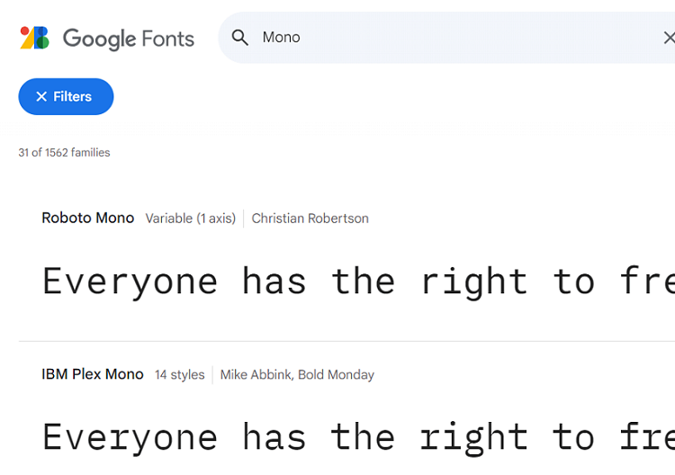
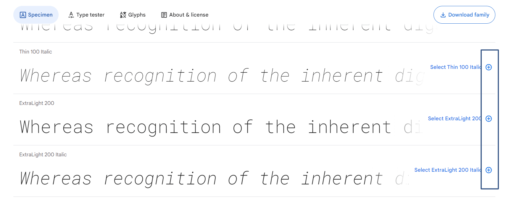
Select the typefaces(styles) you want to use by clicking the “+” button next to each of them or download the whole family.
To embed a font, copy the code provided in the bottom right windows into the
<head>of your html.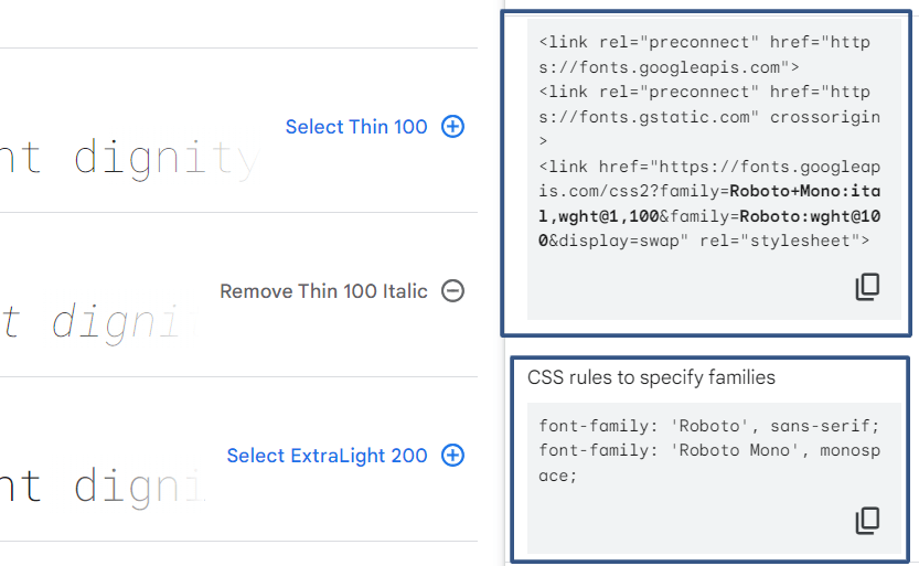
Add the provided code snippets to the HTML and CSS of your solution. Paste it into the
headtag of your html. This code links to the Google Fonts stylesheet and specifies chosen typefaces.Use the fonts in your CSS rules by specifying the font-family property with the selected font names.
Font sizing and spacing within HTML
In HTML and CSS, you have various options for font sizes and spacing management. Here’s a basic guide to font sizing and spacing in HTML:
Managing font size within HTML
- You can set font sizes using absolute units like pixels (px) or points (pt). However, this approach doesn’t scale well across different devices and screen sizes.
1    p {
2        font-size: 16px;
3 }- Relative units can offer you better responsiveness across different devices. Common relative units include percentages (%) and EM units.
1    p {
2        font-size: 100%;
3    }
4
5    p {
6        font-size: 1.2em;
7 }- Viewport units are relative to the size of the browser window. This can be especially useful in responsive designs.
1    p {
2        font-size: 5vw;
3    }
If needed, you can convert px to em, pt to px, px to pt, and versa onlineto adjust the font size to the needs of your project. Just select the unit you want to convert from and the resulting unit, write the number, and get the result instantly.
Managing font space within HTML
- Margins are the space outside an element. Padding is the space inside it. You can control these parameters using various units like pixels (px) or percentages (%).
1    .container {
2        margin: 20px;
3        padding: 10px;
4 }- Line height - a parameter that controls the vertical space between lines of text. It’s often expressed as a unitless multiplier or using a specific unit like pixels.
1    p {
2        line-height: 1.5;
3 }- Letter spacing - a parameter that controls the space between individual characters in a text.
1    p {
2        letter-spacing: 1px;
3 }- Word spacing controls the space between words in a text.
1    p {
2        word-spacing: 2px;
3    }
How to integrate custom fonts into HTML using the @font-face rule in CSS?
Integrating custom fonts into HTML using the @font-face rule in CSS allows you to use non-standard fonts on your website. Here’s how to do it:
- Select the font you want to use. It is better to have the font files in different formats like WOFF, WOFF2, EOT, and TTF because it increases compatibility across different browsers.
- Upload the font files to a directory on your server, and note the path to these files.
- In your CSS file, use the
@font-facerule to define the custom font. This rule specifies the font family name, the paths to the font files, and other font-related properties.
1    @font-face {
2        font-family: 'CustomFont';
3        src: url('path/to/customfont.woff2') format('woff2'),
4             url('path/to/customfont.woff') format('woff'),
5             url('path/to/customfont.ttf') format('truetype');
6 }- Apply the custom font to specific elements in your CSS using the font-family property.
1    body {
2        font-family: 'CustomFont', sans-serif;
3    }
4
5    h1 {
6        font-family: 'CustomFont', serif;
7 }- Different browsers support different font formats. By providing multiple formats in the
srcattribute of the@font-facerule, you improve cross-browser compatibility. - Control how the browser handles font loading and rendering using the
font-displayproperty to define a strategy for displaying text while the custom font is loading.
1    @font-face {
2        font-family: 'CustomFont';
3        src: url('path/to/customfont.woff2') format('woff2');
4        font-display: swap;
5 }- Test your website across different browsers and devices. Use font subsets if possible to reduce the font file size.
Remember to keep in mind performance, usability, and licensing. Make sure you have the necessary rights to use the fonts on your website and that you’re optimizing their loading for the best user experience.
Responsive typography
Responsive typography involves adjusting the font sizes, line heights, and other typographic elements to ensure optimal readability and aesthetics across various devices and screen sizes. Here are some strategies for implementing responsive typography in your HTML and CSS:
- Use viewport units (vw, vh, vmin, vmax) to set font sizes relative to the size of the viewport to scale the text proportionally with the screen size.
1    h1 {
2        font-size: 5vw;
3 }- Use media queries to apply different font sizes based on specific screen widths to adapt typography for various devices.
 1    @media (max-width: 768px) {
 2        h1 {
 3            font-size: 3.5vw;
 4        }
 5    }
 6
 7    @media (max-width: 480px) {
 8        h1 {
 9            font-size: 2.5vw;
10        }
11 }- Combine viewport units and
calc()function to create fluid typography with a balanced ratio between different elements.
1    body {
2        font-size: calc(16px + 0.5vw);
3 }- Set a maximum and minimum font size to ensure readability and prevent excessive scaling.
1    p {
2        font-size: clamp(14px, 3vw, 24px);
3 }- Adjust the line height relative to the font size to have the right amount of spacing between lines, even when text sizes change.
1    {
2        font-size: 2vw;
3        line-height: 1.5;
4 }- Use a modular scale to establish a consistent relationship between font sizes to get a harmonious typographic hierarchy.
- Test your responsive typography on a range of devices and screen sizes to ensure that the text remains readable.
- Choose fonts that are optimized for web use and offer various weights for different styles.
- On touch devices, ensure that there’s enough spacing between clickable elements (like buttons and links) to prevent accidental taps.
Remember that the goal of responsive typography is to user-friendly reading experience regardless of the device they’re using.
Impact of font loading on website performance
Font loading affects factors such as page load time, user experience, and overall site optimization. Here are some key points to have in mind regarding the impact of font loading on website performance:
How does font loading affect website performance?
- Fonts, especially custom web fonts, add additional HTTP requests to your website’s resources. These requests can increase the overall page load time, especially if the fonts are large or not properly optimized.
- Slow-loading fonts can result in a poor user experience because users expect websites to load quickly and smoothly, and fonts that take too long to load can negatively impact this expectation and make them go from your site.
- Fonts are often considered render-blocking resources. Browsers won’t render the content until the fonts are fully downloaded and processed.
- FOIT (Flash of Invisible Text) occurs when text content is initially invisible while the custom font is being loaded. On the other hand, FOUT (Flash of Unstyled Text) occurs when the browser initially renders text in a fallback font and then replaces it with the custom font once it’s loaded. Both situations can be jarring for users.
- Repeatedly loading fonts from external sources can result in increased data usage and slower subsequent page loads for users who haven’t cached the fonts.
How to improve font loading times?
- Properly optimizing font files, using formats like WOFF (Web Open Font Format), and compressing them can reduce their file size and improve loading times.
- Use techniques like preloading fonts or asynchronous loading aimed to load fonts in the background without blocking the rendering of the main content.
- Use fallback fonts in your CSS to maintain content visibility even if the custom font fails to load.
- Use content delivery networks (CDNs) or font delivery services to optimize font loading by serving fonts from servers that are geographically closer to the user, improving load times.
- Consider using font subsets.
- Use different caching strategies.
Conclusion
Fonts help notably to shape the visual and textual identity of your HTML content. They are not just mere text styles, but powerful tools that convey emotions, establish branding, and enhance user experience. Choosing and implementing fonts for HTML involves a thoughtful balance between aesthetics and usability.
Using web-safe fonts, you ensure a consistent appearance across various devices and browsers because they are readily available and don’t require additional loading time. But, the true creative potential lies in custom fonts. The use of the @font-face rule in CSS lets you use them easily in your project. Through careful consideration of font loading strategies, such as asynchronous loading and font subsets, you can mitigate performance issues and create a seamless experience for users.
Have in mind responsive typography that is an essential aspect of modern web design. Consider techniques like viewport units, media queries, and fluid typography to ensure that your content remains legible and visually appealing on screens of all sizes.