Display font Knowledge Base
What is a display font?
Display fonts (screen fonts) are typefaces designed to grab attention and make a stand-out design. They are often used for headlines, titles, and other text that needs to be highlighted. Display fonts have a lot of styles and can be decorative, elegant, modern, or bold. Their main aim is to add personality and style to a design, but they should be paired with more conventional fonts for body text to create a balanced and visually appealing composition.
The purpose of display fonts is to make text stand out and draw attention to it. But what else?
- Display fonts are great to be used for headlines, titles, and other text in advertising or branding materials.
- They are highly decorative, expressive, and unique, so you can make any design special and unique.
- They are great for creating a visual hierarchy in a design by emphasizing certain elements and guiding the viewer’s eye.
- By using display fonts, you can create a distinctive look and convey a specific message or tone.
- Using display fonts you can add visual interest and impact to a design and make it more memorable and engaging for the viewer.
Pros and cons of display fonts
When choosing the right font it’s important to create a balance between the visual appeal of fonts and their functionality. Let’s find out what drawbacks and benefits will give you using display fonts.
| Pros | Cons |
|---|---|
| Display typeface is designed to draw attention to the text and be eye-catching, so they are great for headlines and titles. | Some display fonts can be difficult to read, especially in smaller sizes, which can cause a problem if they’re used for body text. |
| Personality and style: Display fonts come in a wide range of fancy styles, so they allow designers to add personality and style to their designs. | Because display fonts are so attention-grabbing, they can quickly become overwhelming and distracting if you overuse them or use them inappropriately. |
| Using a display font gives designers more creative freedom to experiment with typography and create unique designs. | Some display fonts may not be suitable for certain projects, like those requiring a more formal or conservative tone. |
Overall, display fonts can be a great tool for designers who want to add personality and style to designs, but you should use them carefully to ensure maximum impact and readability.
Classification and display fonts examples
These standing-out fonts can be classified into different categories relying on their style and design. Here are some common classifications of display fonts with display font examples:
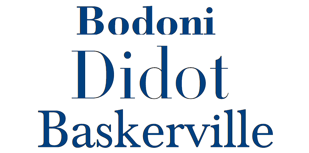
Serif display
These fonts have decorative serifs on the letterforms and are often associated with a classic or traditional style. The most known representatives are:
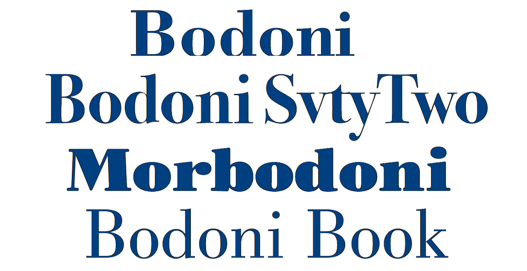
- Bodoni
- Didot
- Baskerville
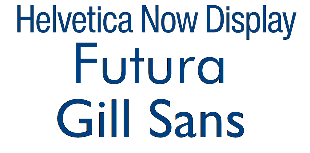
Sans-serif display
These fonts have a modern, minimalist feel and do not have decorative serifs. They do not stand out much from fonts of other types, so can be used even for body text. Examples of such fonts are:
- Helvetica
- Futura
- Gill Sans
Script display
These fonts mimic handwriting or calligraphy and have flowing, decorative letterforms. Here are a few representatives:
- Brush Script
- Lobster
- Pacifico

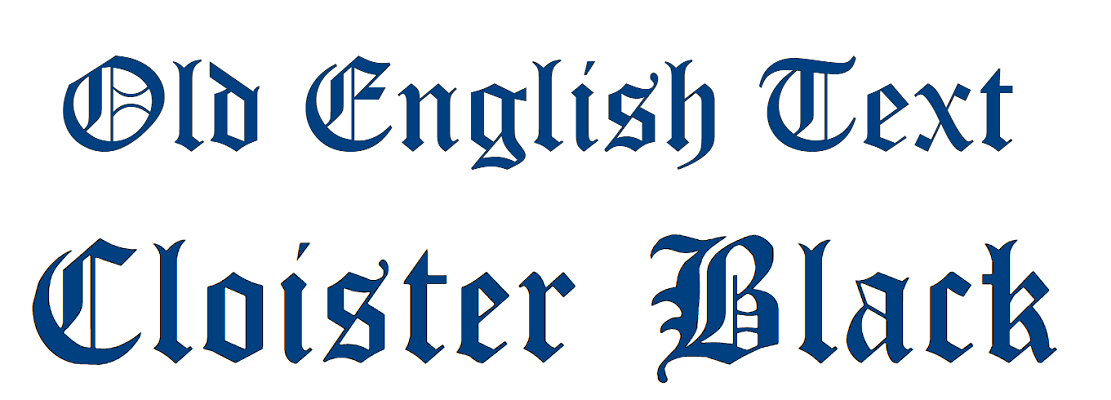
Blackletter display
These fonts are inspired by medieval manuscripts and have a bold, ornate style with thick, black letterforms. Here are some examples of such typesets:
- Old English Text
- Cloister Black
- Kanzlei
- Schwabacher
- Rotunda
- Bastarda
Decorative display
The fonts of this type are highly stylized and often include elaborate designs, patterns, or illustrations within the letterforms. To have a better understanding take a look at the representatives of decorative display fonts like:
- Cooper Black
- ITC Zapf Dingbats
- Bauhaus
- Papyrus

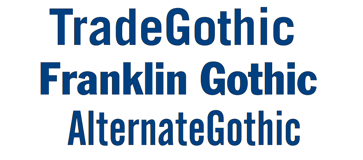
Display gothic
These fonts are characterized by their bold, condensed letterforms and geometric shapes. The examples are:
- Trade Gothic
- Impact
- Franklin Gothic
- News Gothic
- Alternate Gothic
- Eurostile
Display slab serif
These fonts have thick, block-like serifs so they have a strong, industrial look. The most famous representatives of these typefaces are:
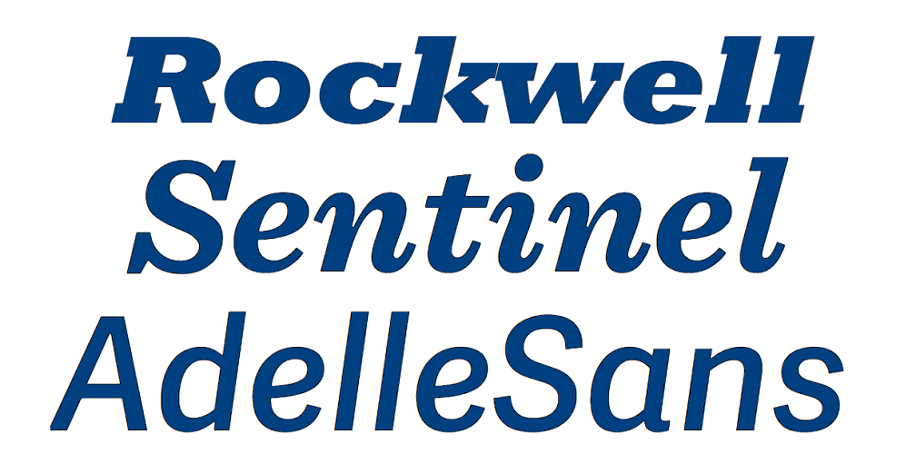
- Rockwell
- Memphis
- Sentinel
- Archer
- Egyptienne
- Lubalin Graph
- Playfair Display
Drawing a conclusion, display fonts offer a wide range of styles to cover all the fanciest desires. These fonts can be used to add personality and impact to a design, so knowing these classifications can help designers choose the right typeface for their projects.
Characteristics of display typefaces
Display fonts can be spotted by some characteristics they have. They are:
- Display fonts often have bold and striking letterforms that stand out from the page because they are designed to be attention-grabbing.

- These fonts are often featured with ornamentation like serifs, swashes, or flourishes to add personality to the typeface.

- Display fonts are typically of large sizes, so used as headlines or titles, where their size can be fully appreciated.
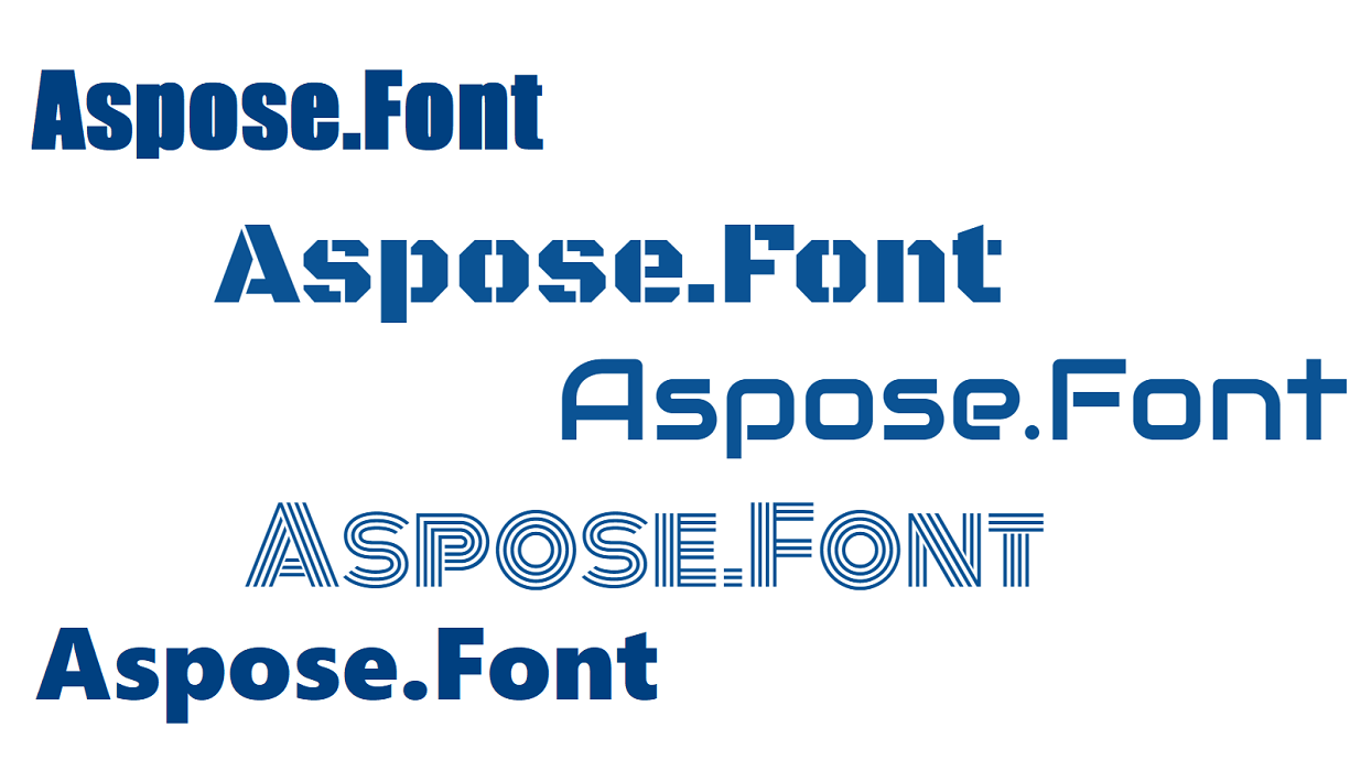
- Display fonts are well-known for their uniqueness as they are designed to be distinctive and unique to stand out from more conventional typefaces.

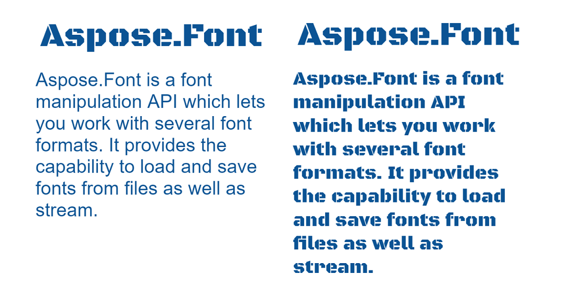
- Because of their boldness and uniqueness, display fonts are of limited use, to add impact to specific elements of a design rather than being used for all the text. See the difference in the picture below.
- Some display fonts have multiple weights or variations, so they provide you with a wider range of effects and styles within the same typeface.
- These fonts will help convey a specific mood or tone, which makes them useful for creating a specific impression in a design.
Overall, the key characteristics of display fonts are boldness, ornamentation, uniqueness, and the ability to convey a specific mood or tone, that is why they are a valuable tool for designers who are looking to add impact and personality to their designs.
How are display fonts different from other font categories?
Logically continuing the previous chapter let’s discuss the ways in which display fonts differ from other font types to be able to pinpoint them easily.
- Serif vs display fonts Serif fonts are characterized by small lines or flourish at the ends of the strokes that make up each letter. They are more traditional and formal than other types and are commonly used for body text in printing materials such as books and newspapers. Display fonts, on the other hand, are typically more playful and decorative, and are used to draw attention to specific parts of a design.
- Sans serif vs display fonts Letters of sans serif do not have the small lines at the ends of the strokes that serif fonts do. They seem to be more modern and informal and are commonly used for digital media such as websites and mobile apps. As you may already notice, some display fonts may be sans serif, but they tend to be more decorative and stylized than standard sans serif fonts or at least notably bolder.
- Script vs display fonts Script fonts are designed to look like handwriting and are often used for formal invitations, greeting cards, and other designs where a personal touch is desired. Display fonts may also be decorative or stylized, but they are typically less cursive and more geometric than script fonts, but in some cases, fonts can be both script and display, like brush ones.
- Monospace vs display fonts Monospace fonts are designed so that each character takes up the same amount of horizontal space, regardless of its actual width. This makes them convenient for programming and other applications where aligning text is important. Display fonts, on the contrary, are typically not designed for legibility at small sizes, and may not be suitable for use in situations where precise alignment is required.
Drawing a conclusion it is worth saying that display fonts are very versatile so they can be useful in different designs to create desired moods and styles. They are usually more decorative and stylized than other types of fonts but some typefaces can be both display and another type.
Popular styles and trends in display fonts
Display fonts are constantly evolving and changing. As they are very decorative they can afford to follow the newest trends, styles, or even hype. they can be created to highlight some occasions or holiday celebrations, etc. And as any other trend or style, they can become outdated or old-fashioned. Here are some of the currently popular among designers styles and trends in display fonts:
- Geometric fonts They are simple and clean, with a focus on basic shapes and proportions. They are often used for modern and minimalistic designs.
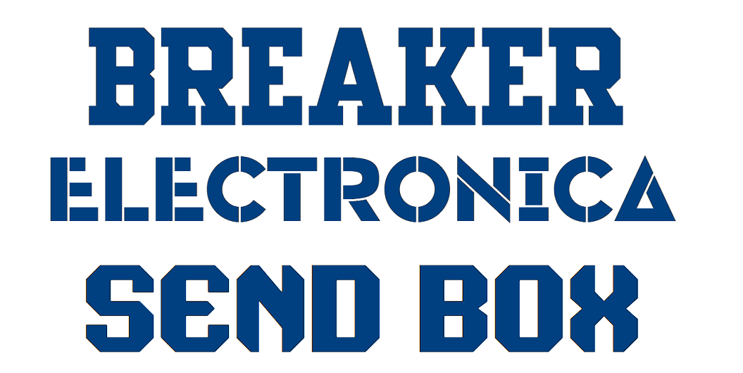
- Handwritten and brush fonts These ones are designed to look like handwriting and are often used for more informal designs, such as invitations, posters, and greeting cards.
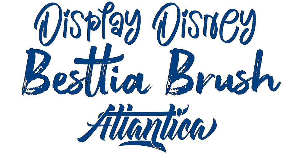
- Retro and vintage fonts These ones have a nostalgic feel that drifts back to the design trends of the past. They are often used for branding and advertising, as well as for more artistic designs.
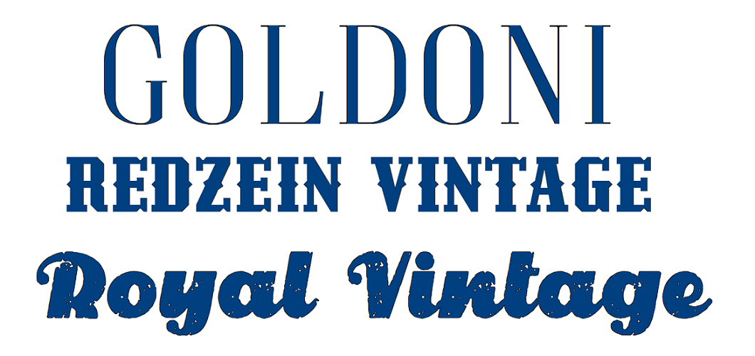
- Experimental fonts They push the boundaries of traditional design, having unusual shapes, decorations, textures, and effects. They are often used for artistic and avant-garde designs, as well as for more niche projects.
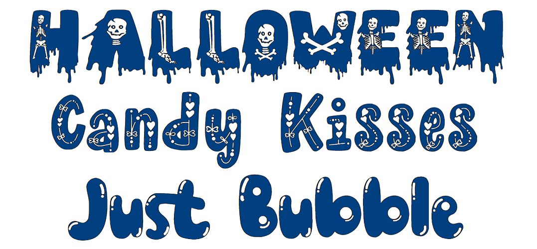
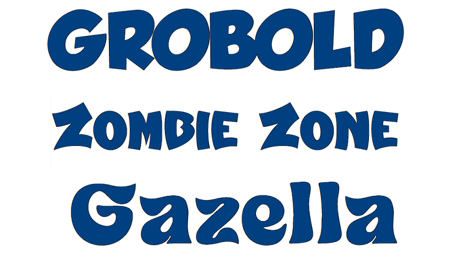
- Bold and chunky fonts These ones have thick and dramatic strokes that make them stand out on the page. They are very eye-catching and often used for headlines and titles, as well as for branding and advertising.
- Stylized serif fonts They have intricate details and flourishes that give them a decorative, fancy feel and are often used for high-end designs, such as luxury brands and fashion magazines.
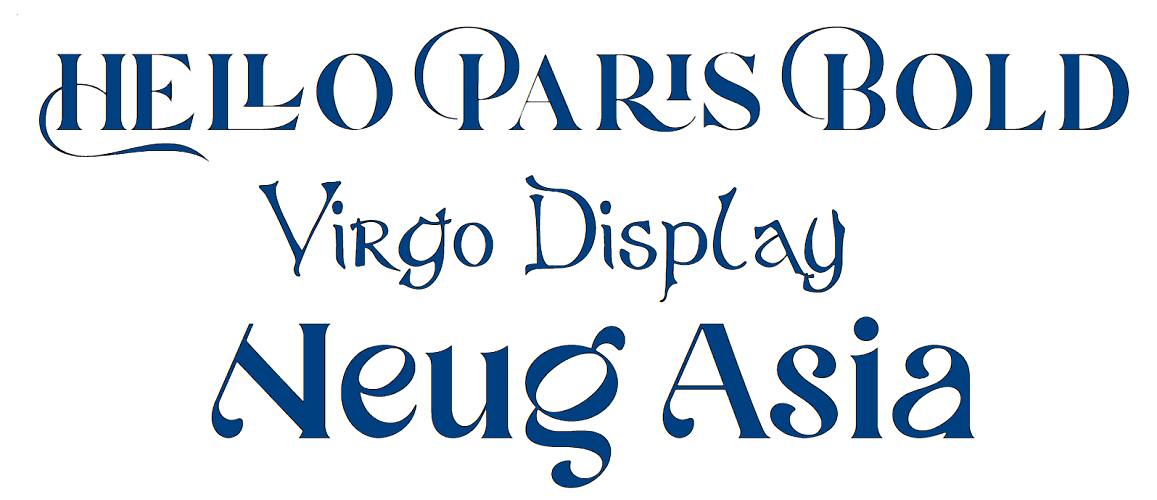
These are just a few examples illustrated with the images of fonts that are on trend among designers nowadays. The world of typography is constantly evolving, influenced by historical, political, technological, and fashion trends, so new styles are always emerging.
Technical considerations when working with display fonts
When choosing to use display fonts in your project, there are several technical issues the designers may face. Here are some of the most important ones:
- Font size Fonts of this type are usually designed to be used in larger sizes, such as for headlines and titles. They are often so elaborated and detailed that designers need to make sure that the details of the font remain visible and legible when the size is small.
- Kerning and tracking Display typefaces often have unique shapes and proportions that can make kerning and spacing between letters and words more difficult. You need to pay attention to these details so the text is legible and visually appealing.
- File size These fonts often have much larger files in comparison to other types. That is due to their unique shapes and details. You should take it into account and consider how the file size affects the performance of the project. Have in mind that you can create subset from only glyphs you would need and in this way reduce the size of the file. Try the Font Generator for this job.
- Screen resolution It is always required to consider how the font will look on different screens and resolutions when designing for digital media. Display fonts can look notably different on different devices, so test carefully how the texts are rendered before publishing or deploying.
- Accessibility Display fonts can sometimes be more difficult to read for individuals with low eyesight so you need to consider how the font affects the accessibility of the designs, and whether there are better alternative font choices.
- Licensing Display fonts often have licensing agreements, which can dictate how they can be used and distributed. Ensure that they have the appropriate licensing rights and only then use them in their designs.
These are just a few of the technical considerations that designers need to keep in mind when working with display fonts. Create a checklist so you do not miss these details this will help you create beautiful and effective designs with the chosen fonts.
Conclusion
Display fonts are a versatile and powerful tool for creating eye-catching and powerful designs. They can be used in designing a logo, a website, or a printed brochure and will help you make all the difference in creating a design that stands out from the others. However, it’s important to keep in mind the technical considerations involved in working with display fonts, such as kerning and tracking, font size, screen resolution, file size, licensing, and accessibility. Remember that same as script fonts, they also should be carefully paired with more plain casual fonts following the same rules of effective font pairing. The guidelines for effective use of display fonts are also the same as for effective use of script ones. If you take into account these details you will get designs that are both beautiful and functional.