Dyslexia and Fonts. What should you know?
What is dyslexia and how does it affect reading?
Dyslexia is a learning disorder that affects a person’s ability to read, write, and spell accurately. People with this illness may experience challenges in processing language and recognizing words. This leads to difficulties in reading fluently. The impact of dyslexia on reading can be significant and can vary from person to person, but some common effects include:
- Dyslexia often leads to a lack of reading fluency. People may struggle to read text smoothly and at a pace comparable to their peers. They may experience hesitations, pauses, and frequent errors while reading.
- Decoding involves associating the sounds of letters and letter combinations to form words. For dyslexic individuals, it may be difficult to decode, It causes problems in recognizing and understanding words.
- The disorder can also impact spelling abilities. Since dyslexics may have difficulty connecting sounds to letters, they often find it challenging to spell words correctly.
- Reading comprehension can also be affected by dyslexia. Even if a person can decode the words, they may struggle to grasp the meaning of the text. This leads to difficulties in understanding and remembering what was read. It can also influence writing skills as well.
- Dyslexia might prevent the increase in vocabulary as reading is a fundamental way of acquiring new words.
- The effort required to read and comprehend can be exhausting and frustrating for individuals with dyslexia. This can lead to a lack of interest in reading.
The need for dyslexic fonts
In today’s reality, when all environments are tending to become more and more inclusive so that people with disabilities could access the service provided, it was a natural step for dyslexic fonts to appear. Designers wanted to make reading more accessible and less challenging for individuals with dyslexia. Traditional fonts, such as Times New Roman or Arial, can be challenging to read for dyslexic readers due to their letterforms and spacing. Reading text in standard fonts can also be more confusing and tiring for individuals with this disorder.
What is dyslexia typeface?
Dyslexic fonts, also known as “dyslexia-friendly fonts” or “dyslexia-specific fonts,” are specifically designed to alleviate some of the challenges faced by dyslexic readers. These fonts are commonly used in educational materials, websites, and publications and incorporate certain features to make reading easier and improve overall readability.
Characteristics of dyslexic fonts
The development of such fonts is based on research and understanding of the reading difficulties faced by individuals with dyslexia. Some common characteristics of dyslexic fonts include:
| Characteristic | Description |
|---|---|
| Letterforms | Unique letter shapes that are more distinct and less likely to be confused with other letters. For example, lowercase “b,” “d,” “p,” and “q” may have more significant differences in shape to reduce letter reversals. |
| Letter spacing | Slightly increased letter spacing to ease for readers to distinguish individual letters and words. |
| Weight and style | Heavier weights or slightly slanted styles so the text stands out and the blurring effects are reduced. |
| Line length and height | May have shorter line lengths and taller letters. |
| Distinctive characters | Glyphs like “1,” “I,” and “l” might be modified to avoid confusion. |
| Open and rounded shapes | Open counters and rounded edges can improve letter recognition. |
It’s important to note that while dyslexia typefaces can be beneficial for some individuals with dyslexia, different people may have different preferences and responses to specific font styles. What works best for one person with dyslexia may not work as effectively for another. Therefore, providing multiple font options and considering other accessibility measures, such as clear layout, sufficient color contrast, and reading tools, can further support dyslexic readers in their learning journey.
Use of dyslexic fonts in different projects
Dyslexic fonts are used in various projects and applications to improve readability and accessibility for those who faced this disorder. They can be implemented in both print and digital media and here are a few examples of how it can be done:
Educational materials
Font for dyslexic readers are often included in educational materials, such as textbooks, workbooks, and handouts. By doing this, educators aim to support dyslexic students in their learning process and promote a positive reading experience.
Website and app design
Web designers and app developers use these fonts on websites and digital applications to create a more inclusive user experience. Dyslexic-friendly websites and apps ensure that users with dyslexia can access information and content. Here are some common places where such fonts can be helpful if used:
- Main body text and paragraphs on web pages.
- Headings and subheadings.
- Applied to navigation menus they can assist dyslexic users in finding and accessing different sections of the website more easily.
- Buttons and CTA elements, so users can understand the actions they can take on the website.
- Web forms. It will increase the readability of instructions and input fields.
- Error messages and alerts.
- Interactive content, such as quizzes or educational games.
- Text-based content in multimedia.
Branding and marketing materials
Companies and organizations that value inclusivity or target such people use dyslexic fonts in their branding and marketing materials. This gesture demonstrates their commitment to accessibility and creates a positive reputation with customers and stakeholders.
E-learning platforms
These fonts can be integrated into e-learning platforms and online courses to accommodate the needs of dyslexic learners. This is really helpful and provides equal opportunities for education and training.
Signage and public spaces
Inclusive design principles extend to public spaces, where dyslexic fonts can be used in signs and guideway materials, to help dyslexic individuals in navigating and accessing information.
Kids books
Employed in children’s books these fonts enhance readability for young readers with dyslexia. They help children become confident in their reading abilities and foster a love for reading from an early age.
Documentation
Dyslexic fonts can be used in various documents, such as reports, newsletters, and official communications, to ensure that the information is accessible to a wider range of readers.
How to implement font for dyslexic readers in design projects?
Implementing dyslexia typefaces in design projects can be done through various design software and tools. Let’s take a look at a step-by-step guide on how to get them incorporated:
- Select fonts that you want to use in your design. You can choose from the list of dyslexic fonts placed below or explore other dyslexia-friendly typefaces available online.
- Download and install the fonts.
- Open the design software (Adobe Illustrator, Adobe Photoshop, Sketch, or any other design tool that supports font selection).
- Start a new design project or open an existing one where you want to use the dyslexic fonts. Apply the font to the desired text by going to the menu and choosing the dyslexic font you installed on your computer.
- Format text by changing the font size, line spacing, and letter spacing to make the text more dyslexia-friendly.
- Test your design for accessibility. Check if the text is easy to read, and verify that the overall design is inclusive and user-friendly. If you use dyslexic fonts across multiple pages or sections, maintain consistency throughout your design project. If your design includes images with text content, ensure you provide alternative text (alt text) for the images. Alt text should describe the image’s content to assistive technologies for visually impaired users. If possible, conduct user testing, including feedback from dyslexic users.
- Include a brief explanation of the use of dyslexic fonts and other accessibility measures in your design project’s documentation.
Examples of dyslexic friendly fonts
Some fonts are considered to be dyslexic-friendly because of their design features. These fonts have specific characteristics that help reduce letter confusion, improve their recognition, and decrease visual crowding. Let’s take a look at popular fonts of such a type:
- Arial, Verdana, and Helvetica. These commonly used sans-serif fonts were not specifically designed for dyslexia, but are often considered more accessible for dyslexic readers because of their clean and straightforward design.
- Dyslexie is one the best typeface for dyslexia, specifically designed for dyslexic readers. It has heavier letter bottoms, larger openings, and slight slants to help differentiate between similar letters and reduce letter flipping and rotation.
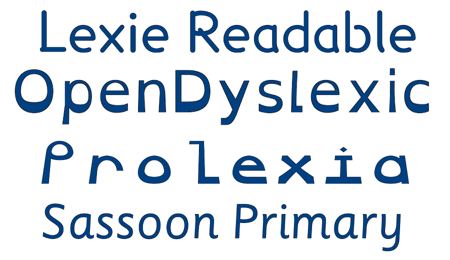
- OpenDyslexic is an open-source font with a unique design that emphasizes heavy base lines and varying letter heights. Its letters are slightly tilted, and the openings are wide to improve visual clarity and reduce letter confusion.
- Comic Sans Dyslexic, based on the popular Comic Sans font, gained some modifications to improve readability like a more consistent baseline and slightly different letter shapes to reduce common dyslexic reading challenges.
- Read Regular is another font designed to help dyslexic readers. It is done by adding larger spaces within letters and distinctive shapes that make it easier to differentiate similar characters.
- Lexie Readable is a font that provides distinctive letterforms and increased spacing.
- Sassoon Primary is originally designed for young children learning to read and write. It is also fitting for people with the disorder because of clear letterforms and consistent letter heights.
- Andika is a sans-serif font specifically created for literacy projects. It includes clear letterforms and notable spacing.
Conclusion
Dyslexic fonts have emerged as a valuable tool in the quest for greater inclusivity and accessibility for typography and design projects. These specially-designed fonts have features that help dyslexic readers to overcome reading difficulties. By incorporating dyslexic fonts into various projects, from educational materials and websites to branding and marketing initiatives, designers can make a significant impact on the reading experiences of those with dyslexia.
However, it is essential to keep in mind that dyslexia is a multifaceted learning difference, and individual needs and preferences may vary. So designers must use a broader spectrum of inclusive design principles, such as color contrast, clear navigation, and user-friendly interfaces.