Monospace Fonts Knowledge Base
What is monospaced font?
A monospace font, also known as a fixed-width or non-proportional font, is a font type where each character, including letters, numbers, symbols, and whitespace, takes the same amount of horizontal space. It distinguishes them from proportional fonts, where characters have varying widths.
The uniformity of monospace fonts creates a grid-like structure where characters align vertically, making it easier to maintain consistent spacing between elements. It allows for precise alignment and facilitates the creation of tabular data, code snippets, and other text structures that require exact positioning.
While fixed-width fonts are commonly associated with coding and technical applications, they can also be used in various other contexts. For example, they are occasionally employed in headlines or display typography to create a visually striking effect or evoke a sense of nostalgia.
Popular examples of monospace fonts include Courier, Consolas, Monaco, and Inconsolata, each with its own unique characteristics and variations.
Use cases of monospace fonts
Fonts of monospace type have a wide range of projects where they can be used like:
- Coding and programming - Monospace fonts are constantly used in coding and programming environments. They can ensure consistent alignment and facilitate the presentation of code snippets, so it is easier for developers to read, write, and debug code. They also help maintain the proper indentation and structure which is important in programming languages.
- Data Tables and spreadsheets - These fonts are also a good choice when it comes to creating data tables and spreadsheets as they enhance the clarity and organization of tabular information, making it easier to interpret and analyze data.
- Terminal emulators and command-line interfaces - Monospace fonts are commonly used in terminal emulators and command-line interfaces to improve the legibility and give you a clean, organized appearance when displaying system output, executing commands, or interacting with the command line.
- Typography and design - Monospace fonts are also a popular choice in typography and design projects. They can give a retro or vintage vibe to a design. You can also use them in logos, headlines, and graphic design elements to achieve a bold and eye-catching visual impact.
- Text editors and Integrated Development Environments (IDEs) - Fonts of monospace type are often used in text editors and IDEs for programming and writing purposes to improve readability, especially when working with large blocks of code or text. Here consistent spacing between characters helps in visually distinguishing different elements and improves comprehension.
- Email and text formatting - Monospace fonts can be also used in email composition or text formatting. It may help highlight specific content or convey a sense of structure. For example, they can be used in quotations or excerpts from the main text.
- ASCII Art and creative expression - Monospace fonts are integral to ASCII art, which is created using characters and symbols to form images or designs. The fixed-width characters of fixed-width fonts allow artists to precisely align and structure their creations to get more appealing artwork.
Pros and cons of using monospace fonts
It’s important to note that while monospace fonts excel in the aforementioned areas, they may not be ideal for all typographic needs. It is important to learn all pros and cons of such a font type, before picking it out for your project.
| Pros | Cons |
|---|---|
| Monospace fonts offer excellent readability, particularly in contexts that require precise character alignment because of the consistent width of each character. This is helpful in code snippets, tables, or any content where visual clarity and alignment are essential. | The fixed-width nature of monospace fonts can be a drawback in contexts where varied character widths that give more natural flow of text are desired. |
| Monospace fonts are highly beneficial for coding and programming tasks because their fixed-width characters make it easier to spot syntax errors, align code elements, and maintain consistent indentation. | Monospace fonts can be space inefficient, as each character occupies the same width, so wider characters may leave unused space, reducing the overall text density and potentially requiring more screen or paper space. |
| They ensure that the output, commands, and file listings are neatly aligned and easily readable, enhancing the overall user experience in command-line interfaces and terminal emulators. | Monospace fonts may have limitations in terms of expressing typographic variety or conveying specific moods or tones and cannot offer a broader range of stylistic choices in comparison to proportional fonts. |
| Monospace fonts have a unique and appealing look, particularly in designs that aim to evoke a retro or vintage vibe. The clean, grid-like appearance of monospace characters can add character and charm to a design. | Due to their uniformity, monospace fonts are less commonly used for lengthy texts or body content. Proportional fonts, with their variable character widths, generally offer better readability for extended reading. |
So let’s summarize that before making a choice in favor of a specific font type it is important to assess the requirements of the project, such as readability, alignment needs, and the desired aesthetic. It is often a matter of selecting the right tool for the intended purpose.
Classification of monospace fonts
In this block, we will make an attempt to classify fonts of monospace type based on various characteristics such as style, design era, and intended use.
Classic monospace fonts
These ones include fonts that have a traditional, retro, or typewriter-inspired design. Classic monospace fonts often show distinct characteristics like slab serifs, square shapes, and a vintage aesthetic. Here are a few representatives of such typefaces:
- Courier
- Andale Mono
- Consolas
- Droid Sans Mono
- Inconsolata
- Anonymous Pro

Modern monospace fonts
These ones are considered to be best mono fonts as they have a contemporary design approach combined with fixed-width characteristics. They often feature clean lines, a minimalistic appearance, and a balance between readability and style. Examples of modern monospace fonts are:
- Roboto Mono
- Source Code Pro
- Input Mono
- Liberation Mono
- Bitstream Vera Sans Mono

Programming fonts
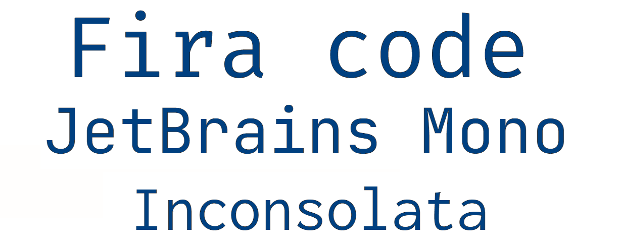
Such fonts are specifically designed to enhance code readability and facilitate software development. They typically have clear distinctions between characters, optimized spacing, and special symbols for code-specific use cases. The representatives of programming fonts are:
- Fira Code
- JetBrains Mono
- Inconsolata
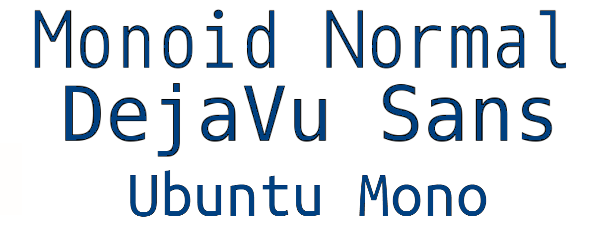
Terminal fonts
They are designed for optimal readability in command-line interfaces and terminal emulators. Terminal monospace fonts prioritize readability even at smaller sizes and often have enhanced anti-aliasing or hinting for screen rendering. Here are some famous representatives of such fonts:
- Monoid
- Terminus
- DejaVu Sans Mono
- Droid Sans Mono
- Ubuntu Mono
- PT Mono
- IBM Plex Mono
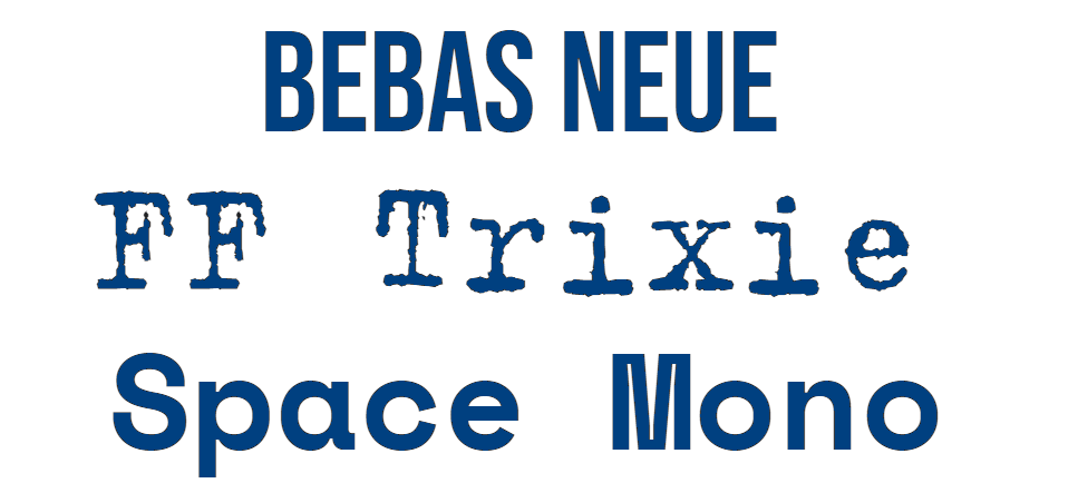
Display monospace fonts
Display monospace fonts are intended for use in headlines, logos, or large-scale typography because they have unique and stylized designs, to create a bold and eye-catching visual impact. They may have exaggerated proportions, decorative elements, or distinctive ligatures. Here are some examples to learn these fonts:
- FF Trixie
- Space Mono
- Overpass Mono
- Bebas Neue
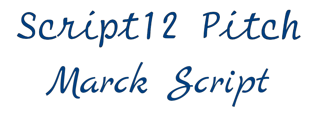
Handwriting and/or script monospace fonts
Script monospace fonts imitate the look of handwritten text and combine the uniqueness of handwriting with the alignment and spacing benefits of mono space fonts. Examples of handwriting monospace:
- Courier Handwriting
- Script12 Pitch
- Marck Script
This was not a precise classification because you may find that some fonts can get into a few categories. It is also worth remembering that new monospace typefaces are continually being created, expanding the range of classification possibilities.
Where can I get monospace and/or download monospace fonts?
There are several places where you can find monospace fonts:
Google Fonts: There is a wide variety of fonts, including a lot of monospace options. You can search for best free mono space fonts and download them there.
Adobe Fonts: It is a subscription-based service that gives you access to a vast collection of fonts, including monospace ones. Some fonts may require a subscription or licensing fee.
DaFont and/or Font Squirrel: On these popular sites you can also find a lot of free fonts, including monospace options. Just browse through different categories and download the fonts for personal use.
GitHub: GitHub is a code hosting platform where developers often share their projects. You can find monospace fonts in various programming-related repositories. Simply search for them or explore repositories that focus on typography or design.
Remember to always check the licensing terms and conditions for each font to ensure it is suitable for your specific use case as it can be an issue of using font violating the copyright.
Characteristics of monospace fonts
A good way to summarize the information about fixed-width fonts is by explaining their peculiarities. This will help you better remember everything you have already read and distinguish fonts of monospace type among the others in the future. So here are some key characteristics of monospaced fonts:
- Equal character width - Every character, including letters, numbers, and punctuation marks, is taking the same width, regardless of its actual width or shape, so the text has a grid-like appearance.
- Alignment - Monospace fonts provide vertical alignment, so each character is positioned at the same vertical point, making it easier to align columns of text or numbers. You may find it useful when working with code, tables, or any text that requires precise formatting.
- Better readability - Uniform spacing makes monospace fonts highly readable, especially when it comes to presenting code or displaying tabular data.
- Retro or typewriter aesthetic - Monospace typefaces are often associated with a retro or vintage typewriter look because of consistent width and distinct letter shapes. So these fonts can be used for creative or design purposes, such as in headings or logos.
- Limited design variations - Compared to proportional fonts, especially script and display ones, monospace fonts have fewer design variations or stylistic flourishes and typically feature simple, straight, and angular letterforms.
Overall, monospace fonts are characterized by their fixed character width, alignment capabilities, readability, and their association with coding environments and retro aesthetics.