Finding perfect font combinations
What is font pairing?
Font pairing is the process of selecting and combining two or more fonts to use together so they fit each other in design projects, such as websites, print materials, or presentations. The primary goal of font matching is to create a visually appealing and balanced typographic composition that improves readability and overall aesthetics.
Combining (pairing) fonts properly is crucial in design, as different typefaces convey distinct emotions, styles, and personalities. In an effective design, fonts should complement each other and create a cohesive and professional look, making the content more engaging and easier to digest for the audience.
Factors to consider when pairing fonts
Font pairing is an art that requires a keen eye for aesthetics and a deep understanding of typography principles. When choosing fonts that will satisfy the requirements of the project designers also often consider the following factors:
- Pairing fonts with contrasting styles can create visual interest and hierarchy in the design. Combine a bold, attention-grabbing headline font with a simple and clear body font.
- It is also important to ensure that the fonts still work well together and maintain a sense of harmony. They should complement each other without overlapping or creating a distracting appearance.
- Establishing a clear hierarchy in typography is vital for guiding the reader’s eye through the content. Use different font styles, sizes, and weights, designers to create a visual hierarchy that highlights important elements and improves readability.
- Consistency helps reinforce the brand identity and gives the project a cohesive look. Use a consistent set of matching fonts for headings, subheadings, and body text to get a neat and professional design.
- Consider the context and purpose of the design project. For example, a formal corporate website may require a different font combination than one for a playful kid book.
- Legibility of the fonts is a key factor. Ensure that the selected font pairs are easy to read across different devices and screen sizes.
Types of font matching
There are various types of strategies you can use. Each strategy has its unique characteristics. Here are some common types of font pairing:
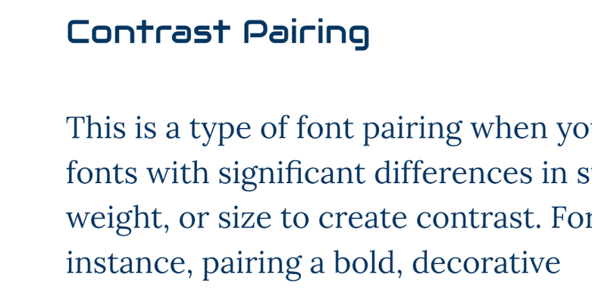
- Contrast pairing
This is a type of font pairing when you take fonts with significant differences in style, weight, or size to create contrast. For instance, pairing a bold, decorative headline font with a simple and clean body font can be an effective contrast pairing.
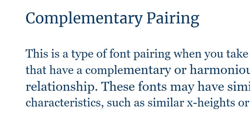
- Complementary pairing
Here when yo are matching fonts you take ones that have a complementary or harmonious relationship. These fonts may have similar characteristics, such as similar x-heights or similar serif styles. This will help you create a cohesive and balanced typographic composition.
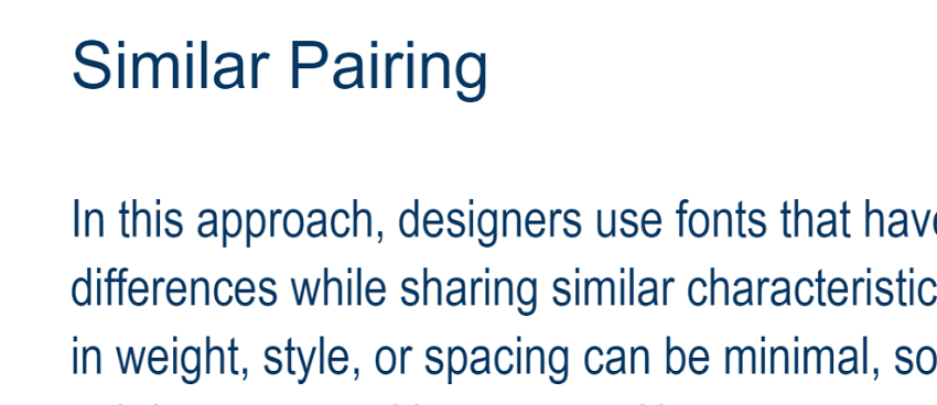
- Similar pairing
In this approach, designers use fonts that have subtle differences while sharing similar characteristics. The variations in weight, style, or spacing can be minimal, so you have a more subtle contrast with a sense of harmony.
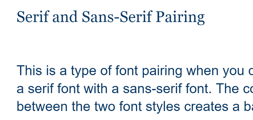
- Serif and sans-serif font combinations
This is a type of font pairing when you combine a serif font with a sans-serif font. The contrast between the two font styles creates a balanced and visually interesting composition. For example, pairing a serif font for headings and a sans-serif font for body text is a common serif and sans-serif pairing.
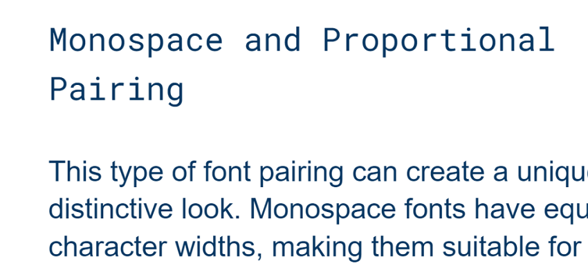
- Monospace and proportional pairing
This type of font combination gives a unique and distinctive look. Monospace fonts have equal character widths, making them suitable for coding or displaying data, while proportional fonts are more commonly used for body text and headings.
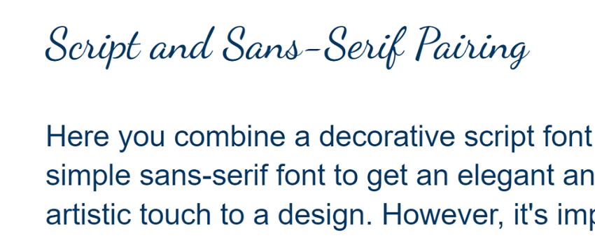
- Script and sans-serif pairing
Here you combine a decorative script font with a simple sans-serif font to get an elegant and artistic touch to a design. However, it’s important to use script fonts carefully and pay attention to readability.
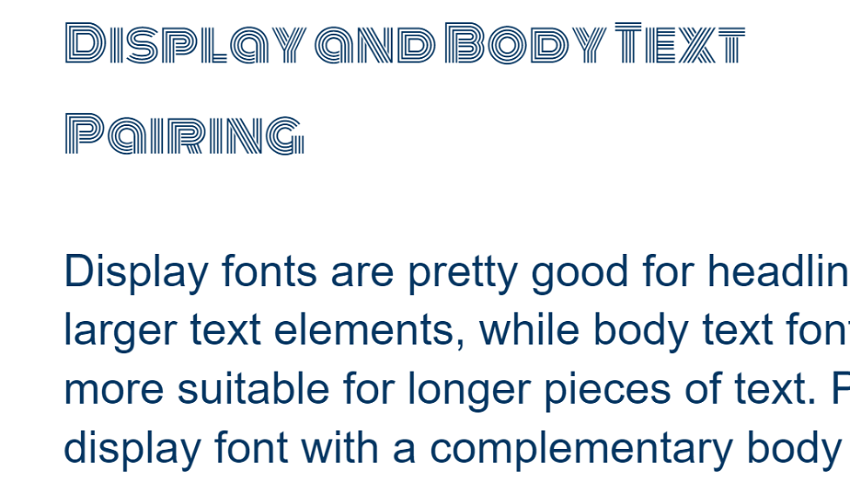
- Display and body text pairing
Display fonts are pretty good for headlines and larger text elements, while body text fonts are more suitable for longer pieces of text. Pairing a display font with a complementary body text font helps create a clear visual hierarchy and improve readability. Such combinations are often quite contrasting.
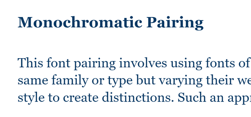
- Monochromatic pairing
This font pairing involves using fonts of the same family or type but varying their weight or style to create distinctions. Such an approach adds diversity to the design without introducing a stark contrast. It is usually used for formal papers.
- Brand-centric pairing
Some designers select specific combinations of typefaces that align with a brand’s identity and personality. They are chosen to reinforce the brand’s overall look and feel consistently.
Tools for font pairing
There are several online tools and resources available that can help designers and developers with font matching. They simplify the process of finding and combining different fonts, making it easier to create visually pleasant and harmonious designs. If you’re working on a web project, presentation, or print materials, these tools can save time and make the font pairing process more enjoyable. Here are some popular tools you may find useful for such purposes:
| Tool | Usage for font pairing |
|---|---|
| Google Fonts | Has a vast collection of free and open-source web fonts that can be easily paired together. The platform provides recommendations and allows users to compare multiple fonts side by side. |
| FontPair | A tool that demonstrates popular font combinations. It allows users to see the fonts in various sizes and weights to visualize how they work together. |
| Adobe Fonts(Typekit) | Offers a wide selection of premium and open-source fonts along with typeface combos suggestions. This allows users to create their font kits. |
| Canva Font Combinations | It visualizes various font pairings fitting for different design projects. The tool also has a preview option to see how the fonts look together. |
| Fontjoy | It uses machine learning to suggest font pairings based on user preferences and generates combinations with contrasting styles, sizes, and weights. |
| FontFlipper | A tool that generates random font pairings for inspiration. It offers a unique way to explore font combinations outside of common recommendations. |
How to pair fonts effectively?
Getting the best font combinations can be subjective, and there’s no airproof solution. Trust your design taste and expertise, and don’t be afraid to experiment. But have in mind these helpful practices for font combining:
- Balance contrast with complement. You should create contrast between fonts but not decrease their complementarity. They should not contradict each other and stick out of the overall concept of the design.
- Limit the number of fonts. Avoid having too many fonts in your project. Not only can it be overwhelming the design, but also harder to manage.
- Consider the context. Match the fonts that satisfy the purpose of your design. Different projects may require formality or playfulness, so choose fonts that fit with the intended tone.
- Create hierarchy and readability. Use fonts that help build a clear hierarchy to distinguish between headings, subheadings, and body text. Prioritize readability by selecting legible fonts and appropriate font sizes. Besides font styles and weights, use color and size to reinforce the typographic hierarchy.
- Try different sizes and weights to see how they interact and work with each other. This allows you to fine-tune the combination for the best result.
- Pay attention to accessibility. Ensure that your font pairs are easy to read to all users. Opt for readable typefaces and provide sufficient contrast between text and background.
- Maintain consistency in font usage throughout the design. Use the same font pairings across different sections or pages.
- Combine serifs and sans-serifs. This is a classic approach that often works well. It gives sufficient contrast between the two styles and adds visual interest without visual conflict.
- Try to pair fonts from the same family. This approach ensures a cohesive design while offering subtle differences.
- Take advantage of font libraries like Google Fonts or Adobe Fonts and other tools.
- Test the combination of typefaces across different devices and platforms. Test the design on various screen sizes to guarantee a consistent user experience.
- Adjust line spacing (line height) to improve legibility and create a balanced look between the fonts. Too tight or too loose line spacing can affect readability negatively.
What type of fonts pair well together?
These are considered to be great font combinations:
- Serif and sans-serif is a classic combination.
- Thick and thin typeface combos can create a visually appealing contrast.
- Fonts from the same family but in different styles, such as regular, italic, bold, and light, often work well together.
- Two complementary sans-serif fonts can create a contemporary and modern feel.
- Decorative display font with a more straightforward font for body text.
- Decorative script font with a simple sans-serif font.
- Monospace font (equal character widths) with a proportional font (variable character widths).
- Fonts with similar x-heights (height of lowercase letters).
- Geometric font (with clean, precise lines) with a humanist font (with more organic and human-like qualities).
Algorithm for software validation of a font pair
If you want to have an automatic font pairing testing tool, it should include next necessary steps:
- Family check - Metadata parsing stage, reading FamilyName properties. If both fonts belong to the same superfamily (for example, Source Sans and Source Serif), the pair is considered to be perfect by default.
- Metric analysis - Programmatic comparison of Ascender, Descender, and XHeight metrics. Calculation of the scaling factor for the main text.
- Encoding validation - Localization check. Automatic analysis of the
cmaptable of both fonts to confirm that they both support the required character range (for example, specific language Cyrillic) to avoid the appearance of “rectangles” instead of the missing letters.
Conclusion
Font pairing can create visually captivating and harmonious designs. Selecting the right combination can notably impact the overall aesthetics and readability of a project. By following best practices and considering the context, hierarchy, and accessibility, you can achieve the best result that leaves a lasting impression on the audience.
With the abundance of font libraries and online tools available, designers can experiment with various combinations and view them before making final decisions. However, it’s essential to exercise restraint and maintain consistency to avoid overwhelming the design with too many fonts, or fonts that are beautiful but hard to read.