Sans font type Knowledge Base | Aspose.Font
What are sans serif fonts?
Sans serif fonts are a category of typefaces without the small decorative strokes(serifs) at the ends of the main strokes of each letter or character. In comparison to serif fonts, sans serif fonts have clean and simplified letterforms with no serifs. Due to their simplicity, еруіу fonts are commonly used in digital interfaces, signage, headlines, and other contexts that require a contemporary and stylish look.
The absence of serifs in sans serif fonts eliminates the intricate details that may appear fuzzy or unclear in certain situations, so they can have a different visual impact compared to serif fonts. These typefaces can offer good legibility, especially at smaller font sizes and on screens.
Pros and cons of sans serif typeface
Due to their distinct characteristics, sans-serif fonts are widely used in different projects, including digital and print media. To understand if it is an appropriate choice for your needs let’s explore some pros and cons of these typefaces:
| Pros | Cons |
|---|---|
| Sans-serif fonts are more legible and preferred on screens and at smaller sizes in comparison to serif ones. The absence of decorative serifs allows you to get clearer and more straightforward letterforms. | Sans-serif fonts are generally thought less formal than serif ones, which have a more traditional association. In certain contexts, such as formal invitations or academic papers, serif fonts may be preferred for their classic and elegant appearance. |
| Sans-serifs often offer a contemporary and minimalistic feel. That is why they are frequently used in modern designs, such as websites, logos, and branding, to achieve a clean and professional look. | The absence of serifs may lead to worse character recognition, particularly in long paragraphs or dense text. |
| Sans-serif fonts are highly versatile and adaptable to different design styles and applications and are good in both formal and informal contexts, making them suitable for a wide range of projects. | As sans-serif fonts are better in digital spaces, they may offer less brand distinctiveness or uniqueness compared to serif ones. |
| Simplicity and clarity can improve readability for those who have visual impairments or reading difficulties. Their straightforward letterforms can enhance accessibility in digital interfaces or printed materials. | Serif fonts have a historical lineage, and some readers may associate them with established print traditions, such as books or newspapers where a sense of tradition, authority, or reliability may be needed. |
| These fonts are optimized for screen display. They are designed with larger x-heights and wider spacing, which improves legibility on different screens, particularly at lower resolutions. | Different cultures and languages may have preferences and expectations regarding font styles, so serif fonts might be more appropriate due to cultural or historical conventions in certain regions or for specific target audiences. |
Now you know why to use sans serif fonts. But all the benefits and drawbacks of a certain font type may be neglected as when choosing a font to use, you first need to consider the specific design goals, target audience, and overall context of the project.
Classification of sans serif fonts
These typefaces can be classified into various categories based on their design characteristics. Let’s focus on the next types of sans serif fonts:
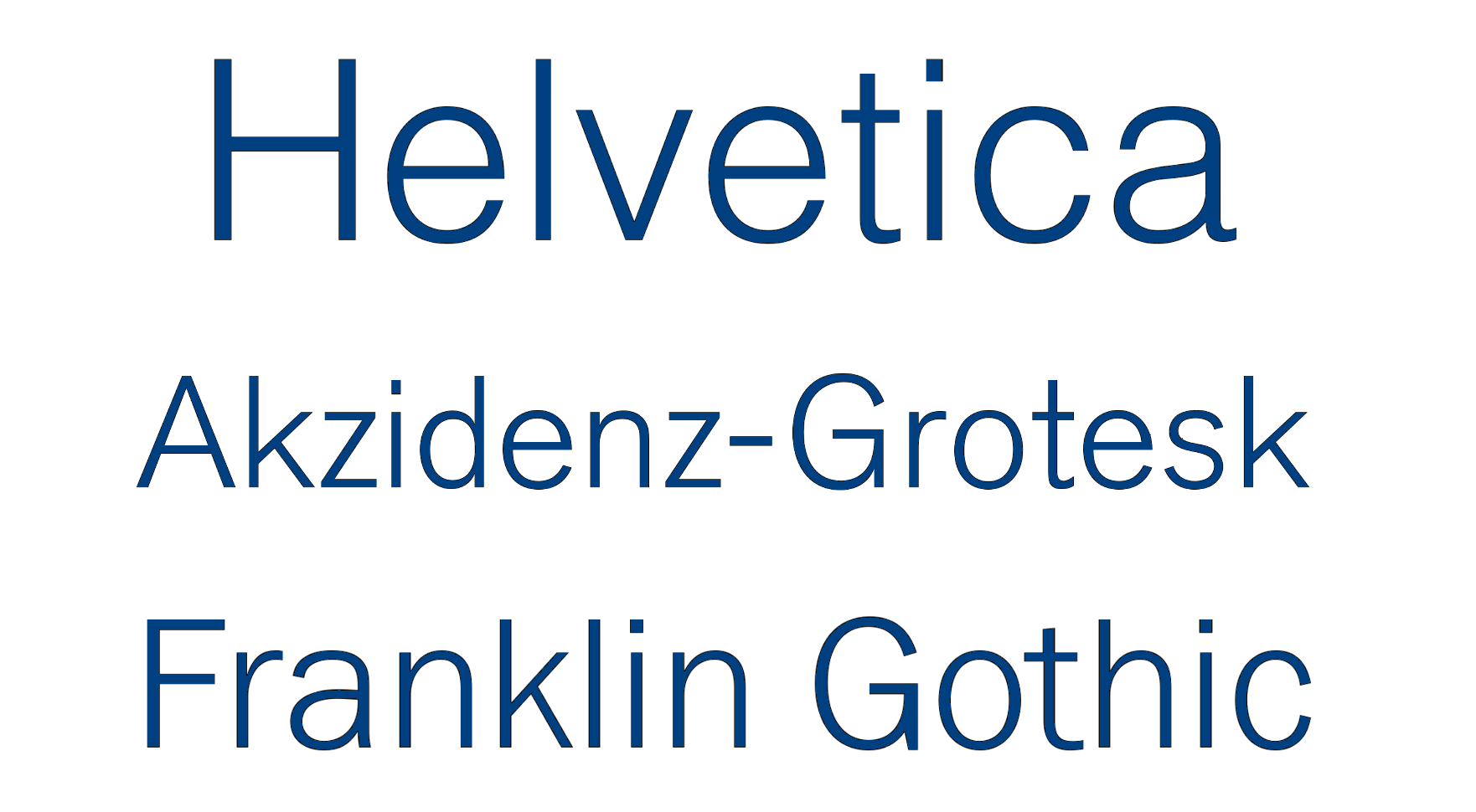
Grotesque sans serifs
They are also known as early grotesques or grotesk fonts and were among the first sans-serif typefaces. They appeared in the 19th century and are characterized by irregular stroke widths, moderate-to-low contrast between thick and thin strokes, and a more mechanical appearance. Here are a few examples of grotesque sans serif fonts:
- Helvetica
- Akzidenz-Grotesk
- Franklin Gothic
- Trade Gothic
- News Gothic
- DIN
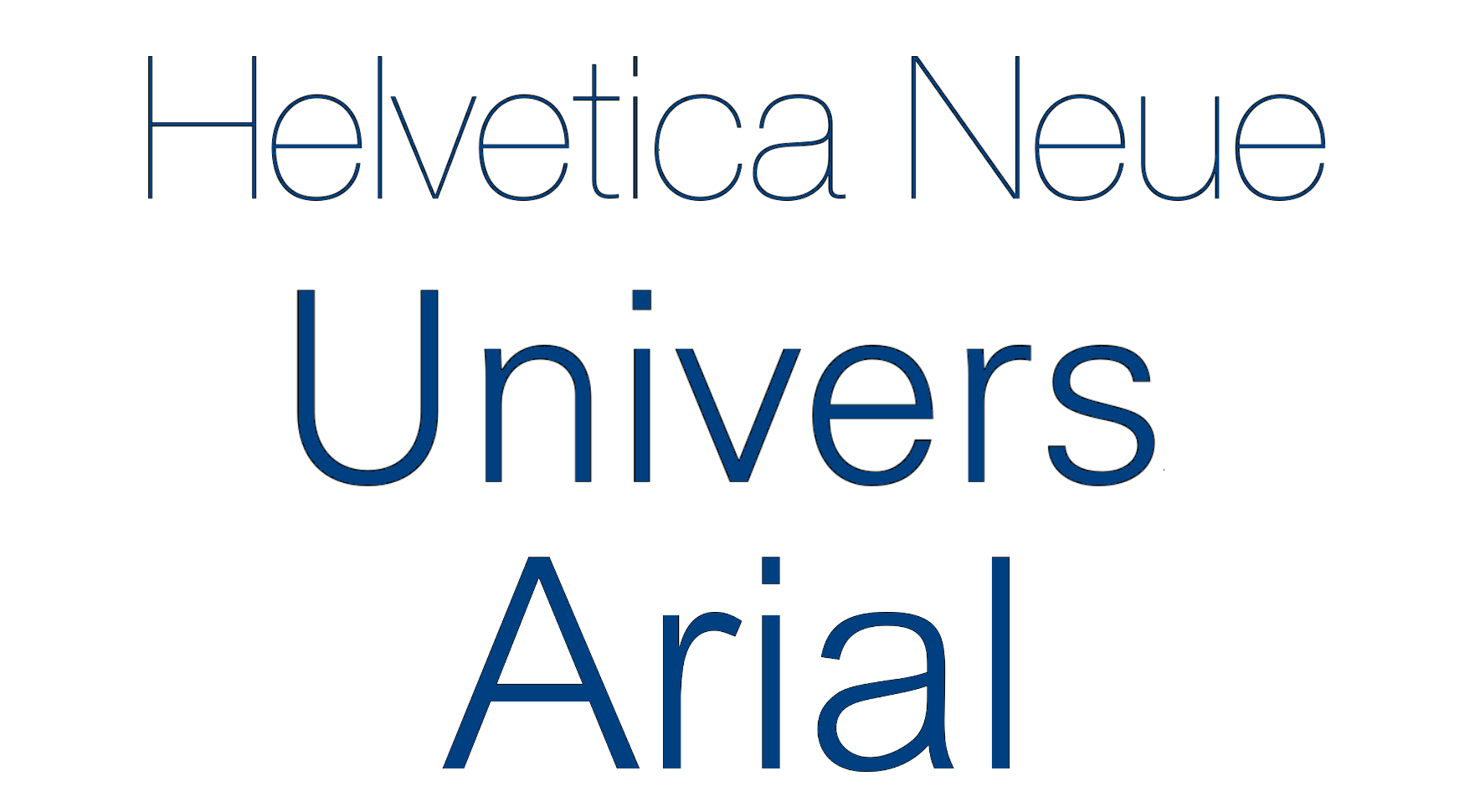
Neo-grotesque fonts
These sans serif typefaces evolved from the earlier grotesque fonts and became popular in the mid-20th century. They have more regular and consistent stroke widths, better legibility, and a cleaner, more modern aesthetic in comparison to their predecessors. Here are some examples of such typefaces:
- Helvetica Neue
- Univers
- Arial
- Roboto
- Proxima Nova
- Gotham
- Avenir
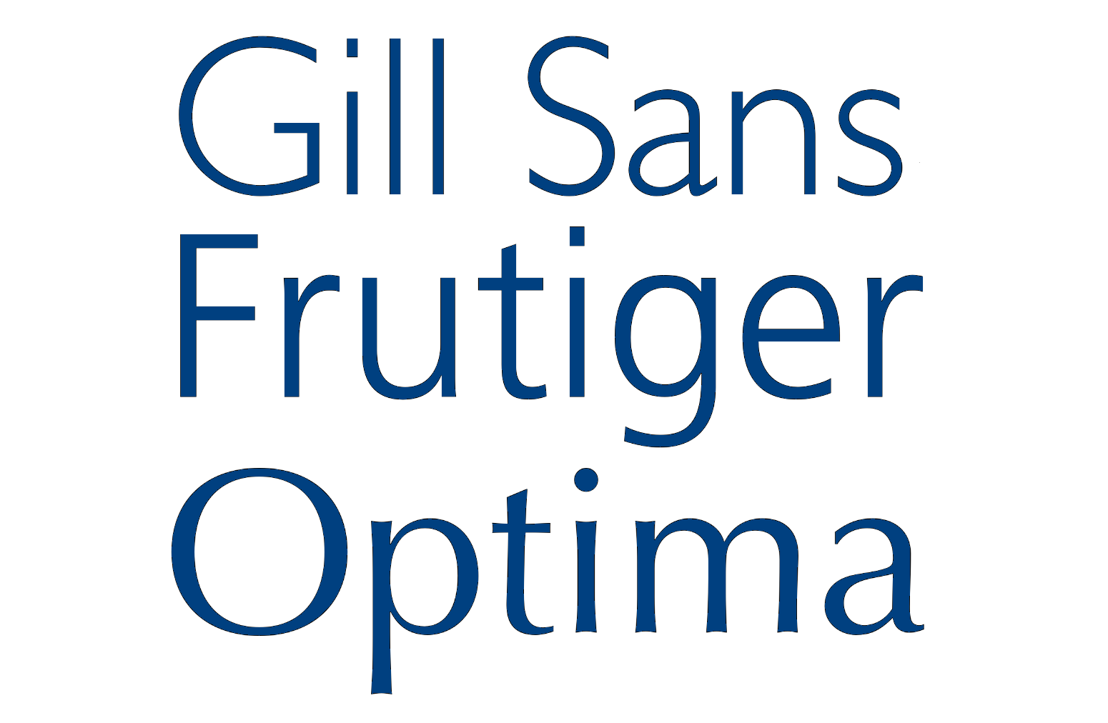
Humanist sans-serif fonts
They are inspired by traditional calligraphy and exhibit more organic and dynamic letterforms with subtle variations in stroke width, so the glyphs look as if written by a human hand. Humanist fonts often have open apertures and slightly angled stress on letters. Examples include such fonts:
- Gill Sans
- Frutiger
- Optima
- Myriad
- Verdana
- Tahoma
- Corbel
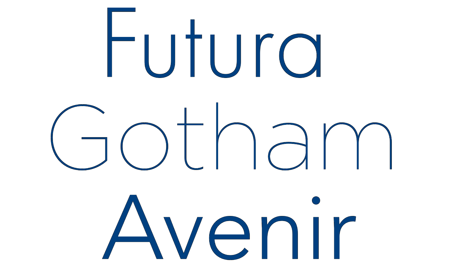
Geometric sans-serif fonts
These typefaces have precise, geometric shapes and often a more minimalist appearance. They are based on simple geometric forms like circles, squares, and triangles, resulting in a clean, symmetrical design. Here are some examples of popular geometric sans serifs:
- Futura
- Avant Garde
- Avenir
- Gotham
- Montserrat
- Eurostile
- Neutraface
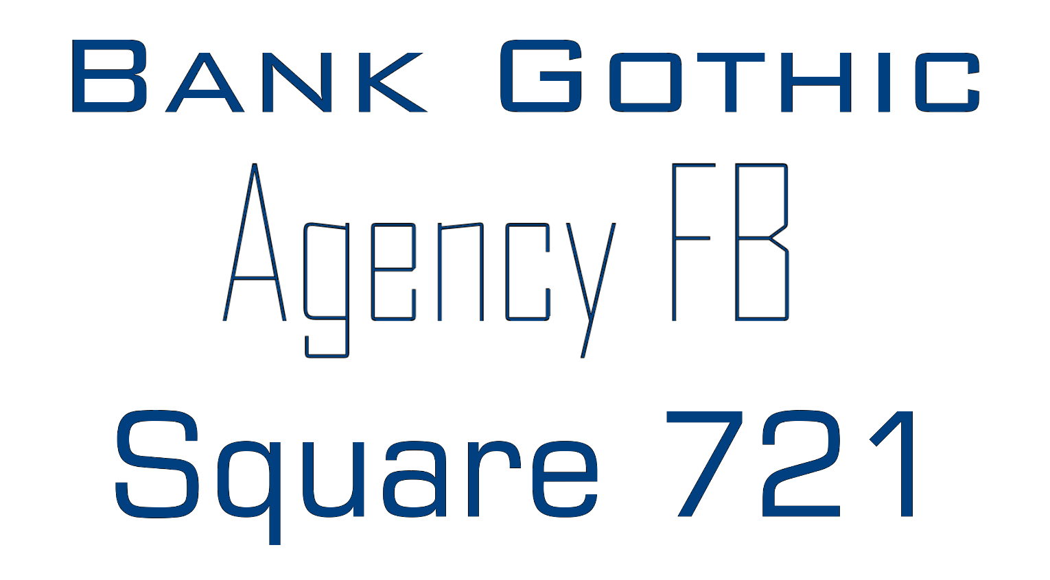
Square sans serif typefaces
These typefaces have letterforms with squared terminals or corners, so they have a more box-like or blocky look. Having a strong, contemporary feel, sans-serifs are commonly used in technology-related or display applications. Among the representatives are:
- Eurostile
- Bank Gothic
- Agency FB
- Square 721
- Proxima Nova Square
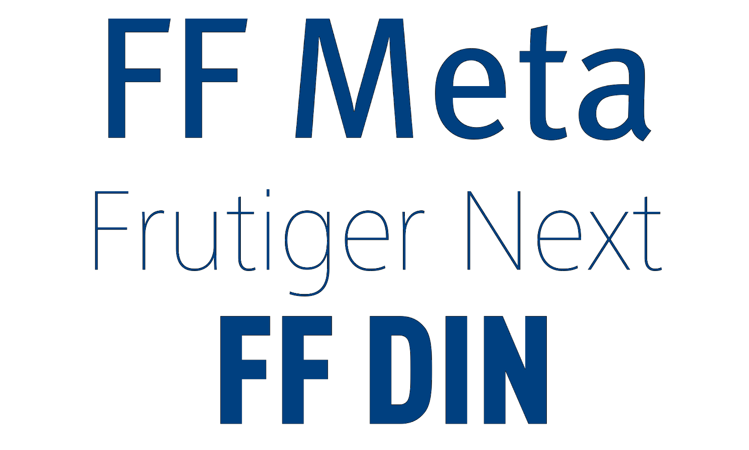
Humanist geometric sans fonts
These sans-serifs combine the characteristics of humanist and geometric typefaces. They keep the clean and geometric structure but also add subtle calligraphic details or humanistic features. The representatives of humanist geometric fonts are:
- FF Meta
- Myriad
- Frutiger Next
- FF DIN
- Aktiv Grotesk
- Klavika
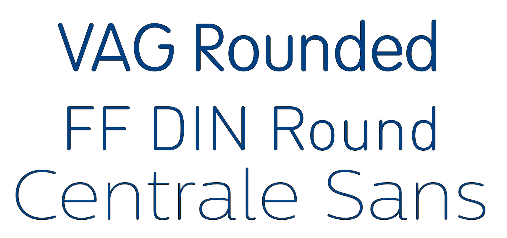
Rounded sans-serif fonts
They have curved or rounded endings, which soften the overall look of the letterforms that conveys a friendly, playful, or approachable tone. Examples of rounded sans-serif fonts include:
- Helvetica Rounded
- VAG Rounded
- Proxima Nova Soft
- Futuracha Pro
- Quicksand
- FF DIN Round
- Centrale Sans Rounded
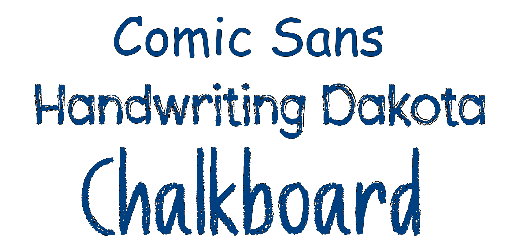
Informal sans-serif fonts
These sans fonts have a more casual, hand-drawn, or whimsical style. They often mimic the imperfections of handwriting and add a personal or creative touch to designs. Here are examples of informal sans-serif fonts:
- Comic Sans
- Marker Felt
- Handwriting Dakota
- Chalkboard
- Kristen ITC
The classification is not precise and many fonts may be put into multiple categories or have their unique design traits. But font classification is a useful way to understand the diverse range of sans-serif typefaces available.
Characteristics of sans serif fonts
Sans serif fonts have several distinctive characteristics that set them apart from other font types. The most common ones are:
- Absence of serifs - these fonts have clean and straightforward letterforms without any serifs.
- Clean and minimalistic appearance - Sans-serif fonts tend to have uniform stroke widths, crisp edges, and a lack of embellishments, making them appear clean and plain.
- Legibility and readability - The absence of serifs, combined with clear and open letterforms, contributes to good readability, especially at smaller sizes or on digital screens.
- Sans-serif fonts are highly versatile and can be used in a lot of design projects like print and digital media. They can adapt to different styles, from formal to informal, depending on the specific font and its characteristics.
- These typefaces are often associated with a contemporary or modern look. They are commonly used in branding, advertising, user interfaces, and other applications where a clean and professional appearance is required.
- Simplified letterforms in comparison to their serif counterparts. These fonts often have more geometric or straighter strokes, simpler terminals, and lowered stroke contrast.
- Sans-serif fonts are well-suited for digital environments, designed with larger x-heights and wider spacing, which enhance legibility on screens, especially at lower resolutions.
- Sans-serif fonts often have a neutral character. They are designed to convey information clearly without imposing a specific mood or tone.
Popular script fonts
There are many popular sans-serif fonts that have been widely used across various design contexts. Here are examples of some of them:
- Helvetica - widely recognized and influential sans-serif font designed by Max Miedinger and Eduard Hoffmann. It has a clean and versatile design, with even stroke widths and a neutral appearance. Helvetica has a really extensive font family to cover a wide range of applications.
- Arial - a typeface that is known as a digital alternative to Helvetica. Arial is one of the default system fonts on many operating systems and software. It has a clean and straightforward design, fitting for digital media and print applications.
- Roboto - is a sans-serif font family with a modern appearance, open letterforms, and a wide range of weights designed for Google. It was tailored for optimal screen legibility, making it popular for digital interfaces and mobile applications.
- Futura - a geometric sans-serif font with clean lines, simple geometric forms, and a modern appearance making it widely used in branding, advertising, and editorial design.
- Lato - is a humanist sans-serif font of a warm, friendly character with subtle calligraphic influences. It offers a variety of weights and styles, making it suitable for display and text applications.
- Univers - is a comprehensive sans-serif known for its extensive range of weights and widths making a clean and harmonious design.
- Gill Sans - a versatile and humanist sans-serif font with a distinctive style with slightly rounded stroke terminals and a calligraphic influence. It is known for good legibility and versatility, making it suitable for both body text and display purposes.
- Proxima Nova - a modern font known for its versatility and readability with a clean and balanced design and a variety of weights and styles. Proxima Nova is often used in branding, web design, and editorial layouts.
These popular sans-serif fonts represent a range of styles and design characteristics, and their widespread usage is explained by their legibility, versatility, and clean design.
What sans serif fonts are present in MS Word?
Let’s also find an answer to a popular question: “What is a sans serif font in Word?” Microsoft Word includes a lot of sans-serif fonts by default. The specific fonts available in Word may vary depending on the version you use and any additional fonts you may have installed on your computer. Here are some common sans-serif fonts that are often included with Microsoft Word:
- Arial
- Calibri
- Century Gothic
- Franklin Gothic
- Gill Sans
- Helvetica
- Segoe UI
- Tahoma
- Verdana
If needed, you can also download and install other fonts from reputable sources to expand the font selection in Word.
Conclusion
Sans-serif fonts play a significant role in modern typography, offering a clean and minimalist design. The absence of serifs and the use of uniform stroke widths in sans-serif fonts can increase legibility, particularly at smaller sizes and on digital screens. Also, their simple letterforms, well-designed proportions, and ample x-heights further contribute to readability.
However, it is important to consider the context and purpose of use when you pick out a sans-serif font. Pay attention to factors such as the target audience, and reading conditions.