Handwritten/Cursive fonts
What are script fonts?
Script Fonts, also known as cursive fonts, are those typefaces that mimic the appearance of handwritten or calligraphic writing. You can also find such terms as writing fonts or letter fonts. They have flowing and connected letterforms, often embellished with elegant and decorative elements. These fonts vary in style from formal and traditional to more casual and playful scripts.
Fonts of script type are commonly used in various design applications such as invitations, greeting cards, logos, and branding materials, where a personalized or artistic touch is desired.These fonts will help you evoke a sense of elegance, sophistication, style and creativity to your design project.
Pros and cons of script fonts
When choosing the right font it’s important to create a balance between the visual appeal of fonts and their functionality. Let’s find out what drawbacks and benefits will give you using script typography.
| Pros | Cons |
|---|---|
| Elegance and Style given to your designs. Cursive fonts can convey a sense of beauty and grace, making them really suitable for projects where aesthetics are important. | Due to their intricate and decorative nature, some script fonts have low readability, especially at smaller sizes or in longer texts. The connected letterforms and elaborate flourishes can make individual characters interweave together which makes it hard to distinguish one from another and so read the text. |
| Cursive fonts can give a personalized and handcrafted feel to a design, making it stand out and feel more unique. They also add a sense of warmth and personality. Which is why they are popular for invitations, greeting cards, and personal branding. | Script fonts are not widely suitable. In formal or professional contexts, such as business reports or academic papers, they will be rather inappropriate or unprofessional. Consider the target audience and the purpose of the design before choosing script fonts over more formal ones. |
| They are fonts of a wide variety and versatility ranging from formal and traditional to casual and playful styles. This allows designers to choose a script font that fits perfectly the mood and purpose of their design. | Script fonts have gained popularity in recent years, so you may notice some potential overuse or a sense of commonplace. If not chosen carefully you may get a sense of old-fashion or generic in your design. |
| Some cursive fonts may be of low compatibility and accessibility, potentially leading to issues when sharing or transferring files. Additionally, certain script fonts may not be accessible to people with visual impairments, as the intricacies of the letterforms can make it difficult to read with screen readers. |
Classification of script typefaces
Script fonts can be divided into several categories regarding their style and characteristics. Here are some types of script fonts:
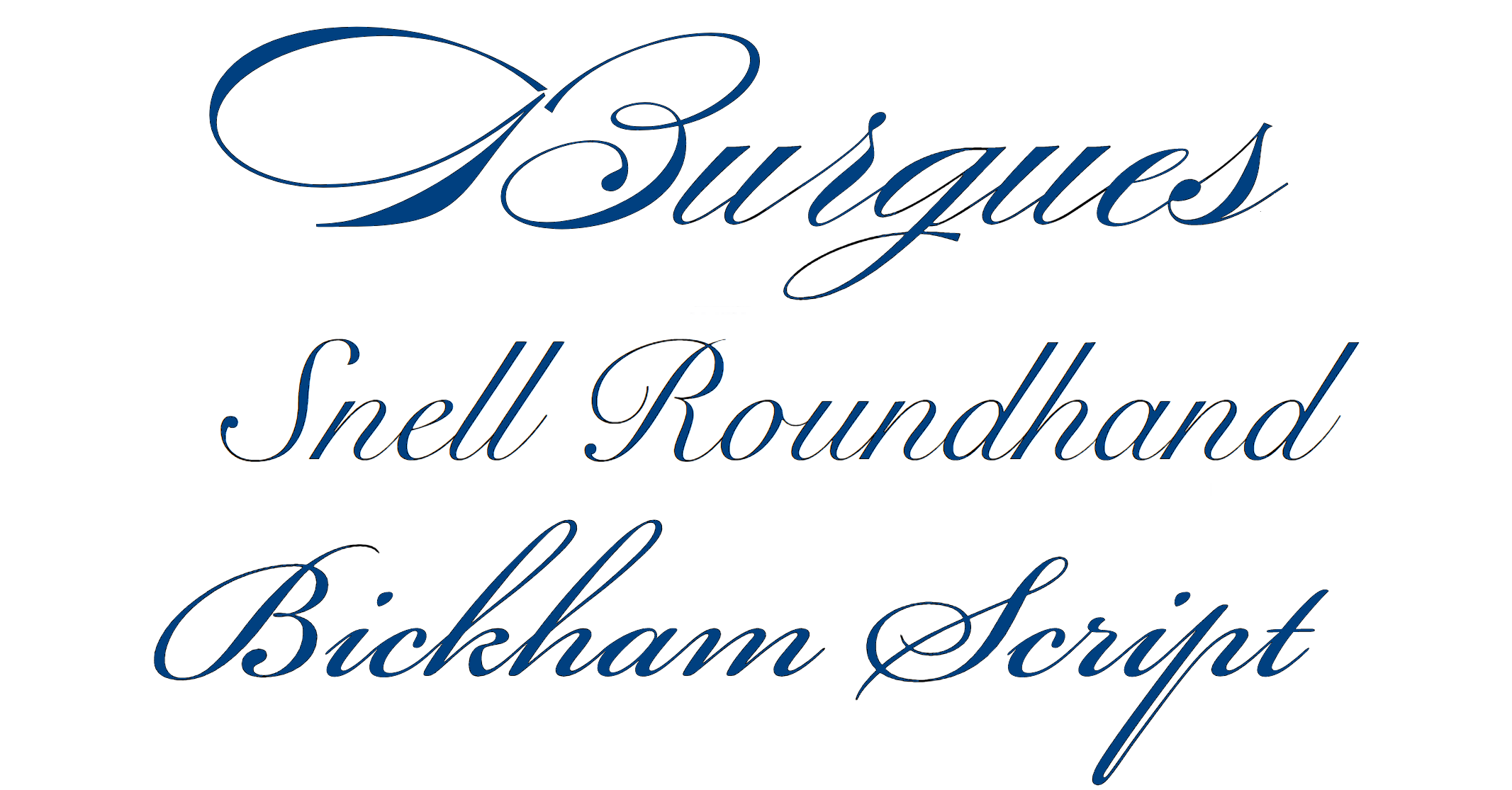
Formal/classic scripts
These script fonts have an elegant and traditional appearance. They often copy the handwriting styles found in formal documents, invitations, and certificates. Such scripts are flowing, and have connected letterforms with fancy swashes and flourishes. Here are a few representatives of formal script fonts:
- Edwardian Script
- Bickham Script
- Copperplate
- Affair
- Snell Roundhand
- Burgues Script
Casual scripts
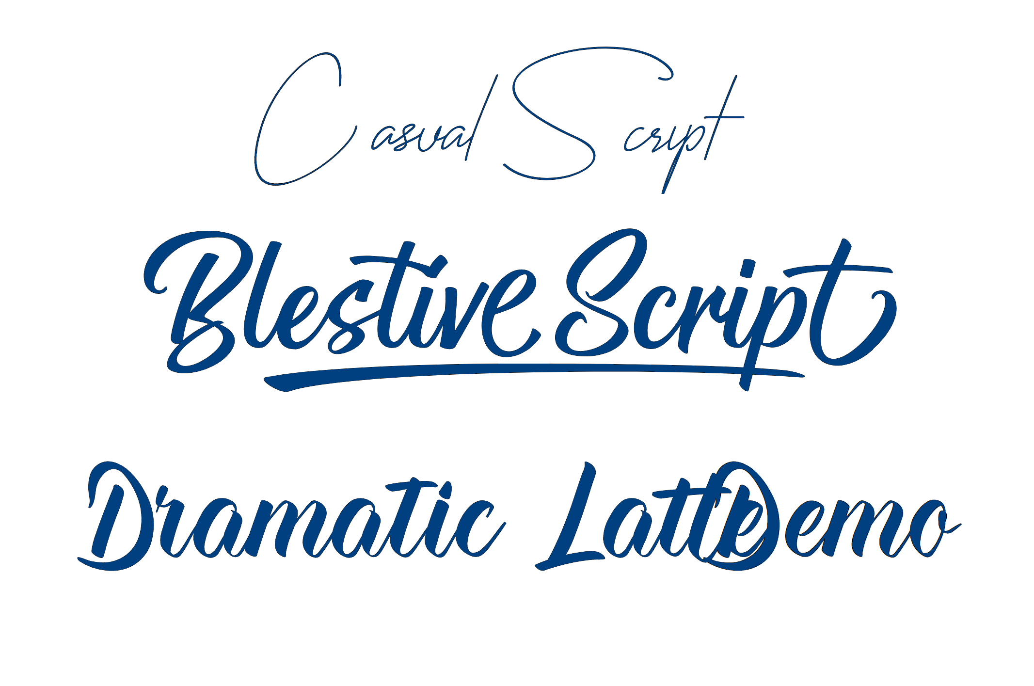
These scripts have a more relaxed and informal feel. They copy the look of everyday handwriting and are often used in projects that aim to convey a friendly, approachable, or playful tone. These fonts often have varying degrees of connectedness between letters and are not much about ornate flourishes. Here are some examples of casual script fonts:
- Lobster
- Pacifico
- Brush Script
- Amatic SC
- Kristi
- Cheddar Jack
Calligraphic scripts
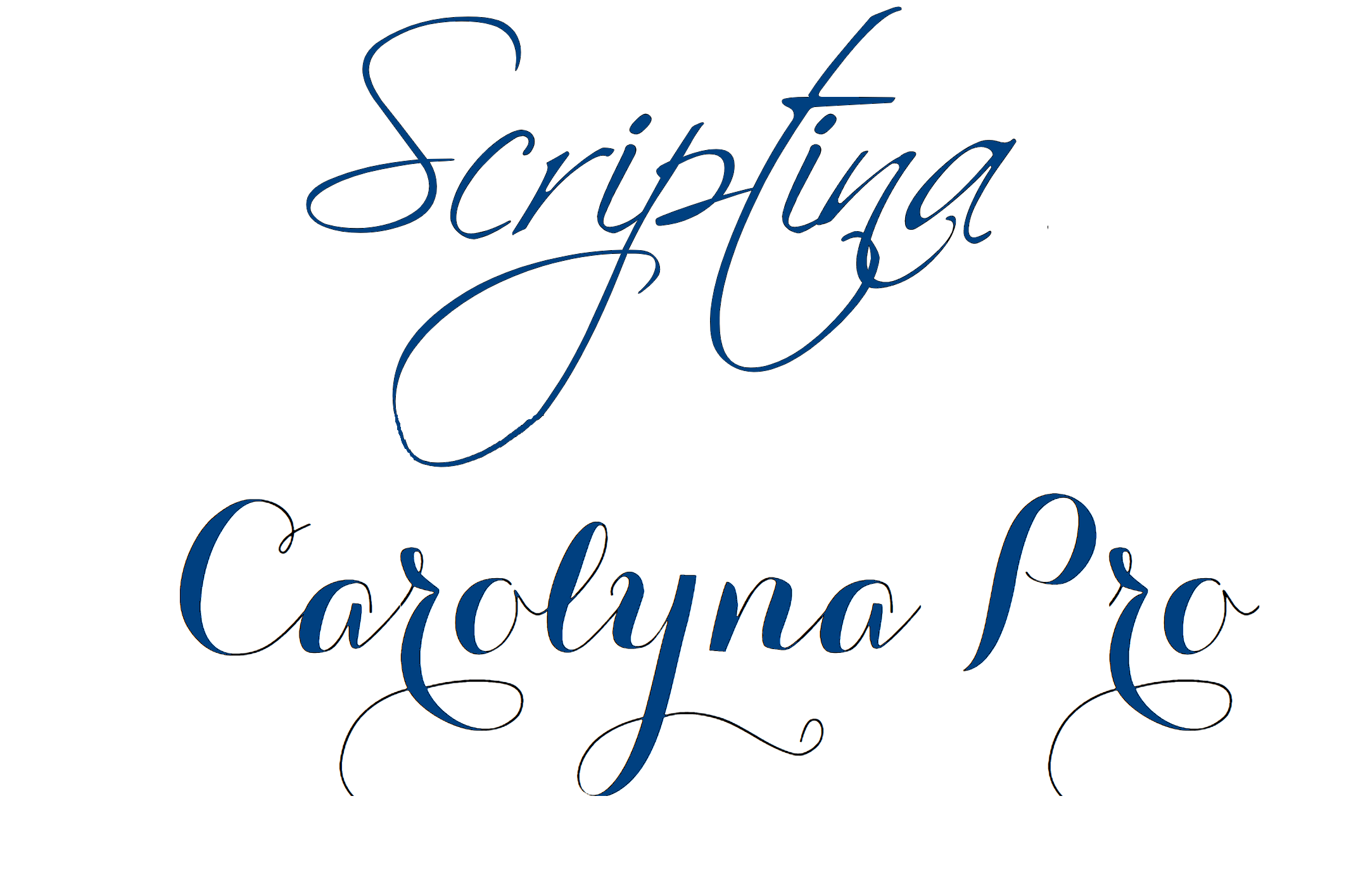
These ones are inspired by calligraphy, the art of decorative writing. Calligraphic scripts copy the brush or pen strokes of traditional calligraphy. They have exaggerated loops, swashes, and thick-to-thin strokes with a sense of dynamic movement. Here are some examples of calligraphic script fonts:
- Spencerian Script
- Scriptina
- Zapfino
- Carolyna Pro Black
- Monoline Script
- Poem Script
- Edwardian Script
- Copperplate
- Bickham Script
Retro/vintage scripts
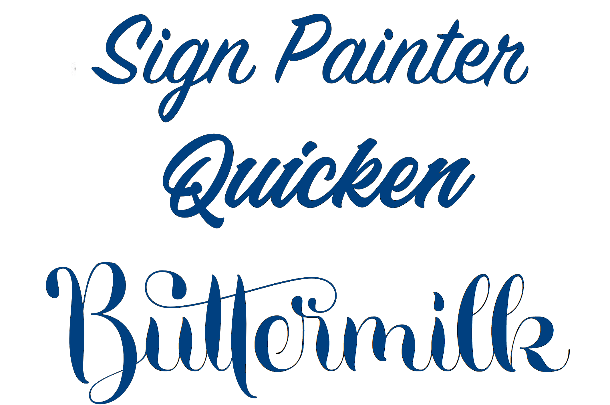
Such ones look like typography from a particular era, such as the Art Deco period or the 1960s. Retro scripts often have bold, geometric letterforms, and they give a sense of nostalgia and old-fashioned manner. Let’s take a look at some examples of retro script fonts:
- Retroville
- Playlist Script
- Miami Vice
- Pacifico
- Buttermilk Farmhouse
- Kaushan Script
- Thirsty Script
- Bourbon Grotesque
- Retro Market
- SignPainter
Brush scripts
These fonts imitate the look of handwritten text created with a brush or marker. They look more casual and spontaneous, and slightly rough or textured. They give a modern, artistic, or urban feel to designs. Here are just a few examples of popular brush script fonts:
- Grand Hotel
- Rumble Brave
- Yellowtail
- Brush Script MT
- Playlist Script
- Great Vibes
- Berkshire Swash
- Sacramento
- Alex Brush
- Dancing Script
- Kaushan Script

Blackletter/gothic scripts
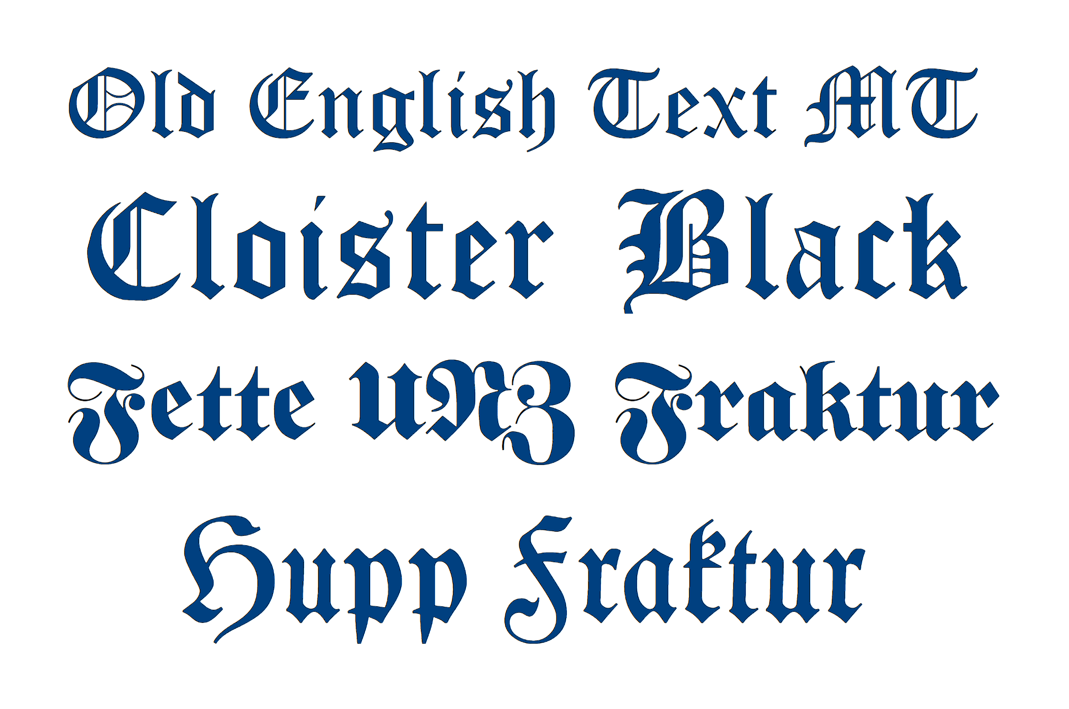
These scripts are inspired by the medieval calligraphic styles used in European manuscripts. They have a bold and angular appearance, with sharp serifs and intricate details. When users see such fonts they feel the vibe of tradition, history, or gothic aesthetics. Some examples of blackletter script fonts are listed below:
- Fraktur
- Old English Text MT
- Cloister Black
- Textura
- Fette Fraktur
- Lombardic
- Kanzlei
- Schwabacher
- Rotunda
- Bastarda
Script fonts with additional stylistic elements
Some cursive fonts come with additional stylistic elements such as swashes are decorative flourishes that can be added to the beginning or end of glyphs to increase the beauty of the text. Ligatures are unique character combinations to replace individual letters for better flow. Alternate letterforms provide different variations of certain characters, so they could be further customized and varied.
These classifications are not total, as script/writing fonts really vary one from another with their unique styles and peculiarities so much that some of them are just hard to group. Some fonts can be distinguished as members of a few groups at the same time like you may have noticed Lobster or Copperplate placed in two groups. Anyway, it is useful to know the classification when you need to have a set of fallback fonts so that in case one does not work your project will not lose its style and vibe.
Characteristics of script fonts
Script fonts are known for their unique characteristics like fluidity, different stroke widths, and cursive letterforms. Let’s take a closer look at these features:
- Fluidity. Script fonts are designed to mimic handwritten or calligraphic styles, they have a flowing and organic appearance. The letters usually have graceful curves and smooth transitions making the texts look elegant.

- Varying stroke widths. One of the defining features of script fonts is the variation in stroke width. The strokes of some fonts can vary from thin and delicate in some areas to thick and bold in others. This makes letters more aesthetic and unique.

- Cursive letterforms. Script fonts often look like cursive handwriting. They typically have letterforms that slant and overlap, which is why the text looks continued. This cursive style gives a natural and handcrafted feel to the font.

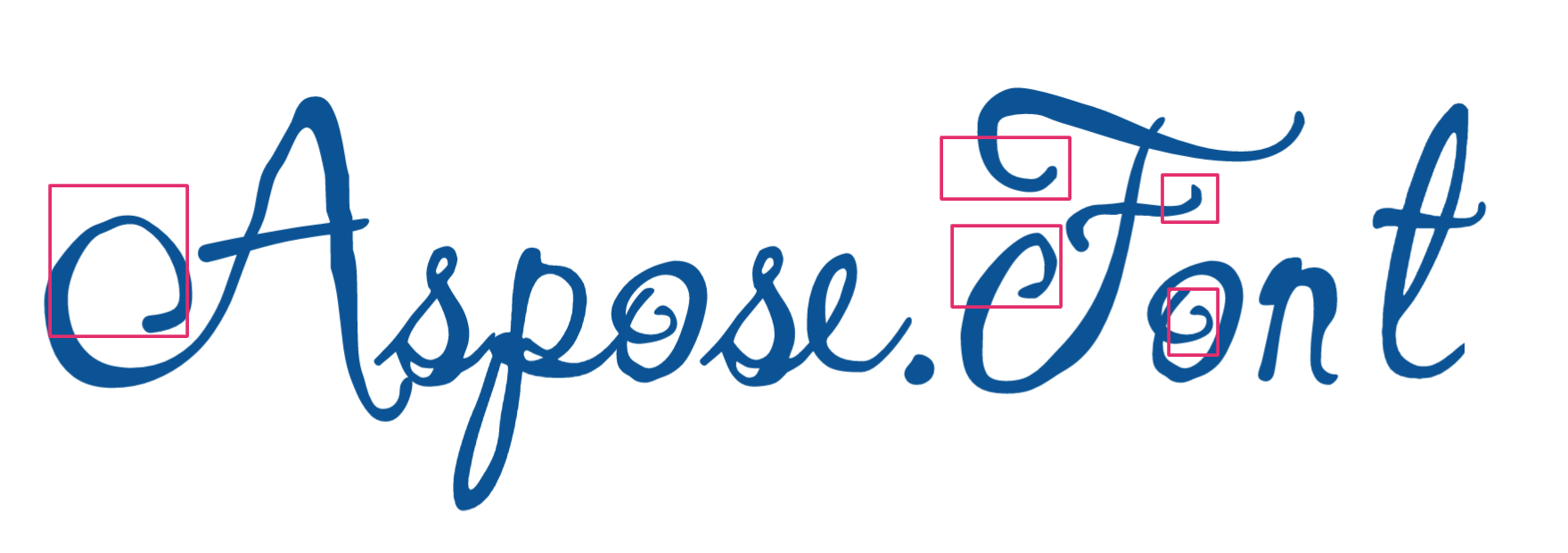
- Ligatures and swashes. Many script fonts use additional elements like ligatures and washes.
Ligatures - are unique letter combinations designed to improve the visual flow and reduce the awkward spacing between specific character pairs.

Swashes - are decorative extensions at the beginning or end of letters added to improve the elegance and artistic flair of the font.
How to pair script fonts effectively?
Here we prepared a few tips for pairing a script fonts effectively:
- Have a sufficient contrast. Choose a sans-serif or serif font that contrasts well with the script font. This will create a visual balance and allows the script font to stand out. For example, a thick, bold script font will fit well with a clean and simple sans-serif font.
- Ensure a good level of readability. Paired fonts should be legible and easy to read, especially when used in smaller sizes or longer blocks of text. That is why two script fonts will not be a good option to use together, as they can be challenging to read. Instead, use a script font for headings or short phrases, and take a more readable font for body text.
- Pair fonts of some similarity. Contrasting fonts work well, but to have a cohesive look all the used fonts have to have something in common like similar letterforms, strokes, or overall style elements. This will create harmony between the script font and the secondary font.
- Build the hierarchy. Script fonts are perfect to highlight specific elements, such as headlines, titles, or important words. Reserve the secondary font for supporting text and body content. This will establish a clear visual hierarchy and prevent the script font from overwhelming the design. The other benefit of such an approach is that in this case the script font will be readable, as it will be in a bigger size.
- Pay attention to the scale and spacing of the paired fonts. Ensure that they harmonize well and are visually balanced. Find the perfect, visually appealing combination of different sizes and spacing to enhance the overall design.
- Test and iterate the combinations of fonts. It is a good idea to experiment with different font pairings and layouts. Have multiple versions of your design and compare them to see which pairing works best. Collect feedback from others to correct your choices.
- Pay attention to the context and purpose when choosing script fonts. Pick out a script font that aligns with the overall tone and intent of your design.
So you’d better keep in mind that the effectiveness of font pairing depends on the specific project and design goals. Experiment, trust your experience, and explore different combinations to find the perfect ones.
Popular script typefaces
There are several popular script fonts that are widely used for various design purposes or are already included in popular tools. Here are some of the most famous ones:
- Brush Script. It is a casual and lively script font that resembles handwritten brush strokes.
- Lobster. It is a bold and decorative script font with exaggerated curves and flourishes. It has a retro vibe and is often used for attention-grabbing headlines or logos. It is included in the set of fonts in Google Docs.
- Pacifico - a casual and fluid script font with a handwritten feel. It has a laid-back and friendly style and is also included in Google Docs.
- Great Vibes - Is a calligraphy script font designed by Robert E. Leuschke. It has a sophisticated and classic appearance, often used for formal invitations and wedding-related designs.
- Scriptina - This is a thin and ornate script font with intricate letterforms and decorative swashes that can be used to add a touch of refinement to various design projects.
- Alex Brush - is a calligraphy script font that imitates traditional handwriting. It was developed by Robert E. Leuschke. The font is good for projects that require a balance of elegance and readability.
- Dancing Script - is a lively and casual script font with a bouncy rhythm and is available in Google Docs.
These are just a few examples of script fonts that first come to mind, but there are many more available. The choice of a script font depends on the specific design requirements and the desired vibe.
Tips for using script fonts effectively
By now you have already learned much about script fonts to make a decision if you want them or not, but how to make the most of it? Here are a few recommendations for you:
- Keep in mind legibility. Script fonts are really beautiful and fancy, but sometimes it is challenging to read them. Choose ones that are legible and clear. Avoid overly ornate or intricate scripts that may notably decrease readability.
- Size is an important aspect. Adjust the size of your script font according to its complexity and the context in which it’s being used. Larger sizes work well for headlines and short phrases, while smaller sizes are more suitable for longer blocks of text. But the bigger size the easier it is to read the font.
- Pay attention to the kerning and spacing. To letters flow smoothly script fonts often require adjustments like kerning. You can also manually adjust the spacing to get a pleasant result.
- Maintain consistency in your typography in your design. It is recommended to use a limited number of writing fonts but ones that complement each other. This will help avoid a cluttered and disjointed look.
- Test your chosen script font at various sizes and on different devices. By doing this you will ensure legibility. Do not forget to proofread your text to exclude any confusion caused by complex letterforms or ligatures.
- Use script fonts to emphasize key elements, such as important words, names, or dates but not for the main text. It will draw attention to these pieces.
- Achieve a visual balance script fonts with other elements in your design, such as images, colors, or shapes. The overall composition should feel coherent and visually appealing.
These tips serve as general guidelines, and it’s important to experiment and trust your design instincts. Also, have in mind those tips given about pairing script typefaces. Following them all and your own expertise will lead you to the desired result!
Conclusion
Script fonts can make your design fancy, elegant, and unique. There are a great deal of different script fonts but it’s crucial to choose and use them wisely, so not to spoil legibility and maintain a cohesive overall line.
Mostly script fonts work well for headings, titles, or accents while combining them with sans-serif or serif fonts for body text increases the text readability. Testing and proofreading are important steps in dealing with script fonts. So, go ahead and unleash your creativity with them, and enjoy all the possibilities offered!