Serif Fonts Knowledge Base | Aspose.Font
What are serif fonts?
Serif fonts are a category of typefaces that feature small decorative strokes, at the ends of the main strokes of each letter or character. These strokes are called serifs and this is where the name comes from. These serifs are usually placed at the top and bottom of vertical and horizontal strokes. The most famous examples of these fonts include Times New Roman, Georgia, and Garamond.
The serifs serve two purposes: functional and aesthetic. If talking about the functional one, the serifs help guide the reader’s eye along the text’s lines, making it easier to read. They can also help distinguish individual letters, especially in smaller font sizes.
Aesthetic purpose of serif fonts is often associated with a more traditional and formal look. Due to their historical roots in calligraphy and engraving, fons of this type are often used in printed material like books, newspapers, or legal documents. They are also commonly used in body text for longer passages because they are considered more readable in print.
However, in recent years, there has been a rise in the use of sans-serif fonts, which lack decorative serifs. Both types of fonts have their own characteristics and appropriate usage contexts. The choice between them depends on the specific design goals, readability requirements, and the overall style desired for a particular project or medium.
Pros and cons of serif fonts
There are 5 font types known: serif, sans serif, monospace, script, and display. So if you are going to use serif one for your project you first need to learn its benefits and drawbacks so the decision would be balanced and meet the requirements of the project.
| Pros | Cons |
|---|---|
| Serif fonts are considered to be more readable in printed materials, especially for long passages of text and the serifs help with this. | Serif fonts may not always be as legible on screens as they are in print. At smaller sizes and lower resolutions, they may look fuzzy or be harder to read issues. |
| These fonts have a more traditional and formal aesthetic. That is why they are often used in typography such as formal documents, academic papers, or printed books. | These fonts may not be the best choice for designs that aim for a modern, simple and clear, or informal look. Sans-serif fonts are often considered to be a better option in these contexts. |
| The serifs enhance the legibility of characters, especially in smaller font sizes, and help distinguish individual glyphs and prevent them from blending together | The decorative serifs can take some additional horizontal space, making fonts of the type less space-efficient in comparison to sans-serif ones. So you need to have this in mind when designing for limited space, such as on mobile screens or in narrow columns. |
The effectiveness and appropriateness of serif fonts depend on many factors: the specific font, size, context, personal preference, etc. It’s always recommended to consider the overall design and readability requirements when choosing a font.
Classification of serif fonts
Serif fonts can be classified into several categories relying on the specific design characteristics. The classification is not really precise and some font families can be representatives of not only one group but a few. So let’s take a look at some types of serif fonts:
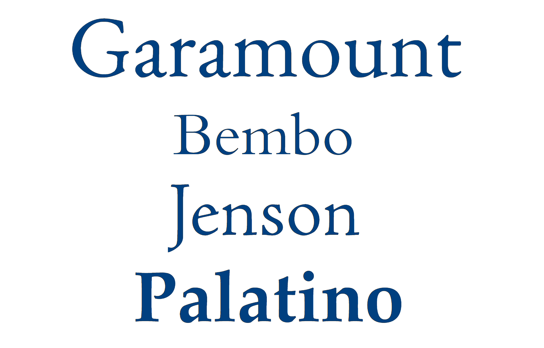
Old style serifs
They are also known as Venetian or Humanist serifs, and have a more organic and calligraphic appearance. They originated during the Renaissance and are characterized by their diagonal stress, moderate contrast between thick and thin strokes, and angled serifs. These typefaces represent enduring appeal and timelessness. Here are a few representatives of old style serif fonts:
- Garamond
- Bembo
- Jenson
- Minion
- Palatino
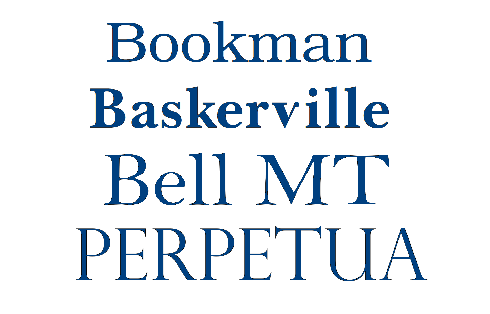
Transitional serifs
These fonts appeared in the 18th century as a transition between Old Style and Modern serifs. They have sharper and more pronounced serifs, vertical stress, and increased contrast between thick and thin strokes. Transitional serif fonts strike a balance between the organic forms of Old Style and the stark geometric forms of Modern serifs. Here are some examples of such typefaces:
- Times New Roman
- Baskerville
- Bookman
- Bell MT
- Perpetua
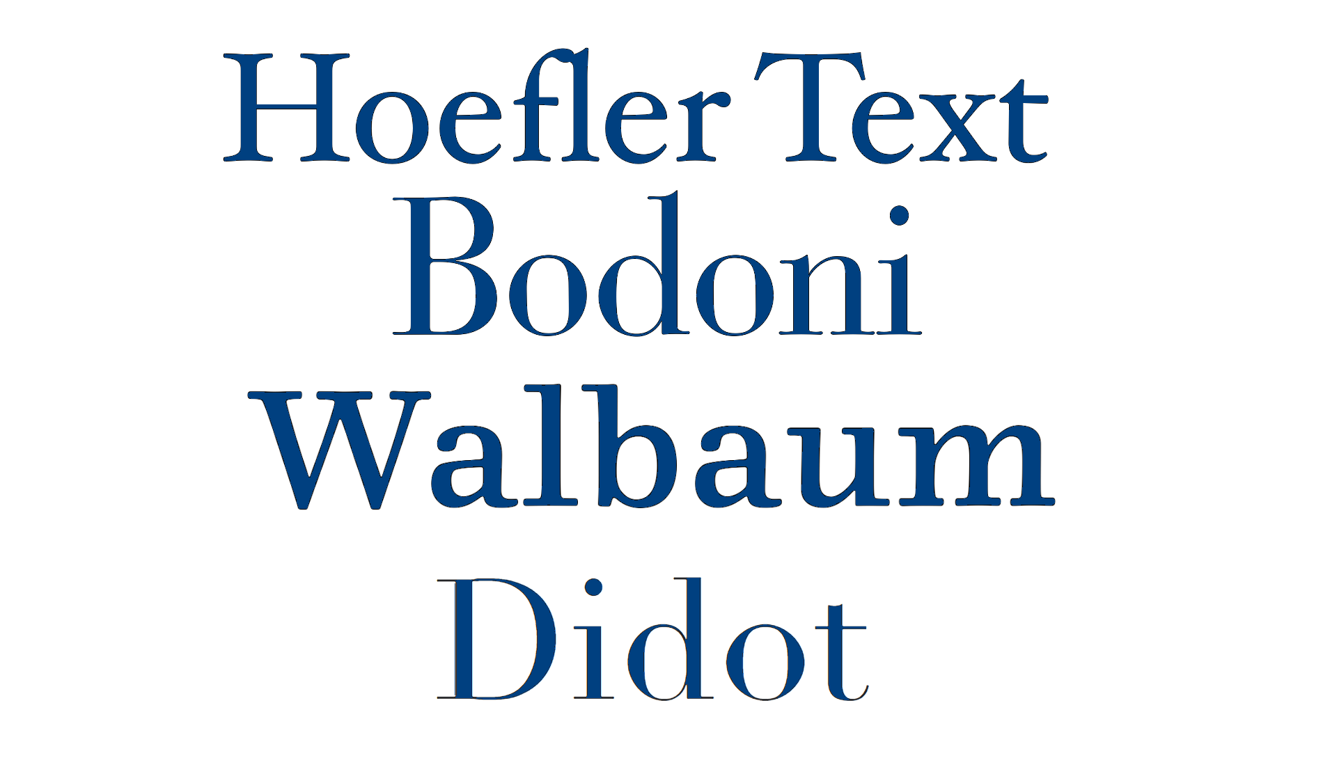
Modern serifs
They are also known as Didone or Neoclassical serifs and were developed in the late 18th century. They have significant contrast between thick and thin strokes, vertical stress, and very thin, hairline serifs. Modern serif fonts have a more mechanical and geometric appearance. Examples of Modern serifs are:
- Bodoni
- Didot
- Walbaum
- Didone
- Hoefler Text
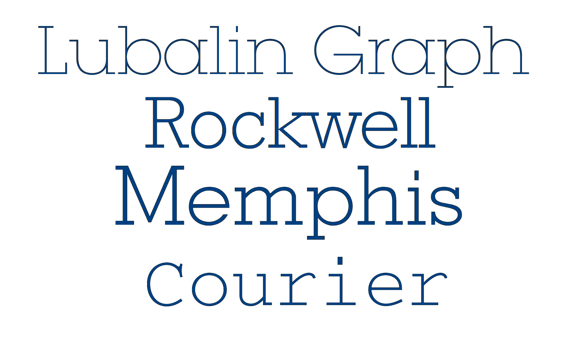
Slab serifs
They are also known as Egyptian serifs and are from the early 19th century. These typefaces are characterized by their bold and uniform serifs with slight or no contrast between thick and thin strokes. Slab serif fonts have a strong and solid appearance and are really good for display purposes or for designs where a bold, impactful look is needed. Here are some examples of slab serifs:
- Rockwell
- Courier
- Lubalin Graph
- Memphis
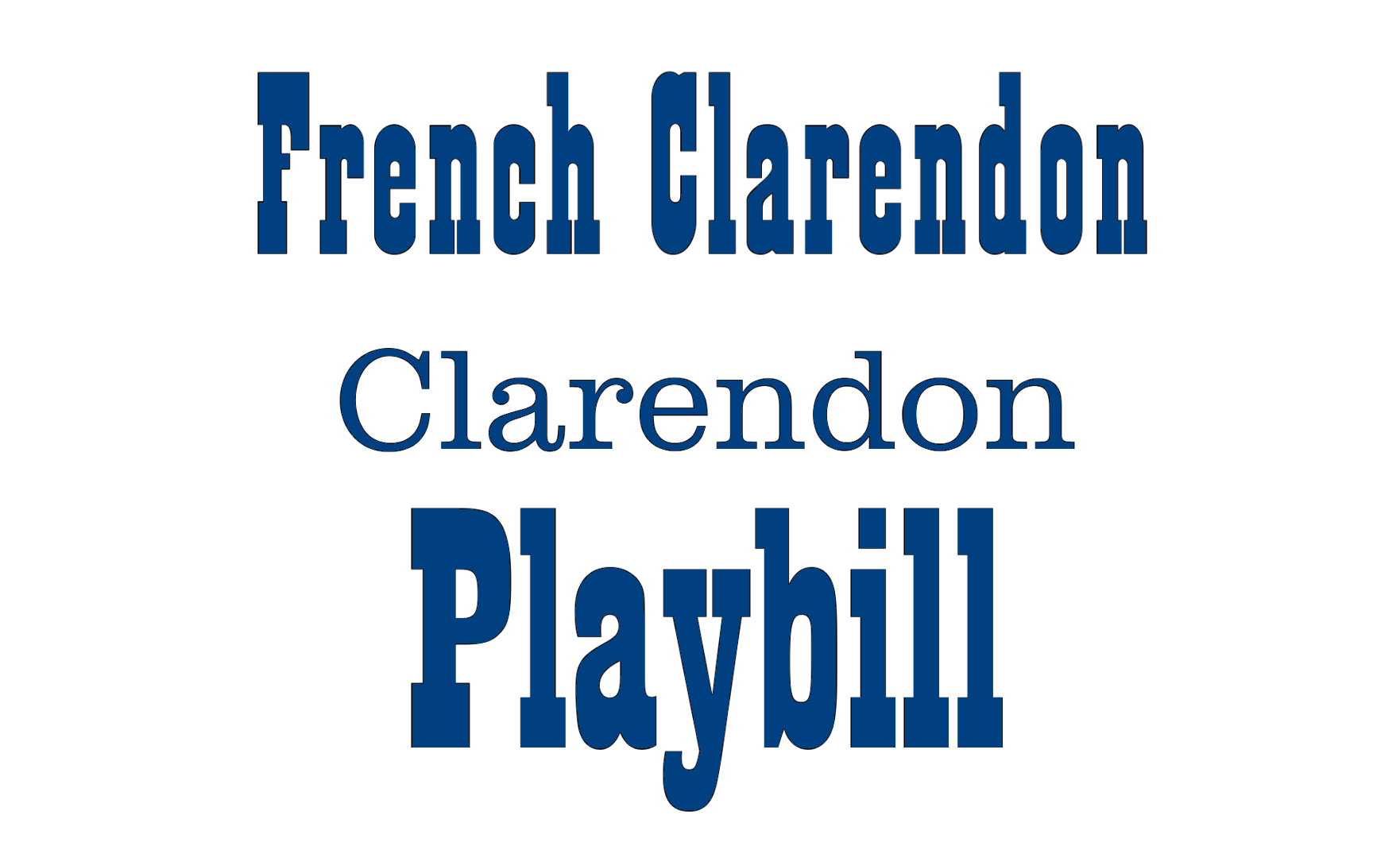
Clarendon serifs
They are named after the original Clarendon typeface and have a distinct appearance with square or bracketed serifs, moderate contrast, and sturdy letterforms. These typefaces give you a vintage or retro aesthetic and are pretty good for advertising and signage. Some famous representatives of Clarendon scripts are:
- Clarendon
- Lubalin Graph
- Playbill
The classification provides you with a general overview of the main categories of serif fonts. It’s worth noting that there are many variations and subcategories within each classification and, some serif fonts may have characteristics that span multiple categories or are not easy to categorize.
Characteristics of serif fonts
Serif fonts have several distinctive characteristics that set them apart from other font types. The most common ones are:
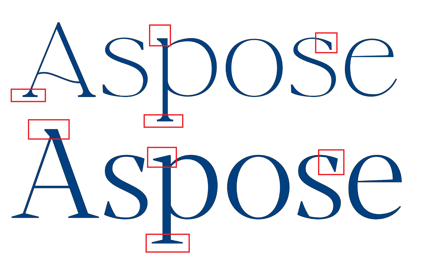
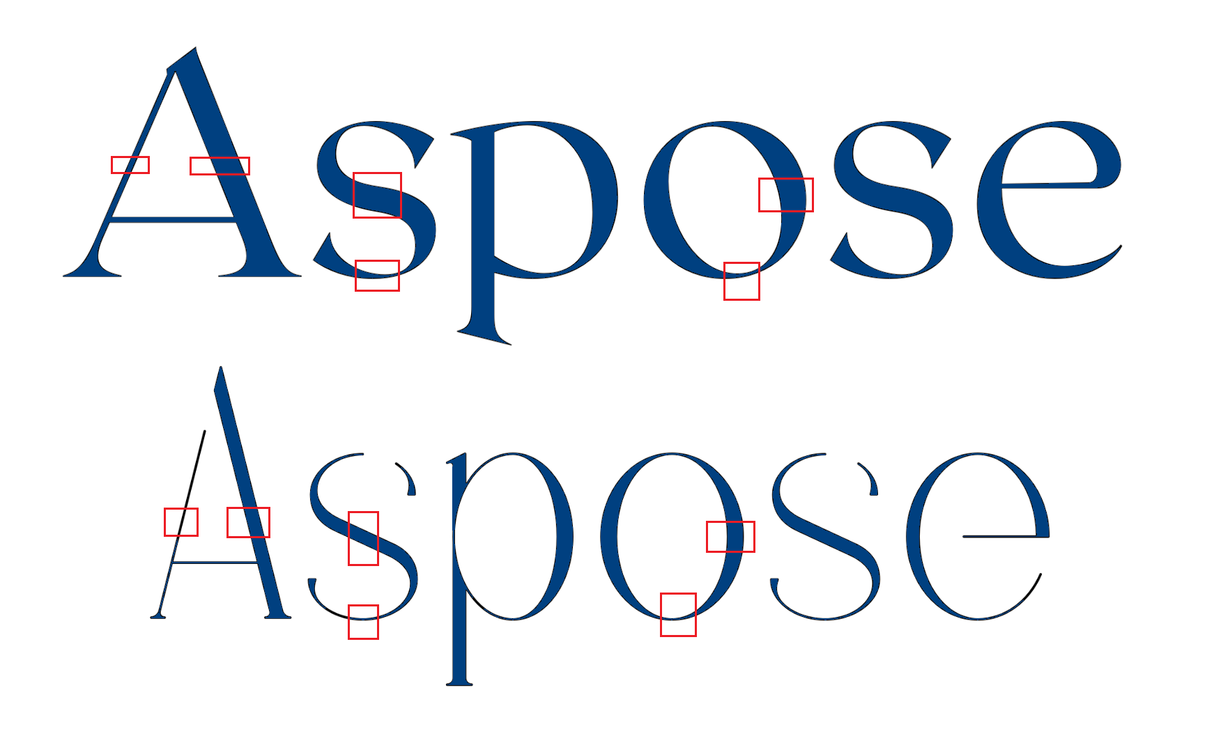
- Serifs - small decorative strokes at the ends of the main strokes of letters. They can be horizontal, vertical, or diagonal in orientation and are typically found at the tops and bottoms of vertical and horizontal strokes. Serifs can be bracketed (curved) or unbracketed (straight) depending on the font style.
- Contrast - Serif fonts often show a notable contrast between the thick and thin strokes of the letters. Usually, the vertical strokes tend to be thicker while the horizontal strokes, especially in round letters, are thinner. This feature helps create visual interest and increases the legibility of the text.
Traditional and Formal Look - Serif fonts can be easily distinguished by a more traditional, classic, and formal aesthetic. Their historical roots in calligraphy and engraving give them an elegant and timeless quality. So, serif fonts are still commonly used in print media such as books, newspapers, and formal documents.
Readability - Serif fonts are generally easier to read in longer passages of text, especially in print. That is due to the serifs that help guide the reader’s eye along the lines. The distinctive shapes of serifs also help in recognizing individual letters, particularly at smaller font sizes.
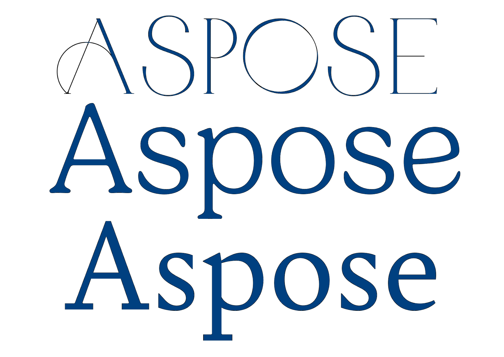
Versatility of serif fonts ranges from classic and elegant to bold and modern, allowing a great selection for design applications. This flexibility makes them suitable for a wide range of projects, from formal documents to branding and advertising materials.
It’s important to note that while these characteristics are generally associated with serif fonts, there can be variations and exceptions within the category. Different serif fonts may emphasize certain characteristics more than others, and also be categorized as fonts of another type at the same time.
Popular serif fonts
Here are some of the most popular serif fonts that have gained widespread popularity and have become widely recognized and used:
- Times New Roman is the most well-known and widely used font. It has been a default font choice in many word-processing applications and is commonly used in academic papers, books, and newspapers.
- Georgia is a popular serif font designed specifically for on-screen readability. It is widely used in web design and digital publications due to its legibility and clear letterforms.
- Garamond is a classic serif font that has been popular for centuries. It has a really elegant and timeless appearance. There are various versions of Garamond, including Adobe Garamond and EB Garamond.
- Baskerville - a refined and versatile serif font with a long history. It is usually chosen because of its elegance and readability and is commonly used in books, magazines, and corporate branding.
- Palatino - a widely recognized serif font created by Hermann Zapf. Having a balanced and harmonious design it is suitable for both print and digital applications. Palatino can be often spotted in book typography and editorial designs.
- Caslon - a classic serif font with a rich history that dates back to the 18th century. It has sturdy letterforms and moderate contrast. Caslon has been used in various applications, including book typography, packaging, and branding.
Readability and legibility aspects of serif fonts
Serif fonts are often praised for their readability and legibility, and here is why:
- As was already mentioned in this article, serifs help guide the reader’s eye along the lines of text which is really helpful for long passages of text, making it easier to read and comprehend.
- The distinct shapes and details of serifs can help in distinguishing between individual letters. The serifs create visual anchors that make it easier to recognize and differentiate characters, particularly in small font sizes or lower-resolution settings.
- Serif fonts often have a well-defined and consistent shape for each letter, which contributes to the ease of word recognition. This can help readers quickly read and comprehend the text.
- These typefaces have a long history and are widely used in traditional print media, such as books, newspapers, and academic publications. As a result, readers are familiar with the characteristics of serif fonts, which can make reading easier as well.
- Studies have shown that serif fonts can improve reading speed and comprehension in comparison to sans-serif fonts in certain contexts. The well-defined letterforms and guiding serifs lead to smooth reading and reduce eye strain.
However, it’s important to note that the readability and legibility of serif fonts can vary from the specific font. Different serif fonts may offer varying degrees of readability, so it is always a good idea to test a chosen font.
How to pair serif fonts effectively?
Pairing fonts is a process of finding a complementary balance between different serif typefaces to create harmonious and visually appealing combinations. Here we prepared a few tips for pairing a serif font effectively:
Choose serifs that have contrasting styles or characteristics to create visual interest and distinction. For example, pairing a classic and elegant serif font with a more modern and bold serif font.
Experiment with different sizes and weights of serif fonts. This will create contrast and hierarchy and enhance readability and visual appeal. Pair a larger, bolder serif font for headings or titles with a smaller, lighter serif font for body text.
Pay attention to the proportions and shapes of the serif fonts you’re pairing. Choose a balanced combination, where the height of letters and overall letterforms complement each other.
Consider the overall harmony between the serif styles. Choose serif fonts with similar characteristics, such as similar levels of contrast, serif shape, or overall design approach.
When pairing serif fonts, especially if they will be used for longer passages of text, remember that readability is the top priority. Make sure that the serifs do not cause confusion or lower legibility at smaller sizes.
Try pairing serif fonts with complementary sans-serif, script, or display fonts. fonts. It will give you the contrast between typefaces that can create a visually pleasant composition.
Experiment! Test different combinations, and ask for a second opinion, if you have any doubts.
Conclusion
Serif fonts continue to be a solid and versatile choice in typography. Their distinct characteristics, such as serifs, notable contrast, and traditional elegance, contribute to their widespread use in various design applications. Serif fonts are perfect for printed materials, providing readability, guiding the reader’s eye, and aiding in character distinction.
While serif fonts are often associated with a formal and classic aesthetic, they offer a range of styles that can satisfy different design needs. Whether in print or on screens, serif fonts stand as trusted companions in communicating information, evoking emotions, and capturing attention.