# 在 PHP 中建立或更新 PowerPoint 簡報圖表
> 使用 Aspose.Slides for PHP(透過 Java)在 PowerPoint 簡報中建立與自訂圖表。提供實作範例以新增、格式化與編輯圖表。
Source: https://docs.aspose.com/slides/zh-hant/php-java/create-chart/
## **概述**
本文提供了使用 Aspose.Slides 建立與自訂圖表的完整指南。您將學習如何以程式方式將圖表加入投影片、填入資料,並套用各種格式設定以符合特定設計需求。全文透過詳細的程式碼範例說明每一步驟,從初始化簡報與圖表物件到設定系列、坐標軸與圖例。遵循本指南,您將能在應用程式中整合動態圖表產生,簡化資料驅動投影片的製作流程。
## **建立圖表**
圖表可協助使用者快速視覺化資料,並從中獲得在表格或試算表中不易立即看出的洞見。
**為什麼要建立圖表?**
使用圖表,您可以
* 在單一投影片中彙整、濃縮或摘要大量資料
* 顯示資料的模式與趨勢
* 推斷資料隨時間或特定測量單位的方向與勢頭
* 偵測異常值、偏差、錯誤或不合邏輯的資料
* 傳達或呈現複雜資料
在 PowerPoint 中,您可以透過「插入」功能建立圖表,該功能提供眾多圖表樣板。使用 Aspose.Slides,您可以建立一般圖表(基於常見圖表類型)與自訂圖表。
{{% alert color="primary" %}}
為了協助您建立圖表,Aspose.Slides 提供了 [ChartType](https://reference.aspose.com/slides/zh-hant/php-java/aspose.slides/ChartType) 類別。此類別下的欄位對應不同的圖表類型。
{{% /alert %}}
### **建立常規圖表**
_步驟:建立圖表_
- 步驟: 建立 PowerPoint 圖表
- 步驟: 建立簡報圖表
- 步驟: 建立 PowerPoint 簡報圖表
**程式碼步驟:**
1. 建立 [Presentation](https://reference.aspose.com/slides/zh-hant/php-java/aspose.slides/Presentation) 類別的實例。
2. 透過索引取得投影片參考。
3. 加入圖表並設定資料與您偏好的圖表類型。
4. 為圖表新增標題。
5. 取得圖表資料工作表。
6. 清除所有預設的系列與類別。
7. 新增系列與類別。
8. 為圖表系列新增資料。
9. 為圖表系列設定填色。
10. 為圖表系列新增標籤。
11. 將修改後的簡報寫入 PPTX 檔案。
以下 PHP 程式碼示範如何建立常規圖表:
```php
# 實例化一個代表 PPTX 檔案的簡報類別
$pres = new Presentation();
try {
# 存取第一張投影片
$sld = $pres->getSlides()->get_Item(0);
# 加入帶有預設資料的圖表
$chart = $sld->getShapes()->addChart(ChartType::ClusteredColumn, 0, 0, 500, 500);
# 設定圖表標題
$chart->getChartTitle()->addTextFrameForOverriding("Sample Title");
$chart->getChartTitle()->getTextFrameForOverriding()->getTextFrameFormat()->setCenterText(NullableBool::True);
$chart->getChartTitle()->setHeight(20);
$chart->hasTitle();
# 設定第一個系列顯示數值
$chart->getChartData()->getSeries()->get_Item(0)->getLabels()->getDefaultDataLabelFormat()->setShowValue(true);
# 設定圖表資料工作表的索引
$defaultWorksheetIndex = 0;
# 取得圖表資料工作表
$fact = $chart->getChartData()->getChartDataWorkbook();
# 刪除預設產生的系列與類別
$chart->getChartData()->getSeries()->clear();
$chart->getChartData()->getCategories()->clear();
$s = $chart->getChartData()->getSeries()->size();
$s = $chart->getChartData()->getCategories()->size();
# 加入新系列
$chart->getChartData()->getSeries()->add($fact->getCell($defaultWorksheetIndex, 0, 1, "Series 1"), $chart->getType());
$chart->getChartData()->getSeries()->add($fact->getCell($defaultWorksheetIndex, 0, 2, "Series 2"), $chart->getType());
# 加入新類別
$chart->getChartData()->getCategories()->add($fact->getCell($defaultWorksheetIndex, 1, 0, "Caetegoty 1"));
$chart->getChartData()->getCategories()->add($fact->getCell($defaultWorksheetIndex, 2, 0, "Caetegoty 2"));
$chart->getChartData()->getCategories()->add($fact->getCell($defaultWorksheetIndex, 3, 0, "Caetegoty 3"));
# 取得第一個圖表系列
$series = $chart->getChartData()->getSeries()->get_Item(0);
# 現在填入系列資料
$series->getDataPoints()->addDataPointForBarSeries($fact->getCell($defaultWorksheetIndex, 1, 1, 20));
$series->getDataPoints()->addDataPointForBarSeries($fact->getCell($defaultWorksheetIndex, 2, 1, 50));
$series->getDataPoints()->addDataPointForBarSeries($fact->getCell($defaultWorksheetIndex, 3, 1, 30));
# 設定系列的填色
$series->getFormat()->getFill()->setFillType(FillType::Solid);
$series->getFormat()->getFill()->getSolidFillColor()->setColor(java("java.awt.Color")->RED);
# 取得第二個圖表系列
$series = $chart->getChartData()->getSeries()->get_Item(1);
# 填入系列資料
$series->getDataPoints()->addDataPointForBarSeries($fact->getCell($defaultWorksheetIndex, 1, 2, 30));
$series->getDataPoints()->addDataPointForBarSeries($fact->getCell($defaultWorksheetIndex, 2, 2, 10));
$series->getDataPoints()->addDataPointForBarSeries($fact->getCell($defaultWorksheetIndex, 3, 2, 60));
# 設定系列的填色
$series->getFormat()->getFill()->setFillType(FillType::Solid);
$series->getFormat()->getFill()->getSolidFillColor()->setColor(java("java.awt.Color")->GREEN);
# 為新系列的每個類別建立自訂標籤
# 設定第一個標籤顯示類別名稱
$lbl = $series->getDataPoints()->get_Item(0)->getLabel();
$lbl->getDataLabelFormat()->setShowCategoryName(true);
$lbl = $series->getDataPoints()->get_Item(1)->getLabel();
$lbl->getDataLabelFormat()->setShowSeriesName(true);
# 設定第三個標籤顯示數值
$lbl = $series->getDataPoints()->get_Item(2)->getLabel();
$lbl->getDataLabelFormat()->setShowValue(true);
$lbl->getDataLabelFormat()->setShowSeriesName(true);
$lbl->getDataLabelFormat()->setSeparator("/");
# 儲存含圖表的簡報
$pres->save("output.pptx", SaveFormat::Pptx);
} finally {
if (!java_is_null($pres)) {
$pres->dispose();
}
}
```
### **建立散佈圖表**
散佈圖(亦稱散點圖或 X‑Y 圖)常用於檢查模式或顯示兩個變數之間的相關性。
您可能想在以下情況使用散佈圖
* 有成對的數值資料
* 兩個變數彼此關聯良好
* 想判斷兩個變數是否相關
* 有一個自變數對於因變數有多個值
步驟: 建立散佈圖 |
步驟: 建立 PowerPoint 散佈圖 |
步驟: 建立 PowerPoint 簡報散佈圖
1. 請依照前述的 [建立常規圖表](#creating-normal-charts) 步驟操作。
2. 第三步,加入圖表並將圖表類型指定為以下之一
1. [ChartType::ScatterWithMarkers](https://reference.aspose.com/slides/zh-hant/php-java/aspose.slides/charttype/#ScatterWithMarkers) - _表示散佈圖,使用標記。_
2. [ChartType::ScatterWithSmoothLinesAndMarkers](https://reference.aspose.com/slides/zh-hant/php-java/aspose.slides/charttype/#ScatterWithSmoothLinesAndMarkers) - _表示以曲線連接且有資料標記的散佈圖。_
3. [ChartType::ScatterWithSmoothLines](https://reference.aspose.com/slides/zh-hant/php-java/aspose.slides/charttype/#ScatterWithSmoothLines) - _表示以曲線連接且無資料標記的散佈圖。_
4. [ChartType::ScatterWithStraightLinesAndMarkers](https://reference.aspose.com/slides/zh-hant/php-java/aspose.slides/charttype/#ScatterWithStraightLinesAndMarkers) - _表示以直線連接且有資料標記的散佈圖。_
5. [ChartType::ScatterWithStraightLines](https://reference.aspose.com/slides/zh-hant/php-java/aspose.slides/charttype/#ScatterWithStraightLines) - _表示以直線連接且無資料標記的散佈圖。_
以下 PHP 程式碼示範如何建立具有不同標記系列的散佈圖表:
```php
# 實例化一個代表 PPTX 檔案的簡報類別
$pres = new Presentation();
try {
# 存取第一張投影片
$slide = $pres->getSlides()->get_Item(0);
# 建立預設圖表
$chart = $slide->getShapes()->addChart(ChartType::ScatterWithSmoothLines, 0, 0, 400, 400);
# 取得預設圖表資料工作表索引
$defaultWorksheetIndex = 0;
# 取得圖表資料工作表
$fact = $chart->getChartData()->getChartDataWorkbook();
# 刪除示範系列
$chart->getChartData()->getSeries()->clear();
# 加入新系列
$chart->getChartData()->getSeries()->add($fact->getCell($defaultWorksheetIndex, 1, 1, "Series 1"), $chart->getType());
$chart->getChartData()->getSeries()->add($fact->getCell($defaultWorksheetIndex, 1, 3, "Series 2"), $chart->getType());
# 取得第一個圖表系列
$series = $chart->getChartData()->getSeries()->get_Item(0);
# 為系列新增一個點 (1:3)
$series->getDataPoints()->addDataPointForScatterSeries($fact->getCell($defaultWorksheetIndex, 2, 1, 1), $fact->getCell($defaultWorksheetIndex, 2, 2, 3));
# 新增一個點 (2:10)
$series->getDataPoints()->addDataPointForScatterSeries($fact->getCell($defaultWorksheetIndex, 3, 1, 2), $fact->getCell($defaultWorksheetIndex, 3, 2, 10));
# 變更系列類型
$series->setType(ChartType::ScatterWithStraightLinesAndMarkers);
# 變更圖表系列標記
$series->getMarker()->setSize(10);
$series->getMarker()->setSymbol(MarkerStyleType::Star);
# 取得第二個圖表系列
$series = $chart->getChartData()->getSeries()->get_Item(1);
# 在此新增一個點 (5:2)
$series->getDataPoints()->addDataPointForScatterSeries($fact->getCell($defaultWorksheetIndex, 2, 3, 5), $fact->getCell($defaultWorksheetIndex, 2, 4, 2));
# 新增一個點 (3:1)
$series->getDataPoints()->addDataPointForScatterSeries($fact->getCell($defaultWorksheetIndex, 3, 3, 3), $fact->getCell($defaultWorksheetIndex, 3, 4, 1));
# 新增一個點 (2:2)
$series->getDataPoints()->addDataPointForScatterSeries($fact->getCell($defaultWorksheetIndex, 4, 3, 2), $fact->getCell($defaultWorksheetIndex, 4, 4, 2));
# 新增一個點 (5:1)
$series->getDataPoints()->addDataPointForScatterSeries($fact->getCell($defaultWorksheetIndex, 5, 3, 5), $fact->getCell($defaultWorksheetIndex, 5, 4, 1));
# 變更圖表系列標記
$series->getMarker()->setSize(10);
$series->getMarker()->setSymbol(MarkerStyleType::Circle);
$pres->save("AsposeChart_out.pptx", SaveFormat::Pptx);
} finally {
if (!java_is_null($pres)) {
$pres->dispose();
}
}
```
### **建立圓形圖表**
圓形圖最適合顯示資料的部分與整體關係,特別是當資料包含帶有數值的分類標籤時。然而,若資料的部份或標籤過多,建議改用長條圖。
步驟: 建立圓形圖 |
步驟: 建立 PowerPoint 圓形圖 |
步驟: 建立 PowerPoint 簡報圓形圖
1. 建立 [Presentation](https://reference.aspose.com/slides/zh-hant/php-java/aspose.slides/Presentation) 類別的實例。
2. 依索引取得投影片參考。
3. 加入圖表並使用預設資料以及所需類型(此處使用 [ChartType](https://reference.aspose.com/slides/zh-hant/php-java/aspose.slides/ChartType).Pie)。
4. 取得 [ChartDataWorkbook](https://reference.aspose.com/slides/zh-hant/php-java/aspose.slides/chartdataworkbook/)。
5. 清除預設的系列與類別。
6. 新增系列與類別。
7. 為圖表系列新增資料。
8. 為圓形圖區段新增點並設定自訂顏色。
9. 設定系列的標籤。
10. 設定系列標籤的引線。
11. 設定圓形圖的旋轉角度。
12. 將修改後的簡報寫入 PPTX 檔案。
以下 PHP 程式碼示範如何建立圓形圖表:
```php
# 實例化一個代表 PPTX 檔案的簡報類別
$pres = new Presentation();
try {
# 存取第一張投影片
$slides = $pres->getSlides()->get_Item(0);
# 加入預設資料的圖表
$chart = $slides->getShapes()->addChart(ChartType::Pie, 100, 100, 400, 400);
# 設定圖表標題
$chart->getChartTitle()->addTextFrameForOverriding("Sample Title");
$chart->getChartTitle()->getTextFrameForOverriding()->getTextFrameFormat()->setCenterText(NullableBool::True);
$chart->getChartTitle()->setHeight(20);
$chart->setTitle(true);
# 設定第一個系列顯示數值
$chart->getChartData()->getSeries()->get_Item(0)->getLabels()->getDefaultDataLabelFormat()->setShowValue(true);
# 設定圖表資料工作表的索引
$defaultWorksheetIndex = 0;
# 取得圖表資料工作表
$fact = $chart->getChartData()->getChartDataWorkbook();
# 刪除預設產生的系列與類別
$chart->getChartData()->getSeries()->clear();
$chart->getChartData()->getCategories()->clear();
# 新增類別
$chart->getChartData()->getCategories()->add($fact->getCell(0, 1, 0, "First Qtr"));
$chart->getChartData()->getCategories()->add($fact->getCell(0, 2, 0, "2nd Qtr"));
$chart->getChartData()->getCategories()->add($fact->getCell(0, 3, 0, "3rd Qtr"));
# 新增系列
$series = $chart->getChartData()->getSeries()->add($fact->getCell(0, 0, 1, "Series 1"), $chart->getType());
# 填入系列資料
$series->getDataPoints()->addDataPointForPieSeries($fact->getCell($defaultWorksheetIndex, 1, 1, 20));
$series->getDataPoints()->addDataPointForPieSeries($fact->getCell($defaultWorksheetIndex, 2, 1, 50));
$series->getDataPoints()->addDataPointForPieSeries($fact->getCell($defaultWorksheetIndex, 3, 1, 30));
# 在新版本中無法運作
# 新增點並設定區段顏色
# series.IsColorVaried = true;
$chart->getChartData()->getSeriesGroups()->get_Item(0)->setColorVaried(true);
$point = $series->getDataPoints()->get_Item(0);
$point->getFormat()->getFill()->setFillType(FillType::Solid);
$point->getFormat()->getFill()->getSolidFillColor()->setColor(java("java.awt.Color")->CYAN);
# 設定區段邊框
$point->getFormat()->getLine()->getFillFormat()->setFillType(FillType::Solid);
$point->getFormat()->getLine()->getFillFormat()->getSolidFillColor()->setColor(java("java.awt.Color")->GRAY);
$point->getFormat()->getLine()->setWidth(3.0);
$point->getFormat()->getLine()->setStyle(LineStyle->ThinThick);
$point->getFormat()->getLine()->setDashStyle(LineDashStyle->DashDot);
$point1 = $series->getDataPoints()->get_Item(1);
$point1->getFormat()->getFill()->setFillType(FillType::Solid);
$point1->getFormat()->getFill()->getSolidFillColor()->setColor(java("java.awt.Color")->ORANGE);
# 設定區段邊框
$point1->getFormat()->getLine()->getFillFormat()->setFillType(FillType::Solid);
$point1->getFormat()->getLine()->getFillFormat()->getSolidFillColor()->setColor(java("java.awt.Color")->BLUE);
$point1->getFormat()->getLine()->setWidth(3.0);
$point1->getFormat()->getLine()->setStyle(LineStyle->Single);
$point1->getFormat()->getLine()->setDashStyle(LineDashStyle->LargeDashDot);
$point2 = $series->getDataPoints()->get_Item(2);
$point2->getFormat()->getFill()->setFillType(FillType::Solid);
$point2->getFormat()->getFill()->getSolidFillColor()->setColor(java("java.awt.Color")->YELLOW);
# 設定區段邊框
$point2->getFormat()->getLine()->getFillFormat()->setFillType(FillType::Solid);
$point2->getFormat()->getLine()->getFillFormat()->getSolidFillColor()->setColor(java("java.awt.Color")->RED);
$point2->getFormat()->getLine()->setWidth(2.0);
$point2->getFormat()->getLine()->setStyle(LineStyle->ThinThin);
$point2->getFormat()->getLine()->setDashStyle(LineDashStyle->LargeDashDotDot);
# 為新系列的每個類別建立自訂標籤
$lbl1 = $series->getDataPoints()->get_Item(0)->getLabel();
# lbl.ShowCategoryName = true;
$lbl1->getDataLabelFormat()->setShowValue(true);
$lbl2 = $series->getDataPoints()->get_Item(1)->getLabel();
$lbl2->getDataLabelFormat()->setShowValue(true);
$lbl2->getDataLabelFormat()->setShowLegendKey(true);
$lbl2->getDataLabelFormat()->setShowPercentage(true);
$lbl3 = $series->getDataPoints()->get_Item(2)->getLabel();
$lbl3->getDataLabelFormat()->setShowSeriesName(true);
$lbl3->getDataLabelFormat()->setShowPercentage(true);
# 為圖表顯示引線
$series->getLabels()->getDefaultDataLabelFormat()->setShowLeaderLines(true);
# 設定圓形圖區段的旋轉角度
$chart->getChartData()->getSeriesGroups()->get_Item(0)->setFirstSliceAngle(180);
# 儲存含圖表的簡報
$pres->save("PieChart_out.pptx", SaveFormat::Pptx);
} finally {
if (!java_is_null($pres)) {
$pres->dispose();
}
}
```
### **建立折線圖表**
折線圖(亦稱折線圖)最適合用於顯示隨時間變化的數值。透過折線圖,您可以同時比較大量資料、追蹤變化與趨勢、凸顯資料系列的異常等。
1. 建立 [Presentation](https://reference.aspose.com/slides/zh-hant/php-java/aspose.slides/Presentation) 類別的實例。
1. 透過索引取得投影片參考。
1. 加入圖表並使用預設資料以及所需類型(此處為 `ChartType::Line`)。
1. 取得圖表資料 IChartDataWorkbook。
1. 清除預設的系列與類別。
1. 新增系列與類別。
1. 為圖表系列新增資料。
1. 將修改後的簡報寫入 PPTX 檔案。
以下 PHP 程式碼示範如何建立折線圖表:
```php
$pres = new Presentation();
try {
$lineChart = $pres->getSlides()->get_Item(0)->getShapes()->addChart(ChartType::Line, 10, 50, 600, 350);
$pres->save("lineChart.pptx", SaveFormat::Pptx);
} finally {
if (!java_is_null($pres)) {
$pres->dispose();
}
}
```
預設情況下,折線圖的點會以直線相連。若想改為以虛線相連,可如此指定首選的虛線類型:
```php
$lineChart = $pres->getSlides()->get_Item(0)->getShapes()->addChart(ChartType::Line, 10, 50, 600, 350);
foreach($lineChart->getChartData()->getSeries() as $series) {
$series->getFormat()->getLine()->setDashStyle(LineDashStyle->Dash);
}
```
### **建立樹狀圖表**
樹狀圖最適合用於銷售資料,可顯示資料類別的相對大小,並同時迅速突顯對每個類別貢獻大的項目。
步驟: 建立樹狀圖 |
步驟: 建立 PowerPoint 樹狀圖 |
步驟: 建立 PowerPoint 簡報樹狀圖
1. 建立 [Presentation](https://reference.aspose.com/slides/zh-hant/php-java/aspose.slides/Presentation) 類別的實例。
2. 透過索引取得投影片參考。
3. 加入圖表並使用預設資料以及所需類型(此處為 [ChartType](https://reference.aspose.com/slides/zh-hant/php-java/aspose.slides/ChartType).TreeMap)。
4. 取得 [ChartDataWorkbook](https://reference.aspose.com/slides/zh-hant/php-java/aspose.slides/chartdataworkbook/)。
5. 清除預設的系列與類別。
6. 新增系列與類別。
7. 為圖表系列新增資料。
8. 將修改後的簡報寫入 PPTX 檔案。
以下 PHP 程式碼示範如何建立樹狀圖表:
```php
$pres = new Presentation();
try {
$chart = $pres->getSlides()->get_Item(0)->getShapes()->addChart(ChartType::Treemap, 50, 50, 500, 400);
$chart->getChartData()->getCategories()->clear();
$chart->getChartData()->getSeries()->clear();
$wb = $chart->getChartData()->getChartDataWorkbook();
$wb->clear(0);
# 分支 1
$leaf = $chart->getChartData()->getCategories()->add($wb->getCell(0, "C1", "Leaf1"));
$leaf->getGroupingLevels()->setGroupingItem(1, "Stem1");
$leaf->getGroupingLevels()->setGroupingItem(2, "Branch1");
$chart->getChartData()->getCategories()->add($wb->getCell(0, "C2", "Leaf2"));
$leaf = $chart->getChartData()->getCategories()->add($wb->getCell(0, "C3", "Leaf3"));
$leaf->getGroupingLevels()->setGroupingItem(1, "Stem2");
$chart->getChartData()->getCategories()->add($wb->getCell(0, "C4", "Leaf4"));
# 分支 2
$leaf = $chart->getChartData()->getCategories()->add($wb->getCell(0, "C5", "Leaf5"));
$leaf->getGroupingLevels()->setGroupingItem(1, "Stem3");
$leaf->getGroupingLevels()->setGroupingItem(2, "Branch2");
$chart->getChartData()->getCategories()->add($wb->getCell(0, "C6", "Leaf6"));
$leaf = $chart->getChartData()->getCategories()->add($wb->getCell(0, "C7", "Leaf7"));
$leaf->getGroupingLevels()->setGroupingItem(1, "Stem4");
$chart->getChartData()->getCategories()->add($wb->getCell(0, "C8", "Leaf8"));
$series = $chart->getChartData()->getSeries()->add(ChartType::Treemap);
$series->getLabels()->getDefaultDataLabelFormat()->setShowCategoryName(true);
$series->getDataPoints()->addDataPointForTreemapSeries($wb->getCell(0, "D1", 4));
$series->getDataPoints()->addDataPointForTreemapSeries($wb->getCell(0, "D2", 5));
$series->getDataPoints()->addDataPointForTreemapSeries($wb->getCell(0, "D3", 3));
$series->getDataPoints()->addDataPointForTreemapSeries($wb->getCell(0, "D4", 6));
$series->getDataPoints()->addDataPointForTreemapSeries($wb->getCell(0, "D5", 9));
$series->getDataPoints()->addDataPointForTreemapSeries($wb->getCell(0, "D6", 9));
$series->getDataPoints()->addDataPointForTreemapSeries($wb->getCell(0, "D7", 4));
$series->getDataPoints()->addDataPointForTreemapSeries($wb->getCell(0, "D8", 3));
$series->setParentLabelLayout(ParentLabelLayoutType::Overlapping);
$pres->save("Treemap.pptx", SaveFormat::Pptx);
} finally {
if (!java_is_null($pres)) {
$pres->dispose();
}
}
```
### **建立股票圖表**
步驟: 建立股票圖表 |
步驟: 建立 PowerPoint 股票圖表 |
步驟: 建立 PowerPoint 簡報股票圖表
1. 建立 [Presentation](https://reference.aspose.com/slides/zh-hant/php-java/aspose.slides/Presentation) 類別的實例。
2. 依索引取得投影片參考。
3. 加入圖表並使用預設資料以及所需類型([ChartType](https://reference.aspose.com/slides/zh-hant/php-java/aspose.slides/ChartType).OpenHighLowClose)。
4. 取得 [ChartDataWorkbook](https://reference.aspose.com/slides/zh-hant/php-java/aspose.slides/chartdataworkbook/)。
5. 清除預設的系列與類別。
6. 新增系列與類別。
7. 為圖表系列新增資料。
8. 指定 HiLowLines 格式。
9. 將修改後的簡報寫入 PPTX 檔案。
以下 PHP 程式碼示範如何建立股票圖表:
```php
$pres = new Presentation();
try {
$chart = $pres->getSlides()->get_Item(0)->getShapes()->addChart(ChartType::OpenHighLowClose, 50, 50, 600, 400, false);
$chart->getChartData()->getSeries()->clear();
$chart->getChartData()->getCategories()->clear();
$wb = $chart->getChartData()->getChartDataWorkbook();
$chart->getChartData()->getCategories()->add($wb->getCell(0, 1, 0, "A"));
$chart->getChartData()->getCategories()->add($wb->getCell(0, 2, 0, "B"));
$chart->getChartData()->getCategories()->add($wb->getCell(0, 3, 0, "C"));
$chart->getChartData()->getSeries()->add($wb->getCell(0, 0, 1, "Open"), $chart->getType());
$chart->getChartData()->getSeries()->add($wb->getCell(0, 0, 2, "High"), $chart->getType());
$chart->getChartData()->getSeries()->add($wb->getCell(0, 0, 3, "Low"), $chart->getType());
$chart->getChartData()->getSeries()->add($wb->getCell(0, 0, 4, "Close"), $chart->getType());
$series = $chart->getChartData()->getSeries()->get_Item(0);
$series->getDataPoints()->addDataPointForStockSeries($wb->getCell(0, 1, 1, 72));
$series->getDataPoints()->addDataPointForStockSeries($wb->getCell(0, 2, 1, 25));
$series->getDataPoints()->addDataPointForStockSeries($wb->getCell(0, 3, 1, 38));
$series = $chart->getChartData()->getSeries()->get_Item(1);
$series->getDataPoints()->addDataPointForStockSeries($wb->getCell(0, 1, 2, 172));
$series->getDataPoints()->addDataPointForStockSeries($wb->getCell(0, 2, 2, 57));
$series->getDataPoints()->addDataPointForStockSeries($wb->getCell(0, 3, 2, 57));
$series = $chart->getChartData()->getSeries()->get_Item(2);
$series->getDataPoints()->addDataPointForStockSeries($wb->getCell(0, 1, 3, 12));
$series->getDataPoints()->addDataPointForStockSeries($wb->getCell(0, 2, 3, 12));
$series->getDataPoints()->addDataPointForStockSeries($wb->getCell(0, 3, 3, 13));
$series = $chart->getChartData()->getSeries()->get_Item(3);
$series->getDataPoints()->addDataPointForStockSeries($wb->getCell(0, 1, 4, 25));
$series->getDataPoints()->addDataPointForStockSeries($wb->getCell(0, 2, 4, 38));
$series->getDataPoints()->addDataPointForStockSeries($wb->getCell(0, 3, 4, 50));
$chart->getChartData()->getSeriesGroups()->get_Item(0)->getUpDownBars()->setUpDownBars(true);
$chart->getChartData()->getSeriesGroups()->get_Item(0)->getHiLowLinesFormat()->getLine()->getFillFormat()->setFillType(FillType::Solid);
foreach($chart->getChartData()->getSeries() as $ser) {
$ser->getFormat()->getLine()->getFillFormat()->setFillType(FillType::NoFill);
}
$pres->save("output.pptx", SaveFormat::Pptx);
} finally {
if (!java_is_null($pres)) {
$pres->dispose();
}
}
```
### **建立箱形與鬍鬚圖表**
步驟: 建立箱形與鬍鬚圖表 |
步驟: 建立 PowerPoint 箱形與鬍鬚圖表 |
步驟: 建立 PowerPoint 簡報箱形與鬍鬚圖表
1. 建立 [Presentation](https://reference.aspose.com/slides/zh-hant/php-java/aspose.slides/Presentation) 類別的實例。
2. 透過索引取得投影片參考。
3. 加入圖表並使用預設資料以及所需類型([ChartType](https://reference.aspose.com/slides/zh-hant/php-java/aspose.slides/ChartType).BoxAndWhisker)。
4. 取得 [ChartDataWorkbook](https://reference.aspose.com/slides/zh-hant/php-java/aspose.slides/chartdataworkbook/)。
5. 清除預設的系列與類別。
6. 新增系列與類別。
7. 為圖表系列新增資料。
8. 將修改後的簡報寫入 PPTX 檔案。
以下 PHP 程式碼示範如何建立箱形與鬍鬚圖表:
```php
$pres = new Presentation();
try {
$chart = $pres->getSlides()->get_Item(0)->getShapes()->addChart(ChartType::BoxAndWhisker, 50, 50, 500, 400);
$chart->getChartData()->getCategories()->clear();
$chart->getChartData()->getSeries()->clear();
$wb = $chart->getChartData()->getChartDataWorkbook();
$wb->clear(0);
$chart->getChartData()->getCategories()->add($wb->getCell(0, "A1", "Category 1"));
$chart->getChartData()->getCategories()->add($wb->getCell(0, "A2", "Category 1"));
$chart->getChartData()->getCategories()->add($wb->getCell(0, "A3", "Category 1"));
$chart->getChartData()->getCategories()->add($wb->getCell(0, "A4", "Category 1"));
$chart->getChartData()->getCategories()->add($wb->getCell(0, "A5", "Category 1"));
$chart->getChartData()->getCategories()->add($wb->getCell(0, "A6", "Category 1"));
$series = $chart->getChartData()->getSeries()->add(ChartType::BoxAndWhisker);
$series->setQuartileMethod(QuartileMethodType::Exclusive);
$series->setShowMeanLine(true);
$series->setShowMeanMarkers(true);
$series->setShowInnerPoints(true);
$series->setShowOutlierPoints(true);
$series->getDataPoints()->addDataPointForBoxAndWhiskerSeries($wb->getCell(0, "B1", 15));
$series->getDataPoints()->addDataPointForBoxAndWhiskerSeries($wb->getCell(0, "B2", 41));
$series->getDataPoints()->addDataPointForBoxAndWhiskerSeries($wb->getCell(0, "B3", 16));
$series->getDataPoints()->addDataPointForBoxAndWhiskerSeries($wb->getCell(0, "B4", 10));
$series->getDataPoints()->addDataPointForBoxAndWhiskerSeries($wb->getCell(0, "B5", 23));
$series->getDataPoints()->addDataPointForBoxAndWhiskerSeries($wb->getCell(0, "B6", 16));
$pres->save("BoxAndWhisker.pptx", SaveFormat::Pptx);
} finally {
if (!java_is_null($pres)) {
$pres->dispose();
}
}
```
### **建立漏斗圖表**
步驟: 建立漏斗圖表 |
步驟: 建立 PowerPoint 漏斗圖表 |
步驟: 建立 PowerPoint 簡報漏斗圖表
1. 建立 [Presentation](https://reference.aspose.com/slides/zh-hant/php-java/aspose.slides/Presentation) 類別的實例。
2. 透過索引取得投影片參考。
3. 加入圖表並使用預設資料以及所需類型([ChartType](https://reference.aspose.com/slides/zh-hant/php-java/aspose.slides/ChartType).Funnel)。
4. 將修改後的簡報寫入 PPTX 檔案。
以下 PHP 程式碼示範如何建立漏斗圖表:
```php
$pres = new Presentation();
try {
$chart = $pres->getSlides()->get_Item(0)->getShapes()->addChart(ChartType::Funnel, 50, 50, 500, 400);
$chart->getChartData()->getCategories()->clear();
$chart->getChartData()->getSeries()->clear();
$wb = $chart->getChartData()->getChartDataWorkbook();
$wb->clear(0);
$chart->getChartData()->getCategories()->add($wb->getCell(0, "A1", "Category 1"));
$chart->getChartData()->getCategories()->add($wb->getCell(0, "A2", "Category 2"));
$chart->getChartData()->getCategories()->add($wb->getCell(0, "A3", "Category 3"));
$chart->getChartData()->getCategories()->add($wb->getCell(0, "A4", "Category 4"));
$chart->getChartData()->getCategories()->add($wb->getCell(0, "A5", "Category 5"));
$chart->getChartData()->getCategories()->add($wb->getCell(0, "A6", "Category 6"));
$series = $chart->getChartData()->getSeries()->add(ChartType::Funnel);
$series->getDataPoints()->addDataPointForFunnelSeries($wb->getCell(0, "B1", 50));
$series->getDataPoints()->addDataPointForFunnelSeries($wb->getCell(0, "B2", 100));
$series->getDataPoints()->addDataPointForFunnelSeries($wb->getCell(0, "B3", 200));
$series->getDataPoints()->addDataPointForFunnelSeries($wb->getCell(0, "B4", 300));
$series->getDataPoints()->addDataPointForFunnelSeries($wb->getCell(0, "B5", 400));
$series->getDataPoints()->addDataPointForFunnelSeries($wb->getCell(0, "B6", 500));
$pres->save("Funnel.pptx", SaveFormat::Pptx);
} finally {
if (!java_is_null($pres)) {
$pres->dispose();
}
}
```
### **建立向心圖表**
步驟: 建立向心圖表 |
步驟: 建立 PowerPoint 向心圖表 |
步驟: 建立 PowerPoint 簡報向心圖表
1. 建立 [Presentation](https://reference.aspose.com/slides/zh-hant/php-java/aspose.slides/Presentation) 類別的實例。
2. 透過索引取得投影片參考。
3. 加入圖表並使用預設資料以及所需類型(此處為 [ChartType](https://reference.aspose.com/slides/zh-hant/php-java/aspose.slides/ChartType).sunburst)。
4. 將修改後的簡報寫入 PPTX 檔案。
以下 PHP 程式碼示範如何建立向心圖表:
```php
$pres = new Presentation();
try {
$chart = $pres->getSlides()->get_Item(0)->getShapes()->addChart(ChartType::Sunburst, 50, 50, 500, 400);
$chart->getChartData()->getCategories()->clear();
$chart->getChartData()->getSeries()->clear();
$wb = $chart->getChartData()->getChartDataWorkbook();
$wb->clear(0);
# 分支 1
$leaf = $chart->getChartData()->getCategories()->add($wb->getCell(0, "C1", "Leaf1"));
$leaf->getGroupingLevels()->setGroupingItem(1, "Stem1");
$leaf->getGroupingLevels()->setGroupingItem(2, "Branch1");
$chart->getChartData()->getCategories()->add($wb->getCell(0, "C2", "Leaf2"));
$leaf = $chart->getChartData()->getCategories()->add($wb->getCell(0, "C3", "Leaf3"));
$leaf->getGroupingLevels()->setGroupingItem(1, "Stem2");
$chart->getChartData()->getCategories()->add($wb->getCell(0, "C4", "Leaf4"));
# 分支 2
$leaf = $chart->getChartData()->getCategories()->add($wb->getCell(0, "C5", "Leaf5"));
$leaf->getGroupingLevels()->setGroupingItem(1, "Stem3");
$leaf->getGroupingLevels()->setGroupingItem(2, "Branch2");
$chart->getChartData()->getCategories()->add($wb->getCell(0, "C6", "Leaf6"));
$leaf = $chart->getChartData()->getCategories()->add($wb->getCell(0, "C7", "Leaf7"));
$leaf->getGroupingLevels()->setGroupingItem(1, "Stem4");
$chart->getChartData()->getCategories()->add($wb->getCell(0, "C8", "Leaf8"));
$series = $chart->getChartData()->getSeries()->add(ChartType::Sunburst);
$series->getLabels()->getDefaultDataLabelFormat()->setShowCategoryName(true);
$series->getDataPoints()->addDataPointForSunburstSeries($wb->getCell(0, "D1", 4));
$series->getDataPoints()->addDataPointForSunburstSeries($wb->getCell(0, "D2", 5));
$series->getDataPoints()->addDataPointForSunburstSeries($wb->getCell(0, "D3", 3));
$series->getDataPoints()->addDataPointForSunburstSeries($wb->getCell(0, "D4", 6));
$series->getDataPoints()->addDataPointForSunburstSeries($wb->getCell(0, "D5", 9));
$series->getDataPoints()->addDataPointForSunburstSeries($wb->getCell(0, "D6", 9));
$series->getDataPoints()->addDataPointForSunburstSeries($wb->getCell(0, "D7", 4));
$series->getDataPoints()->addDataPointForSunburstSeries($wb->getCell(0, "D8", 3));
$pres->save("Sunburst.pptx", SaveFormat::Pptx);
} finally {
if (!java_is_null($pres)) {
$pres->dispose();
}
}
```
### **建立直方圖表**
步驟: 建立直方圖表 |
步驟: 建立 PowerPoint 直方圖表 |
步驟: 建立 PowerPoint 簡報直方圖表
1. 建立 [Presentation](https://reference.aspose.com/slides/zh-hant/php-java/aspose.slides/Presentation) 類別的實例。
2. 透過索引取得投影片參考。
3. 加入圖表並使用預設資料以及所需類型([ChartType](https://reference.aspose.com/slides/zh-hant/php-java/aspose.slides/ChartType).Histogram)。
4. 取得 [ChartDataWorkbook](https://reference.aspose.com/slides/zh-hant/php-java/aspose.slides/chartdataworkbook/)。
5. 清除預設的系列與類別。
6. 新增系列與類別。
7. 將修改後的簡報寫入 PPTX 檔案。
以下 PHP 程式碼示範如何建立直方圖表:
```php
$pres = new Presentation();
$chart = $pres->getSlides()->get_Item(0)->getShapes()->addChart(ChartType::Histogram, 50, 50, 500, 400);
$chart->getChartData()->getCategories()->clear();
$chart->getChartData()->getSeries()->clear();
$wb = $chart->getChartData()->getChartDataWorkbook();
$wb->clear(0);
$series = $chart->getChartData()->getSeries()->add(ChartType::Histogram);
$series->getDataPoints()->addDataPointForHistogramSeries($wb->getCell(0, "A1", 15));
$series->getDataPoints()->addDataPointForHistogramSeries($wb->getCell(0, "A2", -41));
$series->getDataPoints()->addDataPointForHistogramSeries($wb->getCell(0, "A3", 16));
$series->getDataPoints()->addDataPointForHistogramSeries($wb->getCell(0, "A4", 10));
$series->getDataPoints()->addDataPointForHistogramSeries($wb->getCell(0, "A5", -23));
$series->getDataPoints()->addDataPointForHistogramSeries($wb->getCell(0, "A6", 16));
$chart->getAxes()->getHorizontalAxis()->setAggregationType(AxisAggregationType::Automatic);
```
### **建立雷達圖表**
步驟: 建立雷達圖表 |
步驟: 建立 PowerPoint 雷達圖表 |
步驟: 建立 PowerPoint 簡報雷達圖表
1. 建立 [Presentation](https://reference.aspose.com/slides/zh-hant/php-java/aspose.slides/Presentation) 類別的實例。
2. 透過索引取得投影片參考。
3. 加入圖表並指定您偏好的圖表類型(此處為 `ChartType::Radar`)。
4. 將修改後的簡報寫入 PPTX 檔案。
以下 PHP 程式碼示範如何建立雷達圖表:
```php
$pres = new Presentation();
try {
$pres->getSlides()->get_Item(0)->getShapes()->addChart(ChartType::Radar, 20, 20, 400, 300);
$pres->save("Radar-chart.pptx", SaveFormat::Pptx);
} finally {
if (!java_is_null($pres)) {
$pres->dispose();
}
}
```
### **建立多類別圖表**
步驟: 建立多類別圖表 |
步驟: 建立 PowerPoint 多類別圖表 |
步驟: 建立 PowerPoint 簡報多類別圖表
1. 建立 [Presentation](https://reference.aspose.com/slides/zh-hant/php-java/aspose.slides/Presentation) 類別的實例。
2. 透過索引取得投影片參考。
3. 加入圖表並使用預設資料以及所需類型([ChartType](https://reference.aspose.com/slides/zh-hant/php-java/aspose.slides/ChartType).ClusteredColumn)。
4. 取得 [ChartDataWorkbook](https://reference.aspose.com/slides/zh-hant/php-java/aspose.slides/chartdataworkbook/)。
5. 清除預設的系列與類別。
6. 新增系列與類別。
7. 為圖表系列新增資料。
8. 將修改後的簡報寫入 PPTX 檔案。
以下 PHP 程式碼示範如何建立多類別圖表:
```php
$pres = new Presentation();
try {
$ch = $pres->getSlides()->get_Item(0)->getShapes()->addChart(ChartType::ClusteredColumn, 100, 100, 600, 450);
$ch->getChartData()->getSeries()->clear();
$ch->getChartData()->getCategories()->clear();
$fact = $ch->getChartData()->getChartDataWorkbook();
$fact->clear(0);
$defaultWorksheetIndex = 0;
$category = $ch->getChartData()->getCategories()->add($fact->getCell(0, "c2", "A"));
$category->getGroupingLevels()->setGroupingItem(1, "Group1");
$category = $ch->getChartData()->getCategories()->add($fact->getCell(0, "c3", "B"));
$category = $ch->getChartData()->getCategories()->add($fact->getCell(0, "c4", "C"));
$category->getGroupingLevels()->setGroupingItem(1, "Group2");
$category = $ch->getChartData()->getCategories()->add($fact->getCell(0, "c5", "D"));
$category = $ch->getChartData()->getCategories()->add($fact->getCell(0, "c6", "E"));
$category->getGroupingLevels()->setGroupingItem(1, "Group3");
$category = $ch->getChartData()->getCategories()->add($fact->getCell(0, "c7", "F"));
$category = $ch->getChartData()->getCategories()->add($fact->getCell(0, "c8", "G"));
$category->getGroupingLevels()->setGroupingItem(1, "Group4");
$category = $ch->getChartData()->getCategories()->add($fact->getCell(0, "c9", "H"));
# 新增系列
$series = $ch->getChartData()->getSeries()->add($fact->getCell(0, "D1", "Series 1"), ChartType::ClusteredColumn);
$series->getDataPoints()->addDataPointForBarSeries($fact->getCell($defaultWorksheetIndex, "D2", 10));
$series->getDataPoints()->addDataPointForBarSeries($fact->getCell($defaultWorksheetIndex, "D3", 20));
$series->getDataPoints()->addDataPointForBarSeries($fact->getCell($defaultWorksheetIndex, "D4", 30));
$series->getDataPoints()->addDataPointForBarSeries($fact->getCell($defaultWorksheetIndex, "D5", 40));
$series->getDataPoints()->addDataPointForBarSeries($fact->getCell($defaultWorksheetIndex, "D6", 50));
$series->getDataPoints()->addDataPointForBarSeries($fact->getCell($defaultWorksheetIndex, "D7", 60));
$series->getDataPoints()->addDataPointForBarSeries($fact->getCell($defaultWorksheetIndex, "D8", 70));
$series->getDataPoints()->addDataPointForBarSeries($fact->getCell($defaultWorksheetIndex, "D9", 80));
# 儲存含圖表的簡報
$pres->save("AsposeChart_out.pptx", SaveFormat::Pptx);
} finally {
if (!java_is_null($pres)) {
$pres->dispose();
}
}
```
### **建立地圖圖表**
地圖圖表是顯示含有資料的區域的可視化方式。地圖圖表最適合比較不同地理區域的資料或數值。
步驟: 建立地圖圖表 |
步驟: 建立 PowerPoint 地圖圖表 |
步驟: 建立 PowerPoint 簡報地圖圖表
以下 PHP 程式碼示範如何建立地圖圖表:
```php
$pres = new Presentation();
try {
$chart = $pres->getSlides()->get_Item(0)->getShapes()->addChart(ChartType::Map, 50, 50, 500, 400);
$pres->save("mapChart.pptx", SaveFormat::Pptx);
} finally {
if (!java_is_null($pres)) {
$pres->dispose();
}
}
```
### **建立組合圖表**
組合圖(或稱 Combo 圖)可在同一圖形中結合兩種或以上的圖表類型。此圖表讓您突顯、比較或檢視多個資料集之間的差異,協助辨識它們之間的關係。
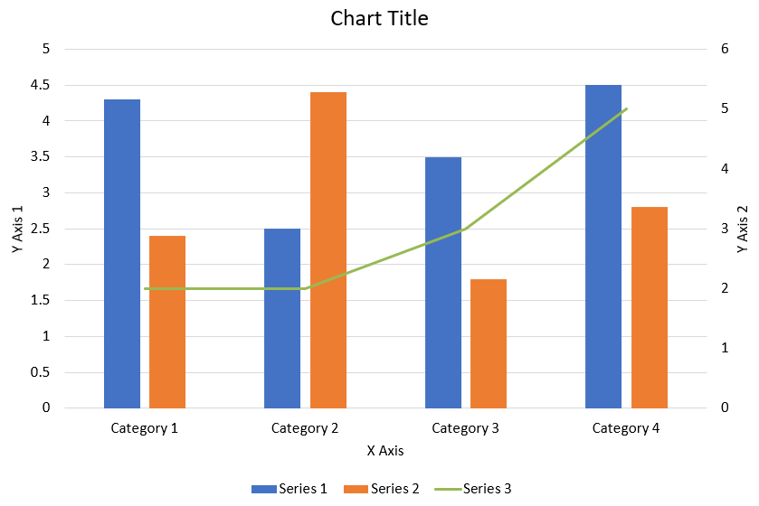
以下 PHP 程式碼示範如何在 PowerPoint 簡報中建立上圖所示的組合圖:
```php
function createComboChart() {
$presentation = new Presentation();
$slide = $presentation->getSlides()->get_Item(0);
try {
$chart = createChartWithFirstSeries($slide);
addSecondSeriesToChart($chart);
addThirdSeriesToChart($chart);
setPrimaryAxesFormat($chart);
setSecondaryAxesFormat($chart);
$presentation->save("combo-chart.pptx", SaveFormat::Pptx);
} finally {
$presentation->dispose();
}
}
function createChartWithFirstSeries($slide) {
$chart = $slide->getShapes()->addChart(ChartType::ClusteredColumn, 50, 50, 600, 400);
// 設定圖表標題。
$chart->setTitle(true);
$chart->getChartTitle()->addTextFrameForOverriding("Chart Title");
$chart->getChartTitle()->setOverlay(false);
$titleParagraph = $chart->getChartTitle()->getTextFrameForOverriding()->getParagraphs()->get_Item(0);
$titleFormat = $titleParagraph->getParagraphFormat()->getDefaultPortionFormat();
$titleFormat->setFontBold(NullableBool::False);
$titleFormat->setFontHeight(18);
// 設定圖表圖例。
$chart->getLegend()->setPosition(LegendPositionType::Bottom);
$chart->getLegend()->getTextFormat()->getPortionFormat()->setFontHeight(12);
// 刪除預設產生的系列與類別。
$chart->getChartData()->getSeries()->clear();
$chart->getChartData()->getCategories()->clear();
$worksheetIndex = 0;
$workbook = $chart->getChartData()->getChartDataWorkbook();
// 新增類別。
$chart->getChartData()->getCategories()->add($workbook->getCell($worksheetIndex, 1, 0, "Category 1"));
$chart->getChartData()->getCategories()->add($workbook->getCell($worksheetIndex, 2, 0, "Category 2"));
$chart->getChartData()->getCategories()->add($workbook->getCell($worksheetIndex, 3, 0, "Category 3"));
$chart->getChartData()->getCategories()->add($workbook->getCell($worksheetIndex, 4, 0, "Category 4"));
// 新增第一個系列。
$seriesNameCell = $workbook->getCell($worksheetIndex, 0, 1, "Series 1");
$series = $chart->getChartData()->getSeries()->add($seriesNameCell, $chart->getType());
$series->getParentSeriesGroup()->setOverlap(-25);
$series->getParentSeriesGroup()->setGapWidth(220);
$series->getDataPoints()->addDataPointForBarSeries($workbook->getCell($worksheetIndex, 1, 1, 4.3));
$series->getDataPoints()->addDataPointForBarSeries($workbook->getCell($worksheetIndex, 2, 1, 2.5));
$series->getDataPoints()->addDataPointForBarSeries($workbook->getCell($worksheetIndex, 3, 1, 3.5));
$series->getDataPoints()->addDataPointForBarSeries($workbook->getCell($worksheetIndex, 4, 1, 4.5));
return $chart;
}
function addSecondSeriesToChart($chart) {
$workbook = $chart->getChartData()->getChartDataWorkbook();
$worksheetIndex = 0;
$seriesNameCell = $workbook->getCell($worksheetIndex, 0, 2, "Series 2");
$series = $chart->getChartData()->getSeries()->add($seriesNameCell, ChartType::ClusteredColumn);
$series->getParentSeriesGroup()->setOverlap(-25);
$series->getParentSeriesGroup()->setGapWidth(220);
$series->getDataPoints()->addDataPointForBarSeries($workbook->getCell($worksheetIndex, 1, 2, 2.4));
$series->getDataPoints()->addDataPointForBarSeries($workbook->getCell($worksheetIndex, 2, 2, 4.4));
$series->getDataPoints()->addDataPointForBarSeries($workbook->getCell($worksheetIndex, 3, 2, 1.8));
$series->getDataPoints()->addDataPointForBarSeries($workbook->getCell($worksheetIndex, 4, 2, 2.8));
}
function addThirdSeriesToChart($chart) {
$workbook = $chart->getChartData()->getChartDataWorkbook();
$worksheetIndex = 0;
$seriesNameCell = $workbook->getCell($worksheetIndex, 0, 3, "Series 3");
$series = $chart->getChartData()->getSeries()->add($seriesNameCell, ChartType::Line);
$series->getDataPoints()->addDataPointForLineSeries($workbook->getCell($worksheetIndex, 1, 3, 2.0));
$series->getDataPoints()->addDataPointForLineSeries($workbook->getCell($worksheetIndex, 2, 3, 2.0));
$series->getDataPoints()->addDataPointForLineSeries($workbook->getCell($worksheetIndex, 3, 3, 3.0));
$series->getDataPoints()->addDataPointForLineSeries($workbook->getCell($worksheetIndex, 4, 3, 5.0));
$series->setPlotOnSecondAxis(true);
}
function setPrimaryAxesFormat($chart) {
// 設定水平軸。
$horizontalAxis = $chart->getAxes()->getHorizontalAxis();
$horizontalAxis->getTextFormat()->getPortionFormat()->setFontHeight(12);
$horizontalAxis->getFormat()->getLine()->getFillFormat()->setFillType(FillType::NoFill);
setAxisTitle($horizontalAxis, "X Axis");
// 設定垂直軸。
$verticalAxis = $chart->getAxes()->getVerticalAxis();
$verticalAxis->getTextFormat()->getPortionFormat()->setFontHeight(12);
$verticalAxis->getFormat()->getLine()->getFillFormat()->setFillType(FillType::NoFill);
setAxisTitle($verticalAxis, "Y Axis 1");
// 設定垂直主要格線顏色。
$majorGridLinesFormat = $verticalAxis->getMajorGridLinesFormat()->getLine()->getFillFormat();
$majorGridLinesFormat->setFillType(FillType::Solid);
$majorGridLinesFormat->getSolidFillColor()->setColor(new java("java.awt.Color", 217, 217, 217));
}
function setSecondaryAxesFormat($chart) {
// 設定次要水平軸。
$secondaryHorizontalAxis = $chart->getAxes()->getSecondaryHorizontalAxis();
$secondaryHorizontalAxis->setPosition(AxisPositionType::Bottom);
$secondaryHorizontalAxis->setCrossType(CrossesType::Maximum);
$secondaryHorizontalAxis->setVisible(false);
$secondaryHorizontalAxis->getMajorGridLinesFormat()->getLine()->getFillFormat()->setFillType(FillType::NoFill);
$secondaryHorizontalAxis->getMinorGridLinesFormat()->getLine()->getFillFormat()->setFillType(FillType::NoFill);
// 設定次要垂直軸。
$secondaryVerticalAxis = $chart->getAxes()->getSecondaryVerticalAxis();
$secondaryVerticalAxis->setPosition(AxisPositionType::Right);
$secondaryVerticalAxis->getTextFormat()->getPortionFormat()->setFontHeight(12);
$secondaryVerticalAxis->getFormat()->getLine()->getFillFormat()->setFillType(FillType::NoFill);
$secondaryVerticalAxis->getMajorGridLinesFormat()->getLine()->getFillFormat()->setFillType(FillType::NoFill);
$secondaryVerticalAxis->getMinorGridLinesFormat()->getLine()->getFillFormat()->setFillType(FillType::NoFill);
setAxisTitle($secondaryVerticalAxis, "Y Axis 2");
}
function setAxisTitle($axis, $axisTitle) {
$axis->setTitle(true);
$axis->getTitle()->setOverlay(false);
$titleParagraph = $axis->getTitle()->addTextFrameForOverriding($axisTitle)->getParagraphs()->get_Item(0);
$titleFormat = $titleParagraph->getParagraphFormat()->getDefaultPortionFormat();
$titleFormat->setFontBold(NullableBool::False);
$titleFormat->setFontHeight(12);
}
```
## **更新圖表**
步驟: 更新 PowerPoint 圖表 |
步驟: 更新簡報圖表 |
步驟: 更新 PowerPoint 簡報圖表
1. 實例化一個代表包含欲更新圖表之簡報的 [Presentation](https://reference.aspose.com/slides/zh-hant/php-java/aspose.slides/Presentation) 類別。
2. 透過索引取得投影片參考。
3. 巡覽所有圖形以找到目標圖表。
4. 取得圖表資料工作表。
5. 透過變更系列值來修改圖表資料系列。
6. 新增系列並填入資料。
7. 將修改後的簡報寫入 PPTX 檔案。
以下 PHP 程式碼示範如何更新圖表:
```php
$pres = new Presentation();
try {
# 取得第一張投影片
$sld = $pres->getSlides()->get_Item(0);
# 取得帶有預設資料的圖表
$chart = $sld->getShapes()->get_Item(0);
# 設定圖表資料工作表的索引
$defaultWorksheetIndex = 0;
# 取得圖表資料工作表
$fact = $chart->getChartData()->getChartDataWorkbook();
# 變更圖表類別名稱
$fact->getCell($defaultWorksheetIndex, 1, 0, "Modified Category 1");
$fact->getCell($defaultWorksheetIndex, 2, 0, "Modified Category 2");
# 取得第一個圖表系列
$series = $chart->getChartData()->getSeries()->get_Item(0);
# 現在更新系列資料
$fact->getCell($defaultWorksheetIndex, 0, 1, "New_Series1"); // 修改系列名稱
$series->getDataPoints()->get_Item(0)->getValue()->setData(90);
$series->getDataPoints()->get_Item(1)->getValue()->setData(123);
$series->getDataPoints()->get_Item(2)->getValue()->setData(44);
# 取得第二個圖表系列
$series = $chart->getChartData()->getSeries()->get_Item(1);
# 現在更新系列資料
$fact->getCell($defaultWorksheetIndex, 0, 2, "New_Series2"); // 修改系列名稱
$series->getDataPoints()->get_Item(0)->getValue()->setData(23);
$series->getDataPoints()->get_Item(1)->getValue()->setData(67);
$series->getDataPoints()->get_Item(2)->getValue()->setData(99);
# 現在,新增一個系列
$chart->getChartData()->getSeries()->add($fact->getCell($defaultWorksheetIndex, 0, 3, "Series 3"), $chart->getType());
# 取得第三個圖表系列
$series = $chart->getChartData()->getSeries()->get_Item(2);
# 現在填入系列資料
$series->getDataPoints()->addDataPointForBarSeries($fact->getCell($defaultWorksheetIndex, 1, 3, 20));
$series->getDataPoints()->addDataPointForBarSeries($fact->getCell($defaultWorksheetIndex, 2, 3, 50));
$series->getDataPoints()->addDataPointForBarSeries($fact->getCell($defaultWorksheetIndex, 3, 3, 30));
$chart->setType(ChartType::ClusteredCylinder);
# 儲存含圖表的簡報
$pres->save("AsposeChartModified_out.pptx", SaveFormat::Pptx);
} finally {
if (!java_is_null($pres)) {
$pres->dispose();
}
}
```
## **設定圖表的資料範圍**
設定圖表的資料範圍,請執行以下步驟:
1. 實例化一個代表包含圖表之簡報的 [Presentation](https://reference.aspose.com/slides/zh-hant/php-java/aspose.slides/Presentation) 類別。
2. 透過索引取得投影片參考。
3. 巡覽所有圖形以找到目標圖表。
4. 取得圖表資料並設定範圍。
5. 將修改後的簡報儲存為 PPTX 檔案。
以下 PHP 程式碼示範如何設定圖表的資料範圍:
```php
$pres = new Presentation();
try {
$slide = $pres->getSlides()->get_Item(0);
$chart = $slide->getShapes()->get_Item(0);
$chart->getChartData()->setRange("Sheet1!A1:B4");
$pres->save("SetDataRange_out.pptx", SaveFormat::Pptx);
} finally {
if (!java.get_???(pres)) {
$pres->dispose();
}
}
```
## **在圖表中使用預設標記**
使用預設標記時,系統會自動為每個圖表系列指派不同的預設標記符號。
以下 PHP 程式碼示範如何自動為圖表系列設定標記:
```php
$pres = new Presentation();
try {
$slide = $pres->getSlides()->get_Item(0);
$chart = $slide->getShapes()->addChart(ChartType::LineWithMarkers, 10, 10, 400, 400);
$chart->getChartData()->getSeries()->clear();
$chart->getChartData()->getCategories()->clear();
$fact = $chart->getChartData()->getChartDataWorkbook();
$chart->getChartData()->getSeries()->add($fact->getCell(0, 0, 1, "Series 1"), $chart->getType());
$series = $chart->getChartData()->getSeries()->get_Item(0);
$chart->getChartData()->getCategories()->add($fact->getCell(0, 1, 0, "C1"));
$series->getDataPoints()->addDataPointForLineSeries($fact->getCell(0, 1, 1, 24));
$chart->getChartData()->getCategories()->add($fact->getCell(0, 2, 0, "C2"));
$series->getDataPoints()->addDataPointForLineSeries($fact->getCell(0, 2, 1, 23));
$chart->getChartData()->getCategories()->add($fact->getCell(0, 3, 0, "C3"));
$series->getDataPoints()->addDataPointForLineSeries($fact->getCell(0, 3, 1, -10));
$chart->getChartData()->getCategories()->add($fact->getCell(0, 4, 0, "C4"));
$series->getDataPoints()->addDataPointForLineSeries($fact->getCell(0, 4, 1, null));
$chart->getChartData()->getSeries()->add($fact->getCell(0, 0, 2, "Series 2"), $chart->getType());
# 取得第二個圖表系列
$series2 = $chart->getChartData()->getSeries()->get_Item(1);
# 現在填入系列資料
$series2->getDataPoints()->addDataPointForLineSeries($fact->getCell(0, 1, 2, 30));
$series2->getDataPoints()->addDataPointForLineSeries($fact->getCell(0, 2, 2, 10));
$series2->getDataPoints()->addDataPointForLineSeries($fact->getCell(0, 3, 2, 60));
$series2->getDataPoints()->addDataPointForLineSeries($fact->getCell(0, 4, 2, 40));
$chart->setLegend(true);
$chart->getLegend()->setOverlay(false);
$pres->save("DefaultMarkersInChart.pptx", SaveFormat::Pptx);
} finally {
if (!java_is_null($pres)) {
$pres->dispose();
}
}
```
## **常見問題集**
**Aspose.Slides 支援哪些圖表類型?**
Aspose.Slides 支援廣泛的 [chart types](https://reference.aspose.com/slides/zh-hant/php-java/aspose.slides/charttype/),包括長條圖、折線圖、圓形圖、面積圖、散佈圖、直方圖、雷達圖等。此彈性讓您能依資料視覺化需求選擇最合適的圖表類型。
**如何將新圖表加入投影片?**
首先建立 [Presentation](https://reference.aspose.com/slides/zh-hant/php-java/aspose.slides/presentation/) 類別的實例,依索引取得目標投影片,然後呼叫加入圖表的方法,指定圖表類型與初始資料,即可將圖表直接嵌入簡報。
**如何更新圖表中顯示的資料?**
您可以透過存取圖表的資料工作簿 ([ChartDataWorkbook](https://reference.aspose.com/slides/zh-hant/php-java/aspose.slides/chartdataworkbook/)),清除預設的系列與類別,然後加入自訂資料,以刷新圖表並顯示最新資料。
**是否可以自訂圖表的外觀?**
可以,Aspose.Slides 提供豐富的自訂選項,您可以修改顏色、字型、標籤、圖例及其他 [formatting elements](/slides/zh-hant/php-java/chart-entities/),以符合特定的設計需求。