Fills and Strokes in SVG – Basics and SVG Code
Filling and stroking are both painting operations. All graphical elements such as shapes, paths and text – are rendered by being filled. The fill is painting the interior of the object, and the stroke is painting along its outline. The SVG stroke and SVG fill are some of the main CSS properties that can be set for any lines, text and shapes. In the SVG text file, they can be specified both in the style attribute and using presentation attributes. There is a corresponding presentation attribute for each property, which is described in the Styling chapter of the W3 SVG 2.0 specification.
SVG Fill and SVG Stroke Properties
Colorization or painting means the operation of adding color, gradients or patterns to graphics using fill and stroke. A set of attributes define their properties: fill, fill-opacity, fill-rule, stroke, stroke-dasharray, stroke-dashoffset, stroke-linecap, stroke-linejoin, stroke-miterlimit, stroke-opacity, and stroke-width. These are some of the presentation attributes.
SVG fills and SVG strokes features can be set in the style attribute. The syntax for properties specifying is:
style="stroke:#00ff00; stroke-width:2; fill:#ff0000"
But the same style properties can be given in the presentation attributes with such the syntax:
stroke="green" stroke-width="2" fill="#ff0000"
For the SVG color specifying, you can take color names, rgb values, hex values, etc. In the following examples will be using different ways of writing fills and strokes characteristics.
Fill attribute
The fill attribute colors the interior of a graphic element. When you fill an SVG shape or curve, the fill colourizes open paths too as if the last its point was connected to the first, even though the stroke color in that part of the path will not appear. If the fill attribute property is not specified, the default is black.
So that there is no filling, you need to specify the attribute value fill="none" or fill="transparent".
The sample below illustrates the presents and lacking fill="none" property (
two-paths.svg):
1<svg height="400" width="800" xmlns="http://www.w3.org/2000/svg">
2    <path d="M 10 100 Q 25 10 180 100 T 250 100 T 300 100 T 390 130" stroke="red" stroke-width="3" fill="none" />
3    <path d="M 10 100 Q 25 10 180 100 T 250 100 T 300 100 T 390 130" stroke="red" stroke-width="3" transform="translate(0 125)" />
4</svg>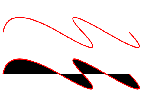
SVG Lines and Stroke Caps
The more often used stroke properties are the following: stroke, stroke-width, stroke-linecap, and stroke-linejoin. They define the color, thickness, types of line endings to an open path, and kind of join of the two meet lines.
For any line, it is possible to set the shape of its ends. This makes sense if the line has the stroke-width property. The sample below shows as the stroke-width and stroke-linecap properties define the SVG stroke’s width and form of its ends ( lines.svg).
 1<svg height="200" width="800" xmlns="http://www.w3.org/2000/svg">
 2  <g stroke="grey">
 3    <path stroke-width="3" d="M 5 20 l 215 0" />
 4    <path stroke-width="15" d="M 5 60 l 215 0" />
 5    <path stroke-width="30" d="M 5 100 l 215 0" />
 6  </g>
 7 <g stroke="grey" stroke-width="30">
 8    <path stroke-linecap="butt" d="M 300 20 l 215 0" />
 9    <path stroke-linecap="round" d="M 300 60 l 215 0" />
10    <path stroke-linecap="square" d="M 300 100 l 215 0" />
11  </g>
12  <g stroke="orange" stroke-width="2">
13    <line x1="300" y1="20" x2="515" y2="20" />
14    <path d="M 300 60 l 215 0" />
15    <path d="M 300 100 l 215 0" />
16  </g>
17</svg>
In the sample, we use a <g> element to set common properties on objects, such as stroke and stroke-width.
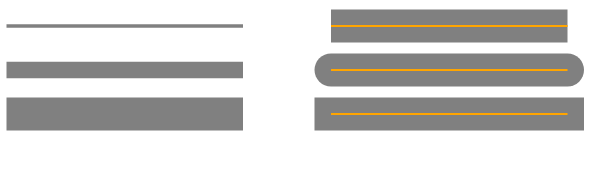
In the example above, the SVG paths (SVG lines) are shown in orange, and the SVG strokes in grey.
The stroke-linecap CSS attribute defines how the ends of an SVG line are rendered, and has three possible values: butt, square and round.
As a result of butt using, the stroke cap is cut off with a straight edge that is normal exactly where the line ends. The value square results in a stroke cap that looks like a cut off, but it extends slightly beyond where the line ends. The distance that the stroke goes beyond the path is half of the stroke-width value. The value round means the stroke cap has the round ends, which radius depends by the stroke-width.
One more sample illustrates a stroke-linejoin property ( linejoin.svg):
 1<svg width="300" height="300" xmlns="http://www.w3.org/2000/svg">
 2    <g stroke-width="20" fill="none">
 3        <polyline points="40 60 80 20 120 60 160 20 200 60 240 20" stroke="grey" stroke-linecap="butt"  stroke-linejoin="miter" />
 4        <polyline points="40 140 80 100 120 140 160 100 200 140 240 100" stroke="#CD5C5C" stroke-linecap="round" stroke-linejoin="round" />
 5        <polyline points="40 220 80 180 120 220 160 180 200 220 240 180" stroke="black"  stroke-linecap="square" stroke-linejoin="bevel" />
 6    </g>
 7    <g fill="none" stroke="orange" stroke-width="2">
 8        <polyline points="40 60 80 20 120 60 160 20 200 60 240 20" />
 9        <polyline points="40 140 80 100 120 140 160 100 200 140 240 100" />
10        <polyline points="40 220 80 180 120 220 160 180 200 220 240 180" />
11   </g>
12</svg>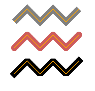
Note, the orange line inside is the object (polyline), around is the SVG stroke.
The stroke-linejoin attribute can take a three value: miter, round, and bevel. The miter extends the stroke to create a square corner in the lines join point; round builds a rounded stroke in the joining end; bevel makes a new angle to aid in the transition between the two lines.
Dots and Dashes. Stroke-dasharray
All the SVG stroke properties can be applied to any line type, text and outlines of elements like a circle, rectangle, etc. The stroke-dasharray property in CSS is for creating dashes in the stroke of SVG shapes. The stroke-dasharray attribute converts paths into dashes and makes the stroke of an SVG shape rendered with dashed lines. The values that stroke-dasharray attribute takes are an array of commas or whitespace-separated numbers. These values define the length of dashes and spaces.
Here is a stroke-dasharray example ( dasharray.svg):
1<svg width="400" height="300" xmlns="http://www.w3.org/2000/svg">
2    <line x1="20" y1="30" x2="400" y2="30" style="stroke:rgb(112, 128, 144); fill:none; stroke-width:10; stroke-dasharray:10 5;" />
3    <line x1="20" y1="80" x2="400" y2="80" style="stroke:olive; fill:none; stroke-width: 20; stroke-dasharray: 20 10 5;" />
4    <path d="M 10 200 Q 50 100 150 200 T 230 200 T 300 200 T 390 200" stroke="#FF8C00" stroke-width="8" fill="none" stroke-linecap="round" stroke-dasharray="15 10 2 8" />
5</svg>
For the grey and orange SVG lines, we specify even number of values: each of number couples means “filled-unfilled” areas. The default values are in pixels.
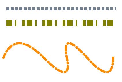
If an odd number of values is specified, the list is then repeated to produce an even number of values. For example, 20 10 5 becomes 20 10 5 20 10 5, as for olive-color line.
Moreover, you can separately specify the opacity of the SVG fill or stroke that controlled by the fill-opacity and stroke-opacity attributes.
You can experiment with stroke-dasharray attribute. Amazing things can be achieved with SVG strokes and simple SVG shapes ( dasharray-example.svg):
 1<svg height="600" width="600" xmlns="http://www.w3.org/2000/svg">
 2    <g fill="none">
 3        <circle cx="100" cy="100" r="40" stroke="red" stroke-width="55" stroke-dasharray="4,2" />
 4        <circle cx="100" cy="100" r="30" stroke="grey" stroke-width="45" stroke-dasharray="5,2" transform="translate(120,40)" />
 5        <circle cx="100" cy="100" r="35" stroke="orange" stroke-width="45" stroke-dasharray="9,3" transform="translate(30,130)" />
 6		<circle cx="100" cy="100" r="20" stroke="pink" stroke-linecap="round" stroke-width="20" stroke-dasharray="10,15" transform="translate(380,120)" />
 7        <rect x="320" y="100" width="100" height="100" stroke="DarkCyan" stroke-width="55" stroke-dasharray="7 7 3 2" />
 8        <text x="200" y="300" font-family="arial" font-size="60" stroke="#000080" stroke-width="3" stroke-dasharray="2 1">I love SVG!</text>
 9    </g>
10</svg>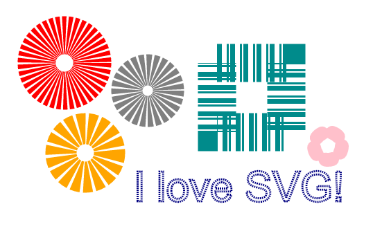
Aspose.SVG offers SVG Free Web Applications for converting SVG or image files, merging SVG files, image vectorizing, SVG sprite generating, SVG to base64 data encoding, and text vectorizing. These online Apps work on any operating system with a web browser and don’t require additional software installation. It’s a fast and easy way to efficiently and effectively solve your SVG-related tasks!