Analyzing your prompt, please hold on...
An error occurred while retrieving the results. Please refresh the page and try again.
SVG filters add special visual effects to bitmap or vector graphics. A filter is a set of operations that are applied to an image before it is rendered. These operations can produce color and lighting changes, blurring, warping, noise, texture generation, and more. SVG filters are capable of creating complex effects in the browser and have the potential to be using in a variety of projects. They are supported by almost all modern browsers, including mobile ones.
A filter is defined with a <filter> element placed inside a <defs> block. The <filter> itself is never rendered; its children – filter primitives – perform the actual work. The <filter> element defines the coordinate system and the region where all filter primitives operate. It supports the following key attributes:
x, y, width, height – define the rectangular region of the graphic to which the filter is appliedfilterUnits – specifies the coordinate system for the filter region (userSpaceOnUse or objectBoundingBox)primitiveUnits – defines the coordinate system used by filter primitives inside the filterid, class, style, and presentation properties (see the
Filter Property specification)SVG filters are built by combining multiple filter primitives.
in attribute. The default is in="SourceGraphic". The output of the operation is defined in the result attribute.x, y, width, and height, which is resolved relative to the <filter> region.The table below provides an overview of the most commonly used SVG filter primitives, their purpose, and key attributes.
| Category | Filter primitive | Purpose | Key attributes |
|---|---|---|---|
| Gaussian Blur | <feGaussianBlur> | Blurs the input image using a Gaussian function | in, stdDeviation, result |
| Drop Shadow | <feOffset> | Offsets the alpha channel to create a shadow base | in, dx, dy, result |
| Drop Shadow | <feGaussianBlur> | Softens the offset shadow | in, stdDeviation, result |
| Drop Shadow | <feBlend> | Blends the shadow with the original graphic | in, in2, mode |
| Light Effects | <feGaussianBlur> | Smooths the alpha channel used as a bump map | in, stdDeviation, result |
| Light Effects | <feSpecularLighting> | Generates specular (shiny) lighting using a light source | in, surfaceScale, specularConstant, specularExponent, lighting-color, result |
| Light Effects | <feDiffuseLighting> | Generates diffuse lighting using a light source | in, surfaceScale, diffuseConstant, lighting-color, result |
| Light Effects | <fePointLight> | Defines a point light source for lighting primitives | x, y, z |
| Light Effects | <feComposite> | Combines lighting with the source graphic | in, in2, operator, k1, k2, k3, k4, result |
| Light Effects | <feMerge> | Merges multiple filter results into a single output | – |
| Color Filters | <feColorMatrix> | Applies matrix-based color transformations | in, type, values, result |
| Color Filters | <feComponentTransfer> | Applies per-channel color transfer functions | in, result |
Each filter requires a source image to process. Otherwise, the filter will have nothing to render and so not work. All the filter primitives define in the Filter primitives overview.
The Gaussian blur function is obtained by blurring & smoothing an image using the Gaussian function. It can be considered as a filter that reduces image noise and minor details. Designers and photographers often apply Gaussian blur functions for different purposes: Gaussian blur can soften the image, it is useful for reducing chromatic aberration, it can hide a license plate or brand logo you don’t have permission to use, etc.
The <feGaussianBlur> filter creates a soft blur effect. It is a frequently used effect. The stdDeviation attribute specifies the number that characterizes the standard deviation for the blur operation. If two numbers are provided, the first number represents a standard deviation value along the x-axis of the coordinate system, the second one – on the y-axis.
Here is an example illustrates the various values of stdDeviation attribute ( gaussian-blur.svg):
 1<svg height="400" width="600" xmlns="http://www.w3.org/2000/svg">
 2    <defs>
 3        <filter id="f1" x="-20" y="-20" height="100" width="100">
 4            <feGaussianBlur in="SourceGraphic" stdDeviation="10" />
 5        </filter>
 6        <filter id="f2" x="-20" y="-20" height="100" width="100">
 7            <feGaussianBlur in="SourceGraphic" stdDeviation="10, 0" />
 8        </filter>
 9        <filter id="f3" x="-20" y="-20" height="100" width="100">
10            <feGaussianBlur in="SourceGraphic" stdDeviation="0,10" />
11        </filter>
12    </defs>
13    <g stroke="none" fill="#20B2AA">
14        <ellipse cx="60" cy="80" rx="55" ry="35" />
15        <ellipse cx="200" cy="80" rx="55" ry="35" filter="url(#f1)" />
16        <ellipse cx="340" cy="80" rx="55" ry="35" filter="url(#f2)" />
17        <ellipse cx="500" cy="80" rx="55" ry="35" filter="url(#f3)" />
18    </g>
19</svg>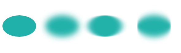
The blur, added around a shape, often makes output picture larger than source one. Negative numbers for x and y must be used to avoid clipping the graphic added by the filter. In the example above, we did this in lines 3, 6, and 9.
You can create a Gaussian Blur effect in C# using Aspose.SVG for .NET API. To learn more about the Aspose.Svg.Filters namespace and consider detailed C# examples of using the SVGFEGaussianBlurElement class to apply the Gaussian Blur effect to SVG elements and bitmaps, please see the
Gaussian Blur article.
A typical example of the drop shadow effect is to add a 3D look to a shape or text. Also, a drop shadow effect can be used to make an image stand out.
The <feOffset> filter primitive is used to offset a layer in SVG. In addition to the in and result attributes, this primitive accepts two main attributes – dx and dy, which define the distance the layer is offset along the x and y axes, respectively.
The <feBlend> filter blends two objects; its mode attribute defines the blending mode.
Let’s see how to create a drop shadow effect ( drop-shadow-effect.svg):
 1<svg height="200" width="200" xmlns="http://www.w3.org/2000/svg">
 2    <defs>
 3        <filter id="shadow" x="-20" y="-20" height="150" width="150">
 4            <feOffset result="offset" in="SourceAlpha" dx="10" dy="10" />
 5            <feGaussianBlur result="blur" in="offset" stdDeviation="10" />
 6            <feBlend in="SourceGraphic" in2="blur" mode="normal" />
 7        </filter>
 8    </defs>
 9    <ellipse cx="95" cy="90" rx="75" ry="55" fill="#20B2AA" filter="url(#shadow)" />
10</svg>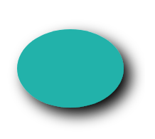
Step‑by‑step explanation
<feOffset> takes in="SourceAlpha", and shifts the result 10 px to the right and 10px to the bottom, and stores the result in the buffer as "offset". Note, the alpha channel of the shape is used as input. The value SourceAlpha leads to a black-color result.<feGaussianBlur> takes in="offset", applies a blur of 10, and stores the result in a temporary buffer named "blur".<feBlend> takes two inputs in="SourceGraphic" and in2="blur" then blends the SourceGraphic on top of the offset black blurred image.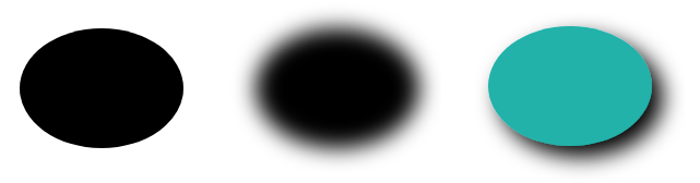
You can create a drop shadow effect in C# using Aspose.SVG for .NET API. See the Drop Shadow Effect article to learn more about the Aspose.Svg.Filters namespace and consider detailed C# examples of applying the drop shadow effect to SVG shapes and text.
The lighting effect is making in SVG using a set of filters. Consider some of them: <feDiffuseLighting>, <feSpecularLighting>, and <fePointLight>. You can combine several filters, create and control the details for a lighting effect.
The <fePointLight> filter defines a light source which sets a point light effect. It can be used within the <feDiffuseLighting> or <feSpecularLighting> primitive as a child. Specific attributes x, y, and z indicate the position of the point light source. Both <feDiffuseLighting> and the <feSpecularLighting> filter light an image using its alpha channel as a bump map. The difference between them is the various calculations of the lighting model components.
Consider an example of a light effect ( light-effect.svg):
 1<svg height="300" width="300" xmlns="http://www.w3.org/2000/svg">
 2    <defs>
 3        <filter id = "F1">
 4            <feGaussianBlur in = "SourceAlpha" stdDeviation = "4" result = "blur" />
 5            <feSpecularLighting result = "light" in = "blur" specularExponent = "25" lighting-color = "#bbbbbb">
 6                <fePointLight x = "80" y = "60" z = "200" />
 7            </feSpecularLighting>
 8            <feComposite in = "SourceGraphic" in2 = "light" operator = "arithmetic" k1 ="0" k2 ="1" k3 ="1" k4 ="0" />
 9        </filter>
10    </defs>
11    <g  fill = "INDIANRED" filter = "url(#F1)">
12        <circle cx="100" cy="100" r="60" />
13        <circle cx="100" cy="230" r="60" />
14        <circle cx="230" cy="100" r="60" />
15        <circle cx="230" cy="230" r="60" />
16    </g>
17</svg>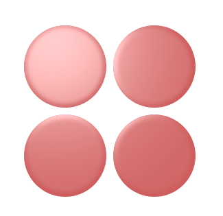
Step‑by‑step explanation
In this example, four SVG filters are applied to create the light effect:
<feGaussianBlur> takes input SourceAlpha, which is the alpha channel of the source image. The result is stored in a temporary buffer named "blur".<feSpecularLighting> and <fePointLighting> filter effects.
<feSpecularLighting> uses buffer "blur" as a model of a surface elevation and generates a lighting effect from a point source that sets in the <fePointLighting>filter. The result is stored in buffer "light".<feComposite> filter takes two inputs in="SourceGraphic" in2="light" and performs they combination using the arithmetic compositing operation. The output from the arithmetic operator for each result pixel is computed as: result = k1·in1·in2 + k2·in1 + k3·in2 + k4The code below demonstrates one more example of combining SVG filters ( button.svg):
 1<svg height="200" width="200" xmlns="http://www.w3.org/2000/svg">
 2    <defs>
 3        <filter id="myF" x="-5" y="-5" height="100" width="150">
 4            <feGaussianBlur in="SourceAlpha" stdDeviation="5" result="blur" />
 5            <feOffset in="blur" dx="5" dy="5" result="offsetBlur" />
 6            <feSpecularLighting in="offsetBlur" surfaceScale="8" specularConstant="0.7" specularExponent="2" lighting-color="#bbbbbb" result="specOut">
 7                <fePointLight x="-100" y="-100" z="100" />
 8            </feSpecularLighting>
 9            <feComposite in="specOut" in2="SourceAlpha" operator="in" result="specOut" />
10            <feComposite in="SourceGraphic" in2="specOut" operator="arithmetic" k1="1.5" k2="0.5" k3="1" k4="0" result="litPaint" />
11            <feMerge>
12                <feMergeNode in="offsetBlur" />
13                <feMergeNode in="litPaint" />
14            </feMerge>
15        </filter>
16    </defs>
17    <ellipse cx="85" cy="70" rx="65" ry="45" fill="#20B2AA" filter="url(#myF)" />
18    <g fill="#696969" font-size="25" font-family="arial">
19        <text x="55" y="80">PUSH</text>
20    </g>
21</svg>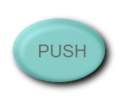
In SVG Lighting Effects, you learn how to combine multiple filters to create and control SVG lighting effects in C# using the Aspose.SVG for .NET API.
In SVG, you can create a wide variety of color effects that are supported in almost all modern browsers. When it comes to color handling, <feColorMatrix> is the best option. It is a type of color filter that uses a matrix to affect the color values for each RGBA channel. The <feComponentTransfer> is one of the most powerful SVG filter primitives. It gives control over the individual RGBA channels of the image, allowing you to create Photoshop-like SVG effects; for example, it can be used to posterize images.
Consider the main color filters – <feColorMatrix> and <feComponentTransfer>.
<feColorMatrix> – Saturation ExampleThe <feColorMatrix> filter applies a matrix transformation to the RGBA channels of each pixel in the input image. As a result, a new set of color and alpha values is produced. The type attribute can be:
matrix – custom 5×4 matrixsaturate – adjusts saturationhueRotate – rotates hue around the color wheelluminanceToAlpha – converts luminance to alphaLet’s see examples of the saturate operation use ( saturation.svg):
1<svg width="640" height="480" viewbox="0 0 640 480" xmlns="http://www.w3.org/2000/svg">
2    <defs>
3        <filter id="myFilter">
4            <feColorMatrix in="SourceGraphic" type="saturate" values="0"></feColorMatrix>
5        </filter>
6    </defs>
7    <image filter="url(#myFilter)" href="https://docs.aspose.com/svg/images/drawing/park.jpg" width="100%" height="100%" />
8</svg>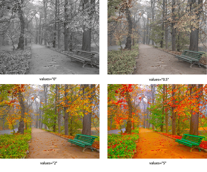
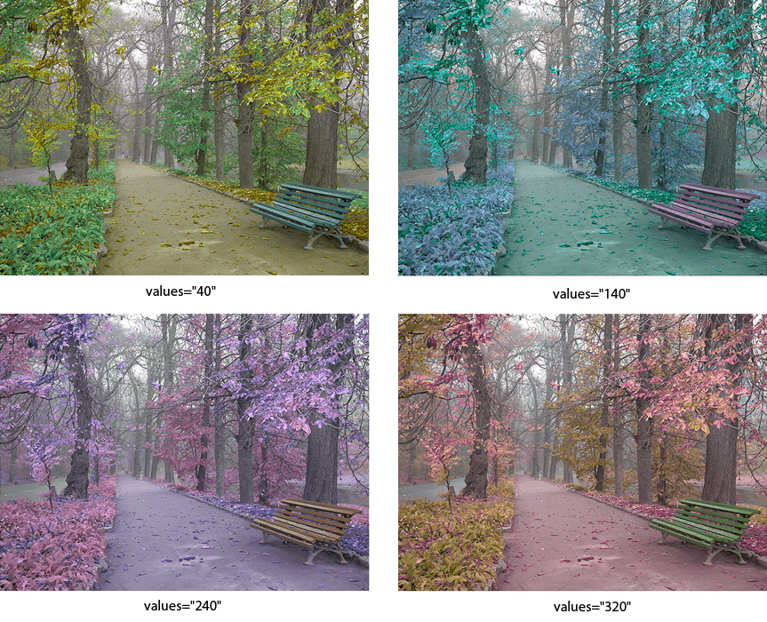
<feColorMatrix> – Hue Rotation ExampleThe specific case of color matrices is image rotation along the color wheel. The following example illustrates using the hueRotate operation.
1<svg width="640" height="480" viewbox="0 0 640 480" xmlns="http://www.w3.org/2000/svg">
2    <defs>
3        <filter id="hueR">
4            <feColorMatrix in="SourceGraphic" type="hueRotate" values="40"></feColorMatrix>
5        </filter>
6    </defs>
7    <image filter="url(#hueR)" href="https://docs.aspose.com/svg/images/drawing/park.jpg" width="100%" height="100%" />
8</svg>
The figure below contains a series of images that illustrate the different hueRotate values.
<feComponentTransfer> – Channel Manipulation ExampleThe <feComponentTransfer> filter allows you to perform linear, tabular, discrete operations with image channels, as well as change the gamma of each channel (RGBA). It lets operations like brightness adjustment, contrast adjustment, and color balance.
Let’s look at an example:
 1<svg width="640" height="480" viewbox="0 0 640 480" xmlns="http://www.w3.org/2000/svg">
 2    <defs>
 3        <filter id="RGBA">
 4            <fecomponenttransfer>
 5                <feFuncR type="linear" slope="2.0" />
 6                <feFuncG type="linear" slope="1.7" />
 7                <feFuncB type="linear" slope="0.1" />
 8                <feFuncA type="identity" />
 9            </fecomponenttransfer>
10        </filter>
11    </defs>
12    <image filter="url(#RGBA)" href="https://docs.aspose.com/svg/images/drawing/park.jpg" width="100%" height="100%" />
13</svg>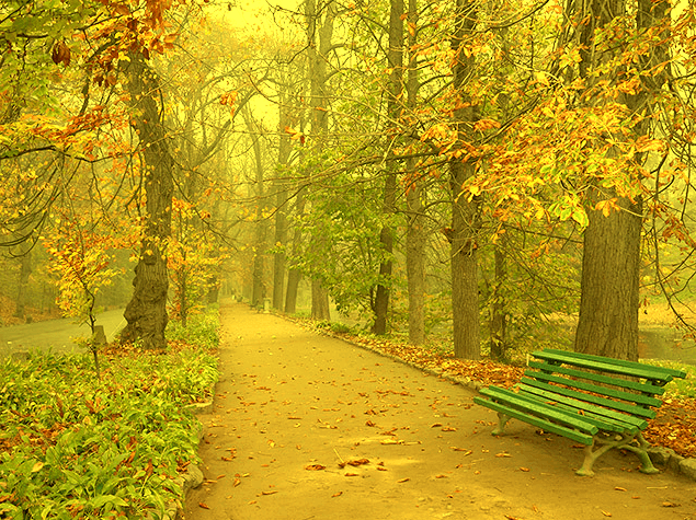
The <feComponentTransfer> element allows modifying each of the R, G, B and A components present in a pixel. The RGBA components are also called transfer function elements: <feFuncR>, <feFuncG>, <feFuncB>, and <feFuncA>.
In the type attribute, the type of function that allows modifying this component is determined. There are five function types: identity, table, discrete, linear, and gamma.
Read the
Color Filters article if you want to create color filters in C#. You will learn about the feColorMatrix and feComponentTransfer filter primitives and look at C# code snippets that show how to use them.
| Problem | Cause | Solution |
|---|---|---|
| Filter output is clipped | The filter region (x, y, width, height) is too small | Expand the filter region using negative x and y values and larger width and height |
| Drop shadow is not visible | The shadow uses SourceGraphic instead of SourceAlpha or is blended incorrectly | Use SourceAlpha as input for <feOffset> and blend it with the original graphic |
| Lighting effect looks flat or invisible | The alpha channel is not prepared as a bump map or lighting values are too low | Blur SourceAlpha before lighting and adjust lighting parameters |
| Colors change unexpectedly | Incorrect color matrix or transfer values are applied | Apply color filters directly to SourceGraphic and verify values step by step |
Create a simple Gaussian blur
1<filter id="blur">
2    <feGaussianBlur in="SourceGraphic" stdDeviation="6" />
3</filter>
Apply directional blur (horizontal or vertical)
1<filter id="directionalBlur">
2    <feGaussianBlur in="SourceGraphic" stdDeviation="8 0" />
3</filter>
Add a soft drop shadow
1<filter id="shadow" x="-20%" y="-20%" width="140%" height="140%">
2    <feOffset in="SourceAlpha" dx="6" dy="6" result="offset" />
3    <feGaussianBlur in="offset" stdDeviation="6" result="blur" />
4    <feBlend in="SourceGraphic" in2="blur" mode="normal" />
5</filter>
Create an inner shadow effect
1<filter id="innerShadow">
2    <feOffset in="SourceAlpha" dx="4" dy="4" result="offset" />
3    <feGaussianBlur in="offset" stdDeviation="4" result="blur" />
4    <feComposite in="blur" in2="SourceAlpha" operator="out" result="shadow" />
5    <feComposite in="SourceGraphic" in2="shadow" operator="over" />
6</filter>
Convert an image to grayscale
1<filter id="grayscale">
2    <feColorMatrix type="saturate" values="0" />
3</filter>
Adjust brightness and contrast
1<filter id="brightnessContrast">
2    <feComponentTransfer>
3        <feFuncR type="linear" slope="1.2" intercept="0.1" />
4        <feFuncG type="linear" slope="1.2" intercept="0.1" />
5        <feFuncB type="linear" slope="1.2" intercept="0.1" />
6    </feComponentTransfer>
7</filter>
Combine multiple filter results
1<filter id="combined">
2    <feGaussianBlur in="SourceAlpha" stdDeviation="3" result="blur" />
3    <feOffset in="blur" dx="4" dy="4" result="offset" />
4    <feMerge>
5        <feMergeNode in="offset" />
6        <feMergeNode in="SourceGraphic" />
7    </feMerge>
8</filter>
See Also
Analyzing your prompt, please hold on...
An error occurred while retrieving the results. Please refresh the page and try again.