Analyzing your prompt, please hold on...
An error occurred while retrieving the results. Please refresh the page and try again.
A gradient is a smooth color transition between points on a drawing surface. There are two types of gradients defined by the following elements: <linearGradient> and <radialGradient>.
The <linearGradient> or <radialGradient> element must be embedded within a <defs> tag to promote reusability. The id attribute specifies a unique name for the SVG gradient. Other elements inside the file can reference it. The gradient can be applied for the fill or stroke properties for shapes, text, etc.
When talking about the SVG gradient, we have to define what a gradient vector is? The linear gradient vector connects starting and ending points onto which the gradient stops are mapped. The attributes x1, y1, x2 and y2 set the linear gradient vector. Their values can be either numbers or percentages.
The <linearGradient> has nested children <stop> elements that control the colors used in the gradient. Each color is specified with the <stop> tag. An offset attribute of the <stop> element indicates where the gradient stop is placed. For linear gradients, it represents a location along the gradient vector (
linear-gradient.svg).
 1<svg height="250" width="700" xmlns="http://www.w3.org/2000/svg">
 2	<defs>
 3		<linearGradient id="grad1" x1="0%" y1="0%" x2="100%" y2="0%">
 4			<stop offset="10%" style="stop-color:LIGHTSALMON" />
 5			<stop offset="50%" style="stop-color:TEAL" />
 6			<stop offset="90%" style="stop-color:LIGHTPINK" />
 7		</linearGradient>
 8	</defs>
 9    <ellipse cx="300" cy="170" rx="165" ry="55" fill="url(#grad1)" />
10    <text x="10" y="85" font-family="Arial" stroke="grey" stroke-width="1" font-size="90" fill="url(#grad1)" >Linear Gradient</text>
11</svg>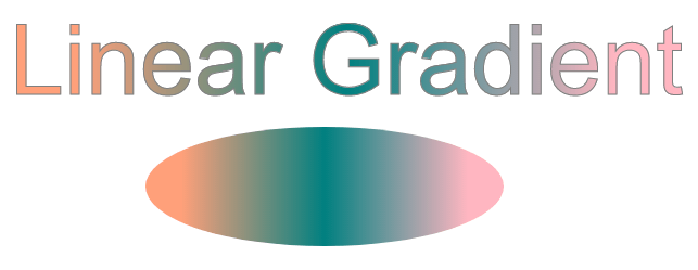
In the example above, the linear gradient id="grad1" is referenced by the <text> and <ellipse> elements in the fill attribute. There are three <stop> nodes inside the linear gradient. In each of them, an offset attribute sets the position the SVG gradient gets a stop-color value.
A radial gradient is more difficult than a linear one. The colors change circularly rather than linearly in it. The attributes cx, cy, and r define the outermost circle for the radial gradient: cx and cy mark the center of this circle. Their values are specified as percentages of the width and height of a shape to fill. Both defaults to 50% if omitted. The fx and fy attributes define the innermost circle for the radial gradient. This is the point at which the SVG gradient «radiates».
In this example, the centers of the innermost and outermost border of the SVG gradient are the same ( radial-gradient.svg).
 1<svg height="300" width="600" xmlns="http://www.w3.org/2000/svg">
 2    <defs>
 3        <radialGradient id="myRG" cx="0.5" cy="0.5" r="0.9" fx="0.5" fy="0.5" spreadMethod="pad">
 4            <stop offset="0%" stop-color="BISQUE" />
 5            <stop offset="60%" stop-color="CADETBLUE" />
 6        </radialGradient>
 7    </defs>
 8    <ellipse cx="300" cy="170" rx="165" ry="55" fill="url(#myRG)" />
 9    <text x="10" y="85" font-family="Arial" stroke="grey" stroke-width="1" font-size="85" fill="url(#myRG)" >Radial Gradient</text>
10</svg>
Let’s see an example of the radial gradient, where the focal point (fx, fy) moved from the center of the object to position fx=25% and fy=25% (
radial-gradient1.svg):
 1<svg height="300" width="600" xmlns="http://www.w3.org/2000/svg">
 2    <defs>
 3        <radialGradient id="myRG" cx="0.5" cy="0.5" r="0.8" fx="25%" fy="25%" spreadMethod="pad">
 4            <stop offset="0%" stop-color="BISQUE" />
 5            <stop offset="30%" stop-color="SILVER" />
 6            <stop offset="60%" stop-color="BISQUE" />
 7            <stop offset="90%" stop-color="GREY" />
 8        </radialGradient>
 9    </defs>
10    <ellipse cx="300" cy="170" rx="185" ry="65" fill="url(#myRG)" fill-opacity="1" />
11    <text x="10" y="85" font-family="Arial" stroke="grey" stroke-width="1" font-size="85" fill="url(#myRG)">Radial Gradient</text>
12</svg>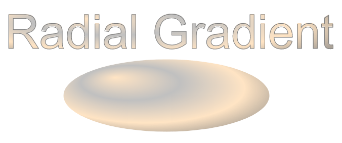
Here we applied several color transitions and received an interesting effect that is well-expressed on the ellipse.
| Problem | Cause | Solution |
|---|---|---|
| Gradient is not visible | The gradient is defined outside <defs> or has no id | Always define <linearGradient> or <radialGradient> inside <defs> and set a unique id |
| Gradient does not apply to a shape | Incorrect reference in fill or stroke | Use fill="url(#gradientId)" or stroke="url(#gradientId)" and ensure the id matches |
| Colors appear in an unexpected direction | Incorrect x1, y1, x2, y2 values | Adjust the gradient vector attributes to control the direction |
| Radial gradient looks clipped | Radius r is too small | Increase the r value or adjust cx and cy to cover the target shape |
| Gradient scales unexpectedly | Default gradientUnits="objectBoundingBox" is used | Set gradientUnits="userSpaceOnUse" for absolute positioning |
| Stops do not blend smoothly | offset values are missing or unordered | Ensure offset values increase from 0% to 100% |
| Gradient not reusable | Gradient defined inline on one element | Define gradients once in <defs> and reuse via url(#id) |
Create a linear gradient fill (horizontal)
1<linearGradient id="gradHorizontal" x1="0%" y1="0%" x2="100%" y2="0%">
2    <stop offset="0%" stop-color="steelblue" />
3    <stop offset="100%" stop-color="lightblue" />
4</linearGradient>
Create a vertical linear gradient
1<linearGradient id="gradVertical" x1="0%" y1="0%" x2="0%" y2="100%">
2    <stop offset="0%" stop-color="orange" />
3    <stop offset="100%" stop-color="purple" />
4</linearGradient>
Apply a gradient to a stroke instead of fill
1<rect x="20" y="20" width="200" height="120"
2      fill="none"
3      stroke="url(#gradHorizontal)"
4      stroke-width="10" />
Create a centered radial gradient
1<radialGradient id="radialCenter" cx="50%" cy="50%" r="50%">
2    <stop offset="0%" stop-color="white" />
3    <stop offset="100%" stop-color="darkblue" />
4</radialGradient>
Move the focal point of a radial gradient
1<radialGradient id="radialFocus" cx="50%" cy="50%" r="60%" fx="25%" fy="25%">
2    <stop offset="0%" stop-color="gold" />
3    <stop offset="100%" stop-color="brown" />
4</radialGradient>
Reuse the same gradient for multiple elements
1<circle cx="80" cy="80" r="50" fill="url(#gradHorizontal)" />
2<rect x="160" y="30" width="100" height="100" fill="url(#gradHorizontal)" />
See Also
Analyzing your prompt, please hold on...
An error occurred while retrieving the results. Please refresh the page and try again.