
Analyzing your prompt, please hold on...
An error occurred while retrieving the results. Please refresh the page and try again.
Filling and stroking are the two core painting operations in SVG. Shapes, paths, and text can use a fill for the interior paint and a stroke for the outline. Both can be applied as presentation attributes, such as fill="red", or inside the CSS style attribute.
This article explains how SVG fill and stroke work, clarifies the difference between properties and attributes, and shows practical ways to control color, opacity, line width, line caps, joins, and dash patterns.
In this article, you will learn to:
fill to paint the inside of SVG shapes, paths, and text.stroke and stroke-width to draw outlines.When an SVG shape is rendered, painting happens in two steps:
Both fill and stroke are optional:
To specify SVG colors, you can use color names, HEX values, RGB values, currentColor, gradients, or patterns. The examples below show several ways to write fill and stroke values in SVG markup.
In SVG, fill and stroke are defined as CSS properties, but they can be applied in different ways.
fill, stroke-width).| Concept | Example |
|---|---|
| CSS property | fill, stroke, stroke-width |
| Presentation attribute | fill="red" stroke="#00ff00"; stroke-width="2" |
| Inline CSS | style="fill:red; stroke:#00ff00; stroke-width:2" |
Throughout this article:
Use presentation attributes for simple SVG markup and inline CSS when several style properties should stay together on the same element. Both forms are common in SVG files.
<path>, <rect>, <circle>, <polyline>, or <text>.fill to paint the interior, or use fill="none" when only the outline should be visible.stroke to define the outline color.stroke-width to make the outline visible and control its thickness.stroke-linecap, stroke-linejoin, or stroke-dasharray when the outline needs a specific shape or pattern.fill-opacity and stroke-opacity when fill and stroke need separate transparency values.The fill property defines how the interior of a shape or text is painted. It applies to SVG shapes such as <rect>, <circle>, <path>, and text elements. If the fill is not specified, the default value is black.
| Value | Description | Example |
|---|---|---|
| color value | Fills the shape with a solid color | fill="red" |
none | Disables filling | fill="none" |
url(#id) | Uses a paint server (gradient or pattern) | fill="url(#gradient1)" |
currentColor | Uses the current text color | fill="currentColor" |
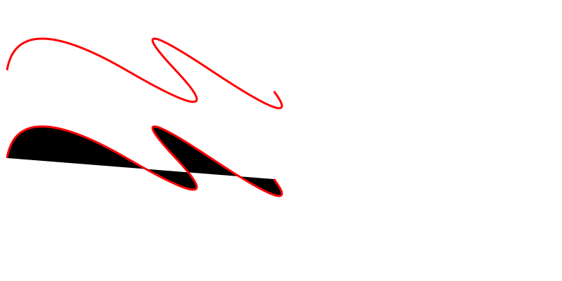
The sample below compares a path with fill="none" and the same path without an explicit fill (
two-paths.svg):
1<svg height="400" width="800" xmlns="http://www.w3.org/2000/svg">
2    <path d="M 10 100 Q 25 10 180 100 T 250 100 T 300 100 T 390 130" stroke="red" stroke-width="3" fill="none" />
3    <path d="M 10 100 Q 25 10 180 100 T 250 100 T 300 100 T 390 130" stroke="red" stroke-width="3" transform="translate(0 125)" />
4</svg>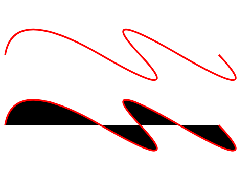
The stroke property defines the paint used for a shape’s outline. Unlike fill, stroke is disabled by default. The stroke is centered on the shape’s path and extends equally inside and outside.
| Property | Description | Example |
|---|---|---|
stroke | Sets the stroke color | stroke="red" |
stroke-width | Controls the thickness of the stroke | stroke-width="5" |
stroke-linecap ValuesFor any line, it is possible to set the shape of its ends. The stroke-linecap property defines how the ends of an SVG line are rendered, and has three possible values:
| Value | Appearance |
|---|---|
butt | Flat edge ending exactly at the path’s end point. |
square | Flat edge that extends half a stroke‑width beyond the end point. |
round | Semi‑circular end whose radius equals half the stroke‑width. |
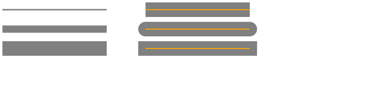
The effect is visible when the line has a noticeable stroke-width. The sample below shows how stroke-width and stroke-linecap define stroke thickness and endpoint shape (
lines.svg).
 1<svg height="200" width="800" xmlns="http://www.w3.org/2000/svg">
 2  <g stroke="grey">
 3    <path stroke-width="3" d="M 5 20 l 215 0" />
 4    <path stroke-width="15" d="M 5 60 l 215 0" />
 5    <path stroke-width="30" d="M 5 100 l 215 0" />
 6  </g>
 7 <g stroke="grey" stroke-width="30">
 8    <path stroke-linecap="butt" d="M 300 20 l 215 0" />
 9    <path stroke-linecap="round" d="M 300 60 l 215 0" />
10    <path stroke-linecap="square" d="M 300 100 l 215 0" />
11  </g>
12  <g stroke="orange" stroke-width="2">
13    <line x1="300" y1="20" x2="515" y2="20" />
14    <path d="M 300 60 l 215 0" />
15    <path d="M 300 100 l 215 0" />
16  </g>
17</svg>
In the sample, the <g> element sets shared properties, such as stroke and stroke-width, for several child paths.
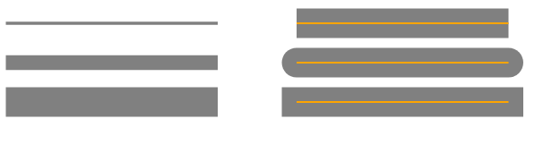
In the example above, the orange guide lines show the original paths, and the grey strokes show how stroke width and line caps change the rendered result.
stroke-linejoin ValuesThe stroke-linejoin property controls the shape of corners where two stroke segments meet. It can use three common values:
| Value | Description |
|---|---|
miter | Extends outer edges to a corner (default). |
round | Rounds the corner with a radius of half the stroke width. |
bevel | Cuts off the corner, creating a flat edge. |
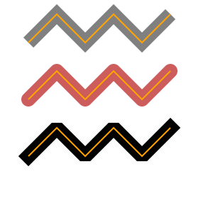
The next sample illustrates stroke-linejoin values (
linejoin.svg):
 1<svg width="300" height="300" xmlns="http://www.w3.org/2000/svg">
 2    <g stroke-width="20" fill="none">
 3        <polyline points="40 60 80 20 120 60 160 20 200 60 240 20" stroke="grey" stroke-linecap="butt"  stroke-linejoin="miter" />
 4        <polyline points="40 140 80 100 120 140 160 100 200 140 240 100" stroke="#CD5C5C" stroke-linecap="round" stroke-linejoin="round" />
 5        <polyline points="40 220 80 180 120 220 160 180 200 220 240 180" stroke="black"  stroke-linecap="square" stroke-linejoin="bevel" />
 6    </g>
 7    <g fill="none" stroke="orange" stroke-width="2">
 8        <polyline points="40 60 80 20 120 60 160 20 200 60 240 20" />
 9        <polyline points="40 140 80 100 120 140 160 100 200 140 240 100" />
10        <polyline points="40 220 80 180 120 220 160 180 200 220 240 180" />
11    </g>
12</svg>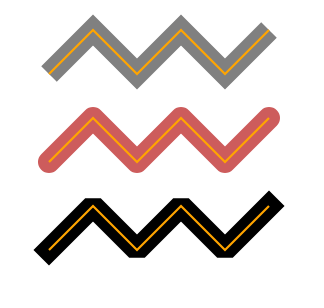
The orange line shows the original polyline path, while the wider colored outline shows the rendered stroke around it.
stroke-dasharrayAll the SVG stroke properties can be applied to any line type, text and outlines of elements like a circle, rectangle, etc. The stroke-dasharray property turns a solid stroke into a patterned dash‑gap sequence. The attribute accepts a list of numbers that define alternating dash and gap lengths (in user units, typically pixels).
1stroke-dasharray="10 5"   /* dash 10, gap 5 */
2stroke-dasharray="20 10 5"/* dash 20, gap 10, dash 5, then repeats */| Property | Description |
|---|---|
stroke-dasharray | Defines dash and gap pattern |
stroke-dashoffset | Shifts the dash pattern |
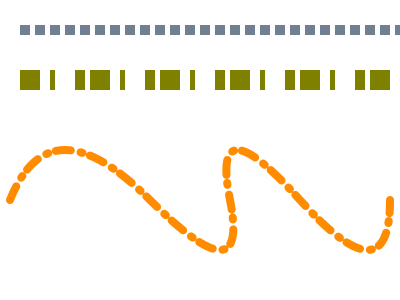
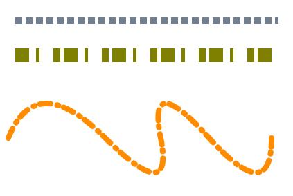
Here is an example of using stroke-dasharray (
dasharray.svg):
1<svg width="400" height="300" xmlns="http://www.w3.org/2000/svg">
2    <line x1="20" y1="30" x2="400" y2="30" style="stroke:rgb(112, 128, 144); fill:none; stroke-width:10; stroke-dasharray:10 5;" />
3    <line x1="20" y1="80" x2="400" y2="80" style="stroke:olive; fill:none; stroke-width: 20; stroke-dasharray: 20 10 5;" />
4    <path d="M 10 200 Q 50 100 150 200 T 230 200 T 300 200 T 390 200" stroke="#FF8C00" stroke-width="8" fill="none" stroke-linecap="round" stroke-dasharray="15 10 2 8" />
5</svg>
For the grey and orange lines, the dash pattern uses an even number of values: each pair means dash length and gap length. If the list has an odd number of values, SVG repeats the list to make an even pattern. For example, 20 10 5 becomes 20 10 5 20 10 5, as shown by the olive line.
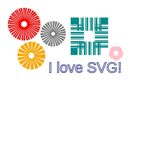
You can experiment with stroke-dasharray attribute. Amazing things can be achieved with SVG strokes and simple SVG shapes (
dasharray-example.svg):
 1<svg height="600" width="600" xmlns="http://www.w3.org/2000/svg">
 2    <g fill="none">
 3        <circle cx="100" cy="100" r="40" stroke="red" stroke-width="55" stroke-dasharray="4,2" />
 4        <circle cx="100" cy="100" r="30" stroke="grey" stroke-width="45" stroke-dasharray="5,2" transform="translate(120,40)" />
 5        <circle cx="100" cy="100" r="35" stroke="orange" stroke-width="45" stroke-dasharray="9,3" transform="translate(30,130)" />
 6		<circle cx="100" cy="100" r="20" stroke="pink" stroke-linecap="round" stroke-width="20" stroke-dasharray="10,15" transform="translate(380,120)" />
 7        <rect x="320" y="100" width="100" height="100" stroke="DarkCyan" stroke-width="55" stroke-dasharray="7 7 3 2" />
 8        <text x="200" y="300" font-family="arial" font-size="60" stroke="#000080" stroke-width="3" stroke-dasharray="2 1">I love SVG!</text>
 9    </g>
10</svg>
| Attribute | Purpose | Example |
|---|---|---|
fill-opacity | Value from 0 (transparent) to 1 (opaque) | fill-opacity="0.6" |
fill-rule | Determines how complex shapes are filled. Options: nonzero (default) or evenodd. | fill-rule="evenodd" |
stroke-opacity | Value from 0 (transparent) to 1 (opaque) | stroke-opacity="0.6" |
stroke-miterlimit | Controls the maximum length of a miter join. Values > 1. | stroke-miterlimit="4" |
stroke-dashoffset | Shifts the start of a dash pattern along the path. | stroke-dashoffset="5" |
These attributes can be combined with the ones shown above to achieve precise visual control.
Set fill="none". This removes the interior paint while keeping the stroke visible. Use stroke and stroke-width to control the outline.
fill paints the inside of a shape, path, or text. stroke paints the outline along the element boundary or path. A shape can use both at the same time.
Dash lengths are measured along the path length. Curves can make dash segments look visually uneven. Adjust the dash and gap values or use stroke-dashoffset to fine-tune the pattern.
stroke-linecap affects the ends of open sub-paths, while stroke-linejoin affects corners where two segments meet. Use round on both when endpoints and corners should look softened.
Yes. Gradients and patterns can be applied with fill="url(#id)" or stroke="url(#id)", where id points to a gradient or pattern definition.
| Problem | Cause | Solution |
|---|---|---|
Shape appears black despite fill attribute | fill attribute omitted or set to default | Add fill="none" or a valid color (fill="#00ff00"). |
| Dashes are missing on a curved line | stroke-dasharray values too small for curve length | Increase dash and gap lengths or use stroke-dashoffset to reposition. |
| Stroke caps look clipped | stroke-linecap not set while using thick strokes | Set stroke-linecap="square" or round for proper end rendering. |
| Miter joins create excessively long spikes | Sharp angles use stroke-linejoin="miter" with a high miter limit | Lower stroke-miterlimit or use stroke-linejoin="round" or bevel. |
| Opacity applied to both fill and stroke unintentionally | Using opacity instead of fill-opacity/stroke-opacity | Replace opacity with fill-opacity and/or stroke-opacity. |
| Goal | SVG Code |
|---|---|
| Disable fill | fill="none" |
| Solid fill color | fill="orange" |
| Semi-transparent fill | fill-opacity="0.5" |
| Enable stroke | stroke="black" |
| Thicker outline | stroke-width="4" |
| Dashed stroke | stroke-dasharray="10 5" |
| Rounded stroke ends | stroke-linecap="round" |
1. Simple solid fill and stroke
1<svg width="120" height="120" xmlns="http://www.w3.org/2000/svg">
2  <circle cx="60" cy="60" r="50" fill="#4CAF50" stroke="#026802" stroke-width="4"/>
3</svg>
2. Dashed line with offset
1<svg width="200" height="40" xmlns="http://www.w3.org/2000/svg">
2  <line x1="10" y1="20" x2="190" y2="20" stroke="#ff6600" stroke-width="8" stroke-dasharray="15 5" stroke-dashoffset="7"/>
3</svg>
Dashed stroke with rounded caps
1<line x1="10" y1="40" x2="140" y2="40"
2      stroke="black"
3      stroke-width="4"
4      stroke-dasharray="10 6"
5 stroke-linecap="round" />fill and stroke can be written directly as SVG attributes.red, orange, or DarkCyan in SVG examples.fill, stroke, and stroke-width are applied to basic SVG shapes.fill, stroke, inline styles, and gradient stops.
Analyzing your prompt, please hold on...
An error occurred while retrieving the results. Please refresh the page and try again.