


Analyzing your prompt, please hold on...
An error occurred while retrieving the results. Please refresh the page and try again.
SVG filters create visual effects such as blur, drop shadows, lighting, saturation changes, hue rotation, and channel adjustments directly in SVG markup. This tutorial explains how filters are defined in <defs>, how filter primitives work together, and how to apply a filter to shapes, text, or images.
Quick Answer: Define an SVG <filter> inside <defs>, add one or more filter primitives such as <feGaussianBlur>, <feOffset>, <feBlend>, <feSpecularLighting>, or <feColorMatrix>, and apply the filter with filter="url(#filter-id)" on the target element.
1<svg width="220" height="140" xmlns="http://www.w3.org/2000/svg">
2  <defs>
3    <filter id="soft-blur">
4      <feGaussianBlur in="SourceGraphic" stdDeviation="5" />
5    </filter>
6  </defs>
7  <circle cx="110" cy="70" r="45" fill="#20b2aa" filter="url(#soft-blur)" />
8</svg>
In this article, you will learn how to:
filter attribute;<feGaussianBlur>, <feColorMatrix>, and <feComponentTransfer>;SVG filters add visual effects to bitmap or vector graphics before the final result is rendered. A filter can blur an element, create a shadow, change color channels, add lighting, distort pixels, or combine several intermediate results into one effect. Because the effect remains part of the SVG markup, it can scale with the vector graphic and stay editable.
A filter is defined with a <filter> element placed inside a <defs> block. The <filter> itself is never rendered; its children – filter primitives – perform the actual work. The <filter> element defines the coordinate system and the region where all filter primitives operate. It supports the following key attributes:
x, y, width, height – define the rectangular region of the graphic to which the filter is appliedfilterUnits – specifies the coordinate system for the filter region (userSpaceOnUse or objectBoundingBox)primitiveUnits – defines the coordinate system used by filter primitives inside the filterid, class, style, and presentation propertiesSVG filters are built by combining multiple filter primitives.
in attribute. The default is in="SourceGraphic". The output of the operation is named with the result attribute so another primitive can reuse it.x, y, width, and height, which is resolved relative to the <filter> region.The table below provides an overview of common SVG filter elements, their purpose, and key attributes. Most rows are filter primitives; light source elements such as <fePointLight> are used inside lighting primitives.
| Category | Filter element | Purpose | Key attributes |
|---|---|---|---|
| Gaussian Blur | <feGaussianBlur> | Blurs the input image using a Gaussian function | in, stdDeviation, result |
| Drop Shadow | <feOffset> | Offsets the alpha channel to create a shadow base | in, dx, dy, result |
| Drop Shadow | <feGaussianBlur> | Softens the offset shadow | in, stdDeviation, result |
| Drop Shadow | <feBlend> | Blends the shadow with the original graphic | in, in2, mode |
| Light Effects | <feGaussianBlur> | Smooths the alpha channel used as a bump map | in, stdDeviation, result |
| Light Effects | <feSpecularLighting> | Generates specular (shiny) lighting using a light source | in, surfaceScale, specularConstant, specularExponent, lighting-color, result |
| Light Effects | <feDiffuseLighting> | Generates diffuse lighting using a light source | in, surfaceScale, diffuseConstant, lighting-color, result |
| Light Effects | <fePointLight> | Defines a point light source for lighting primitives | x, y, z |
| Light Effects | <feComposite> | Combines lighting with the source graphic | in, in2, operator, k1, k2, k3, k4, result |
| Light Effects | <feMerge> | Merges multiple filter results into a single output | – |
| Color Filters | <feColorMatrix> | Applies matrix-based color transformations | in, type, values, result |
| Color Filters | <feComponentTransfer> | Applies per-channel color transfer functions | in, result |
Each filter requires an input image or source graphic to process. Without input, the filter has nothing to render. The in and result attributes are important because they let one primitive pass its output to the next primitive in the chain.
<defs> block to hold filter definitions that should not render by themselves.<filter> element and give it a stable id.<feGaussianBlur>, <feOffset>, <feBlend>, or <feColorMatrix>.in and result when a later primitive must consume the output of an earlier one.x, y, width, and height when blur, shadow, or lighting extends outside the original shape.filter="url(#id)".Gaussian blur softens an image or shape by spreading nearby pixels according to a Gaussian function. In SVG, it is commonly used for shadows, glow effects, soft focus, reduced detail, and directional blur.
The <feGaussianBlur> primitive creates the blur. The stdDeviation attribute controls the blur radius. A single value blurs equally in both directions. Two values create directional blur: the first value applies along the x-axis, and the second value applies along the y-axis.
The example below compares different stdDeviation values in one SVG file (
gaussian-blur.svg):
 1<svg height="400" width="600" xmlns="http://www.w3.org/2000/svg">
 2    <defs>
 3        <filter id="f1" x="-20%" y="-20%" width="140%" height="140%">
 4            <feGaussianBlur in="SourceGraphic" stdDeviation="10" />
 5        </filter>
 6        <filter id="f2" x="-20%" y="-20%" width="140%" height="140%">
 7            <feGaussianBlur in="SourceGraphic" stdDeviation="10, 0" />
 8        </filter>
 9        <filter id="f3" x="-20%" y="-20%" width="140%" height="140%">
10            <feGaussianBlur in="SourceGraphic" stdDeviation="0,10" />
11        </filter>
12    </defs>
13    <g stroke="none" fill="#20B2AA">
14        <ellipse cx="60" cy="80" rx="55" ry="35" />
15        <ellipse cx="200" cy="80" rx="55" ry="35" filter="url(#f1)" />
16        <ellipse cx="340" cy="80" rx="55" ry="35" filter="url(#f2)" />
17        <ellipse cx="500" cy="80" rx="55" ry="35" filter="url(#f3)" />
18    </g>
19</svg>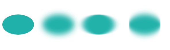
Blur usually expands the visible result beyond the original shape. If the filter region is too small, the blurred edges are clipped. The example expands the filter region with negative x and y values so the softened edges remain visible.
You can create a Gaussian Blur effect in C# using Aspose.SVG for .NET API. To learn more about the Aspose.Svg.Filters namespace and consider detailed C# examples of using the SVGFEGaussianBlurElement class to apply the Gaussian Blur effect to SVG elements and bitmaps, please see the
Gaussian Blur article.
A drop shadow separates a shape or text from the background. In SVG, a shadow is usually built from the source alpha channel, an offset, a blur, and a blend or merge step.
The <feOffset> filter primitive is used to offset a layer in SVG. In addition to the in and result attributes, this primitive accepts two main attributes – dx and dy, which define the distance the layer is offset along the x and y axes, respectively.
The <feBlend> filter primitive blends two input layers; its mode attribute defines the blending mode.
The following SVG creates a soft drop shadow for an ellipse ( drop-shadow-effect.svg):
 1<svg height="200" width="200" xmlns="http://www.w3.org/2000/svg">
 2    <defs>
 3        <filter id="shadow" x="-20%" y="-20%" width="150%" height="150%">
 4            <feOffset result="offset" in="SourceAlpha" dx="10" dy="10" />
 5            <feGaussianBlur result="blur" in="offset" stdDeviation="10" />
 6            <feBlend in="SourceGraphic" in2="blur" mode="normal" />
 7        </filter>
 8    </defs>
 9    <ellipse cx="95" cy="90" rx="75" ry="55" fill="#20B2AA" filter="url(#shadow)" />
10</svg>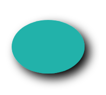
Step-by-step explanation
<feOffset> takes in="SourceAlpha", shifts the alpha mask 10 px right and 10 px down, and stores the intermediate result as "offset". Using SourceAlpha creates a shadow from the shape outline, not from the fill color.<feGaussianBlur> takes in="offset", applies a blur of 10, and stores the result in a temporary buffer named "blur".<feBlend> takes in="SourceGraphic" and in2="blur", then draws the original ellipse together with the blurred offset shadow.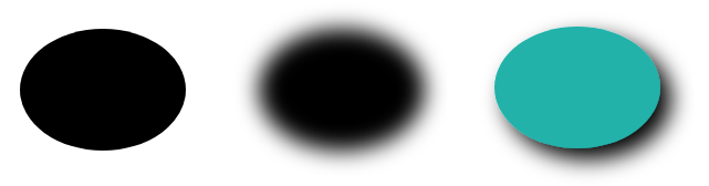
You can create a drop shadow effect in C# using Aspose.SVG for .NET API. See the Drop Shadow Effect article to learn more about the Aspose.Svg.Filters namespace and consider detailed C# examples of applying the drop shadow effect to SVG shapes and text.
SVG lighting effects are created inside one <filter> with lighting primitives such as <feDiffuseLighting> and <feSpecularLighting>, plus light source elements such as <fePointLight>. The lighting primitives use the source alpha channel as a surface map and calculate how light should appear on that surface.
The <fePointLight> element defines a point light source and is used as a child of <feDiffuseLighting> or <feSpecularLighting>. Its x, y, and z attributes set the light position. Diffuse lighting creates a matte illuminated surface, while specular lighting creates a shinier highlight.
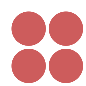
Consider an example of a light effect ( light-effect.svg):
 1<svg height="300" width="300" xmlns="http://www.w3.org/2000/svg">
 2    <defs>
 3        <filter id = "F1">
 4            <feGaussianBlur in = "SourceAlpha" stdDeviation = "4" result = "blur" />
 5            <feSpecularLighting result = "light" in = "blur" specularExponent = "25" lighting-color = "#bbbbbb">
 6                <fePointLight x = "80" y = "60" z = "200" />
 7            </feSpecularLighting>
 8            <feComposite in = "SourceGraphic" in2 = "light" operator = "arithmetic" k1 ="0" k2 ="1" k3 ="1" k4 ="0" />
 9        </filter>
10    </defs>
11    <g  fill = "INDIANRED" filter = "url(#F1)">
12        <circle cx="100" cy="100" r="60" />
13        <circle cx="100" cy="230" r="60" />
14        <circle cx="230" cy="100" r="60" />
15        <circle cx="230" cy="230" r="60" />
16    </g>
17</svg>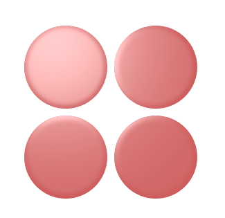
Step-by-step explanation
In this example, the light effect is created by a chain of SVG elements inside one <filter>: three elements are filter primitives, and <fePointLight> defines the light source:
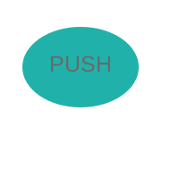
<feGaussianBlur> takes input SourceAlpha, which is the alpha channel of the source image. The result is stored in a temporary buffer named "blur".<feSpecularLighting> and its child <fePointLight>. <feSpecularLighting> uses the "blur" buffer as a surface elevation map and stores the highlight in "light".<feComposite> takes in="SourceGraphic" and in2="light", then combines them with the arithmetic compositing operation. For each pixel, the arithmetic operator computes: result = k1·in1·in2 + k2·in1 + k3·in2 + k4.The code below demonstrates one more example of chaining filter primitives and a light source inside one <filter> (
button.svg):
 1<svg height="200" width="200" xmlns="http://www.w3.org/2000/svg">
 2    <defs>
 3        <filter id="myF" x="-20%" y="-20%" width="160%" height="160%">
 4            <feGaussianBlur in="SourceAlpha" stdDeviation="5" result="blur" />
 5            <feOffset in="blur" dx="5" dy="5" result="offsetBlur" />
 6            <feSpecularLighting in="offsetBlur" surfaceScale="8" specularConstant="0.7" specularExponent="2" lighting-color="#bbbbbb" result="specOut">
 7                <fePointLight x="-100" y="-100" z="100" />
 8            </feSpecularLighting>
 9            <feComposite in="specOut" in2="SourceAlpha" operator="in" result="specOut" />
10            <feComposite in="SourceGraphic" in2="specOut" operator="arithmetic" k1="1.5" k2="0.5" k3="1" k4="0" result="litPaint" />
11            <feMerge>
12                <feMergeNode in="offsetBlur" />
13                <feMergeNode in="litPaint" />
14            </feMerge>
15        </filter>
16    </defs>
17    <ellipse cx="85" cy="70" rx="65" ry="45" fill="#20B2AA" filter="url(#myF)" />
18    <g fill="#696969" font-size="25" font-family="arial">
19        <text x="55" y="80">PUSH</text>
20    </g>
21</svg>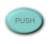
In SVG Lighting Effects, you learn how to combine filter primitives and light sources to create and control SVG lighting effects in C# using the Aspose.SVG for .NET API.
In SVG, you can create a wide variety of color effects that are supported in almost all modern browsers. When it comes to color handling, <feColorMatrix> is often the best option. It is a filter primitive that uses a matrix to affect the color values for each RGBA channel. The <feComponentTransfer> element is another powerful SVG filter primitive. It gives control over the individual RGBA channels of the image, allowing you to create Photoshop-like SVG effects; for example, it can be used to posterize images.
This section focuses on two practical color primitives: <feColorMatrix> for matrix-based transformations and <feComponentTransfer> for per-channel edits.
The <feColorMatrix> filter primitive applies a matrix transformation to the RGBA channels of each pixel in the input image. As a result, a new set of color and alpha values is produced. The type attribute can be:
matrix – custom 5×4 matrixsaturate – adjusts saturationhueRotate – rotates hue around the color wheelluminanceToAlpha – converts luminance to alphaLet’s see examples of the saturate operation use ( saturation.svg):
1<svg width="640" height="480" viewBox="0 0 640 480" xmlns="http://www.w3.org/2000/svg">
2    <defs>
3        <filter id="myFilter">
4            <feColorMatrix in="SourceGraphic" type="saturate" values="0"></feColorMatrix>
5        </filter>
6    </defs>
7    <image filter="url(#myFilter)" href="https://docs.aspose.com/svg/images/drawing/park.jpg" width="100%" height="100%" />
8</svg>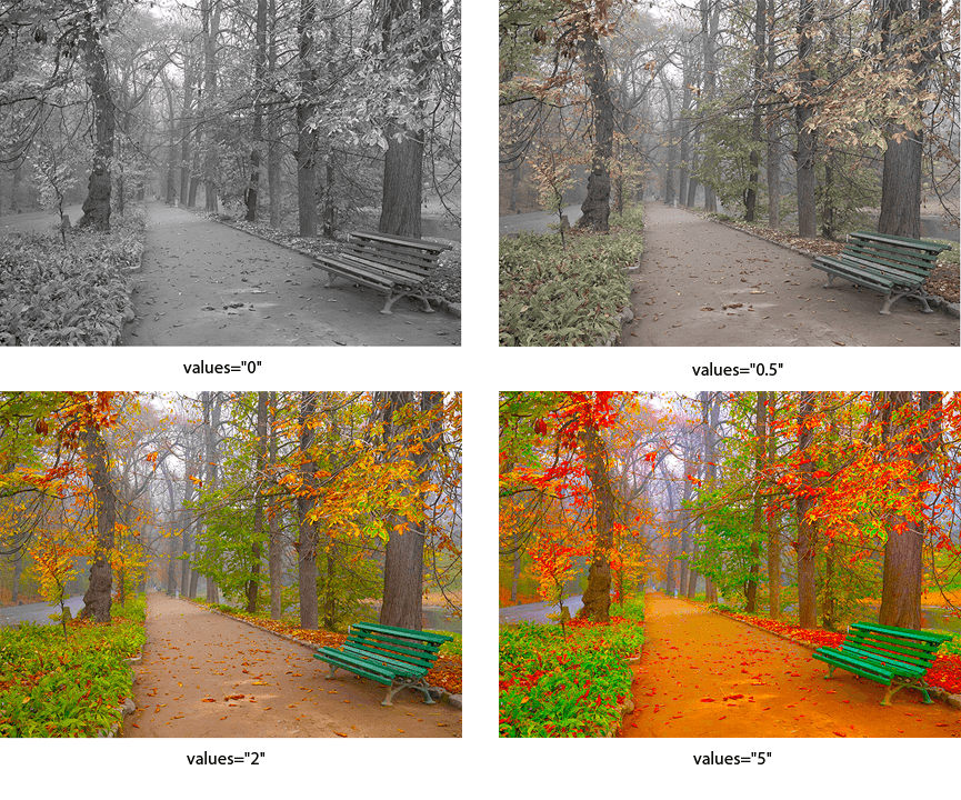
A specific color-matrix operation is hue rotation around the color wheel. The following example illustrates the hueRotate operation.
1<svg width="640" height="480" viewBox="0 0 640 480" xmlns="http://www.w3.org/2000/svg">
2    <defs>
3        <filter id="hueR">
4            <feColorMatrix in="SourceGraphic" type="hueRotate" values="40"></feColorMatrix>
5        </filter>
6    </defs>
7    <image filter="url(#hueR)" href="https://docs.aspose.com/svg/images/drawing/park.jpg" width="100%" height="100%" />
8</svg>
The figure below contains a series of images that illustrate the different hueRotate values.
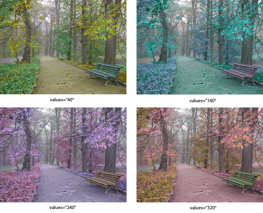
The <feComponentTransfer> primitive performs per-channel operations on RGBA values. It is useful for brightness adjustment, contrast changes, channel balancing, and posterized color effects.
The example below changes the red, green, and blue channels independently:
 1<svg width="640" height="480" viewBox="0 0 640 480" xmlns="http://www.w3.org/2000/svg">
 2    <defs>
 3        <filter id="RGBA">
 4            <feComponentTransfer>
 5                <feFuncR type="linear" slope="2.0" />
 6                <feFuncG type="linear" slope="1.7" />
 7                <feFuncB type="linear" slope="0.1" />
 8                <feFuncA type="identity" />
 9            </feComponentTransfer>
10        </filter>
11    </defs>
12    <image filter="url(#RGBA)" href="https://docs.aspose.com/svg/images/drawing/park.jpg" width="100%" height="100%" />
13</svg>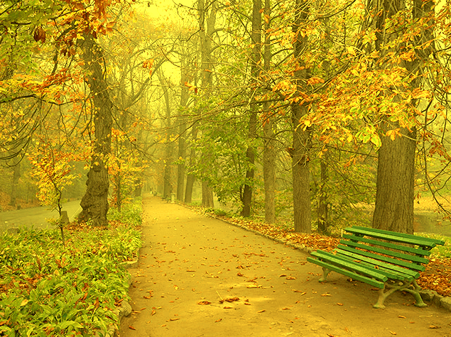
The <feComponentTransfer> element modifies color channels through child transfer function elements: <feFuncR>, <feFuncG>, <feFuncB>, and <feFuncA>. Each child element controls the red, green, blue, or alpha channel.
The type attribute selects the transfer function used for that channel. SVG supports five function types: identity, table, discrete, linear, and gamma.
Read the
Color Filters article if you want to create color filters in C#. You will learn about the feColorMatrix and feComponentTransfer filter primitives and look at C# code snippets that show how to use them.
| Problem | Cause | Solution |
|---|---|---|
| Filter output is clipped | The filter region (x, y, width, height) is too small | Expand the filter region using negative x and y values and larger width and height |
| Drop shadow is not visible | The shadow uses SourceGraphic instead of SourceAlpha or is blended incorrectly | Use SourceAlpha as input for <feOffset> and blend it with the original graphic |
| Lighting effect looks flat or invisible | The alpha channel is not prepared as a bump map or lighting values are too low | Blur SourceAlpha before lighting and adjust lighting parameters |
| Colors change unexpectedly | Incorrect color matrix or transfer values are applied | Apply color filters directly to SourceGraphic and verify values step by step |
Create a simple Gaussian blur
1<filter id="blur">
2    <feGaussianBlur in="SourceGraphic" stdDeviation="6" />
3</filter>
Apply directional blur (horizontal or vertical)
1<filter id="directionalBlur">
2    <feGaussianBlur in="SourceGraphic" stdDeviation="8 0" />
3</filter>
Add a soft drop shadow
1<filter id="shadow" x="-20%" y="-20%" width="140%" height="140%">
2    <feOffset in="SourceAlpha" dx="6" dy="6" result="offset" />
3    <feGaussianBlur in="offset" stdDeviation="6" result="blur" />
4    <feBlend in="SourceGraphic" in2="blur" mode="normal" />
5</filter>
Clip a blurred shadow to the original shape
1<filter id="clippedShadow">
2    <feOffset in="SourceAlpha" dx="4" dy="4" result="offset" />
3    <feGaussianBlur in="offset" stdDeviation="4" result="blur" />
4    <feComposite in="blur" in2="SourceAlpha" operator="in" result="shadow" />
5    <feComposite in="SourceGraphic" in2="shadow" operator="over" />
6</filter>
Convert an image to grayscale
1<filter id="grayscale">
2    <feColorMatrix type="saturate" values="0" />
3</filter>
Adjust brightness and contrast
1<filter id="brightnessContrast">
2    <feComponentTransfer>
3        <feFuncR type="linear" slope="1.2" intercept="0.1" />
4        <feFuncG type="linear" slope="1.2" intercept="0.1" />
5        <feFuncB type="linear" slope="1.2" intercept="0.1" />
6    </feComponentTransfer>
7</filter>
Combine multiple filter results
1<filter id="combined">
2    <feGaussianBlur in="SourceAlpha" stdDeviation="3" result="blur" />
3    <feOffset in="blur" dx="4" dy="4" result="offset" />
4    <feMerge>
5        <feMergeNode in="offset" />
6        <feMergeNode in="SourceGraphic" />
7    </feMerge>
8</filter>Define the filter in <defs> and apply it with filter="url(#filter-id)" on a shape, text element, group, or image. The id in the filter definition must match the value used in the filter attribute.
Blur and shadow effects often extend outside the original object bounds. Expand the filter region with x, y, width, and height so the generated pixels have enough space to render.
Use <feColorMatrix> when one matrix operation should transform color values, such as grayscale, saturation, or hue rotation. Use <feComponentTransfer> when you need separate control over red, green, blue, or alpha channels.
Yes. The SVG Filters in C# article shows how to create SVG filters programmatically with Aspose.SVG for .NET.
<feGaussianBlur> primitive.<feColorMatrix> and <feComponentTransfer> in C# examples.
Analyzing your prompt, please hold on...
An error occurred while retrieving the results. Please refresh the page and try again.