
Analyzing your prompt, please hold on...
An error occurred while retrieving the results. Please refresh the page and try again.
SVG gradients create smooth color transitions that can fill or stroke SVG shapes, text, and paths. This tutorial explains how <linearGradient>, <radialGradient>, <stop>, fill="url(#id)", and stroke="url(#id)" work together in SVG markup.
Quick Answer: Define a gradient inside <defs>, give it an id, add <stop> elements with offset and stop-color, and reference the gradient from a shape or text element with fill="url(#id)" or stroke="url(#id)".
1<svg width="220" height="120" xmlns="http://www.w3.org/2000/svg">
2  <defs>
3    <linearGradient id="brand-gradient" x1="0%" y1="0%" x2="100%" y2="0%">
4      <stop offset="0%" stop-color="steelblue" />
5      <stop offset="100%" stop-color="gold" />
6    </linearGradient>
7  </defs>
8  <rect x="20" y="20" width="180" height="80" fill="url(#brand-gradient)" />
9</svg>
In this article, you will learn how to:
<defs>;fill and stroke;id, url(#id), offset, and gradientUnits;A gradient is a smooth color transition between points on a drawing surface. SVG supports two main gradient elements: <linearGradient> and <radialGradient>. Both are paint servers, which means they are defined once and then referenced by visible elements.
Place <linearGradient> or <radialGradient> inside <defs> so the gradient can be reused. The id attribute gives the gradient a name, and visible elements reference it through fill="url(#id)" or stroke="url(#id)". This keeps the color transition separate from the shapes, text, or paths that use it.
<defs> block to store reusable gradient definitions.<linearGradient> for a straight color transition or <radialGradient> for a transition that radiates from a center or focal point.id so visible elements can reference the gradient.<stop> elements with increasing offset values and stop-color values.fill="url(#id)" or stroke="url(#id)".x1, y1, x2, y2, cx, cy, r, fx, fy, or gradientUnits when the direction or scale is not what you expect.A linear gradient changes color along a straight line called the gradient vector. The x1, y1, x2, and y2 attributes define that vector. With the default gradientUnits="objectBoundingBox", values are usually written as percentages or fractions from 0 to 1; with gradientUnits="userSpaceOnUse", they are interpreted in the current SVG coordinate system.
The <linearGradient> element contains nested <stop> elements. Each stop defines a color at a specific position along the vector. The offset attribute sets the position, and the color can be set with the stop-color attribute or through CSS style declarations (
linear-gradient.svg).
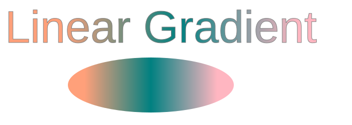
 1<svg height="250" width="700" xmlns="http://www.w3.org/2000/svg">
 2	<defs>
 3		<linearGradient id="grad1" x1="0%" y1="0%" x2="100%" y2="0%">
 4			<stop offset="10%" style="stop-color:LIGHTSALMON" />
 5			<stop offset="50%" style="stop-color:TEAL" />
 6			<stop offset="90%" style="stop-color:LIGHTPINK" />
 7		</linearGradient>
 8	</defs>
 9    <ellipse cx="300" cy="170" rx="165" ry="55" fill="url(#grad1)" />
10    <text x="10" y="85" font-family="Arial" stroke="grey" stroke-width="1" font-size="90" fill="url(#grad1)" >Linear Gradient</text>
11</svg>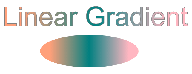
In the example above, the <text> and <ellipse> elements both use fill="url(#grad1)", so they share the same gradient definition. The three <stop> elements create the visible color transition from LIGHTSALMON to TEAL to LIGHTPINK.
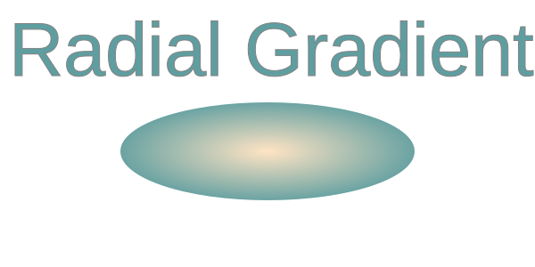
A radial gradient changes color outward from a center or focal point. The cx, cy, and r attributes define the end circle of the gradient: cx and cy set its center, and r sets its radius. The fx and fy attributes define the focal point where the gradient visually begins. If cx and cy are omitted, both default to 50%; if fx and fy are omitted, they default to the same values as cx and cy.
In this example, the center and focal point use the same coordinates. With the default objectBoundingBox coordinate system, 0.5 means the middle of the target element, so the radial gradient spreads evenly from the center (
radial-gradient.svg).
 1<svg height="300" width="600" xmlns="http://www.w3.org/2000/svg">
 2    <defs>
 3        <radialGradient id="myRG" cx="0.5" cy="0.5" r="0.9" fx="0.5" fy="0.5" spreadMethod="pad">
 4            <stop offset="0%" stop-color="BISQUE" />
 5            <stop offset="60%" stop-color="CADETBLUE" />
 6        </radialGradient>
 7    </defs>
 8    <ellipse cx="300" cy="170" rx="165" ry="55" fill="url(#myRG)" />
 9    <text x="10" y="85" font-family="Arial" stroke="grey" stroke-width="1" font-size="85" fill="url(#myRG)" >Radial Gradient</text>
10</svg>
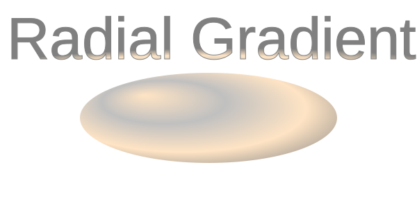
The next example moves the focal point from the center to fx="25%" and fy="25%". This shifts the visual highlight toward the upper-left part of the filled shape (
radial-gradient1.svg):
 1<svg height="300" width="600" xmlns="http://www.w3.org/2000/svg">
 2    <defs>
 3        <radialGradient id="myRG" cx="0.5" cy="0.5" r="0.8" fx="25%" fy="25%" spreadMethod="pad">
 4            <stop offset="0%" stop-color="BISQUE" />
 5            <stop offset="30%" stop-color="SILVER" />
 6            <stop offset="60%" stop-color="BISQUE" />
 7            <stop offset="90%" stop-color="GREY" />
 8        </radialGradient>
 9    </defs>
10    <ellipse cx="300" cy="170" rx="185" ry="65" fill="url(#myRG)" fill-opacity="1" />
11    <text x="10" y="85" font-family="Arial" stroke="grey" stroke-width="1" font-size="85" fill="url(#myRG)">Radial Gradient</text>
12</svg>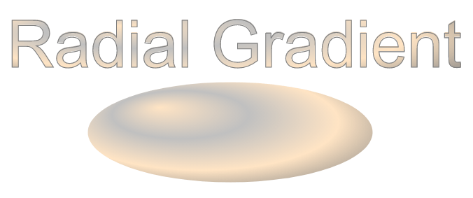
Here, several color stops and an off-center focal point create a stronger highlight on the ellipse. This is a common way to make flat SVG geometry look more dimensional.
| Problem | Cause | Solution |
|---|---|---|
| Gradient is not visible | The gradient has no id, the reference is wrong, or the target element does not use it | Give the gradient a unique id, reference it with url(#id), and keep definitions in <defs> for clarity |
| Gradient does not apply to a shape | Incorrect reference in fill or stroke | Use fill="url(#gradientId)" or stroke="url(#gradientId)" and ensure the id matches |
| Colors appear in an unexpected direction | Incorrect x1, y1, x2, y2 values | Adjust the gradient vector attributes to control the direction |
| Radial gradient does not cover the expected area | Radius r, center, focal point, or gradientUnits do not match the target shape | Adjust r, cx, cy, fx, fy, or set gradientUnits="userSpaceOnUse" when you need fixed coordinates |
| Gradient scales unexpectedly | Default gradientUnits="objectBoundingBox" is used | Set gradientUnits="userSpaceOnUse" for absolute positioning |
| Stops do not blend as expected | offset values are missing, repeated unintentionally, or not in the intended order | Check that offset values follow the desired order from 0% to 100% |
| Gradient is duplicated many times | The same stops are repeated in several places | Define the gradient once in <defs> and reuse it with url(#id) |
Create a linear gradient fill (horizontal)
1<linearGradient id="gradHorizontal" x1="0%" y1="0%" x2="100%" y2="0%">
2    <stop offset="0%" stop-color="steelblue" />
3    <stop offset="100%" stop-color="lightblue" />
4</linearGradient>
Create a vertical linear gradient
1<linearGradient id="gradVertical" x1="0%" y1="0%" x2="0%" y2="100%">
2    <stop offset="0%" stop-color="orange" />
3    <stop offset="100%" stop-color="purple" />
4</linearGradient>
Apply a gradient to a stroke instead of fill
1<rect x="20" y="20" width="200" height="120"
2      fill="none"
3      stroke="url(#gradHorizontal)"
4      stroke-width="10" />
Create a centered radial gradient
1<radialGradient id="radialCenter" cx="50%" cy="50%" r="50%">
2    <stop offset="0%" stop-color="white" />
3    <stop offset="100%" stop-color="darkblue" />
4</radialGradient>
Move the focal point of a radial gradient
1<radialGradient id="radialFocus" cx="50%" cy="50%" r="60%" fx="25%" fy="25%">
2    <stop offset="0%" stop-color="gold" />
3    <stop offset="100%" stop-color="brown" />
4</radialGradient>
Reuse the same gradient for multiple elements
1<circle cx="80" cy="80" r="50" fill="url(#gradHorizontal)" />
2<rect x="160" y="30" width="100" height="100" fill="url(#gradHorizontal)" />Define the gradient in <defs>, give it an id, and set the target shape’s fill or stroke to url(#id). The reference must match the gradient id exactly.
Use <linearGradient> for a color transition along a straight line. Use <radialGradient> when the color should spread outward from a center or focal point.
Yes. Define the gradient in <defs> and set stroke="url(#id)" on the target element. Use stroke-width large enough to make the gradient visible.
By default, gradientUnits="objectBoundingBox" maps the gradient to each element’s bounding box. Use gradientUnits="userSpaceOnUse" when you want the same coordinate-based gradient placement across multiple elements.
Yes. In Python via .NET, load the SVG and update the stop-color attributes on <stop> elements. See
Change SVG Colors in Python for a workflow that edits gradient stops.
fill, and stroke used by gradient examples.
Analyzing your prompt, please hold on...
An error occurred while retrieving the results. Please refresh the page and try again.