
Analyzing your prompt, please hold on...
An error occurred while retrieving the results. Please refresh the page and try again.
Simple vector shapes are the building blocks of logos, diagrams, icons, charts, and many other SVG graphics. In an SVG file, each basic shape is represented by an element whose attributes define its position, size, and visual style. You can customize fill color, opacity, corner rounding, stroke width, and more.
In this article, you will learn to:
fill, stroke, opacity, and rounded corners.<rect> – Rectangle ElementThe <rect> element creates rectangles and rounded-corner rectangles. A rectangle is positioned by its top-left corner and then sized with width and height.
| Attribute | Description | Default |
|---|---|---|
| x | X‑coordinate of the top‑left corner | 0 |
| y | Y‑coordinate of the top‑left corner | 0 |
| width | Rectangle width | – |
| height | Rectangle height | – |
| rx | Horizontal radius for rounded corners | 0 |
| ry | Vertical radius for rounded corners | 0 |
You can style the rectangle with presentation attributes or with the style attribute. The example below uses fill, stroke, opacity, and corner radius values to show how geometry and painting work together.
1<svg width="500" height="550" xmlns="http://www.w3.org/2000/svg">
2    <rect x="60" y="100" width="70" height="40" rx="10" ry="10" style="fill:#778899; stroke:#FF4500; stroke-width:5; fill-opacity:0.7; stroke-opacity:0.6" />
3</svg>
The first example creates a rectangle whose top-left corner is at (60, 100). The rectangle is 70 units wide and 40 units high, with rounded corners and an orange stroke. The second example removes rounded corners and uses a larger square-like rectangle, so the difference between rx/ry and ordinary sharp corners is easy to see.
1<svg width="500" height="550" xmlns="http://www.w3.org/2000/svg">
2    <rect x="120" y="140" width="90" height="90" style="fill:grey; stroke-width:3; stroke:rgb(0,0,0)" />
3</svg>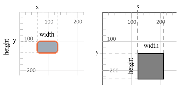
Colors can be specified as:
fill:blue (140+ CSS color names).fill:rgb(0,0,255).fill:#0000ff.<circle> – Circle ElementThe <circle> element draws a perfect circle. Its position is defined by the center coordinates cx and cy, and its size is defined by the radius r.
| Attribute | Description | Default |
|---|---|---|
| cx | X‑coordinate of the circle center | 0 |
| cy | Y‑coordinate of the circle center | 0 |
| r | Radius of the circle | – |
1<svg width="300" height="550" xmlns="http://www.w3.org/2000/svg">
2    <circle cx="250" cy="100" r="60" style="fill:red; stroke-width:3; stroke:rgb(0,0,0); fill-opacity:0.7" />
3</svg>
The code below sets cx and cy for the center point and r for the radius. Because the circle is painted with both fill and stroke, the output also demonstrates how shape geometry and painting properties combine.
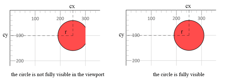
The circle extends beyond the 300 px viewport width; a width of at least 310 px (cx + r) is required for full visibility.
<ellipse> – Ellipse ElementThe <ellipse> element creates an oval shape. It also uses a center point, but it has two radii: rx for horizontal size and ry for vertical size.
| Attribute | Description | Default |
|---|---|---|
| cx | X‑coordinate of the ellipse center | 0 |
| cy | Y‑coordinate of the ellipse center | 0 |
| rx | Horizontal radius (half the width) | – |
| ry | Vertical radius (half the height) | – |
1<svg width="500" height="550" xmlns="http://www.w3.org/2000/svg">
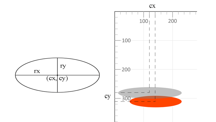
2    <ellipse cx="140" cy="310" rx="90" ry="20" style="fill:OrangeRed" />
3    <ellipse cx="120" cy="280" rx="110" ry="20" style="fill:grey; fill-opacity:0.5" />
4</svg>
The example draws two ellipses with different radii and opacity. The second ellipse (grey, 50% opacity) is rendered on top of the first because SVG paints elements in source order: later elements appear above earlier ones.
<line> – Line ElementThe <line> element draws a straight segment between two coordinate points. It has no fill area, so visible lines normally need stroke and stroke-width.
| Attribute | Description | Default |
|---|---|---|
| x1 | X‑coordinate of the start point | – |
| y1 | Y‑coordinate of the start point | – |
| x2 | X‑coordinate of the end point | – |
| y2 | Y‑coordinate of the end point | – |
| style (stroke, stroke-width) | Visual styling of the line | – |
1<svg width="500" height="550" xmlns="http://www.w3.org/2000/svg">
2    <line x1="30" y1="30" x2="350" y2="290" style="stroke:rgb(255,0,0); stroke-width:3" />
3    <line x1="30" y1="50" x2="300" y2="350" style="stroke:grey; stroke-width:5" />
4    <line x1="20" y1="80" x2="100" y2="200" style="stroke:orangered; stroke-width:8" />
5</svg>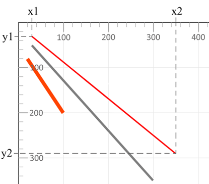
Each line in the example has a different start point, end point, color, and thickness. The stroke property defines line color, while stroke-width sets its thickness.
<polyline> – Polyline ElementThe <polyline> element draws a series of connected straight segments. It is commonly used for broken lines, chart lines, simple outlines, and open angular shapes.
| Attribute | Description | Default |
|---|---|---|
| points | List of x,y coordinate pairs defining the polyline vertices | – |
| style (fill, stroke, stroke-width) | Visual styling of the shape | – |
1<svg width="500" height="550" xmlns="http://www.w3.org/2000/svg">
2    <polyline points="280,290 300,220 320,290" style="fill:grey; stroke:grey; stroke-width:2; fill-opacity:0.5" />
3    <polyline points="220,200 240,180 260,200 280,180 300,200 320,180 340,200" style="fill:none; stroke:red; stroke-width:6" />
4</svg>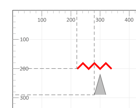
The first polyline uses three points and visually forms a triangle-like shape. The second polyline is an open zig-zag line with fill="none", which is usually the clearest choice when a polyline should behave like a line rather than a filled shape.
For more details on SVG styling, see Fills and Strokes in SVG.
<polygon> – Polygon ElementThe <polygon> element defines a closed shape formed by a series of connected points. SVG automatically connects the last point back to the first point.
| Attribute | Description | Default |
|---|---|---|
| points | List of x,y coordinate pairs for each vertex (must contain at least three points) | – |
| style (fill, stroke, stroke-width) | Visual styling of the polygon | – |
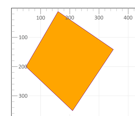
1<svg width="500" height="550" xmlns="http://www.w3.org/2000/svg">
2    <polygon points="160,10 350,140 210,350 50,199" style="fill:orange;stroke:purple;stroke-width:1" />
3</svg>
The polygon example uses four coordinate pairs in the points attribute. Since <polygon> is always closed, the purple stroke returns from the last point to the first point automatically.
<svg> element with width, height, and xmlns.<rect>, <circle>, <ellipse>, <line>, <polyline>, or <polygon>.fill, stroke, stroke-width, or opacity.A minimal SVG document can combine all basic shapes into a single illustration. This is useful when you need to build diagrams, badges, icons, or generated graphics from simple primitives.
 1<svg width="500" height="550" xmlns="http://www.w3.org/2000/svg">
 2    <line x1="30" y1="30" x2="350" y2="290" style="stroke:rgb(255,0,0); stroke-width:3" />
 3    <line x1="30" y1="50" x2="300" y2="350" style="stroke:grey; stroke-width:5" />
 4    <rect x="60" y="100" width="70" height="40" rx="10" ry="10" style="fill:#778899; stroke:#FF4500; stroke-width:5; fill-opacity:0.7; stroke-opacity:0.6" />
 5    <polygon points="160,10 350,140 210,350 50,199" style="fill:orange; stroke:purple; stroke-width:1; fill-opacity:1" />
 6    <rect x="120" y="150" width="90" height="90" style="fill:grey; stroke-width:3; stroke:rgb(0,0,0)" />
 7    <circle cx="250" cy="100" r="60" style="fill:red; stroke:black; stroke-width:3; fill-opacity:0.7" />
 8    <ellipse cx="140" cy="310" rx="90" ry="20" style="fill:OrangeRed" />
 9    <ellipse cx="120" cy="280" rx="110" ry="20" style="fill:grey; fill-opacity:0.5" />
10    <polyline points="220,200 240,180 260,200 280,180 300,200 320,180 340,200" style="fill:none; stroke:red; stroke-width:6" />
11    <line x1="20" y1="80" x2="100" y2="200" style="stroke:orangered; stroke-width:8" />
12    <polyline points="280,290 300,220 320,290" style="fill:grey; stroke:grey; stroke-width:2; fill-opacity:0.5" />
13</svg>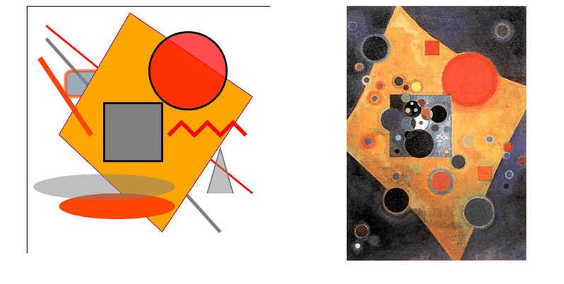
The illustration “SVG Basic Shapes” contains all the figures described above: lines, rectangles, a circle, ellipses, polylines, and a polygon. Nearby is the famous painting “Pink Accent” by Wassily Kandinsky, which shows how simple geometric forms can become a more expressive composition.
| Problem | Likely Cause | How to Fix |
|---|---|---|
| Shape is not visible | SVG viewport is smaller than the shape | Increase width / height or adjust the viewBox |
| Shape is clipped | Coordinates exceed the viewport bounds | Recalculate coordinates or expand the SVG canvas |
| Fill color does not appear | fill="none" or fill-opacity="0" is set | Set a valid fill value and opacity |
| Stroke is invisible | stroke-width="0" or missing stroke | Define both stroke and a positive stroke-width |
| Rounded corners do not work | rx / ry values are missing or zero | Set non-zero rx and ry attributes |
| Elements overlap unexpectedly | SVG renders elements in source order | Reorder elements in the markup or use grouping |
| Task | Example |
|---|---|
| Solid fill color | fill="blue" |
| Semi-transparent fill | fill="red" fill-opacity="0.5" |
| Transparent fill with visible outline | fill="none" stroke="black" |
| Semi-transparent stroke | stroke="black" stroke-opacity="0.4" |
| Thick colored outline | stroke="orange" stroke-width="6" |
| Dashed outline | stroke-dasharray="5,3" |
For advanced SVG styling techniques, see Fills and Strokes in SVG.
Use <rect> for rectangles, <circle> for equal-radius round shapes, <ellipse> for ovals, <line> for one straight segment, <polyline> for an open chain of segments, and <polygon> for a closed shape made from points.
<polyline> draws connected points but stays open unless you manually repeat the first point. <polygon> closes the shape automatically by connecting the last point back to the first point.
Yes. Most SVG shapes can use both fill and stroke. The fill paints the inside of the shape, while stroke and stroke-width draw the outline.
Yes, when the graphic is a simple rectangle, circle, ellipse, straight line, polyline, or polygon. Use SVG Path Data when you need curves, arcs, custom outlines, or a single complex contour.
<rect>, <circle>, <ellipse>, <line>, <polyline>, and <polygon>.
Analyzing your prompt, please hold on...
An error occurred while retrieving the results. Please refresh the page and try again.