

Analyzing your prompt, please hold on...
An error occurred while retrieving the results. Please refresh the page and try again.
SVG transformations change how graphic elements are displayed without rewriting the element geometry. Use the transform attribute to move, resize, rotate, or skew SVG shapes with functions such as translate(), scale(), rotate(), skewX(), and skewY(). For the matrix form of the same idea, see
Transformation Matrix.
In this article, you will learn to:
translate().scale().skewX() and skewY().transform attribute to that element or to a parent <g> group.translate(tx, ty) to move the element.scale(sx, sy), rotate(angle cx cy), skewX(angle), or skewY(angle) to change the visible geometry.matrix(a,b,c,d,e,f) only when a single matrix is easier than separate transform functions.translate()Translation moves every point of an element by the same distance. The translate(tx, ty) function moves an element by tx along the x-axis and by ty along the y-axis. If ty is omitted, it defaults to 0.
| Parameter | Description |
|---|---|
tx | Horizontal offset (positive → right, negative → left) |
ty | Vertical offset (positive → down, negative → up) |
The action of attribute transform="translate(tx, ty)" means the changing of object coordinates according to the formula:
x(new) = x(old) + tx
y(new) = y(old) + ty
Here is a simple example:
 1<svg viewBox="0 0 100 100" xmlns="http://www.w3.org/2000/svg">
 2    <g fill="none">
 3        <!-- no translation -->
 4        <circle cx="15" cy="15" r="10" stroke="blue" />
 5        <!-- horizontal translation -->
 6        <circle cx="15" cy="15" r="10" stroke="black" transform="translate(22)" />
 7        <circle cx="15" cy="15" r="10" stroke="red" transform="translate(44)" />
 8        <!-- both horizontal and vertical translation -->
 9        <circle cx="15" cy="15" r="10" stroke="green" transform="translate(33,13)" />
10        <circle cx="15" cy="15" r="10" stroke="yellow" transform="translate(11,13)" />
11	</g>
12</svg>
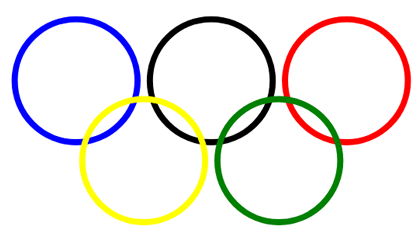
In the code example, the <g> element groups the circles, and fill="none" applies to every circle inside the group. The image below shows the original circle and translated copies (
translation.svg):
scale()Scaling enlarges or reduces an element by a scale factor. The scale(sx, sy) function multiplies the element width by sx and height by sy. If sy is omitted, SVG uses the same value as sx, so the element scales uniformly.
| Parameter | Description |
|---|---|
sx | Horizontal scaling factor |
sy | Vertical scaling factor (optional) |
 1<svg viewBox="-50 -50 200 200" xmlns="http://www.w3.org/2000/svg">
 2    <!-- uniform scale -->
 3    <circle cx="0" cy="0" r="10" fill="#B0C4DE" transform="scale(4)" />
 4    <circle cx="0" cy="0" r="10" fill="#DDA0DD" transform="scale(3)" />
 5    <circle cx="0" cy="0" r="10" fill="#FFB6C1" transform="scale(2)" />
 6    <!-- no scale -->
 7    <circle cx="0" cy="0" r="10" fill="#5F9EA0" />
 8    <g transform="translate(100)">
 9        <!-- uniform scale -->
10        <circle cx="0" cy="0" r="10" fill="#B0C4DE" transform="scale(4)" />
11        <!-- vertical scale -->
12        <circle cx="0" cy="0" r="10" fill="#DDA0DD" transform="scale(1,4)" />
13        <!-- horizontal scale -->
14        <circle cx="0" cy="0" r="10" fill="#FFB6C1" transform="scale(4,1)" />
15        <!-- no scale -->
16        <circle cx="0" cy="0" r="10" fill="#5F9EA0" />
17    </g>
18</svg>
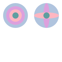
Here is the resulting image ( scaling.svg):
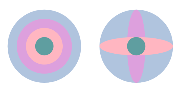
The code above uses scale() and translate(). The first group shows uniform scaling, where both axes use the same factor. The second group shows directional scaling: scale(1,4) stretches the circle vertically, while scale(4,1) stretches it horizontally.
rotate()The rotate(angle, cx, cy) function rotates an element by angle degrees around the point (cx, cy). If cx and cy are omitted, SVG rotates the element around (0, 0) in the current coordinate system.
| Parameter | Description |
|---|---|
angle | Rotation angle in degrees (positive → clockwise) |
cx | X‑coordinate of rotation center (optional) |
cy | Y‑coordinate of rotation center (optional) |
All rotate or skew angle values should be specified in degrees, you cannot use the other units we have available in CSS. If we use a positive angle value, then the rotation will be clockwise, and conversely, a negative angle value gives us counterclockwise spin.
Note: rotate(angle cx) is invalid. If you provide a rotation center, specify both cx and cy.
Like translation, rotation does not distort the element. It preserves distances, angles, and parallel lines.
1<svg width="450" height="450" xmlns="http://www.w3.org/2000/svg">
2    <rect x="100" y="250" width="200" height="30" fill="CadetBlue" />
3    <rect x="100" y="250" width="200" height="30" fill="#DDA0DD" transform ="rotate(-45 200 265)" />
4    <rect x="100" y="250" width="200" height="30" fill="Pink" transform ="rotate(-90 200 265)" />
5    <rect x="100" y="250" width="200" height="30" fill="#B0C4DE" transform ="rotate(45 200 265)" />
6    <rect x="100" y="250" width="200" height="30" fill="CadetBlue" transform ="rotate(-35)" />
7</svg>
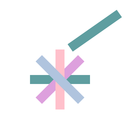
The function transform="rotate(-90 200 265)" rotates the pink rectangle 90 degrees counterclockwise around (200, 265). The last rectangle uses rotate(-35) without a center point, so SVG rotates it around (0, 0). The result is shown below:
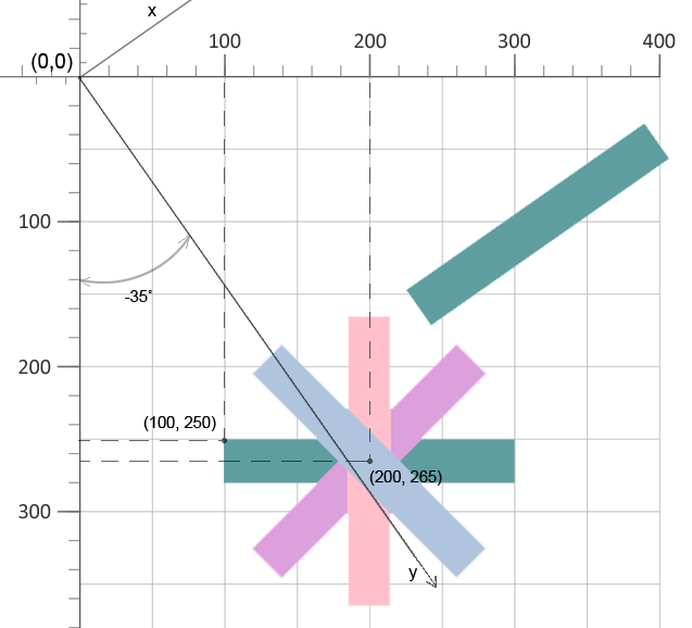
The sample file rotation.svg contains the SVG rotation example.
skewX() and skewY()Skewing tilts an element by changing one coordinate axis. Use skewX(angle) to skew along the x-axis and skewY(angle) to skew along the y-axis. The angle is specified in degrees. With skewX(angle), x coordinates change while y coordinates remain unchanged; with skewY(angle), y coordinates change while x coordinates remain unchanged.
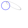
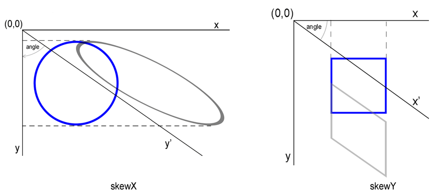
Here is shown an example of the circle with skewX(55) value ( skew-x.svg):
1<svg viewBox="0 0 100 100" xmlns="http://www.w3.org/2000/svg">
2    <circle cx="20" cy="20" r="15" stroke="blue" fill="none" />
3    <circle cx="20" cy="20" r="15" stroke="grey" stroke-opacity="0.7" fill="none" transform="skewX(55)" />
4</svg>
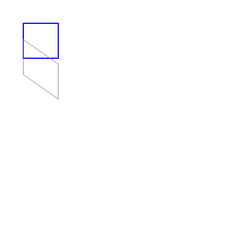
A simple example of the rectangle skewed by skewY(35) function ( skew-y.svg):
1<svg  width="800" height="800" viewBox="0 0 200 200" xmlns="http://www.w3.org/2000/svg">
2   <rect x="20" y="20" width="30" height="30" stroke="blue" stroke-opacity="1" fill="none" />
3   <rect x="20" y="20" width="30" height="30" stroke="grey" stroke-opacity="0.5" fill="none" transform="skewY(35)" />
4 </svg>
The rendered examples look like:
| Problem | Cause | Solution |
|---|---|---|
Rectangle does not move after applying translate | transform attribute misspelled or missing quotes | Ensure transform="translate(150,50)" is set correctly on the element |
| Translation does not apply | transform attribute placed on a parent element instead of the target element | Set transform directly on the element you want to move (e.g., the <rect>). |
| Unexpected rotation direction | Angle sign interpreted opposite to expectation | Use positive values for clockwise rotation, negative for counter‑clockwise |
| Rotation occurs around the wrong point | cx/cy omitted or set to the element’s origin | Provide explicit rotation center coordinates or apply a pre‑translation to shift the pivot. |
| Skew appears too extreme | Angle supplied in radians instead of degrees | Provide angles in degrees (e.g., skewX(30)) |
| Element disappears after scaling | Scale factor set to 0 or negative unintentionally | Use positive non‑zero scale values; verify the order of transforms if combined. |
| Combined transforms produce wrong result | Order of functions is reversed | Remember that transforms are applied right‑to‑left; write translate(...) rotate(...) to rotate first then translate |
| Effect | Copy-Paste SVG Code |
|---|---|
| Move right 50px, down 30px | <rect x="10" y="10" width="40" height="20" transform="translate(50,30)" /> |
| Double size (uniform) | <circle cx="20" cy="20" r="10" transform="scale(2)" /> |
| Stretch horizontally 3× | <rect x="0" y="0" width="20" height="20" transform="scale(3,1)" /> |
| Rotate 45° around center (100,100) | <polygon points="90,90 110,90 100,110" transform="rotate(45 100 100)" /> |
| Rotate 90° clockwise around origin | <line x1="0" y1="0" x2="50" y2="0" stroke="black" transform="rotate(90)" /> |
| Skew X by 30° | <rect x="10" y="10" width="30" height="30" transform="skewX(30)" /> |
| Skew Y by -20° | <circle cx="25" cy="25" r="15" transform="skewY(-20)" /> |
| Chain: move then rotate | <g transform="translate(100,50) rotate(30)"><rect width="40" height="10" fill="red"/></g> |
The transform attribute applies a geometric transformation to an SVG element or group. It changes how the element is displayed, but it does not rewrite attributes such as x, y, cx, cy, or path data.
translate(tx, ty) moves an element without changing its size. scale(sx, sy) changes the element size and can also shift the visible position because scaling is performed relative to the coordinate system origin.
Use rotate(angle cx cy) and provide both center coordinates. For example, transform="rotate(45 100 100)" rotates the element 45 degrees around point (100, 100).
Use separate functions such as translate(), scale(), and rotate() when readability matters. Use matrix(a,b,c,d,e,f) when you need one combined transform or calculated values from another tool or API.
transform property and transform functions.transform attributes to SVG elements and groups.
Analyzing your prompt, please hold on...
An error occurred while retrieving the results. Please refresh the page and try again.