
Analyzing your prompt, please hold on...
An error occurred while retrieving the results. Please refresh the page and try again.
SVG gradients 可以为 SVG 形状、文本和 paths 创建平滑的颜色过渡,并可用于 fill 或 stroke。本教程解释 <linearGradient>、<radialGradient>、<stop>、fill="url(#id)" 和 stroke="url(#id)" 如何在 SVG 标记中配合工作。
快速回答: 在 <defs> 中定义渐变,为它设置 id,添加带 offset 和 stop-color 的 <stop> 元素,然后在形状或文本元素上用 fill="url(#id)" 或 stroke="url(#id)" 引用该渐变。
1<svg width="220" height="120" xmlns="http://www.w3.org/2000/svg">
2  <defs>
3    <linearGradient id="brand-gradient" x1="0%" y1="0%" x2="100%" y2="0%">
4      <stop offset="0%" stop-color="steelblue" />
5      <stop offset="100%" stop-color="gold" />
6    </linearGradient>
7  </defs>
8  <rect x="20" y="20" width="180" height="80" fill="url(#brand-gradient)" />
9</svg>
本文将学习如何:
<defs> 中创建可复用 SVG 渐变定义;fill 与 stroke;id、url(#id)、offset 和 gradientUnits 的常见问题;渐变是在绘图表面上的点之间形成的平滑颜色过渡。SVG 支持两个主要渐变元素:<linearGradient> 和 <radialGradient>。两者都是 paint servers,意思是先定义一次,然后由可见元素引用。
把 <linearGradient> 或 <radialGradient> 放入 <defs>,即可复用渐变。id 属性为渐变命名,可见元素通过 fill="url(#id)" 或 stroke="url(#id)" 引用它。这样可以把颜色过渡与使用它的形状、文本或 paths 分离。
<defs> 块,用于存放可复用渐变定义。<linearGradient>;从中心或焦点向外扩散的过渡使用 <radialGradient>。id,使可见元素能够引用该渐变。<stop> 元素,并使用递增的 offset 值和 stop-color 值。fill="url(#id)" 或 stroke="url(#id)" 应用渐变。x1、y1、x2、y2、cx、cy、r、fx、fy 或 gradientUnits。线性渐变沿一条直线改变颜色,这条直线称为 gradient vector。x1、y1、x2 和 y2 属性定义该向量。默认 gradientUnits="objectBoundingBox" 时,值通常写成百分比或 0 到 1 的小数;使用 gradientUnits="userSpaceOnUse" 时,它们按当前 SVG 坐标系统解释。
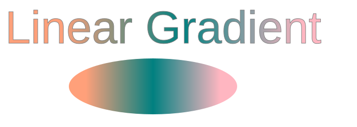
<linearGradient> 元素包含嵌套的 <stop> 元素。每个 stop 在向量上的特定位置定义一种颜色。offset 属性设置位置,颜色可通过 stop-color 属性或 CSS style declarations 设置(
linear-gradient.svg)。
 1<svg height="250" width="700" xmlns="http://www.w3.org/2000/svg">
 2    <defs>
 3        <linearGradient id="grad1" x1="0%" y1="0%" x2="100%" y2="0%">
 4            <stop offset="10%" style="stop-color:LIGHTSALMON" />
 5            <stop offset="50%" style="stop-color:TEAL" />
 6            <stop offset="90%" style="stop-color:LIGHTPINK" />
 7        </linearGradient>
 8    </defs>
 9    <ellipse cx="300" cy="170" rx="165" ry="55" fill="url(#grad1)" />
10    <text x="10" y="85" font-family="Arial" stroke="grey" stroke-width="1" font-size="90" fill="url(#grad1)" >Linear Gradient</text>
11</svg>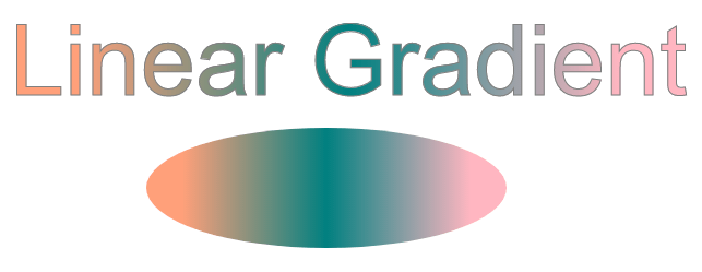
在上面的示例中,<text> 和 <ellipse> 都使用 fill="url(#grad1)",因此共享同一个渐变定义。三个 <stop> 元素创建从 LIGHTSALMON 到 TEAL 再到 LIGHTPINK 的可见颜色过渡。
径向渐变从中心或焦点向外改变颜色。cx、cy 和 r 属性定义渐变的终止圆:cx 和 cy 设置圆心,r 设置半径。fx 和 fy 属性定义渐变视觉起点,也就是焦点。如果省略 cx 和 cy,两者默认都是 50%;如果省略 fx 和 fy,它们默认与 cx 和 cy 相同。
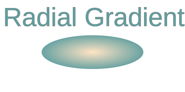
在这个示例中,中心和焦点使用相同坐标。默认 objectBoundingBox 坐标系统下,0.5 表示目标元素中间,因此径向渐变从中心均匀扩散(
radial-gradient.svg)。
 1<svg height="300" width="600" xmlns="http://www.w3.org/2000/svg">
 2    <defs>
 3        <radialGradient id="myRG" cx="0.5" cy="0.5" r="0.9" fx="0.5" fy="0.5" spreadMethod="pad">
 4            <stop offset="0%" stop-color="BISQUE" />
 5            <stop offset="60%" stop-color="CADETBLUE" />
 6        </radialGradient>
 7    </defs>
 8    <ellipse cx="300" cy="170" rx="165" ry="55" fill="url(#myRG)" />
 9    <text x="10" y="85" font-family="Arial" stroke="grey" stroke-width="1" font-size="85" fill="url(#myRG)" >Radial Gradient</text>
10</svg>
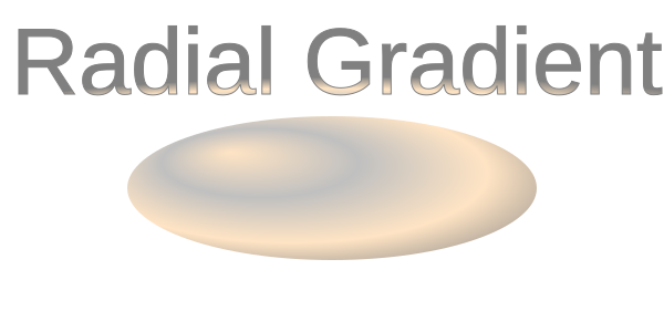
下一个示例把焦点从中心移动到 fx="25%" 和 fy="25%"。这会把视觉高光移向填充形状的左上部分(
radial-gradient1.svg):
 1<svg height="300" width="600" xmlns="http://www.w3.org/2000/svg">
 2    <defs>
 3        <radialGradient id="myRG" cx="0.5" cy="0.5" r="0.8" fx="25%" fy="25%" spreadMethod="pad">
 4            <stop offset="0%" stop-color="BISQUE" />
 5            <stop offset="30%" stop-color="SILVER" />
 6            <stop offset="60%" stop-color="BISQUE" />
 7            <stop offset="90%" stop-color="GREY" />
 8        </radialGradient>
 9    </defs>
10    <ellipse cx="300" cy="170" rx="185" ry="65" fill="url(#myRG)" fill-opacity="1" />
11    <text x="10" y="85" font-family="Arial" stroke="grey" stroke-width="1" font-size="85" fill="url(#myRG)">Radial Gradient</text>
12</svg>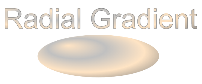
这里,多个 color stops 和偏离中心的焦点在椭圆上创建更强的高光。这是让扁平 SVG 几何看起来更有立体感的常见方法。
| 问题 | 原因 | 解决方法 |
|---|---|---|
| 渐变不可见 | 渐变没有 id、引用错误,或目标元素没有使用它 | 给渐变唯一 id,用 url(#id) 引用,并把定义放在 <defs> 中 |
| 渐变没有应用到形状 | fill 或 stroke 中引用错误 | 使用 fill="url(#gradientId)" 或 stroke="url(#gradientId)",并确认 id 完全匹配 |
| 颜色方向不符合预期 | x1、y1、x2、y2 值错误 | 调整 gradient vector 属性控制方向 |
| 径向渐变没有覆盖预期区域 | 半径 r、中心、焦点或 gradientUnits 与目标形状不匹配 | 调整 r、cx、cy、fx、fy,或需要固定坐标时设置 gradientUnits="userSpaceOnUse" |
| 渐变缩放异常 | 使用默认 gradientUnits="objectBoundingBox" | 设置 gradientUnits="userSpaceOnUse" 进行绝对定位 |
| Stops 混合效果不符合预期 | offset 缺失、意外重复或顺序不正确 | 检查 offset 值是否按需要从 0% 到 100% 排列 |
| 渐变被重复定义多次 | 同一组 stops 在多处重复 | 在 <defs> 中定义一次,并用 url(#id) 复用 |
创建水平线性渐变填充
1<linearGradient id="gradHorizontal" x1="0%" y1="0%" x2="100%" y2="0%">
2    <stop offset="0%" stop-color="steelblue" />
3    <stop offset="100%" stop-color="lightblue" />
4</linearGradient>
创建垂直线性渐变
1<linearGradient id="gradVertical" x1="0%" y1="0%" x2="0%" y2="100%">
2    <stop offset="0%" stop-color="orange" />
3    <stop offset="100%" stop-color="purple" />
4</linearGradient>
把渐变应用到 stroke 而不是 fill
1<rect x="20" y="20" width="200" height="120"
2      fill="none"
3      stroke="url(#gradHorizontal)"
4      stroke-width="10" />
创建居中的径向渐变
1<radialGradient id="radialCenter" cx="50%" cy="50%" r="50%">
2    <stop offset="0%" stop-color="white" />
3    <stop offset="100%" stop-color="darkblue" />
4</radialGradient>
移动径向渐变焦点
1<radialGradient id="radialFocus" cx="50%" cy="50%" r="60%" fx="25%" fy="25%">
2    <stop offset="0%" stop-color="gold" />
3    <stop offset="100%" stop-color="brown" />
4</radialGradient>
为多个元素复用同一个渐变
1<circle cx="80" cy="80" r="50" fill="url(#gradHorizontal)" />
2<rect x="160" y="30" width="100" height="100" fill="url(#gradHorizontal)" />在 <defs> 中定义渐变,给它设置 id,然后把目标形状的 fill 或 stroke 设置为 url(#id)。引用值必须与渐变 id 完全匹配。
<linearGradient> 用于沿直线方向的颜色过渡。<radialGradient> 用于颜色从中心或焦点向外扩散的效果。
可以。在 <defs> 中定义渐变,并在目标元素上设置 stroke="url(#id)"。同时使用足够大的 stroke-width,让渐变可见。
默认情况下,gradientUnits="objectBoundingBox" 会把渐变映射到每个元素自己的 bounding box。若希望多个元素使用相同的坐标定位,请使用 gradientUnits="userSpaceOnUse"。
可以。在 Python via .NET 中,加载 SVG 后更新 <stop> 元素上的 stop-color 属性。请参见
Change SVG Colors in Python 中编辑 gradient stops 的工作流。
fill 和 stroke。
Analyzing your prompt, please hold on...
An error occurred while retrieving the results. Please refresh the page and try again.