
Analyzing your prompt, please hold on...
An error occurred while retrieving the results. Please refresh the page and try again.
SVG transformations 会改变图形元素的显示方式,而不重写元素本身的几何属性。使用 transform 属性,可以通过 translate()、scale()、rotate()、skewX() 和 skewY() 移动、调整大小、旋转或倾斜 SVG 形状。同一思想的矩阵形式,请参见
Transformation Matrix。
本文将学习:
translate() 移动 SVG 元素。scale() 调整 SVG 元素大小。skewX() 和 skewY() 倾斜 SVG 图形。<g> group 上添加 transform 属性。translate(tx, ty) 移动元素。scale(sx, sy)、rotate(angle cx cy)、skewX(angle) 或 skewY(angle) 改变可见几何。matrix(a,b,c,d,e,f)。translate() 进行 SVG 平移Translation 会让元素的每个点移动相同距离。translate(tx, ty) 函数沿 x 轴移动 tx,沿 y 轴移动 ty。如果省略 ty,默认值为 0。
| 参数 | 说明 |
|---|---|
tx | 水平偏移(正值向右,负值向左) |
ty | 垂直偏移(正值向下,负值向上) |
属性 transform="translate(tx, ty)" 的作用是按公式改变对象坐标:
x(new) = x(old) + tx
y(new) = y(old) + ty
简单示例:
 1<svg viewBox="0 0 100 100" xmlns="http://www.w3.org/2000/svg">
 2    <g fill="none">
 3        <!-- no translation -->
 4        <circle cx="15" cy="15" r="10" stroke="blue" />
 5        <!-- horizontal translation -->
 6        <circle cx="15" cy="15" r="10" stroke="black" transform="translate(22)" />
 7        <circle cx="15" cy="15" r="10" stroke="red" transform="translate(44)" />
 8        <!-- both horizontal and vertical translation -->
 9        <circle cx="15" cy="15" r="10" stroke="green" transform="translate(33,13)" />
10        <circle cx="15" cy="15" r="10" stroke="yellow" transform="translate(11,13)" />
11    </g>
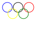
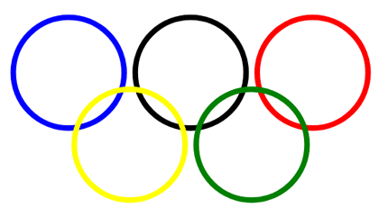
12</svg>代码示例中,<g> 元素把圆组合起来,fill="none" 应用于 group 内的每个圆。下图显示原始圆和被平移的副本(
translation.svg):
scale() 进行 SVG 缩放Scaling 会按缩放因子放大或缩小元素。scale(sx, sy) 函数把元素宽度乘以 sx,高度乘以 sy。如果省略 sy,SVG 使用与 sx 相同的值,因此元素会等比缩放。
| 参数 | 说明 |
|---|---|
sx | 水平方向缩放因子 |
sy | 垂直方向缩放因子,可选 |
 1<svg viewBox="-50 -50 200 200" xmlns="http://www.w3.org/2000/svg">
 2    <!-- uniform scale -->
 3    <circle cx="0" cy="0" r="10" fill="#B0C4DE" transform="scale(4)" />
 4    <circle cx="0" cy="0" r="10" fill="#DDA0DD" transform="scale(3)" />
 5    <circle cx="0" cy="0" r="10" fill="#FFB6C1" transform="scale(2)" />
 6    <!-- no scale -->
 7    <circle cx="0" cy="0" r="10" fill="#5F9EA0" />
 8    <g transform="translate(100)">
 9        <!-- uniform scale -->
10        <circle cx="0" cy="0" r="10" fill="#B0C4DE" transform="scale(4)" />
11        <!-- vertical scale -->
12        <circle cx="0" cy="0" r="10" fill="#DDA0DD" transform="scale(1,4)" />
13        <!-- horizontal scale -->
14        <circle cx="0" cy="0" r="10" fill="#FFB6C1" transform="scale(4,1)" />
15        <!-- no scale -->
16        <circle cx="0" cy="0" r="10" fill="#5F9EA0" />
17    </g>
18</svg>
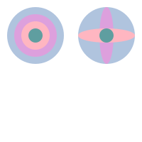
渲染结果如下( scaling.svg):
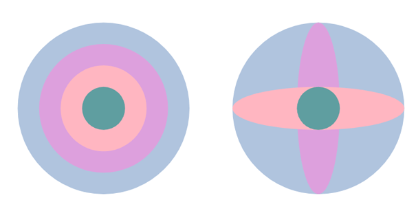
上面的代码使用 scale() 和 translate()。第一组展示等比缩放,两个轴使用相同因子。第二组展示方向性缩放:scale(1,4) 纵向拉伸圆,scale(4,1) 横向拉伸圆。
rotate() 进行 SVG 旋转rotate(angle, cx, cy) 函数围绕点 (cx, cy) 旋转元素 angle 度。如果省略 cx 和 cy,SVG 会围绕当前坐标系统中的 (0, 0) 旋转元素。
| 参数 | 说明 |
|---|---|
angle | 旋转角度,单位为度(正值顺时针) |
cx | 旋转中心的 x 坐标,可选 |
cy | 旋转中心的 y 坐标,可选 |
所有 rotate 或 skew 角度值都应使用度,不能使用 CSS 中可用的其他角度单位。正角度表示顺时针旋转,负角度表示逆时针旋转。
注意: rotate(angle cx) 是无效的。如果提供旋转中心,必须同时指定 cx 和 cy。
与 translation 一样,rotation 不会扭曲元素。它保持距离、角度和平行线不变。
1<svg width="450" height="450" xmlns="http://www.w3.org/2000/svg">
2    <rect x="100" y="250" width="200" height="30" fill="CadetBlue" />
3    <rect x="100" y="250" width="200" height="30" fill="#DDA0DD" transform ="rotate(-45 200 265)" />
4    <rect x="100" y="250" width="200" height="30" fill="Pink" transform ="rotate(-90 200 265)" />
5    <rect x="100" y="250" width="200" height="30" fill="#B0C4DE" transform ="rotate(45 200 265)" />
6    <rect x="100" y="250" width="200" height="30" fill="CadetBlue" transform ="rotate(-35)" />
7</svg>
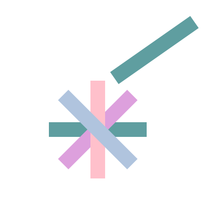
函数 transform="rotate(-90 200 265)" 会让粉色矩形围绕 (200, 265) 逆时针旋转 90 度。最后一个矩形使用不带中心点的 rotate(-35),因此 SVG 会围绕 (0, 0) 旋转它。结果如下:
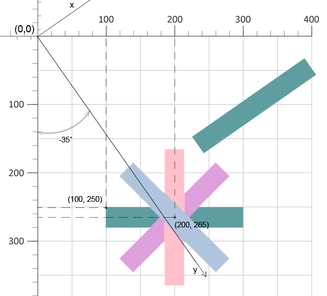
示例文件 rotation.svg 包含 SVG rotation 示例。
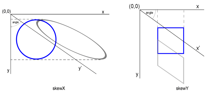
skewX() 和 skewY() 进行 SVG 倾斜Skewing 通过改变一个坐标轴来倾斜元素。使用 skewX(angle) 沿 x 轴倾斜,使用 skewY(angle) 沿 y 轴倾斜。角度以度为单位。使用 skewX(angle) 时,x 坐标改变而 y 坐标保持不变;使用 skewY(angle) 时,y 坐标改变而 x 坐标保持不变。
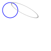
下面是使用 skewX(55) 的圆示例(
skew-x.svg):
1<svg viewBox="0 0 100 100" xmlns="http://www.w3.org/2000/svg">
2    <circle cx="20" cy="20" r="15" stroke="blue" fill="none" />
3    <circle cx="20" cy="20" r="15" stroke="grey" stroke-opacity="0.7" fill="none" transform="skewX(55)" />
4</svg>
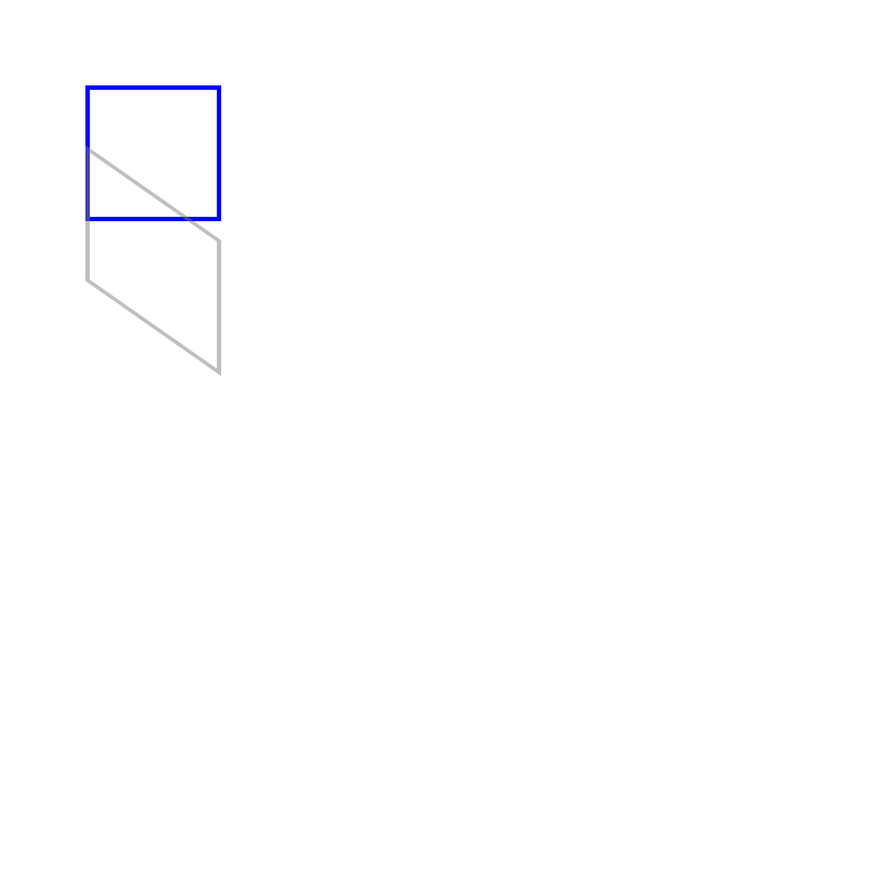
下面是使用 skewY(35) 倾斜矩形的简单示例(
skew-y.svg):
1<svg  width="800" height="800" viewBox="0 0 200 200" xmlns="http://www.w3.org/2000/svg">
2   <rect x="20" y="20" width="30" height="30" stroke="blue" stroke-opacity="1" fill="none" />
3   <rect x="20" y="20" width="30" height="30" stroke="grey" stroke-opacity="0.5" fill="none" transform="skewY(35)" />
4 </svg>
渲染示例如下:
| 问题 | 原因 | 解决方法 |
|---|---|---|
应用 translate 后矩形不移动 | transform 属性拼写错误或缺少引号 | 确认元素上正确设置 transform="translate(150,50)" |
| Translation 没有应用 | transform 属性放在父元素而不是目标元素上 | 把 transform 直接设置到要移动的元素,例如 <rect> |
| 旋转方向与预期相反 | 角度正负号理解错误 | 正值表示顺时针,负值表示逆时针 |
| 围绕错误点旋转 | 省略 cx/cy 或设置为元素原点 | 提供明确的旋转中心坐标,或用预平移调整 pivot |
| Skew 过于夸张 | 角度误用弧度 | 使用度,例如 skewX(30) |
| 缩放后元素消失 | scale factor 被设置为 0 或意外为负 | 使用非零正缩放值;组合变换时验证顺序 |
| 组合 transforms 结果错误 | 函数顺序反了 | 记住 transforms 按从右到左应用;写 translate(...) rotate(...) 表示先 rotate 后 translate |
| 效果 | 可复制 SVG 代码 |
|---|---|
| 向右 50px、向下 30px | <rect x="10" y="10" width="40" height="20" transform="translate(50,30)" /> |
| 等比放大 2 倍 | <circle cx="20" cy="20" r="10" transform="scale(2)" /> |
| 横向拉伸 3 倍 | <rect x="0" y="0" width="20" height="20" transform="scale(3,1)" /> |
| 围绕中心 (100,100) 旋转 45° | <polygon points="90,90 110,90 100,110" transform="rotate(45 100 100)" /> |
| 围绕原点顺时针旋转 90° | <line x1="0" y1="0" x2="50" y2="0" stroke="black" transform="rotate(90)" /> |
| X 方向倾斜 30° | <rect x="10" y="10" width="30" height="30" transform="skewX(30)" /> |
| Y 方向倾斜 -20° | <circle cx="25" cy="25" r="15" transform="skewY(-20)" /> |
| 组合:移动后旋转 | <g transform="translate(100,50) rotate(30)"><rect width="40" height="10" fill="red"/></g> |
transform 属性对 SVG 元素或 group 应用几何变换。它改变元素的显示方式,但不会重写 x、y、cx、cy 或 path data 等属性。
translate(tx, ty) 移动元素,不改变尺寸。scale(sx, sy) 改变元素大小,并且可能改变可见位置,因为缩放相对于坐标系统原点执行。
使用 rotate(angle cx cy) 并提供两个中心坐标。例如,transform="rotate(45 100 100)" 会围绕点 (100, 100) 旋转 45 度。
当可读性重要时,使用 translate()、scale() 和 rotate() 等单独函数。当需要一个组合 transform,或来自其他工具/API 的计算值时,使用 matrix(a,b,c,d,e,f)。
transform property 和 transform functions。transform 属性的示例。
Analyzing your prompt, please hold on...
An error occurred while retrieving the results. Please refresh the page and try again.