2. Font characteristics
Fonts can be divided into individual overlapping classes based on various characteristics. It often proves useful to know these characteristics when we need to decide which font family to use in a specific context. See also Aspose.Font’s documentation article on different types of fonts.
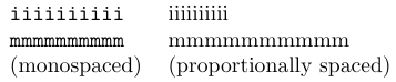
2.1. Proportional and monospaced fonts
Fonts can be either proportional or monospaced. In a proportional font, glyphs have different widths depending on their shape. At the same time, in a monospaced font, all glyphs are of the same width. The extra spaces around glyphs of monospaced fonts make it more difficult to recognize word boundaries and thus make text typed in such fonts less readable. In contrast, proportional (or typographic) fonts usually allow more words to be placed on a page and are more readable than monospaced fonts. See the figure below:
Although monospaced fonts appear less readable, they still have their use. One example is tables or program listings where proper alignment of the content is important. You will always find computer programs displayed in a monospaced font in any computer since book. This easily distinguishes programs from surrounding text.
You can even choose a monospaced font as the base font for a complete document because such a font looks hand-made when used with unjustified paragraphs, giving it a flavor of a typewriter.
2.2. Serifed and sans serif fonts
In some fonts, glyphs have serifs, while in others, they do not. This fact leads us to another useful classification. Serifs are tiny horizontal strokes at the extremities of glyphs. Originally, they were produced by the chisel when Roman capitals were engraved into stone. That is why serifed fonts are often called Roman fonts.
Serifed fonts were long thought of as more readable since they give the eye more clues for identification. But dedicated researches have shown that reading speed is not substantially affected by the absence of serifs.
2.3. Font families and their attributes
Apart from the crude classifications we discussed above, fonts are grouped into font families. Members of a font family share common design principles and are distinguished by variations in size, weight, width, and shape.
Font shapes
Almost every font family has one shape called the upright shape. The font that you are now reading is in the upright shape. This font shape is usually used for typing regular text.
Another important shape included in most families is the italic shape, which looks
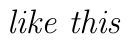
Italic glyphs are slanted to the right, and letters are drawn differently from their upright counterparts, as shown in the figure below:
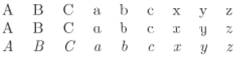
The first line shows letters from the Computer Modern Serif family in upright shape, and the third line shows the same letters in italic shape. To make the difference in drawing more apparent, the second line gives the italic letters without the usual slant. In other words, those are italic letters in an upright position.
San serif font families often lack a proper italic shape; instead, they have a slanted shape in which the regular upright characters slant to the right. Such fonts are also often called oblique or sloped.
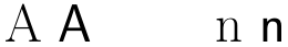
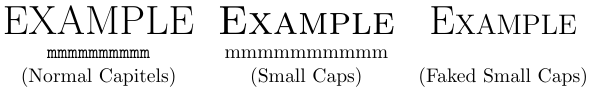
Another common font shape is the small caps shape, in which the lowercase letters are represented as capitals with a reduced height. If the small caps shape is not available for a specific font, typographers sometimes use upright capitals from smaller sizes, but this does not produce the same quality as a well-designed small caps font. True small caps have different widths and weight than capital letters from the same font that have been reduced to the height of designed small caps. You can see in the figure below that the strokes in the faked capitals are much too thin.
Weight and width
Fonts of a certain shape within a family may differ in weight. This characteristic is related to the thickness of the strokes used to draw the individual shapes. Some font manufacturers call the font weights intended to be used for normal text book, while others call them medium. For thin strokes, the name light is commonplace, while thicker strokes are usually called bold. In larger font families, we sometimes find a range starting with ultra light, going through extra light, light, semi light, and so on, and ending with ultra bold at the other end. But often only a few weights are available in some families. The Computer Modern Roman family, for example, has only medium and bold weights.
The font width is another important attribute. It refers to the amount of expansion or contraction with respect to the normal or medium width in the family. Computer Modern Roman has bold fonts in medium width and extended width. Condensed fonts are often used in titles and headings, where medium-width fonts, when used at large sizes, would consume too much space.
Font sizes
The measurement unit for font sizes is a printer point (pt). There are 72.27 points in an inch. The font size does not refer to any particular characteristic, but it is rather a value chosen by the font designer to guide the user. For example, in a 10pt font, letters of the alphabet are usually less than 10pt tall, and only characters such as parentheses have approximately this height.
The appearance of a font depends on many factors, such as the height of the lowercase letters (the x-height), the stroke width, and the depth of the descenders (the part of the letters below the baseline, as in the letter ‘q’). That is why two fonts of the same size may not blend well with each other.
In the LaTeX world, fonts are often available in sizes that are powers of 1.2, which means they follow a geometric progression. This arrangement makes it easy to produce an enlarged master copy that can later be photographically reduced, thereby effectively increasing the final output resolution. Nowadays, fonts are usually vectorized and thus can be scaled at will. As a consequence, many commercial font families are provided in only a single design size.
Using scaled fonts instead of fonts designed for a specific size often gives less satisfactory results. This is due to the fact that fonts do not scale in a linear fashion to the human eye. You can see the difference in the figure below:

The glyphs in handcrafted fonts of larger sizes are usually narrower than fonts magnified from a smaller size of the same family. One should use fonts designed for the desired size whenever possible, although it is acceptable to scale fonts within a small size range if necessary.
2.4. Font encodings
As we mentioned in the introduction, TeX refers to the glyphs of a font by addressing them via codes. Such a mapping is called a font encoding. In LaTeX, two fonts having the same font encoding are supposed to be interchangeable in the sense that given the same input, they produce the “same” glyphs on the printed page.
By classifying fonts by their font encodings, it is possible to modify other characteristics, such as font family or font series, and still ensure that the typeset result will remain comprehensible.
Originally, TeX distributions included the fonts that have only 128 glyphs per font. Therefore, those fonts do not include any accented characters as individual glyphs. All such glyphs had to be constructed using TeX’s \accent primitive or by similar methods. As a result, any word containing diacritics cannot be automatically hyphenated by LaTeX, and kerning (correction of spacing between certain letters in the font) cannot be automatically applied. The encoding of these fonts is called OT1. Although it remains the default encoding for LaTeX, it is not advisable to use OT1 for languages other than English.
The TeX user community defined a 256-character encoding called T1 that enables TeX to correctly typeset in more than 30 languages based on the Latin alphabet. Therefore, the use of the T1 encoding is highly recommended since, nowadays, nearly all font families that can be used with LaTeX are available in this encoding. In fact, some are only available in the T1 encoding. Specifying \usepackage[T1]{fontenc} after the \documentclass command makes T1 the default encoding within a document.