Analyzing your prompt, please hold on...
An error occurred while retrieving the results. Please refresh the page and try again.
تمت إضافة طريقة insert_chart جديدة إلى فئة DocumentBuilder. لذلك، دعونا نرى كيفية إدراج مخطط عمودي بسيط في المستند باستخدام طريقة DocumentBuilder.insert_chart:
سنتعلم في هذا القسم كيفية إدراج مخطط في مستند.
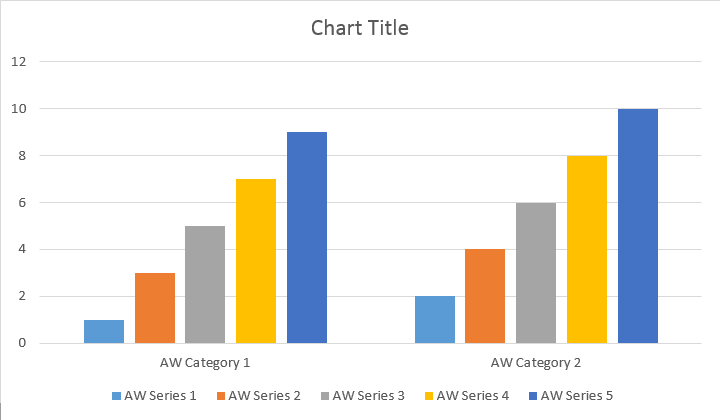
يوضح مثال التعليمات البرمجية التالي كيفية إدراج مخطط عمودي:
الكود يعطي النتيجة التالية:
هناك طرق add وadd_double وadd_date، والتي تم عرضها لتغطية جميع المتغيرات المحتملة لمصادر البيانات لجميع أنواع المخططات:
الكود يعطي النتيجة التالية:
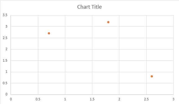
يوضح المثال أدناه كيفية إدراج مخطط مبعثر.
الكود يعطي النتيجة التالية:
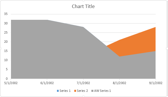
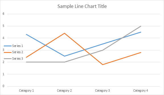
يوضح مثال التعليمات البرمجية التالي كيفية إدراج مخطط مساحي:
الكود يعطي النتيجة التالية:
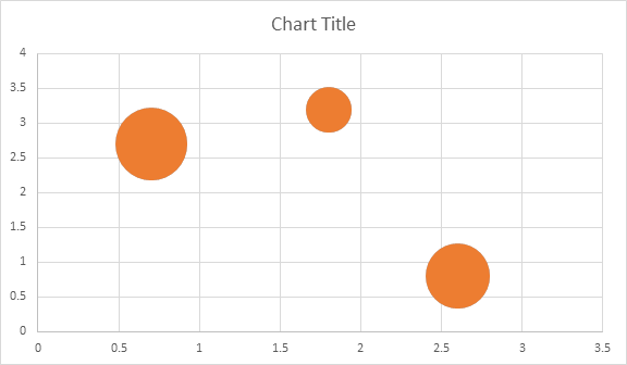
يوضح مثال التعليمات البرمجية التالي كيفية إدراج مخطط فقاعي:
الكود يعطي النتيجة التالية:
بمجرد إدراج المخطط وملؤه بالبيانات، يمكنك تغيير مظهره. تحتوي خاصية Shape.chart على جميع الخيارات المتعلقة بالمخطط المتاحة من خلال API العام.
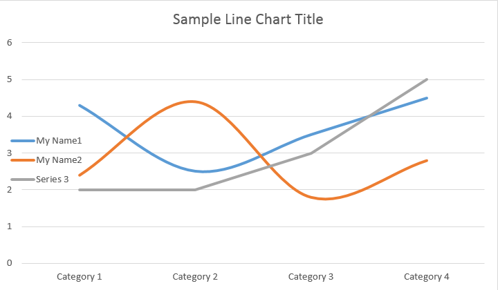
على سبيل المثال، لنغير عنوان Chart أو سلوك وسيلة الإيضاح:
يُنشئ الكود النتائج التالية:
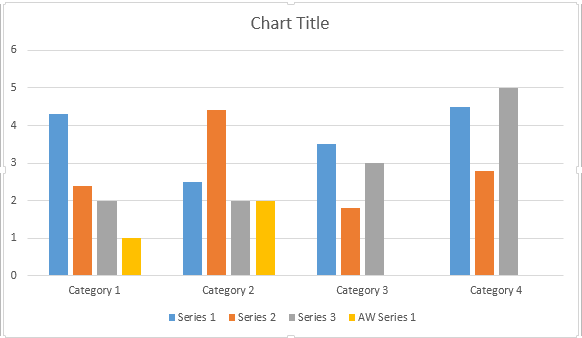
دعونا نلقي نظرة على مجموعة ChartSeries. جميع سلاسل المخططات متاحة من خلال مجموعة Chart.series:
يمكنك إزالة السلسلة واحدة تلو الأخرى أو مسحها جميعًا بالإضافة إلى إضافة سلسلة جديدة إذا لزم الأمر. يحتوي المخطط المدرج حديثًا على بعض السلاسل الافتراضية المضافة إلى هذه المجموعة. لإزالتها تحتاج إلى استدعاء طريقة chart.series.clear().
إليك كيفية العمل مع سلسلة معينة.
يرجى الاطلاع على النتيجة أدناه:
تحتوي جميع ملفات ChartSeries المنفردة على خيارات ChartDataPoint افتراضية، يرجى محاولة استخدام الكود التالي لتغييرها:
يرجى الاطلاع على النتيجة أدناه:
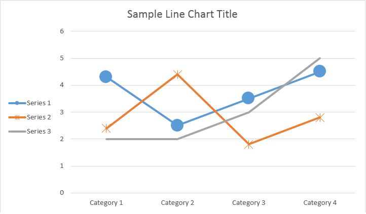
ChartSeriesباستخدام ChartDataPoint، يمكنك تخصيص تنسيق نقطة بيانات واحدة في سلسلة المخططات:
يرجى الاطلاع على النتيجة أدناه:
باستخدام ChartDataLabel، يمكنك تحديد تنسيق تسمية بيانات واحدة لسلسلة المخططات، مثل إظهار/إخفاء LegendKey وCategoryName وSeriesName وValue وما إلى ذلك.
يرجى الاطلاع على النتيجة أدناه:
تحدد فئة ChartDataLabelCollection الخصائص التي يمكن استخدامها لتعيين الخيارات الافتراضية لـ ChartDataLabels لسلسلة المخططات. تتضمن هذه الخصائص show_category_name وshow_bubble_size وshow_percentage وshow_series_name وshow_value وما إلى ذلك.
يرجى الاطلاع على النتيجة أدناه:
باستخدام ChartDataLabel.number_format، يمكنك تحديد تنسيق الأرقام لتسمية بيانات واحدة للمخطط.
يوضح مثال التعليمات البرمجية التالي كيفية تنسيق عدد من تسمية البيانات:
إذا كنت تريد العمل مع محور المخطط ووحدات القياس والعرض لمحور القيمة، فيرجى استخدام فئات ChartAxis وAxisDisplayUnit وAxisScaling.
يوضح مثال التعليمات البرمجية التالي كيفية تعريف خصائص المحور X وY:
يوضح مثال التعليمات البرمجية التالي كيفية تعيين قيم التاريخ/الوقت لخصائص المحور:
يوضح مثال التعليمات البرمجية التالي كيفية تغيير تنسيق الأرقام على محور القيمة:
تمثل فئة AxisBound الحد الأدنى أو الأقصى لقيم المحور. يمكن تحديد المنضم كقيمة رقمية أو تاريخ/وقت أو قيمة “تلقائية” خاصة.
يوضح مثال التعليمات البرمجية التالي كيفية تعيين حدود المحور:
يوضح مثال التعليمات البرمجية التالي كيفية تعيين وحدة الفاصل الزمني بين التسميات على المحور:
إذا كنت تريد إظهار أو إخفاء محور المخطط، فيمكنك ببساطة تحقيق ذلك عن طريق تعيين قيمة خاصية ChartAxis.hidden.
يوضح مثال التعليمات البرمجية التالي كيفية إخفاء المحور Y للمخطط:
إذا كنت تريد تعيين محاذاة النص للتسميات متعددة الأسطر، فيمكنك ببساطة تحقيق ذلك عن طريق تعيين قيمة خاصية ChartAxis.tick_label_alignment.
يوضح مثال التعليمات البرمجية التالي كيفية تحديد محاذاة التسمية:
يمكن تعيين تنسيق التعبئة والحد لسلسلة المخططات ونقاط البيانات والعلامات. للقيام بذلك، تحتاج إلى استخدام خصائص نوع ChartFormat في فئات ChartSeries وChartDataPoint وChartMarker، بالإضافة إلى الأسماء المستعارة لبعض الخصائص، مثل fore_color وback_color وvisible وtransparency في فئة Stroke.
يوضح مثال التعليمات البرمجية التالي كيفية تعيين لون السلسلة:
doc = aw.Document()
builder = aw.DocumentBuilder(doc)

shape = builder.insert_chart(aw.drawing.charts.ChartType.COLUMN, 432, 252)

chart = shape.chart
seriesColl = chart.series

# Delete default generated series.
seriesColl.clear()

# Create category names array.
categories = [ "AW Category 1", "AW Category 2" ]

# Adding new series. Value and category arrays must be the same size.
series1 = seriesColl.add("AW Series 1", categories, [ 1, 2 ])
series2 = seriesColl.add("AW Series 2", categories, [ 3, 4 ])
series3 = seriesColl.add("AW Series 3", categories, [ 5, 6 ])

# Set series color.
series1.format.fill.fore_color = drawing.Color.red
series2.format.fill.fore_color = drawing.Color.yellow
series3.format.fill.fore_color = drawing.Color.blue

doc.save(docs_base.artifacts_dir + "WorkingWithCharts.set_series_color.docx")
يوضح مثال التعليمات البرمجية التالي كيفية تعيين لون الخط ووزنه:
doc = aw.Document()
builder = aw.DocumentBuilder(doc)
shape = builder.insert_chart(aw.drawing.charts.ChartType.LINE, 432, 252)
chart = shape.chart
seriesColl = chart.series
# Delete default generated series.
seriesColl.clear()
# Adding new series.
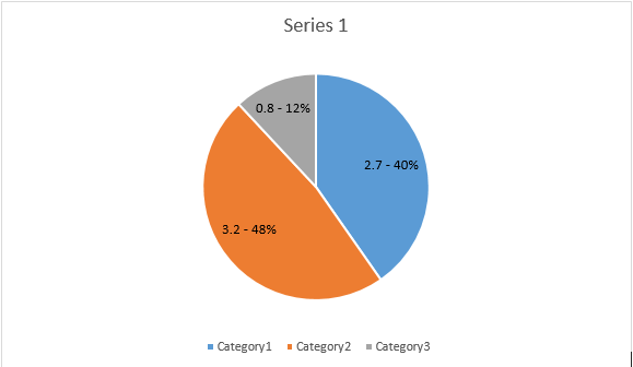
series1 = seriesColl.add_double("AW Series 1", [ 0.7, 1.8, 2.6 ], [ 2.7, 3.2, 0.8 ])
series2 = seriesColl.add_double("AW Series 2", [ 0.5, 1.5, 2.5 ], [ 3, 1, 2 ])
# Set series color.
series1.format.stroke.fore_color = drawing.Color.red
series1.format.stroke.weight = 5
series2.format.stroke.fore_color = drawing.Color.light_green
series2.format.stroke.weight = 5
doc.save(docs_base.artifacts_dir + "WorkingWithCharts.line_color_and_weight.docx")Analyzing your prompt, please hold on...
An error occurred while retrieving the results. Please refresh the page and try again.