Praca z wykresami
Do klasy DocumentBuilder dodano nową metodę insert_chart. Zobaczmy więc, jak wstawić prosty wykres kolumnowy do dokumentu za pomocą metody DocumentBuilder.insert_chart:
Jak wstawić wykres
W tej sekcji dowiemy się, jak wstawić wykres do dokumentu.
Wstaw wykres kolumnowy
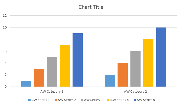
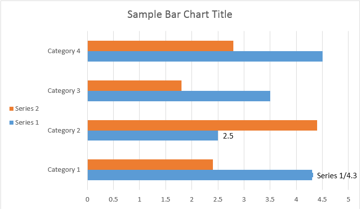
Poniższy przykład kodu pokazuje, jak wstawić wykres kolumnowy:
# For complete examples and data files, please go to https://github.com/aspose-words/Aspose.Words-for-Python-via-.NET | |
doc = aw.Document() | |
builder = aw.DocumentBuilder(doc) | |
# You can specify different chart types and sizes. | |
shape = builder.insert_chart(aw.drawing.charts.ChartType.COLUMN, 432, 252) | |
chart = shape.chart | |
seriesColl = chart.series | |
print(seriesColl.count) | |
# Delete default generated series. | |
seriesColl.clear() | |
# Create category names array, in this example we have two categories. | |
categories = [ "Category 1", "Category 2" ] | |
# Please note, data arrays must not be empty and arrays must be the same size. | |
seriesColl.add("Aspose Series 1", categories, [ 1, 2 ]) | |
seriesColl.add("Aspose Series 2", categories, [ 3, 4 ]) | |
seriesColl.add("Aspose Series 3", categories, [ 5, 6 ]) | |
seriesColl.add("Aspose Series 4", categories, [ 7, 8 ]) | |
seriesColl.add("Aspose Series 5", categories, [ 9, 10 ]) | |
doc.save(docs_base.artifacts_dir + "WorkingWithCharts.insert_simple_column_chart.docx") |
Kod generuje następujący wynik:
Istnieją metody add, add_double i add_date, które zostały wyeksponowane w celu uwzględnienia wszystkich możliwych wariantów źródeł danych dla wszystkich typów wykresów:
# For complete examples and data files, please go to https://github.com/aspose-words/Aspose.Words-for-Python-via-.NET | |
doc = aw.Document() | |
builder = aw.DocumentBuilder(doc) | |
shape = builder.insert_chart(aw.drawing.charts.ChartType.COLUMN, 432, 252) | |
chart = shape.chart | |
chart.series.add("Aspose Series 1", [ "Category 1", "Category 2" ], [ 1, 2 ]) | |
doc.save(docs_base.artifacts_dir + "WorkingWithCharts.insert_column_chart.docx") |
Kod generuje następujący wynik:
Wstaw wykres punktowy
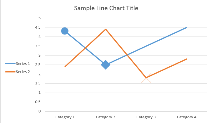
Poniższy przykład pokazuje, jak wstawić wykres punktowy.
# For complete examples and data files, please go to https://github.com/aspose-words/Aspose.Words-for-Python-via-.NET | |
doc = aw.Document() | |
builder = aw.DocumentBuilder(doc) | |
shape = builder.insert_chart(aw.drawing.charts.ChartType.SCATTER, 432, 252) | |
chart = shape.chart | |
chart.series.add_double("Aspose Series 1", [ 0.7, 1.8, 2.6 ], [ 2.7, 3.2, 0.8 ]) | |
doc.save(docs_base.artifacts_dir + "WorkingWithCharts.insert_scatter_chart.docx") |
Kod generuje następujący wynik:
Wstaw wykres warstwowy
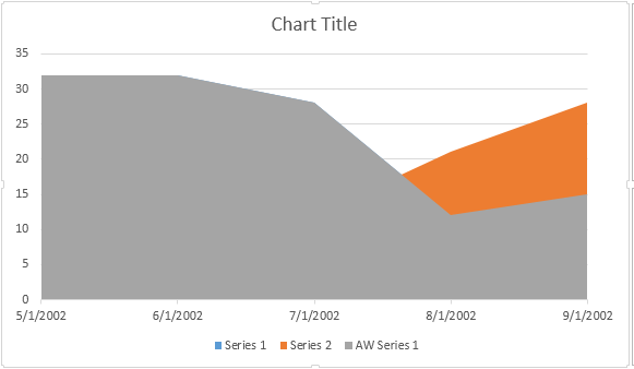
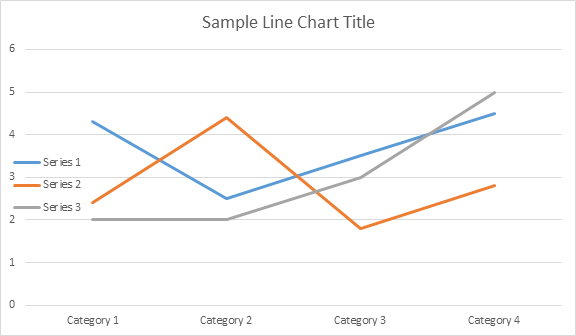
Poniższy przykład kodu pokazuje, jak wstawić wykres warstwowy:
# For complete examples and data files, please go to https://github.com/aspose-words/Aspose.Words-for-Python-via-.NET | |
doc = aw.Document() | |
builder = aw.DocumentBuilder(doc) | |
shape = builder.insert_chart(aw.drawing.charts.ChartType.AREA, 432, 252) | |
chart = shape.chart | |
chart.series.add_date("Aspose Series 1", | |
[ date(2002, 5, 1), date(2002, 6, 1), date(2002, 7, 1), date(2002, 8, 1), date(2002, 9, 1) ], | |
[ 32, 32, 28, 12, 15 ]) | |
doc.save(docs_base.artifacts_dir + "WorkingWithCharts.insert_area_chart.docx") |
Kod generuje następujący wynik:
Wstaw wykres bąbelkowy
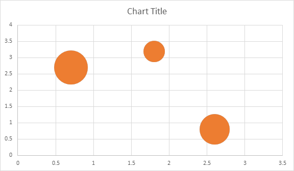
Poniższy przykład kodu pokazuje, jak wstawić wykres bąbelkowy:
# For complete examples and data files, please go to https://github.com/aspose-words/Aspose.Words-for-Python-via-.NET | |
doc = aw.Document() | |
builder = aw.DocumentBuilder(doc) | |
shape = builder.insert_chart(aw.drawing.charts.ChartType.BUBBLE, 432, 252) | |
chart = shape.chart | |
chart.series.add("Aspose Series 1", [ 0.7, 1.8, 2.6 ], [ 2.7, 3.2, 0.8 ], [ 10, 4, 8 ]) | |
doc.save(docs_base.artifacts_dir + "WorkingWithCharts.insert_bubble_chart.docx") |
Kod generuje następujący wynik:
Praca z wykresami za pomocą obiektu Shape.chart
Po wstawieniu i wypełnieniu wykresu danymi istnieje możliwość zmiany jego wyglądu. Właściwość Shape.chart zawiera wszystkie opcje związane z wykresami dostępne w publicznym API.
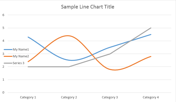
Na przykład zmieńmy tytuł lub legendę Chart:
# For complete examples and data files, please go to https://github.com/aspose-words/Aspose.Words-for-Python-via-.NET | |
doc = aw.Document() | |
builder = aw.DocumentBuilder(doc) | |
shape = builder.insert_chart(aw.drawing.charts.ChartType.LINE, 432, 252) | |
chart = shape.chart | |
chart.title.show = True | |
chart.title.text = "Line Chart Title" | |
chart.title.overlay = False | |
# Please note if None or empty value is specified as title text, auto generated title will be shown. | |
chart.legend.position = aw.drawing.charts.LegendPosition.LEFT | |
chart.legend.overlay = True | |
doc.save(docs_base.artifacts_dir + "WorkingWithCharts.create_chart_using_shape.docx") |
Kod generuje następujące wyniki:
Jak pracować z ChartSeriesCollection of Chart
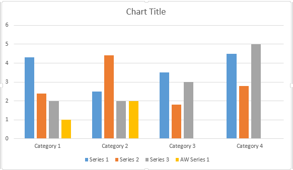
Przyjrzyjmy się kolekcji ChartSeries. Wszystkie serie wykresów są dostępne w kolekcji Chart.series:
# For complete examples and data files, please go to https://github.com/aspose-words/Aspose.Words-for-Python-via-.NET | |
seriesColl = chart.series | |
print(seriesColl.count) |
Możesz usuwać serie pojedynczo lub wyczyścić wszystkie, a jeśli zajdzie taka potrzeba, dodać nową. Nowo wstawiony wykres zawiera kilka domyślnych serii dodanych do tej kolekcji. Aby je usunąć należy wywołać metodę chart.series.clear().
Praca z klasą Single ChartSeries
Oto jak pracować z konkretną serią.
# For complete examples and data files, please go to https://github.com/aspose-words/Aspose.Words-for-Python-via-.NET | |
series0 = chart.series[0] | |
series1 = chart.series[1] | |
series0.name = "Chart Series Name 1" | |
series1.name = "Chart Series Name 2" | |
# You can also specify whether the line connecting the points on the chart shall be smoothed using Catmull-Rom splines. | |
series0.smooth = True | |
series1.smooth = True |
Proszę zobaczyć wynik poniżej:
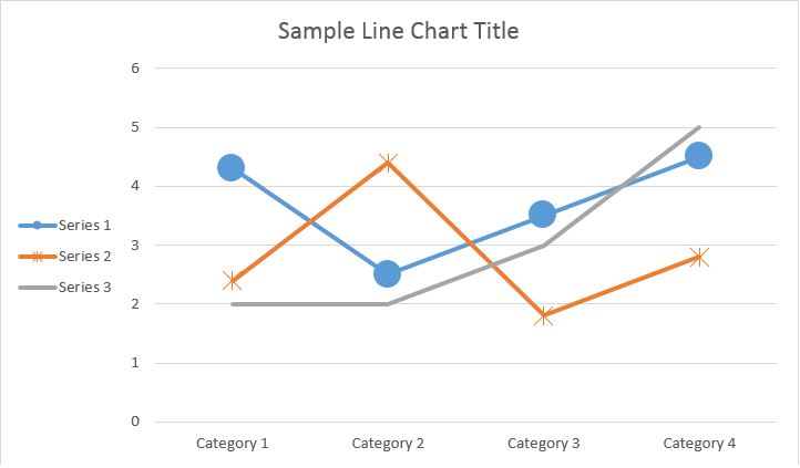
Wszystkie pojedyncze ChartSeries mają domyślne opcje ChartDataPoint. Spróbuj użyć poniższego kodu, aby je zmienić:
# For complete examples and data files, please go to https://github.com/aspose-words/Aspose.Words-for-Python-via-.NET | |
# Specifies whether by default the parent element shall inverts its colors if the value is negative. | |
series0.invert_if_negative = True | |
series0.marker.symbol = aw.drawing.charts.MarkerSymbol.CIRCLE | |
series0.marker.size = 15 | |
series1.marker.symbol = aw.drawing.charts.MarkerSymbol.STAR | |
series1.marker.size = 10 |
Proszę zobaczyć wynik poniżej:
Jak pracować z pojedynczym ChartDataPoint w ChartSeries
Korzystając z ChartDataPoint, możesz dostosować formatowanie pojedynczego punktu danych w serii wykresów:
# For complete examples and data files, please go to https://github.com/aspose-words/Aspose.Words-for-Python-via-.NET | |
doc = aw.Document() | |
builder = aw.DocumentBuilder(doc) | |
shape = builder.insert_chart(aw.drawing.charts.ChartType.LINE, 432, 252) | |
chart = shape.chart | |
series0 = chart.series[0] | |
series1 = chart.series[1] | |
dataPointCollection = series0.data_points | |
dataPoint00 = dataPointCollection[0] | |
dataPoint01 = dataPointCollection[1] | |
dataPoint00.explosion = 50 | |
dataPoint00.marker.symbol = aw.drawing.charts.MarkerSymbol.CIRCLE | |
dataPoint00.marker.size = 15 | |
dataPoint01.marker.symbol = aw.drawing.charts.MarkerSymbol.DIAMOND | |
dataPoint01.marker.size = 20 | |
dataPoint12 = series1.data_points[2] | |
dataPoint12.invert_if_negative = True | |
dataPoint12.marker.symbol = aw.drawing.charts.MarkerSymbol.STAR | |
dataPoint12.marker.size = 20 | |
doc.save(docs_base.artifacts_dir + "WorkingWithCharts.single_chart_data_point.docx") |
Proszę zobaczyć wynik poniżej:
Jak pracować z ChartDataLabel pojedynczej serii wykresów
Używając ChartDataLabel, możesz określić formatowanie pojedynczej etykiety danych serii wykresów, np. pokaż/ukryj klucz legendy, nazwę kategorii, nazwę serii, wartość itp.
# For complete examples and data files, please go to https://github.com/aspose-words/Aspose.Words-for-Python-via-.NET | |
doc = aw.Document() | |
builder = aw.DocumentBuilder(doc) | |
shape = builder.insert_chart(aw.drawing.charts.ChartType.BAR, 432, 252) | |
chart = shape.chart | |
series0 = shape.chart.series[0] | |
labels = series0.data_labels | |
labels.show_legend_key = True | |
# By default, when you add data labels to the data points in a pie chart, leader lines are displayed for data labels that are | |
# positioned far outside the end of data points. Leader lines create a visual connection between a data label and its | |
# corresponding data point. | |
labels.show_leader_lines = True | |
labels.show_category_name = False | |
labels.show_percentage = False | |
labels.show_series_name = True | |
labels.show_value = True | |
labels.separator = "/" | |
labels.show_value = True | |
doc.save(docs_base.artifacts_dir + "WorkingWithCharts.chart_data_label.docx") |
Proszę zobaczyć wynik poniżej:
Jak zdefiniować domyślne opcje dla ChartDataLabels w ChartSeries
Klasa ChartDataLabelCollection definiuje właściwości, których można użyć do ustawienia domyślnych opcji dla ChartDataLabels dla serii wykresów. Właściwości te obejmują show_category_name, show_bubble_size, show_percentage, show_series_name, show_value itp.
# For complete examples and data files, please go to https://github.com/aspose-words/Aspose.Words-for-Python-via-.NET | |
doc = aw.Document() | |
builder = aw.DocumentBuilder(doc) | |
shape = builder.insert_chart(aw.drawing.charts.ChartType.PIE, 432, 252) | |
chart = shape.chart | |
chart.series.clear() | |
series = chart.series.add("Aspose Series 1", | |
[ "Category 1", "Category 2", "Category 3" ], | |
[ 2.7, 3.2, 0.8 ]) | |
labels = series.data_labels | |
labels.show_percentage = True | |
labels.show_value = True | |
labels.show_leader_lines = False | |
labels.separator = " - " | |
doc.save(docs_base.artifacts_dir + "WorkingWithCharts.default_options_for_data_labels.docx") |
Proszę zobaczyć wynik poniżej:
Jak sformatować numer etykiety danych wykresu
Za pomocą ChartDataLabel.number_format możesz określić formatowanie liczbowe pojedynczej etykiety danych wykresu.
Poniższy przykład kodu pokazuje, jak sformatować numer etykiety danych:
# For complete examples and data files, please go to https://github.com/aspose-words/Aspose.Words-for-Python-via-.NET | |
doc = aw.Document() | |
builder = aw.DocumentBuilder(doc) | |
shape = builder.insert_chart(aw.drawing.charts.ChartType.LINE, 432, 252) | |
chart = shape.chart | |
chart.title.text = "Data Labels With Different Number Format" | |
# Delete default generated series. | |
chart.series.clear() | |
series1 = chart.series.add("Aspose Series 1", [ "Category 1", "Category 2", "Category 3" ], [ 2.5, 1.5, 3.5 ]) | |
series1.has_data_labels = True | |
series1.data_labels.show_value = True | |
series1.data_labels[0].number_format.format_code = "\"$\"#,##0.00" | |
series1.data_labels[1].number_format.format_code = "dd/mm/yyyy" | |
series1.data_labels[2].number_format.format_code = "0.00%" | |
# Or you can set format code to be linked to a source cell, | |
# in this case NumberFormat will be reset to general and inherited from a source cell. | |
series1.data_labels[2].number_format.is_linked_to_source = True | |
doc.save(docs_base.artifacts_dir + "WorkingWithCharts.format_number_of_data_label.docx") |
Jak ustawić właściwości osi wykresu
Jeśli chcesz pracować z osią wykresu, skalowaniem i jednostkami wyświetlania dla osi wartości, użyj klas ChartAxis, AxisDisplayUnit i AxisScaling.
Poniższy przykład kodu pokazuje, jak zdefiniować właściwości osi X i Y:
# For complete examples and data files, please go to https://github.com/aspose-words/Aspose.Words-for-Python-via-.NET | |
doc = aw.Document() | |
builder = aw.DocumentBuilder(doc) | |
# Insert chart | |
shape = builder.insert_chart(aw.drawing.charts.ChartType.AREA, 432, 252) | |
chart = shape.chart | |
chart.series.clear() | |
chart.series.add_date("Aspose Series 1", | |
[ date(2002, 1, 1), date(2002, 6, 1), date(2002, 7, 1), date(2002, 8, 1), date(2002, 9, 1) ], | |
[ 640, 320, 280, 120, 150 ]) | |
xAxis = chart.axis_x | |
yAxis = chart.axis_y | |
# Change the X axis to be category instead of date, so all the points will be put with equal interval on the X axis. | |
xAxis.category_type = aw.drawing.charts.AxisCategoryType.CATEGORY | |
xAxis.crosses = aw.drawing.charts.AxisCrosses.CUSTOM | |
xAxis.crosses_at = 3 # Measured in display units of the Y axis (hundreds). | |
xAxis.reverse_order = True | |
xAxis.major_tick_mark = aw.drawing.charts.AxisTickMark.CROSS | |
xAxis.minor_tick_mark = aw.drawing.charts.AxisTickMark.OUTSIDE | |
xAxis.tick_label_offset = 200 | |
yAxis.tick_label_position = aw.drawing.charts.AxisTickLabelPosition.HIGH | |
yAxis.major_unit = 100 | |
yAxis.minor_unit = 50 | |
yAxis.display_unit.unit = aw.drawing.charts.AxisBuiltInUnit.HUNDREDS | |
yAxis.scaling.minimum = aw.drawing.charts.AxisBound(100) | |
yAxis.scaling.maximum = aw.drawing.charts.AxisBound(700) | |
doc.save(docs_base.artifacts_dir + "WorkingWithCharts.define_xy_axis_properties.docx") |
Jak ustawić wartość czasu Date osi
Poniższy przykład kodu pokazuje, jak ustawić wartości daty/godziny dla właściwości osi:
# For complete examples and data files, please go to https://github.com/aspose-words/Aspose.Words-for-Python-via-.NET | |
doc = aw.Document() | |
builder = aw.DocumentBuilder(doc) | |
shape = builder.insert_chart(aw.drawing.charts.ChartType.COLUMN, 432, 252) | |
chart = shape.chart | |
chart.series.clear() | |
chart.series.add_date("Aspose Series 1", | |
[ date(2017, 11, 6), date(2017, 11, 9), date(2017, 11, 15), date(2017, 11, 21), date(2017, 11, 25), date(2017, 11, 29) ], | |
[ 1.2, 0.3, 2.1, 2.9, 4.2, 5.3 ]) | |
xAxis = chart.axis_x | |
xAxis.scaling.minimum = aw.drawing.charts.AxisBound(date(2017, 11, 5)) | |
xAxis.scaling.maximum = aw.drawing.charts.AxisBound(date(2017, 12, 3)) | |
# Set major units to a week and minor units to a day. | |
xAxis.major_unit = 7 | |
xAxis.minor_unit = 1 | |
xAxis.major_tick_mark = aw.drawing.charts.AxisTickMark.CROSS | |
xAxis.minor_tick_mark = aw.drawing.charts.AxisTickMark.OUTSIDE | |
doc.save(docs_base.artifacts_dir + "WorkingWithCharts.date_time_values_to_axis.docx") |
Jak sformatować wartość liczbową osi
Poniższy przykład kodu pokazuje, jak zmienić format liczb na osi wartości:
# For complete examples and data files, please go to https://github.com/aspose-words/Aspose.Words-for-Python-via-.NET | |
doc = aw.Document() | |
builder = aw.DocumentBuilder(doc) | |
shape = builder.insert_chart(aw.drawing.charts.ChartType.COLUMN, 432, 252) | |
chart = shape.chart | |
chart.series.clear() | |
chart.series.add("Aspose Series 1", | |
[ "Item 1", "Item 2", "Item 3", "Item 4", "Item 5" ], | |
[ 1900000, 850000, 2100000, 600000, 1500000 ]) | |
chart.axis_y.number_format.format_code = "#,##0" | |
doc.save(docs_base.artifacts_dir + "WorkingWithCharts.number_format_for_axis.docx") |
Jak ustawić granice osi
Klasa AxisBound reprezentuje minimalną lub maksymalną granicę wartości osi. Powiązanie można określić jako wartość liczbową, datę i godzinę lub specjalną wartość “automatyczną”.
Poniższy przykład kodu pokazuje, jak ustawić granice osi:
# For complete examples and data files, please go to https://github.com/aspose-words/Aspose.Words-for-Python-via-.NET | |
doc = aw.Document() | |
builder = aw.DocumentBuilder(doc) | |
shape = builder.insert_chart(aw.drawing.charts.ChartType.COLUMN, 432, 252) | |
chart = shape.chart | |
chart.series.clear() | |
chart.series.add("Aspose Series 1", | |
[ "Item 1", "Item 2", "Item 3", "Item 4", "Item 5" ], | |
[ 1.2, 0.3, 2.1, 2.9, 4.2 ]) | |
chart.axis_y.scaling.minimum = aw.drawing.charts.AxisBound(0) | |
chart.axis_y.scaling.maximum = aw.drawing.charts.AxisBound(6) | |
doc.save(docs_base.artifacts_dir + "WorkingWithCharts.bounds_of_axis.docx") |
Jak ustawić jednostkę odstępu między etykietami
Poniższy przykład kodu pokazuje, jak ustawić jednostkę odstępu między etykietami na osi:
# For complete examples and data files, please go to https://github.com/aspose-words/Aspose.Words-for-Python-via-.NET | |
doc = aw.Document() | |
builder = aw.DocumentBuilder(doc) | |
shape = builder.insert_chart(aw.drawing.charts.ChartType.COLUMN, 432, 252) | |
chart = shape.chart | |
chart.series.clear() | |
chart.series.add("Aspose Series 1", | |
[ "Item 1", "Item 2", "Item 3", "Item 4", "Item 5" ], | |
[ 1.2, 0.3, 2.1, 2.9, 4.2 ]) | |
chart.axis_x.tick_label_spacing = 2 | |
doc.save(docs_base.artifacts_dir + "WorkingWithCharts.interval_unit_between_labels_on_axis.docx") |
Jak ukryć oś wykresu
Jeśli chcesz pokazać lub ukryć oś wykresu, możesz to po prostu osiągnąć, ustawiając wartość właściwości ChartAxis.hidden.
Poniższy przykład kodu pokazuje, jak ukryć oś Y wykresu:
# For complete examples and data files, please go to https://github.com/aspose-words/Aspose.Words-for-Python-via-.NET | |
doc = aw.Document() | |
builder = aw.DocumentBuilder(doc) | |
shape = builder.insert_chart(aw.drawing.charts.ChartType.COLUMN, 432, 252) | |
chart = shape.chart | |
chart.series.clear() | |
chart.series.add("Aspose Series 1", | |
[ "Item 1", "Item 2", "Item 3", "Item 4", "Item 5" ], | |
[ 1.2, 0.3, 2.1, 2.9, 4.2 ]) | |
chart.axis_y.hidden = True | |
doc.save(docs_base.artifacts_dir + "WorkingWithCharts.hide_chart_axis.docx") |
Jak wyrównać etykietę wykresu
Jeśli chcesz ustawić wyrównanie tekstu dla etykiet wielowierszowych, możesz to po prostu osiągnąć, ustawiając wartość właściwości ChartAxis.tick_label_alignment.
Poniższy przykład kodu pokazuje, jak zaznaczyć wyrównanie etykiet:
# For complete examples and data files, please go to https://github.com/aspose-words/Aspose.Words-for-Python-via-.NET | |
doc = aw.Document() | |
builder = aw.DocumentBuilder(doc) | |
shape = builder.insert_chart(aw.drawing.charts.ChartType.SCATTER, 450, 250) | |
axis = shape.chart.axis_x | |
# This property has effect only for multi-line labels. | |
axis.tick_label_alignment = aw.ParagraphAlignment.RIGHT | |
doc.save(docs_base.artifacts_dir + "WorkingWithCharts.tick_multi_line_label_alignment.docx") |
Jak ustawić formatowanie wypełnienia i obrysu
Formatowanie wypełnienia i obrysu można ustawić dla serii wykresów, punktów danych i znaczników. Aby to zrobić, należy użyć właściwości typu ChartFormat w klasach ChartSeries, ChartDataPoint i ChartMarker, a także aliasów dla niektórych właściwości, takich jak fore_color, back_color, visible i transparency w klasie Stroke.
Poniższy przykład kodu pokazuje, jak ustawić kolor serii:
doc = aw.Document()
builder = aw.DocumentBuilder(doc)
shape = builder.insert_chart(aw.drawing.charts.ChartType.COLUMN, 432, 252)
chart = shape.chart
seriesColl = chart.series
# Delete default generated series.
seriesColl.clear()
# Create category names array.
categories = [ "AW Category 1", "AW Category 2" ]
# Adding new series. Value and category arrays must be the same size.
series1 = seriesColl.add("AW Series 1", categories, [ 1, 2 ])
series2 = seriesColl.add("AW Series 2", categories, [ 3, 4 ])
series3 = seriesColl.add("AW Series 3", categories, [ 5, 6 ])
# Set series color.
series1.format.fill.fore_color = drawing.Color.red
series2.format.fill.fore_color = drawing.Color.yellow
series3.format.fill.fore_color = drawing.Color.blue
doc.save(docs_base.artifacts_dir + "WorkingWithCharts.set_series_color.docx")
Poniższy przykład kodu pokazuje, jak ustawić kolor i wagę linii:
doc = aw.Document()
builder = aw.DocumentBuilder(doc)
shape = builder.insert_chart(aw.drawing.charts.ChartType.LINE, 432, 252)
chart = shape.chart
seriesColl = chart.series
# Delete default generated series.
seriesColl.clear()
# Adding new series.
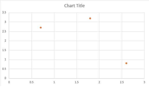
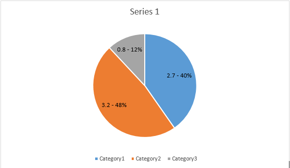
series1 = seriesColl.add_double("AW Series 1", [ 0.7, 1.8, 2.6 ], [ 2.7, 3.2, 0.8 ])
series2 = seriesColl.add_double("AW Series 2", [ 0.5, 1.5, 2.5 ], [ 3, 1, 2 ])
# Set series color.
series1.format.stroke.fore_color = drawing.Color.red
series1.format.stroke.weight = 5
series2.format.stroke.fore_color = drawing.Color.light_green
series2.format.stroke.weight = 5
doc.save(docs_base.artifacts_dir + "WorkingWithCharts.line_color_and_weight.docx")