Analyzing your prompt, please hold on...
An error occurred while retrieving the results. Please refresh the page and try again.
Нові insert_chart метод додано в DocumentBuilder клас. Отже, побачимо, як вставити просту таблицю стовпців у документ, використовуючи DocumentBuilder.insert_chart метод:
У цьому розділі ми дізнаємося, як вставити діаграму в документ.
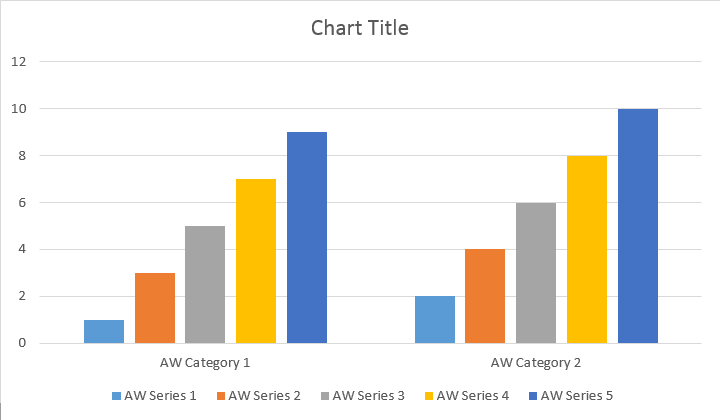
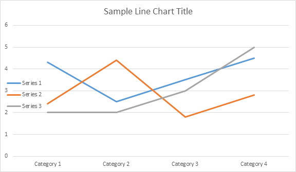
Приклад наступного коду показує, як вставити діаграму стовпців:
Код виробляє наступний результат:
Є add, add_double і add_date методи, які піддаються обкладанню всіх можливих варіантів джерел даних для всіх типів діаграм:
Код виробляє наступний результат:
Нижче показано, як вставити діаграму скатерів.
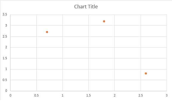
Код виробляє наступний результат:
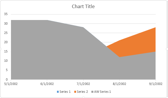
Приклад коду показує, як вставити діаграму області:
Код виробляє наступний результат:
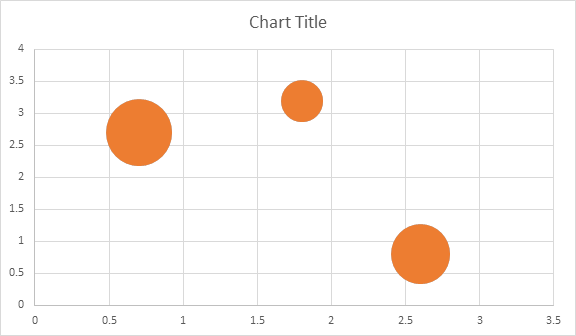
Приклад наступного коду показує, як вставити діаграму міхура:
Код виробляє наступний результат:
Після того, як графік був вставлений і заповнений даними, ви зможете змінити зовнішній вигляд. Shape.chart майно містить всі параметри діаграми, доступні через публічний APIй
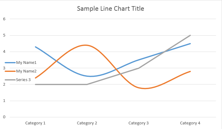
Наприклад, зміна дати Chart Назва або легенда поведінки:
Код генерує результати:
Давайте подивимося ChartSeries збірка. Всі серії діаграм доступні через Chart.series Колекція:
Ви можете видалити серію один за одним або очистити всі вони, а також додати новий, якщо це потрібно. До цієї колекції додано нову таблицю за замовчуванням. Щоб видалити їх потрібно chart.series.clear() метод.
Ось як працювати з певною серією.
Будь ласка, введіть результат нижче:
Всі ChartSeries За замовчуванням ChartDataPoint параметри, будь ласка, спробуйте використовувати наступний код, щоб змінити їх:
Будь ласка, введіть результат нижче:
ChartSeriesВикористання ChartDataPoint Ви зможете налаштувати форматування однієї точки даних серії діаграм:
Будь ласка, введіть результат нижче:
Використання ChartDataLabel Ви можете вказати форматування одного тега даних серії діаграм, як шоу/hide LegendKey, КатегоріяName, SeriesName, значення тощо.
Будь ласка, введіть результат нижче:
Про нас ChartDataLabelCollection Клас визначає властивості, які можна використовувати для встановлення параметрів за замовчуванням ChartDataLabels для серії діаграм. Ці властивості включають show_category_name, show_bubble_size, show_percentage, show_series_name, show_value і т.д.
Будь ласка, введіть результат нижче:
Використання ChartDataLabel.number_format Ви можете вказати форматування номеру однієї мітки даних діаграми.
Приклад наступного коду показує, як форматувати ряд етикеток даних:
Якщо ви хочете працювати з віссю діаграми, масштабування та розподільчих одиниць для осі значення, будь ласка, використовуйте ChartAxis, AxisDisplayUnit, і AxisScaling класи.
Приклад коду показує, як визначити властивості X і Y:
Приклад наступного коду показує, як встановити значення дати / часу до властивостей осі:
Приклад коду показує, як змінити формат чисел на осі значення:
Про нас AxisBound клас являє собою мінімальну або максимальну межу значень осі. Злягання може бути вказаний як числова, дата-time або спеціальне значення “auto”.
Приклад коду показує, як встановити межі осі:
Приклад коду показує, як встановити інтервал між етикетками на осі:
Якщо ви хочете показати або приховати вісь діаграми, ви можете просто досягти цього, встановивши значення ChartAxis.hidden майно.
Приклад наступного коду показує, як приховати Y-осені діаграми:
Якщо ви хочете встановити вирівнювання тексту для багатолінійних етикеток, ви можете просто досягти цього, встановлюючи значення значення ChartAxis.tick_label_alignment майно.
Приклад наступного коду показує, як вирівняти етикетку:
Заповнення та форматування штрихів можна встановити для серії діаграм, точок даних та маркерів. Для цього потрібно використовувати властивості ChartFormat тип у ChartSeries, ChartDataPoint, і ChartMarker класи, а також псевдоніми для деяких властивостей, таких як fore_color, back_color, visible, і transparency в Stroke клас.
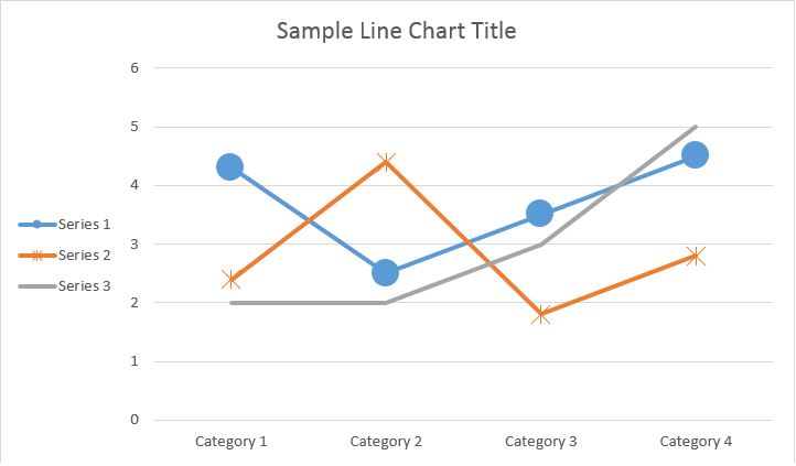
Приклад коду показує, як встановити колір серії:
doc = aw.Document()
builder = aw.DocumentBuilder(doc)

shape = builder.insert_chart(aw.drawing.charts.ChartType.COLUMN, 432, 252)

chart = shape.chart
seriesColl = chart.series

# Delete default generated series.
seriesColl.clear()

# Create category names array.
categories = [ "AW Category 1", "AW Category 2" ]

# Adding new series. Value and category arrays must be the same size.
series1 = seriesColl.add("AW Series 1", categories, [ 1, 2 ])
series2 = seriesColl.add("AW Series 2", categories, [ 3, 4 ])
series3 = seriesColl.add("AW Series 3", categories, [ 5, 6 ])

# Set series color.
series1.format.fill.fore_color = drawing.Color.red
series2.format.fill.fore_color = drawing.Color.yellow
series3.format.fill.fore_color = drawing.Color.blue

doc.save(docs_base.artifacts_dir + "WorkingWithCharts.set_series_color.docx")
Приклад коду показує, як встановити колір лінії і вага:
doc = aw.Document()
builder = aw.DocumentBuilder(doc)

shape = builder.insert_chart(aw.drawing.charts.ChartType.LINE, 432, 252)

chart = shape.chart
seriesColl = chart.series

# Delete default generated series.
seriesColl.clear()

# Adding new series.
series1 = seriesColl.add_double("AW Series 1", [ 0.7, 1.8, 2.6 ], [ 2.7, 3.2, 0.8 ])
series2 = seriesColl.add_double("AW Series 2", [ 0.5, 1.5, 2.5 ], [ 3, 1, 2 ])

# Set series color.
series1.format.stroke.fore_color = drawing.Color.red
series1.format.stroke.weight = 5
series2.format.stroke.fore_color = drawing.Color.light_green
series2.format.stroke.weight = 5

doc.save(docs_base.artifacts_dir + "WorkingWithCharts.line_color_and_weight.docx")Analyzing your prompt, please hold on...
An error occurred while retrieving the results. Please refresh the page and try again.