

Analyzing your prompt, please hold on...
An error occurred while retrieving the results. Please refresh the page and try again.
We don’t provide useful APIs directly.
However, we can write some JavaScript functions based on the DOM structure to achieve it.
For example, to keep the File menu only, assume the div id of GridJs is "gridjs-divid":
// get menubar parent DOM
   const menubar=document.querySelector("#gridjs-divid > div > div:nth-child(1) > div > div.x-spreadsheet-banner-info-s > div.x-spreadsheet-toolbar.x-spreadsheet-menubar");
   var childs = menubar.childNodes;

for (var i = childs.length - 1; i >= 0; i--) {
     // keep File menu  only
  if (childs[i].childNodes[0].childNodes[0].textContent !== "File") {
         menubar.removeChild(childs[i]);
       }
   }
After calling this function
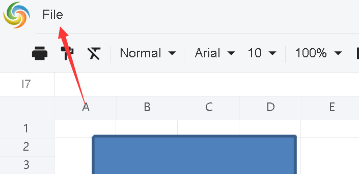
For example, to keep the “Download As XLSX” menu item in the File menu only, assume the div id of GridJs is "gridjs-divid":
// get menubar parent DOM
   const menubar=document.querySelector("#gridjs-divid > div > div:nth-child(1) > div > div.x-spreadsheet-banner-info-s > div.x-spreadsheet-toolbar.x-spreadsheet-menubar");
   var childs = menubar.childNodes;

// keep the first one → File menu only
for (var i = childs.length - 1; i >= 0; i--) {
  // find the File menu
  if (childs[i].childNodes[0].childNodes[0].textContent === "File") {
            var dropdownparent = childs[i].childNodes[0].childNodes[1];
            var menuitems = dropdownparent.childNodes;
    for (var ii = menuitems.length - 1; ii >= 0; ii--) {
      // remove other menu items that are not "Download As XLSX"
      if (menuitems[ii].textContent !== "Download As XLSX") {
                    dropdownparent.removeChild(menuitems[ii]);
                }
            }
       }
   }
After calling this function
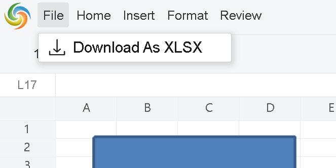
For example, to keep the Search button only, assume the div id of GridJs is "gridjs-divid":
// get toolbar parent DOM
   const toolbar=document.querySelector("#gridjs-divid > div > div.x-spreadsheet-toolbar > div.x-spreadsheet-toolbar-btns");
   var childs = toolbar.childNodes;

for (var i = childs.length - 1; i >= 0; i--) {
  // keep Search button only
  if (childs[i].getAttribute("data-tooltip") !== "Search") {
         toolbar.removeChild(childs[i]);
       }
   }
After calling this function
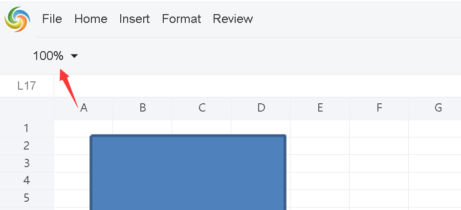
Open the browser inspection window and select the toolbar button,
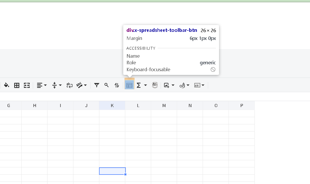
Then we can find that the related CSS key for this button is: freeze
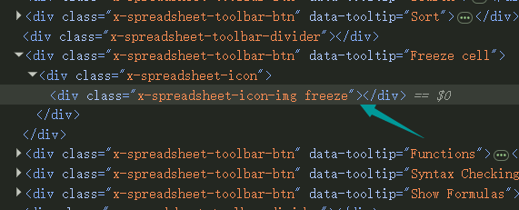
Add the following CSS rule:
.x-spreadsheet-toolbar .x-spreadsheet-toolbar-btn:hover .x-spreadsheet-icon-img.freeze,
.x-spreadsheet-toolbar .x-spreadsheet-toolbar-btn.active .x-spreadsheet-icon-img.freeze {
  background: rgba(4, 71, 33, 0.08);
  filter: brightness(0) saturate(100%) invert(27%) sepia(51%) saturate(2878%) hue-rotate(346deg) brightness(104%) contrast(97%);
}
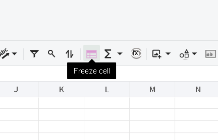
The result will be:
Insert one or more fully-custom buttons into the x-spreadsheet top toolbar to host host-app-specific actions (e.g. “Export log”, “Quick fill”, “Open third-party panel”…). The buttons are placed at the tail of the native toolbar, just before the More (overflow) button, and participate in the same responsive collapsing logic — when the window gets narrow they automatically fold into the More dropdown panel.
Just pass an array through options.customToolbarButtons , assume the div id of GridJs is “gridjs-divid”:
const xs = x_spreadsheet('#gridjs-divid', {
  customToolbarButtons: [
    {
      tag: 'open-panel',
      tooltip: 'Open my panel',
      icon: { text: '★' },
      onClick: (btn, spreadsheet) => {
        console.log('button clicked:', btn.tag);
        // Call any public Spreadsheet API
        const sheetName = spreadsheet.getSheetName();
        // Toggle active state at runtime
        btn.setActive(!btn.config.active);
      },
    },
  ],
});

// Centralized listener for ALL custom-button clicks
xs.on('custom-button', (tag, btn) => {
  console.log('custom-button clicked:', tag, btn);
});
CustomToolbarButtonConfig)| Field | Type | Required | Description |
|---|---|---|---|
tag |
string |
✅ | Unique identifier; used to distinguish buttons in onClick / custom-button event |
tooltip |
string |
Tooltip text shown on hover | |
icon |
CustomToolbarButtonIcon |
Icon descriptor; see Section 3 | |
onClick |
(btn, spreadsheet) => void |
Click callback. 1st arg is the button instance, 2nd arg is the Spreadsheet instance |
|
active |
boolean |
Initial active (highlighted) state | |
disabled |
boolean |
Initial disabled state. Disabled buttons fire neither onClick nor custom-button event |
|
width |
number |
Fixed button width in px; omitted = icon auto-width |
CustomToolbarButtonIcon)icon accepts four mutually-exclusive forms, listed in priority order:
icon: {
  url: 'https://example.com/icon.png',
  width: 20,   // optional, default 16
  height: 20,  // optional, default 16
}
icon: { className: 'my-custom-icon' }
.my-custom-icon {
  background: url('./my.svg') no-repeat center / contain;
  width: 16px;
  height: 16px;
}
icon: {
  html: '<svg width="16" height="16" viewBox="0 0 24 24"><path d="M12 2l3 7h7l-6 4 2 7-6-4-6 4 2-7-6-4h7z"/></svg>'
}
icon: { text: '★' }
icon: { text: 'EXP' }
CustomToolbarButton)The 1st argument of onClick, and the 2nd argument of the custom-button event, is the runtime button instance, which exposes:
| Method | Description |
|---|---|
setIcon(iconConfig) |
Replace the icon at runtime (same shape as CustomToolbarButtonIcon) |
setTooltip(text) |
Update the tooltip text |
setActive(boolean) |
Toggle active (highlighted) state |
setDisabled(boolean) |
Toggle disabled state |
show() / hide() |
Show / hide the button |
And the following properties:
| Property | Description |
|---|---|
tag |
The button tag |
tip |
Current tooltip text |
spreadsheet |
The host Spreadsheet instance — full public API is callable |
config |
The original config object you passed in |
Besides the per-button onClick callback, every custom-button click also dispatches a unified event named custom-button:
xs.on('custom-button', (tag, btn) => {
  // tag: string, the clicked button tag
  // btn: CustomToolbarButton instance
});
Handy for the “single entry, dispatch by tag” pattern.
const xs = x_spreadsheet('#app', {
  customToolbarButtons: [
    // 1. URL icon + initial disabled
    {
      tag: 'export-log',
      tooltip: 'Export log',
      icon: { url: '/assets/log.png' },
      disabled: true,
      onClick: (btn) => downloadLog(),
    },
    // 2. Text icon + dynamic active toggling
    {
      tag: 'toggle-mode',
      tooltip: 'Toggle readonly',
      icon: { text: '🔒' },
      onClick: (btn, spreadsheet) => {
        const readonly = !btn.config.active;
        btn.config.active = readonly;
        btn.setActive(readonly);
        btn.setIcon({ text: readonly ? '🔒' : '🔓' });
      },
    },
    // 3. Inline SVG
    {
      tag: 'refresh',
      tooltip: 'Refresh data',
      icon: {
        html: '<svg width="16" height="16" viewBox="0 0 24 24"><path fill="currentColor" d="M17.65 6.35A8 8 0 1 0 20 12h-2a6 6 0 1 1-1.76-4.24L13 11h7V4z"/></svg>',
      },
      onClick: (btn, spreadsheet) => reloadData(spreadsheet),
    },
  ],
});

xs.on('custom-button', (tag, btn) => {
  switch (tag) {
    case 'export-log':
      // Never fired while disabled
      break;
    case 'toggle-mode':
      console.log('mode =', btn.config.active);
      break;
    default:
      break;
  }
});

// Mutate a button externally / asynchronously
setTimeout(() => {
  // e.g. log has finished generating — enable the export button
  const exportBtn = xs.sheet.toolbar.customButtons
    .find((b) => b.tag === 'export-log');
  exportBtn && exportBtn.setDisabled(false);
}, 3000);
More button; they cannot be interleaved into other groups.More dropdown with identical interaction.disabled: true, the button fires neither the per-button onClick nor the custom-button event.tag must be unique: Event dispatching relies on tag. If omitted, the framework auto-assigns custom-<timestamp>.CustomToolbarButtonConfig / CustomToolbarButtonIcon / CustomToolbarButton from index.d.ts for full type hints.The bottom bar contains two interactive buttons:
add class) – creates new worksheetsellipsis class) – manages worksheet selectionYou can access these elements using:
// Add Worksheet Button
const addButton = document.querySelector('.x-spreadsheet-icon-img.add');

// Select Worksheet Button
const selectButton = document.querySelector('.x-spreadsheet-icon-img.ellipsis');
To remove a button from the DOM:
// Hide Add Worksheet Button
const addButton = document.querySelector('.x-spreadsheet-icon-img.add');
addButton.parentElement.removeChild(addButton);

// Hide Select Worksheet Button
const selectButton = document.querySelector('.x-spreadsheet-icon-img.ellipsis');
selectButton.parentElement.removeChild(selectButton);
You can replace icons using either external SVG files or inline SVG data:
const addButton = document.querySelector('.x-spreadsheet-icon-img.add');
addButton.style.backgroundImage = "url('https://example.com/fish-icon.svg')";
// Adjust size and position
addButton.style.width = '18px';
addButton.style.height = '18px';
addButton.style.left = '0';
addButton.style.top = '0';
You can modify the click event to customize functionality:
const addButton = document.querySelector('.x-spreadsheet-icon-img.add');
addButton.addEventListener('click', function() {
  // Custom action here
  console.log('Custom add worksheet action');
});

Analyzing your prompt, please hold on...
An error occurred while retrieving the results. Please refresh the page and try again.