Práce s grafy
Nový insertChart byla přidána do DocumentBuilder třída. Podívejme se, jak vložit jednoduchý sloupcový graf do dokumentu pomocí vložit Graf metoda.
Jak vložit graf ze Škrábance pomocí Aspose.Words
V této části se naučíme, jak vložit graf do dokumentu.
Vložit graf sloupce
Následující příklad kódu ukazuje, jak vložit sloupec graf:
// For complete examples and data files, please go to https://github.com/aspose-words/Aspose.Words-for-Java | |
Document doc = new Document(); | |
DocumentBuilder builder = new DocumentBuilder(doc); | |
// Add chart with default data. You can specify different chart types and sizes. | |
Shape shape = builder.insertChart(ChartType.COLUMN, 432, 252); | |
// Chart property of Shape contains all chart related options. | |
Chart chart = shape.getChart(); | |
// Get chart series collection. | |
ChartSeriesCollection seriesColl = chart.getSeries(); | |
// Delete default generated series. | |
seriesColl.clear(); | |
// Create category names array, in this example we have two categories. | |
String[] categories = new String[]{"AW Category 1", "AW Category 2"}; | |
// Adding new series. Please note, data arrays must not be empty and arrays must be the same size. | |
seriesColl.add("AW Series 1", categories, new double[]{1, 2}); | |
seriesColl.add("AW Series 2", categories, new double[]{3, 4}); | |
seriesColl.add("AW Series 3", categories, new double[]{5, 6}); | |
seriesColl.add("AW Series 4", categories, new double[]{7, 8}); | |
seriesColl.add("AW Series 5", categories, new double[]{9, 10}); | |
doc.save(dataDir + "TestInsertChartColumn1_out.docx"); |
Kód produkuje následující výsledek:
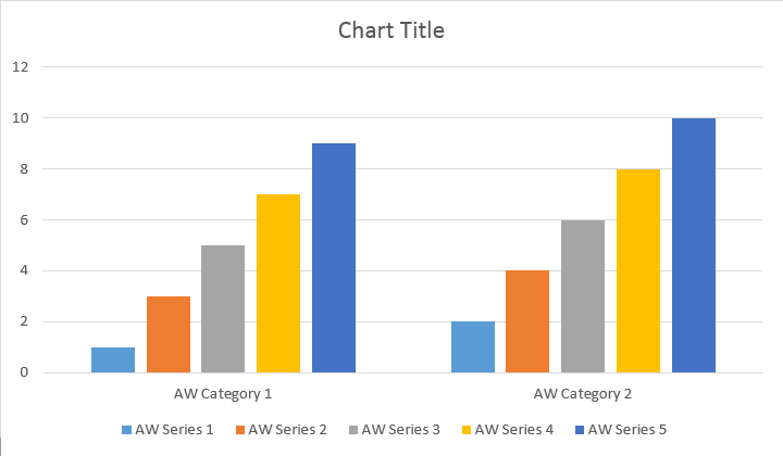
Existují čtyři různé přetížení pro sérii Přidat metodu, která byla vystavena pokrytí všech možných variant zdrojů dat pro všechny typy grafů:
// For complete examples and data files, please go to https://github.com/aspose-words/Aspose.Words-for-Java | |
Document doc = new Document(); | |
DocumentBuilder builder = new DocumentBuilder(doc); | |
// Insert Column chart. | |
Shape shape = builder.insertChart(ChartType.COLUMN, 432, 252); | |
Chart chart = shape.getChart(); | |
// Use this overload to add series to any type of Bar, Column, Line and Surface charts. | |
chart.getSeries().add("AW Series 1", new String[]{"AW Category 1", "AW Category 2"}, new double[]{1, 2}); | |
doc.save(dataDir + "TestInsertColumnChart2_out.docx"); |
Kód produkuje následující výsledek:
Vložit rozptyl Graf
Následující příklad kódu ukazuje, jak vložit graf Scatter:
// For complete examples and data files, please go to https://github.com/aspose-words/Aspose.Words-for-Java | |
Document doc = new Document(); | |
DocumentBuilder builder = new DocumentBuilder(doc); | |
// Insert Scatter chart. | |
Shape shape = builder.insertChart(ChartType.SCATTER, 432, 252); | |
Chart chart = shape.getChart(); | |
// Use this overload to add series to any type of Scatter charts. | |
chart.getSeries().add("AW Series 1", new double[]{0.7, 1.8, 2.6}, new double[]{2.7, 3.2, 0.8}); | |
doc.save(dataDir + "TestInsertScatterChart_out.docx"); |
Kód produkuje následující výsledek:
Vložit oblast Graf
Následující příklad kódu ukazuje, jak vložit graf plochy:
// For complete examples and data files, please go to https://github.com/aspose-words/Aspose.Words-for-Java | |
Document doc = new Document(); | |
DocumentBuilder builder = new DocumentBuilder(doc); | |
// Insert Area chart. | |
Shape shape = builder.insertChart(ChartType.AREA, 432, 252); | |
Chart chart = shape.getChart(); | |
SimpleDateFormat sdf = new SimpleDateFormat("dd/MM/yyyy"); | |
Date date1 = sdf.parse("01/01/2016"); | |
Date date2 = sdf.parse("02/02/2016"); | |
Date date3 = sdf.parse("03/03/2016"); | |
Date date4 = sdf.parse("04/04/2016"); | |
Date date5 = sdf.parse("05/05/2016"); | |
// Use this overload to add series to any type of Area, Radar and Stock charts. | |
chart.getSeries().add("AW Series 1", new Date[]{date1, date2, date3, date4, date5}, new double[]{32, 32, 28, 12, 15}); | |
doc.save(dataDir + "TestInsertAreaChart_out.docx"); |
Kód produkuje následující výsledek:
Vložit graf bubliny
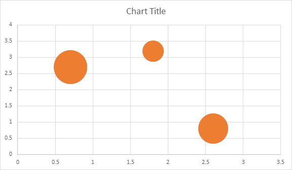
Následující příklad kódu ukazuje, jak vložit bublinový graf:
// For complete examples and data files, please go to https://github.com/aspose-words/Aspose.Words-for-Java | |
Document doc = new Document(); | |
DocumentBuilder builder = new DocumentBuilder(doc); | |
// Insert Bubble chart. | |
Shape shape = builder.insertChart(ChartType.BUBBLE, 432, 252); | |
Chart chart = shape.getChart(); | |
// Use this overload to add series to any type of Bubble charts. | |
chart.getSeries().add("AW Series 1", new double[]{0.7, 1.8, 2.6}, new double[]{2.7, 3.2, 0.8}, new double[]{10, 4, 8}); | |
doc.save(dataDir + "TestInsertBubbleChart_out.docx"); |
Kód produkuje následující výsledek:
Práce s grafy přes Shape.Chart
Předmět
Jakmile byl graf vložen a vyplněn daty, jste schopni změnit jeho vzhled. Shape.Chart vlastnost obsahuje všechny možnosti související s grafem dostupné prostřednictvím veřejnosti API.
Například, pojďme změnit Titulek nebo legenda chování:
// For complete examples and data files, please go to https://github.com/aspose-words/Aspose.Words-for-Java | |
Document doc = new Document(); | |
DocumentBuilder builder = new DocumentBuilder(doc); | |
Shape shape = builder.insertChart(ChartType.LINE, 432, 252); | |
Chart chart = shape.getChart(); | |
// Determines whether the title shall be shown for this chart. Default is true. | |
chart.getTitle().setShow(true); | |
// Setting chart Title. | |
chart.getTitle().setText("Sample Line Chart Title"); | |
// Determines whether other chart elements shall be allowed to overlap title. | |
chart.getTitle().setOverlay(false); | |
// Please note if null or empty value is specified as title text, auto generated title will be shown. | |
// Determines how legend shall be shown for this chart. | |
chart.getLegend().setPosition(LegendPosition.LEFT); | |
chart.getLegend().setOverlay(true); | |
doc.save(dataDir + "ChartAppearance_out.docx"); |
Kód generuje následující výsledky:
Jak pracovat s ChartSeriesSběr grafu
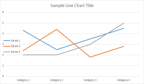
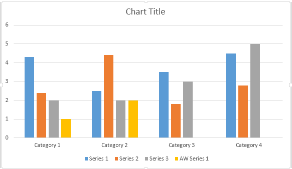
Podívejme se na to. ChartSeries kolekce. Všechny řady grafů jsou k dispozici prostřednictvím chart.getSeries() sběr, který je Iterable:
// For complete examples and data files, please go to https://github.com/aspose-words/Aspose.Words-for-Java | |
Document doc = new Document(); | |
DocumentBuilder builder = new DocumentBuilder(doc); | |
Shape shape = builder.insertChart(ChartType.LINE, 432, 252); | |
// Chart property of Shape contains all chart related options. | |
Chart chart = shape.getChart(); | |
// Get chart series collection. | |
ChartSeriesCollection seriesCollection = chart.getSeries(); | |
// Check series count. | |
System.out.println(seriesCollection.getCount()); |
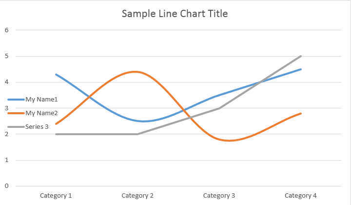
Můžete odstranit sérii jedna po jedné nebo vymazat všechny z nich, stejně jako přidat nový v případě potřeby. Nově vložená tabulka má k této kolekci přidány některé výchozí řady. Chcete-li odstranit, musíte zavolat graf.getSeries().clear() metoda.
Práce s jednou třídou grafů
Zde je, jak pracovat s konkrétní série.
// For complete examples and data files, please go to https://github.com/aspose-words/Aspose.Words-for-Java | |
Document doc = new Document(); | |
DocumentBuilder builder = new DocumentBuilder(doc); | |
Shape shape = builder.insertChart(ChartType.LINE, 432, 252); | |
// Get first series. | |
ChartSeries series0 = shape.getChart().getSeries().get(0); | |
// Get second series. | |
ChartSeries series1 = shape.getChart().getSeries().get(1); | |
// Change first series name. | |
series0.setName("My Name1"); | |
// Change second series name. | |
series1.setName("My Name2"); | |
// You can also specify whether the line connecting the points on the chart shall be smoothed using Catmull-Rom splines. | |
series0.setSmooth(true); | |
series1.setSmooth(true); | |
doc.save(dataDir + "SingleChartSeries_out.docx"); |
Viz níže uvedený výsledek:
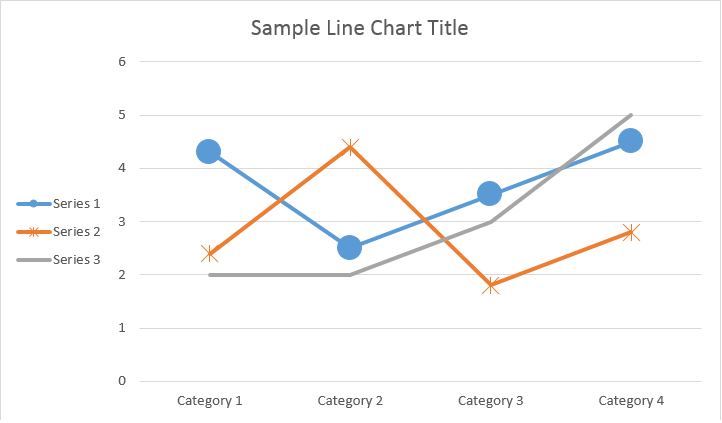
Všechny samostatné ChartSeries mají výchozí ChartDataPoint možnosti, zkuste prosím použít následující kód pro jejich změnu:
// For complete examples and data files, please go to https://github.com/aspose-words/Aspose.Words-for-Java | |
Document doc = new Document(); | |
DocumentBuilder builder = new DocumentBuilder(doc); | |
Shape shape = builder.insertChart(ChartType.LINE, 432, 252); | |
// Get first series. | |
ChartSeries series0 = shape.getChart().getSeries().get(0); | |
// Get second series. | |
ChartSeries series1 = shape.getChart().getSeries().get(1); | |
// Specifies whether by default the parent element shall inverts its colors if the value is negative. | |
series0.setInvertIfNegative(true); | |
// Set default marker symbol and size. | |
series0.getMarker().setSymbol(MarkerSymbol.CIRCLE); | |
series0.getMarker().setSize(15); | |
series1.getMarker().setSymbol(MarkerSymbol.STAR); | |
series1.getMarker().setSize(10); | |
doc.save(dataDir + "ChartDataPoints_out.docx");// |
Jak pracovat s jedním grafDataPoint ChartSeries
Použití ChartDataPoint jste schopni přizpůsobit formátování jednoho datového bodu řady grafu:
// For complete examples and data files, please go to https://github.com/aspose-words/Aspose.Words-for-Java | |
Document doc = new Document(); | |
DocumentBuilder builder = new DocumentBuilder(doc); | |
Shape shape = builder.insertChart(ChartType.LINE, 432, 252); | |
// Get first series. | |
ChartSeries series0 = shape.getChart().getSeries().get(0); | |
// Get second series. | |
ChartSeries series1 = shape.getChart().getSeries().get(1); | |
ChartDataPointCollection dataPointCollection = series0.getDataPoints(); | |
// Add data point to the first and second point of the first series. | |
ChartDataPoint dataPoint00 = dataPointCollection.add(0); | |
ChartDataPoint dataPoint01 = dataPointCollection.add(1); | |
// Set explosion. | |
dataPoint00.setExplosion(50); | |
// Set marker symbol and size. | |
dataPoint00.getMarker().setSymbol(MarkerSymbol.CIRCLE); | |
dataPoint00.getMarker().setSize(15); | |
dataPoint01.getMarker().setSymbol(MarkerSymbol.DIAMOND); | |
dataPoint01.getMarker().setSize(20); | |
// Add data point to the third point of the second series. | |
ChartDataPoint dataPoint12 = series1.getDataPoints().add(2); | |
dataPoint12.setInvertIfNegative(true); | |
dataPoint12.getMarker().setSymbol(MarkerSymbol.STAR); | |
dataPoint12.getMarker().setSize(20); | |
doc.save(dataDir + "SingleChartDataPointOfAChartSeries_out.docx"); |
Viz níže uvedený výsledek:
Jak pracovat s grafDataLabel jedné řady grafů
Použití ChartDataLabel jste schopni určit formátování jednoho datového štítku série grafu, jako je show/hide LegendKey, CategoryName, SeriesName, Hodnota atd.:
// For complete examples and data files, please go to https://github.com/aspose-words/Aspose.Words-for-Java | |
Document doc = new Document(); | |
DocumentBuilder builder = new DocumentBuilder(doc); | |
Shape shape = builder.insertChart(ChartType.BAR, 432, 252); | |
// Get first series. | |
ChartSeries series0 = shape.getChart().getSeries().get(0); | |
series0.hasDataLabels(true); | |
// Set properties. | |
series0.getDataLabels().setShowLegendKey(true); | |
// By default, when you add data labels to the data points in a pie chart, leader lines are displayed for data labels that are | |
// positioned far outside the end of data points. Leader lines create a visual connection between a data label and its | |
// corresponding data point. | |
series0.getDataLabels().setShowLeaderLines(true); | |
series0.getDataLabels().setShowCategoryName(false); | |
series0.getDataLabels().setShowPercentage(false); | |
series0.getDataLabels().setShowSeriesName(true); | |
series0.getDataLabels().setShowValue(true); | |
series0.getDataLabels().setSeparator("/"); | |
series0.getDataLabels().setShowValue(true); | |
doc.save(dataDir + "ChartDataLabelOfASingleChartSeries_out.docx"); |
Viz níže uvedený výsledek:
Jak definovat výchozí možnosti pro ChartDataLabels of ChartSeries
The ChartDataLabelCollection třída definuje vlastnosti, které lze použít pro nastavení výchozích možností ChartDataLabels pro graf Series. Tyto vlastnosti zahrnují setShowCategoryName, setShowBubbleSize, setShowProcentage, setShowSeriesName, setShowShow Hodnota atd.:
// For complete examples and data files, please go to https://github.com/aspose-words/Aspose.Words-for-Java | |
Document doc = new Document(); | |
DocumentBuilder builder = new DocumentBuilder(doc); | |
Shape shape = builder.insertChart(ChartType.PIE, 432, 252); | |
Chart chart = shape.getChart(); | |
chart.getSeries().clear(); | |
ChartSeries series = chart.getSeries().add("Series 1", new String[] { "Category1", "Category2", "Category3" }, | |
new double[] { 2.7, 3.2, 0.8 }); | |
ChartDataLabelCollection labels = series.getDataLabels(); | |
labels.setShowPercentage(true); | |
labels.setShowValue(true); | |
labels.setShowLeaderLines(false); | |
labels.setSeparator(" - "); | |
doc.save(dataDir + "Demo.docx"); |
Viz níže uvedený výsledek:
Jak formátovat počet znaků
Použití NumberFormat vlastnost, můžete zadat číslo formátování jednoho datového štítku grafu.
Následující příklad kódu ukazuje, jak formátovat číslo štítku:
// For complete examples and data files, please go to https://github.com/aspose-words/Aspose.Words-for-Java | |
Document doc = new Document(); | |
DocumentBuilder builder = new DocumentBuilder(doc); | |
// Add chart with default data. | |
Shape shape = builder.insertChart(ChartType.LINE, 432, 252); | |
Chart chart = shape.getChart(); | |
chart.getTitle().setText("Data Labels With Different Number Format"); | |
// Delete default generated series. | |
chart.getSeries().clear(); | |
// Add new series | |
ChartSeries series0 = chart.getSeries().add("AW Series 0", new String[] { "AW0", "AW1", "AW2" }, | |
new double[] { 2.5, 1.5, 3.5 }); | |
series0.hasDataLabels(true); | |
// Set currency format code. | |
series0.getDataLabels().get(0).getNumberFormat().setFormatCode("\"$\"#,##0.00"); | |
// Set date format code. | |
series0.getDataLabels().get(1).getNumberFormat().setFormatCode("d/mm/yyyy"); | |
// Set percentage format code. | |
series0.getDataLabels().get(2).getNumberFormat().setFormatCode("0.00%"); | |
// Or you can set format code to be linked to a source cell, | |
// in this case NumberFormat will be reset to general and inherited from a | |
// source cell. | |
series0.getDataLabels().get(2).getNumberFormat().isLinkedToSource(true); | |
doc.save(dataDir + "NumberFormat_DataLabel_out.docx"); |
Jak nastavit vlastnosti grafu Osa
Pokud chcete pracovat s osou grafu, škálováním a zobrazením jednotek pro osu hodnoty, použijte prosím ChartAxis, AxisDisplayUnit, a AxisScaling třídy.
Následující příklad kódu ukazuje, jak definovat vlastnosti osy X a Y:
// For complete examples and data files, please go to https://github.com/aspose-words/Aspose.Words-for-Java | |
Document doc = new Document(); | |
DocumentBuilder builder = new DocumentBuilder(doc); | |
// Insert chart. | |
Shape shape = builder.insertChart(ChartType.AREA, 432, 252); | |
Chart chart = shape.getChart(); | |
// Clear demo data. | |
chart.getSeries().clear(); | |
// Fill data. | |
chart.getSeries().add("AW Series 1", | |
new Date[]{new Date(2002, 1, 1), new Date(2002, 6, 1), new Date(2015, 7, 1), new Date(2015, 8, 1), new Date(2015, 9, 1)}, | |
new double[]{640, 320, 280, 120, 150}); | |
ChartAxis xAxis = chart.getAxisX(); | |
ChartAxis yAxis = chart.getAxisY(); | |
// Change the X axis to be category instead of date, so all the points will be put with equal interval on the X axis. | |
xAxis.setCategoryType(AxisCategoryType.CATEGORY); | |
// Define X axis properties. | |
xAxis.setCrosses(AxisCrosses.CUSTOM); | |
xAxis.setCrossesAt(3); // measured in display units of the Y axis (hundreds) | |
xAxis.setReverseOrder(true); | |
xAxis.setMajorTickMark(AxisTickMark.CROSS); | |
xAxis.setMinorTickMark(AxisTickMark.OUTSIDE); | |
xAxis.setTickLabelOffset(200); | |
// Define Y axis properties. | |
yAxis.setTickLabelPosition(AxisTickLabelPosition.HIGH); | |
yAxis.setMajorUnit(100); | |
yAxis.setMinorUnit(50); | |
yAxis.getDisplayUnit().setUnit(AxisBuiltInUnit.HUNDREDS); | |
yAxis.getScaling().setMinimum(new AxisBound(100)); | |
yAxis.getScaling().setMaximum(new AxisBound(700)); | |
dataDir = dataDir + "SetAxisProperties_out.docx"; | |
doc.save(dataDir); |
Jak nastavit DateČasová hodnota osy
Následující příklad kódu ukazuje, jak nastavit hodnoty datumu a času na vlastnosti osy:
// For complete examples and data files, please go to https://github.com/aspose-words/Aspose.Words-for-Java | |
Document doc = new Document(); | |
DocumentBuilder builder = new DocumentBuilder(doc); | |
// Insert chart. | |
Shape shape = builder.insertChart(ChartType.COLUMN, 432, 252); | |
Chart chart = shape.getChart(); | |
// Clear demo data. | |
chart.getSeries().clear(); | |
// Fill data. | |
chart.getSeries().add("AW Series 1", | |
new Date[]{new Date(2017, 11, 06), new Date(2017, 11, 9), new Date(2017, 11, 15), | |
new Date(2017, 11, 21), new Date(2017, 11, 25), new Date(2017, 11, 29)}, | |
new double[]{1.2, 0.3, 2.1, 2.9, 4.2, 5.3} | |
); | |
// Set X axis bounds. | |
ChartAxis xAxis = chart.getAxisX(); | |
xAxis.getScaling().setMinimum(new AxisBound(new Date(2017, 11, 5).getTime())); | |
xAxis.getScaling().setMaximum(new AxisBound(new Date(2017, 12, 3).getTime())); | |
// Set major units to a week and minor units to a day. | |
xAxis.setMajorUnit(7); | |
xAxis.setMinorUnit(1); | |
xAxis.setMajorTickMark(AxisTickMark.CROSS); | |
xAxis.setMinorTickMark(AxisTickMark.OUTSIDE); | |
dataDir = dataDir + "SetDateTimeValuesToAxis_out.docx"; | |
doc.save(dataDir); |
Jak formátovat hodnotu čísla osy
Následující příklad kódu ukazuje, jak změnit formát čísel na ose hodnoty:
// For complete examples and data files, please go to https://github.com/aspose-words/Aspose.Words-for-Java | |
Document doc = new Document(); | |
DocumentBuilder builder = new DocumentBuilder(doc); | |
// Insert chart. | |
Shape shape = builder.insertChart(ChartType.COLUMN, 432, 252); | |
Chart chart = shape.getChart(); | |
// Clear demo data. | |
chart.getSeries().clear(); | |
// Fill data. | |
chart.getSeries().add("AW Series 1", | |
new String[]{"Item 1", "Item 2", "Item 3", "Item 4", "Item 5"}, | |
new double[]{1900000, 850000, 2100000, 600000, 1500000}); | |
// Set number format. | |
chart.getAxisY().getNumberFormat().setFormatCode("#,##0"); | |
dataDir = dataDir + "FormatAxisNumber_out.docx"; | |
doc.save(dataDir); |
Jak nastavit hranice osy
The AxisBound
třída představuje minimální nebo maximální hranici hodnot osy. Hranice může být specifikována jako numerická, data-time nebo speciální “auto” hodnota.
Následující příklad kódu ukazuje, jak nastavit hranice osy:
// For complete examples and data files, please go to https://github.com/aspose-words/Aspose.Words-for-Java | |
Document doc = new Document(); | |
DocumentBuilder builder = new DocumentBuilder(doc); | |
// Insert chart. | |
Shape shape = builder.insertChart(ChartType.COLUMN, 432, 252); | |
Chart chart = shape.getChart(); | |
// Clear demo data. | |
chart.getSeries().clear(); | |
// Fill data. | |
chart.getSeries().add("AW Series 1", | |
new String[]{"Item 1", "Item 2", "Item 3", "Item 4", "Item 5"}, | |
new double[]{1.2, 0.3, 2.1, 2.9, 4.2}); | |
chart.getAxisY().getScaling().setMinimum(new AxisBound(0)); | |
chart.getAxisY().getScaling().setMaximum(new AxisBound(6)); | |
dataDir = dataDir + "SetboundsOfAxis_out.docx"; | |
doc.save(dataDir); |
Jak nastavit mezi značkami mezilehlou jednotku
Následující příklad kódu ukazuje, jak nastavit intervalovou jednotku mezi štítky na osu:
// For complete examples and data files, please go to https://github.com/aspose-words/Aspose.Words-for-Java | |
Document doc = new Document(); | |
DocumentBuilder builder = new DocumentBuilder(doc); | |
// Insert chart. | |
Shape shape = builder.insertChart(ChartType.COLUMN, 432, 252); | |
Chart chart = shape.getChart(); | |
// Clear demo data. | |
chart.getSeries().clear(); | |
// Fill data. | |
chart.getSeries().add("AW Series 1", | |
new String[]{"Item 1", "Item 2", "Item 3", "Item 4", "Item 5"}, | |
new double[]{1.2, 0.3, 2.1, 2.9, 4.2}); | |
chart.getAxisX().setTickLabelSpacing(2); | |
dataDir = dataDir + "SetIntervalUnitBetweenLabelsOnAxis_out.docx"; | |
doc.save(dataDir); |
Jak skrýt grafovou osu
Pokud chcete zobrazit nebo skrýt osu grafu, můžete jednoduše dosáhnout nastavením hodnoty ChartAxis.Hidden
majetek.
Následující příklad kódu ukazuje, jak skrýt osu Y grafu:
// For complete examples and data files, please go to https://github.com/aspose-words/Aspose.Words-for-Java | |
Document doc = new Document(); | |
DocumentBuilder builder = new DocumentBuilder(doc); | |
// Insert chart. | |
Shape shape = builder.insertChart(ChartType.COLUMN, 432, 252); | |
Chart chart = shape.getChart(); | |
// Clear demo data. | |
chart.getSeries().clear(); | |
// Fill data. | |
chart.getSeries().add("AW Series 1", | |
new String[]{"Item 1", "Item 2", "Item 3", "Item 4", "Item 5"}, | |
new double[]{1.2, 0.3, 2.1, 2.9, 4.2}); | |
// Hide the Y axis. | |
chart.getAxisY().setHidden(true); | |
dataDir = dataDir + "HideChartAxis_out.docx"; | |
doc.save(dataDir); |
Jak zarovnat štítek grafu
Pokud chcete nastavit nastavení textu pro víceřádkové etikety, můžete toho jednoduše dosáhnout nastavením hodnoty setTickLabelAlignment() majetek.
Následující příklad kódu ukazuje, jak zaškrtnout zarovnání štítků:
// For complete examples and data files, please go to https://github.com/aspose-words/Aspose.Words-for-Java | |
Document doc = new Document(dataDir + "Document.docx"); | |
Shape shape = (Shape) doc.getChild(NodeType.SHAPE, 0, true); | |
ChartAxis axis = shape.getChart().getAxisX(); | |
//This property has effect only for multi-line labels. | |
axis.setTickLabelAlignment(ParagraphAlignment.RIGHT); | |
doc.save(dataDir + "Document_out.docx"); |
Jak nastavit formátování fill a mrtvice
Formátování výplně a zdvihu lze nastavit pro grafové řady, datové body a značky. K tomu je třeba použít vlastnosti ChartFormat
type in the ChartSeries, ChartDataPoint, and ChartMarker class, jakož i aliasy pro některé vlastnosti, jako je ForeColor, BackColor, Visible, a transparentnost v Stroke
třída.
Následující příklad kódu ukazuje, jak nastavit barvu série:
Document doc = new Document();
DocumentBuilder builder = new DocumentBuilder(doc);
Shape shape = builder.InsertChart(ChartType.Column, 432, 252);
Chart chart = shape.Chart;
ChartSeriesCollection seriesColl = chart.Series;
// Delete default generated series.
seriesColl.Clear();
// Create category names array.
string[] categories = new string[] { "AW Category 1", "AW Category 2" };
// Adding new series. Value and category arrays must be the same size.
ChartSeries series1 = seriesColl.Add("AW Series 1", categories, new double[] { 1, 2 });
ChartSeries series2 = seriesColl.Add("AW Series 2", categories, new double[] { 3, 4 });
ChartSeries series3 = seriesColl.Add("AW Series 3", categories, new double[] { 5, 6 });
// Set series color.
series1.Format.Fill.ForeColor = Color.Red;
series2.Format.Fill.ForeColor = Color.Yellow;
series3.Format.Fill.ForeColor = Color.Blue;
doc.Save("ColumnColor.docx");
Následující příklad kódu ukazuje, jak nastavit barvu řádku a hmotnost:
Document doc = new Document();
DocumentBuilder builder = new DocumentBuilder(doc);
Shape shape = builder.InsertChart(ChartType.Line, 432, 252);
Chart chart = shape.Chart;
ChartSeriesCollection seriesColl = chart.Series;
// Delete default generated series.
seriesColl.Clear();
// Adding new series.
ChartSeries series1 = seriesColl.Add("AW Series 1", new double[] { 0.7, 1.8, 2.6 }, new double[] { 2.7, 3.2, 0.8 });
ChartSeries series2 = seriesColl.Add("AW Series 2", new double[] { 0.5, 1.5, 2.5 }, new double[] { 3, 1, 2 });
// Set series color.
series1.Format.Stroke.ForeColor = Color.Red;
series1.Format.Stroke.Weight = 5;
series2.Format.Stroke.ForeColor = Color.LightGreen;
series2.Format.Stroke.Weight = 5;
doc.Save("LineColorAndWeight.docx");