Analyzing your prompt, please hold on...
An error occurred while retrieving the results. Please refresh the page and try again.
חדש חדש חדש insert_chart השיטה נוספה DocumentBuilder מעמד. אז בואו נראה כיצד להכניס תרשים טור פשוט לתוך המסמך באמצעות DocumentBuilder.insert_chart שיטה:
בסעיף זה נלמד כיצד להכניס תרשים למסמך.
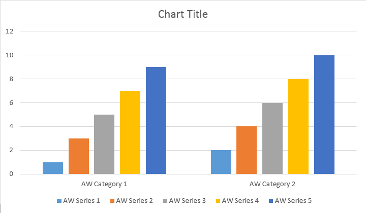
הדוגמה הבאה של הקוד מראה כיצד להוסיף תרשים עמודה:
הקוד יוצר את התוצאה הבאה:
יש add, add_double ו add_date שיטות, שנחשפו כדי לכסות את כל הגרסאות האפשריות של מקורות נתונים לכל סוגי הטבלה:
הקוד יוצר את התוצאה הבאה:
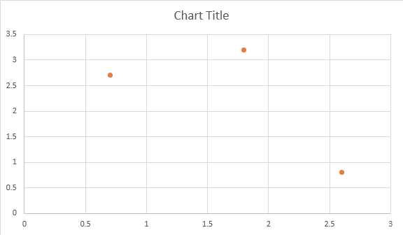
להלן דוגמאות כיצד להוסיף תרשים פיזור.
הקוד יוצר את התוצאה הבאה:
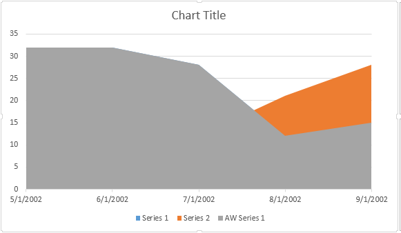
לדוגמה הקוד הבא מראה כיצד להוסיף תרשים שטח:
הקוד יוצר את התוצאה הבאה:
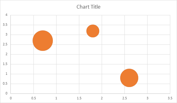
הדוגמה הבאה של הקוד מראה כיצד להכניס תרשים בועות:
הקוד יוצר את התוצאה הבאה:
לאחר שהטבלה הוחדרה ומלאה בנתונים, אתה יכול לשנות את המראה שלה. Shape.chart הנכס מכיל את כל האפשרויות הקשורות לטבלה הזמינות באמצעות הציבור API.
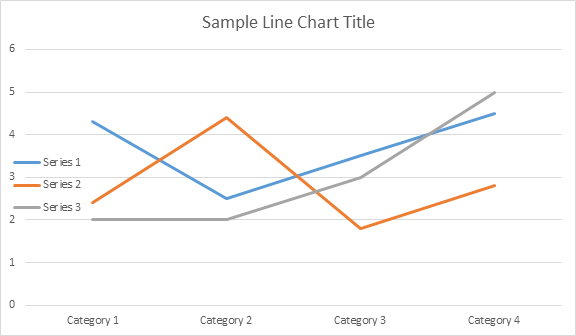
לדוגמה, בואו לשנות Chart שם או אגדה התנהגות:
הקוד יוצר את התוצאות הבאות:
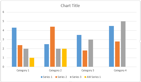
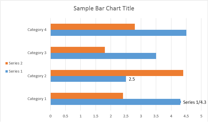
בואו נסתכל ChartSeries אוסף. כל סדרות הטבלה זמינות באמצעות Chart.series אוסף:
אתה יכול להסיר סדרה אחת או לנקות את כולם, כמו גם להוסיף אחד חדש במידת הצורך. בתרשים המוכנס החדש יש כמה סדרות ברירת מחדל נוספות לאוסף זה. כדי להסיר אותם אתה צריך להתקשר chart.series.clear() שיטה.
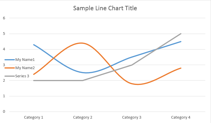
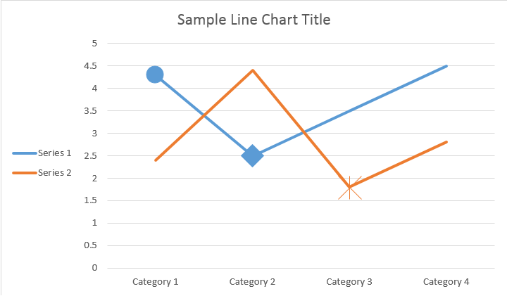
הנה איך לעבוד עם סדרה מסוימת.
ראה את התוצאה למטה:
הכל רווק ChartSeries כברירת מחדל ChartDataPoint אפשרויות, אנא נסה להשתמש בקוד הבא כדי לשנות אותם:
ראה את התוצאה למטה:
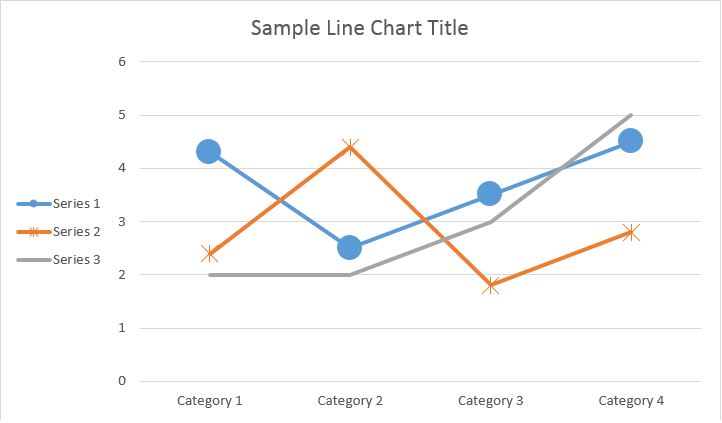
ChartSeriesשימוש ChartDataPoint אתה יכול להתאים אישית את פורמט של נקודת נתונים אחת של סדרת תרשים:
ראה את התוצאה למטה:
שימוש ChartDataLabel אתה יכול לציין את הפורמט של תווית נתונים אחת של סדרת התרשים, כמו show /hide LegendKey, Category שם, סדרה, ערך וכו ‘.
ראה את התוצאה למטה:
The The The ChartDataLabelCollection מחלקה מגדיר תכונות שניתן להשתמש כדי להגדיר אפשרויות ברירת מחדל עבור ChartDataLabels עבור Chart Series. תכונות אלה כוללות show_category_name, show_bubble_size, show_percentage, show_series_name, show_value וכו’.
ראה את התוצאה למטה:
שימוש ChartDataLabel.number_format אתה יכול לציין פורמט מספר של תווית נתונים אחת של התרשים.
לדוגמה הקוד הבא מראה כיצד לעצב מספר של תווית הנתונים:
אם אתה רוצה לעבוד עם ציר תרשים, קנה מידה, ולהציג יחידות עבור ציר הערך, אנא השתמש ChartAxis, AxisDisplayUnit, ו AxisScaling שיעורים.
הדוגמה הבאה של הקוד מראה כיצד להגדיר תכונות X ו- Y-axis:
הדוגמה הבאה של הקוד מראה כיצד לקבוע ערכי תאריך/שעה לתכונות ציר:
לדוגמה הקוד הבא מראה כיצד לשנות את פורמט המספרים על ציר הערך:
The The The AxisBound שיעור מייצג מינימום או מקסימום ערכי ציר. Bound יכול להיות מוגדר כמספרי, זמן תאריך או ערך מיוחד “auto”.
הדוגמה הבאה של הקוד מראה כיצד להגדיר גבולות של ציר:
הדוגמה הבאה של הקוד מראה כיצד להגדיר את יחידת המרווח בין תוויות בציר:
אם אתה רוצה להראות או להסתיר את ציר התרשים, אתה יכול פשוט להשיג את זה על ידי הגדרת הערך של ChartAxis.hidden רכוש.
הדוגמה הקודית הבאה מראה כיצד להסתיר את Y-axis של התרשים:
אם אתה רוצה להגדיר היערכות טקסט עבור תוויות מרובות באינטרנט, אתה יכול פשוט להשיג את זה על ידי הגדרת הערך של ChartAxis.tick_label_alignment רכוש.
הדוגמה הבאה של הקוד מראה כיצד לתכנת תוויות:
פורמט מלא ושבץ ניתן להגדיר עבור סדרות תרשים, נקודות נתונים וסמן. כדי לעשות זאת, עליך להשתמש בתכונות של ChartFormat סוג ב ChartSeries, ChartDataPoint, ו ChartMarker שיעורים, כמו גם כינויים עבור כמה נכסים, כגון fore_color, back_color, visible, ו transparency בתוך Stroke מעמד.
דוגמה לקוד הבא מראה כיצד להגדיר צבע סדרה:
doc = aw.Document()
builder = aw.DocumentBuilder(doc)
shape = builder.insert_chart(aw.drawing.charts.ChartType.COLUMN, 432, 252)
chart = shape.chart
seriesColl = chart.series
# Delete default generated series.
seriesColl.clear()
# Create category names array.
categories = [ "AW Category 1", "AW Category 2" ]
# Adding new series. Value and category arrays must be the same size.
series1 = seriesColl.add("AW Series 1", categories, [ 1, 2 ])
series2 = seriesColl.add("AW Series 2", categories, [ 3, 4 ])
series3 = seriesColl.add("AW Series 3", categories, [ 5, 6 ])
# Set series color.
series1.format.fill.fore_color = drawing.Color.red
series2.format.fill.fore_color = drawing.Color.yellow
series3.format.fill.fore_color = drawing.Color.blue
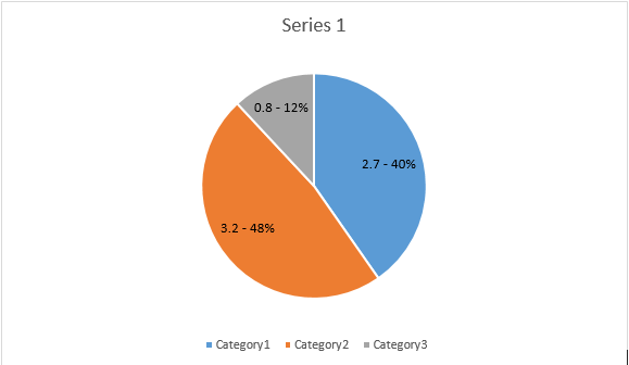
doc.save(docs_base.artifacts_dir + "WorkingWithCharts.set_series_color.docx")דוגמה לקוד הבא מראה כיצד להגדיר צבע קו ומשקל:
doc = aw.Document()
builder = aw.DocumentBuilder(doc)

shape = builder.insert_chart(aw.drawing.charts.ChartType.LINE, 432, 252)

chart = shape.chart
seriesColl = chart.series

# Delete default generated series.
seriesColl.clear()

# Adding new series.
series1 = seriesColl.add_double("AW Series 1", [ 0.7, 1.8, 2.6 ], [ 2.7, 3.2, 0.8 ])
series2 = seriesColl.add_double("AW Series 2", [ 0.5, 1.5, 2.5 ], [ 3, 1, 2 ])

# Set series color.
series1.format.stroke.fore_color = drawing.Color.red
series1.format.stroke.weight = 5
series2.format.stroke.fore_color = drawing.Color.light_green
series2.format.stroke.weight = 5

doc.save(docs_base.artifacts_dir + "WorkingWithCharts.line_color_and_weight.docx")Analyzing your prompt, please hold on...
An error occurred while retrieving the results. Please refresh the page and try again.