チャートの操作
新しい insert_chart メソッドが DocumentBuilder クラスに追加されました。それでは、DocumentBuilder.insert_chart メソッドを使用して単純な縦棒グラフをドキュメントに挿入する方法を見てみましょう。
グラフを挿入する方法
このセクションでは、ドキュメントにグラフを挿入する方法を学習します。
縦棒グラフの挿入
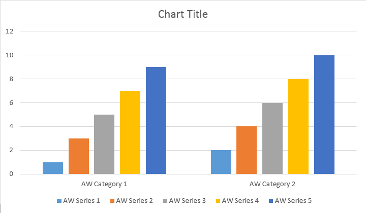
次のコード例は、縦棒グラフを挿入する方法を示しています。
# For complete examples and data files, please go to https://github.com/aspose-words/Aspose.Words-for-Python-via-.NET | |
doc = aw.Document() | |
builder = aw.DocumentBuilder(doc) | |
# You can specify different chart types and sizes. | |
shape = builder.insert_chart(aw.drawing.charts.ChartType.COLUMN, 432, 252) | |
chart = shape.chart | |
seriesColl = chart.series | |
print(seriesColl.count) | |
# Delete default generated series. | |
seriesColl.clear() | |
# Create category names array, in this example we have two categories. | |
categories = [ "Category 1", "Category 2" ] | |
# Please note, data arrays must not be empty and arrays must be the same size. | |
seriesColl.add("Aspose Series 1", categories, [ 1, 2 ]) | |
seriesColl.add("Aspose Series 2", categories, [ 3, 4 ]) | |
seriesColl.add("Aspose Series 3", categories, [ 5, 6 ]) | |
seriesColl.add("Aspose Series 4", categories, [ 7, 8 ]) | |
seriesColl.add("Aspose Series 5", categories, [ 9, 10 ]) | |
doc.save(docs_base.artifacts_dir + "WorkingWithCharts.insert_simple_column_chart.docx") |
このコードは次の結果を生成します。
add、add_double、および add_date メソッドがあり、すべてのチャート タイプのデータ ソースの可能なすべてのバリアントをカバーするために公開されました。
# For complete examples and data files, please go to https://github.com/aspose-words/Aspose.Words-for-Python-via-.NET | |
doc = aw.Document() | |
builder = aw.DocumentBuilder(doc) | |
shape = builder.insert_chart(aw.drawing.charts.ChartType.COLUMN, 432, 252) | |
chart = shape.chart | |
chart.series.add("Aspose Series 1", [ "Category 1", "Category 2" ], [ 1, 2 ]) | |
doc.save(docs_base.artifacts_dir + "WorkingWithCharts.insert_column_chart.docx") |
このコードは次の結果を生成します。
散布図の挿入
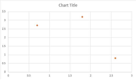
以下の例は、散布図を挿入する方法を示しています。
# For complete examples and data files, please go to https://github.com/aspose-words/Aspose.Words-for-Python-via-.NET | |
doc = aw.Document() | |
builder = aw.DocumentBuilder(doc) | |
shape = builder.insert_chart(aw.drawing.charts.ChartType.SCATTER, 432, 252) | |
chart = shape.chart | |
chart.series.add_double("Aspose Series 1", [ 0.7, 1.8, 2.6 ], [ 2.7, 3.2, 0.8 ]) | |
doc.save(docs_base.artifacts_dir + "WorkingWithCharts.insert_scatter_chart.docx") |
このコードは次の結果を生成します。
面グラフの挿入
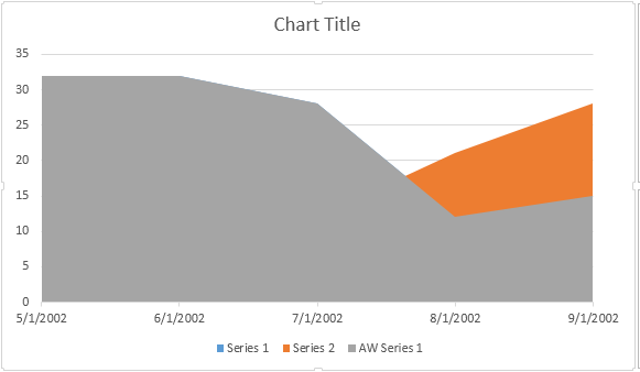
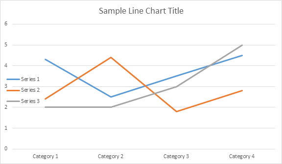
次のコード例は、面グラフを挿入する方法を示しています。
# For complete examples and data files, please go to https://github.com/aspose-words/Aspose.Words-for-Python-via-.NET | |
doc = aw.Document() | |
builder = aw.DocumentBuilder(doc) | |
shape = builder.insert_chart(aw.drawing.charts.ChartType.AREA, 432, 252) | |
chart = shape.chart | |
chart.series.add_date("Aspose Series 1", | |
[ date(2002, 5, 1), date(2002, 6, 1), date(2002, 7, 1), date(2002, 8, 1), date(2002, 9, 1) ], | |
[ 32, 32, 28, 12, 15 ]) | |
doc.save(docs_base.artifacts_dir + "WorkingWithCharts.insert_area_chart.docx") |
このコードは次の結果を生成します。
バブル チャートの挿入
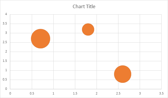
次のコード例は、バブル チャートを挿入する方法を示しています。
# For complete examples and data files, please go to https://github.com/aspose-words/Aspose.Words-for-Python-via-.NET | |
doc = aw.Document() | |
builder = aw.DocumentBuilder(doc) | |
shape = builder.insert_chart(aw.drawing.charts.ChartType.BUBBLE, 432, 252) | |
chart = shape.chart | |
chart.series.add("Aspose Series 1", [ 0.7, 1.8, 2.6 ], [ 2.7, 3.2, 0.8 ], [ 10, 4, 8 ]) | |
doc.save(docs_base.artifacts_dir + "WorkingWithCharts.insert_bubble_chart.docx") |
このコードは次の結果を生成します。
Shape.chart オブジェクトを使用したグラフの操作
グラフを挿入してデータを入力したら、その外観を変更できます。 Shape.chart プロパティには、パブリック API を通じて使用できるすべてのチャート関連のオプションが含まれています。
たとえば、Chart タイトルまたは凡例の動作を変更してみましょう。
# For complete examples and data files, please go to https://github.com/aspose-words/Aspose.Words-for-Python-via-.NET | |
doc = aw.Document() | |
builder = aw.DocumentBuilder(doc) | |
shape = builder.insert_chart(aw.drawing.charts.ChartType.LINE, 432, 252) | |
chart = shape.chart | |
chart.title.show = True | |
chart.title.text = "Line Chart Title" | |
chart.title.overlay = False | |
# Please note if None or empty value is specified as title text, auto generated title will be shown. | |
chart.legend.position = aw.drawing.charts.LegendPosition.LEFT | |
chart.legend.overlay = True | |
doc.save(docs_base.artifacts_dir + "WorkingWithCharts.create_chart_using_shape.docx") |
このコードは次の結果を生成します。
ChartSeries のチャートのコレクションの操作方法
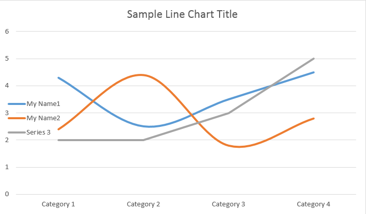
ChartSeries コレクションを見てみましょう。すべてのチャート シリーズは Chart.series コレクションを通じて利用できます。
# For complete examples and data files, please go to https://github.com/aspose-words/Aspose.Words-for-Python-via-.NET | |
seriesColl = chart.series | |
print(seriesColl.count) |
シリーズを 1 つずつ削除したり、すべてをクリアしたり、必要に応じて新しいシリーズを追加したりできます。新しく挿入されたグラフには、このコレクションにいくつかのデフォルト シリーズが追加されています。それらを削除するには、chart.series.clear() メソッドを呼び出す必要があります。
単一の ChartSeries クラスの操作
特定のシリーズを操作する方法は次のとおりです。
# For complete examples and data files, please go to https://github.com/aspose-words/Aspose.Words-for-Python-via-.NET | |
series0 = chart.series[0] | |
series1 = chart.series[1] | |
series0.name = "Chart Series Name 1" | |
series1.name = "Chart Series Name 2" | |
# You can also specify whether the line connecting the points on the chart shall be smoothed using Catmull-Rom splines. | |
series0.smooth = True | |
series1.smooth = True |
以下の結果をご覧ください。
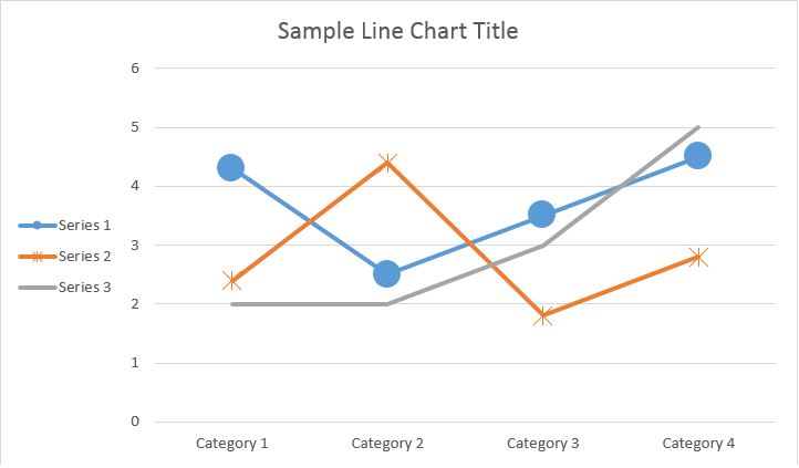
すべての単一 ChartSeries にはデフォルトの ChartDataPoint オプションがあります。次のコードを使用してそれらを変更してみてください。
# For complete examples and data files, please go to https://github.com/aspose-words/Aspose.Words-for-Python-via-.NET | |
# Specifies whether by default the parent element shall inverts its colors if the value is negative. | |
series0.invert_if_negative = True | |
series0.marker.symbol = aw.drawing.charts.MarkerSymbol.CIRCLE | |
series0.marker.size = 15 | |
series1.marker.symbol = aw.drawing.charts.MarkerSymbol.STAR | |
series1.marker.size = 10 |
以下の結果をご覧ください。
ChartSeries
の単一の ChartDataPoint を操作する方法
ChartDataPoint を使用すると、グラフ シリーズの単一のデータ ポイントの書式設定をカスタマイズできます。
# For complete examples and data files, please go to https://github.com/aspose-words/Aspose.Words-for-Python-via-.NET | |
doc = aw.Document() | |
builder = aw.DocumentBuilder(doc) | |
shape = builder.insert_chart(aw.drawing.charts.ChartType.LINE, 432, 252) | |
chart = shape.chart | |
series0 = chart.series[0] | |
series1 = chart.series[1] | |
dataPointCollection = series0.data_points | |
dataPoint00 = dataPointCollection[0] | |
dataPoint01 = dataPointCollection[1] | |
dataPoint00.explosion = 50 | |
dataPoint00.marker.symbol = aw.drawing.charts.MarkerSymbol.CIRCLE | |
dataPoint00.marker.size = 15 | |
dataPoint01.marker.symbol = aw.drawing.charts.MarkerSymbol.DIAMOND | |
dataPoint01.marker.size = 20 | |
dataPoint12 = series1.data_points[2] | |
dataPoint12.invert_if_negative = True | |
dataPoint12.marker.symbol = aw.drawing.charts.MarkerSymbol.STAR | |
dataPoint12.marker.size = 20 | |
doc.save(docs_base.artifacts_dir + "WorkingWithCharts.single_chart_data_point.docx") |
以下の結果をご覧ください。
単一の ChartSeries の ChartDataLabel を操作する方法
ChartDataLabel を使用すると、LegendKey、CategoryName、SeriesName、Value などの表示/非表示など、グラフ シリーズの単一のデータ ラベルの書式設定を指定できます。
# For complete examples and data files, please go to https://github.com/aspose-words/Aspose.Words-for-Python-via-.NET | |
doc = aw.Document() | |
builder = aw.DocumentBuilder(doc) | |
shape = builder.insert_chart(aw.drawing.charts.ChartType.BAR, 432, 252) | |
chart = shape.chart | |
series0 = shape.chart.series[0] | |
labels = series0.data_labels | |
labels.show_legend_key = True | |
# By default, when you add data labels to the data points in a pie chart, leader lines are displayed for data labels that are | |
# positioned far outside the end of data points. Leader lines create a visual connection between a data label and its | |
# corresponding data point. | |
labels.show_leader_lines = True | |
labels.show_category_name = False | |
labels.show_percentage = False | |
labels.show_series_name = True | |
labels.show_value = True | |
labels.separator = "/" | |
labels.show_value = True | |
doc.save(docs_base.artifacts_dir + "WorkingWithCharts.chart_data_label.docx") |
以下の結果をご覧ください。
ChartSeries の ChartDataLabels のデフォルト オプションを定義する方法
ChartDataLabelCollection クラスは、チャート シリーズの ChartDataLabels のデフォルト オプションを設定するために使用できるプロパティを定義します。これらのプロパティには、show_category_name、show_bubble_size、show_percentage、show_series_name、show_value などが含まれます。
# For complete examples and data files, please go to https://github.com/aspose-words/Aspose.Words-for-Python-via-.NET | |
doc = aw.Document() | |
builder = aw.DocumentBuilder(doc) | |
shape = builder.insert_chart(aw.drawing.charts.ChartType.PIE, 432, 252) | |
chart = shape.chart | |
chart.series.clear() | |
series = chart.series.add("Aspose Series 1", | |
[ "Category 1", "Category 2", "Category 3" ], | |
[ 2.7, 3.2, 0.8 ]) | |
labels = series.data_labels | |
labels.show_percentage = True | |
labels.show_value = True | |
labels.show_leader_lines = False | |
labels.separator = " - " | |
doc.save(docs_base.artifacts_dir + "WorkingWithCharts.default_options_for_data_labels.docx") |
以下の結果をご覧ください。
チャートデータラベルの番号をフォーマットする方法
ChartDataLabel.number_format を使用すると、グラフの単一のデータ ラベルの数値書式設定を指定できます。
次のコード例は、データ ラベルの数値をフォーマットする方法を示しています。
# For complete examples and data files, please go to https://github.com/aspose-words/Aspose.Words-for-Python-via-.NET | |
doc = aw.Document() | |
builder = aw.DocumentBuilder(doc) | |
shape = builder.insert_chart(aw.drawing.charts.ChartType.LINE, 432, 252) | |
chart = shape.chart | |
chart.title.text = "Data Labels With Different Number Format" | |
# Delete default generated series. | |
chart.series.clear() | |
series1 = chart.series.add("Aspose Series 1", [ "Category 1", "Category 2", "Category 3" ], [ 2.5, 1.5, 3.5 ]) | |
series1.has_data_labels = True | |
series1.data_labels.show_value = True | |
series1.data_labels[0].number_format.format_code = "\"$\"#,##0.00" | |
series1.data_labels[1].number_format.format_code = "dd/mm/yyyy" | |
series1.data_labels[2].number_format.format_code = "0.00%" | |
# Or you can set format code to be linked to a source cell, | |
# in this case NumberFormat will be reset to general and inherited from a source cell. | |
series1.data_labels[2].number_format.is_linked_to_source = True | |
doc.save(docs_base.artifacts_dir + "WorkingWithCharts.format_number_of_data_label.docx") |
グラフ軸のプロパティを設定する方法
グラフの軸、スケーリング、値軸の表示単位を操作する場合は、ChartAxis、AxisDisplayUnit、および AxisScaling クラスを使用してください。
次のコード例は、X 軸と Y 軸のプロパティを定義する方法を示しています。
# For complete examples and data files, please go to https://github.com/aspose-words/Aspose.Words-for-Python-via-.NET | |
doc = aw.Document() | |
builder = aw.DocumentBuilder(doc) | |
# Insert chart | |
shape = builder.insert_chart(aw.drawing.charts.ChartType.AREA, 432, 252) | |
chart = shape.chart | |
chart.series.clear() | |
chart.series.add_date("Aspose Series 1", | |
[ date(2002, 1, 1), date(2002, 6, 1), date(2002, 7, 1), date(2002, 8, 1), date(2002, 9, 1) ], | |
[ 640, 320, 280, 120, 150 ]) | |
xAxis = chart.axis_x | |
yAxis = chart.axis_y | |
# Change the X axis to be category instead of date, so all the points will be put with equal interval on the X axis. | |
xAxis.category_type = aw.drawing.charts.AxisCategoryType.CATEGORY | |
xAxis.crosses = aw.drawing.charts.AxisCrosses.CUSTOM | |
xAxis.crosses_at = 3 # Measured in display units of the Y axis (hundreds). | |
xAxis.reverse_order = True | |
xAxis.major_tick_mark = aw.drawing.charts.AxisTickMark.CROSS | |
xAxis.minor_tick_mark = aw.drawing.charts.AxisTickMark.OUTSIDE | |
xAxis.tick_label_offset = 200 | |
yAxis.tick_label_position = aw.drawing.charts.AxisTickLabelPosition.HIGH | |
yAxis.major_unit = 100 | |
yAxis.minor_unit = 50 | |
yAxis.display_unit.unit = aw.drawing.charts.AxisBuiltInUnit.HUNDREDS | |
yAxis.scaling.minimum = aw.drawing.charts.AxisBound(100) | |
yAxis.scaling.maximum = aw.drawing.charts.AxisBound(700) | |
doc.save(docs_base.artifacts_dir + "WorkingWithCharts.define_xy_axis_properties.docx") |
軸のDate時間値の設定方法
次のコード例は、日付/時刻値を軸プロパティに設定する方法を示しています。
# For complete examples and data files, please go to https://github.com/aspose-words/Aspose.Words-for-Python-via-.NET | |
doc = aw.Document() | |
builder = aw.DocumentBuilder(doc) | |
shape = builder.insert_chart(aw.drawing.charts.ChartType.COLUMN, 432, 252) | |
chart = shape.chart | |
chart.series.clear() | |
chart.series.add_date("Aspose Series 1", | |
[ date(2017, 11, 6), date(2017, 11, 9), date(2017, 11, 15), date(2017, 11, 21), date(2017, 11, 25), date(2017, 11, 29) ], | |
[ 1.2, 0.3, 2.1, 2.9, 4.2, 5.3 ]) | |
xAxis = chart.axis_x | |
xAxis.scaling.minimum = aw.drawing.charts.AxisBound(date(2017, 11, 5)) | |
xAxis.scaling.maximum = aw.drawing.charts.AxisBound(date(2017, 12, 3)) | |
# Set major units to a week and minor units to a day. | |
xAxis.major_unit = 7 | |
xAxis.minor_unit = 1 | |
xAxis.major_tick_mark = aw.drawing.charts.AxisTickMark.CROSS | |
xAxis.minor_tick_mark = aw.drawing.charts.AxisTickMark.OUTSIDE | |
doc.save(docs_base.artifacts_dir + "WorkingWithCharts.date_time_values_to_axis.docx") |
軸の数値をフォーマットする方法
次のコード例は、値軸の数値の形式を変更する方法を示しています。
# For complete examples and data files, please go to https://github.com/aspose-words/Aspose.Words-for-Python-via-.NET | |
doc = aw.Document() | |
builder = aw.DocumentBuilder(doc) | |
shape = builder.insert_chart(aw.drawing.charts.ChartType.COLUMN, 432, 252) | |
chart = shape.chart | |
chart.series.clear() | |
chart.series.add("Aspose Series 1", | |
[ "Item 1", "Item 2", "Item 3", "Item 4", "Item 5" ], | |
[ 1900000, 850000, 2100000, 600000, 1500000 ]) | |
chart.axis_y.number_format.format_code = "#,##0" | |
doc.save(docs_base.artifacts_dir + "WorkingWithCharts.number_format_for_axis.docx") |
軸の境界を設定する方法
AxisBound クラスは、軸値の最小値または最大値の境界を表します。 Bound は、数値、日時、または特別な「自動」値として指定できます。
次のコード例は、軸の境界を設定する方法を示しています。
# For complete examples and data files, please go to https://github.com/aspose-words/Aspose.Words-for-Python-via-.NET | |
doc = aw.Document() | |
builder = aw.DocumentBuilder(doc) | |
shape = builder.insert_chart(aw.drawing.charts.ChartType.COLUMN, 432, 252) | |
chart = shape.chart | |
chart.series.clear() | |
chart.series.add("Aspose Series 1", | |
[ "Item 1", "Item 2", "Item 3", "Item 4", "Item 5" ], | |
[ 1.2, 0.3, 2.1, 2.9, 4.2 ]) | |
chart.axis_y.scaling.minimum = aw.drawing.charts.AxisBound(0) | |
chart.axis_y.scaling.maximum = aw.drawing.charts.AxisBound(6) | |
doc.save(docs_base.artifacts_dir + "WorkingWithCharts.bounds_of_axis.docx") |
ラベル間の間隔単位の設定方法
次のコード例は、軸上のラベル間の間隔単位を設定する方法を示しています。
# For complete examples and data files, please go to https://github.com/aspose-words/Aspose.Words-for-Python-via-.NET | |
doc = aw.Document() | |
builder = aw.DocumentBuilder(doc) | |
shape = builder.insert_chart(aw.drawing.charts.ChartType.COLUMN, 432, 252) | |
chart = shape.chart | |
chart.series.clear() | |
chart.series.add("Aspose Series 1", | |
[ "Item 1", "Item 2", "Item 3", "Item 4", "Item 5" ], | |
[ 1.2, 0.3, 2.1, 2.9, 4.2 ]) | |
chart.axis_x.tick_label_spacing = 2 | |
doc.save(docs_base.artifacts_dir + "WorkingWithCharts.interval_unit_between_labels_on_axis.docx") |
グラフの軸を非表示にする方法
グラフの軸を表示または非表示にしたい場合は、ChartAxis.hidden プロパティの値を設定するだけでこれを実現できます。
次のコード例は、グラフの Y 軸を非表示にする方法を示しています。
# For complete examples and data files, please go to https://github.com/aspose-words/Aspose.Words-for-Python-via-.NET | |
doc = aw.Document() | |
builder = aw.DocumentBuilder(doc) | |
shape = builder.insert_chart(aw.drawing.charts.ChartType.COLUMN, 432, 252) | |
chart = shape.chart | |
chart.series.clear() | |
chart.series.add("Aspose Series 1", | |
[ "Item 1", "Item 2", "Item 3", "Item 4", "Item 5" ], | |
[ 1.2, 0.3, 2.1, 2.9, 4.2 ]) | |
chart.axis_y.hidden = True | |
doc.save(docs_base.artifacts_dir + "WorkingWithCharts.hide_chart_axis.docx") |
グラフのラベルを揃える方法
複数行ラベルのテキスト配置を設定したい場合は、ChartAxis.tick_label_alignment プロパティの値を設定するだけでこれを実現できます。
次のコード例は、ラベルの配置をチェックする方法を示しています。
# For complete examples and data files, please go to https://github.com/aspose-words/Aspose.Words-for-Python-via-.NET | |
doc = aw.Document() | |
builder = aw.DocumentBuilder(doc) | |
shape = builder.insert_chart(aw.drawing.charts.ChartType.SCATTER, 450, 250) | |
axis = shape.chart.axis_x | |
# This property has effect only for multi-line labels. | |
axis.tick_label_alignment = aw.ParagraphAlignment.RIGHT | |
doc.save(docs_base.artifacts_dir + "WorkingWithCharts.tick_multi_line_label_alignment.docx") |
塗りつぶしとストロークの書式設定を設定する方法
塗りつぶしとストロークの書式設定は、グラフ シリーズ、データ ポイント、マーカーに設定できます。これを行うには、ChartSeries、ChartDataPoint、および ChartMarker クラスの ChartFormat タイプのプロパティを使用するだけでなく、Stroke クラスの fore_color、back_color、visible、transparency などの一部のプロパティのエイリアスを使用する必要があります。
次のコード例は、シリーズの色を設定する方法を示しています。
doc = aw.Document()
builder = aw.DocumentBuilder(doc)
shape = builder.insert_chart(aw.drawing.charts.ChartType.COLUMN, 432, 252)
chart = shape.chart
seriesColl = chart.series
# Delete default generated series.
seriesColl.clear()
# Create category names array.
categories = [ "AW Category 1", "AW Category 2" ]
# Adding new series. Value and category arrays must be the same size.
series1 = seriesColl.add("AW Series 1", categories, [ 1, 2 ])
series2 = seriesColl.add("AW Series 2", categories, [ 3, 4 ])
series3 = seriesColl.add("AW Series 3", categories, [ 5, 6 ])
# Set series color.
series1.format.fill.fore_color = drawing.Color.red
series2.format.fill.fore_color = drawing.Color.yellow
series3.format.fill.fore_color = drawing.Color.blue
doc.save(docs_base.artifacts_dir + "WorkingWithCharts.set_series_color.docx")
次のコード例は、線の色と太さを設定する方法を示しています。
doc = aw.Document()
builder = aw.DocumentBuilder(doc)
shape = builder.insert_chart(aw.drawing.charts.ChartType.LINE, 432, 252)
chart = shape.chart
seriesColl = chart.series
# Delete default generated series.
seriesColl.clear()
# Adding new series.
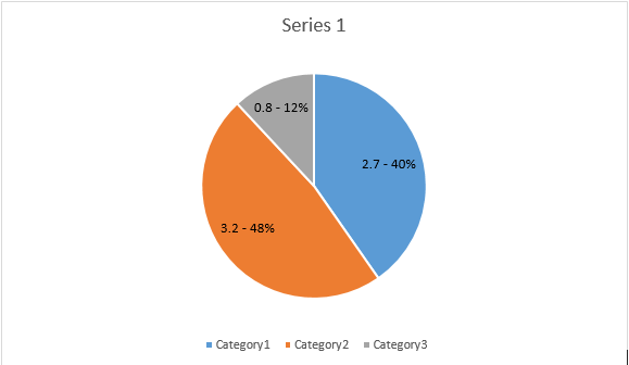
series1 = seriesColl.add_double("AW Series 1", [ 0.7, 1.8, 2.6 ], [ 2.7, 3.2, 0.8 ])
series2 = seriesColl.add_double("AW Series 2", [ 0.5, 1.5, 2.5 ], [ 3, 1, 2 ])
# Set series color.
series1.format.stroke.fore_color = drawing.Color.red
series1.format.stroke.weight = 5
series2.format.stroke.fore_color = drawing.Color.light_green
series2.format.stroke.weight = 5
doc.save(docs_base.artifacts_dir + "WorkingWithCharts.line_color_and_weight.docx")