Analyzing your prompt, please hold on...
An error occurred while retrieving the results. Please refresh the page and try again.
새로운insertChart메서드가DocumentBuilder클래스에 추가되었습니다. 자,insertChart방법을 사용하여 간단한 세로 막대형 차트를 문서에 삽입하는 방법을 살펴 보겠습니다.
이 섹션에서는 문서에 차트를 삽입하는 방법을 배웁니다.
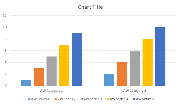
다음 코드 예제에서는 세로 막대형 차트를 삽입하는 방법을 보여 줍니다:
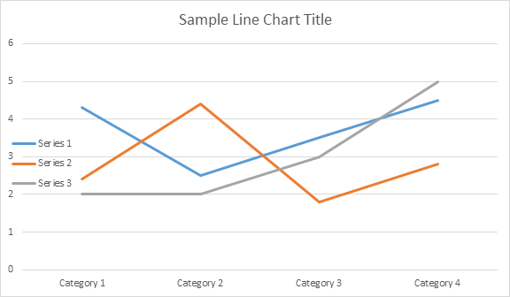
이 코드는 다음과 같은 결과를 생성합니다:
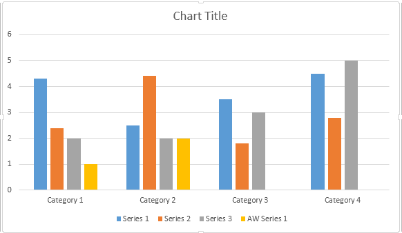
시리즈 추가 방법에는 네 가지 오버로드가 있으며,이 오버로드는 모든 차트 유형에 대해 가능한 모든 데이터 원본 변형을 포함하도록 노출되었습니다:
이 코드는 다음과 같은 결과를 생성합니다:
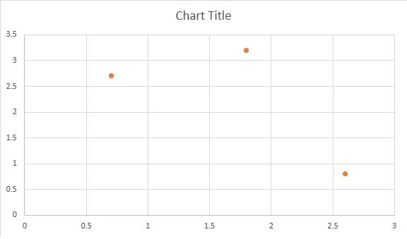
다음 코드 예제에서는 분산형 차트를 삽입하는 방법을 보여 줍니다:
이 코드는 다음과 같은 결과를 생성합니다:
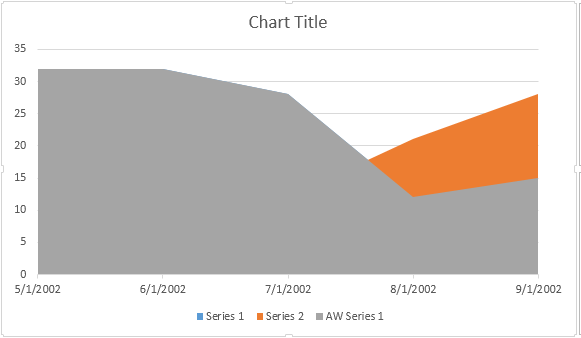
다음 코드 예제에서는 영역 차트를 삽입하는 방법을 보여 줍니다:
이 코드는 다음과 같은 결과를 생성합니다:
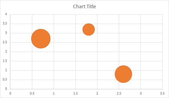
다음 코드 예제에서는 거품형 차트를 삽입하는 방법을 보여 줍니다:
이 코드는 다음과 같은 결과를 생성합니다:
Shape.Chart개체를 통해 차트 작업차트가 삽입되고 데이터로 채워지면 모양을 변경할 수 있습니다. Shape.Chart속성에는 공용API을 통해 사용할 수 있는 모든 차트 관련 옵션이 포함되어 있습니다.
예를 들어 차트 제목 또는 범례 동작을 변경해 보겠습니다:
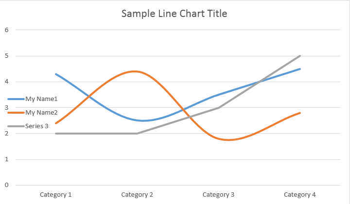
코드는 다음 결과를 생성합니다:
ChartSeries컬렉션을 살펴 보겠습니다. 모든 차트 계열은chart.getSeries()컬렉션(Iterable)을 통해 사용할 수 있습니다:
당신은 하나 시리즈 하나를 제거하거나 그들 모두를 취소뿐만 아니라 필요한 경우 새 하나를 추가 할 수 있습니다. 새로 삽입된 차트에는 일부 기본 계열이 이 컬렉션에 추가되었습니다. 이를 제거하려면**chart.getSeries().clear()**메서드를 호출해야 합니다.
다음은 특정 시리즈를 사용하는 방법입니다.
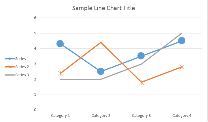
아래 결과를 참조하십시오:
모든 단일ChartSeries에는 기본ChartDataPoint옵션이 있으므로 다음 코드를 사용하여 변경해 보십시오:
ChartSeries의 단일ChartDataPoint으로 작업하는 방법ChartDataPoint을 사용하면 차트 계열의 단일 데이터 요소의 서식을 사용자 지정할 수 있습니다:
아래 결과를 참조하십시오:
ChartDataLabel을 사용하면 표시/숨기기와 같이 차트 계열의 단일 데이터 레이블의 서식을 지정할 수 있습니다LegendKey, CategoryName, SeriesName, 가치 등:
아래 결과를 참조하십시오:
ChartDataLabelCollection클래스는 차트Series의ChartDataLabels에 대한 기본 옵션을 설정하는 데 사용할 수 있는 속성을 정의합니다. 이러한 속성에는setShowCategoryName, setShowBubbleSize, setShowPercentage, setShowSeriesName, setShowValue 기타:
아래 결과를 참조하십시오:
NumberFormat속성을 사용하여 차트의 단일 데이터 레이블의 숫자 서식을 지정할 수 있습니다.
다음 코드 예제에서는 데이터 레이블의 번호를 포맷하는 방법을 보여 줍니다:
값 축에 대한 차트 축,크기 조정 및 표시 단위로 작업하려면ChartAxis,AxisDisplayUnit및AxisScaling클래스를 사용하십시오.
다음 코드 예제에서는 속성을 정의하는 방법을 보여 줍니다:
다음 코드 예제에서는 날짜/시간 값을 축 속성으로 설정하는 방법을 보여 줍니다:
다음 코드 예제에서는 값 축에서 숫자 형식을 변경하는 방법을 보여 줍니다:
AxisBound클래스는 축 값의 최소 또는 최대 경계를 나타냅니다. 바인딩은 숫자,날짜-시간 또는 특수"자동"값으로 지정할 수 있습니다.
다음 코드 예제에서는 축의 경계를 설정하는 방법을 보여 줍니다:
다음 코드 예제에서는 축의 레이블 간 간격 단위를 설정하는 방법을 보여 줍니다:
차트 축을 표시하거나 숨기려면ChartAxis.Hidden속성 값을 설정하면 됩니다.
다음 코드 예제에서는 차트의 축을 숨기는 방법을 보여 줍니다:
여러 줄 레이블에 대한 텍스트 정렬을 설정하려면setTickLabelAlignment()속성 값을 설정하면 됩니다.
다음 코드 예제에서는 레이블 정렬을 선택하는 방법을 보여 줍니다:
차트 계열,데이터 요소 및 마커에 대해 채우기 및 획 서식을 설정할 수 있습니다. 이렇게 하려면ChartSeries,ChartDataPoint및ChartMarker클래스의ChartFormat형식의 속성과ForeColor,BackColor,표시 및Stroke클래스의 투명도와 같은 일부 속성의 별칭을 사용해야 합니다.
다음 코드 예제에서는 계열 색상을 설정하는 방법을 보여 줍니다:
Document doc = new Document();
DocumentBuilder builder = new DocumentBuilder(doc);

Shape shape = builder.InsertChart(ChartType.Column, 432, 252);

Chart chart = shape.Chart;
ChartSeriesCollection seriesColl = chart.Series;

// Delete default generated series.
seriesColl.Clear();

// Create category names array.
string[] categories = new string[] { "AW Category 1", "AW Category 2" };

// Adding new series. Value and category arrays must be the same size.
ChartSeries series1 = seriesColl.Add("AW Series 1", categories, new double[] { 1, 2 });
ChartSeries series2 = seriesColl.Add("AW Series 2", categories, new double[] { 3, 4 });
ChartSeries series3 = seriesColl.Add("AW Series 3", categories, new double[] { 5, 6 });

// Set series color.
series1.Format.Fill.ForeColor = Color.Red;
series2.Format.Fill.ForeColor = Color.Yellow;
series3.Format.Fill.ForeColor = Color.Blue;

doc.Save("ColumnColor.docx");
다음 코드 예제에서는 선 색상 및 가중치를 설정하는 방법을 보여 줍니다:
Document doc = new Document();
DocumentBuilder builder = new DocumentBuilder(doc);

Shape shape = builder.InsertChart(ChartType.Line, 432, 252);

Chart chart = shape.Chart;
ChartSeriesCollection seriesColl = chart.Series;

// Delete default generated series.
seriesColl.Clear();

// Adding new series.
ChartSeries series1 = seriesColl.Add("AW Series 1", new double[] { 0.7, 1.8, 2.6 }, new double[] { 2.7, 3.2, 0.8 });
ChartSeries series2 = seriesColl.Add("AW Series 2", new double[] { 0.5, 1.5, 2.5 }, new double[] { 3, 1, 2 });

// Set series color.
series1.Format.Stroke.ForeColor = Color.Red;
series1.Format.Stroke.Weight = 5;
series2.Format.Stroke.ForeColor = Color.LightGreen;
series2.Format.Stroke.Weight = 5;

doc.Save("LineColorAndWeight.docx");
Analyzing your prompt, please hold on...
An error occurred while retrieving the results. Please refresh the page and try again.