کار با نمودارها
روش جدید insert_chart به کلاس DocumentBuilder اضافه شد. بنابراین، بیایید ببینیم که چگونه یک نمودار ستونی ساده را با استفاده از روش DocumentBuilder.insert_chart در سند وارد کنیم:
نحوه درج نمودار
در این بخش نحوه درج نمودار را در یک سند یاد خواهیم گرفت.
درج نمودار ستونی
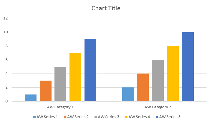
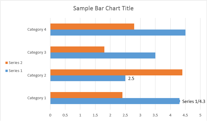
مثال کد زیر نحوه درج نمودار ستونی را نشان می دهد:
# For complete examples and data files, please go to https://github.com/aspose-words/Aspose.Words-for-Python-via-.NET | |
doc = aw.Document() | |
builder = aw.DocumentBuilder(doc) | |
# You can specify different chart types and sizes. | |
shape = builder.insert_chart(aw.drawing.charts.ChartType.COLUMN, 432, 252) | |
chart = shape.chart | |
seriesColl = chart.series | |
print(seriesColl.count) | |
# Delete default generated series. | |
seriesColl.clear() | |
# Create category names array, in this example we have two categories. | |
categories = [ "Category 1", "Category 2" ] | |
# Please note, data arrays must not be empty and arrays must be the same size. | |
seriesColl.add("Aspose Series 1", categories, [ 1, 2 ]) | |
seriesColl.add("Aspose Series 2", categories, [ 3, 4 ]) | |
seriesColl.add("Aspose Series 3", categories, [ 5, 6 ]) | |
seriesColl.add("Aspose Series 4", categories, [ 7, 8 ]) | |
seriesColl.add("Aspose Series 5", categories, [ 9, 10 ]) | |
doc.save(docs_base.artifacts_dir + "WorkingWithCharts.insert_simple_column_chart.docx") |
کد نتیجه زیر را ایجاد می کند:
روشهای add، add_double و add_date وجود دارد که برای پوشش همه انواع منابع دادهای ممکن برای همه انواع نمودار در معرض دید قرار گرفت:
# For complete examples and data files, please go to https://github.com/aspose-words/Aspose.Words-for-Python-via-.NET | |
doc = aw.Document() | |
builder = aw.DocumentBuilder(doc) | |
shape = builder.insert_chart(aw.drawing.charts.ChartType.COLUMN, 432, 252) | |
chart = shape.chart | |
chart.series.add("Aspose Series 1", [ "Category 1", "Category 2" ], [ 1, 2 ]) | |
doc.save(docs_base.artifacts_dir + "WorkingWithCharts.insert_column_chart.docx") |
کد نتیجه زیر را ایجاد می کند:
درج نمودار پراکندگی
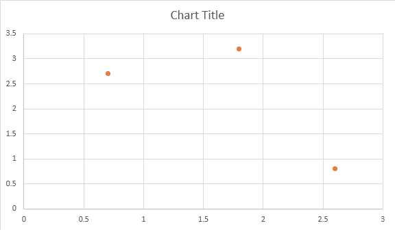
مثال زیر نحوه درج نمودار پراکندگی را نشان می دهد.
# For complete examples and data files, please go to https://github.com/aspose-words/Aspose.Words-for-Python-via-.NET | |
doc = aw.Document() | |
builder = aw.DocumentBuilder(doc) | |
shape = builder.insert_chart(aw.drawing.charts.ChartType.SCATTER, 432, 252) | |
chart = shape.chart | |
chart.series.add_double("Aspose Series 1", [ 0.7, 1.8, 2.6 ], [ 2.7, 3.2, 0.8 ]) | |
doc.save(docs_base.artifacts_dir + "WorkingWithCharts.insert_scatter_chart.docx") |
کد نتیجه زیر را ایجاد می کند:
درج نمودار منطقه
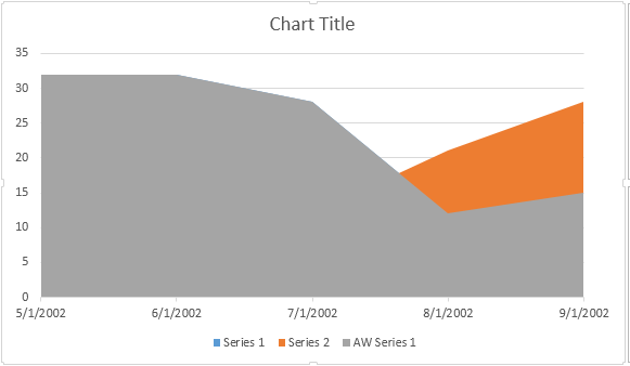
مثال کد زیر نحوه درج نمودار منطقه را نشان می دهد:
# For complete examples and data files, please go to https://github.com/aspose-words/Aspose.Words-for-Python-via-.NET | |
doc = aw.Document() | |
builder = aw.DocumentBuilder(doc) | |
shape = builder.insert_chart(aw.drawing.charts.ChartType.AREA, 432, 252) | |
chart = shape.chart | |
chart.series.add_date("Aspose Series 1", | |
[ date(2002, 5, 1), date(2002, 6, 1), date(2002, 7, 1), date(2002, 8, 1), date(2002, 9, 1) ], | |
[ 32, 32, 28, 12, 15 ]) | |
doc.save(docs_base.artifacts_dir + "WorkingWithCharts.insert_area_chart.docx") |
کد نتیجه زیر را ایجاد می کند:
درج نمودار حباب
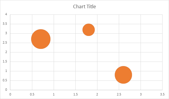
مثال کد زیر نحوه درج نمودار حباب را نشان می دهد:
# For complete examples and data files, please go to https://github.com/aspose-words/Aspose.Words-for-Python-via-.NET | |
doc = aw.Document() | |
builder = aw.DocumentBuilder(doc) | |
shape = builder.insert_chart(aw.drawing.charts.ChartType.BUBBLE, 432, 252) | |
chart = shape.chart | |
chart.series.add("Aspose Series 1", [ 0.7, 1.8, 2.6 ], [ 2.7, 3.2, 0.8 ], [ 10, 4, 8 ]) | |
doc.save(docs_base.artifacts_dir + "WorkingWithCharts.insert_bubble_chart.docx") |
کد نتیجه زیر را ایجاد می کند:
کار با نمودارها از طریق Shape.chart Object
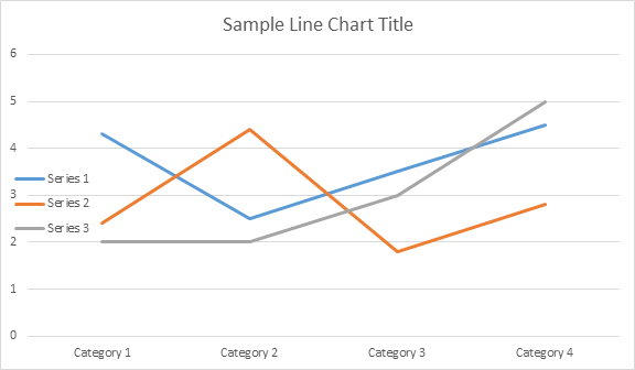
هنگامی که نمودار درج شد و با داده ها پر شد، می توانید ظاهر آن را تغییر دهید. ویژگی Shape.chart شامل تمام گزینه های مربوط به نمودار در دسترس از طریق API عمومی است.
به عنوان مثال، اجازه دهید عنوان یا رفتار افسانه Chart را تغییر دهیم:
# For complete examples and data files, please go to https://github.com/aspose-words/Aspose.Words-for-Python-via-.NET | |
doc = aw.Document() | |
builder = aw.DocumentBuilder(doc) | |
shape = builder.insert_chart(aw.drawing.charts.ChartType.LINE, 432, 252) | |
chart = shape.chart | |
chart.title.show = True | |
chart.title.text = "Line Chart Title" | |
chart.title.overlay = False | |
# Please note if None or empty value is specified as title text, auto generated title will be shown. | |
chart.legend.position = aw.drawing.charts.LegendPosition.LEFT | |
chart.legend.overlay = True | |
doc.save(docs_base.artifacts_dir + "WorkingWithCharts.create_chart_using_shape.docx") |
کد نتایج زیر را ایجاد می کند:
نحوه کار با ChartSeriesCollection of Chart
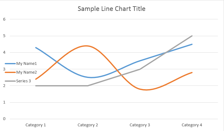
بیایید به مجموعه ChartSeries نگاه کنیم. تمام سری نمودارها از طریق مجموعه Chart.series در دسترس هستند:
# For complete examples and data files, please go to https://github.com/aspose-words/Aspose.Words-for-Python-via-.NET | |
seriesColl = chart.series | |
print(seriesColl.count) |
میتوانید سریها را یکی یکی حذف کنید یا همه آنها را پاک کنید و در صورت نیاز یک سری جدید اضافه کنید. نموداری که به تازگی درج شده است تعدادی سری پیش فرض به این مجموعه اضافه شده است. برای حذف آنها باید با روش chart.series.clear() تماس بگیرید.
کار با کلاس Single ChartSeries
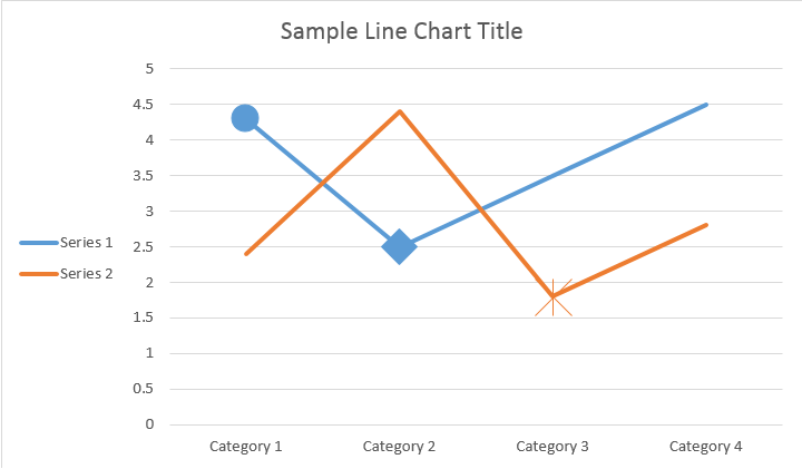
در اینجا نحوه کار با یک سریال خاص است.
# For complete examples and data files, please go to https://github.com/aspose-words/Aspose.Words-for-Python-via-.NET | |
series0 = chart.series[0] | |
series1 = chart.series[1] | |
series0.name = "Chart Series Name 1" | |
series1.name = "Chart Series Name 2" | |
# You can also specify whether the line connecting the points on the chart shall be smoothed using Catmull-Rom splines. | |
series0.smooth = True | |
series1.smooth = True |
لطفا نتیجه را در زیر ببینید:
همه ChartSeries تک گزینههای ChartDataPoint پیشفرض دارند، لطفاً از کد زیر برای تغییر آنها استفاده کنید:
# For complete examples and data files, please go to https://github.com/aspose-words/Aspose.Words-for-Python-via-.NET | |
# Specifies whether by default the parent element shall inverts its colors if the value is negative. | |
series0.invert_if_negative = True | |
series0.marker.symbol = aw.drawing.charts.MarkerSymbol.CIRCLE | |
series0.marker.size = 15 | |
series1.marker.symbol = aw.drawing.charts.MarkerSymbol.STAR | |
series1.marker.size = 10 |
لطفا نتیجه را در زیر ببینید:
نحوه کار با Single ChartDataPoint یک ChartSeries
با استفاده از ChartDataPoint میتوانید قالببندی یک نقطه داده از سری نمودار را سفارشی کنید:
# For complete examples and data files, please go to https://github.com/aspose-words/Aspose.Words-for-Python-via-.NET | |
doc = aw.Document() | |
builder = aw.DocumentBuilder(doc) | |
shape = builder.insert_chart(aw.drawing.charts.ChartType.LINE, 432, 252) | |
chart = shape.chart | |
series0 = chart.series[0] | |
series1 = chart.series[1] | |
dataPointCollection = series0.data_points | |
dataPoint00 = dataPointCollection[0] | |
dataPoint01 = dataPointCollection[1] | |
dataPoint00.explosion = 50 | |
dataPoint00.marker.symbol = aw.drawing.charts.MarkerSymbol.CIRCLE | |
dataPoint00.marker.size = 15 | |
dataPoint01.marker.symbol = aw.drawing.charts.MarkerSymbol.DIAMOND | |
dataPoint01.marker.size = 20 | |
dataPoint12 = series1.data_points[2] | |
dataPoint12.invert_if_negative = True | |
dataPoint12.marker.symbol = aw.drawing.charts.MarkerSymbol.STAR | |
dataPoint12.marker.size = 20 | |
doc.save(docs_base.artifacts_dir + "WorkingWithCharts.single_chart_data_point.docx") |
لطفا نتیجه را در زیر ببینید:
نحوه کار با ChartDataLabel یک ChartSeries منفرد
با استفاده از ChartDataLabel میتوانید قالببندی یک برچسب داده از سری نمودار را مشخص کنید، مانند نمایش/پنهان کردن LegendKey، CategoryName، SeriesName، Value و غیره.
# For complete examples and data files, please go to https://github.com/aspose-words/Aspose.Words-for-Python-via-.NET | |
doc = aw.Document() | |
builder = aw.DocumentBuilder(doc) | |
shape = builder.insert_chart(aw.drawing.charts.ChartType.BAR, 432, 252) | |
chart = shape.chart | |
series0 = shape.chart.series[0] | |
labels = series0.data_labels | |
labels.show_legend_key = True | |
# By default, when you add data labels to the data points in a pie chart, leader lines are displayed for data labels that are | |
# positioned far outside the end of data points. Leader lines create a visual connection between a data label and its | |
# corresponding data point. | |
labels.show_leader_lines = True | |
labels.show_category_name = False | |
labels.show_percentage = False | |
labels.show_series_name = True | |
labels.show_value = True | |
labels.separator = "/" | |
labels.show_value = True | |
doc.save(docs_base.artifacts_dir + "WorkingWithCharts.chart_data_label.docx") |
لطفا نتیجه را در زیر ببینید:
نحوه تعریف گزینه های پیش فرض برای ChartDataLabels ChartSeries
کلاس ChartDataLabelCollection ویژگی هایی را تعریف می کند که می توان از آنها برای تنظیم گزینه های پیش فرض برای ChartDataLabels برای سری نمودار استفاده کرد. این ویژگی ها عبارتند از show_category_name، show_bubble_size، show_percentage، show_series_name، show_value و غیره.
# For complete examples and data files, please go to https://github.com/aspose-words/Aspose.Words-for-Python-via-.NET | |
doc = aw.Document() | |
builder = aw.DocumentBuilder(doc) | |
shape = builder.insert_chart(aw.drawing.charts.ChartType.PIE, 432, 252) | |
chart = shape.chart | |
chart.series.clear() | |
series = chart.series.add("Aspose Series 1", | |
[ "Category 1", "Category 2", "Category 3" ], | |
[ 2.7, 3.2, 0.8 ]) | |
labels = series.data_labels | |
labels.show_percentage = True | |
labels.show_value = True | |
labels.show_leader_lines = False | |
labels.separator = " - " | |
doc.save(docs_base.artifacts_dir + "WorkingWithCharts.default_options_for_data_labels.docx") |
لطفا نتیجه را در زیر ببینید:
نحوه قالب بندی شماره برچسب داده نمودار
با استفاده از ChartDataLabel.number_format می توانید قالب بندی عددی یک برچسب داده واحد از نمودار را مشخص کنید.
مثال کد زیر نحوه قالب بندی تعدادی از برچسب داده ها را نشان می دهد:
# For complete examples and data files, please go to https://github.com/aspose-words/Aspose.Words-for-Python-via-.NET | |
doc = aw.Document() | |
builder = aw.DocumentBuilder(doc) | |
shape = builder.insert_chart(aw.drawing.charts.ChartType.LINE, 432, 252) | |
chart = shape.chart | |
chart.title.text = "Data Labels With Different Number Format" | |
# Delete default generated series. | |
chart.series.clear() | |
series1 = chart.series.add("Aspose Series 1", [ "Category 1", "Category 2", "Category 3" ], [ 2.5, 1.5, 3.5 ]) | |
series1.has_data_labels = True | |
series1.data_labels.show_value = True | |
series1.data_labels[0].number_format.format_code = "\"$\"#,##0.00" | |
series1.data_labels[1].number_format.format_code = "dd/mm/yyyy" | |
series1.data_labels[2].number_format.format_code = "0.00%" | |
# Or you can set format code to be linked to a source cell, | |
# in this case NumberFormat will be reset to general and inherited from a source cell. | |
series1.data_labels[2].number_format.is_linked_to_source = True | |
doc.save(docs_base.artifacts_dir + "WorkingWithCharts.format_number_of_data_label.docx") |
نحوه تنظیم ویژگی های محور نمودار
اگر میخواهید با محور نمودار، مقیاسبندی و واحدهای نمایشی برای محور ارزش کار کنید، لطفاً از کلاسهای ChartAxis، AxisDisplayUnit و AxisScaling استفاده کنید.
مثال کد زیر نحوه تعریف ویژگی های محور X و Y را نشان می دهد:
# For complete examples and data files, please go to https://github.com/aspose-words/Aspose.Words-for-Python-via-.NET | |
doc = aw.Document() | |
builder = aw.DocumentBuilder(doc) | |
# Insert chart | |
shape = builder.insert_chart(aw.drawing.charts.ChartType.AREA, 432, 252) | |
chart = shape.chart | |
chart.series.clear() | |
chart.series.add_date("Aspose Series 1", | |
[ date(2002, 1, 1), date(2002, 6, 1), date(2002, 7, 1), date(2002, 8, 1), date(2002, 9, 1) ], | |
[ 640, 320, 280, 120, 150 ]) | |
xAxis = chart.axis_x | |
yAxis = chart.axis_y | |
# Change the X axis to be category instead of date, so all the points will be put with equal interval on the X axis. | |
xAxis.category_type = aw.drawing.charts.AxisCategoryType.CATEGORY | |
xAxis.crosses = aw.drawing.charts.AxisCrosses.CUSTOM | |
xAxis.crosses_at = 3 # Measured in display units of the Y axis (hundreds). | |
xAxis.reverse_order = True | |
xAxis.major_tick_mark = aw.drawing.charts.AxisTickMark.CROSS | |
xAxis.minor_tick_mark = aw.drawing.charts.AxisTickMark.OUTSIDE | |
xAxis.tick_label_offset = 200 | |
yAxis.tick_label_position = aw.drawing.charts.AxisTickLabelPosition.HIGH | |
yAxis.major_unit = 100 | |
yAxis.minor_unit = 50 | |
yAxis.display_unit.unit = aw.drawing.charts.AxisBuiltInUnit.HUNDREDS | |
yAxis.scaling.minimum = aw.drawing.charts.AxisBound(100) | |
yAxis.scaling.maximum = aw.drawing.charts.AxisBound(700) | |
doc.save(docs_base.artifacts_dir + "WorkingWithCharts.define_xy_axis_properties.docx") |
نحوه تنظیم مقدار زمانی محور Date
مثال کد زیر نحوه تنظیم مقادیر تاریخ/زمان به ویژگی های محور را نشان می دهد:
# For complete examples and data files, please go to https://github.com/aspose-words/Aspose.Words-for-Python-via-.NET | |
doc = aw.Document() | |
builder = aw.DocumentBuilder(doc) | |
shape = builder.insert_chart(aw.drawing.charts.ChartType.COLUMN, 432, 252) | |
chart = shape.chart | |
chart.series.clear() | |
chart.series.add_date("Aspose Series 1", | |
[ date(2017, 11, 6), date(2017, 11, 9), date(2017, 11, 15), date(2017, 11, 21), date(2017, 11, 25), date(2017, 11, 29) ], | |
[ 1.2, 0.3, 2.1, 2.9, 4.2, 5.3 ]) | |
xAxis = chart.axis_x | |
xAxis.scaling.minimum = aw.drawing.charts.AxisBound(date(2017, 11, 5)) | |
xAxis.scaling.maximum = aw.drawing.charts.AxisBound(date(2017, 12, 3)) | |
# Set major units to a week and minor units to a day. | |
xAxis.major_unit = 7 | |
xAxis.minor_unit = 1 | |
xAxis.major_tick_mark = aw.drawing.charts.AxisTickMark.CROSS | |
xAxis.minor_tick_mark = aw.drawing.charts.AxisTickMark.OUTSIDE | |
doc.save(docs_base.artifacts_dir + "WorkingWithCharts.date_time_values_to_axis.docx") |
نحوه قالب بندی مقدار عدد محور
مثال کد زیر نحوه تغییر فرمت اعداد در محور مقدار را نشان می دهد:
# For complete examples and data files, please go to https://github.com/aspose-words/Aspose.Words-for-Python-via-.NET | |
doc = aw.Document() | |
builder = aw.DocumentBuilder(doc) | |
shape = builder.insert_chart(aw.drawing.charts.ChartType.COLUMN, 432, 252) | |
chart = shape.chart | |
chart.series.clear() | |
chart.series.add("Aspose Series 1", | |
[ "Item 1", "Item 2", "Item 3", "Item 4", "Item 5" ], | |
[ 1900000, 850000, 2100000, 600000, 1500000 ]) | |
chart.axis_y.number_format.format_code = "#,##0" | |
doc.save(docs_base.artifacts_dir + "WorkingWithCharts.number_format_for_axis.docx") |
نحوه تنظیم مرزهای محور
کلاس AxisBound حداقل یا حداکثر مرز مقادیر محور را نشان می دهد. Bound را می توان به عنوان یک عدد عددی، تاریخ-زمان یا یک مقدار “خودکار” خاص مشخص کرد.
مثال کد زیر نحوه تنظیم مرزهای یک محور را نشان می دهد:
# For complete examples and data files, please go to https://github.com/aspose-words/Aspose.Words-for-Python-via-.NET | |
doc = aw.Document() | |
builder = aw.DocumentBuilder(doc) | |
shape = builder.insert_chart(aw.drawing.charts.ChartType.COLUMN, 432, 252) | |
chart = shape.chart | |
chart.series.clear() | |
chart.series.add("Aspose Series 1", | |
[ "Item 1", "Item 2", "Item 3", "Item 4", "Item 5" ], | |
[ 1.2, 0.3, 2.1, 2.9, 4.2 ]) | |
chart.axis_y.scaling.minimum = aw.drawing.charts.AxisBound(0) | |
chart.axis_y.scaling.maximum = aw.drawing.charts.AxisBound(6) | |
doc.save(docs_base.artifacts_dir + "WorkingWithCharts.bounds_of_axis.docx") |
نحوه تنظیم واحد فاصله بین برچسب ها
مثال کد زیر نحوه تنظیم واحد فاصله بین برچسب ها را در یک محور نشان می دهد:
# For complete examples and data files, please go to https://github.com/aspose-words/Aspose.Words-for-Python-via-.NET | |
doc = aw.Document() | |
builder = aw.DocumentBuilder(doc) | |
shape = builder.insert_chart(aw.drawing.charts.ChartType.COLUMN, 432, 252) | |
chart = shape.chart | |
chart.series.clear() | |
chart.series.add("Aspose Series 1", | |
[ "Item 1", "Item 2", "Item 3", "Item 4", "Item 5" ], | |
[ 1.2, 0.3, 2.1, 2.9, 4.2 ]) | |
chart.axis_x.tick_label_spacing = 2 | |
doc.save(docs_base.artifacts_dir + "WorkingWithCharts.interval_unit_between_labels_on_axis.docx") |
نحوه پنهان کردن محور نمودار
اگر می خواهید محور نمودار را نشان دهید یا پنهان کنید، می توانید به سادگی با تنظیم مقدار ویژگی ChartAxis.hidden به این امر دست یابید.
مثال کد زیر نحوه پنهان کردن محور Y نمودار را نشان می دهد:
# For complete examples and data files, please go to https://github.com/aspose-words/Aspose.Words-for-Python-via-.NET | |
doc = aw.Document() | |
builder = aw.DocumentBuilder(doc) | |
shape = builder.insert_chart(aw.drawing.charts.ChartType.COLUMN, 432, 252) | |
chart = shape.chart | |
chart.series.clear() | |
chart.series.add("Aspose Series 1", | |
[ "Item 1", "Item 2", "Item 3", "Item 4", "Item 5" ], | |
[ 1.2, 0.3, 2.1, 2.9, 4.2 ]) | |
chart.axis_y.hidden = True | |
doc.save(docs_base.artifacts_dir + "WorkingWithCharts.hide_chart_axis.docx") |
نحوه تراز کردن برچسب نمودار
اگر میخواهید یک همترازی متن برای برچسبهای چند خطی تنظیم کنید، میتوانید به سادگی با تنظیم مقدار ویژگی ChartAxis.tick_label_alignment به این هدف برسید.
مثال کد زیر نحوه تیک زدن تراز برچسب را نشان می دهد:
# For complete examples and data files, please go to https://github.com/aspose-words/Aspose.Words-for-Python-via-.NET | |
doc = aw.Document() | |
builder = aw.DocumentBuilder(doc) | |
shape = builder.insert_chart(aw.drawing.charts.ChartType.SCATTER, 450, 250) | |
axis = shape.chart.axis_x | |
# This property has effect only for multi-line labels. | |
axis.tick_label_alignment = aw.ParagraphAlignment.RIGHT | |
doc.save(docs_base.artifacts_dir + "WorkingWithCharts.tick_multi_line_label_alignment.docx") |
نحوه تنظیم قالب بندی پر و ضربه
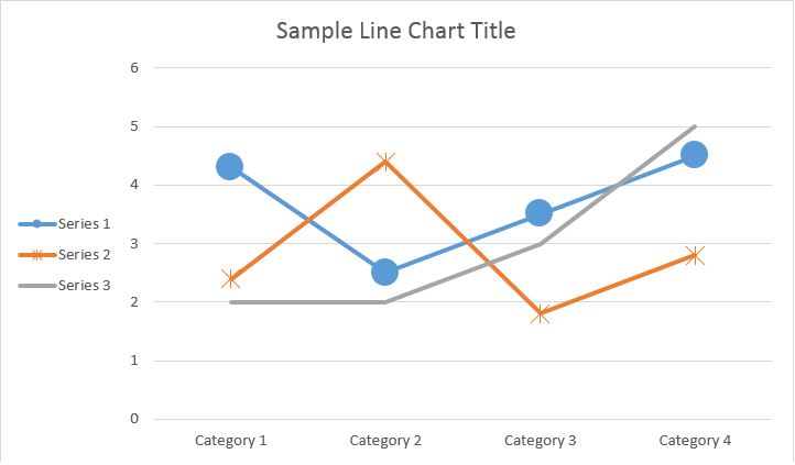
قالب بندی پر و استروک را می توان برای سری نمودارها، نقاط داده و نشانگرها تنظیم کرد. برای این کار باید از ویژگی های نوع ChartFormat در کلاس های ChartSeries، ChartDataPoint و ChartMarker و همچنین نام مستعار برای برخی از ویژگی ها مانند fore_color، back_color، visible و transparency در کلاس Stroke استفاده کنید.
مثال کد زیر نحوه تنظیم رنگ سری را نشان می دهد:
doc = aw.Document()
builder = aw.DocumentBuilder(doc)
shape = builder.insert_chart(aw.drawing.charts.ChartType.COLUMN, 432, 252)
chart = shape.chart
seriesColl = chart.series
# Delete default generated series.
seriesColl.clear()
# Create category names array.
categories = [ "AW Category 1", "AW Category 2" ]
# Adding new series. Value and category arrays must be the same size.
series1 = seriesColl.add("AW Series 1", categories, [ 1, 2 ])
series2 = seriesColl.add("AW Series 2", categories, [ 3, 4 ])
series3 = seriesColl.add("AW Series 3", categories, [ 5, 6 ])
# Set series color.
series1.format.fill.fore_color = drawing.Color.red
series2.format.fill.fore_color = drawing.Color.yellow
series3.format.fill.fore_color = drawing.Color.blue
doc.save(docs_base.artifacts_dir + "WorkingWithCharts.set_series_color.docx")
مثال کد زیر نحوه تنظیم رنگ و وزن خط را نشان می دهد:
doc = aw.Document()
builder = aw.DocumentBuilder(doc)
shape = builder.insert_chart(aw.drawing.charts.ChartType.LINE, 432, 252)
chart = shape.chart
seriesColl = chart.series
# Delete default generated series.
seriesColl.clear()
# Adding new series.
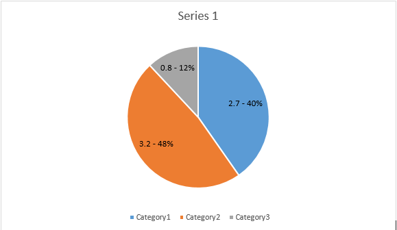
series1 = seriesColl.add_double("AW Series 1", [ 0.7, 1.8, 2.6 ], [ 2.7, 3.2, 0.8 ])
series2 = seriesColl.add_double("AW Series 2", [ 0.5, 1.5, 2.5 ], [ 3, 1, 2 ])
# Set series color.
series1.format.stroke.fore_color = drawing.Color.red
series1.format.stroke.weight = 5
series2.format.stroke.fore_color = drawing.Color.light_green
series2.format.stroke.weight = 5
doc.save(docs_base.artifacts_dir + "WorkingWithCharts.line_color_and_weight.docx")