Analyzing your prompt, please hold on...
An error occurred while retrieving the results. Please refresh the page and try again.
新的 insert_chart 方法已添加到 DocumentBuilder 类中。那么,让我们看看如何使用 DocumentBuilder.insert_chart 方法将简单的柱形图插入到文档中:
在本节中,我们将学习如何将图表插入到文档中。
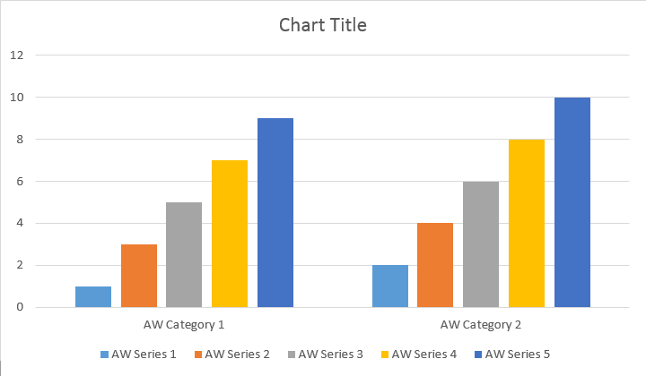
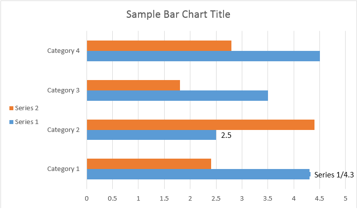
以下代码示例展示了如何插入柱形图:
该代码产生以下结果:
有 add、add_double 和 add_date 方法,这些方法涵盖了所有图表类型的数据源的所有可能变体:
该代码产生以下结果:
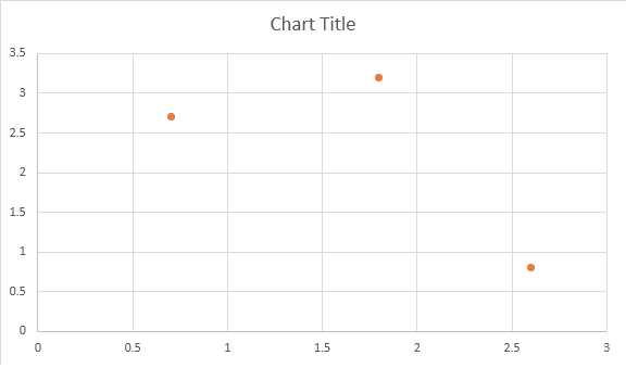
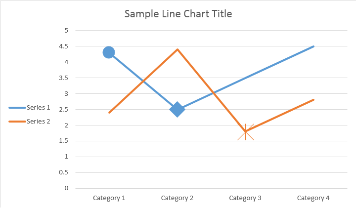
下面的示例展示了如何插入散点图。
该代码产生以下结果:
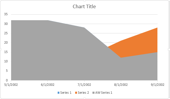
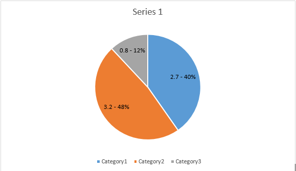
以下代码示例展示了如何插入面积图:
该代码产生以下结果:
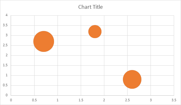
以下代码示例展示了如何插入气泡图:
该代码产生以下结果:
插入图表并填充数据后,您就可以更改其外观。 Shape.chart 属性包含通过公共 API 提供的所有图表相关选项。
例如,让我们更改 Chart 标题或图例行为:
该代码生成以下结果:
让我们看看 ChartSeries 集合。所有图表系列均可通过 Chart.series 集合获取:
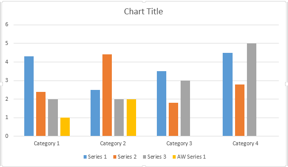
您可以逐个删除系列或清除所有系列,也可以根据需要添加新系列。新插入的图表已添加到此集合中的一些默认系列。要删除它们,您需要调用 chart.series.clear() 方法。
以下是如何处理特定系列。
请看下面的结果:
所有单个 ChartSeries 都有默认的 ChartDataPoint 选项,请尝试使用以下代码更改它们:
请看下面的结果:
ChartSeries 的单个 ChartDataPoint使用 ChartDataPoint,您可以自定义图表系列的单个数据点的格式:
请看下面的结果:
使用 ChartDataLabel,您可以指定图表系列的单个数据标签的格式,例如显示/隐藏 LegendKey、CategoryName、SeriesName、Value 等。
请看下面的结果:
ChartDataLabelCollection 类定义可用于设置图表系列 ChartDataLabels 的默认选项的属性。这些属性包括 show_category_name、show_bubble_size、show_percentage、show_series_name、show_value 等。
请看下面的结果:
使用 ChartDataLabel.number_format,您可以指定图表的单个数据标签的数字格式。
下面的代码示例展示了如何格式化多个数据标签:
如果您想使用图表轴、缩放比例和值轴的显示单位,请使用 ChartAxis、AxisDisplayUnit 和 AxisScaling 类。
以下代码示例显示如何定义 X 轴和 Y 轴属性:
以下代码示例显示如何将日期/时间值设置为轴属性:
以下代码示例演示如何更改值轴上的数字格式:
AxisBound 类表示轴值的最小或最大界限。绑定可以指定为数字、日期时间或特殊的"自动"值。
以下代码示例显示如何设置轴的边界:
以下代码示例显示如何设置轴上标签之间的间隔单位:
如果要显示或隐藏图表轴,只需设置 ChartAxis.hidden 属性的值即可实现。
以下代码示例展示了如何隐藏图表的 Y 轴:
如果要设置多行标签的文本对齐方式,只需设置 ChartAxis.tick_label_alignment 属性的值即可实现。
以下代码示例展示了如何勾选标签对齐:
可以为图表系列、数据点和标记设置填充和描边格式。为此,您需要使用 ChartSeries、ChartDataPoint 和 ChartMarker 类中 ChartFormat 类型的属性,以及某些属性的别名,例如 Stroke 类中的 fore_color、back_color、visible 和 transparency。
以下代码示例展示了如何设置系列颜色:
doc = aw.Document()
builder = aw.DocumentBuilder(doc)

shape = builder.insert_chart(aw.drawing.charts.ChartType.COLUMN, 432, 252)

chart = shape.chart
seriesColl = chart.series

# Delete default generated series.
seriesColl.clear()

# Create category names array.
categories = [ "AW Category 1", "AW Category 2" ]

# Adding new series. Value and category arrays must be the same size.
series1 = seriesColl.add("AW Series 1", categories, [ 1, 2 ])
series2 = seriesColl.add("AW Series 2", categories, [ 3, 4 ])
series3 = seriesColl.add("AW Series 3", categories, [ 5, 6 ])

# Set series color.
series1.format.fill.fore_color = drawing.Color.red
series2.format.fill.fore_color = drawing.Color.yellow
series3.format.fill.fore_color = drawing.Color.blue

doc.save(docs_base.artifacts_dir + "WorkingWithCharts.set_series_color.docx")
以下代码示例展示了如何设置线条颜色和粗细:
doc = aw.Document()
builder = aw.DocumentBuilder(doc)

shape = builder.insert_chart(aw.drawing.charts.ChartType.LINE, 432, 252)

chart = shape.chart
seriesColl = chart.series

# Delete default generated series.
seriesColl.clear()

# Adding new series.
series1 = seriesColl.add_double("AW Series 1", [ 0.7, 1.8, 2.6 ], [ 2.7, 3.2, 0.8 ])
series2 = seriesColl.add_double("AW Series 2", [ 0.5, 1.5, 2.5 ], [ 3, 1, 2 ])

# Set series color.
series1.format.stroke.fore_color = drawing.Color.red
series1.format.stroke.weight = 5
series2.format.stroke.fore_color = drawing.Color.light_green
series2.format.stroke.weight = 5

doc.save(docs_base.artifacts_dir + "WorkingWithCharts.line_color_and_weight.docx")Analyzing your prompt, please hold on...
An error occurred while retrieving the results. Please refresh the page and try again.