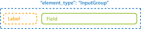
InputGroup
Contents
[
Hide
]
This element is used to insert personalized information, such as the respondent’s name or email, into the form. “InputGroup” is a purely layout element which is not processed by Aspose.OMR during the recognition.
Declaration
InputGroup element is declared as an object with "element_type": "InputGroup" property.
InputGroup must contain 2 Content elements provided as an array of objects in the children property:
- The first Content element defines the label.
- The second Content element defines the text in the field.
{
	"element_type": "InputGroup",
	"children": [
		{
			"element_type": "Content",
			"name": "Label"
		},
		{
			"element_type": "Content",
			"name": "Field text"
		}
	]
}
Required properties
| Name | Type | Description |
|---|---|---|
| element_type | string | Must be "InputGroup" (case-insensitive). |
Optional properties
| Name | Type | Default value | Description |
|---|---|---|---|
| name | string | n/a | Used as a reminder of the element’s purpose; for example, “Student name”. You can use the same value for multiple elements. This text is not displayed on the form. |
| label_border | string | “none” | Whether to draw a border around the label.
|
| input_border | string | “none” | Whether to draw a border around the field.
|
| border_size | integer | 3 | Width of all borders. |
| border_color | string | “Black” | Color of all borders. Can be picked from one of the supported values. |
| border_top_style | object | inherits border_size and border_color | Override the width and color of the element’s top border. Provided as the following object: {"size": <border width>, "color": "<border color>", "disable": <true \| false>}. Specifying true in the disable property removes the top border. |
| border_bottom_style | object | inherits border_size and border_color | Override the width and color of the element’s bottom border. Provided as the following object: {"size": <border width>, "color": "<border color>", "disable": <true \| false>}. Specifying true in the disable property removes the bottom border. |
| border_left_style | object | inherits border_size and border_color | Override the width and color of the element’s left border. Provided as the following object: {"size": <border width>, "color": "<border color>", "disable": <true \| false>}. Specifying true in the disable property removes the left border. |
| border_right_style | object | inherits border_size and border_color | Override the width and color of the element’s right border. Provided as the following object: {"size": <border width>, "color": "<border color>", "disable": <true \| false>}. Specifying true in the disable property removes the right border. |
Allowed child elements
Example
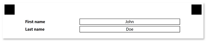
{
	"element_type": "Template",
	"children": [
		{
			"element_type": "Page",
			"children": [
				{
					"element_type": "InputGroup",
					"input_border": "square",
					"children": [
						{
							"element_type": "content",
							"name": "First name",
							"font_style": "bold"
						},
						{
							"element_type": "content",
							"name": "John",
							"align": "center"
						}
					]
				},
				{
					"element_type": "InputGroup",
					"input_border": "square",
					"children": [
						{
							"element_type": "content",
							"name": "Last name",
							"font_style": "bold"
						},
						{
							"element_type": "content",
							"name": "Doe",
							"align": "center"
						}
					]
				}
			]
		}
	]
}