کار با نمودارها
روش جدید insertChart به کلاس DocumentBuilder اضافه شد. پس بیایید ببینیم که چگونه یک نمودار ستون ساده را با استفاده از روش insertChart وارد سند کنیم.
چگونه یک نمودار را از ابتدا با استفاده از Aspose.Wordsوارد کنیم
در این بخش ما یاد خواهیم گرفت که چگونه یک نمودار را در یک سند قرار دهیم.
وارد نمودار ستون
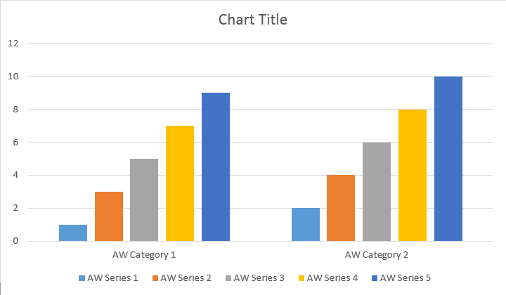
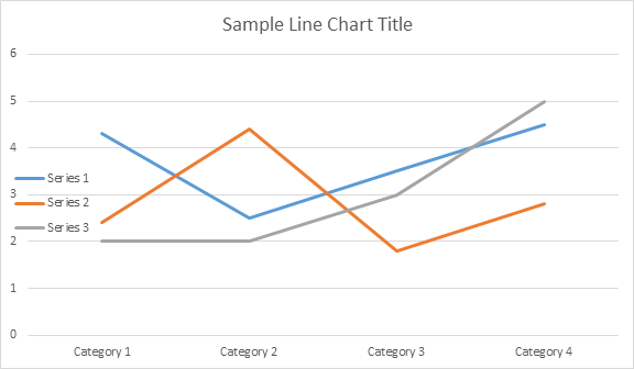
مثال کد زیر نشان می دهد که چگونه نمودار ستون را وارد کنید:
// For complete examples and data files, please go to https://github.com/aspose-words/Aspose.Words-for-Java | |
Document doc = new Document(); | |
DocumentBuilder builder = new DocumentBuilder(doc); | |
// Add chart with default data. You can specify different chart types and sizes. | |
Shape shape = builder.insertChart(ChartType.COLUMN, 432, 252); | |
// Chart property of Shape contains all chart related options. | |
Chart chart = shape.getChart(); | |
// Get chart series collection. | |
ChartSeriesCollection seriesColl = chart.getSeries(); | |
// Delete default generated series. | |
seriesColl.clear(); | |
// Create category names array, in this example we have two categories. | |
String[] categories = new String[]{"AW Category 1", "AW Category 2"}; | |
// Adding new series. Please note, data arrays must not be empty and arrays must be the same size. | |
seriesColl.add("AW Series 1", categories, new double[]{1, 2}); | |
seriesColl.add("AW Series 2", categories, new double[]{3, 4}); | |
seriesColl.add("AW Series 3", categories, new double[]{5, 6}); | |
seriesColl.add("AW Series 4", categories, new double[]{7, 8}); | |
seriesColl.add("AW Series 5", categories, new double[]{9, 10}); | |
doc.save(dataDir + "TestInsertChartColumn1_out.docx"); |
کد نتیجه زیر را تولید می کند:
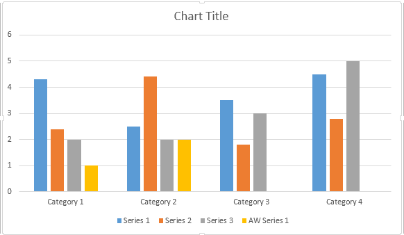
چهار بار اضافی مختلف برای روش اضافه کردن سری وجود دارد که در معرض پوشش تمام انواع ممکن منابع داده برای همه انواع نمودار قرار گرفته است:
// For complete examples and data files, please go to https://github.com/aspose-words/Aspose.Words-for-Java | |
Document doc = new Document(); | |
DocumentBuilder builder = new DocumentBuilder(doc); | |
// Insert Column chart. | |
Shape shape = builder.insertChart(ChartType.COLUMN, 432, 252); | |
Chart chart = shape.getChart(); | |
// Use this overload to add series to any type of Bar, Column, Line and Surface charts. | |
chart.getSeries().add("AW Series 1", new String[]{"AW Category 1", "AW Category 2"}, new double[]{1, 2}); | |
doc.save(dataDir + "TestInsertColumnChart2_out.docx"); |
کد نتیجه زیر را تولید می کند:
نمودار پراکندگی را وارد کنید
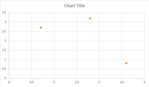
مثال کد زیر نشان می دهد که چگونه یک نمودار پراکندگی را وارد کنید:
// For complete examples and data files, please go to https://github.com/aspose-words/Aspose.Words-for-Java | |
Document doc = new Document(); | |
DocumentBuilder builder = new DocumentBuilder(doc); | |
// Insert Scatter chart. | |
Shape shape = builder.insertChart(ChartType.SCATTER, 432, 252); | |
Chart chart = shape.getChart(); | |
// Use this overload to add series to any type of Scatter charts. | |
chart.getSeries().add("AW Series 1", new double[]{0.7, 1.8, 2.6}, new double[]{2.7, 3.2, 0.8}); | |
doc.save(dataDir + "TestInsertScatterChart_out.docx"); |
کد نتیجه زیر را تولید می کند:
وارد نمودار منطقه
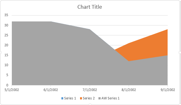
مثال کد زیر نشان می دهد که چگونه یک نمودار منطقه را وارد کنید:
// For complete examples and data files, please go to https://github.com/aspose-words/Aspose.Words-for-Java | |
Document doc = new Document(); | |
DocumentBuilder builder = new DocumentBuilder(doc); | |
// Insert Area chart. | |
Shape shape = builder.insertChart(ChartType.AREA, 432, 252); | |
Chart chart = shape.getChart(); | |
SimpleDateFormat sdf = new SimpleDateFormat("dd/MM/yyyy"); | |
Date date1 = sdf.parse("01/01/2016"); | |
Date date2 = sdf.parse("02/02/2016"); | |
Date date3 = sdf.parse("03/03/2016"); | |
Date date4 = sdf.parse("04/04/2016"); | |
Date date5 = sdf.parse("05/05/2016"); | |
// Use this overload to add series to any type of Area, Radar and Stock charts. | |
chart.getSeries().add("AW Series 1", new Date[]{date1, date2, date3, date4, date5}, new double[]{32, 32, 28, 12, 15}); | |
doc.save(dataDir + "TestInsertAreaChart_out.docx"); |
کد نتیجه زیر را تولید می کند:
درج نمودار حباب
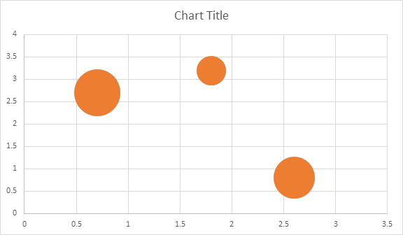
مثال کد زیر نشان می دهد که چگونه یک نمودار حباب را وارد کنید:
// For complete examples and data files, please go to https://github.com/aspose-words/Aspose.Words-for-Java | |
Document doc = new Document(); | |
DocumentBuilder builder = new DocumentBuilder(doc); | |
// Insert Bubble chart. | |
Shape shape = builder.insertChart(ChartType.BUBBLE, 432, 252); | |
Chart chart = shape.getChart(); | |
// Use this overload to add series to any type of Bubble charts. | |
chart.getSeries().add("AW Series 1", new double[]{0.7, 1.8, 2.6}, new double[]{2.7, 3.2, 0.8}, new double[]{10, 4, 8}); | |
doc.save(dataDir + "TestInsertBubbleChart_out.docx"); |
کد نتیجه زیر را تولید می کند:
کار با نمودارها از طریق Shape.Chart
Object
هنگامی که نمودار وارد شد و با داده ها پر شد، شما قادر به تغییر ظاهر آن هستید. Shape.Chart property شامل تمام گزینه های مربوط به نمودار است که از طریق public API در دسترس است.
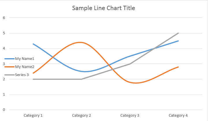
به عنوان مثال، بیایید عنوان نمودار یا رفتار افسانه ای را تغییر دهیم:
// For complete examples and data files, please go to https://github.com/aspose-words/Aspose.Words-for-Java | |
Document doc = new Document(); | |
DocumentBuilder builder = new DocumentBuilder(doc); | |
Shape shape = builder.insertChart(ChartType.LINE, 432, 252); | |
Chart chart = shape.getChart(); | |
// Determines whether the title shall be shown for this chart. Default is true. | |
chart.getTitle().setShow(true); | |
// Setting chart Title. | |
chart.getTitle().setText("Sample Line Chart Title"); | |
// Determines whether other chart elements shall be allowed to overlap title. | |
chart.getTitle().setOverlay(false); | |
// Please note if null or empty value is specified as title text, auto generated title will be shown. | |
// Determines how legend shall be shown for this chart. | |
chart.getLegend().setPosition(LegendPosition.LEFT); | |
chart.getLegend().setOverlay(true); | |
doc.save(dataDir + "ChartAppearance_out.docx"); |
کد نتایج زیر را تولید می کند:
نحوه کار با ChartSeriesCollection نمودار
بیایید به مجموعه ChartSeries نگاه کنیم. تمام سری های نمودار از طریق مجموعه chart.getSeries() که Iterableاست در دسترس هستند:
// For complete examples and data files, please go to https://github.com/aspose-words/Aspose.Words-for-Java | |
Document doc = new Document(); | |
DocumentBuilder builder = new DocumentBuilder(doc); | |
Shape shape = builder.insertChart(ChartType.LINE, 432, 252); | |
// Chart property of Shape contains all chart related options. | |
Chart chart = shape.getChart(); | |
// Get chart series collection. | |
ChartSeriesCollection seriesCollection = chart.getSeries(); | |
// Check series count. | |
System.out.println(seriesCollection.getCount()); |
شما می توانید سری را یک به یک حذف کنید یا همه آنها را پاک کنید و همچنین در صورت نیاز یک سری جدید اضافه کنید. نمودار تازه وارد شده دارای مجموعه ای پیش فرض است که به این مجموعه اضافه شده است. برای حذف آنها باید روش chart.getSeries().clear() را فراخوانی کنید.
کار با کلاس Single ChartSeries
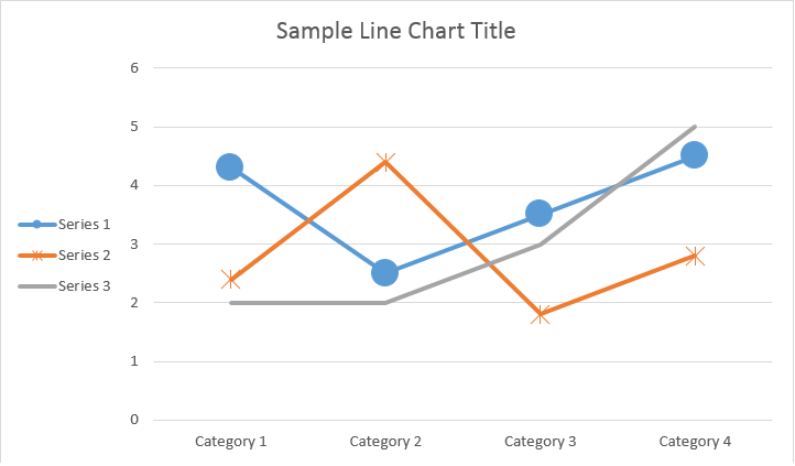
در اینجا نحوه کار با یک سری خاص آورده شده است.
// For complete examples and data files, please go to https://github.com/aspose-words/Aspose.Words-for-Java | |
Document doc = new Document(); | |
DocumentBuilder builder = new DocumentBuilder(doc); | |
Shape shape = builder.insertChart(ChartType.LINE, 432, 252); | |
// Get first series. | |
ChartSeries series0 = shape.getChart().getSeries().get(0); | |
// Get second series. | |
ChartSeries series1 = shape.getChart().getSeries().get(1); | |
// Change first series name. | |
series0.setName("My Name1"); | |
// Change second series name. | |
series1.setName("My Name2"); | |
// You can also specify whether the line connecting the points on the chart shall be smoothed using Catmull-Rom splines. | |
series0.setSmooth(true); | |
series1.setSmooth(true); | |
doc.save(dataDir + "SingleChartSeries_out.docx"); |
لطفا نتیجه را در زیر ببینید:
همه گزینه های تک ChartSeries دارای گزینه های پیش فرض ChartDataPoint هستند، لطفا از کد زیر برای تغییر آنها استفاده کنید:
// For complete examples and data files, please go to https://github.com/aspose-words/Aspose.Words-for-Java | |
Document doc = new Document(); | |
DocumentBuilder builder = new DocumentBuilder(doc); | |
Shape shape = builder.insertChart(ChartType.LINE, 432, 252); | |
// Get first series. | |
ChartSeries series0 = shape.getChart().getSeries().get(0); | |
// Get second series. | |
ChartSeries series1 = shape.getChart().getSeries().get(1); | |
// Specifies whether by default the parent element shall inverts its colors if the value is negative. | |
series0.setInvertIfNegative(true); | |
// Set default marker symbol and size. | |
series0.getMarker().setSymbol(MarkerSymbol.CIRCLE); | |
series0.getMarker().setSize(15); | |
series1.getMarker().setSymbol(MarkerSymbol.STAR); | |
series1.getMarker().setSize(10); | |
doc.save(dataDir + "ChartDataPoints_out.docx");// |
چگونه با تک ChartDataPoint از ChartSeries
کار کنیم
با استفاده از ChartDataPoint شما قادر به سفارشی کردن قالب بندی یک نقطه داده واحد از سری نمودار هستید:
// For complete examples and data files, please go to https://github.com/aspose-words/Aspose.Words-for-Java | |
Document doc = new Document(); | |
DocumentBuilder builder = new DocumentBuilder(doc); | |
Shape shape = builder.insertChart(ChartType.LINE, 432, 252); | |
// Get first series. | |
ChartSeries series0 = shape.getChart().getSeries().get(0); | |
// Get second series. | |
ChartSeries series1 = shape.getChart().getSeries().get(1); | |
ChartDataPointCollection dataPointCollection = series0.getDataPoints(); | |
// Add data point to the first and second point of the first series. | |
ChartDataPoint dataPoint00 = dataPointCollection.add(0); | |
ChartDataPoint dataPoint01 = dataPointCollection.add(1); | |
// Set explosion. | |
dataPoint00.setExplosion(50); | |
// Set marker symbol and size. | |
dataPoint00.getMarker().setSymbol(MarkerSymbol.CIRCLE); | |
dataPoint00.getMarker().setSize(15); | |
dataPoint01.getMarker().setSymbol(MarkerSymbol.DIAMOND); | |
dataPoint01.getMarker().setSize(20); | |
// Add data point to the third point of the second series. | |
ChartDataPoint dataPoint12 = series1.getDataPoints().add(2); | |
dataPoint12.setInvertIfNegative(true); | |
dataPoint12.getMarker().setSymbol(MarkerSymbol.STAR); | |
dataPoint12.getMarker().setSize(20); | |
doc.save(dataDir + "SingleChartDataPointOfAChartSeries_out.docx"); |
لطفا نتیجه را در زیر ببینید:
چگونه با ChartDataLabel از یک ChartSeriesکار کنیم
با استفاده از ChartDataLabel شما می توانید قالب بندی یک برچسب داده واحد از سری نمودار را مشخص کنید، مانند show / hide LegendKey, CategoryName, SeriesName, ارزش و غیره:
// For complete examples and data files, please go to https://github.com/aspose-words/Aspose.Words-for-Java | |
Document doc = new Document(); | |
DocumentBuilder builder = new DocumentBuilder(doc); | |
Shape shape = builder.insertChart(ChartType.BAR, 432, 252); | |
// Get first series. | |
ChartSeries series0 = shape.getChart().getSeries().get(0); | |
series0.hasDataLabels(true); | |
// Set properties. | |
series0.getDataLabels().setShowLegendKey(true); | |
// By default, when you add data labels to the data points in a pie chart, leader lines are displayed for data labels that are | |
// positioned far outside the end of data points. Leader lines create a visual connection between a data label and its | |
// corresponding data point. | |
series0.getDataLabels().setShowLeaderLines(true); | |
series0.getDataLabels().setShowCategoryName(false); | |
series0.getDataLabels().setShowPercentage(false); | |
series0.getDataLabels().setShowSeriesName(true); | |
series0.getDataLabels().setShowValue(true); | |
series0.getDataLabels().setSeparator("/"); | |
series0.getDataLabels().setShowValue(true); | |
doc.save(dataDir + "ChartDataLabelOfASingleChartSeries_out.docx"); |
لطفا نتیجه را در زیر ببینید:
چگونه گزینه های پیش فرض را برای ChartDataLabels از ChartSeriesتعریف کنیم
کلاس ChartDataLabelCollection ویژگی هایی را تعریف می کند که می تواند برای تنظیم گزینه های پیش فرض برای ChartDataLabels برای نمودار Series استفاده شود. این خواص عبارتند ازsetShowCategoryName, setShowBubbleSize, setShowPercentage, setShowSeriesName, setShowValue و غیره:
// For complete examples and data files, please go to https://github.com/aspose-words/Aspose.Words-for-Java | |
Document doc = new Document(); | |
DocumentBuilder builder = new DocumentBuilder(doc); | |
Shape shape = builder.insertChart(ChartType.PIE, 432, 252); | |
Chart chart = shape.getChart(); | |
chart.getSeries().clear(); | |
ChartSeries series = chart.getSeries().add("Series 1", new String[] { "Category1", "Category2", "Category3" }, | |
new double[] { 2.7, 3.2, 0.8 }); | |
ChartDataLabelCollection labels = series.getDataLabels(); | |
labels.setShowPercentage(true); | |
labels.setShowValue(true); | |
labels.setShowLeaderLines(false); | |
labels.setSeparator(" - "); | |
doc.save(dataDir + "Demo.docx"); |
لطفا نتیجه را در زیر ببینید:
نحوه قالب بندی تعداد برچسب داده نمودار
با استفاده از ویژگی NumberFormat، می توانید قالب بندی شماره یک برچسب داده واحد نمودار را مشخص کنید.
مثال کد زیر نشان می دهد که چگونه تعدادی از برچسب داده ها را فرمت کنیم:
// For complete examples and data files, please go to https://github.com/aspose-words/Aspose.Words-for-Java | |
Document doc = new Document(); | |
DocumentBuilder builder = new DocumentBuilder(doc); | |
// Add chart with default data. | |
Shape shape = builder.insertChart(ChartType.LINE, 432, 252); | |
Chart chart = shape.getChart(); | |
chart.getTitle().setText("Data Labels With Different Number Format"); | |
// Delete default generated series. | |
chart.getSeries().clear(); | |
// Add new series | |
ChartSeries series0 = chart.getSeries().add("AW Series 0", new String[] { "AW0", "AW1", "AW2" }, | |
new double[] { 2.5, 1.5, 3.5 }); | |
series0.hasDataLabels(true); | |
// Set currency format code. | |
series0.getDataLabels().get(0).getNumberFormat().setFormatCode("\"$\"#,##0.00"); | |
// Set date format code. | |
series0.getDataLabels().get(1).getNumberFormat().setFormatCode("d/mm/yyyy"); | |
// Set percentage format code. | |
series0.getDataLabels().get(2).getNumberFormat().setFormatCode("0.00%"); | |
// Or you can set format code to be linked to a source cell, | |
// in this case NumberFormat will be reset to general and inherited from a | |
// source cell. | |
series0.getDataLabels().get(2).getNumberFormat().isLinkedToSource(true); | |
doc.save(dataDir + "NumberFormat_DataLabel_out.docx"); |
نحوه تنظیم ویژگی های محور نمودار
اگر می خواهید با محور نمودار، مقیاس بندی و واحدهای نمایش برای محور ارزش کار کنید، لطفا از کلاس های ChartAxis، AxisDisplayUnit و AxisScaling استفاده کنید.
مثال کد زیر نشان می دهد که چگونه ویژگی های محور X و Y را تعریف کنیم:
// For complete examples and data files, please go to https://github.com/aspose-words/Aspose.Words-for-Java | |
Document doc = new Document(); | |
DocumentBuilder builder = new DocumentBuilder(doc); | |
// Insert chart. | |
Shape shape = builder.insertChart(ChartType.AREA, 432, 252); | |
Chart chart = shape.getChart(); | |
// Clear demo data. | |
chart.getSeries().clear(); | |
// Fill data. | |
chart.getSeries().add("AW Series 1", | |
new Date[]{new Date(2002, 1, 1), new Date(2002, 6, 1), new Date(2015, 7, 1), new Date(2015, 8, 1), new Date(2015, 9, 1)}, | |
new double[]{640, 320, 280, 120, 150}); | |
ChartAxis xAxis = chart.getAxisX(); | |
ChartAxis yAxis = chart.getAxisY(); | |
// Change the X axis to be category instead of date, so all the points will be put with equal interval on the X axis. | |
xAxis.setCategoryType(AxisCategoryType.CATEGORY); | |
// Define X axis properties. | |
xAxis.setCrosses(AxisCrosses.CUSTOM); | |
xAxis.setCrossesAt(3); // measured in display units of the Y axis (hundreds) | |
xAxis.setReverseOrder(true); | |
xAxis.setMajorTickMark(AxisTickMark.CROSS); | |
xAxis.setMinorTickMark(AxisTickMark.OUTSIDE); | |
xAxis.setTickLabelOffset(200); | |
// Define Y axis properties. | |
yAxis.setTickLabelPosition(AxisTickLabelPosition.HIGH); | |
yAxis.setMajorUnit(100); | |
yAxis.setMinorUnit(50); | |
yAxis.getDisplayUnit().setUnit(AxisBuiltInUnit.HUNDREDS); | |
yAxis.getScaling().setMinimum(new AxisBound(100)); | |
yAxis.getScaling().setMaximum(new AxisBound(700)); | |
dataDir = dataDir + "SetAxisProperties_out.docx"; | |
doc.save(dataDir); |
چگونه مقدار DateTime محور را تنظیم کنیم
مثال کد زیر نشان می دهد که چگونه مقادیر تاریخ/زمان را به ویژگی های محور تنظیم کنید:
// For complete examples and data files, please go to https://github.com/aspose-words/Aspose.Words-for-Java | |
Document doc = new Document(); | |
DocumentBuilder builder = new DocumentBuilder(doc); | |
// Insert chart. | |
Shape shape = builder.insertChart(ChartType.COLUMN, 432, 252); | |
Chart chart = shape.getChart(); | |
// Clear demo data. | |
chart.getSeries().clear(); | |
// Fill data. | |
chart.getSeries().add("AW Series 1", | |
new Date[]{new Date(2017, 11, 06), new Date(2017, 11, 9), new Date(2017, 11, 15), | |
new Date(2017, 11, 21), new Date(2017, 11, 25), new Date(2017, 11, 29)}, | |
new double[]{1.2, 0.3, 2.1, 2.9, 4.2, 5.3} | |
); | |
// Set X axis bounds. | |
ChartAxis xAxis = chart.getAxisX(); | |
xAxis.getScaling().setMinimum(new AxisBound(new Date(2017, 11, 5).getTime())); | |
xAxis.getScaling().setMaximum(new AxisBound(new Date(2017, 12, 3).getTime())); | |
// Set major units to a week and minor units to a day. | |
xAxis.setMajorUnit(7); | |
xAxis.setMinorUnit(1); | |
xAxis.setMajorTickMark(AxisTickMark.CROSS); | |
xAxis.setMinorTickMark(AxisTickMark.OUTSIDE); | |
dataDir = dataDir + "SetDateTimeValuesToAxis_out.docx"; | |
doc.save(dataDir); |
نحوه قالب بندی تعداد ارزش محور
مثال کد زیر نشان می دهد که چگونه فرمت اعداد را در محور ارزش تغییر دهید:
// For complete examples and data files, please go to https://github.com/aspose-words/Aspose.Words-for-Java | |
Document doc = new Document(); | |
DocumentBuilder builder = new DocumentBuilder(doc); | |
// Insert chart. | |
Shape shape = builder.insertChart(ChartType.COLUMN, 432, 252); | |
Chart chart = shape.getChart(); | |
// Clear demo data. | |
chart.getSeries().clear(); | |
// Fill data. | |
chart.getSeries().add("AW Series 1", | |
new String[]{"Item 1", "Item 2", "Item 3", "Item 4", "Item 5"}, | |
new double[]{1900000, 850000, 2100000, 600000, 1500000}); | |
// Set number format. | |
chart.getAxisY().getNumberFormat().setFormatCode("#,##0"); | |
dataDir = dataDir + "FormatAxisNumber_out.docx"; | |
doc.save(dataDir); |
نحوه تنظیم مرزهای محور
کلاس AxisBound
حداقل یا حداکثر مرز مقادیر محور را نشان می دهد. Bound را می توان به عنوان یک مقدار عددی، تاریخ و زمان یا یک مقدار ویژه “خودکار” مشخص کرد.
مثال کد زیر نشان می دهد که چگونه مرزهای یک محور را تنظیم کنید:
// For complete examples and data files, please go to https://github.com/aspose-words/Aspose.Words-for-Java | |
Document doc = new Document(); | |
DocumentBuilder builder = new DocumentBuilder(doc); | |
// Insert chart. | |
Shape shape = builder.insertChart(ChartType.COLUMN, 432, 252); | |
Chart chart = shape.getChart(); | |
// Clear demo data. | |
chart.getSeries().clear(); | |
// Fill data. | |
chart.getSeries().add("AW Series 1", | |
new String[]{"Item 1", "Item 2", "Item 3", "Item 4", "Item 5"}, | |
new double[]{1.2, 0.3, 2.1, 2.9, 4.2}); | |
chart.getAxisY().getScaling().setMinimum(new AxisBound(0)); | |
chart.getAxisY().getScaling().setMaximum(new AxisBound(6)); | |
dataDir = dataDir + "SetboundsOfAxis_out.docx"; | |
doc.save(dataDir); |
نحوه تنظیم واحد فاصله بین برچسب ها
مثال کد زیر نشان می دهد که چگونه واحد فاصله بین برچسب ها را در یک محور تنظیم کنیم:
// For complete examples and data files, please go to https://github.com/aspose-words/Aspose.Words-for-Java | |
Document doc = new Document(); | |
DocumentBuilder builder = new DocumentBuilder(doc); | |
// Insert chart. | |
Shape shape = builder.insertChart(ChartType.COLUMN, 432, 252); | |
Chart chart = shape.getChart(); | |
// Clear demo data. | |
chart.getSeries().clear(); | |
// Fill data. | |
chart.getSeries().add("AW Series 1", | |
new String[]{"Item 1", "Item 2", "Item 3", "Item 4", "Item 5"}, | |
new double[]{1.2, 0.3, 2.1, 2.9, 4.2}); | |
chart.getAxisX().setTickLabelSpacing(2); | |
dataDir = dataDir + "SetIntervalUnitBetweenLabelsOnAxis_out.docx"; | |
doc.save(dataDir); |
چگونه برای پنهان کردن محور نمودار
اگر می خواهید محور نمودار را نشان دهید یا پنهان کنید، می توانید به سادگی با تنظیم مقدار ChartAxis.Hidden
خاصیت به این هدف برسید.
مثال کد زیر نشان می دهد که چگونه محور Y نمودار را پنهان کنیم:
// For complete examples and data files, please go to https://github.com/aspose-words/Aspose.Words-for-Java | |
Document doc = new Document(); | |
DocumentBuilder builder = new DocumentBuilder(doc); | |
// Insert chart. | |
Shape shape = builder.insertChart(ChartType.COLUMN, 432, 252); | |
Chart chart = shape.getChart(); | |
// Clear demo data. | |
chart.getSeries().clear(); | |
// Fill data. | |
chart.getSeries().add("AW Series 1", | |
new String[]{"Item 1", "Item 2", "Item 3", "Item 4", "Item 5"}, | |
new double[]{1.2, 0.3, 2.1, 2.9, 4.2}); | |
// Hide the Y axis. | |
chart.getAxisY().setHidden(true); | |
dataDir = dataDir + "HideChartAxis_out.docx"; | |
doc.save(dataDir); |
چگونه برچسب نمودار را تراز کنیم
اگر می خواهید یک تراز متن برای برچسب های چند خطی تنظیم کنید، می توانید به سادگی با تنظیم مقدار setTickLabelAlignment() property به این هدف برسید.
مثال کد زیر نشان می دهد که چگونه تراز برچسب را تیک بزنید:
// For complete examples and data files, please go to https://github.com/aspose-words/Aspose.Words-for-Java | |
Document doc = new Document(dataDir + "Document.docx"); | |
Shape shape = (Shape) doc.getChild(NodeType.SHAPE, 0, true); | |
ChartAxis axis = shape.getChart().getAxisX(); | |
//This property has effect only for multi-line labels. | |
axis.setTickLabelAlignment(ParagraphAlignment.RIGHT); | |
doc.save(dataDir + "Document_out.docx"); |
نحوه تنظیم قالب بندی پر کردن و سکته مغزی
قالب بندی Fill و stroke را می توان برای سری های نمودار، نقاط داده و نشانگرها تنظیم کرد. برای انجام این کار، باید از ویژگی های نوع ChartFormat
در کلاس های ChartSeries، ChartDataPoint و ChartMarker و همچنین نام مستعار برای برخی از ویژگی ها مانند ForeColor، BackColor، قابل مشاهده و شفافیت در کلاس Stroke
استفاده کنید.
مثال کد زیر نشان می دهد که چگونه رنگ سری را تنظیم کنید:
Document doc = new Document();
DocumentBuilder builder = new DocumentBuilder(doc);
Shape shape = builder.InsertChart(ChartType.Column, 432, 252);
Chart chart = shape.Chart;
ChartSeriesCollection seriesColl = chart.Series;
// Delete default generated series.
seriesColl.Clear();
// Create category names array.
string[] categories = new string[] { "AW Category 1", "AW Category 2" };
// Adding new series. Value and category arrays must be the same size.
ChartSeries series1 = seriesColl.Add("AW Series 1", categories, new double[] { 1, 2 });
ChartSeries series2 = seriesColl.Add("AW Series 2", categories, new double[] { 3, 4 });
ChartSeries series3 = seriesColl.Add("AW Series 3", categories, new double[] { 5, 6 });
// Set series color.
series1.Format.Fill.ForeColor = Color.Red;
series2.Format.Fill.ForeColor = Color.Yellow;
series3.Format.Fill.ForeColor = Color.Blue;
doc.Save("ColumnColor.docx");
مثال کد زیر نشان می دهد که چگونه رنگ و وزن خط را تنظیم کنید:
Document doc = new Document();
DocumentBuilder builder = new DocumentBuilder(doc);
Shape shape = builder.InsertChart(ChartType.Line, 432, 252);
Chart chart = shape.Chart;
ChartSeriesCollection seriesColl = chart.Series;
// Delete default generated series.
seriesColl.Clear();
// Adding new series.
ChartSeries series1 = seriesColl.Add("AW Series 1", new double[] { 0.7, 1.8, 2.6 }, new double[] { 2.7, 3.2, 0.8 });
ChartSeries series2 = seriesColl.Add("AW Series 2", new double[] { 0.5, 1.5, 2.5 }, new double[] { 3, 1, 2 });
// Set series color.
series1.Format.Stroke.ForeColor = Color.Red;
series1.Format.Stroke.Weight = 5;
series2.Format.Stroke.ForeColor = Color.LightGreen;
series2.Format.Stroke.Weight = 5;
doc.Save("LineColorAndWeight.docx");