Trabalhar com gráficos
O novo método insertChart foi adicionado à classe DocumentBuilder. Então, vamos ver como inserir um gráfico de colunas simples no documento usando o método insertChart.
Como inserir um gráfico do zero usando Aspose.Words
Nesta seção, aprenderemos como inserir um gráfico em um documento.
Inserir Gráfico De Colunas
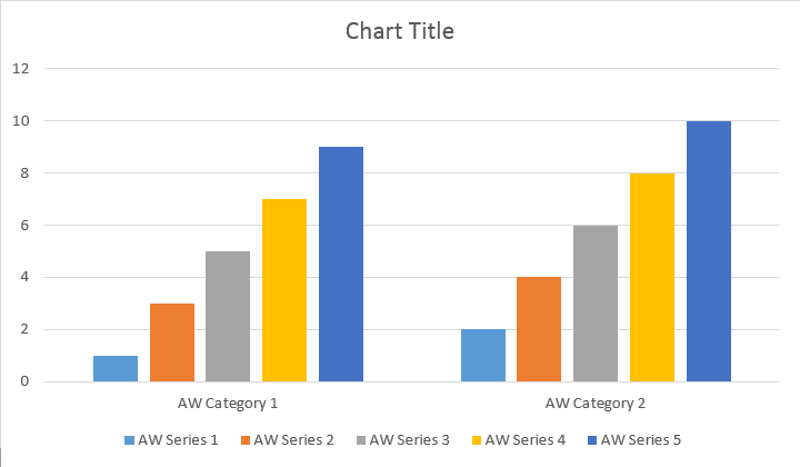
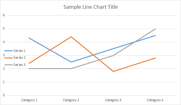
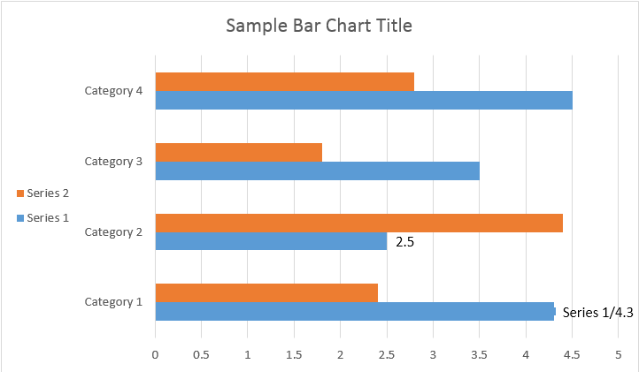
O exemplo de código a seguir mostra como inserir o gráfico de colunas:
// For complete examples and data files, please go to https://github.com/aspose-words/Aspose.Words-for-Java | |
Document doc = new Document(); | |
DocumentBuilder builder = new DocumentBuilder(doc); | |
// Add chart with default data. You can specify different chart types and sizes. | |
Shape shape = builder.insertChart(ChartType.COLUMN, 432, 252); | |
// Chart property of Shape contains all chart related options. | |
Chart chart = shape.getChart(); | |
// Get chart series collection. | |
ChartSeriesCollection seriesColl = chart.getSeries(); | |
// Delete default generated series. | |
seriesColl.clear(); | |
// Create category names array, in this example we have two categories. | |
String[] categories = new String[]{"AW Category 1", "AW Category 2"}; | |
// Adding new series. Please note, data arrays must not be empty and arrays must be the same size. | |
seriesColl.add("AW Series 1", categories, new double[]{1, 2}); | |
seriesColl.add("AW Series 2", categories, new double[]{3, 4}); | |
seriesColl.add("AW Series 3", categories, new double[]{5, 6}); | |
seriesColl.add("AW Series 4", categories, new double[]{7, 8}); | |
seriesColl.add("AW Series 5", categories, new double[]{9, 10}); | |
doc.save(dataDir + "TestInsertChartColumn1_out.docx"); |
O código produz o seguinte resultado:
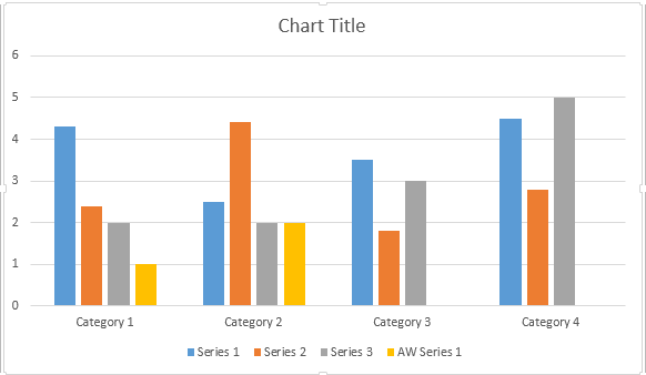
Existem quatro sobrecargas diferentes para o método Add em série, que foram expostas para abranger todas as variantes possíveis de fontes de dados para todos os tipos de gráficos:
// For complete examples and data files, please go to https://github.com/aspose-words/Aspose.Words-for-Java | |
Document doc = new Document(); | |
DocumentBuilder builder = new DocumentBuilder(doc); | |
// Insert Column chart. | |
Shape shape = builder.insertChart(ChartType.COLUMN, 432, 252); | |
Chart chart = shape.getChart(); | |
// Use this overload to add series to any type of Bar, Column, Line and Surface charts. | |
chart.getSeries().add("AW Series 1", new String[]{"AW Category 1", "AW Category 2"}, new double[]{1, 2}); | |
doc.save(dataDir + "TestInsertColumnChart2_out.docx"); |
O código produz o seguinte resultado:
Inserir Gráfico De Dispersão
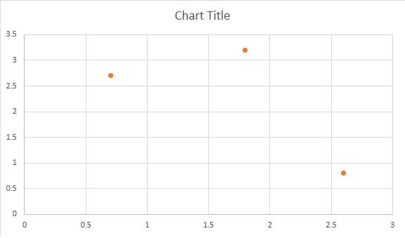
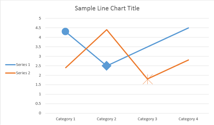
O exemplo de código a seguir mostra como inserir um gráfico de dispersão:
// For complete examples and data files, please go to https://github.com/aspose-words/Aspose.Words-for-Java | |
Document doc = new Document(); | |
DocumentBuilder builder = new DocumentBuilder(doc); | |
// Insert Scatter chart. | |
Shape shape = builder.insertChart(ChartType.SCATTER, 432, 252); | |
Chart chart = shape.getChart(); | |
// Use this overload to add series to any type of Scatter charts. | |
chart.getSeries().add("AW Series 1", new double[]{0.7, 1.8, 2.6}, new double[]{2.7, 3.2, 0.8}); | |
doc.save(dataDir + "TestInsertScatterChart_out.docx"); |
O código produz o seguinte resultado:
Inserir Gráfico De Área
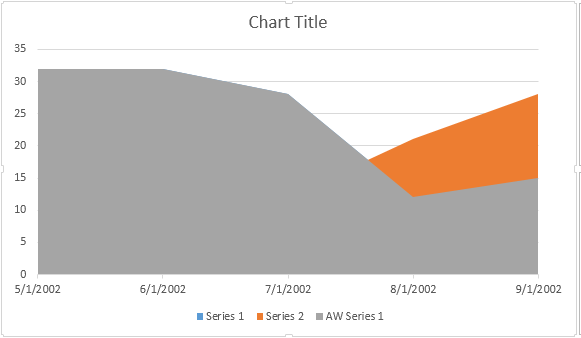
O exemplo de código a seguir mostra como inserir um gráfico de área:
// For complete examples and data files, please go to https://github.com/aspose-words/Aspose.Words-for-Java | |
Document doc = new Document(); | |
DocumentBuilder builder = new DocumentBuilder(doc); | |
// Insert Area chart. | |
Shape shape = builder.insertChart(ChartType.AREA, 432, 252); | |
Chart chart = shape.getChart(); | |
SimpleDateFormat sdf = new SimpleDateFormat("dd/MM/yyyy"); | |
Date date1 = sdf.parse("01/01/2016"); | |
Date date2 = sdf.parse("02/02/2016"); | |
Date date3 = sdf.parse("03/03/2016"); | |
Date date4 = sdf.parse("04/04/2016"); | |
Date date5 = sdf.parse("05/05/2016"); | |
// Use this overload to add series to any type of Area, Radar and Stock charts. | |
chart.getSeries().add("AW Series 1", new Date[]{date1, date2, date3, date4, date5}, new double[]{32, 32, 28, 12, 15}); | |
doc.save(dataDir + "TestInsertAreaChart_out.docx"); |
O código produz o seguinte resultado:
Inserir Gráfico De Bolhas
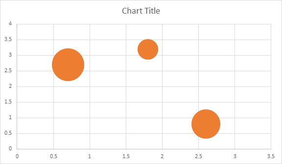
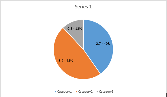
O exemplo de código a seguir mostra como inserir um gráfico de bolhas:
// For complete examples and data files, please go to https://github.com/aspose-words/Aspose.Words-for-Java | |
Document doc = new Document(); | |
DocumentBuilder builder = new DocumentBuilder(doc); | |
// Insert Bubble chart. | |
Shape shape = builder.insertChart(ChartType.BUBBLE, 432, 252); | |
Chart chart = shape.getChart(); | |
// Use this overload to add series to any type of Bubble charts. | |
chart.getSeries().add("AW Series 1", new double[]{0.7, 1.8, 2.6}, new double[]{2.7, 3.2, 0.8}, new double[]{10, 4, 8}); | |
doc.save(dataDir + "TestInsertBubbleChart_out.docx"); |
O código produz o seguinte resultado:
Trabalhando com gráficos através do objeto Shape.Chart
Uma vez que o gráfico foi inserido e preenchido com dados, você pode alterar sua aparência. A propriedade Shape.Chart contém todas as opções relacionadas ao gráfico disponíveis através do público API.
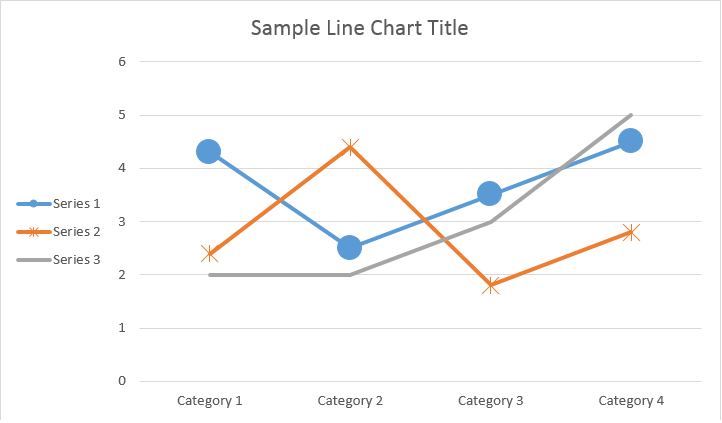
Por exemplo, vamos alterar o comportamento do título ou da legenda do Gráfico:
// For complete examples and data files, please go to https://github.com/aspose-words/Aspose.Words-for-Java | |
Document doc = new Document(); | |
DocumentBuilder builder = new DocumentBuilder(doc); | |
Shape shape = builder.insertChart(ChartType.LINE, 432, 252); | |
Chart chart = shape.getChart(); | |
// Determines whether the title shall be shown for this chart. Default is true. | |
chart.getTitle().setShow(true); | |
// Setting chart Title. | |
chart.getTitle().setText("Sample Line Chart Title"); | |
// Determines whether other chart elements shall be allowed to overlap title. | |
chart.getTitle().setOverlay(false); | |
// Please note if null or empty value is specified as title text, auto generated title will be shown. | |
// Determines how legend shall be shown for this chart. | |
chart.getLegend().setPosition(LegendPosition.LEFT); | |
chart.getLegend().setOverlay(true); | |
doc.save(dataDir + "ChartAppearance_out.docx"); |
O código gera os seguintes resultados:
Como trabalhar com ChartSeriesCollection do Gráfico
Vamos dar uma olhada na coleção ChartSeries. Todas as séries de gráficos estão disponíveis através da coleção chart.getSeries(), que é Iterable:
// For complete examples and data files, please go to https://github.com/aspose-words/Aspose.Words-for-Java | |
Document doc = new Document(); | |
DocumentBuilder builder = new DocumentBuilder(doc); | |
Shape shape = builder.insertChart(ChartType.LINE, 432, 252); | |
// Chart property of Shape contains all chart related options. | |
Chart chart = shape.getChart(); | |
// Get chart series collection. | |
ChartSeriesCollection seriesCollection = chart.getSeries(); | |
// Check series count. | |
System.out.println(seriesCollection.getCount()); |
Você pode remover uma série por uma ou limpar todas elas, bem como adicionar uma nova, se necessário. O gráfico recém-inserido tem algumas séries padrão adicionadas a esta coleção. Para removê-los, você precisa chamar o método chart.getSeries().clear().
Trabalhando com uma única classe ChartSeries
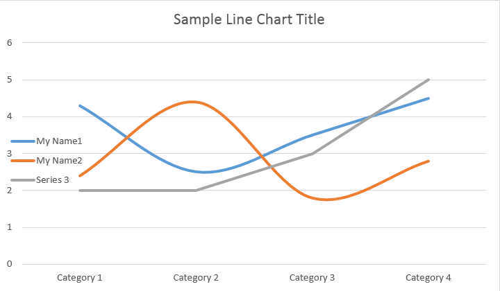
Aqui está como trabalhar com uma série específica.
// For complete examples and data files, please go to https://github.com/aspose-words/Aspose.Words-for-Java | |
Document doc = new Document(); | |
DocumentBuilder builder = new DocumentBuilder(doc); | |
Shape shape = builder.insertChart(ChartType.LINE, 432, 252); | |
// Get first series. | |
ChartSeries series0 = shape.getChart().getSeries().get(0); | |
// Get second series. | |
ChartSeries series1 = shape.getChart().getSeries().get(1); | |
// Change first series name. | |
series0.setName("My Name1"); | |
// Change second series name. | |
series1.setName("My Name2"); | |
// You can also specify whether the line connecting the points on the chart shall be smoothed using Catmull-Rom splines. | |
series0.setSmooth(true); | |
series1.setSmooth(true); | |
doc.save(dataDir + "SingleChartSeries_out.docx"); |
Veja o resultado abaixo:
Todos os únicos ChartSeries têm opções padrão ChartDataPoint, tente usar o seguinte código para alterá - los:
// For complete examples and data files, please go to https://github.com/aspose-words/Aspose.Words-for-Java | |
Document doc = new Document(); | |
DocumentBuilder builder = new DocumentBuilder(doc); | |
Shape shape = builder.insertChart(ChartType.LINE, 432, 252); | |
// Get first series. | |
ChartSeries series0 = shape.getChart().getSeries().get(0); | |
// Get second series. | |
ChartSeries series1 = shape.getChart().getSeries().get(1); | |
// Specifies whether by default the parent element shall inverts its colors if the value is negative. | |
series0.setInvertIfNegative(true); | |
// Set default marker symbol and size. | |
series0.getMarker().setSymbol(MarkerSymbol.CIRCLE); | |
series0.getMarker().setSize(15); | |
series1.getMarker().setSymbol(MarkerSymbol.STAR); | |
series1.getMarker().setSize(10); | |
doc.save(dataDir + "ChartDataPoints_out.docx");// |
Como trabalhar com um único ChartDataPoint de um ChartSeries
Usando ChartDataPoint você pode personalizar a formatação de um único ponto de dados da série de gráficos:
// For complete examples and data files, please go to https://github.com/aspose-words/Aspose.Words-for-Java | |
Document doc = new Document(); | |
DocumentBuilder builder = new DocumentBuilder(doc); | |
Shape shape = builder.insertChart(ChartType.LINE, 432, 252); | |
// Get first series. | |
ChartSeries series0 = shape.getChart().getSeries().get(0); | |
// Get second series. | |
ChartSeries series1 = shape.getChart().getSeries().get(1); | |
ChartDataPointCollection dataPointCollection = series0.getDataPoints(); | |
// Add data point to the first and second point of the first series. | |
ChartDataPoint dataPoint00 = dataPointCollection.add(0); | |
ChartDataPoint dataPoint01 = dataPointCollection.add(1); | |
// Set explosion. | |
dataPoint00.setExplosion(50); | |
// Set marker symbol and size. | |
dataPoint00.getMarker().setSymbol(MarkerSymbol.CIRCLE); | |
dataPoint00.getMarker().setSize(15); | |
dataPoint01.getMarker().setSymbol(MarkerSymbol.DIAMOND); | |
dataPoint01.getMarker().setSize(20); | |
// Add data point to the third point of the second series. | |
ChartDataPoint dataPoint12 = series1.getDataPoints().add(2); | |
dataPoint12.setInvertIfNegative(true); | |
dataPoint12.getMarker().setSymbol(MarkerSymbol.STAR); | |
dataPoint12.getMarker().setSize(20); | |
doc.save(dataDir + "SingleChartDataPointOfAChartSeries_out.docx"); |
Veja o resultado abaixo:
Como trabalhar com ChartDataLabel de um único ChartSeries
Usando ChartDataLabel, você pode especificar a formatação de um único rótulo de dados da série de gráficos, como mostrar / ocultar LegendKey, CategoryName, SeriesName, Valor etc:
// For complete examples and data files, please go to https://github.com/aspose-words/Aspose.Words-for-Java | |
Document doc = new Document(); | |
DocumentBuilder builder = new DocumentBuilder(doc); | |
Shape shape = builder.insertChart(ChartType.BAR, 432, 252); | |
// Get first series. | |
ChartSeries series0 = shape.getChart().getSeries().get(0); | |
series0.hasDataLabels(true); | |
// Set properties. | |
series0.getDataLabels().setShowLegendKey(true); | |
// By default, when you add data labels to the data points in a pie chart, leader lines are displayed for data labels that are | |
// positioned far outside the end of data points. Leader lines create a visual connection between a data label and its | |
// corresponding data point. | |
series0.getDataLabels().setShowLeaderLines(true); | |
series0.getDataLabels().setShowCategoryName(false); | |
series0.getDataLabels().setShowPercentage(false); | |
series0.getDataLabels().setShowSeriesName(true); | |
series0.getDataLabels().setShowValue(true); | |
series0.getDataLabels().setSeparator("/"); | |
series0.getDataLabels().setShowValue(true); | |
doc.save(dataDir + "ChartDataLabelOfASingleChartSeries_out.docx"); |
Veja o resultado abaixo:
Como definir opções padrão para ChartDataLabels de ChartSeries
A classe ChartDataLabelCollection define propriedades que podem ser usadas para definir opções padrão para ChartDataLabels para o gráfico Series. Essas propriedades incluem setShowCategoryName, setShowBubbleSize, setShowPercentage, setShowSeriesName, setShowValue etc:
// For complete examples and data files, please go to https://github.com/aspose-words/Aspose.Words-for-Java | |
Document doc = new Document(); | |
DocumentBuilder builder = new DocumentBuilder(doc); | |
Shape shape = builder.insertChart(ChartType.PIE, 432, 252); | |
Chart chart = shape.getChart(); | |
chart.getSeries().clear(); | |
ChartSeries series = chart.getSeries().add("Series 1", new String[] { "Category1", "Category2", "Category3" }, | |
new double[] { 2.7, 3.2, 0.8 }); | |
ChartDataLabelCollection labels = series.getDataLabels(); | |
labels.setShowPercentage(true); | |
labels.setShowValue(true); | |
labels.setShowLeaderLines(false); | |
labels.setSeparator(" - "); | |
doc.save(dataDir + "Demo.docx"); |
Veja o resultado abaixo:
Como formatar o número do rótulo dos dados do Gráfico
Usando a propriedade NumberFormat, é possível especificar a formatação numérica de um único rótulo de dados do gráfico.
O exemplo de código a seguir mostra como formatar um número do rótulo de dados:
// For complete examples and data files, please go to https://github.com/aspose-words/Aspose.Words-for-Java | |
Document doc = new Document(); | |
DocumentBuilder builder = new DocumentBuilder(doc); | |
// Add chart with default data. | |
Shape shape = builder.insertChart(ChartType.LINE, 432, 252); | |
Chart chart = shape.getChart(); | |
chart.getTitle().setText("Data Labels With Different Number Format"); | |
// Delete default generated series. | |
chart.getSeries().clear(); | |
// Add new series | |
ChartSeries series0 = chart.getSeries().add("AW Series 0", new String[] { "AW0", "AW1", "AW2" }, | |
new double[] { 2.5, 1.5, 3.5 }); | |
series0.hasDataLabels(true); | |
// Set currency format code. | |
series0.getDataLabels().get(0).getNumberFormat().setFormatCode("\"$\"#,##0.00"); | |
// Set date format code. | |
series0.getDataLabels().get(1).getNumberFormat().setFormatCode("d/mm/yyyy"); | |
// Set percentage format code. | |
series0.getDataLabels().get(2).getNumberFormat().setFormatCode("0.00%"); | |
// Or you can set format code to be linked to a source cell, | |
// in this case NumberFormat will be reset to general and inherited from a | |
// source cell. | |
series0.getDataLabels().get(2).getNumberFormat().isLinkedToSource(true); | |
doc.save(dataDir + "NumberFormat_DataLabel_out.docx"); |
Como definir as propriedades do eixo do Gráfico
Se você quiser trabalhar com eixo de gráfico, dimensionamento e unidades de exibição para o eixo de valor, use as classes ChartAxis, AxisDisplayUnit e AxisScaling.
O exemplo de código a seguir mostra como definir as propriedades dos eixos X e Y:
// For complete examples and data files, please go to https://github.com/aspose-words/Aspose.Words-for-Java | |
Document doc = new Document(); | |
DocumentBuilder builder = new DocumentBuilder(doc); | |
// Insert chart. | |
Shape shape = builder.insertChart(ChartType.AREA, 432, 252); | |
Chart chart = shape.getChart(); | |
// Clear demo data. | |
chart.getSeries().clear(); | |
// Fill data. | |
chart.getSeries().add("AW Series 1", | |
new Date[]{new Date(2002, 1, 1), new Date(2002, 6, 1), new Date(2015, 7, 1), new Date(2015, 8, 1), new Date(2015, 9, 1)}, | |
new double[]{640, 320, 280, 120, 150}); | |
ChartAxis xAxis = chart.getAxisX(); | |
ChartAxis yAxis = chart.getAxisY(); | |
// Change the X axis to be category instead of date, so all the points will be put with equal interval on the X axis. | |
xAxis.setCategoryType(AxisCategoryType.CATEGORY); | |
// Define X axis properties. | |
xAxis.setCrosses(AxisCrosses.CUSTOM); | |
xAxis.setCrossesAt(3); // measured in display units of the Y axis (hundreds) | |
xAxis.setReverseOrder(true); | |
xAxis.setMajorTickMark(AxisTickMark.CROSS); | |
xAxis.setMinorTickMark(AxisTickMark.OUTSIDE); | |
xAxis.setTickLabelOffset(200); | |
// Define Y axis properties. | |
yAxis.setTickLabelPosition(AxisTickLabelPosition.HIGH); | |
yAxis.setMajorUnit(100); | |
yAxis.setMinorUnit(50); | |
yAxis.getDisplayUnit().setUnit(AxisBuiltInUnit.HUNDREDS); | |
yAxis.getScaling().setMinimum(new AxisBound(100)); | |
yAxis.getScaling().setMaximum(new AxisBound(700)); | |
dataDir = dataDir + "SetAxisProperties_out.docx"; | |
doc.save(dataDir); |
Como definir DateTime Valor Do Eixo
O exemplo de código a seguir mostra como definir valores de data / hora para propriedades do eixo:
// For complete examples and data files, please go to https://github.com/aspose-words/Aspose.Words-for-Java | |
Document doc = new Document(); | |
DocumentBuilder builder = new DocumentBuilder(doc); | |
// Insert chart. | |
Shape shape = builder.insertChart(ChartType.COLUMN, 432, 252); | |
Chart chart = shape.getChart(); | |
// Clear demo data. | |
chart.getSeries().clear(); | |
// Fill data. | |
chart.getSeries().add("AW Series 1", | |
new Date[]{new Date(2017, 11, 06), new Date(2017, 11, 9), new Date(2017, 11, 15), | |
new Date(2017, 11, 21), new Date(2017, 11, 25), new Date(2017, 11, 29)}, | |
new double[]{1.2, 0.3, 2.1, 2.9, 4.2, 5.3} | |
); | |
// Set X axis bounds. | |
ChartAxis xAxis = chart.getAxisX(); | |
xAxis.getScaling().setMinimum(new AxisBound(new Date(2017, 11, 5).getTime())); | |
xAxis.getScaling().setMaximum(new AxisBound(new Date(2017, 12, 3).getTime())); | |
// Set major units to a week and minor units to a day. | |
xAxis.setMajorUnit(7); | |
xAxis.setMinorUnit(1); | |
xAxis.setMajorTickMark(AxisTickMark.CROSS); | |
xAxis.setMinorTickMark(AxisTickMark.OUTSIDE); | |
dataDir = dataDir + "SetDateTimeValuesToAxis_out.docx"; | |
doc.save(dataDir); |
Como formatar o valor numérico do eixo
O exemplo de código a seguir mostra como alterar o formato dos números no eixo do valor:
// For complete examples and data files, please go to https://github.com/aspose-words/Aspose.Words-for-Java | |
Document doc = new Document(); | |
DocumentBuilder builder = new DocumentBuilder(doc); | |
// Insert chart. | |
Shape shape = builder.insertChart(ChartType.COLUMN, 432, 252); | |
Chart chart = shape.getChart(); | |
// Clear demo data. | |
chart.getSeries().clear(); | |
// Fill data. | |
chart.getSeries().add("AW Series 1", | |
new String[]{"Item 1", "Item 2", "Item 3", "Item 4", "Item 5"}, | |
new double[]{1900000, 850000, 2100000, 600000, 1500000}); | |
// Set number format. | |
chart.getAxisY().getNumberFormat().setFormatCode("#,##0"); | |
dataDir = dataDir + "FormatAxisNumber_out.docx"; | |
doc.save(dataDir); |
Como definir limites de eixo
A classe AxisBound
representa um limite mínimo ou máximo de valores de eixo. O limite pode ser especificado como um valor numérico, data-hora ou um valor especial “auto”.
O exemplo de código a seguir mostra como definir os limites de um eixo:
// For complete examples and data files, please go to https://github.com/aspose-words/Aspose.Words-for-Java | |
Document doc = new Document(); | |
DocumentBuilder builder = new DocumentBuilder(doc); | |
// Insert chart. | |
Shape shape = builder.insertChart(ChartType.COLUMN, 432, 252); | |
Chart chart = shape.getChart(); | |
// Clear demo data. | |
chart.getSeries().clear(); | |
// Fill data. | |
chart.getSeries().add("AW Series 1", | |
new String[]{"Item 1", "Item 2", "Item 3", "Item 4", "Item 5"}, | |
new double[]{1.2, 0.3, 2.1, 2.9, 4.2}); | |
chart.getAxisY().getScaling().setMinimum(new AxisBound(0)); | |
chart.getAxisY().getScaling().setMaximum(new AxisBound(6)); | |
dataDir = dataDir + "SetboundsOfAxis_out.docx"; | |
doc.save(dataDir); |
Como definir a unidade de intervalo entre rótulos
O exemplo de código a seguir mostra como definir a unidade de intervalo entre rótulos em um eixo:
// For complete examples and data files, please go to https://github.com/aspose-words/Aspose.Words-for-Java | |
Document doc = new Document(); | |
DocumentBuilder builder = new DocumentBuilder(doc); | |
// Insert chart. | |
Shape shape = builder.insertChart(ChartType.COLUMN, 432, 252); | |
Chart chart = shape.getChart(); | |
// Clear demo data. | |
chart.getSeries().clear(); | |
// Fill data. | |
chart.getSeries().add("AW Series 1", | |
new String[]{"Item 1", "Item 2", "Item 3", "Item 4", "Item 5"}, | |
new double[]{1.2, 0.3, 2.1, 2.9, 4.2}); | |
chart.getAxisX().setTickLabelSpacing(2); | |
dataDir = dataDir + "SetIntervalUnitBetweenLabelsOnAxis_out.docx"; | |
doc.save(dataDir); |
Como ocultar o eixo do Gráfico
Se você quiser mostrar ou ocultar o eixo do gráfico, você pode simplesmente conseguir isso definindo o valor da propriedade ChartAxis.Hidden
.
O exemplo de código a seguir mostra como ocultar o eixo Y do gráfico:
// For complete examples and data files, please go to https://github.com/aspose-words/Aspose.Words-for-Java | |
Document doc = new Document(); | |
DocumentBuilder builder = new DocumentBuilder(doc); | |
// Insert chart. | |
Shape shape = builder.insertChart(ChartType.COLUMN, 432, 252); | |
Chart chart = shape.getChart(); | |
// Clear demo data. | |
chart.getSeries().clear(); | |
// Fill data. | |
chart.getSeries().add("AW Series 1", | |
new String[]{"Item 1", "Item 2", "Item 3", "Item 4", "Item 5"}, | |
new double[]{1.2, 0.3, 2.1, 2.9, 4.2}); | |
// Hide the Y axis. | |
chart.getAxisY().setHidden(true); | |
dataDir = dataDir + "HideChartAxis_out.docx"; | |
doc.save(dataDir); |
Como alinhar o rótulo do Gráfico
Se você quiser definir um alinhamento de texto para rótulos de várias linhas, você pode simplesmente conseguir isso definindo o valor da propriedade setTickLabelAlignment().
O exemplo de código a seguir mostra como marcar o alinhamento do rótulo:
// For complete examples and data files, please go to https://github.com/aspose-words/Aspose.Words-for-Java | |
Document doc = new Document(dataDir + "Document.docx"); | |
Shape shape = (Shape) doc.getChild(NodeType.SHAPE, 0, true); | |
ChartAxis axis = shape.getChart().getAxisX(); | |
//This property has effect only for multi-line labels. | |
axis.setTickLabelAlignment(ParagraphAlignment.RIGHT); | |
doc.save(dataDir + "Document_out.docx"); |
Como definir a formatação de preenchimento e traçado
A formatação de preenchimento e traçado pode ser definida para séries de gráficos, pontos de dados e marcadores. Para fazer isso, você precisa usar as propriedades do tipo ChartFormat
nas classes ChartSeries, ChartDataPoint e ChartMarker, bem como aliases para algumas propriedades, como ForeColor, BackColor, Visible e Transparency na classe Stroke
.
O exemplo de código a seguir mostra como definir a cor da série:
Document doc = new Document();
DocumentBuilder builder = new DocumentBuilder(doc);
Shape shape = builder.InsertChart(ChartType.Column, 432, 252);
Chart chart = shape.Chart;
ChartSeriesCollection seriesColl = chart.Series;
// Delete default generated series.
seriesColl.Clear();
// Create category names array.
string[] categories = new string[] { "AW Category 1", "AW Category 2" };
// Adding new series. Value and category arrays must be the same size.
ChartSeries series1 = seriesColl.Add("AW Series 1", categories, new double[] { 1, 2 });
ChartSeries series2 = seriesColl.Add("AW Series 2", categories, new double[] { 3, 4 });
ChartSeries series3 = seriesColl.Add("AW Series 3", categories, new double[] { 5, 6 });
// Set series color.
series1.Format.Fill.ForeColor = Color.Red;
series2.Format.Fill.ForeColor = Color.Yellow;
series3.Format.Fill.ForeColor = Color.Blue;
doc.Save("ColumnColor.docx");
O exemplo de código a seguir mostra como definir a cor e o peso da linha:
Document doc = new Document();
DocumentBuilder builder = new DocumentBuilder(doc);
Shape shape = builder.InsertChart(ChartType.Line, 432, 252);
Chart chart = shape.Chart;
ChartSeriesCollection seriesColl = chart.Series;
// Delete default generated series.
seriesColl.Clear();
// Adding new series.
ChartSeries series1 = seriesColl.Add("AW Series 1", new double[] { 0.7, 1.8, 2.6 }, new double[] { 2.7, 3.2, 0.8 });
ChartSeries series2 = seriesColl.Add("AW Series 2", new double[] { 0.5, 1.5, 2.5 }, new double[] { 3, 1, 2 });
// Set series color.
series1.Format.Stroke.ForeColor = Color.Red;
series1.Format.Stroke.Weight = 5;
series2.Format.Stroke.ForeColor = Color.LightGreen;
series2.Format.Stroke.Weight = 5;
doc.Save("LineColorAndWeight.docx");