Analyzing your prompt, please hold on...
An error occurred while retrieving the results. Please refresh the page and try again.
可扩展矢量图形 (SVG) 是一种用于创建二维矢量和混合矢量/光栅图形的 XML 语言。而变换矩阵就是在矩阵乘法过程中将一个向量变换为另一个向量的矩阵。因此,它是应用 SVG 转换(如translation, rotation, scaling, 和 skewing)的便捷工具。变换矩阵基于线性代数,它提供了一种数学上优雅的方式来表达复杂的变换。该数学基础使具有数学背景的开发人员和设计人员可以更轻松地使用 SVG 转换。
让我们仔细看看它是如何工作的!
变换矩阵为 3x3,结合了平移、缩放、旋转和倾斜变换。以下是每个元素代表的含义:
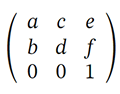
a – 它可以是 x 方向的缩放因子,通常表示为 sx 或旋转角度的余弦值 cos(α)
b – 可以是 tan(α) y 方向的倾斜因子或旋转角度的正弦值 sin(α)
c – 可以是 tan(α) x 方向的倾斜因子或旋转角度的正弦值 -sin(α)
d – 可以是 y 方向的缩放因子,通常表示为 sy 或旋转角度的余弦值 cos(α)
e – 沿 x 方向的平移通常表示为 tx
f – 沿 y 方向的平移通常表示为 ty
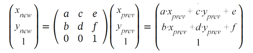
变换矩阵允许您在变换期间通过将其乘以先前坐标的值(x prev,y prev)来获得对象点的新坐标(x new,y new):
可以使用变换属性的矩阵属性来更改 SVG 对象:transform=“matrix(a,b,c,d,e,f)”。只能指定前 6 个值。因此,您向矩阵变换函数提供 6 个值来设置平移、缩放、旋转和倾斜。
translation 是 SVG 中的变换函数,它沿着平行线以相同的距离移动对象的所有点。此变换会移动元素坐标系的原点。平移矩阵如下所示:
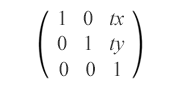
matrix(1,0,0,1,tx,ty)
平移矩阵结合了 tx 和 ty 值来水平和垂直移动元素。它将对象沿 x 轴移动 tx,沿 y 轴移动 ty。
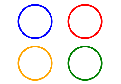
查看原始蓝色矩形的示例,该矩形沿 x 轴(红色)、y 轴(橙色)和两者(绿色)平移:
 1<svg viewBox="0 0 200 200" xmlns="http://www.w3.org/2000/svg">
 2    <g fill="none">
 3        <!-- no translation -->
 4        <circle cx="15" cy="15" r="10" stroke="blue" />
 5        <!-- horizontal translation by tx=30 -->
 6        <circle cx="15" cy="15" r="10" stroke="red" transform="matrix(1 0 0 1 30 0)" />
 7        <!-- vertical translation by by ty=25 -->
 8        <circle cx="15" cy="15" r="10" stroke="orange" transform="matrix(1 0 0 1 0 25)" />
 9        <!-- both horizontal and vertical translation by tx=30 and by ty=25 -->
10        <circle cx="15" cy="15" r="10" stroke="green" transform="matrix(1 0 0 1 30 25)" />
11    </g>
12</svg>
属性 transform=“matrix(1,0,0,1,tx,ty)” 的作用是根据以下公式改变对象坐标:
x(新) = a·x(上一个) + b·y(上一个) +e = x(上一个) + tx
y(新) = b·x(上一个) + d·y(上一个) +f = y(上一个) + ty
在代码示例中, <g> 元素用于将圆圈分组在一起。 fill 属性在 <g> 内应用于所有形状一次。这是生成的图像:
缩放是一种 SVG 变换,它使用缩放因子放大或缩小对象。缩放矩阵用于沿坐标轴均匀或非均匀地缩放对象。 sx 和 sy 是 x 和 y 轴的缩放因子。如果 sx 和 sy 大于1,则对象将被放大;如果它们介于 0 和 1 之间,则对象将按比例缩小。如果比例因子设置为不同的值,则对象的比例会不均匀,从而产生拉伸或收缩的效果。
matrix(sx,0,0,sy,0,0)
看一下原始蓝色矩形的示例,该矩形相对于原点 (0, 0) 均匀和非均匀缩放 – 图片 a 和 b,并且相对于点 (10, 10) 均匀缩放 – 图片 c:
 1<svg viewBox="0 0 400 300" xmlns="http://www.w3.org/2000/svg">
 2	<!-- uniform scale is shown in fig.a -->
 3	<g fill="none">
 4	    <rect x="10" y="10" width="20" height="20" stroke="blue" />
 5		 <rect x="10" y="10" width="20" height="20" stroke="red" transform="matrix(1.5, 0, 0, 1.5, 0, 0)" />
 6		 <rect x="10" y="10" width="20" height="20" stroke="orange" transform="matrix(2, 0, 0, 2, 0, 0)" />
 7		 <rect x="10" y="10" width="20" height="20" stroke="green" transform="matrix(0.7, 0, 0, 0.7, 0, 0)" />
 8	 </g>
 9	 <!-- non-uniform scale is shown in fig.b -->
10	 <g transform="translate(70)">
11		<rect x="10" y="10" width="20" height="20" fill="blue" />
12		<rect x="10" y="10" width="20" height="20" fill="red" transform="matrix(1.5, 0, 0, 2, 0, 0)" />
13		<rect x="10" y="10" width="20" height="20" fill="orange" transform="matrix(3, 0, 0, 2.5, 0, 0)" />
14		<rect x="10" y="10" width="20" height="20" fill="green" transform="matrix(0.7, 0, 0, 0.5, 0, 0)" />
15	 </g>
16	 <!-- uniform scale relative to point (10, 10) is shown in fig.c -->
17	 <g fill="none" transform="translate(170)">
18	    <rect x="10" y="10" width="20" height="20" stroke="blue" />
19	    <rect x="10" y="10" width="20" height="20" stroke="red" transform="matrix(1.5, 0, 0, 1.5, -5, -5)" />
20	    <rect x="10" y="10" width="20" height="20" stroke="orange" transform="matrix(2, 0, 0, 2, -10, -10)" />
21	    <rect x="10" y="10" width="20" height="20" stroke="green" transform="matrix(0.7, 0, 0, 0.7, 3, 3)" />
22	 </g>
23</svg>
这是生成的图像:
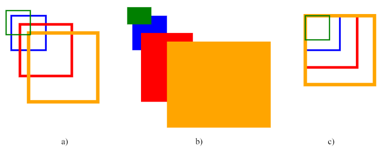
上面的代码使用了尺度矩阵。图中第一组矩形显示了均匀缩放的示例(图a),第二组说明了非均匀缩放(图b),第三组矩形显示了相对于点(10的均匀缩放, 10) – 蓝色(源)矩形的左上角。
注: 缩放是相对于坐标系原点(0, 0)进行的。如果 SVG 对象(相对于其绘制)的点 (cx, cy) 不在原点,则应用缩放变换将移动对象的位置,这会给人 平移 的印象。我们在图 a 和 b 中看到了矩形平移的效果。
为了围绕特定枢轴点 (сx, сy) 进行缩放,您需要对缩放后的形状应用额外的移动,以将其移动到枢轴点(图 c)。结合平移和缩放的完整变换矩阵:
matrix(sx,0,0,sy,cx·(1-sx),cy·(1-sy))
该矩阵将围绕枢轴点(cx,cy)正确缩放对象,而无需任何平移。 cx·(1-sx) 和 cy·(1-sy) 系数处理必要的平移,以确保对象在缩放后保持在其原始位置。 让我们计算 红色矩形 的这些值(图 c)。本例中的枢轴点 (cx, cy) 是 (10, 10) – 蓝色(初始)矩形的左上角:
cx·(1-sx)=10·(1-1.5)=10·(-0.5)=-5
cy·(1-sy)=10·(1-1.5)=10·(-0.5)=-5
您可以使用 Aspose.SVG for .NET API 在 C# 中调整 SVG 大小。
SVG 缩放 – C# 示例一文介绍了 SVG 缩放的 C# 示例。 您会发现在transform属性中使用scale()函数以及变换矩阵 – matrix(a,b,c,d,e,f)的情况。
如果您喜欢练习计算正弦和余弦,那么您就在这里!旋转矩阵如下所示:
matrix(cos(α),sin(α),-sin(α),cos(α),0,0),其中 α 是绕坐标点的角度初始坐标系的 (0, 0)。
看一下初始蓝色矩形的示例,它旋转了 90°(绿色)、180°(灰色)、270°(青色)、-45°(红色)和 135°(橙色):
 1<svg viewBox="-50 -50 200 200" xmlns="http://www.w3.org/2000/svg">
 2	<!-- rotation around point with coordinates (0, 0) is shown in fig.a -->
 3    <g>
 4	  <rect x="0" y="0" width="20" height="20" fill="blue" />
 5	  <rect x="0" y="0" width="20" height="20" fill="green" transform="matrix(0, 1, -1, 0, 0, 0)" />
 6	  <rect x="0" y="0" width="20" height="20" fill="grey" transform="matrix(-1, 0, 0, -1, 0, 0)" />
 7	  <rect x="0" y="0" width="20" height="20" fill="teal" transform="matrix(0, -1, 1, 0, 0, 0)" />
 8	  <rect x="0" y="0" width="20" height="20" fill="red" transform="matrix(0.7071, -0.7071, 0.7071, 0.7071, 0, 0)" />
 9	  <rect x="0" y="0" width="20" height="20" fill="orange" transform="matrix(-0.7071, 0.7071, -0.7071, -0.7071, 0, 0)" />
10	<!-- rotation around point with coordinates (0, 0) is shown in fig.b -->
11    </g>
12	<g transform="translate(70)">
13	  <rect x="5" y="5" width="20" height="20" fill="blue" />
14	  <rect x="5" y="5" width="20" height="20" fill="green" transform="matrix(0, 1, -1, 0, 0, 0)" />
15	  <rect x="5" y="5" width="20" height="20" fill="grey" transform="matrix(-1, 0, 0, -1, 0, 0)" />
16	  <rect x="5" y="5" width="20" height="20" fill="teal" transform="matrix(0, -1, 1, 0, 0, 0)" />
17	  <rect x="5" y="5" width="20" height="20" fill="red" transform="matrix(0.7071, -0.7071, 0.7071, 0.7071, 0, 0)" />
18	  <rect x="5" y="5" width="20" height="20" fill="orange" transform="matrix(-0.7071, 0.7071, -0.7071, -0.7071, 0, 0)" />
19	</g>
20    <!-- rotation around point with coordinates (5, 5) is shown in fig.c -->
21	<g transform="translate(140)">
22	  <rect x="5" y="5" width="20" height="20" fill="blue" />
23	  <rect x="5" y="5" width="20" height="20" fill="green" transform="matrix(0, 1, -1, 0, 10, 0)" />
24	  <rect x="5" y="5" width="20" height="20" fill="grey" transform="matrix(-1, 0, 0, -1, 10, 10)" />
25	  <rect x="5" y="5" width="20" height="20" fill="teal" transform="matrix(0, -1, 1, 0, 0, 10)" />
26	  <rect x="5" y="5" width="20" height="20" fill="red" transform="matrix(0.7071, -0.7071, 0.7071, 0.7071, -2, 5)" />
27	  <rect x="5" y="5" width="20" height="20" fill="orange" transform="matrix(-0.7071, 0.7071, -0.7071, -0.7071, 12, 5)" />
28	</g>
29</svg>
注意: 如果我们使用正角度值,则旋转将为顺时针方向,相反,负角度值则为逆时针旋转。
SVG旋转的结果如图所示:
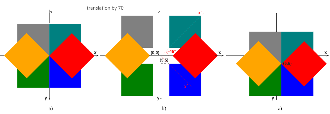
在图上。 a 显示蓝色(初始)矩形 (0, 0) 的左上角与坐标系原点 (0, 0) 匹配的情况。
在图上。 b 说明了蓝色(初始)矩形 (5, 5) 的左上角与原点 (0, 0) 不匹配的情况。该图显示了原始坐标系的x-y轴,该坐标对所有a、b、c图均有效。另外,逆时针旋转45度α=-45°的红色矩形的坐标系的x’-y’轴以红色显示。这清楚地表明矩形的旋转被简化为坐标系的旋转。
在图上。 c 显示蓝色(初始)矩形的左上角 (5, 5) 与坐标系初始点 (0, 0) 不匹配,但围绕点 (5, 0) 发生旋转的情况5)。
注意: 以下矩阵将围绕枢轴点 (cx, cy) 旋转对象:
matrix(cos(α), sin(α), -sin(α), cos(α), cx·(1-cos(α))+cy·sin(α), cy·(1-cos (α))-cx·sin(α))
cx·(1-cos(α))+cy·sin(α) 和 cy·(1-cos(α))-cx·sin(α) 系数句柄必要的平移以确保物体在旋转后保持在其原始位置。让我们计算红色矩形的这些值(图c)。本例中的枢轴点 (cx, cy) 是 (5, 5) – 蓝色(初始)矩形的左上角,红色矩形的角度为 -45°:
cos(-45°)=0.7071,sin(-45°)=-0.7071
cx·(1-cos(α))+cy·sin(α)=5·(1-0.7071)+5·(-0.7071)=-2
cy·(1-cos(α))-cx·sin(α)=5·(1-0.7071)-5·(-0.7071)=5
您可以使用 Aspose.SVG for .NET API 在 C# 中旋转 SVG。
旋转 SVG – C# 示例一文介绍了 SVG 旋转的 C# 示例。 它考虑在transform属性和变换矩阵中使用rotate()函数的情况 – matrix(a,b,c,d,e,f)。
倾斜是一种将元素坐标系的一个轴顺时针或逆时针旋转一定角度α的变换。 SVG 元素可以通过使用倾斜矩阵来倾斜,如下所示:
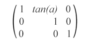
matrix(1,0,tan(α),1,0,0) – 此倾斜矩阵指定沿 x 轴 α 度的倾斜变换。
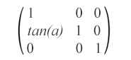
matrix(1,tan(α),0,1,0,0) – 此倾斜矩阵指定沿 y 轴 α 度的倾斜变换。
下面显示了带有倾斜变换的圆的示例:
 1<svg viewBox="0 0 200 200" xmlns="http://www.w3.org/2000/svg">
 2	<g fill="none">
 3		<circle cx="20" cy="20" r="10" stroke="blue" />
 4		<!-- skew transformation along the x-axis by α=45° -->
 5		<circle cx="20" cy="20" r="10" stroke="red" transform="matrix(1,0,1,1,0,0)" />
 6	</g>
 7	<g fill="none" transform="translate(70)">
 8		<circle cx="20" cy="20" r="10" stroke="blue" />
 9		<!-- skew transformation along the y-axis by α=45° -->
10		<circle cx="20" cy="20" r="10" stroke="orange" transform="matrix(1,1,0,1,0,0)" />
11	</g>
12</svg>
渲染的示例如下所示:
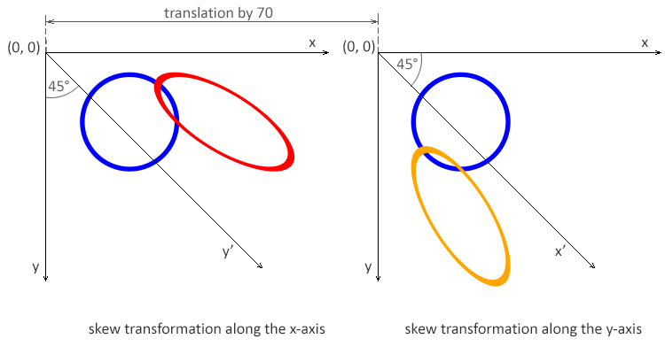
注: 角度值 α 表示沿适当轴的倾斜 SVG 变换(以度为单位)。使用沿x轴的倾斜变换,仅形状点的x坐标发生变化,但y坐标保持不变。沿 x 轴的倾斜变换使垂直线看起来像是旋转了给定角度。每个点的 x 坐标的变化值与指定的角度和到原点的距离成比例。
SVG 变换矩阵是用于操作 SVG 中的对象并为其设置动画的强大工具。它提供了一种将平移、旋转、缩放和倾斜应用于形状和元素的通用方法,使您能够创建视觉动态和交互式图形。该矩阵允许单独和组合变换,提供实现复杂视觉效果的灵活性。我们在本文中仅介绍了单独的转换,但我们将尝试尽快通过包含更复杂示例的新文章来扩展我们的 SVG 绘图指南。
要了解更多信息并获取使用 SVG 变换属性旋转、缩放、移动和倾斜 SVG 图形的 SVG 代码示例,请转到
SVG 变换 文章。
阅读
SVG 转换 – C# 示例 文章,获取使用 Aspose.SVG for .NET 库旋转、缩放、平移和倾斜 SVG 图形的 C# 代码示例。
Aspose.SVG 提供 SVG 免费 Web 应用程序,用于转换 SVG 或图像文件、合并 SVG 文件、图像矢量化、SVG 精灵生成、SVG 到 base64 数据编码等。这些在线应用程序可以在任何带有网络浏览器的操作系统上运行,并且不需要安装额外的软件。这是一种快速、简单的方法,可以高效、有效地解决您的 SVG 相关任务!
Analyzing your prompt, please hold on...
An error occurred while retrieving the results. Please refresh the page and try again.