CSS fonts
The article is aimed to teach you HTML CSS fonts and their properties, depicting with code examples how to work with them. You will learn to make your text bold or semibold, to change font size or font family in CSS and many more.
You will also see the difference between CSS font properties and the common classification of font properties. These fundamentals are described in What is font? article.
CSS fonts
The font in CSS is a resource that contains a visual representation of glyphs. To simplify, it has information that matches the glyphs with their codes.
Font resources may be set up locally on a device in which a browser works. For such fonts describing information can be obtained right from the font resource (for example from a file montserrat.ttf). For web fonts, such information is attached with the link on the font’s resource.
CSS font Properties
CSS provides several font properties to control the appearance and behavior of fonts on web pages. They can be used individually or combined to achieve the desired typography effects in CSS. Not all of them are supported by all browsers, so it’s essential to consider cross-browser compatibility when using these properties. Let’s take a look at some (the most used) of them:
- Font-family;
- Font-weight;
- Font-stretch;
- Font-style;
- Font-size;
- Font;
- Font-synthesis,
- Text-decoration,
- Text-transform,
- Letter-spacing,
- Line-height,
- Word-spacing.
CSS Font family
Fonts with the common design are usually grouped in a font family. Inside the family, glyphs may vary in width, slope, or weight.
CSS font-family property is used for typeface choosing. It is better to notify all the variations of the fonts of one type, because it is hard to predict if the font is available on the user’s computer or not. In this case, a browser will check their presence, sorting out the notified fonts one by one.
CSS font family property is inherited.
In CSS font-family has next values:
- Name of the font family (
Verdana,Montserrat,Courier). - Generic-family. Here you need to note one of five font types: serif, sans serif, cursive (equal to script fonts), fantasy (equal to display fonts) or monospace.
initial- sets up default values.inherit- takes after the parent its values.
Example of using.
There the next parameters are set in the example.
| Property | Value for text 1 | Value for text 2 | Value for text 3 |
|---|---|---|---|
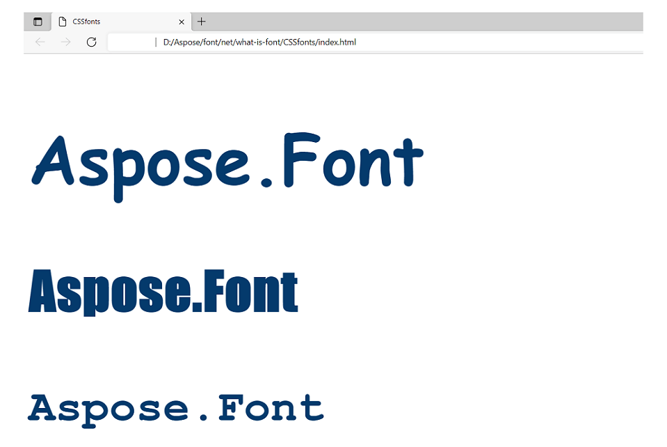
| font-family: | Lobster, Paisfico, cursive; | Audiowide, fantasy; | Courier, monospace; |
Syntax:
 1// text 1
 2.text1 {
 3    font-family: Lobster, cursive;
 4}
 5// text 2
 6.text2 {
 7    font-family: Audiowide, fantasy;
 8}
 9// text 3
10.text3 {
11    font-family: Courier, monospace;
12}
The result of applying is going to be the next (note that the font-size and color were set the same for all three texts in the <body>)
CSS Font weight
Font-weight property is responsible for the thickness of the font lines.
CSS font weight property is inherited.
In HTML CSS font-weight may have the next values:
normal- is a default value equal to 400.bold- makes the font semibold. It is equal to the 700 weight.bolder- sets the weight heavier than the ancestor has.lighter- sets the weight lighter than the ancestor has.100, 200, 300, 400, 500, 600, 700, 800, 900- where100makes the lightest font, and900makes the heaviest (boldest) font.initial- sets up default values.inherit- takes after the parent its values.
Example of using.
Let’s render texts with the next parameters of font-weight.
| Property | Value for text 1 | Value for text 2 | Value for text 3 |
|---|---|---|---|
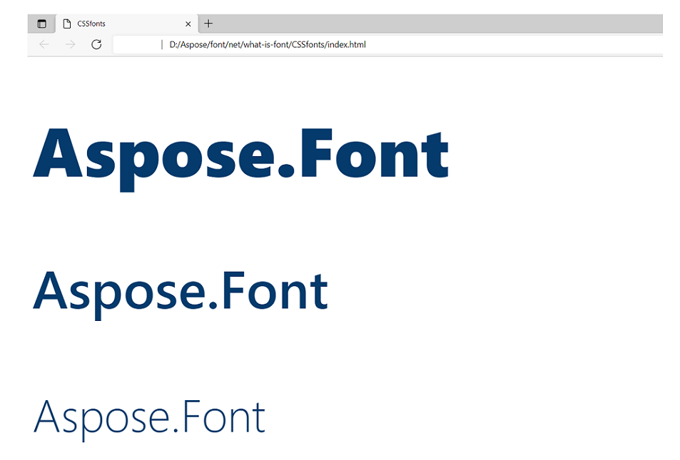
| font-weight: | 900; | 500; | 200; |
Syntax:
 1// text 1
 2.text1 {
 3    font-weight: 900;
 4}
 5// text 2
 6.text2 {
 7    font-weight: 500;
 8}
 9// text 3
10.text3 {
11    font-weight: 200;
12}
The result of applying will look like this (note that the font-size and color were set the same for all three texts in the <body>). Also, it is important to remember that the used font has to have itself the weight variations needed. Most fonts are only available in semi-bold and normal weights. Font Segoe UI used in the example has enough font-weight variations so the text would render in all the values set in the example.
CSS Font stretch
Property font-stretch allows choosing normal, condensed, or expanded typeface from the font family. This HTML CSS property also does not work for every font. Only some specially designed fonts that have in their family typefaces with variant stretches can render this property.
CSS font stretch property is inherited.
The values of font-stretch in CSS can be next:
ultra-condensed- for the most condensed font.extra-condensed- for the second most condensed font.condensed- for a condensed font.semi-condensed- for the slightly condensed font.normal- default value.semi-expanded- for a slightly expanded font.expanded- for an expanded text.extra-expanded- for the second most expanded font.ultra-expanded- for the most expanded font.initial- sets up default values.inherit- takes after the parent its values.
Example of using.
Let’s render texts with the next parameters of font-stretch.
| Property | Value for text 1 | Value for text 2 | Value for text 3 |
|---|---|---|---|
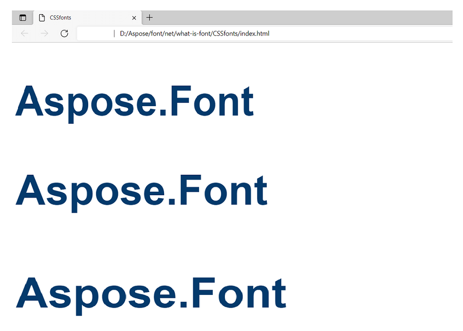
| font-stretch: | condensed; | normal; | expanded; |
Syntax:
 1// text 1
 2.text1 {
 3    font-stretch: condensed;
 4}
 5// text 2
 6.text2 {
 7    font-stretch: normal;
 8}
 9// text 3
10.text3 {
11    font-stretch: expanded;
12}
The result of applying would look like this (note that the font-size and color were set the same for all three texts in the <body>).
CSS Font style
This property regulates the font slope.
CSS font style property is inherited.
Font-style property of HTML CSS may have the next values:
normal- default value that sets up the normal slope for the font.italic- marks the text with the cursive.oblique- sets the sloped typeface of the font (the font has in its typeface variations a sloped one).initial- sets up default values.inherit- takes after the parent its values.
Example of using.
Let’s render texts with the next parameters of font-style.
| Property | Value for text 1 | Value for text 2 | Value for text 3 |
|---|---|---|---|
| font-style: | normal; | italic; | oblique; |
Syntax:
 1// text 1
 2.text1 {
 3    font-style: normal;
 4}
 5// text 2
 6.text2 {
 7    font-style: italic;
 8}
 9// text 3
10.text3 {
11    font-style: oblique;
12}
The result of applying will look like this (note that the font-size and color were set the same for all three texts in the <body>).
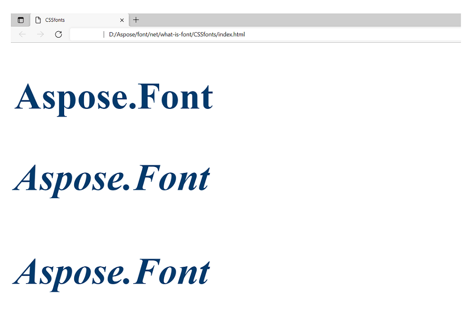
You may have noticed that the results for italic and oblique look the same. The answer to this is that the value oblique works only when the font has itself an oblique typeface and the used font does not have one.
CSS Font size
The property sets the height of glyphs of the font.
CSS font size property is inherited.
CSS font-size has next values:
- Absolute size - it can be
xx-small,x-small,small,medium,large,x-large, orxx-large. The default value ismedium. - Relative size - the size in comparison to the font’s ancestor. Can be
smallerorlarger. Can make fonts even bigger or smaller than the absolute size allows. - Width - it is set in pixels (px) or Ems (em). EM it is a scalable unit used for web documents. One em equals the current font size. If the font size of the document is 14pt, then 1em equals 14pt. Em is scaled so 2em equals 28pt.
%- this relative value is calculated in comparison to the ancestor font. It allows making more exact adjustments to the CSS font-size.- Viewpoint width -
vw, allows the font following the size of the window of the used browser. Note that 1vw = 1% of viewport width. If the viewport is 40cm wide, 1vw is equal to 0.4cm. initial- sets up default values.inherit- takes after the parent its values.
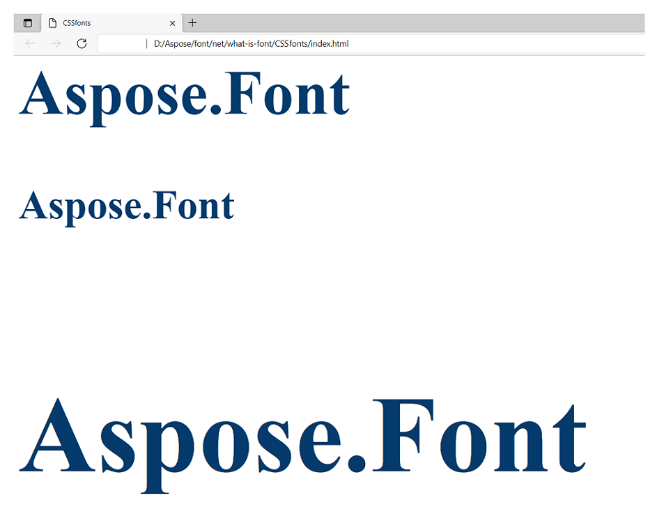
Example of using.
There the next parameters are set.
| Property | Value for text 1 | Value for text 2 | Value for text 3 |
|---|---|---|---|
| font-size: | 7vw; | 70px; | 2em; |
Syntax:
 1// text 1
 2.text1 {
 3    font-size: 7vw;
 4}
 5// text 2
 6.text2 {
 7    font-size: 70px;
 8}
 9// text 3
10.text3 {
11    font-size: 2em;
12}
The result of applying will look like this (note that the font-family and color were set the same for all three texts in the <body>).
CSS Font
The CSS font property is used to make the code shorter. With it, it is possible to set all the other font properties in one property. There can be specified the next properties:
font-style, font-variant, font-weight, font-stretch, font-size/line-height, andfont-family. There also can be included values of font-variant property supported by CSS 2.1 - normal or small-caps. See
Font variant paragraph of
What is font? article to get more information about this property.
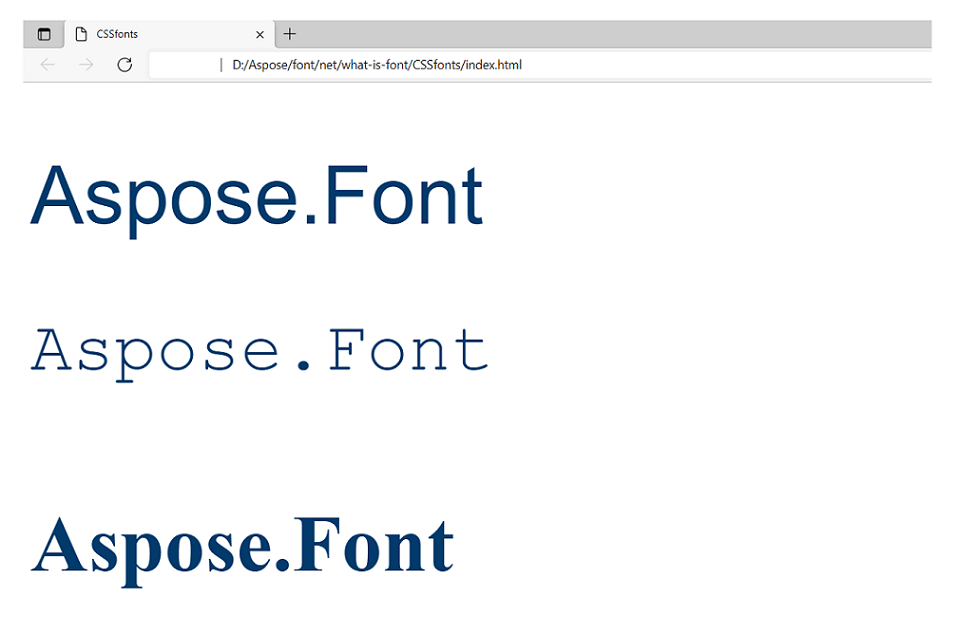
Example of using.
There the next parameters are set.
| Property | Value for text 1 | Value for text 2 | Value for text 3 |
|---|---|---|---|
| font: | 6vw Arial; | 60pt Courier, monospace; | - |
Syntax:
 1// text 1
 2.text1 {
 3    font: 6vw Arial;
 4}
 5// text 2
 6.text2 {
 7    font: 60pt Courier, monospace;
 8}
 9// text 3
10.text3 {
11}
The result of applying these parameters is in the picture below (note that the color is set the same for all three texts in the <body>). As we did not set any values for the third text, it was rendered in default parameters.
CSS Font-synthesis
This HTML CSS property defines if it is allowed for browsers to synthesize semibold or oblique font styles if they are absent in the font family. So if font-weight and font-style are not specified, browsers must not synthesize semibold or oblique styles.
Font synthesis property is inherited.
For CSS font-synthesis parameter next values may be set:
none- forbids the synthesis.weightor/andstyle- noted property/properties are allowed to be synthesized.initial- sets up default values.inherit- takes after the parent its values.
Example of using.
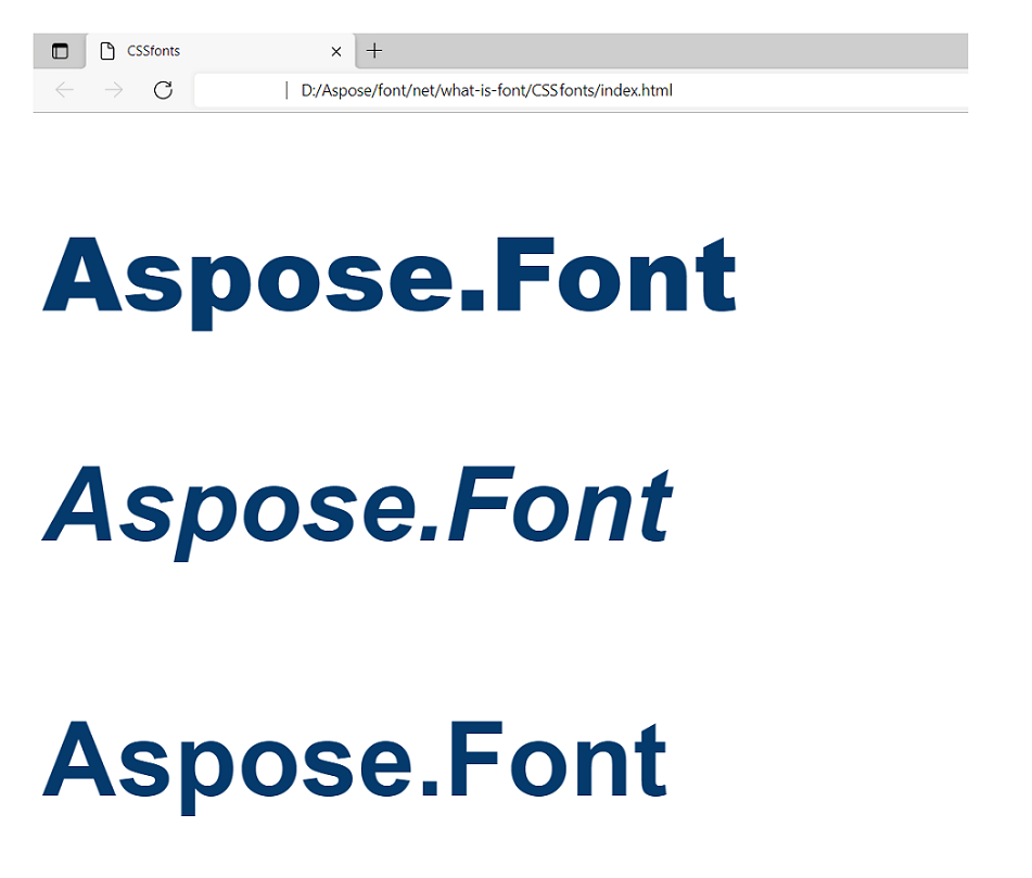
There the next parameters are set.
| Property | Value for text 1 | Value for text 2 | Value for text 3 |
|---|---|---|---|
| font-synthesis: | weight; | style; | none; |
| font-weight: | 900; | - | 900; |
| font-style: | - | oblique; | oblique; |
Syntax:
 1// text 1
 2.text1 {
 3    font-synthesis: weight;
 4    font-weight: 900;
 5}
 6// text 2
 7.text2 {
 8    font-synthesis: style;
 9    font-style: oblique;
10}
11// text 3
12.text3 {
13    font-synthesis: none;
14    font-weight: 900;
15    font-style: oblique;
16}
The result of applying would render as it is shown in the next image (note that the color is set the same for all three texts in the <body>). As we set the none value for the third text, it was rendered in default parameters.
Font stacks
Font stacks refer to a list of fonts defined in cascading style sheets (CSS) used as fallback options if a particular font is failing or absent on a user’s device or system. They ensure that web designers can maintain consistency in typography across different platforms and browsers.
To specify font families in CSS, it’s common to define a font stack by listing multiple fonts in order of preference. If the first option is not available, the browser attempts to use the next one in the stack until a working option is found.
Let’s take a look at an example of a font stack for specifying font families in CSS. Here the preferred font of the stack starts is “Helvetica Neue”. If it is not available, the next option tried by a browser will be “Arial”. If “Arial” also fails, the browser will fall back to the generic sans-serif font.
1 font-family: "Helvetica Neue", Arial, sans-serif;Specifying a generic font family, such as “sans-serif”, “serif”, or “monospace”, as the last option in the font stack is considered good practice. It ensures that the browser will always have a suitable fallback font to display in case none of the preferred fonts are available.
Web-safe fonts
Web-safe fonts, also known as system fonts or default fonts, are a collection of fonts commonly available across various operating systems and devices. They are considered to be safe to use in web design as they are widely supported and will likely be present on users’ devices.
In the early days of web development, designers had limited font options due to the variability in font availability on different systems. As a result, they relied on a core set of fonts that were widely installed on most computers.
Here are some examples of famous web-safe fonts:
- Arial
- Helvetica
- Times New Roman
- Georgia
- Courier New
- Verdana
- Tahoma
- Trebuchet MS
They are often referred to as “fallback fonts” and specified at font stacks because they are considered to be a safe choice if a preferred font is not available.
However, with advancements in web technologies and the widespread use of custom fonts through services like Google Fonts and Typekit, the reliance on web-safe fonts has decreased. Now web designers have more flexibility and a broader range of fonts to enhance the visual appeal of their websites.
How to use external fonts in CSS?
To use external fonts in CSS, you can use the @font-face rule. It allows you to specify a custom font and make it accessible to your web page. Let’s take a look at how you can use external fonts in CSS:
- Obtain the Font Files:
- Find the files in the desired font formats such as WOFF, WOFF2, TTF, or EOT.
- You can either obtain the font files from a font service like Google Fonts or purchase/download them from any reliable source.
- Upload the Font Files:
- Upload the font files to your web server or a designated folder within your project.
- Define the @font-face Rule:
- Do it in your CSS file, to specify the font family name and provide the path to the font files specify the path to the font files and their respective formats. Include multiple formats to support different browsers.
Here is an example of such an operation:
1    @font-face {
2        font-family: 'MyCustomFont';
3        src: url('path-to-fonts/MyCustomFont.woff2') format('woff2'),
4            url('path-to-fonts/MyCustomFont.woff') format('woff');
5        /* Add additional formats if available */
6 }- Apply the Font:
When you’ve defined the @font-face rule, you can use the custom font by specifying the font-family property in your CSS rules like in the example below. Here the custom font named ‘MyCustomFont’ is applied to the body element. If the custom font is not available, the browser will fall back to a generic sans-serif font.
1    body {
2        font-family: 'MyCustomFont', sans-serif;
3 }- Test and verify web pages across different browsers and devices.
A few words about responsive typography
Responsive typography is the practice of designing and implementing typography on a website so it adjusts and adapts to different screen sizes and devices. It involves considering factors such as font size, line length, and spacing to optimize the reading experience on different screen sizes and orientations.
Here are some key aspects of responsive typography:
Rather than using fixed font sizes, responsive typography employs relative units like percentages, ems, or rems to scale texts proportionally based on the screen size or viewport dimensions.
Responsive typography is often implemented together with media queries, which enable the adaptation of font styles based on specific screen widths or device capabilities. This allows for customized typographic adjustments for different breakpoints.
CSS viewport units, such as vw (viewport width) and vh (viewport height), are used to size fonts relative to the dimensions of the viewport. This approach ensures that font sizes adapt smoothly as the user resizes the browser window or switches between devices.
Responsive typography considers the optimal line length (the number of characters per line) for readability. Longer lines on larger screens can be managed by adjusting margins or applying maximum widths. Additionally, line height (vertical spacing between lines) is carefully considered to avoid cramped or overly spaced text.
With limited screen space on smaller devices, it’s important to establish a clear typographic hierarchy. Designers need to ensure that headlines, subheadings, and body text are appropriately differentiated for ease of reading.
Prioritize accessibility by considering contrast ratios between text and background, providing ample spacing for users with visual impairments, and allowing for flexible font size adjustments to accommodate different user preferences.
Conclusion
The CSS font is one of the key blocks in developing interfaces with CSS. Most of the content of the majority of web pages is text content, so without learning this property this content will never have a high-quality look. It will have less readability, scalability, etc.
Some properties are easy to apply to any font, but some properties need a special font that supports the variation of the property. Like font Inconsolata has 8 variations of font-weight when most fonts can only be normal or bold.
If you have in mind a font you want to use but you do not have it on your device, you may try to find and download it from a free web application from Aspose. Apart from that,
Font viewer will provide you with the necessary information about the font you may need when developing.