block
This element is used to organize content within containers. Blocks can only be nested within container elements.
Blocks may not have a visual representation or have a border around them.
Syntax
The element declaration begins with ?block=[name] statement and ends with &block statement. These statements must be placed on separate lines.
name attribute is used as a reminder of the block’s purpose; for example, “First column”. This is an optional attribute - you can use the same name for multiple blocks or just omit it. The name is not displayed on the form.
?block= statement. Doing so will result in an error when rendering a form.
Attributes
The block element can be customized by adding optional attributes to it.
An attribute is written as [attribute_name]=[value]. Each attribute must be placed on a new line immediately after the opening ?block= statement or another attribute, and must begin with a tab character.
| Attribute | Default value | Description | Usage example |
|---|---|---|---|
| column | 1 | The number of the column in which the block will be placed. This number must not exceed the number of columns of the parent container element. |
column=2 |
| border | none | Whether to draw a border around the block.
|
border=square |
| border_size | 3 | Width of the block borders. | border_size=10 |
| border_color | black | Color of the block borders. Can be picked from one of the supported values. | border_color=red |
| border_top_style | inherits border_size and border_color | Override the width and color of the element’s top border in <border width> <border color> format. Specify none to remove the top border. |
border_top_style=10 red |
| border_bottom_style | inherits border_size and border_color | Override the width and color of the element’s bottom border in <border width> <border color> format. Specify none to remove the bottom border. |
border_bottom_style=10 red |
| border_left_style | inherits border_size and border_color | Override the width and color of the element’s left border in <border width> <border color> format. Specify none to remove the left border. |
border_left_style=10 red |
| border_right_style | inherits border_size and border_color | Override the width and color of the element’s right border in <border width> <border color> format. Specify none to remove the right border. |
border_right_style=10 red |
| is_clipped | false | If set to true, the content of the block is stored as a image during recognition, similar to the write_in element. The image can be can be passed to optical character recognition library, such as Aspose.OCR, or saved.If the block contains OMR elements, they will be recognized even if this attribute is set to true. |
is_clipped=true |
| background_color | no fill | Background color of the block element. Can be picked from one of the supported values. | background_color=red |
| height | Automatically adjust height to fit content | Set fixed block height, in pixels. | height=200 |
| horizontal_padding | 20 | Set the left and right padding of the block, in pixels. | horizontal_padding=40 |
| vertical_padding | 20 | Set the top and bottom padding of the block, in pixels. | vertical_padding=40 |
| overflow | Inherit the global page settings | Define how to clip and wrap elements inside the block:
|
overflow=noclip |
Allowed child elements
All, except for block.
Clipping and wrapping block content
When designing OMR forms, you may run into a situation where the content does not fit inside the block. The handling of these edge cases is performed through the use of overflow attribute.
overflow=noclip
Overflow content is rendered outside the block boundaries. This can result in content overlapping with other elements or being clipped at page boundaries.
This is the default rendering method.
overflow=clip
Overflow content will be invisible. Cropping will be done both horizontally and vertically. This may result in some content (images, bubbles, text, and so on) not being presented in the rendered OMR form.

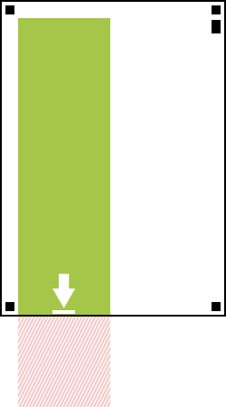
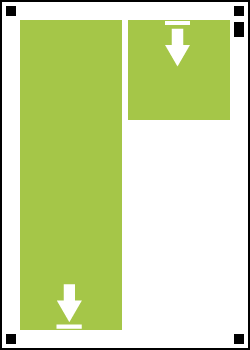
overflow=wrap
Content that does not fit inside the block will automatically appear in the next column. This rendering method only applies to multi-column layouts and cannot slice monolithic elements such as images and barcodes.
Examples
Check out the code examples to see how block elements can be used and combined with each other.
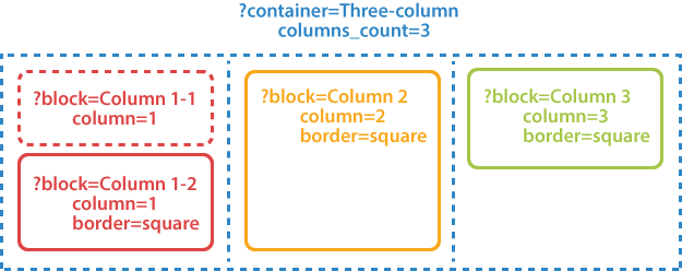
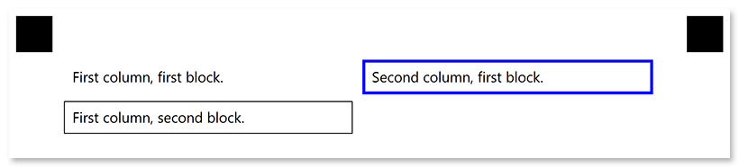
Two-column layout
?container=Two-column
columns_count=2
?block=Column 1-1
column=1
border=none
?paragraph=
?content=First column, first block.
¶graph
&block
?block=Column 1-2
column=1
border=square
?paragraph=
?content=First column, second block.
¶graph
&block
?block=Column 2
column=2
border=square
border_size=10
border_color=blue
?paragraph=
?content=Second column, first block.
¶graph
&block
&container
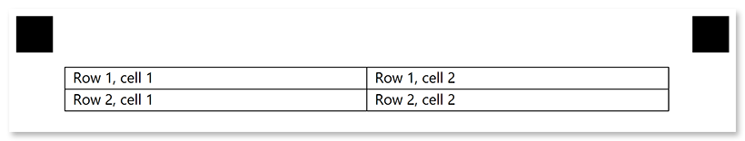
Fake table layout
?container=Two-column
	columns_count=2
	block_right_margin=0
	block_bottom_margin=0
	block_top_padding=0
?block=
	column=1
	border=square
?content=Row 1, cell 1
&block
?block=
	column=1
	border=square
?content=Row 1, cell 2
&block
?block=
	column=2
	border=square
?content=Row 2, cell 1
&block
?block=
	column=2
	border=square
?content=Row 2, cell 2
&block
&container