
Customize Pie Charts in Presentations Using PHP
Overview
This article explains how to work with pie charts in Aspose.Slides. It shows how to configure secondary plot options for Pie of Pie and Bar of Pie charts, and how to enable automatic slice coloring for a standard pie chart.
The examples focus on chart customization tasks such as adding a chart to a slide, adjusting series and label settings, replacing default chart data with custom categories and values, and saving the updated presentation.
Second Plot Options for Pie of Pie and Bar of Pie Charts
Aspose.Slides for PHP via Java supports secondary plot options for Pie of Pie and Bar of Pie charts. These options control the size of the secondary plot and how data points are split between the two plots.
The following example creates a Pie of Pie chart in a new presentation and displays data point values as labels. The setSecondPieSize method sets the secondary plot size to 149% of the main plot. setPieSplitBy selects percentage-based splitting, and setPieSplitPosition sets the threshold to 53%.
use aspose\slides\ChartType;
use aspose\slides\PieSplitType;
use aspose\slides\Presentation;
use aspose\slides\SaveFormat;

$presentation = new Presentation();
try {
    $slide = $presentation->getSlides()->get_Item(0);

    $chart = $slide->getShapes()->addChart(ChartType::PieOfPie, 50, 50, 500, 400);
    $series = $chart->getChartData()->getSeries()->get_Item(0);

    // Display values and configure the secondary plot.
    $series->getLabels()->getDefaultDataLabelFormat()->setShowValue(true);
    $seriesGroup = $series->getParentSeriesGroup();
    $seriesGroup->setSecondPieSize(149);
    $seriesGroup->setPieSplitBy(PieSplitType::ByPercentage);
    $seriesGroup->setPieSplitPosition(53);

    $presentation->save("pie_of_pie.pptx", SaveFormat::Pptx);
} finally {
    $presentation->dispose();
}
Select Categories for the Secondary Plot
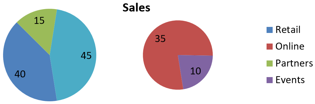
Use custom splitting when you want to group specific categories in the secondary plot regardless of their percentage values. For example, a sales report might show Online and Events together so readers can compare these two channels, even though they account for 35% and 10% of total sales.
Call setPieSplitBy with PieSplitType::Custom and select the points through getPieSplitCustomPoints. The collection’s add method accepts a zero-based index in the series; use addItem to add a data point object. In this example, index 1 selects Online, and the point at index 3 selects Events. Partners is also added temporarily, then excluded using removeItem.
use aspose\slides\ChartType;
use aspose\slides\PieSplitType;
use aspose\slides\Presentation;
use aspose\slides\SaveFormat;

$presentation = new Presentation();
try {
    $slide = $presentation->getSlides()->get_Item(0);

    $chart = $slide->getShapes()->addChart(ChartType::PieOfPie, 50, 50, 600, 200);

    // Replace the default data with sales by channel.
    $workbook = $chart->getChartData()->getChartDataWorkbook();
    $chart->getChartData()->getSeries()->clear();
    $chart->getChartData()->getCategories()->clear();
    $categoryNames = [ "Retail", "Online", "Partners", "Events" ];
    $values = [ 40, 35, 15, 10 ];
    $seriesNameCell = $workbook->getCell(0, 0, 1, "Sales");
    $series = $chart->getChartData()->getSeries()->add($seriesNameCell, $chart->getType());

    for ($i = 0; $i < count($categoryNames); $i++) {
        $categoryCell = $workbook->getCell(0, $i + 1, 0, $categoryNames[$i]);
        $chart->getChartData()->getCategories()->add($categoryCell);

        $valueCell = $workbook->getCell(0, $i + 1, 1, $values[$i]);
        $series->getDataPoints()->addDataPointForPieSeries($valueCell);
    }

    $series->getLabels()->getDefaultDataLabelFormat()->setShowValue(true);
    $seriesGroup = $series->getParentSeriesGroup();
    $seriesGroup->setPieSplitBy(PieSplitType::Custom);
    $seriesGroup->setColorVaried(true);

    // Select Online by its zero-based index and Events by its data point object.
    $seriesGroup->getPieSplitCustomPoints()->add(1);
    $seriesGroup->getPieSplitCustomPoints()->addItem($series->getDataPoints()->get_Item(3));

    // Exclude Partners from the selection without deleting its source data.
    $seriesGroup->getPieSplitCustomPoints()->add(2);
    $seriesGroup->getPieSplitCustomPoints()->removeItem($series->getDataPoints()->get_Item(2));

    $presentation->save("pie_of_pie_custom.pptx", SaveFormat::Pptx);
} finally {
    $presentation->dispose();
}
Online (35) and Events (10) appear as separate slices in the secondary plot. In the primary plot, they are represented by one combined slice with a value of 45, alongside Retail (40) and Partners (15). Removing Partners from the custom selection keeps it in the primary plot; it does not remove the category or its value from the chart’s source data.
The following image shows the saved presentation in PowerPoint:
Set Automatic Pie Chart Slice Colors
Aspose.Slides for PHP via Java can automatically assign different colors to pie chart slices. The following example creates a pie chart with a centered title and replaces the default data with three quarterly categories and their values. The setShowValue method displays the values 20, 50, and 30 as labels, while setColorVaried enables a distinct color for each slice.
use aspose\slides\ChartType;
use aspose\slides\NullableBool;
use aspose\slides\Presentation;
use aspose\slides\SaveFormat;

$presentation = new Presentation();
try {
    $slide = $presentation->getSlides()->get_Item(0);

    $chart = $slide->getShapes()->addChart(ChartType::Pie, 100, 100, 400, 400);

    // Add a centered chart title.
    $chart->getChartTitle()->addTextFrameForOverriding("Sample Title");
    $chart->getChartTitle()->getTextFrameForOverriding()->getTextFrameFormat()->setCenterText(NullableBool::True);
    $chart->getChartTitle()->setHeight(20);
    $chart->setTitle(true);

    // Replace the default data using the first worksheet.
    $workbook = $chart->getChartData()->getChartDataWorkbook();
    $worksheetIndex = 0;
    $chart->getChartData()->getSeries()->clear();
    $chart->getChartData()->getCategories()->clear();
    $categoryNames = [ "First Qtr", "2nd Qtr", "3rd Qtr" ];
    $values = [ 20, 50, 30 ];
    $seriesNameCell = $workbook->getCell($worksheetIndex, 0, 1, "Series 1");
    $series = $chart->getChartData()->getSeries()->add($seriesNameCell, $chart->getType());

    for ($i = 0; $i < count($categoryNames); $i++) {
        $categoryCell = $workbook->getCell($worksheetIndex, $i + 1, 0, $categoryNames[$i]);
        $chart->getChartData()->getCategories()->add($categoryCell);

        $valueCell = $workbook->getCell($worksheetIndex, $i + 1, 1, $values[$i]);
        $series->getDataPoints()->addDataPointForPieSeries($valueCell);
    }

    // Show values and assign different colors to the slices.
    $series->getLabels()->getDefaultDataLabelFormat()->setShowValue(true);
    $series->getParentSeriesGroup()->setColorVaried(true);

    $presentation->save("pie.pptx", SaveFormat::Pptx);
} finally {
    $presentation->dispose();
}
FAQ
Are the Pie of Pie and Bar of Pie variations supported?
Yes, the library supports a secondary plot for pie charts, including the Pie of Pie and Bar of Pie types.
Can I export just the chart as an image (for example, PNG)?
Yes, you can export the chart itself as an image (such as PNG) without exporting the entire presentation.