
Create or Update PowerPoint Presentation Charts in PHP
Overview
This article provides a comprehensive guide on how to create and customize charts using Aspose.Slides for PHP via Java. You will learn how to programmatically add a chart to a slide, populate it with data, and apply various formatting options to match your specific design requirements. Throughout the article, detailed code examples illustrate each step, from initializing the presentation and chart object to configuring series, axes, and legends. By following this guide, you’ll gain a solid understanding of how to integrate dynamic chart generation into your PHP applications, streamlining the process of creating data-driven presentations.
Create a Chart
Charts help people quickly visualize data and gain insights that may not be immediately obvious from a table or spreadsheet.
Why Create Charts?
Using charts, you can:
- aggregate, condense, or summarize large amounts of data on a single slide in a presentation;
- expose patterns and trends in data;
- deduce the direction and momentum of data over time or with respect to a specific unit of measurement;
- spot outliers, aberrations, deviations, errors, and nonsensical data;
- communicate or present complex data.
In PowerPoint, you can create charts through the Insert function, which provides templates for designing many types of charts. Using Aspose.Slides, you can create both regular charts (based on popular chart types) and custom charts.
Note
Use the ChartType enumeration in the aspose\slides namespace. The values in this enumeration correspond to different chart types.Create Clustered Column Charts
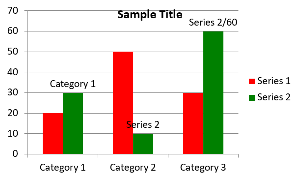
This example uses addChart to create a clustered column chart that compares two series across three categories. The series use red and green fills, and individual labels demonstrate category names, series names, and values. Worksheet index 0 refers to the first sheet in the embedded chart workbook.
use aspose\slides\ChartType;
use aspose\slides\FillType;
use aspose\slides\NullableBool;
use aspose\slides\Presentation;
use aspose\slides\SaveFormat;

$presentation = new Presentation();
try
{
    $slide = $presentation->getSlides()->get_Item(0);

    $chart = $slide->getShapes()->addChart(ChartType::ClusteredColumn, 20, 20, 500, 300);

    $chart->getChartTitle()->addTextFrameForOverriding("Sample Title");
    $chart->getChartTitle()->getTextFrameForOverriding()->getTextFrameFormat()->setCenterText(NullableBool::True);
    $chart->getChartTitle()->setHeight(20);
    $chart->setTitle(true);

    $workbook = $chart->getChartData()->getChartDataWorkbook();
    $worksheetIndex = 0;

    $chart->getChartData()->getSeries()->clear();
    $chart->getChartData()->getCategories()->clear();

    $seriesNameCell = $workbook->getCell($worksheetIndex, 0, 1, "Series 1");
    $chart->getChartData()->getSeries()->add($seriesNameCell, $chart->getType());
    $seriesNameCell = $workbook->getCell($worksheetIndex, 0, 2, "Series 2");
    $chart->getChartData()->getSeries()->add($seriesNameCell, $chart->getType());

    $categoryCell = $workbook->getCell($worksheetIndex, 1, 0, "Category 1");
    $chart->getChartData()->getCategories()->add($categoryCell);
    $categoryCell = $workbook->getCell($worksheetIndex, 2, 0, "Category 2");
    $chart->getChartData()->getCategories()->add($categoryCell);
    $categoryCell = $workbook->getCell($worksheetIndex, 3, 0, "Category 3");
    $chart->getChartData()->getCategories()->add($categoryCell);

    $series = $chart->getChartData()->getSeries()->get_Item(0);

    $valueCell = $workbook->getCell($worksheetIndex, 1, 1, 20);
    $series->getDataPoints()->addDataPointForBarSeries($valueCell);
    $valueCell = $workbook->getCell($worksheetIndex, 2, 1, 50);
    $series->getDataPoints()->addDataPointForBarSeries($valueCell);
    $valueCell = $workbook->getCell($worksheetIndex, 3, 1, 30);
    $series->getDataPoints()->addDataPointForBarSeries($valueCell);

    $series->getFormat()->getFill()->setFillType(FillType::Solid);
    $color = new Java("java.awt.Color", 255, 0, 0);
    $series->getFormat()->getFill()->getSolidFillColor()->setColor($color);

    $series = $chart->getChartData()->getSeries()->get_Item(1);

    $valueCell = $workbook->getCell($worksheetIndex, 1, 2, 30);
    $series->getDataPoints()->addDataPointForBarSeries($valueCell);
    $valueCell = $workbook->getCell($worksheetIndex, 2, 2, 10);
    $series->getDataPoints()->addDataPointForBarSeries($valueCell);
    $valueCell = $workbook->getCell($worksheetIndex, 3, 2, 60);
    $series->getDataPoints()->addDataPointForBarSeries($valueCell);

    $series->getFormat()->getFill()->setFillType(FillType::Solid);
    $color = new Java("java.awt.Color", 0, 128, 0);
    $series->getFormat()->getFill()->getSolidFillColor()->setColor($color);

    $label = $series->getDataPoints()->get_Item(0)->getLabel();
    $label->getDataLabelFormat()->setShowCategoryName(true);

    $label = $series->getDataPoints()->get_Item(1)->getLabel();
    $label->getDataLabelFormat()->setShowSeriesName(true);

    $label = $series->getDataPoints()->get_Item(2)->getLabel();
    $label->getDataLabelFormat()->setShowValue(true);
    $label->getDataLabelFormat()->setShowSeriesName(true);
    $label->getDataLabelFormat()->setSeparator("/");

    $presentation->save("AsposeChart.pptx", SaveFormat::Pptx);
}
finally
{
    $presentation->dispose();
}
The result:
Create Scatter Charts
Scatter charts (also known as scatter plots or x-y graphs) are often used to check for patterns or demonstrate correlations between two variables.
Use a scatter chart when:
- You have paired numerical data.
- You have two variables that pair well together.
- You want to determine whether the two variables are related.
- You have an independent variable that has multiple values for a dependent variable.
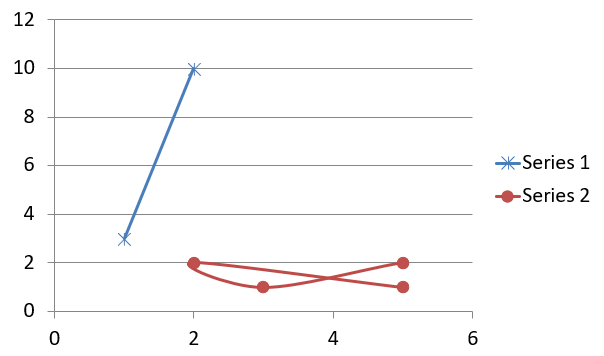
This example plots two sets of x-y values. The first series uses straight lines with star markers, while the second uses smooth lines with circle markers; both use a marker size of 10, configured with setSize. The setSymbol method controls the marker shape.
use aspose\slides\ChartType;
use aspose\slides\MarkerStyleType;
use aspose\slides\Presentation;
use aspose\slides\SaveFormat;

$presentation = new Presentation();
try
{
    $slide = $presentation->getSlides()->get_Item(0);

    $chart = $slide->getShapes()->addChart(ChartType::ScatterWithSmoothLines, 20, 20, 500, 300);

    $workbook = $chart->getChartData()->getChartDataWorkbook();
    $worksheetIndex = 0;

    $chart->getChartData()->getSeries()->clear();

    $seriesNameCell = $workbook->getCell($worksheetIndex, 1, 1, "Series 1");
    $chart->getChartData()->getSeries()->add($seriesNameCell, $chart->getType());
    $seriesNameCell = $workbook->getCell($worksheetIndex, 1, 3, "Series 2");
    $chart->getChartData()->getSeries()->add($seriesNameCell, $chart->getType());

    $series = $chart->getChartData()->getSeries()->get_Item(0);

    $xValueCell = $workbook->getCell($worksheetIndex, 2, 1, 1);
    $yValueCell = $workbook->getCell($worksheetIndex, 2, 2, 3);
    $series->getDataPoints()->addDataPointForScatterSeries($xValueCell, $yValueCell);

    $xValueCell = $workbook->getCell($worksheetIndex, 3, 1, 2);
    $yValueCell = $workbook->getCell($worksheetIndex, 3, 2, 10);
    $series->getDataPoints()->addDataPointForScatterSeries($xValueCell, $yValueCell);

    $series->setType(ChartType::ScatterWithStraightLinesAndMarkers);

    $series->getMarker()->setSize(10);
    $series->getMarker()->setSymbol(MarkerStyleType::Star);

    $series = $chart->getChartData()->getSeries()->get_Item(1);

    $xValueCell = $workbook->getCell($worksheetIndex, 2, 3, 5);
    $yValueCell = $workbook->getCell($worksheetIndex, 2, 4, 2);
    $series->getDataPoints()->addDataPointForScatterSeries($xValueCell, $yValueCell);

    $xValueCell = $workbook->getCell($worksheetIndex, 3, 3, 3);
    $yValueCell = $workbook->getCell($worksheetIndex, 3, 4, 1);
    $series->getDataPoints()->addDataPointForScatterSeries($xValueCell, $yValueCell);

    $xValueCell = $workbook->getCell($worksheetIndex, 4, 3, 2);
    $yValueCell = $workbook->getCell($worksheetIndex, 4, 4, 2);
    $series->getDataPoints()->addDataPointForScatterSeries($xValueCell, $yValueCell);

    $xValueCell = $workbook->getCell($worksheetIndex, 5, 3, 5);
    $yValueCell = $workbook->getCell($worksheetIndex, 5, 4, 1);
    $series->getDataPoints()->addDataPointForScatterSeries($xValueCell, $yValueCell);

    $series->getMarker()->setSize(10);
    $series->getMarker()->setSymbol(MarkerStyleType::Circle);

    $presentation->save("AsposeChart.pptx", SaveFormat::Pptx);
}
finally
{
    $presentation->dispose();
}
The result:
Create Pie Charts
Pie charts are best used to show the part-to-whole relationship in data, especially when the data contains categorical labels with numeric values. However, if your data contains many parts or labels, you might want to consider using a bar chart instead.
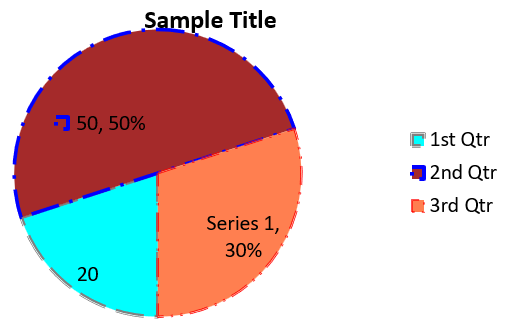
This example creates a pie chart with three quarterly values. Each slice has a custom fill and border, and the labels display different combinations of values, percentages, and series information. The setFirstSliceAngle method sets the first slice to start at 180 degrees.
use aspose\slides\ChartType;
use aspose\slides\FillType;
use aspose\slides\LineDashStyle;
use aspose\slides\LineStyle;
use aspose\slides\NullableBool;
use aspose\slides\Presentation;
use aspose\slides\SaveFormat;

$presentation = new Presentation();
try
{
    $slide = $presentation->getSlides()->get_Item(0);

    $chart = $slide->getShapes()->addChart(ChartType::Pie, 20, 20, 500, 300);

    $chart->getChartTitle()->addTextFrameForOverriding("Sample Title");
    $chart->getChartTitle()->getTextFrameForOverriding()->getTextFrameFormat()->setCenterText(NullableBool::True);
    $chart->getChartTitle()->setHeight(20);
    $chart->setTitle(true);

    $chart->getChartData()->getSeries()->get_Item(0)->getLabels()->getDefaultDataLabelFormat()->setShowValue(true);

    $workbook = $chart->getChartData()->getChartDataWorkbook();
    $worksheetIndex = 0;

    $chart->getChartData()->getSeries()->clear();
    $chart->getChartData()->getCategories()->clear();

    $categoryCell = $workbook->getCell(0, 1, 0, "1st Qtr");
    $chart->getChartData()->getCategories()->add($categoryCell);
    $categoryCell = $workbook->getCell(0, 2, 0, "2nd Qtr");
    $chart->getChartData()->getCategories()->add($categoryCell);
    $categoryCell = $workbook->getCell(0, 3, 0, "3rd Qtr");
    $chart->getChartData()->getCategories()->add($categoryCell);

    $seriesNameCell = $workbook->getCell(0, 0, 1, "Series 1");
    $series = $chart->getChartData()->getSeries()->add($seriesNameCell, $chart->getType());

    $valueCell = $workbook->getCell($worksheetIndex, 1, 1, 20);
    $series->getDataPoints()->addDataPointForPieSeries($valueCell);
    $valueCell = $workbook->getCell($worksheetIndex, 2, 1, 50);
    $series->getDataPoints()->addDataPointForPieSeries($valueCell);
    $valueCell = $workbook->getCell($worksheetIndex, 3, 1, 30);
    $series->getDataPoints()->addDataPointForPieSeries($valueCell);

    $chart->getChartData()->getSeriesGroups()->get_Item(0)->setColorVaried(true);

    $firstSlice = $series->getDataPoints()->get_Item(0);
    $firstSlice->getFormat()->getFill()->setFillType(FillType::Solid);
    $color = new Java("java.awt.Color", 0, 255, 255);
    $firstSlice->getFormat()->getFill()->getSolidFillColor()->setColor($color);

    $firstSlice->getFormat()->getLine()->getFillFormat()->setFillType(FillType::Solid);
    $color = new Java("java.awt.Color", 128, 128, 128);
    $firstSlice->getFormat()->getLine()->getFillFormat()->getSolidFillColor()->setColor($color);
    $firstSlice->getFormat()->getLine()->setWidth(3.0);
    $firstSlice->getFormat()->getLine()->setStyle(LineStyle::ThinThick);
    $firstSlice->getFormat()->getLine()->setDashStyle(LineDashStyle::LargeDash);

    $secondSlice = $series->getDataPoints()->get_Item(1);
    $secondSlice->getFormat()->getFill()->setFillType(FillType::Solid);
    $color = new Java("java.awt.Color", 165, 42, 42);
    $secondSlice->getFormat()->getFill()->getSolidFillColor()->setColor($color);

    $secondSlice->getFormat()->getLine()->getFillFormat()->setFillType(FillType::Solid);
    $color = new Java("java.awt.Color", 0, 0, 255);
    $secondSlice->getFormat()->getLine()->getFillFormat()->getSolidFillColor()->setColor($color);
    $secondSlice->getFormat()->getLine()->setWidth(3.0);
    $secondSlice->getFormat()->getLine()->setStyle(LineStyle::Single);
    $secondSlice->getFormat()->getLine()->setDashStyle(LineDashStyle::LargeDashDot);

    $thirdSlice = $series->getDataPoints()->get_Item(2);
    $thirdSlice->getFormat()->getFill()->setFillType(FillType::Solid);
    $color = new Java("java.awt.Color", 255, 127, 80);
    $thirdSlice->getFormat()->getFill()->getSolidFillColor()->setColor($color);

    $thirdSlice->getFormat()->getLine()->getFillFormat()->setFillType(FillType::Solid);
    $color = new Java("java.awt.Color", 255, 0, 0);
    $thirdSlice->getFormat()->getLine()->getFillFormat()->getSolidFillColor()->setColor($color);
    $thirdSlice->getFormat()->getLine()->setWidth(2.0);
    $thirdSlice->getFormat()->getLine()->setStyle(LineStyle::ThinThin);
    $thirdSlice->getFormat()->getLine()->setDashStyle(LineDashStyle::LargeDashDotDot);

    $firstLabel = $series->getDataPoints()->get_Item(0)->getLabel();
    $firstLabel->getDataLabelFormat()->setShowValue(true);

    $secondLabel = $series->getDataPoints()->get_Item(1)->getLabel();
    $secondLabel->getDataLabelFormat()->setShowValue(true);
    $secondLabel->getDataLabelFormat()->setShowLegendKey(true);
    $secondLabel->getDataLabelFormat()->setShowPercentage(true);

    $thirdLabel = $series->getDataPoints()->get_Item(2)->getLabel();
    $thirdLabel->getDataLabelFormat()->setShowSeriesName(true);
    $thirdLabel->getDataLabelFormat()->setShowPercentage(true);

    $series->getLabels()->getDefaultDataLabelFormat()->setShowLeaderLines(true);

    $chart->getChartData()->getSeriesGroups()->get_Item(0)->setFirstSliceAngle(180);

    $presentation->save("PieChart.pptx", SaveFormat::Pptx);
}
finally
{
    $presentation->dispose();
}
The result:
Create Line Charts
Line charts (also known as line graphs) are best used in situations where you want to demonstrate changes in value over time. Using a line chart, you can compare a large amount of data at once, track changes and trends over time, highlight anomalies in data series, and more.
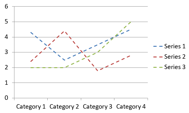
This example uses addChart to create a line chart with the default series and categories, then saves the presentation as PPTX.
use aspose\slides\ChartType;
use aspose\slides\Presentation;
use aspose\slides\SaveFormat;

$presentation = new Presentation();
try
{
    $slide = $presentation->getSlides()->get_Item(0);

    $lineChart = $slide->getShapes()->addChart(ChartType::Line, 20, 20, 500, 300);

    $presentation->save("lineChart.pptx", SaveFormat::Pptx);
}
finally
{
    $presentation->dispose();
}
By default, points on a line chart are joined by straight continuous lines. If you want the points to be joined by dashes instead, call setDashStyle with a value from LineDashStyle:
use aspose\slides\ChartType;
use aspose\slides\LineDashStyle;
use aspose\slides\Presentation;

$presentation = new Presentation();
try
{
    $slide = $presentation->getSlides()->get_Item(0);

    $lineChart = $slide->getShapes()->addChart(ChartType::Line, 20, 20, 500, 300);

    for ($i = 0; $i < java_values($lineChart->getChartData()->getSeries()->size()); $i++)
    {
        $series = $lineChart->getChartData()->getSeries()->get_Item($i);
        $series->getFormat()->getLine()->setDashStyle(LineDashStyle::Dash);
    }
}
finally
{
    $presentation->dispose();
}
The result:
Create Tree Map Charts
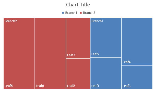
Tree map charts are best used for sales data when you want to show the relative size of data categories and quickly draw attention to items that are large contributors within each category.
This example creates a tree map with eight leaves grouped into four stems and two branches. The setGroupingItem method assigns stems at grouping level 1 and branches at level 2. Values determine the relative rectangle sizes, while category labels and overlapping parent labels identify the hierarchy.
use aspose\slides\ChartType;
use aspose\slides\ParentLabelLayoutType;
use aspose\slides\Presentation;
use aspose\slides\SaveFormat;

$presentation = new Presentation();
try
{
    $slide = $presentation->getSlides()->get_Item(0);

    $chart = $slide->getShapes()->addChart(ChartType::Treemap, 20, 20, 500, 300);

    $chart->getChartData()->getCategories()->clear();
    $chart->getChartData()->getSeries()->clear();

    $workbook = $chart->getChartData()->getChartDataWorkbook();
    $workbook->clear(0);

    // Branch 1
    $categoryCell = $workbook->getCell(0, "C1", "Leaf1");
    $leaf = $chart->getChartData()->getCategories()->add($categoryCell);
    $leaf->getGroupingLevels()->setGroupingItem(1, "Stem1");
    $leaf->getGroupingLevels()->setGroupingItem(2, "Branch1");

    $categoryCell = $workbook->getCell(0, "C2", "Leaf2");
    $chart->getChartData()->getCategories()->add($categoryCell);

    $categoryCell = $workbook->getCell(0, "C3", "Leaf3");
    $leaf = $chart->getChartData()->getCategories()->add($categoryCell);
    $leaf->getGroupingLevels()->setGroupingItem(1, "Stem2");

    $categoryCell = $workbook->getCell(0, "C4", "Leaf4");
    $chart->getChartData()->getCategories()->add($categoryCell);

    // Branch 2
    $categoryCell = $workbook->getCell(0, "C5", "Leaf5");
    $leaf = $chart->getChartData()->getCategories()->add($categoryCell);
    $leaf->getGroupingLevels()->setGroupingItem(1, "Stem3");
    $leaf->getGroupingLevels()->setGroupingItem(2, "Branch2");

    $categoryCell = $workbook->getCell(0, "C6", "Leaf6");
    $chart->getChartData()->getCategories()->add($categoryCell);

    $categoryCell = $workbook->getCell(0, "C7", "Leaf7");
    $leaf = $chart->getChartData()->getCategories()->add($categoryCell);
    $leaf->getGroupingLevels()->setGroupingItem(1, "Stem4");

    $categoryCell = $workbook->getCell(0, "C8", "Leaf8");
    $chart->getChartData()->getCategories()->add($categoryCell);

    $series = $chart->getChartData()->getSeries()->add(ChartType::Treemap);
    $series->getLabels()->getDefaultDataLabelFormat()->setShowCategoryName(true);
    $valueCell = $workbook->getCell(0, "D1", 4);
    $series->getDataPoints()->addDataPointForTreemapSeries($valueCell);
    $valueCell = $workbook->getCell(0, "D2", 5);
    $series->getDataPoints()->addDataPointForTreemapSeries($valueCell);
    $valueCell = $workbook->getCell(0, "D3", 3);
    $series->getDataPoints()->addDataPointForTreemapSeries($valueCell);
    $valueCell = $workbook->getCell(0, "D4", 6);
    $series->getDataPoints()->addDataPointForTreemapSeries($valueCell);
    $valueCell = $workbook->getCell(0, "D5", 9);
    $series->getDataPoints()->addDataPointForTreemapSeries($valueCell);
    $valueCell = $workbook->getCell(0, "D6", 9);
    $series->getDataPoints()->addDataPointForTreemapSeries($valueCell);
    $valueCell = $workbook->getCell(0, "D7", 4);
    $series->getDataPoints()->addDataPointForTreemapSeries($valueCell);
    $valueCell = $workbook->getCell(0, "D8", 3);
    $series->getDataPoints()->addDataPointForTreemapSeries($valueCell);

    $series->setParentLabelLayout(ParentLabelLayoutType::Overlapping);

    $presentation->save("Treemap.pptx", SaveFormat::Pptx);
}
finally
{
    $presentation->dispose();
}
The result:
Create Waterfall Charts
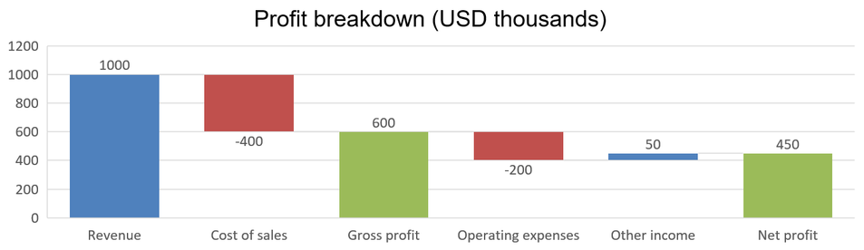
A waterfall chart shows how positive and negative changes contribute to a final value. For example, a profit breakdown can start with revenue, subtract costs, and add other income. Change columns float between the previous and new running values, while total columns extend from zero to the accumulated value.
The following example uses amounts in thousands of US dollars:
| Category | Workbook value | Column type |
|---|---|---|
| Revenue | 1000 | Increase |
| Cost of sales | -400 | Decrease |
| Gross profit | 600 | Intermediate total |
| Operating expenses | -200 | Decrease |
| Other income | 50 | Increase |
| Net profit | 450 | Final total |
To mark a point as an intermediate or final total, call its setSetAsTotal method with true. Supply the actual accumulated amount in that point’s workbook cell: 600 for gross profit (1000 - 400) and 450 for net profit (600 - 200 + 50). The method marks the column as a total; it does not calculate or populate the cell value. Do not use zero as a placeholder or supply another change for a total point. A total column displays the accumulated value without adding it again to the running value.
This complete PHP example creates a chart using the Waterfall member of ChartType, clears the default data, and fills the embedded workbook. Worksheet index 0 selects the first worksheet; column A contains category names and column B contains values. Each value cell is added with addDataPointForWaterfallSeries. The zero-based point indices 2 and 5 identify the intermediate and final totals. Calling setShowValue with true displays the amounts on the columns. No input presentation or workbook is required.
use aspose\slides\ChartType;
use aspose\slides\Presentation;
use aspose\slides\SaveFormat;

$presentation = new Presentation();
try
{
    $slide = $presentation->getSlides()->get_Item(0);

    $chart = $slide->getShapes()->addChart(ChartType::Waterfall, 20, 20, 680, 200);

    $chart->setTitle(true);
    $chart->getChartTitle()->addTextFrameForOverriding("Profit breakdown (USD thousands)");
    $chart->getChartTitle()->setOverlay(false);
    $chart->setLegend(false);

    $chart->getChartData()->getSeries()->clear();
    $chart->getChartData()->getCategories()->clear();

    $workbook = $chart->getChartData()->getChartDataWorkbook();
    $worksheetIndex = 0;

    $workbook->clear($worksheetIndex);

    $seriesNameCell = $workbook->getCell($worksheetIndex, 0, 1, "Profit");
    $series = $chart->getChartData()->getSeries()->add($seriesNameCell, ChartType::Waterfall);
    $categories = [ "Revenue", "Cost of sales", "Gross profit", "Operating expenses", "Other income", "Net profit" ];
    $values = [ 1000, -400, 600, -200, 50, 450 ];

    for ($i = 0; $i < count($categories); $i++)
    {
        $categoryCell = $workbook->getCell($worksheetIndex, $i + 1, 0, $categories[$i]);
        $chart->getChartData()->getCategories()->add($categoryCell);
        $valueCell = $workbook->getCell($worksheetIndex, $i + 1, 1, $values[$i]);
        $series->getDataPoints()->addDataPointForWaterfallSeries($valueCell);
    }

    // The third and sixth points represent totals, not additional changes.
    $series->getDataPoints()->get_Item(2)->setSetAsTotal(true);
    $series->getDataPoints()->get_Item(5)->setSetAsTotal(true);
    $series->setShowConnectorLines(true);
    $series->getLabels()->getDefaultDataLabelFormat()->setShowValue(true);

    $presentation->save("WaterfallChart.pptx", SaveFormat::Pptx);
}
finally
{
    $presentation->dispose();
}
Call the series-level setShowConnectorLines method with true to show lines linking consecutive columns and make the running value easier to follow. To hide these lines, replace the method call in the example with $series->setShowConnectorLines(false); before saving. This changes only the line visibility, not the data or totals.
The saved presentation shows gross profit of 600 and net profit of 450, with both totals drawn from zero:
Create Stock Charts
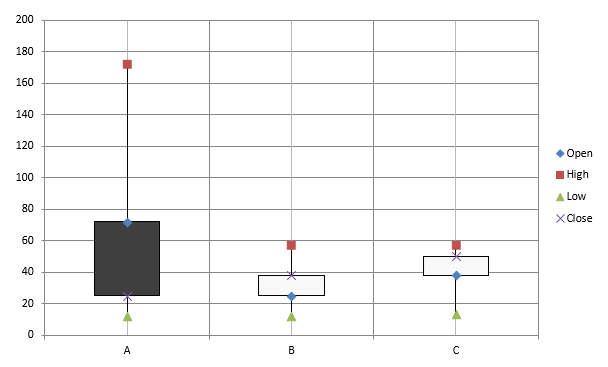
Stock charts are used to display financial data such as open, high, low, and close prices, helping analyze market trends and volatility. They offer essential insights into stock performance, aiding investors and analysts in making informed decisions.
This example creates an open-high-low-close chart with four series in that order and three categories. The setUpDownBars method enables up/down bars, and getHiLowLinesFormat controls the high-low lines that show the price ranges, while the individual series lines and minor horizontal gridlines are hidden.
use aspose\slides\ChartType;
use aspose\slides\FillType;
use aspose\slides\Presentation;
use aspose\slides\SaveFormat;

$presentation = new Presentation();
try
{
    $slide = $presentation->getSlides()->get_Item(0);

    $chart = $slide->getShapes()->addChart(ChartType::OpenHighLowClose, 20, 20, 500, 300, false);

    $workbook = $chart->getChartData()->getChartDataWorkbook();

    $categoryCell = $workbook->getCell(0, 1, 0, "A");
    $chart->getChartData()->getCategories()->add($categoryCell);
    $categoryCell = $workbook->getCell(0, 2, 0, "B");
    $chart->getChartData()->getCategories()->add($categoryCell);
    $categoryCell = $workbook->getCell(0, 3, 0, "C");
    $chart->getChartData()->getCategories()->add($categoryCell);

    $seriesNameCell = $workbook->getCell(0, 0, 1, "Open");
    $chart->getChartData()->getSeries()->add($seriesNameCell, ChartType::OpenHighLowClose);
    $seriesNameCell = $workbook->getCell(0, 0, 2, "High");
    $chart->getChartData()->getSeries()->add($seriesNameCell, ChartType::OpenHighLowClose);
    $seriesNameCell = $workbook->getCell(0, 0, 3, "Low");
    $chart->getChartData()->getSeries()->add($seriesNameCell, ChartType::OpenHighLowClose);
    $seriesNameCell = $workbook->getCell(0, 0, 4, "Close");
    $chart->getChartData()->getSeries()->add($seriesNameCell, ChartType::OpenHighLowClose);

    $series = $chart->getChartData()->getSeries()->get_Item(0);
    $valueCell = $workbook->getCell(0, 1, 1, 72);
    $series->getDataPoints()->addDataPointForStockSeries($valueCell);
    $valueCell = $workbook->getCell(0, 2, 1, 25);
    $series->getDataPoints()->addDataPointForStockSeries($valueCell);
    $valueCell = $workbook->getCell(0, 3, 1, 38);
    $series->getDataPoints()->addDataPointForStockSeries($valueCell);

    $series = $chart->getChartData()->getSeries()->get_Item(1);
    $valueCell = $workbook->getCell(0, 1, 2, 172);
    $series->getDataPoints()->addDataPointForStockSeries($valueCell);
    $valueCell = $workbook->getCell(0, 2, 2, 57);
    $series->getDataPoints()->addDataPointForStockSeries($valueCell);
    $valueCell = $workbook->getCell(0, 3, 2, 57);
    $series->getDataPoints()->addDataPointForStockSeries($valueCell);

    $series = $chart->getChartData()->getSeries()->get_Item(2);
    $valueCell = $workbook->getCell(0, 1, 3, 12);
    $series->getDataPoints()->addDataPointForStockSeries($valueCell);
    $valueCell = $workbook->getCell(0, 2, 3, 12);
    $series->getDataPoints()->addDataPointForStockSeries($valueCell);
    $valueCell = $workbook->getCell(0, 3, 3, 13);
    $series->getDataPoints()->addDataPointForStockSeries($valueCell);

    $series = $chart->getChartData()->getSeries()->get_Item(3);
    $valueCell = $workbook->getCell(0, 1, 4, 25);
    $series->getDataPoints()->addDataPointForStockSeries($valueCell);
    $valueCell = $workbook->getCell(0, 2, 4, 38);
    $series->getDataPoints()->addDataPointForStockSeries($valueCell);
    $valueCell = $workbook->getCell(0, 3, 4, 50);
    $series->getDataPoints()->addDataPointForStockSeries($valueCell);

    $chart->getChartData()->getSeriesGroups()->get_Item(0)->getUpDownBars()->setUpDownBars(true);
    $chart->getChartData()->getSeriesGroups()->get_Item(0)->getHiLowLinesFormat()->getLine()->getFillFormat()->setFillType(FillType::Solid);

    for ($i = 0; $i < java_values($chart->getChartData()->getSeries()->size()); $i++)
    {
        $stockSeries = $chart->getChartData()->getSeries()->get_Item($i);
        $stockSeries->getFormat()->getLine()->getFillFormat()->setFillType(FillType::NoFill);
    }

    $chart->getAxes()->getVerticalAxis()->getMinorGridLinesFormat()->getLine()->getFillFormat()->setFillType(FillType::NoFill);

    $presentation->save("Stock-chart.pptx", SaveFormat::Pptx);
}
finally
{
    $presentation->dispose();
}
The result:
Create Box and Whisker Charts
Box and whisker charts are used to display the distribution of data by summarizing key statistical measures, such as the median, quartiles, and potential outliers. They are particularly useful in exploratory data analysis and statistical studies to quickly understand data variability and identify any anomalies.
This example creates a box and whisker chart from six values. The setQuartileMethod method selects the exclusive quartile calculation. The example also enables mean lines, mean markers, inner points, and outlier points.
use aspose\slides\ChartType;
use aspose\slides\Presentation;
use aspose\slides\QuartileMethodType;
use aspose\slides\SaveFormat;

$presentation = new Presentation();
try
{
    $slide = $presentation->getSlides()->get_Item(0);

    $chart = $slide->getShapes()->addChart(ChartType::BoxAndWhisker, 20, 20, 500, 300);

    $chart->getChartData()->getCategories()->clear();
    $chart->getChartData()->getSeries()->clear();

    $workbook = $chart->getChartData()->getChartDataWorkbook();
    $workbook->clear(0);

    $categoryCell = $workbook->getCell(0, "A1", "Category 1");
    $chart->getChartData()->getCategories()->add($categoryCell);
    $categoryCell = $workbook->getCell(0, "A2", "Category 2");
    $chart->getChartData()->getCategories()->add($categoryCell);
    $categoryCell = $workbook->getCell(0, "A3", "Category 3");
    $chart->getChartData()->getCategories()->add($categoryCell);
    $categoryCell = $workbook->getCell(0, "A4", "Category 4");
    $chart->getChartData()->getCategories()->add($categoryCell);
    $categoryCell = $workbook->getCell(0, "A5", "Category 5");
    $chart->getChartData()->getCategories()->add($categoryCell);
    $categoryCell = $workbook->getCell(0, "A6", "Category 6");
    $chart->getChartData()->getCategories()->add($categoryCell);

    $series = $chart->getChartData()->getSeries()->add(ChartType::BoxAndWhisker);

    $series->setQuartileMethod(QuartileMethodType::Exclusive);
    $series->setShowMeanLine(true);
    $series->setShowMeanMarkers(true);
    $series->setShowInnerPoints(true);
    $series->setShowOutlierPoints(true);

    $valueCell = $workbook->getCell(0, "B1", 15);
    $series->getDataPoints()->addDataPointForBoxAndWhiskerSeries($valueCell);
    $valueCell = $workbook->getCell(0, "B2", 41);
    $series->getDataPoints()->addDataPointForBoxAndWhiskerSeries($valueCell);
    $valueCell = $workbook->getCell(0, "B3", 16);
    $series->getDataPoints()->addDataPointForBoxAndWhiskerSeries($valueCell);
    $valueCell = $workbook->getCell(0, "B4", 10);
    $series->getDataPoints()->addDataPointForBoxAndWhiskerSeries($valueCell);
    $valueCell = $workbook->getCell(0, "B5", 23);
    $series->getDataPoints()->addDataPointForBoxAndWhiskerSeries($valueCell);
    $valueCell = $workbook->getCell(0, "B6", 16);
    $series->getDataPoints()->addDataPointForBoxAndWhiskerSeries($valueCell);

    $presentation->save("BoxAndWhisker.pptx", SaveFormat::Pptx);
}
finally
{
    $presentation->dispose();
}
Create Funnel Charts
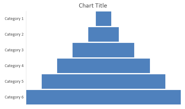
Funnel charts are used to visualize processes that involve sequential stages, where the volume of data decreases as it progresses from one step to the next. They are especially helpful for analyzing conversion rates, identifying bottlenecks, and tracking the efficiency of sales or marketing processes.
This example uses addChart to add a funnel chart to the first slide of an existing presentation. It replaces the default data with six categories and values ranging from 50 to 500, then saves the updated presentation. The input presentation must contain at least one slide.
use aspose\slides\ChartType;
use aspose\slides\Presentation;
use aspose\slides\SaveFormat;

$presentation = new Presentation("test.pptx");
try
{
    $slide = $presentation->getSlides()->get_Item(0);

    $chart = $slide->getShapes()->addChart(ChartType::Funnel, 50, 50, 500, 400);

    $chart->getChartData()->getCategories()->clear();
    $chart->getChartData()->getSeries()->clear();

    $workbook = $chart->getChartData()->getChartDataWorkbook();
    $workbook->clear(0);

    $categoryCell = $workbook->getCell(0, "A1", "Category 1");
    $chart->getChartData()->getCategories()->add($categoryCell);
    $categoryCell = $workbook->getCell(0, "A2", "Category 2");
    $chart->getChartData()->getCategories()->add($categoryCell);
    $categoryCell = $workbook->getCell(0, "A3", "Category 3");
    $chart->getChartData()->getCategories()->add($categoryCell);
    $categoryCell = $workbook->getCell(0, "A4", "Category 4");
    $chart->getChartData()->getCategories()->add($categoryCell);
    $categoryCell = $workbook->getCell(0, "A5", "Category 5");
    $chart->getChartData()->getCategories()->add($categoryCell);
    $categoryCell = $workbook->getCell(0, "A6", "Category 6");
    $chart->getChartData()->getCategories()->add($categoryCell);

    $series = $chart->getChartData()->getSeries()->add(ChartType::Funnel);

    $valueCell = $workbook->getCell(0, "B1", 50);
    $series->getDataPoints()->addDataPointForFunnelSeries($valueCell);
    $valueCell = $workbook->getCell(0, "B2", 100);
    $series->getDataPoints()->addDataPointForFunnelSeries($valueCell);
    $valueCell = $workbook->getCell(0, "B3", 200);
    $series->getDataPoints()->addDataPointForFunnelSeries($valueCell);
    $valueCell = $workbook->getCell(0, "B4", 300);
    $series->getDataPoints()->addDataPointForFunnelSeries($valueCell);
    $valueCell = $workbook->getCell(0, "B5", 400);
    $series->getDataPoints()->addDataPointForFunnelSeries($valueCell);
    $valueCell = $workbook->getCell(0, "B6", 500);
    $series->getDataPoints()->addDataPointForFunnelSeries($valueCell);

    $presentation->save("Funnel.pptx", SaveFormat::Pptx);
}
finally
{
    $presentation->dispose();
}
The result:
Create Sunburst Charts
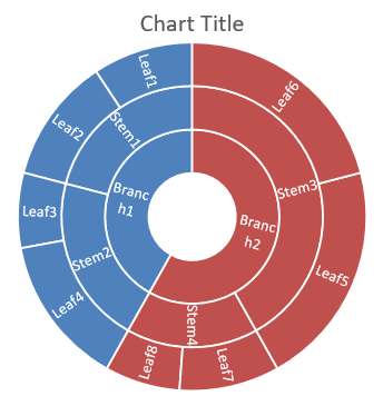
Sunburst charts are used to visualize hierarchical data, displaying levels as concentric rings. They help illustrate part-to-whole relationships and are ideal for representing nested categories and subcategories in a clear, compact format.
This example creates a sunburst chart with eight leaves grouped into four stems and two branches. The setGroupingItem method assigns stems at grouping level 1 and branches at level 2. Category labels identify the segments, and the values determine their relative sizes.
use aspose\slides\ChartType;
use aspose\slides\Presentation;
use aspose\slides\SaveFormat;

$presentation = new Presentation();
try
{
    $slide = $presentation->getSlides()->get_Item(0);

    $chart = $slide->getShapes()->addChart(ChartType::Sunburst, 20, 20, 500, 300);

    $chart->getChartData()->getCategories()->clear();
    $chart->getChartData()->getSeries()->clear();

    $workbook = $chart->getChartData()->getChartDataWorkbook();
    $workbook->clear(0);

    // Branch 1
    $categoryCell = $workbook->getCell(0, "C1", "Leaf1");
    $leaf = $chart->getChartData()->getCategories()->add($categoryCell);
    $leaf->getGroupingLevels()->setGroupingItem(1, "Stem1");
    $leaf->getGroupingLevels()->setGroupingItem(2, "Branch1");

    $categoryCell = $workbook->getCell(0, "C2", "Leaf2");
    $chart->getChartData()->getCategories()->add($categoryCell);

    $categoryCell = $workbook->getCell(0, "C3", "Leaf3");
    $leaf = $chart->getChartData()->getCategories()->add($categoryCell);
    $leaf->getGroupingLevels()->setGroupingItem(1, "Stem2");

    $categoryCell = $workbook->getCell(0, "C4", "Leaf4");
    $chart->getChartData()->getCategories()->add($categoryCell);

    // Branch 2
    $categoryCell = $workbook->getCell(0, "C5", "Leaf5");
    $leaf = $chart->getChartData()->getCategories()->add($categoryCell);
    $leaf->getGroupingLevels()->setGroupingItem(1, "Stem3");
    $leaf->getGroupingLevels()->setGroupingItem(2, "Branch2");

    $categoryCell = $workbook->getCell(0, "C6", "Leaf6");
    $chart->getChartData()->getCategories()->add($categoryCell);

    $categoryCell = $workbook->getCell(0, "C7", "Leaf7");
    $leaf = $chart->getChartData()->getCategories()->add($categoryCell);
    $leaf->getGroupingLevels()->setGroupingItem(1, "Stem4");

    $categoryCell = $workbook->getCell(0, "C8", "Leaf8");
    $chart->getChartData()->getCategories()->add($categoryCell);

    $series = $chart->getChartData()->getSeries()->add(ChartType::Sunburst);
    $series->getLabels()->getDefaultDataLabelFormat()->setShowCategoryName(true);
    $valueCell = $workbook->getCell(0, "D1", 4);
    $series->getDataPoints()->addDataPointForSunburstSeries($valueCell);
    $valueCell = $workbook->getCell(0, "D2", 5);
    $series->getDataPoints()->addDataPointForSunburstSeries($valueCell);
    $valueCell = $workbook->getCell(0, "D3", 3);
    $series->getDataPoints()->addDataPointForSunburstSeries($valueCell);
    $valueCell = $workbook->getCell(0, "D4", 6);
    $series->getDataPoints()->addDataPointForSunburstSeries($valueCell);
    $valueCell = $workbook->getCell(0, "D5", 9);
    $series->getDataPoints()->addDataPointForSunburstSeries($valueCell);
    $valueCell = $workbook->getCell(0, "D6", 9);
    $series->getDataPoints()->addDataPointForSunburstSeries($valueCell);
    $valueCell = $workbook->getCell(0, "D7", 4);
    $series->getDataPoints()->addDataPointForSunburstSeries($valueCell);
    $valueCell = $workbook->getCell(0, "D8", 3);
    $series->getDataPoints()->addDataPointForSunburstSeries($valueCell);

    $presentation->save("Sunburst.pptx", SaveFormat::Pptx);
}
finally
{
    $presentation->dispose();
}
The result:
Create Histogram Charts
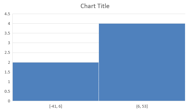
Histogram charts are used to represent the distribution of numerical data by grouping values into ranges or bins. They are particularly useful for identifying data patterns such as frequency, skewness, and spread, and for detecting outliers in a dataset.
This example creates a histogram from six numerical values, including negative values. Calling setAggregationType with the automatic aggregation type lets the chart determine the bins used to display the distribution.
use aspose\slides\AxisAggregationType;
use aspose\slides\ChartType;
use aspose\slides\Presentation;
use aspose\slides\SaveFormat;

$presentation = new Presentation();
try
{
    $slide = $presentation->getSlides()->get_Item(0);

    $chart = $slide->getShapes()->addChart(ChartType::Histogram, 20, 20, 500, 300);

    $chart->getChartData()->getCategories()->clear();
    $chart->getChartData()->getSeries()->clear();

    $workbook = $chart->getChartData()->getChartDataWorkbook();
    $workbook->clear(0);

    $series = $chart->getChartData()->getSeries()->add(ChartType::Histogram);
    $valueCell = $workbook->getCell(0, "A1", 15);
    $series->getDataPoints()->addDataPointForHistogramSeries($valueCell);
    $valueCell = $workbook->getCell(0, "A2", -41);
    $series->getDataPoints()->addDataPointForHistogramSeries($valueCell);
    $valueCell = $workbook->getCell(0, "A3", 16);
    $series->getDataPoints()->addDataPointForHistogramSeries($valueCell);
    $valueCell = $workbook->getCell(0, "A4", 10);
    $series->getDataPoints()->addDataPointForHistogramSeries($valueCell);
    $valueCell = $workbook->getCell(0, "A5", -23);
    $series->getDataPoints()->addDataPointForHistogramSeries($valueCell);
    $valueCell = $workbook->getCell(0, "A6", 16);
    $series->getDataPoints()->addDataPointForHistogramSeries($valueCell);

    $chart->getAxes()->getHorizontalAxis()->setAggregationType(AxisAggregationType::Automatic);

    $presentation->save("Histogram.pptx", SaveFormat::Pptx);
}
finally
{
    $presentation->dispose();
}
The result:
Create Radar Charts
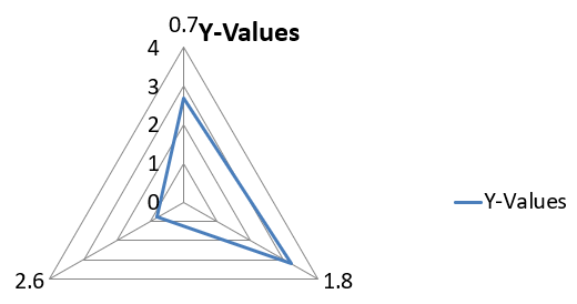
Radar charts are used to display multivariate data in a two-dimensional format, allowing for easy comparison of several variables simultaneously. They are particularly useful for identifying patterns, strengths, and weaknesses across multiple performance metrics or attributes.
This example uses addChart to create a radar chart with the default series and categories, then saves the presentation as PPTX.
use aspose\slides\ChartType;
use aspose\slides\Presentation;
use aspose\slides\SaveFormat;

$presentation = new Presentation();
try
{
    $slide = $presentation->getSlides()->get_Item(0);

    $slide->getShapes()->addChart(ChartType::Radar, 20, 20, 500, 300);

    $presentation->save("Radar-chart.pptx", SaveFormat::Pptx);
}
finally
{
    $presentation->dispose();
}
The result:
Create Multi-Category Charts
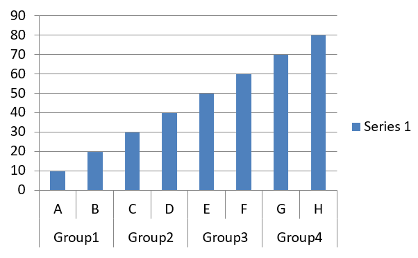
Multi-category charts are used to display data that involves more than one categorical grouping, allowing you to compare values across multiple dimensions simultaneously. They are particularly helpful when you need to analyze trends and relationships within complex, multi-layered datasets.
This example creates a clustered column chart with eight categories arranged in four pairs. The setGroupingItem method gives each pair a shared label at grouping level 1, producing a category axis with both individual and group labels.
use aspose\slides\ChartType;
use aspose\slides\Presentation;
use aspose\slides\SaveFormat;

$presentation = new Presentation();
try
{
    $slide = $presentation->getSlides()->get_Item(0);

    $chart = $slide->getShapes()->addChart(ChartType::ClusteredColumn, 20, 20, 500, 300);

    $chart->getChartData()->getSeries()->clear();
    $chart->getChartData()->getCategories()->clear();

    $workbook = $chart->getChartData()->getChartDataWorkbook();
    $workbook->clear(0);

    $worksheetIndex = 0;

    $categoryCell = $workbook->getCell(0, "c2", "A");
    $category = $chart->getChartData()->getCategories()->add($categoryCell);
    $category->getGroupingLevels()->setGroupingItem(1, "Group1");
    $categoryCell = $workbook->getCell(0, "c3", "B");
    $category = $chart->getChartData()->getCategories()->add($categoryCell);

    $categoryCell = $workbook->getCell(0, "c4", "C");
    $category = $chart->getChartData()->getCategories()->add($categoryCell);
    $category->getGroupingLevels()->setGroupingItem(1, "Group2");
    $categoryCell = $workbook->getCell(0, "c5", "D");
    $category = $chart->getChartData()->getCategories()->add($categoryCell);

    $categoryCell = $workbook->getCell(0, "c6", "E");
    $category = $chart->getChartData()->getCategories()->add($categoryCell);
    $category->getGroupingLevels()->setGroupingItem(1, "Group3");
    $categoryCell = $workbook->getCell(0, "c7", "F");
    $category = $chart->getChartData()->getCategories()->add($categoryCell);

    $categoryCell = $workbook->getCell(0, "c8", "G");
    $category = $chart->getChartData()->getCategories()->add($categoryCell);
    $category->getGroupingLevels()->setGroupingItem(1, "Group4");
    $categoryCell = $workbook->getCell(0, "c9", "H");
    $category = $chart->getChartData()->getCategories()->add($categoryCell);

    $seriesNameCell = $workbook->getCell(0, "D1", "Series 1");
    $series = $chart->getChartData()->getSeries()->add($seriesNameCell, ChartType::ClusteredColumn);

    $valueCell = $workbook->getCell($worksheetIndex, "D2", 10);
    $series->getDataPoints()->addDataPointForBarSeries($valueCell);
    $valueCell = $workbook->getCell($worksheetIndex, "D3", 20);
    $series->getDataPoints()->addDataPointForBarSeries($valueCell);
    $valueCell = $workbook->getCell($worksheetIndex, "D4", 30);
    $series->getDataPoints()->addDataPointForBarSeries($valueCell);
    $valueCell = $workbook->getCell($worksheetIndex, "D5", 40);
    $series->getDataPoints()->addDataPointForBarSeries($valueCell);
    $valueCell = $workbook->getCell($worksheetIndex, "D6", 50);
    $series->getDataPoints()->addDataPointForBarSeries($valueCell);
    $valueCell = $workbook->getCell($worksheetIndex, "D7", 60);
    $series->getDataPoints()->addDataPointForBarSeries($valueCell);
    $valueCell = $workbook->getCell($worksheetIndex, "D8", 70);
    $series->getDataPoints()->addDataPointForBarSeries($valueCell);
    $valueCell = $workbook->getCell($worksheetIndex, "D9", 80);
    $series->getDataPoints()->addDataPointForBarSeries($valueCell);

    $presentation->save("AsposeChart.pptx", SaveFormat::Pptx);
}
finally
{
    $presentation->dispose();
}
The result:
Create Map Charts
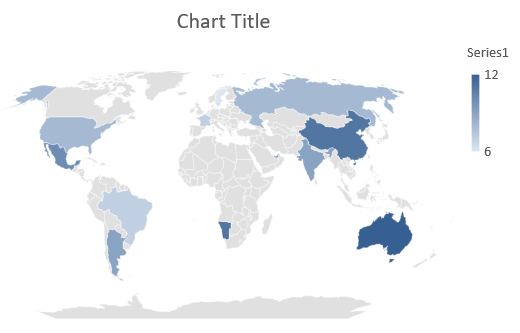
Map charts are used to visualize geographical data by mapping information to specific locations such as countries, states, or cities. They are particularly useful for analyzing regional trends, demographic data, and spatial distributions in a clear, visually engaging manner.
This example uses addChart to create a map chart with the default geographical data and saves it for viewing in PowerPoint.
use aspose\slides\ChartType;
use aspose\slides\Presentation;
use aspose\slides\SaveFormat;

$presentation = new Presentation();
try
{
    $slide = $presentation->getSlides()->get_Item(0);

    $chart = $slide->getShapes()->addChart(ChartType::Map, 20, 20, 500, 300);

    $presentation->save("mapChart.pptx", SaveFormat::Pptx);
}
finally
{
    $presentation->dispose();
}
The result:
Note
The picture above shows the saved presentation opened in PowerPoint. Aspose.Slides writes the map chart and its data correctly, but it does not draw map charts itself: when a slide holding one is rendered to an image or converted to PDF or SVG, the chart area comes out blank. Other shapes on the same slide are unaffected.Create Combination Charts
A combination chart (or combo chart) combines two or more chart types in a single graph. This chart lets you highlight, compare, or examine differences between two or more data sets, helping you identify relationships between them.

This example combines two clustered column series with a line series across four categories. The columns use the primary vertical axis, while setPlotOnSecondAxis places the line on a secondary vertical axis on the right. The helper functions configure the title, legend, axis labels, and gridlines.
use aspose\slides\AxisPositionType;
use aspose\slides\ChartType;
use aspose\slides\CrossesType;
use aspose\slides\FillType;
use aspose\slides\LegendPositionType;
use aspose\slides\NullableBool;
use aspose\slides\Presentation;
use aspose\slides\SaveFormat;

function createComboChart()
{
    $presentation = new Presentation();
    try
    {
        $chart = createChartWithFirstSeries($presentation->getSlides()->get_Item(0));

        addSecondSeriesToChart($chart);
        addThirdSeriesToChart($chart);

        setPrimaryAxesFormat($chart);
        setSecondaryAxesFormat($chart);

        $presentation->save("combo-chart.pptx", SaveFormat::Pptx);
    }
    finally
    {
        $presentation->dispose();
    }
}

function createChartWithFirstSeries($slide)
{
    $chart = $slide->getShapes()->addChart(ChartType::ClusteredColumn, 50, 50, 600, 400);

    $chart->setTitle(true);
    $chart->getChartTitle()->addTextFrameForOverriding("Chart Title");
    $chart->getChartTitle()->setOverlay(false);
    $portionFormat = $chart->getChartTitle()->getTextFrameForOverriding()->getParagraphs()->get_Item(0)->getParagraphFormat()->getDefaultPortionFormat();
    $portionFormat->setFontBold(NullableBool::False);
    $portionFormat->setFontHeight(18);

    $chart->getLegend()->setPosition(LegendPositionType::Bottom);
    $chart->getLegend()->getTextFormat()->getPortionFormat()->setFontHeight(12);

    $chart->getChartData()->getSeries()->clear();
    $chart->getChartData()->getCategories()->clear();

    $workbook = $chart->getChartData()->getChartDataWorkbook();
    $worksheetIndex = 0;

    $categoryCell = $workbook->getCell($worksheetIndex, 1, 0, "Category 1");
    $chart->getChartData()->getCategories()->add($categoryCell);
    $categoryCell = $workbook->getCell($worksheetIndex, 2, 0, "Category 2");
    $chart->getChartData()->getCategories()->add($categoryCell);
    $categoryCell = $workbook->getCell($worksheetIndex, 3, 0, "Category 3");
    $chart->getChartData()->getCategories()->add($categoryCell);
    $categoryCell = $workbook->getCell($worksheetIndex, 4, 0, "Category 4");
    $chart->getChartData()->getCategories()->add($categoryCell);

    $seriesNameCell = $workbook->getCell($worksheetIndex, 0, 1, "Series 1");
    $series = $chart->getChartData()->getSeries()->add($seriesNameCell, $chart->getType());

    $series->getParentSeriesGroup()->setOverlap(-25);
    $series->getParentSeriesGroup()->setGapWidth(220);

    $valueCell = $workbook->getCell($worksheetIndex, 1, 1, 4.3);
    $series->getDataPoints()->addDataPointForBarSeries($valueCell);
    $valueCell = $workbook->getCell($worksheetIndex, 2, 1, 2.5);
    $series->getDataPoints()->addDataPointForBarSeries($valueCell);
    $valueCell = $workbook->getCell($worksheetIndex, 3, 1, 3.5);
    $series->getDataPoints()->addDataPointForBarSeries($valueCell);
    $valueCell = $workbook->getCell($worksheetIndex, 4, 1, 4.5);
    $series->getDataPoints()->addDataPointForBarSeries($valueCell);

    return $chart;
}

function addSecondSeriesToChart($chart)
{
    $workbook = $chart->getChartData()->getChartDataWorkbook();
    $worksheetIndex = 0;

    $seriesNameCell = $workbook->getCell($worksheetIndex, 0, 2, "Series 2");
    $series = $chart->getChartData()->getSeries()->add($seriesNameCell, ChartType::ClusteredColumn);

    $series->getParentSeriesGroup()->setOverlap(-25);
    $series->getParentSeriesGroup()->setGapWidth(220);

    $valueCell = $workbook->getCell($worksheetIndex, 1, 2, 2.4);
    $series->getDataPoints()->addDataPointForBarSeries($valueCell);
    $valueCell = $workbook->getCell($worksheetIndex, 2, 2, 4.4);
    $series->getDataPoints()->addDataPointForBarSeries($valueCell);
    $valueCell = $workbook->getCell($worksheetIndex, 3, 2, 1.8);
    $series->getDataPoints()->addDataPointForBarSeries($valueCell);
    $valueCell = $workbook->getCell($worksheetIndex, 4, 2, 2.8);
    $series->getDataPoints()->addDataPointForBarSeries($valueCell);
}

function addThirdSeriesToChart($chart)
{
    $workbook = $chart->getChartData()->getChartDataWorkbook();
    $worksheetIndex = 0;

    $seriesNameCell = $workbook->getCell($worksheetIndex, 0, 3, "Series 3");
    $series = $chart->getChartData()->getSeries()->add($seriesNameCell, ChartType::Line);

    $valueCell = $workbook->getCell($worksheetIndex, 1, 3, 2.0);
    $series->getDataPoints()->addDataPointForLineSeries($valueCell);
    $valueCell = $workbook->getCell($worksheetIndex, 2, 3, 2.0);
    $series->getDataPoints()->addDataPointForLineSeries($valueCell);
    $valueCell = $workbook->getCell($worksheetIndex, 3, 3, 3.0);
    $series->getDataPoints()->addDataPointForLineSeries($valueCell);
    $valueCell = $workbook->getCell($worksheetIndex, 4, 3, 5.0);
    $series->getDataPoints()->addDataPointForLineSeries($valueCell);

    $series->setPlotOnSecondAxis(true);
}

function setPrimaryAxesFormat($chart)
{
    $horizontalAxis = $chart->getAxes()->getHorizontalAxis();
    $horizontalAxis->getTextFormat()->getPortionFormat()->setFontHeight(12);
    $horizontalAxis->getFormat()->getLine()->getFillFormat()->setFillType(FillType::NoFill);

    setAxisTitle($horizontalAxis, "X Axis");

    $verticalAxis = $chart->getAxes()->getVerticalAxis();
    $verticalAxis->getTextFormat()->getPortionFormat()->setFontHeight(12);
    $verticalAxis->getFormat()->getLine()->getFillFormat()->setFillType(FillType::NoFill);

    setAxisTitle($verticalAxis, "Y Axis 1");

    $majorGridLinesFormat = $verticalAxis->getMajorGridLinesFormat()->getLine()->getFillFormat();
    $majorGridLinesFormat->setFillType(FillType::Solid);
    $color = new Java("java.awt.Color", 217, 217, 217);
    $majorGridLinesFormat->getSolidFillColor()->setColor($color);
}

function setSecondaryAxesFormat($chart)
{
    $secondaryHorizontalAxis = $chart->getAxes()->getSecondaryHorizontalAxis();
    $secondaryHorizontalAxis->setPosition(AxisPositionType::Bottom);
    $secondaryHorizontalAxis->setCrossType(CrossesType::Maximum);
    $secondaryHorizontalAxis->setVisible(false);
    $secondaryHorizontalAxis->getMajorGridLinesFormat()->getLine()->getFillFormat()->setFillType(FillType::NoFill);
    $secondaryHorizontalAxis->getMinorGridLinesFormat()->getLine()->getFillFormat()->setFillType(FillType::NoFill);

    $secondaryVerticalAxis = $chart->getAxes()->getSecondaryVerticalAxis();
    $secondaryVerticalAxis->setPosition(AxisPositionType::Right);
    $secondaryVerticalAxis->getTextFormat()->getPortionFormat()->setFontHeight(12);
    $secondaryVerticalAxis->getFormat()->getLine()->getFillFormat()->setFillType(FillType::NoFill);
    $secondaryVerticalAxis->getMajorGridLinesFormat()->getLine()->getFillFormat()->setFillType(FillType::NoFill);
    $secondaryVerticalAxis->getMinorGridLinesFormat()->getLine()->getFillFormat()->setFillType(FillType::NoFill);

    setAxisTitle($secondaryVerticalAxis, "Y Axis 2");
}

function setAxisTitle($axis, $axisTitle)
{
    $axis->setTitle(true);
    $axis->getTitle()->setOverlay(false);
    $titlePortionFormat = $axis->getTitle()->addTextFrameForOverriding($axisTitle)->getParagraphs()->get_Item(0)->getParagraphFormat()->getDefaultPortionFormat();
    $titlePortionFormat->setFontBold(NullableBool::False);
    $titlePortionFormat->setFontHeight(12);
}

createComboChart();
Update Charts
Aspose.Slides for PHP via Java enables you to update PowerPoint charts by modifying chart data, formatting, and styling. This functionality simplifies the process of keeping presentations up-to-date with dynamic content and ensures that charts accurately reflect current data and visual standards.
This example updates the chart named “My chart” on the first slide of an existing presentation. It requires two column series with three data points each, with category labels in column A and series names in the first row of the first worksheet. The example uses getCell to change workbook cells, updates series values, adds a third series, and changes the chart to clustered cylinders through setType.
use aspose\slides\ChartType;
use aspose\slides\Presentation;
use aspose\slides\SaveFormat;

$chartName = "My chart";
$chartClass = new JavaClass("com.aspose.slides.IChart");

$presentation = new Presentation("ExistingChart.pptx");
try
{
    $slide = $presentation->getSlides()->get_Item(0);

    for ($i = 0; $i < java_values($slide->getShapes()->size()); $i++)
    {
        $shape = $slide->getShapes()->get_Item($i);
        if (java_instanceof($shape, $chartClass) && $chartName === java_values($shape->getName()))
        {
            $chart = $shape;
            $worksheetIndex = 0;

            $workbook = $chart->getChartData()->getChartDataWorkbook();

            $workbook->getCell($worksheetIndex, 1, 0, "Modified Category 1");
            $workbook->getCell($worksheetIndex, 2, 0, "Modified Category 2");

            $series = $chart->getChartData()->getSeries()->get_Item(0);

            $workbook->getCell($worksheetIndex, 0, 1, "New_Series 1");
            $series->getDataPoints()->get_Item(0)->getValue()->setData(90);
            $series->getDataPoints()->get_Item(1)->getValue()->setData(123);
            $series->getDataPoints()->get_Item(2)->getValue()->setData(44);

            $series = $chart->getChartData()->getSeries()->get_Item(1);

            $workbook->getCell($worksheetIndex, 0, 2, "New_Series 2");
            $series->getDataPoints()->get_Item(0)->getValue()->setData(23);
            $series->getDataPoints()->get_Item(1)->getValue()->setData(67);
            $series->getDataPoints()->get_Item(2)->getValue()->setData(99);

            $seriesNameCell = $workbook->getCell($worksheetIndex, 0, 3, "Series 3");
            $series = $chart->getChartData()->getSeries()->add($seriesNameCell, $chart->getType());

            $valueCell = $workbook->getCell($worksheetIndex, 1, 3, 20);
            $series->getDataPoints()->addDataPointForBarSeries($valueCell);
            $valueCell = $workbook->getCell($worksheetIndex, 2, 3, 50);
            $series->getDataPoints()->addDataPointForBarSeries($valueCell);
            $valueCell = $workbook->getCell($worksheetIndex, 3, 3, 30);
            $series->getDataPoints()->addDataPointForBarSeries($valueCell);

            $chart->setType(ChartType::ClusteredCylinder);
        }
    }

    $presentation->save("AsposeChartModified.pptx", SaveFormat::Pptx);
}
finally
{
    $presentation->dispose();
}
Set Data Range for a Chart
To inspect the range already used by an existing chart, see Retrieve a Chart’s Data Range.
Aspose.Slides for PHP via Java provides the flexibility to define a specific data range from a worksheet as the source for your chart’s data. This means you can directly map a portion of your worksheet to the chart, allowing you to control which cells contribute to the chart’s series and categories. As a result, you can easily update and synchronize your charts with the latest data changes in your worksheet, ensuring that your PowerPoint presentations reflect current and accurate information.
This example uses setRange to set the data source of the chart named “My chart” on the first slide of an existing presentation to Sheet1!A1:B4. The chart workbook must contain that worksheet and a populated range with a series heading in the first row, category labels in column A, and three values in column B.
use aspose\slides\Presentation;
use aspose\slides\SaveFormat;

$chartName = "My chart";
$chartClass = new JavaClass("com.aspose.slides.IChart");

$presentation = new Presentation("ExistingChart.pptx");
try
{
    $slide = $presentation->getSlides()->get_Item(0);

    for ($i = 0; $i < java_values($slide->getShapes()->size()); $i++)
    {
        $shape = $slide->getShapes()->get_Item($i);
        if (java_instanceof($shape, $chartClass) && $chartName === java_values($shape->getName()))
        {
            $chart = $shape;
            $chart->getChartData()->setRange("Sheet1!A1:B4");
        }
    }

    $presentation->save("SetDataRange.pptx", SaveFormat::Pptx);
}
finally
{
    $presentation->dispose();
}
Use Default Markers in Charts
When you use default markers in charts, each chart series gets a different default marker symbol automatically.
This example uses addChart to create a chart with two line series and a legend. The marker settings accessed through getMarker retain the automatically assigned marker symbols. The first series includes a negative value and a missing value, represented by null, while the second has a value for every category.
use aspose\slides\ChartType;
use aspose\slides\Presentation;
use aspose\slides\SaveFormat;

$presentation = new Presentation();
try
{
    $slide = $presentation->getSlides()->get_Item(0);

    $chart = $slide->getShapes()->addChart(ChartType::LineWithMarkers, 10, 10, 400, 400);

    $chart->getChartData()->getSeries()->clear();
    $chart->getChartData()->getCategories()->clear();

    $workbook = $chart->getChartData()->getChartDataWorkbook();

    $seriesNameCell = $workbook->getCell(0, 0, 1, "Series 1");
    $series = $chart->getChartData()->getSeries()->add($seriesNameCell, $chart->getType());

    $categoryCell = $workbook->getCell(0, 1, 0, "C1");
    $chart->getChartData()->getCategories()->add($categoryCell);
    $valueCell = $workbook->getCell(0, 1, 1, 24);
    $series->getDataPoints()->addDataPointForLineSeries($valueCell);

    $categoryCell = $workbook->getCell(0, 2, 0, "C2");
    $chart->getChartData()->getCategories()->add($categoryCell);
    $valueCell = $workbook->getCell(0, 2, 1, 23);
    $series->getDataPoints()->addDataPointForLineSeries($valueCell);

    $categoryCell = $workbook->getCell(0, 3, 0, "C3");
    $chart->getChartData()->getCategories()->add($categoryCell);
    $valueCell = $workbook->getCell(0, 3, 1, -10);
    $series->getDataPoints()->addDataPointForLineSeries($valueCell);

    $categoryCell = $workbook->getCell(0, 4, 0, "C4");
    $chart->getChartData()->getCategories()->add($categoryCell);
    $valueCell = $workbook->getCell(0, 4, 1, null);
    $series->getDataPoints()->addDataPointForLineSeries($valueCell);

    $seriesNameCell = $workbook->getCell(0, 0, 2, "Series 2");
    $secondSeries = $chart->getChartData()->getSeries()->add($seriesNameCell, $chart->getType());

    $valueCell = $workbook->getCell(0, 1, 2, 30);
    $secondSeries->getDataPoints()->addDataPointForLineSeries($valueCell);
    $valueCell = $workbook->getCell(0, 2, 2, 10);
    $secondSeries->getDataPoints()->addDataPointForLineSeries($valueCell);
    $valueCell = $workbook->getCell(0, 3, 2, 60);
    $secondSeries->getDataPoints()->addDataPointForLineSeries($valueCell);
    $valueCell = $workbook->getCell(0, 4, 2, 40);
    $secondSeries->getDataPoints()->addDataPointForLineSeries($valueCell);

    $chart->setLegend(true);
    $chart->getLegend()->setOverlay(false);

    $presentation->save("DefaultMarkersInChart.pptx", SaveFormat::Pptx);
}
finally
{
    $presentation->dispose();
}
FAQ
What chart types are supported by Aspose.Slides for PHP via Java?
Aspose.Slides for PHP via Java supports a wide range of chart types, including bar, line, pie, area, scatter, histogram, radar, and many more. This flexibility allows you to choose the most appropriate chart type for your data visualization needs.
How do I add a new chart to a slide?
To add a chart, you first create an instance of the Presentation class, retrieve the desired slide using its index, and then call the method to add a chart, specifying the chart type and initial data. This process integrates the chart directly into your presentation.
How can I update the data displayed in a chart?
You can update a chart’s data by accessing its data workbook (ChartDataWorkbook), clearing any default series and categories, and then adding your custom data. This allows you to programmatically refresh the chart to reflect the latest data.
Is it possible to customize the appearance of the chart?
Yes, Aspose.Slides for PHP via Java provides extensive customization options. You can modify colors, fonts, labels, legends, and other formatting elements to tailor the chart’s appearance to your specific design requirements.