Analyzing your prompt, please hold on...
An error occurred while retrieving the results. Please refresh the page and try again.
Aspose.Cells supports almost all chart types supported in Microsoft Excel. Charts are categorized into two major categories:
Standard charts are those normally used with standard formatting:
- Column - Bar - Line - Pie - Scatter - Area - Doughnut |
- Radar - Bubble - Stock - Cylinder - Cone - Pyramid - Treemap - Sunburst |
|---|---|
| Each of the standard chart types is described in more detail below. |
Column charts use vertical bars (called columns) to display different values of one or more data items. Column charts are mostly used to compare values across different categories. They are ideal for showing variations in an item’s value over time, for example, when doing a budget analysis.
Column charts supported in Microsoft Excel
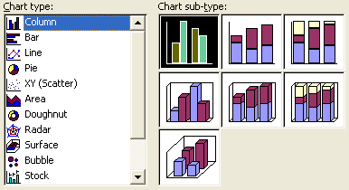
The following column charts are supported in Aspose.Cells:
Bar charts are almost the same type as column charts. The difference is that they use horizontal bars instead of vertical ones.
Bar charts supported in Microsoft Excel
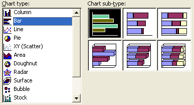
The following bar charts are supported in Aspose.Cells:
Line charts make use of lines to display information. These charts are very useful to show a temporal trend over time and are often used to show variations in the value of more than one item over time.
Line charts supported in Microsoft Excel
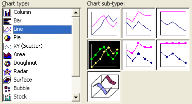
The following line charts are supported in Aspose.Cells:
Pie charts are mostly used to display information when you want to represent the different parts of a whole or the percentages of a total.
Pie charts supported in Microsoft Excel
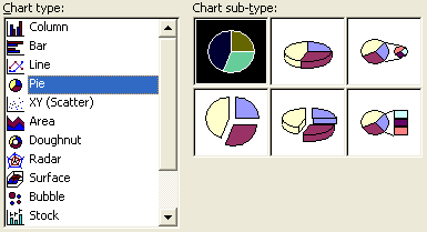
The following pie charts are supported in Aspose.Cells:
Scatter charts are mostly used in statistics to visually display and compare two sets of related quantitative or numerical data by displaying only finitely many points, each having a coordinate on a horizontal (“X”) and a vertical (“Y”) axis.
Scatter charts supported in Microsoft Excel
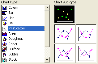
The following scatter charts are supported in Aspose.Cells:
An area chart is a kind of line chart in which each area is given a solid color or pattern to emphasize the relationships between the pieces of charted information.
Area charts supported in Microsoft Excel
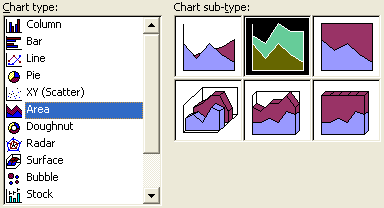
The following area charts are supported in Aspose.Cells:
A doughnut chart is similar to a pie chart and is mostly used to show how proportions of data contribute to the whole.
Doughnut charts supported in Microsoft Excel
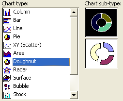
The following doughnut charts are supported in Aspose.Cells:
Radar charts are most useful when you want to look at several different factors, which are related to one item. These charts have multiple axes along which data can be plotted.
Radar charts supported in Microsoft Excel
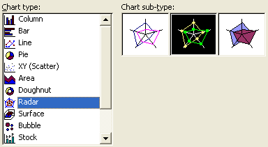
The following radar charts are supported in Aspose.Cells:
Like other 3D charts, surface 3D charts are based on the X, Y and Z axes. These charts are useful for showing a variation in the “Z” variable according to the other two variables, “X” and “Y”.
Surface 3D charts supported in Microsoft Excel
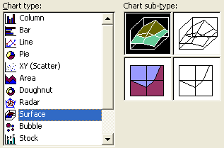
The following surface 3D charts are supported in Aspose.Cells:
A bubble chart is a variation of a scatter chart in which the data points are replaced with bubbles. A bubble chart can be used instead of a scatter chart if your data has three data series, each of which contains a set of values. Bubble charts are mostly used to display financial data.
Bubble charts supported in Microsoft Excel
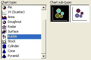
The following bubble charts are supported in Aspose.Cells:
Stock charts are mostly used for stock‑price data, but can also be used for scientific data.
Stock charts supported in Microsoft Excel
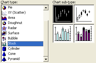
The following stock charts are supported in Aspose.Cells:
These chart types use cylinder data markers to lend a dramatic effect to column, bar, and 3D column charts.
Cylinder charts supported in Microsoft Excel
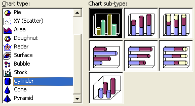
The following cylinder charts are supported in Aspose.Cells:
These chart types use cone data markers to lend a dramatic effect to column, bar, and 3D column charts.
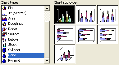
Cone charts supported in Microsoft Excel
The following cone charts are supported in Aspose.Cells:
These chart types use pyramid data markers to lend a dramatic effect to column, bar, and 3D column charts.
Pyramid charts supported in Microsoft Excel

The following pyramid charts are supported in Aspose.Cells:
A treemap chart provides a hierarchical view of your data and makes it easy to spot patterns, such as which items are a store’s best‑selling products. The tree branches are represented by rectangles and each sub‑branch is shown as a smaller rectangle. The treemap chart displays categories by color and proximity, and can easily show lots of data, which would be difficult with other chart types.
The treemap chart is supported in Aspose.Cells.
The sunburst chart is ideal for displaying hierarchical data. Each level of the hierarchy is represented by one ring or circle with the innermost circle as the top of the hierarchy. A sunburst chart without any hierarchical data (one level of categories) looks similar to a doughnut chart. However, a sunburst chart with multiple levels of categories shows how the outer rings relate to the inner rings. The sunburst chart is most effective at showing how one ring is broken into its contributing pieces, while another type of hierarchical chart, the treemap chart, is ideal for comparing relative sizes.
The sunburst chart is supported in Aspose.Cells.
A histogram is a column chart that shows frequency data.
The following histogram charts are supported in Aspose.Cells:
A box and whisker chart shows the distribution of data into quartiles, highlighting the mean and outliers. The boxes may have lines extending vertically called “whiskers”. These lines indicate variability outside the upper and lower quartiles, and any point outside those lines or whiskers is considered an outlier.
The box and whisker chart is supported in Aspose.Cells.
A waterfall chart shows a running total as values are added or subtracted. It’s useful for understanding how an initial value (for example, net income) is affected by a series of positive and negative values.
The waterfall chart is supported in Aspose.Cells.
Custom charts allow you to create charts with custom formatting that can also be applied to other charts. Here, we’ve only discussed the standard charts. If you want to know more details about custom charts then please read the Creating Custom Charts article which describes how to create custom charts.
Analyzing your prompt, please hold on...
An error occurred while retrieving the results. Please refresh the page and try again.