Analyzing your prompt, please hold on...
An error occurred while retrieving the results. Please refresh the page and try again.
A pivot chart is a visual representation of the data in a pivot table. Pivot charts provide a way to summarize, analyze, explore, and present summary data. Here are some key features and aspects of pivot charts:
Dynamic Data Representation: Pivot charts automatically update to reflect changes in the pivot table. If you add or remove fields in the pivot table, the pivot chart updates accordingly.
Interactive: Pivot charts are interactive, allowing users to filter, sort, and drill down into data. This makes it easy to explore different aspects of the data set.
Flexible Layout: Users can change the layout of the pivot chart by dragging and dropping fields, which offers flexibility in how data is visualized.
Various Chart Types: Pivot charts can be created using various chart types such as bar charts, line charts, pie charts, and more, depending on the nature of the data and the insights you wish to gain.
Summarization: Pivot charts summarize large amounts of data and can show totals, averages, counts, or other summary statistics.
Filtering: They provide filtering capabilities, allowing you to display only the data that meets certain criteria.
To create a pivot table using Aspose.Cells:
Cell object’s PutValue/setValue method. You can also use a template file already filled with data. The data will be used as the pivot table’s data source.PivotTables collection’s add method (encapsulated in the Worksheet object).PivotTable object from the PivotTables collection by passing its index.PivotTable object to manage the table.A code sample is given below. Executing the code generates a new file: pivotTable_test.xls.
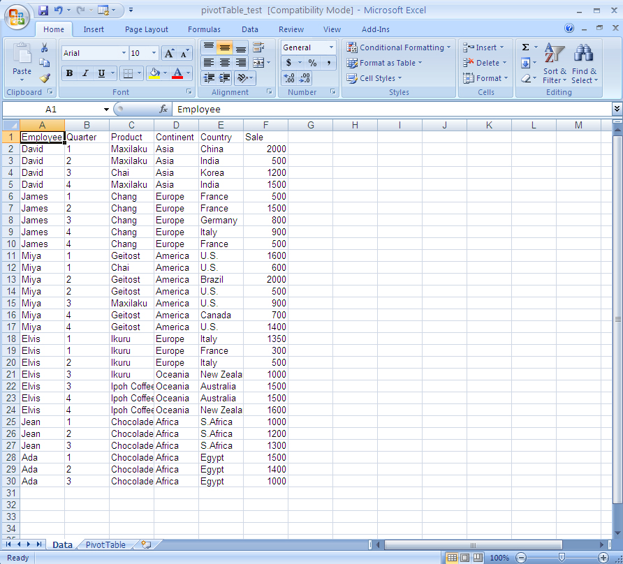
Input data
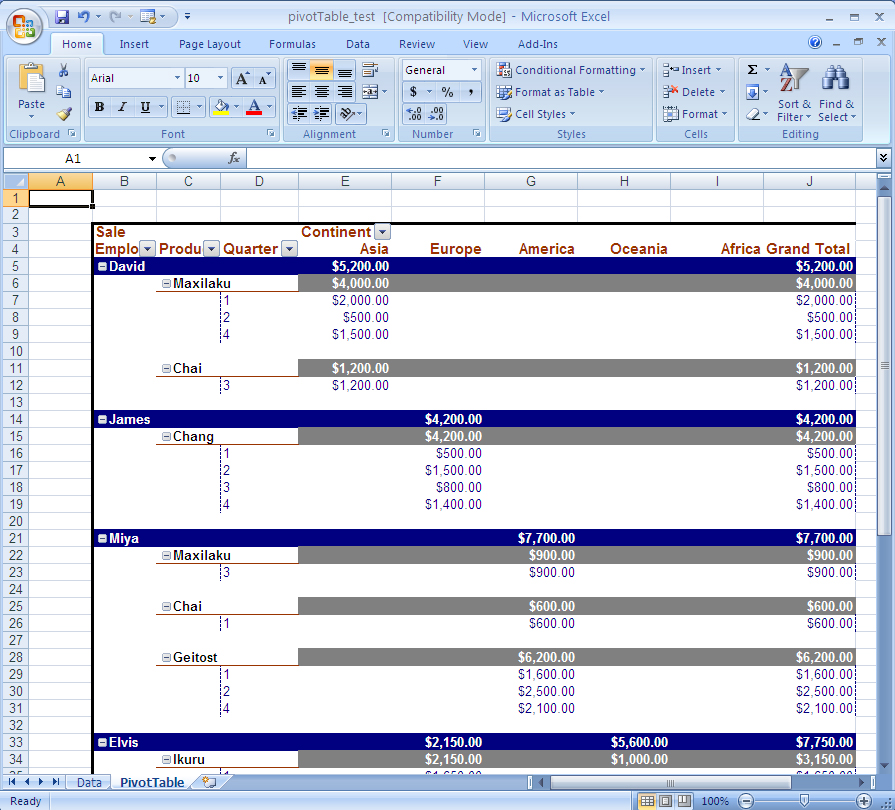
The output pivot table
To create a pivot chart using Aspose.Cells:
PivotSource of the chart to refer to an existing pivot table in the spreadsheet.Below is the code used by the component to accomplish the task. Executing the code generates a new file: pivotChart_test.xls.
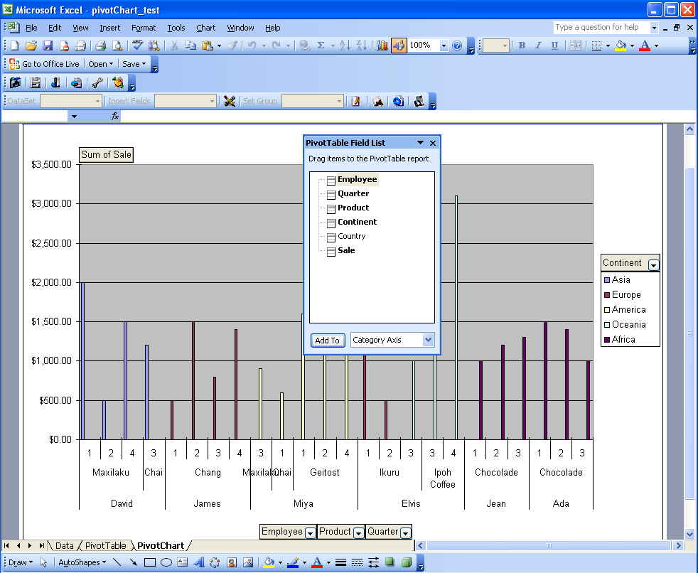
The pivot chart sheet
This article shows how to create pivot tables and pivot charts using Aspose.Cells. Hopefully, it will help you use these features in your own scenarios.
Aspose.Cells has benefited from years of research, design, and careful tuning.
We welcome your queries, comments, and suggestions at the Aspose.Cells Forum. We guarantee a prompt reply.
Analyzing your prompt, please hold on...
An error occurred while retrieving the results. Please refresh the page and try again.