Analyzing your prompt, please hold on...
An error occurred while retrieving the results. Please refresh the page and try again.
This element is used to organize content within containers. BlockConfig elements can only be nested within ContainerConfig elements.
BlockConfig elements may have no visual representation or have a border around them.
BlockConfig element is declared as an instance of BlockConfig class. Reference Aspose.OMR.Generation.Config.Elements.Parents and Aspose.OMR.Generation.Config.Enums namespaces to use BlockConfig types without specifying the fully qualified namespace:
using Aspose.OMR.Generation.Config.Elements.Parents;
using Aspose.OMR.Generation.Config.Enums;
Elements displayed inside blocks are provided in the Children list.
new BlockConfig() {
	Children= new List<BaseConfig>() {
		/*
		 * Put child elements here
		 */
	}
}
| Name | Type | Description |
|---|---|---|
| Children | List<BaseConfig> |
Child elements. |
| Name | Type | Default value | Description |
|---|---|---|---|
| Name | string |
n/a | Used as a reminder of the element’s purpose; for example, “Column 1”. You can use the same value for multiple blocks. This text is not displayed on the form. |
| Column | int |
1 | The number of the column in which the BlockConfig element will be placed. This number must not exceed the number of columns of the parent Container element. |
| BorderType | BorderType |
BorderType.None |
Whether to draw a border around the BlockConfig element.
|
| BorderSize | int |
3 | Width of the BlockConfig borders. |
| BorderColor | Color |
Color.Black |
Color of the BlockConfig borders. |
| BorderTopStyle | object |
inherits border_size and border_color | Override the width and color of the element’s top border. Provided as the object with the following properties:
|
| BorderBottomStyle | object |
inherits border_size and border_color | Override the width and color of the element’s bottom border. Provided as the object with the following properties:
|
| BorderLeftStyle | object |
inherits border_size and border_color | Override the width and color of the element’s left border. Provided as the object with the following properties:
|
| BorderRightStyle | object |
inherits border_size and border_color | Override the width and color of the element’s right border. Provided as the object with the following properties:
|
| IsClipped | bool |
false | If set to true, the content of the BlockConfig element is stored to Images collection during recognition, similar to the WriteInConfig element. The image can be can be passed to optical character recognition library, such as Aspose.OCR, or saved.If the BlockConfig contains OMR elements, they will be recognized even if this property is set to true. |
| BackgroundColor | Color |
no fill | Background color of the BlockConfig element. |
All, except for another BlockConfig.
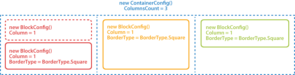
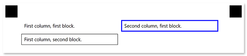
Check out the code examples to see how BlockConfig elements can be used and combined with each other.
TemplateConfig templateConfig = new TemplateConfig() {
	Children=new List<BaseConfig>() {
		new PageConfig() {
			Children = new List<BaseConfig>() {
				new ContainerConfig() {
					Name = "Two-column layout",
					ColumnsCount = 2,
					Children= new List<BaseConfig>() {
						new BlockConfig() {
							Column = 1,
							Children = new List<BaseConfig>() {
								new ContentConfig() {
									Name = "First column, first block."
								}
							}
						},
						new BlockConfig() {
							Column = 1,
							BorderType = BorderType.Square,
							Children = new List<BaseConfig>() {
								new ContentConfig() {
									Name = "First column, second block."
								}
							}
						},
						new BlockConfig() {
							Column = 2,
							BorderType = BorderType.Square,
							BorderSize = 10,
							BorderColor = Color.Blue,
							Children = new List<BaseConfig>() {
								new ContentConfig() {
									Name = "Second column, first block."
								}
							}
						}
					}
				}
			}
		}
	}
};
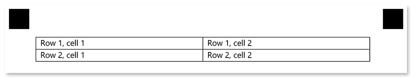
TemplateConfig templateConfig = new TemplateConfig() {
	Children=new List<BaseConfig>() {
		new PageConfig() {
			Children = new List<BaseConfig>() {
				new ContainerConfig() {
					Name = "Fake table layout",
					ColumnsCount = 2,
					BlockRightMargin = 0,
					BlockBottomMargin = 0,
					BlockTopPadding = 0,
					Children= new List<BaseConfig>() {
						new BlockConfig() {
							Column = 1,
							BorderType = BorderType.Square,
							Children = new List<BaseConfig>() {
								new ContentConfig() {
									Name = "Row 1, cell 1"
								}
							}
						},
						new BlockConfig() {
							Column = 1,
							BorderType = BorderType.Square,
							Children = new List<BaseConfig>() {
								new ContentConfig() {
									Name = "Row 1, cell 2"
								}
							}
						},
						new BlockConfig() {
							Column = 2,
							BorderType = BorderType.Square,
							Children = new List<BaseConfig>() {
								new ContentConfig() {
									Name = "Row 2, cell 1"
								}
							}
						},
						new BlockConfig() {
							Column = 2,
							BorderType = BorderType.Square,
							Children = new List<BaseConfig>() {
								new ContentConfig() {
									Name = "Row 2, cell 2"
								}
							}
						}
					}
				}
			}
		}
	}
};
Analyzing your prompt, please hold on...
An error occurred while retrieving the results. Please refresh the page and try again.