Analyzing your prompt, please hold on...
An error occurred while retrieving the results. Please refresh the page and try again.
This element is used to insert personalized information, such as the respondent’s name or email, into the form. “InputGroup” is a purely layout element which is not processed by Aspose.OMR during the recognition.
InputGroup element is declared as an instance of InputGroup class. Reference Aspose.OMR.Generation.Config.Elements and Aspose.OMR.Generation.Config.Enums namespaces to use InputGroup types without specifying the fully qualified namespace:
using Aspose.OMR.Generation.Config.Elements;
using Aspose.OMR.Generation.Config.Enums;
InputGroup must contain 2 ContentConfig elements provided as an array of objects in the children property:
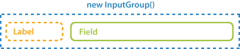
new InputGroup() {
	Children = new List<BaseConfig>() {
		new ContentConfig() {
			Name = "Label"
		},
		new ContentConfig() {
			Name = "Field text"
		}
	}
}
| Name | Type | Default value | Description |
|---|---|---|---|
| Name | string |
n/a | Used as a reminder of the element’s purpose; for example, “Student name”. You can use the same value for multiple elements. This text is not displayed on the form. |
| LabelBorder | BorderType |
BorderType.None |
Whether to draw a border around the label.
|
| InputBorder | BorderType |
BorderType.None |
Whether to draw a border around the field.
|
| BorderSize | int |
3 | Width of all borders. |
| BorderColor | Color |
Color.Black |
Color of the BlockConfig borders. |
| BorderTopStyle | object |
inherits border_size and border_color | Override the width and color of the element’s top border. Provided as the object with the following properties:
|
| BorderBottomStyle | object |
inherits border_size and border_color | Override the width and color of the element’s bottom border. Provided as the object with the following properties:
|
| BorderLeftStyle | object |
inherits border_size and border_color | Override the width and color of the element’s left border. Provided as the object with the following properties:
|
| BorderRightStyle | object |
inherits border_size and border_color | Override the width and color of the element’s right border. Provided as the object with the following properties:
|
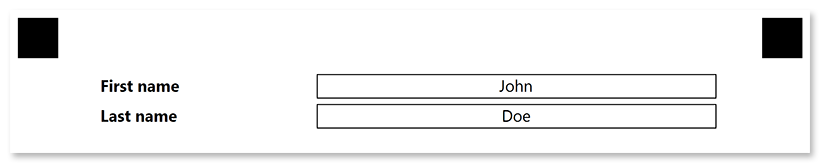
TemplateConfig templateConfig = new TemplateConfig() {
	Children=new List<BaseConfig>() {
		new PageConfig() {
			Children = new List<BaseConfig>() {
				new InputGroup() {
					InputBorder = BorderType.Square,
					Children = new List<BaseConfig>() {
						new ContentConfig() {
							Name = "First name",
							FontStyle = FontStyle.Bold
						},
						new ContentConfig() {
							Name = "John",
							Alignment = AlignmentEnum.Center
						}
					}
				},
				new InputGroup() {
					InputBorder = BorderType.Square,
					Children = new List<BaseConfig>() {
						new ContentConfig() {
							Name = "Last name",
							FontStyle = FontStyle.Bold
						},
						new ContentConfig() {
							Name = "Doe",
							Alignment = AlignmentEnum.Center
						}
					}
				}
			}
		}
	}
};
Analyzing your prompt, please hold on...
An error occurred while retrieving the results. Please refresh the page and try again.