
使用 Java 管理簡報中的圖表資料標籤
簡介
資料標籤會顯示圖表系列與單一資料點的資訊,協助讀者辨識數值並了解圖表。本篇說明如何格式化數值、顯示百分比、讀取標籤文字、在軸上限之外控制標籤、調整類別軸標籤間距,以及調整圓形圖標籤的位置。
設定圖表資料標籤的資料精度
使用setNumberFormatOfValues來格式化系列值。此範例建立一個使用預設資料的折線圖,顯示其資料表,並為第一個系列啟用數值標籤。格式 #,##0.00 會顯示千位分隔符號與兩位小數,且不會變更基礎數值。
import com.aspose.slides.*;

Presentation presentation = new Presentation();
try {
    ISlide slide = presentation.getSlides().get_Item(0);

    IChart chart = slide.getShapes().addChart(ChartType.Line, 50, 50, 450, 300);
    chart.setDataTable(true);

    IChartSeries series = chart.getChartData().getSeries().get_Item(0);
    series.setNumberFormatOfValues("#,##0.00");
    series.getLabels().getDefaultDataLabelFormat().setShowValue(true);

    presentation.save("PrecisionOfDatalabels_out.pptx", SaveFormat.Pptx);
} finally {
    presentation.dispose();
}
顯示百分比作為標籤
對於堆疊直條圖,將每個值計算為其類別總和的百分比,並將文字指派給由getTextFrameForOverriding 回傳的文字框。本範例使用預設圖表資料,並以 8 點字型顯示兩位小數的百分比。總和為零的類別會被跳過,以避免除以零。若圖表資料變更,請重新計算自訂標籤文字。
import com.aspose.slides.*;
import java.util.Locale;

Presentation presentation = new Presentation();
try {
    ISlide slide = presentation.getSlides().get_Item(0);

    IChart chart = slide.getShapes().addChart(ChartType.StackedColumn, 20, 20, 400, 400);

    double[] categoryTotals = new double[chart.getChartData().getCategories().size()];
    for (int k = 0; k < chart.getChartData().getCategories().size(); k++) {
        for (int i = 0; i < chart.getChartData().getSeries().size(); i++) {
            IChartSeries series = chart.getChartData().getSeries().get_Item(i);
            Number pointValue = (Number) series.getDataPoints().get_Item(k).getValue().getData();
            categoryTotals[k] += pointValue.doubleValue();
        }
    }

    for (int x = 0; x < chart.getChartData().getSeries().size(); x++) {
        IChartSeries series = chart.getChartData().getSeries().get_Item(x);
        series.getLabels().getDefaultDataLabelFormat().setShowLegendKey(false);

        for (int j = 0; j < series.getDataPoints().size(); j++) {
            IDataLabel label = series.getDataPoints().get_Item(j).getLabel();
            if (categoryTotals[j] == 0) {
                continue;
            }

            Number pointValue = (Number) series.getDataPoints().get_Item(j).getValue().getData();
            double dataPointPercent = (pointValue.doubleValue() / categoryTotals[j]) * 100;

            IPortion portion = new Portion();
            portion.setText(String.format(Locale.US, "%.2f %%", dataPointPercent));
            portion.getPortionFormat().setFontHeight(8f);

            label.getTextFrameForOverriding().setText("");
            IParagraph paragraph = label.getTextFrameForOverriding().getParagraphs().get_Item(0);
            paragraph.getPortions().add(portion);

            label.getDataLabelFormat().setShowValue(true);
            label.getDataLabelFormat().setShowSeriesName(false);
            label.getDataLabelFormat().setShowPercentage(false);
            label.getDataLabelFormat().setShowLegendKey(false);
            label.getDataLabelFormat().setShowCategoryName(false);
            label.getDataLabelFormat().setShowBubbleSize(false);
        }
    }

    presentation.save("DisplayPercentageAsLabels_out.pptx", SaveFormat.Pptx);
} finally {
    presentation.dispose();
}
在圖表資料標籤中設定百分比符號
當值以分數形式儲存時,使用setNumberFormat來顯示百分比。將 false 傳遞給setNumberFormatLinkedToSource,即可讓標籤格式獨立於來源儲存格。
此範例建立一個 100% 堆疊直條圖,包含紅色與藍色系列,跨四個類別。每對值的總和為 1。標籤格式 0.0% 會將 0.30 顯示為 30.0%,而垂直軸則使用兩位小數。兩個系列皆使用白色、10 點字型的標籤文字。
import com.aspose.slides.*;
import java.awt.Color;

Presentation presentation = new Presentation();
try {
    ISlide slide = presentation.getSlides().get_Item(0);

    IChart chart = slide.getShapes().addChart(ChartType.PercentsStackedColumn, 20, 20, 500, 400);

    chart.getAxes().getVerticalAxis().setNumberFormatLinkedToSource(false);
    chart.getAxes().getVerticalAxis().setNumberFormat("0.00%");

    chart.getChartData().getSeries().clear();
    chart.getChartData().getCategories().clear();

    IChartDataWorkbook workbook = chart.getChartData().getChartDataWorkbook();
    int worksheetIndex = 0;
    for (int i = 0; i < 4; i++) {
        IChartDataCell categoryCell = workbook.getCell(worksheetIndex, i + 1, 0, "Category " + (i + 1));
        chart.getChartData().getCategories().add(categoryCell);
    }

    String[] seriesNames = { "Reds", "Blues" };
    Color[] seriesColors = { Color.RED, Color.BLUE };
    double[][] values = { { 0.30, 0.50, 0.80, 0.65 }, { 0.70, 0.50, 0.20, 0.35 } };

    for (int i = 0; i < seriesNames.length; i++) {
        IChartDataCell seriesCell = workbook.getCell(worksheetIndex, 0, i + 1, seriesNames[i]);
        IChartSeries series = chart.getChartData().getSeries().add(seriesCell, chart.getType());
        for (int j = 0; j < 4; j++) {
            IChartDataCell valueCell = workbook.getCell(worksheetIndex, j + 1, i + 1, values[i][j]);
            series.getDataPoints().addDataPointForBarSeries(valueCell);
        }

        series.getFormat().getFill().setFillType(FillType.Solid);
        series.getFormat().getFill().getSolidFillColor().setColor(seriesColors[i]);

        IDataLabelFormat labelFormat = series.getLabels().getDefaultDataLabelFormat();
        labelFormat.setShowValue(true);
        labelFormat.setNumberFormatLinkedToSource(false);
        labelFormat.setNumberFormat("0.0%");
        labelFormat.getTextFormat().getPortionFormat().setFontHeight(10);
        labelFormat.getTextFormat().getPortionFormat().getFillFormat().setFillType(FillType.Solid);
        labelFormat.getTextFormat().getPortionFormat().getFillFormat().getSolidFillColor().setColor(Color.WHITE);
    }

    presentation.save("SetDataLabelsPercentageSign_out.pptx", SaveFormat.Pptx);
} finally {
    presentation.dispose();
}
讀取資料標籤的實際文字
使用getActualLabelText可取得資料標籤設定所產生的文字。當需要為報告擷取標籤、搜尋簡報內容或驗證產生的圖表時,此功能非常有用。以下範例中,預設的資料標籤格式會結合每個類別名稱、系列名稱與數值。某個資料點將其數值格式化為百分比,另一個則使用由getTextFrameForOverriding 取得的自訂文字。
import com.aspose.slides.*;

Presentation presentation = new Presentation();
try {
    ISlide slide = presentation.getSlides().get_Item(0);

    IChart chart = slide.getShapes().addChart(ChartType.ClusteredColumn, 20, 20, 500, 300);

    chart.getChartData().getSeries().clear();
    chart.getChartData().getCategories().clear();

    IChartDataWorkbook workbook = chart.getChartData().getChartDataWorkbook();
    IChartDataCell firstCategoryCell = workbook.getCell(0, 1, 0, "Q1");
    chart.getChartData().getCategories().add(firstCategoryCell);
    IChartDataCell secondCategoryCell = workbook.getCell(0, 2, 0, "Q2");
    chart.getChartData().getCategories().add(secondCategoryCell);

    IChartDataCell northSeriesCell = workbook.getCell(0, 0, 1, "North");
    IChartSeries north = chart.getChartData().getSeries().add(northSeriesCell, chart.getType());
    IChartDataCell northFirstValueCell = workbook.getCell(0, 1, 1, 0.25);
    north.getDataPoints().addDataPointForBarSeries(northFirstValueCell);
    IChartDataCell northSecondValueCell = workbook.getCell(0, 2, 1, 0.75);
    north.getDataPoints().addDataPointForBarSeries(northSecondValueCell);

    IChartDataCell southSeriesCell = workbook.getCell(0, 0, 2, "South");
    IChartSeries south = chart.getChartData().getSeries().add(southSeriesCell, chart.getType());
    IChartDataCell southFirstValueCell = workbook.getCell(0, 1, 2, 0.40);
    south.getDataPoints().addDataPointForBarSeries(southFirstValueCell);
    IChartDataCell southSecondValueCell = workbook.getCell(0, 2, 2, 0.60);
    south.getDataPoints().addDataPointForBarSeries(southSecondValueCell);

    for (IChartSeries series : chart.getChartData().getSeries()) {
        IDataLabelFormat format = series.getLabels().getDefaultDataLabelFormat();
        format.setShowCategoryName(true);
        format.setShowSeriesName(true);
        format.setShowValue(true);
    }

    north.getLabels().get_Item(1).getDataLabelFormat().setNumberFormatLinkedToSource(false);
    north.getLabels().get_Item(1).getDataLabelFormat().setNumberFormat("0%");
    south.getLabels().get_Item(0).getTextFrameForOverriding().setText("Reviewed");

    for (IChartSeries series : chart.getChartData().getSeries()) {
        for (IChartDataPoint point : series.getDataPoints()) {
            IDataLabel label = point.getLabel();
            if (!label.isVisible()) {
                continue;
            }

            System.out.println("Value: " + point.getValue().getData() + "; label: " + label.getActualLabelText());
        }
    }
} finally {
    presentation.dispose();
}
資料點中儲存的數字仍為 0.75,即使其標籤同時顯示 75% 以及類別與系列名稱。自訂文字會取代產生的標籤文字。getActualLabelText 在兩種情況下皆會回傳結果標籤字串。若僅想擷取可見標籤,如上例所示,請另行檢查 isVisible。
在軸上限之外控制資料標籤
當手動限制軸範圍時,某些資料點可能會超過其最大值。使用setShowDataLabelsOverMaximum來控制是否顯示其資料標籤。此設定僅變更標籤可見性,並不會改變軸範圍或基礎資料值。
以下範例建立一個 2D 群組直條圖,值為 60 與 120。它將 false 傳遞給setAutomaticMaxValue,並透過在垂直軸上使用setMaxValue將最大值設定為 100。第一張投影片允許標籤超出最大值;其複本則停用此功能。兩張投影片皆儲存為 DataLabelsOverMaximum.pptx。
使用setShowValue啟用數值標籤。圖表層級的設定本身不會啟用數值顯示,也不會覆寫個別標籤已停用的數值顯示。此範例為整個系列啟用數值,並使用setPosition將標籤放置於每個柱狀的外部端點。
import com.aspose.slides.*;

Presentation presentation = new Presentation();
try {
    ISlide slide = presentation.getSlides().get_Item(0);

    IChart chart = slide.getShapes().addChart(ChartType.ClusteredColumn, 50, 50, 600, 400);
    chart.setLegend(false);

    chart.getChartData().getSeries().clear();
    chart.getChartData().getCategories().clear();

    IChartDataWorkbook workbook = chart.getChartData().getChartDataWorkbook();

    IChartDataCell firstCategory = workbook.getCell(0, 1, 0, "Within range");
    IChartDataCell secondCategory = workbook.getCell(0, 2, 0, "Above maximum");

    chart.getChartData().getCategories().add(firstCategory);
    chart.getChartData().getCategories().add(secondCategory);

    IChartDataCell seriesName = workbook.getCell(0, 0, 1, "Values");
    IChartSeries series = chart.getChartData().getSeries().add(seriesName, chart.getType());

    IChartDataCell firstValue = workbook.getCell(0, 1, 1, 60);
    IChartDataCell secondValue = workbook.getCell(0, 2, 1, 120);

    series.getDataPoints().addDataPointForBarSeries(firstValue);
    series.getDataPoints().addDataPointForBarSeries(secondValue);

    series.getLabels().getDefaultDataLabelFormat().setShowValue(true);
    series.getLabels().getDefaultDataLabelFormat().setPosition(LegendDataLabelPosition.OutsideEnd);

    chart.getAxes().getVerticalAxis().setAutomaticMaxValue(false);
    chart.getAxes().getVerticalAxis().setMaxValue(100);
    chart.setShowDataLabelsOverMaximum(true);

    ISlide secondSlide = presentation.getSlides().addClone(slide);
    IChart secondChart = (IChart) secondSlide.getShapes().get_Item(0);
    secondChart.setShowDataLabelsOverMaximum(false);

    presentation.save("DataLabelsOverMaximum.pptx", SaveFormat.Pptx);
} finally {
    presentation.dispose();
}
以下圖片顯示 Microsoft PowerPoint 呈現的已儲存投影片。使用 true 時,標籤 120 會出現在上邊界;使用 false 時,則隱藏。標籤 60 仍保持可見,軸最大值仍為 100,且第二個資料點在兩種情況下皆為 120。
| setShowDataLabelsOverMaximum(true) | setShowDataLabelsOverMaximum(false) |
|---|---|
 |
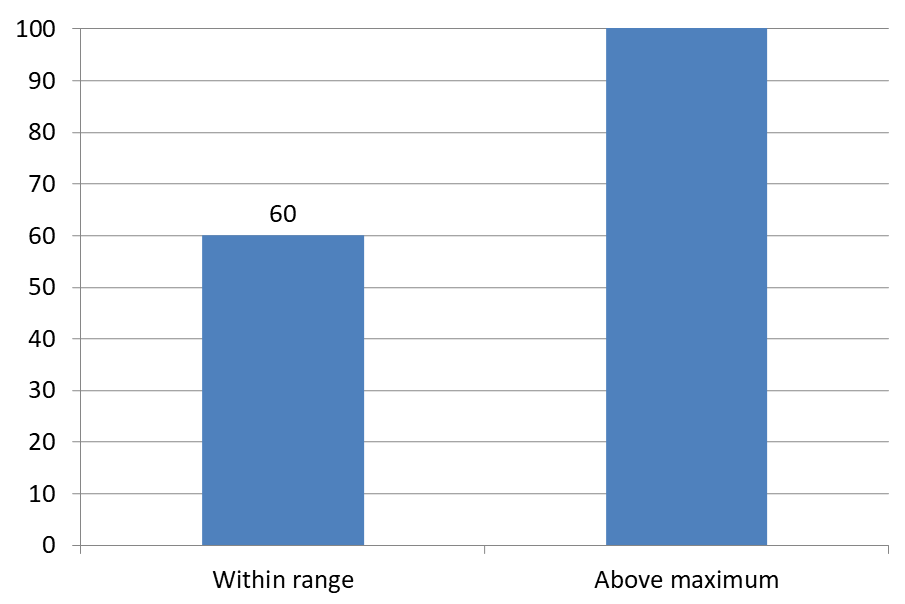 |
Chart Type
此範例使用具有數值軸的 2D 直條圖。沒有數值軸的圖表(例如圓形圖和甜甜圈圖)並沒有此種可限制的軸上限。設定標籤與軸的距離
使用setLabelOffset來控制類別軸標籤與軸之間的距離。該值為軸標籤最大字型大小的百分比。此範例建立一個群組直條圖,將水平軸標籤偏移設定為 500。此設定影響類別軸標籤,而非附加於單一資料點的標籤。
import com.aspose.slides.*;

Presentation presentation = new Presentation();
try {
    ISlide slide = presentation.getSlides().get_Item(0);

    IChart chart = slide.getShapes().addChart(ChartType.ClusteredColumn, 20, 20, 500, 300);
    chart.getAxes().getHorizontalAxis().setLabelOffset(500);

    presentation.save("SetCategoryAxisLabelDistance_out.pptx", SaveFormat.Pptx);
} finally {
    presentation.dispose();
}
調整標籤位置
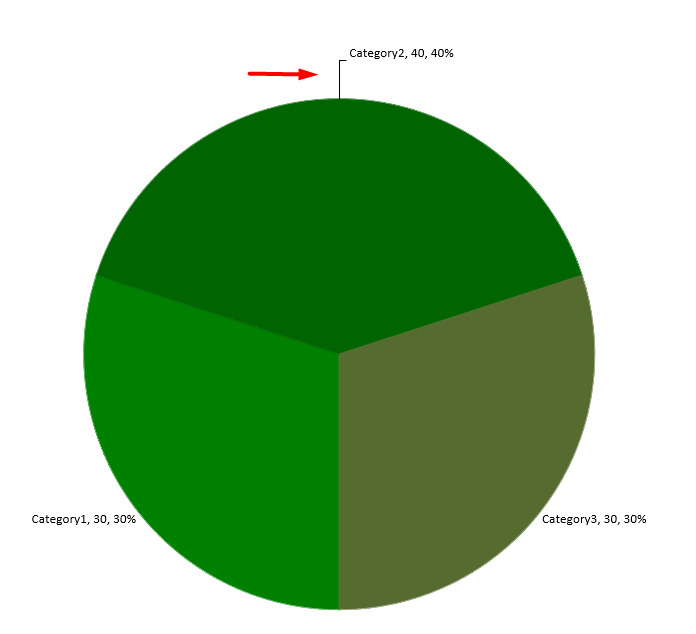
在圓形圖上,調整資料標籤位置以改善間距並為指示線留出空間。
此範例顯示第一個資料點的數值,將其標籤放置於切片外側,並使用setX與setY調整水平與垂直偏移。這些偏移分別相對於圖表的寬度與高度。
import com.aspose.slides.*;

Presentation presentation = new Presentation();
try {
    ISlide slide = presentation.getSlides().get_Item(0);

    IChart chart = slide.getShapes().addChart(ChartType.Pie, 50, 50, 200, 200);
    IChartSeriesCollection series = chart.getChartData().getSeries();

    IDataLabel label = series.get_Item(0).getLabels().get_Item(0);
    label.getDataLabelFormat().setShowValue(true);
    label.getDataLabelFormat().setPosition(LegendDataLabelPosition.OutsideEnd);
    label.setX(0.71f);
    label.setY(0.04f);

    presentation.save("presentation.pptx", SaveFormat.Pptx);
} finally {
    presentation.dispose();
}
常見問題
如何防止在密集圖表上資料標籤重疊?
結合自動標籤放置、指示線與縮小字型大小;如有需要,可隱藏部分欄位(例如類別),或僅為極端值或關鍵點顯示標籤。
如何僅對零、負值或空值停用標籤?
在啟用標籤之前先過濾資料點,並根據已定義的規則對值為 0、負值或遺漏值停用顯示。
如何在匯出為 PDF/影像時確保標籤樣式一致?
明確設定字型族與字型大小,並確認該字型在渲染環境中可用,以避免使用備援字型。