
在 PHP 中管理簡報的圖表資料系列
概述
圖表將其繪製的資料儲存在圖表資料工作簿中。 ChartSeries 代表一組相關的值,系列中的每個 ChartDataPoint 指向一個或多個工作表儲存格。ChartCategory 物件提供系列共用的標籤或分組值。因此,系列名稱、類別與點值會連結到 ChartDataCell 物件,而非僅以顯示文字儲存。
對於典型的類別圖表,預設工作簿使用第 0 列儲存系列名稱,第 0 行儲存類別名稱,其餘儲存格則放置系列值。傳遞給 ChartDataWorkbook.getCell 的工作表、列和欄索引為零基礎。此佈局在建立帶有預設資料的圖表時很有用,但不要假設每個現有圖表都使用它。對於已載入的簡報,請在變更工作簿值之前檢查系列、類別和資料點所參照的儲存格。
圖表設定具有三種不同的範圍:
- 系列層級設定,例如 ChartSeries.getFormat,為單一系列中的所有點提供預設外觀。
- 資料點層級設定,例如 ChartDataPoint.getFormat,覆寫該點的系列外觀。
- 群組設定適用於屬於同一個 ChartSeriesGroup 的相容系列。需要設定重疊或間隙寬度等選項時,請透過 ChartSeries.getParentSeriesGroup 取得群組。
當未明確設定點或系列填充時,圖表樣式與主題會決定自動外觀。當同時存在系列與點的格式設定時,點的格式設定優先於該點。
設定圖表系列重疊度
ChartSeries.getOverlap 回報 2D 圖表中條形或柱形的重疊比例,介於 -100 到 100 百分比之間。它是父系列群組設定的唯讀投影。使用 ChartSeriesGroup.setOverlap 來更新該群組中每個相容系列。此選項僅適用於顯示群組條形或柱形的圖表類型;不會影響組合圖表中不相關的系列群組。
以下範例設定包含第一個系列的群組的重疊度:
$firstSlideIndex = 0;
$firstSeriesIndex = 0;
$overlapPercent = 30;

$presentation = new Presentation();
try {
    $slide = $presentation->getSlides()->get_Item($firstSlideIndex);

    // 新圖表包含範例系列、類別和數值。
    $chart = $slide->getShapes()->addChart(ChartType::ClusteredColumn, 20, 20, 500, 200);

    $series = $chart->getChartData()->getSeries()->get_Item($firstSeriesIndex);
    $series->getParentSeriesGroup()->setOverlap($overlapPercent);

    $presentation->save("series_overlap.pptx", SaveFormat::Pptx);
} finally {
    if (!java_is_null($presentation)) {
        $presentation->dispose();
    }
}
結果:
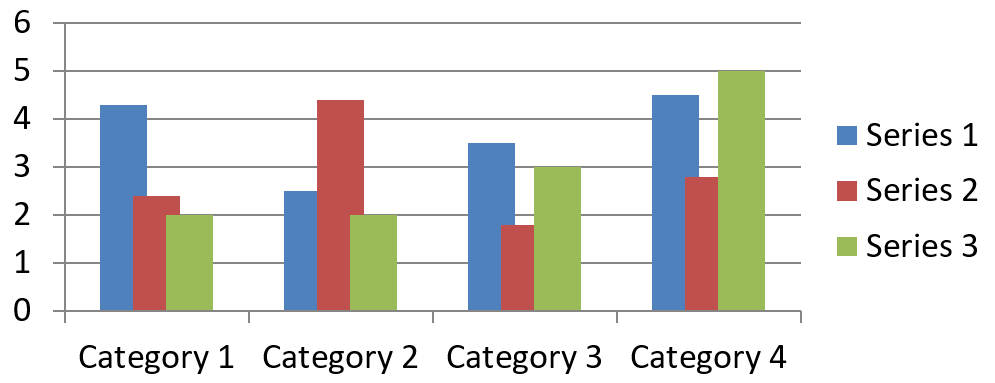
變更系列填充顏色
使用 ChartSeries.getFormat 設定整個系列的預設填充。如果某個點已經有明確的填充,其 ChartDataPoint.getFormat 設定會覆寫該點的系列填充。
以下範例將第一個系列的填充設定為純藍色:
$firstSlideIndex = 0;
$firstSeriesIndex = 0;
$blueColor = java("java.awt.Color")->BLUE;

$presentation = new Presentation();
try {
    $slide = $presentation->getSlides()->get_Item($firstSlideIndex);

    $chart = $slide->getShapes()->addChart(ChartType::ClusteredColumn, 20, 20, 500, 200);

    $series = $chart->getChartData()->getSeries()->get_Item($firstSeriesIndex);
    $series->getFormat()->getFill()->setFillType(FillType::Solid);
    $series->getFormat()->getFill()->getSolidFillColor()->setColor($blueColor);

    $presentation->save("series_color.pptx", SaveFormat::Pptx);
} finally {
    if (!java_is_null($presentation)) {
        $presentation->dispose();
    }
}
結果:

變更系列名稱
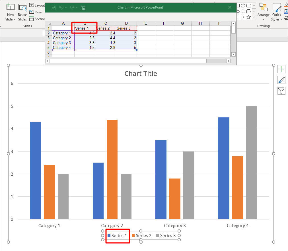
系列名稱儲存在圖表資料工作簿中,通常顯示於圖例。對於預設建立的群集柱形圖,儲存格 B1(第 0 列第 1 欄)包含第一個系列的名稱。以下範例中的命名變數明確說明了此結構:
$firstSlideIndex = 0;
$worksheetIndex = 0;
$seriesNameRowIndex = 0;
$firstSeriesColumnIndex = 1;

$presentation = new Presentation();
try {
    $slide = $presentation->getSlides()->get_Item($firstSlideIndex);

    $chart = $slide->getShapes()->addChart(ChartType::ClusteredColumn, 20, 20, 500, 200);

    $workbook = $chart->getChartData()->getChartDataWorkbook();
    $seriesNameCell = $workbook->getCell($worksheetIndex, $seriesNameRowIndex, $firstSeriesColumnIndex);
    $seriesNameCell->setValue("Revenue");

    $presentation->save("series_name.pptx", SaveFormat::Pptx);
} finally {
    if (!java_is_null($presentation)) {
        $presentation->dispose();
    }
}
您也可以直接更新由 ChartSeries.getName 參照的儲存格。此作法避免假設現有圖表的特定列與欄:
$firstSlideIndex = 0;
$firstSeriesIndex = 0;
$firstNameCellIndex = 0;

$presentation = new Presentation();
try {
    $slide = $presentation->getSlides()->get_Item($firstSlideIndex);

    $chart = $slide->getShapes()->addChart(ChartType::ClusteredColumn, 20, 20, 500, 200);

    $series = $chart->getChartData()->getSeries()->get_Item($firstSeriesIndex);
    $seriesNameCell = $series->getName()->getAsCells()->get_Item($firstNameCellIndex);
    $seriesNameCell->setValue("Revenue");

    $presentation->save("series_name.pptx", SaveFormat::Pptx);
} finally {
    if (!java_is_null($presentation)) {
        $presentation->dispose();
    }
}
結果:
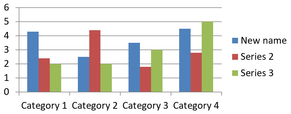
從多個儲存格建立具有名稱的系列
當產品名稱和報告期間分別儲存在不同的工作簿儲存格時,組合系列名稱會很有用。例如,您可以將 B1 中的 Product A 與 C1 中的 2026 結合為單一系列名稱,同時保持兩個部分與來源儲存格的連結。
使用 ChartDataWorkbook::getCellCollection 取得名稱範圍,然後將該集合傳遞給 ChartSeriesCollection::add。skipHiddenCells 參數控制是否包含隱藏儲存格:true 會排除,false 會包含。此範例使用 false 以包含名稱範圍內的所有儲存格。
以下範例建立一個包含一個系列與兩個資料點的簡報。儲存格 B1:C1 只提供系列名稱;A2:A3 提供類別標籤,B2:B3 提供數值。
use aspose\slides\ChartType;
use aspose\slides\Presentation;
use aspose\slides\SaveFormat;

$presentation = new Presentation();
try {
    $slide = $presentation->getSlides()->get_Item(0);

    $chart = $slide->getShapes()->addChart(ChartType::ClusteredColumn, 50, 50, 620, 180);

    $chart->getChartData()->getSeries()->clear();
    $chart->getChartData()->getCategories()->clear();
    $chart->setLegend(true);

    $workbook = $chart->getChartData()->getChartDataWorkbook();
    $workbook->clear(0);

    // 這兩個儲存格提供系列名稱。
    $workbook->getCell(0, 0, 1, "Product A");
    $workbook->getCell(0, 0, 2, "2026");
    $nameCells = $workbook->getCellCollection('Sheet1!$B$1:$C$1', false);
    $series = $chart->getChartData()->getSeries()->add($nameCells, ChartType::ClusteredColumn);

    // 分開的儲存格提供類別和數值資料點。
    $northCategory = $workbook->getCell(0, 1, 0, "North");
    $southCategory = $workbook->getCell(0, 2, 0, "South");
    $chart->getChartData()->getCategories()->add($northCategory);
    $chart->getChartData()->getCategories()->add($southCategory);
    $northValue = $workbook->getCell(0, 1, 1, 120);
    $southValue = $workbook->getCell(0, 2, 1, 150);
    $series->getDataPoints()->addDataPointForBarSeries($northValue);
    $series->getDataPoints()->addDataPointForBarSeries($southValue);

    $presentation->save("composite_series_name.pptx", SaveFormat::Pptx);
} finally {
    $presentation->dispose();
}
產生的系列名稱為 Product A 2026,兩個儲存格值之間有一個空格。圖例將此顯示為兩欄的單一條目。下圖說明結果:

取得自動系列填充顏色
ChartSeries.getAutomaticSeriesColor 會返回根據系列索引與圖表樣式計算出的顏色。這是未明確定義系列填充時使用的顏色。呼叫此方法只會讀取計算出的顏色;不會指派新的填充。
以下範例列印每個預設系列的自動顏色:
$firstSlideIndex = 0;

$presentation = new Presentation();
try {
    $slide = $presentation->getSlides()->get_Item($firstSlideIndex);

    $chart = $slide->getShapes()->addChart(ChartType::ClusteredColumn, 20, 20, 500, 200);

    $seriesCount = java_values($chart->getChartData()->getSeries()->size());
    for ($seriesIndex = 0; $seriesIndex < $seriesCount; $seriesIndex++) {
        $series = $chart->getChartData()->getSeries()->get_Item($seriesIndex);
        $automaticColor = $series->getAutomaticSeriesColor();
        $red = java_values($automaticColor->getRed());
        $green = java_values($automaticColor->getGreen());
        $blue = java_values($automaticColor->getBlue());
        echo "Series " . $seriesIndex . ": java.awt.Color[r=" . $red . ",g=" . $green . ",b=" . $blue . "]" . PHP_EOL;
    }
} finally {
    if (!java_is_null($presentation)) {
        $presentation->dispose();
    }
}
預設圖表樣式的範例輸出:
Series 0: java.awt.Color[r=79,g=129,b=189]
Series 1: java.awt.Color[r=192,g=80,b=77]
Series 2: java.awt.Color[r=155,g=187,b=89]
實際顏色取決於圖表樣式與主題。
設定系列的反轉填充顏色
對於條形、柱形與氣泡系列,ChartSeries.setInvertIfNegative 可在負值時使用不同的填充顏色。將常規系列填充設定為實心,啟用反轉,並透過 ChartSeries.getInvertedSolidFillColor 指定負值顏色。負值在工作簿中保持不變,僅更改其顯示顏色。
以下範例以單一系列取代預設圖表資料。工作表第 0 列為系列名稱,第 0 欄為類別名稱,第 1 欄為數值:
$firstSlideIndex = 0;
$worksheetIndex = 0;
$headerRowIndex = 0;
$categoryColumnIndex = 0;
$firstSeriesColumnIndex = 1;
$firstDataRowIndex = 1;

$categoryNames = ["Category 1", "Category 2", "Category 3"];
$seriesValues = [-20, 50, -30];
$redColor = java("java.awt.Color")->RED;

$presentation = new Presentation();
try {
    $slide = $presentation->getSlides()->get_Item($firstSlideIndex);

    $chart = $slide->getShapes()->addChart(ChartType::ClusteredColumn, 20, 20, 500, 200);
    $chartData = $chart->getChartData();
    $workbook = $chartData->getChartDataWorkbook();

    $chartData->getSeries()->clear();
    $chartData->getCategories()->clear();

    $seriesNameCell = $workbook->getCell($worksheetIndex, $headerRowIndex, $firstSeriesColumnIndex, "Series 1");
    $chartType = $chart->getType();
    $series = $chartData->getSeries()->add($seriesNameCell, $chartType);

    $categoryCount = count($categoryNames);
    for ($categoryIndex = 0; $categoryIndex < $categoryCount; $categoryIndex++) {
        $dataRowIndex = $firstDataRowIndex + $categoryIndex;
        $categoryName = $categoryNames[$categoryIndex];
        $seriesValue = $seriesValues[$categoryIndex];

        $categoryCell = $workbook->getCell($worksheetIndex, $dataRowIndex, $categoryColumnIndex, $categoryName);
        $chartData->getCategories()->add($categoryCell);

        $valueCell = $workbook->getCell($worksheetIndex, $dataRowIndex, $firstSeriesColumnIndex, $seriesValue);
        $series->getDataPoints()->addDataPointForBarSeries($valueCell);
    }

    $automaticSeriesColor = $series->getAutomaticSeriesColor();
    $series->getFormat()->getFill()->setFillType(FillType::Solid);
    $series->getFormat()->getFill()->getSolidFillColor()->setColor($automaticSeriesColor);
    $series->setInvertIfNegative(true);
    $series->getInvertedSolidFillColor()->setColor($redColor);

    $presentation->save("inverted_solid_fill_color.pptx", SaveFormat::Pptx);
} finally {
    if (!java_is_null($presentation)) {
        $presentation->dispose();
    }
}
結果:

您可以透過 ChartDataPoint.setInvertIfNegative 為單一點啟用反轉。以下範例在關閉系列的反轉功能後,只為所選點啟用,且為該點指派負值,以便可見效果:
$firstSlideIndex = 0;
$firstSeriesIndex = 0;
$targetDataPointIndex = 2;
$negativeValue = -30;
$redColor = java("java.awt.Color")->RED;

$presentation = new Presentation();
try {
    $slide = $presentation->getSlides()->get_Item($firstSlideIndex);

    $chart = $slide->getShapes()->addChart(ChartType::ClusteredColumn, 20, 20, 500, 200);

    $series = $chart->getChartData()->getSeries()->get_Item($firstSeriesIndex);
    $automaticSeriesColor = $series->getAutomaticSeriesColor();
    $series->getFormat()->getFill()->setFillType(FillType::Solid);
    $series->getFormat()->getFill()->getSolidFillColor()->setColor($automaticSeriesColor);
    $series->getInvertedSolidFillColor()->setColor($redColor);
    $series->setInvertIfNegative(false);

    $dataPoint = $series->getDataPoints()->get_Item($targetDataPointIndex);
    $dataPoint->getValue()->getAsCell()->setValue($negativeValue);
    $dataPoint->setInvertIfNegative(true);

    $presentation->save("data_point_invert_color_if_negative.pptx", SaveFormat::Pptx);
} finally {
    if (!java_is_null($presentation)) {
        $presentation->dispose();
    }
}
清除特定資料點的值
若要在不移除其他點的情況下使某個點為空,請將其對應的工作簿儲存格設為 null。對於柱形圖,繪製值可透過 ChartDataPoint.getValue 取得。資料點仍保留在相同的類別位置,但圖表會依照空白值設定將其視為空白。
以下範例僅清除第一個系列的第二個點:
$firstSlideIndex = 0;
$firstSeriesIndex = 0;
$targetDataPointIndex = 1;

$presentation = new Presentation();
try {
    $slide = $presentation->getSlides()->get_Item($firstSlideIndex);

    $chart = $slide->getShapes()->addChart(ChartType::ClusteredColumn, 20, 20, 500, 200);

    $series = $chart->getChartData()->getSeries()->get_Item($firstSeriesIndex);
    $dataPoint = $series->getDataPoints()->get_Item($targetDataPointIndex);
    $dataPoint->getValue()->getAsCell()->setValue(null);

    $presentation->save("clear_data_point_value.pptx", SaveFormat::Pptx);
} finally {
    if (!java_is_null($presentation)) {
        $presentation->dispose();
    }
}
散佈圖使用分別的 X 與 Y 儲存格,氣泡圖亦使用尺寸儲存格。僅清除您打算移除的值所在的儲存格。若只想保留其他點,請勿呼叫 ChartDataPointCollection.clear,因為該方法會移除集合中的所有資料點。
控制空白儲存格的顯示
隱藏的儲存格內含值的情況與空白儲存格是不同的案例。若要包含或排除隱藏工作表列與欄位的資料,請參閱 從隱藏列與欄位包含資料。
空白工作簿儲存格代表遺失的資料;包含 0 的儲存格則代表已知的數值。呼叫 ChartDataCell::setValue 並傳入 null 即可使儲存格變為空白。數值零始終保持為零,無論空白儲存格設定為何。
使用 Chart::setDisplayBlanksAs 來選擇圖表如何顯示空白儲存格。此設定適用於整個圖表,會改變空白的繪製方式,而不會將空白工作簿儲存格填入零或插值。
以下自行完整的範例建立一個含有單一系列的折線圖,清除第 3 天的值,並分別使用每種模式儲存同一圖表。此範例不需要輸入檔案。ChartDataWorkbook 使用工作表 0,欄 0 為類別標籤,欄 1 為數值;列 0 為系列名稱。最終資料為 10, 20, empty, 30, 40。
use aspose\slides\ChartType;
use aspose\slides\DisplayBlanksAsType;
use aspose\slides\Presentation;
use aspose\slides\SaveFormat;

$presentation = new Presentation();
try {
    $slide = $presentation->getSlides()->get_Item(0);

    $chart = $slide->getShapes()->addChart(ChartType::LineWithMarkers, 40, 40, 640, 400);
    $chartData = $chart->getChartData();
    $workbook = $chartData->getChartDataWorkbook();

    $chartData->getSeries()->clear();
    $chartData->getCategories()->clear();

    $seriesNameCell = $workbook->getCell(0, 0, 1, "Measurements");
    $series = $chartData->getSeries()->add($seriesNameCell, $chart->getType());
    $values = [10, 20, 25, 30, 40];

    for ($i = 0; $i < count($values); $i++) {
        $categoryCell = $workbook->getCell(0, $i + 1, 0, "Day " . ($i + 1));
        $chartData->getCategories()->add($categoryCell);
        $valueCell = $workbook->getCell(0, $i + 1, 1, $values[$i]);
        $series->getDataPoints()->addDataPointForLineSeries($valueCell);
    }

    // 將第 3 天真正留空,同時保留其類別和資料點。
    $workbook->getCell(0, 3, 1)->setValue(null);

    $modes = [DisplayBlanksAsType::Gap, DisplayBlanksAsType::Zero, DisplayBlanksAsType::Span];
    $modeNames = ["Gap", "Zero", "Span"];
    for ($i = 0; $i < count($modes); $i++) {
        $chart->setDisplayBlanksAs($modes[$i]);
        $presentation->save("empty_cells_" . $modeNames[$i] . ".pptx", SaveFormat::Pptx);
    }
} finally {
    $presentation->dispose();
}
每個輸出檔案在儲存前均已設定相應模式:empty_cells_Gap.pptx、empty_cells_Zero.pptx 與 empty_cells_Span.pptx。若只需一個版本,可在儲存簡報前設定所需模式,然後一次儲存。
下圖比較三個檔案的相同資料。第 3 天在工作簿中皆為空白:

可見效果取決於圖表類型。折線圖可輕易比較三種模式。條形與柱形圖沒有線條可在缺少的類別間連接,因此 Span 無法產生上圖所示的連接段落;缺少的柱形與零高度柱形也可能看起來相似。同樣地,僅有標記的散佈圖亦沒有連接線。請勿期望每種圖表類型都有三種明顯不同的結果;務必檢查您使用的圖表類型的輸出。
設定系列間隙寬度
間隙寬度是相鄰條形或柱形叢集之間的空間,表達為條形或柱形寬度的百分比。與重疊度類似,它屬於父系列群組,而非單一系列。對該群組呼叫一次 ChartSeriesGroup.setGapWidth 即可。較大的值會在叢集之間產生更多空間,較小的值則使它們更緊密。
以下範例變更間隙寬度,並僅儲存最終的簡報:
$firstSlideIndex = 0;
$firstSeriesIndex = 0;
$gapWidthPercent = 30;

$presentation = new Presentation();
try {
    $slide = $presentation->getSlides()->get_Item($firstSlideIndex);

    $chart = $slide->getShapes()->addChart(ChartType::StackedColumn, 20, 20, 500, 200);

    $series = $chart->getChartData()->getSeries()->get_Item($firstSeriesIndex);
    $series->getParentSeriesGroup()->setGapWidth($gapWidthPercent);

    $presentation->save("gap_width_30.pptx", SaveFormat::Pptx);
} finally {
    if (!java_is_null($presentation)) {
        $presentation->dispose();
    }
}
結果:
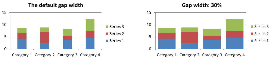
FAQ
哪些圖表類型支援資料系列?
所有由 ChartType 列舉的圖表類型皆使用圖表資料,但其系列的值結構或設定並不完全相同。例如,類別圖表使用類別與值,散佈圖使用 X 與 Y 值,氣泡圖則額外加入氣泡大小。請使用與系列類型相符的資料點建立方法。重疊度與間隙寬度等選項僅適用於相容的條形或柱形群組。
什麼是圖表系列群組?
ChartSeriesGroup 包含共享群組層級繪製設定的相容系列。組合圖表可以包含多個群組,因此透過單一系列取得的群組設定不一定會影響圖表中的所有系列。
新建立的圖表是否包含預設資料?
是。預設情況下,ShapeCollection.addChart 會建立範例系列、類別與值。您可以編輯這些儲存格,或在加入完全自訂的資料集之前先清除系列與類別集合。亦可使用其他重載建立不含預設資料的圖表。
圖表物件如何連結到工作簿儲存格?
系列名稱、類別標籤與資料點值皆參照 ChartDataWorkbook 中的儲存格。變更參照的儲存格即會更新相對應的圖表元素。建構自訂資料時,請保持類別列與系列值列對齊,以確保每個點均在預期的類別下繪製。
如何只清除單一資料點而非整個系列?
將相關的值儲存格設為 null,即可保留該點的類別位置作為空白點。僅在需要移除該系列所有點時才使用 ChartDataPointCollection.clear。
空白點如何顯示?
結果取決於圖表類型以及透過 Chart.setDisplayBlanksAs 設定的值。支援的圖表可以將空白顯示為間隙、零值或連接相鄰點。選擇最符合簡報中遺失資料意義的設定。請參閱 控制空白儲存格的顯示 以取得完整範例與視覺比較。
負值如何格式化?
對於支援的條形、柱形與氣泡系列,呼叫 ChartSeries.setInvertIfNegative 並設定由 ChartSeries.getInvertedSolidFillColor 取得的顏色。您也可以透過 ChartDataPoint.setInvertIfNegative 為單一點覆寫此行為。這些方法僅影響格式,而不會改變儲存的數值。
當系列與資料點同時設定格式時,哪個優先?
對於該點而言,明確的資料點格式會優先於系列格式。其他點仍會使用明確的系列格式,或在未定義系列格式時使用自動圖表樣式與主題。群組設定如重疊度與間隙寬度屬於版面配置,並非點層級的格式覆寫。
圖表能包含的系列數量是否有限制?
Aspose.Slides 本身並未設定固定的系列上限。實務上,簡報檔案的限制、可用記憶體、渲染時間與圖表可讀性等因素會決定實際可容納的系列數量。
當柱狀圖欄位過於接近或過遠時該如何調整?
對相應的父系列群組呼叫 ChartSeriesGroup.setGapWidth。增大數值可擴大叢集之間的間距,減小則使叢集更緊密。