
PHP में प्रस्तुतियों में चार्ट डेटा श्रृंखला प्रबंधित करें
अवलोकन
एक चार्ट अपने प्लॉट किए गए डेटा को चार्ट डेटा वर्कबुक में संग्रहीत करता है। एक ChartSeries एक संबंधित मानों के सेट का प्रतिनिधित्व करता है, और श्रृंखला में प्रत्येक ChartDataPoint एक या अधिक वर्कबुक कोशिकाओं को संदर्भित करता है। ChartCategory ऑब्जेक्ट्स श्रृंखला द्वारा साझा किए गए लेबल या समूह मान प्रदान करते हैं। इसलिए श्रृंखला का नाम, श्रेणियाँ, और बिंदु मान ChartDataCell ऑब्जेक्ट्स से जुड़े होते हैं, न कि केवल प्रदर्शित पाठ के रूप में संग्रहीत।
एक सामान्य श्रेणी चार्ट के लिए, डिफ़ॉल्ट वर्कबुक श्रृंखला नामों के लिए पंक्ति 0, श्रेणी नामों के लिए स्तंभ 0, और शेष कोशिकाएँ श्रृंखला मानों के लिए उपयोग करती है। ChartDataWorkbook.getCell को पास किए गए वर्कशीट, पंक्ति और स्तंभ अनुक्रम शून्य-आधारित होते हैं। यह लेआउट तब उपयोगी होता है जब आप डिफ़ॉल्ट डेटा के साथ चार्ट बनाते हैं, लेकिन यह मानें नहीं कि प्रत्येक मौजूदा चार्ट इसका उपयोग करता है। एक लोडेड प्रस्तुति के लिए, वर्कबुक मान बदलने से पहले श्रृंखला, श्रेणियों और डेटा बिंदुओं द्वारा संदर्भित कोशिकाओं की जाँच करें।
चार्ट सेटिंग्स के तीन अलग-अलग स्तर हैं:
- सीरीज़-स्तर सेटिंग्स, जैसे ChartSeries.getFormat, एक सीरीज़ के सभी बिंदुओं के लिए डिफ़ॉल्ट स्वरूप प्रदान करती हैं।
- डेटा-बिंदु सेटिंग्स, जैसे ChartDataPoint.getFormat, एक बिंदु के लिए सीरीज़ का स्वरूप ओवरराइड करती हैं।
- समूह सेटिंग्स समान ChartSeriesGroup के अंतर्गत आने वाली संगत सीरीज़ पर लागू होती हैं। जब आपको ओवरलैप या गैप चौड़ाई जैसे विकल्प सेट करने की आवश्यकता हो, तो ChartSeries.getParentSeriesGroup के माध्यम से समूह तक पहुंचें।
जब कोई स्पष्ट बिंदु या श्रृंखला भराव सेट नहीं किया गया हो, तो चार्ट शैली और थीम स्वचालित स्वरूप निर्धारित करती हैं। जब श्रृंखला और बिंदु दोनों का फ़ॉर्मेट मौजूद हो, तो बिंदु का फ़ॉर्मेट उस बिंदु के लिए प्राथमिकता रखता है।
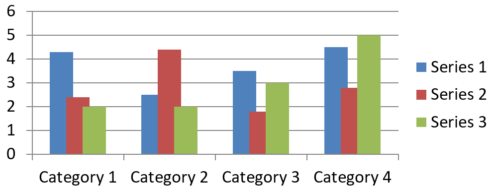
चार्ट सीरीज़ ओवरलैप सेट करें
ChartSeries.getOverlap 2D चार्ट में बार या कॉलम के ओवरलैप प्रतिशत को -100 से 100 तक रिपोर्ट करता है। यह पैरेंट श्रृंखला समूह पर सेटिंग का केवल-पढ़ने योग्य प्रक्षेपण है। समान समूह में प्रत्येक संगत सीरीज़ को अपडेट करने के लिए ChartSeriesGroup.setOverlap का उपयोग करें। यह विकल्प उन चार्ट प्रकारों पर लागू होता है जो समूहित बार या कॉलम प्रदर्शित करते हैं; यह संयोजन चार्ट में असंबंधित सीरीज़ समूहों को प्रभावित नहीं करता।
निम्नलिखित उदाहरण प्रथम श्रृंखला को शामिल करने वाले समूह के लिए ओवरलैप सेट करता है:
$firstSlideIndex = 0;
$firstSeriesIndex = 0;
$overlapPercent = 30;

$presentation = new Presentation();
try {
    $slide = $presentation->getSlides()->get_Item($firstSlideIndex);

    // नया चार्ट नमूना श्रृंखला, श्रेणियां और मान रखता है।
    $chart = $slide->getShapes()->addChart(ChartType::ClusteredColumn, 20, 20, 500, 200);

    $series = $chart->getChartData()->getSeries()->get_Item($firstSeriesIndex);
    $series->getParentSeriesGroup()->setOverlap($overlapPercent);

    $presentation->save("series_overlap.pptx", SaveFormat::Pptx);
} finally {
    if (!java_is_null($presentation)) {
        $presentation->dispose();
    }
}
परिणाम:
सीरीज़ फिल रंग बदलें
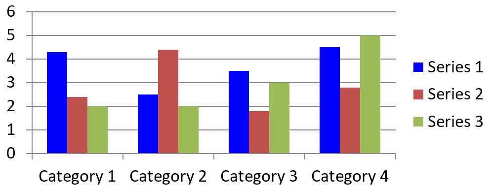
पूरी सीरीज़ के लिए डिफ़ॉल्ट भराव सेट करने हेतु ChartSeries.getFormat का उपयोग करें। यदि किसी बिंदु के पास पहले से स्पष्ट भराव है, तो उसके ChartDataPoint.getFormat सेटिंग उस बिंदु के लिए श्रृंखला भराव को ओवरराइड करती है।
निम्नलिखित उदाहरण प्रथम सीरीज़ पर ठोस नीला भराव लागू करता है:
$firstSlideIndex = 0;
$firstSeriesIndex = 0;
$blueColor = java("java.awt.Color")->BLUE;

$presentation = new Presentation();
try {
    $slide = $presentation->getSlides()->get_Item($firstSlideIndex);

    $chart = $slide->getShapes()->addChart(ChartType::ClusteredColumn, 20, 20, 500, 200);

    $series = $chart->getChartData()->getSeries()->get_Item($firstSeriesIndex);
    $series->getFormat()->getFill()->setFillType(FillType::Solid);
    $series->getFormat()->getFill()->getSolidFillColor()->setColor($blueColor);

    $presentation->save("series_color.pptx", SaveFormat::Pptx);
} finally {
    if (!java_is_null($presentation)) {
        $presentation->dispose();
    }
}
परिणाम:
सीरीज़ नाम बदलें
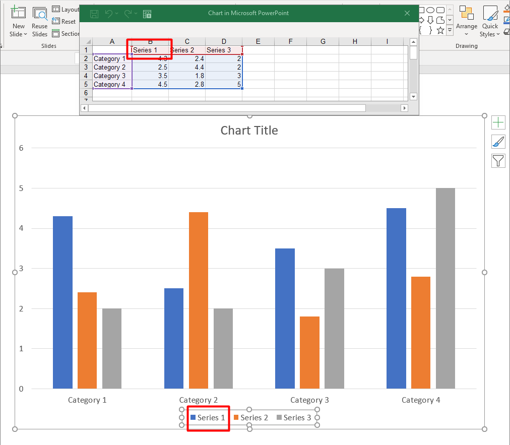
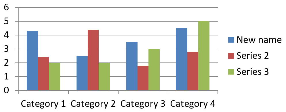
एक सीरीज़ नाम चार्ट डेटा वर्कबुक में संग्रहीत होता है और सामान्यतः लेजेंड में प्रदर्शित होता है। क्लस्टर्ड कॉलम चार्ट के लिए बनाई गई डिफ़ॉल्ट वर्कबुक में, कोशिका B1 पंक्ति 0, स्तंभ 1 पर स्थित होती है और पहले सीरीज़ का नाम रखती है। निम्नलिखित उदाहरण में नामित चर इस संरचना को स्पष्ट करते हैं:
$firstSlideIndex = 0;
$worksheetIndex = 0;
$seriesNameRowIndex = 0;
$firstSeriesColumnIndex = 1;

$presentation = new Presentation();
try {
    $slide = $presentation->getSlides()->get_Item($firstSlideIndex);

    $chart = $slide->getShapes()->addChart(ChartType::ClusteredColumn, 20, 20, 500, 200);

    $workbook = $chart->getChartData()->getChartDataWorkbook();
    $seriesNameCell = $workbook->getCell($worksheetIndex, $seriesNameRowIndex, $firstSeriesColumnIndex);
    $seriesNameCell->setValue("Revenue");

    $presentation->save("series_name.pptx", SaveFormat::Pptx);
} finally {
    if (!java_is_null($presentation)) {
        $presentation->dispose();
    }
}
आप ChartSeries.getName द्वारा पहले से संदर्भित कोशिका को भी अपडेट कर सकते हैं। यह दृष्टिकोण मौजूदा चार्ट में किसी विशिष्ट पंक्ति और स्तंभ को मानने से बचाता है:
$firstSlideIndex = 0;
$firstSeriesIndex = 0;
$firstNameCellIndex = 0;

$presentation = new Presentation();
try {
    $slide = $presentation->getSlides()->get_Item($firstSlideIndex);

    $chart = $slide->getShapes()->addChart(ChartType::ClusteredColumn, 20, 20, 500, 200);

    $series = $chart->getChartData()->getSeries()->get_Item($firstSeriesIndex);
    $seriesNameCell = $series->getName()->getAsCells()->get_Item($firstNameCellIndex);
    $seriesNameCell->setValue("Revenue");

    $presentation->save("series_name.pptx", SaveFormat::Pptx);
} finally {
    if (!java_is_null($presentation)) {
        $presentation->dispose();
    }
}
परिणाम:
कई कोशिकाओं से नाम के साथ सीरीज़ बनाएं
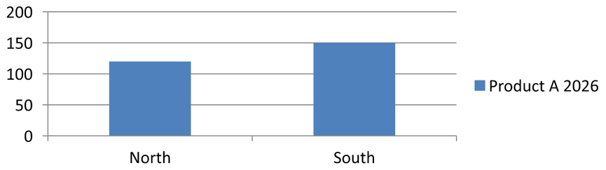
जब उत्पाद नाम और रिपोर्टिंग अवधि अलग-अलग वर्कबुक कोशिकाओं में संग्रहीत हों, तो संयुक्त सीरीज़ नाम उपयोगी होता है। उदाहरण के तौर पर, आप B1 में Product A और C1 में 2026 को मिलाकर एकल सीरीज़ नाम बना सकते हैं, जबकि दोनों भागों को उनके स्रोत कोशिकाओं से जुड़ा रख सकते हैं।
नाम रेंज प्राप्त करने के लिए ChartDataWorkbook::getCellCollection का उपयोग करें, फिर उस संग्रह को ChartSeriesCollection::add को पास करें। skipHiddenCells तर्क यह नियंत्रित करता है कि छिपी हुई कोशिकाएँ शामिल हों या नहीं: true उन्हें बाहर करता है, जबकि false उन्हें शामिल करता है। यह उदाहरण false का उपयोग करके नाम रेंज की सभी कोशिकाओं को शामिल करता है।
निम्नलिखित उदाहरण एक प्रस्तुति बनाता है जिसमें एक सीरीज़ और दो डेटा बिंदु होते हैं। कोशिकाएँ B1:C1 केवल सीरीज़ नाम प्रदान करती हैं; A2:A3 श्रेणी लेबल देती हैं, और B2:B3 संख्यात्मक मान देती हैं।
use aspose\slides\ChartType;
use aspose\slides\Presentation;
use aspose\slides\SaveFormat;

$presentation = new Presentation();
try {
    $slide = $presentation->getSlides()->get_Item(0);

    $chart = $slide->getShapes()->addChart(ChartType::ClusteredColumn, 50, 50, 620, 180);

    $chart->getChartData()->getSeries()->clear();
    $chart->getChartData()->getCategories()->clear();
    $chart->setLegend(true);

    $workbook = $chart->getChartData()->getChartDataWorkbook();
    $workbook->clear(0);

    // ये दो कोशिकाएँ श्रृंखला का नाम प्रदान करती हैं।
    $workbook->getCell(0, 0, 1, "Product A");
    $workbook->getCell(0, 0, 2, "2026");
    $nameCells = $workbook->getCellCollection('Sheet1!$B$1:$C$1', false);
    $series = $chart->getChartData()->getSeries()->add($nameCells, ChartType::ClusteredColumn);

    // अलग कोशिकाएँ श्रेणियाँ और संख्यात्मक डेटा बिंदु प्रदान करती हैं।
    $northCategory = $workbook->getCell(0, 1, 0, "North");
    $southCategory = $workbook->getCell(0, 2, 0, "South");
    $chart->getChartData()->getCategories()->add($northCategory);
    $chart->getChartData()->getCategories()->add($southCategory);
    $northValue = $workbook->getCell(0, 1, 1, 120);
    $southValue = $workbook->getCell(0, 2, 1, 150);
    $series->getDataPoints()->addDataPointForBarSeries($northValue);
    $series->getDataPoints()->addDataPointForBarSeries($southValue);

    $presentation->save("composite_series_name.pptx", SaveFormat::Pptx);
} finally {
    $presentation->dispose();
}
परिणामस्वरूप सीरीज़ नाम Product A 2026 होगा, जिसमें दो कोशिका मानों के बीच एक स्पेस होगा। लेजेंड इसे दोनों स्तंभों के लिए एक प्रविष्टि के रूप में दिखाएगा। नीचे की छवि परिणाम को दर्शाती है:
ऑटोमैटिक सीरीज़ फिल रंग प्राप्त करें
ChartSeries.getAutomaticSeriesColor श्रृंखला अनुक्रम और चार्ट शैली से गणना किया गया रंग लौटाता है। यह वह रंग है जो तब उपयोग होता है जब श्रृंखला भराव स्पष्ट रूप से परिभाषित नहीं किया गया हो। इस मेथड को कॉल करने से गणना किया गया रंग पढ़ा जाता है; यह नया भराव असाइन नहीं करता।
निम्नलिखित उदाहरण प्रत्येक डिफ़ॉल्ट श्रृंखला का स्वचालित रंग प्रिंट करता है:
$firstSlideIndex = 0;

$presentation = new Presentation();
try {
    $slide = $presentation->getSlides()->get_Item($firstSlideIndex);

    $chart = $slide->getShapes()->addChart(ChartType::ClusteredColumn, 20, 20, 500, 200);

    $seriesCount = java_values($chart->getChartData()->getSeries()->size());
    for ($seriesIndex = 0; $seriesIndex < $seriesCount; $seriesIndex++) {
        $series = $chart->getChartData()->getSeries()->get_Item($seriesIndex);
        $automaticColor = $series->getAutomaticSeriesColor();
        $red = java_values($automaticColor->getRed());
        $green = java_values($automaticColor->getGreen());
        $blue = java_values($automaticColor->getBlue());
        echo "Series " . $seriesIndex . ": java.awt.Color[r=" . $red . ",g=" . $green . ",b=" . $blue . "]" . PHP_EOL;
    }
} finally {
    if (!java_is_null($presentation)) {
        $presentation->dispose();
    }
}
डिफ़ॉल्ट चार्ट शैली के लिए उदाहरण आउटपुट:
Series 0: java.awt.Color[r=79,g=129,b=189]
Series 1: java.awt.Color[r=192,g=80,b=77]
Series 2: java.awt.Color[r=155,g=187,b=89]
सटीक रंग चार्ट शैली और थीम पर निर्भर करते हैं।
चार्ट सीरीज़ के लिए इनवर्ट फिल रंग सेट करें
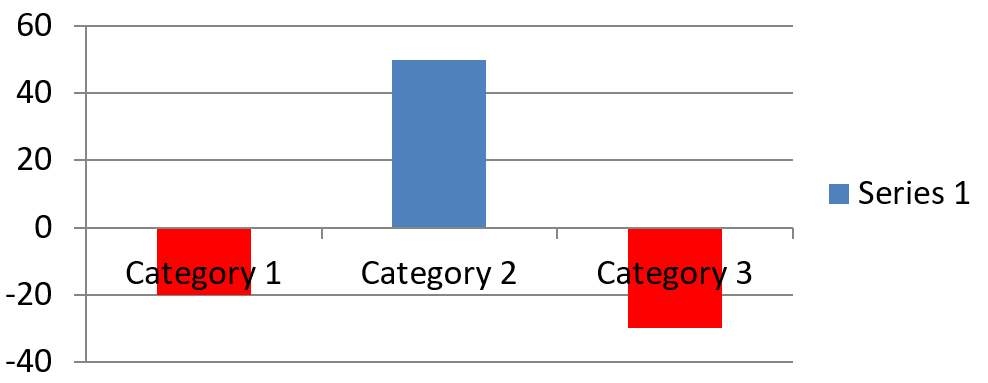
बार, कॉलम और बबल श्रृंखलाओं के लिए, ChartSeries.setInvertIfNegative नकारात्मक मानों को अलग रंग से दर्शा सकता है। नियमित श्रृंखला भराव को ठोस सेट करें, इनवर्शन सक्षम करें, और नकारात्मक‑मान रंग को ChartSeries.getInvertedSolidFillColor के माध्यम से असाइन करें। नकारात्मक संख्याएँ वर्कबुक में अपरिवर्तित रहती हैं; केवल उनका प्रदर्शन रंग बदलता है।
निम्नलिखित उदाहरण डिफ़ॉल्ट चार्ट डेटा को एक श्रृंखला से बदलता है। वर्कशीट की पंक्ति 0 में श्रृंखला नाम, स्तंभ 0 में श्रेणी नाम, और स्तंभ 1 में मान होते हैं:
$firstSlideIndex = 0;
$worksheetIndex = 0;
$headerRowIndex = 0;
$categoryColumnIndex = 0;
$firstSeriesColumnIndex = 1;
$firstDataRowIndex = 1;

$categoryNames = ["Category 1", "Category 2", "Category 3"];
$seriesValues = [-20, 50, -30];
$redColor = java("java.awt.Color")->RED;

$presentation = new Presentation();
try {
    $slide = $presentation->getSlides()->get_Item($firstSlideIndex);

    $chart = $slide->getShapes()->addChart(ChartType::ClusteredColumn, 20, 20, 500, 200);
    $chartData = $chart->getChartData();
    $workbook = $chartData->getChartDataWorkbook();

    $chartData->getSeries()->clear();
    $chartData->getCategories()->clear();

    $seriesNameCell = $workbook->getCell($worksheetIndex, $headerRowIndex, $firstSeriesColumnIndex, "Series 1");
    $chartType = $chart->getType();
    $series = $chartData->getSeries()->add($seriesNameCell, $chartType);

    $categoryCount = count($categoryNames);
    for ($categoryIndex = 0; $categoryIndex < $categoryCount; $categoryIndex++) {
        $dataRowIndex = $firstDataRowIndex + $categoryIndex;
        $categoryName = $categoryNames[$categoryIndex];
        $seriesValue = $seriesValues[$categoryIndex];

        $categoryCell = $workbook->getCell($worksheetIndex, $dataRowIndex, $categoryColumnIndex, $categoryName);
        $chartData->getCategories()->add($categoryCell);

        $valueCell = $workbook->getCell($worksheetIndex, $dataRowIndex, $firstSeriesColumnIndex, $seriesValue);
        $series->getDataPoints()->addDataPointForBarSeries($valueCell);
    }

    $automaticSeriesColor = $series->getAutomaticSeriesColor();
    $series->getFormat()->getFill()->setFillType(FillType::Solid);
    $series->getFormat()->getFill()->getSolidFillColor()->setColor($automaticSeriesColor);
    $series->setInvertIfNegative(true);
    $series->getInvertedSolidFillColor()->setColor($redColor);

    $presentation->save("inverted_solid_fill_color.pptx", SaveFormat::Pptx);
} finally {
    if (!java_is_null($presentation)) {
        $presentation->dispose();
    }
}
परिणाम:
आप ChartDataPoint.setInvertIfNegative के द्वारा एक बिंदु के लिए इनवर्शन सक्षम कर सकते हैं। निम्न उदाहरण में श्रृंखला के लिए इनवर्शन अक्षम किया गया है और केवल चयनित बिंदु के लिए सक्षम किया गया है। बिंदु को नकारात्मक मान भी असाइन किया गया है ताकि प्रभाव स्पष्ट दिखे:
$firstSlideIndex = 0;
$firstSeriesIndex = 0;
$targetDataPointIndex = 2;
$negativeValue = -30;
$redColor = java("java.awt.Color")->RED;

$presentation = new Presentation();
try {
    $slide = $presentation->getSlides()->get_Item($firstSlideIndex);

    $chart = $slide->getShapes()->addChart(ChartType::ClusteredColumn, 20, 20, 500, 200);

    $series = $chart->getChartData()->getSeries()->get_Item($firstSeriesIndex);
    $automaticSeriesColor = $series->getAutomaticSeriesColor();
    $series->getFormat()->getFill()->setFillType(FillType::Solid);
    $series->getFormat()->getFill()->getSolidFillColor()->setColor($automaticSeriesColor);
    $series->getInvertedSolidFillColor()->setColor($redColor);
    $series->setInvertIfNegative(false);

    $dataPoint = $series->getDataPoints()->get_Item($targetDataPointIndex);
    $dataPoint->getValue()->getAsCell()->setValue($negativeValue);
    $dataPoint->setInvertIfNegative(true);

    $presentation->save("data_point_invert_color_if_negative.pptx", SaveFormat::Pptx);
} finally {
    if (!java_is_null($presentation)) {
        $presentation->dispose();
    }
}
विशिष्ट डेटा बिंदु मान साफ़ करें
एक बिंदु को खाली करने के लिए उसके समर्थन वर्कबुक सेल को null सेट करें, जबकि अन्य बिंदुओं को न हटाएँ। कॉलम चार्ट के लिए, प्लॉट किया गया मान ChartDataPoint.getValue के माध्यम से उपलब्ध होता है। डेटा बिंदु समान श्रेणी स्थिति पर रहता है, लेकिन चार्ट उसकी मान को खाली मानता है जैसा कि चार्ट की खाली‑मान सेटिंग्स में परिभाषित है।
निम्नलिखित उदाहरण प्रथम श्रृंखला के दूसरे बिंदु को ही साफ़ करता है:
$firstSlideIndex = 0;
$firstSeriesIndex = 0;
$targetDataPointIndex = 1;

$presentation = new Presentation();
try {
    $slide = $presentation->getSlides()->get_Item($firstSlideIndex);

    $chart = $slide->getShapes()->addChart(ChartType::ClusteredColumn, 20, 20, 500, 200);

    $series = $chart->getChartData()->getSeries()->get_Item($firstSeriesIndex);
    $dataPoint = $series->getDataPoints()->get_Item($targetDataPointIndex);
    $dataPoint->getValue()->getAsCell()->setValue(null);

    $presentation->save("clear_data_point_value.pptx", SaveFormat::Pptx);
} finally {
    if (!java_is_null($presentation)) {
        $presentation->dispose();
    }
}
स्कैटर चार्ट अलग‑अलग X और Y सेल का उपयोग करते हैं, और बबल चार्ट एक आकार सेल भी उपयोग करता है। केवल उस सेल को साफ़ करें जो आप हटाना चाहते हैं। जब आप अन्य बिंदुओं को रखना चाहते हैं, तो ChartDataPointCollection.clear न बुलाएँ, क्योंकि यह मेथड संग्रह से सभी डेटा बिंदु हटा देता है।
खाली कोशिकाओं के प्रदर्शन को नियंत्रित करें
छिपी हुई कोशिकाएँ जिनमें मान होते हैं, वे खाली कोशिकाओं से अलग मामले हैं। छिपी हुई वर्कशीट पंक्तियों और स्तंभों से डेटा को शामिल या बाहर करने के लिए देखें छिपी पंक्तियों और स्तंभों से डेटा शामिल करें।
एक खाली वर्कबुक सेल गायब डेटा को दर्शाता है; 0 वाला सेल ज्ञात संख्यात्मक मान को दर्शाता है। null के साथ ChartDataCell::setValue को कॉल करके सेल को खाली बनायें। संख्यात्मक शून्य ब्लैंक‑सेल सेटिंग के बावजूद शून्य ही रहता है।
खाली कोशिकाओं को चार्ट कैसे दिखाता है, इसे चुनने के लिए Chart::setDisplayBlanksAs का उपयोग करें। यह सेटिंग पूरे चार्ट पर लागू होती है। यह ब्लैंक्स के प्लॉटिंग तरीके को बदलती है, बिना खाली वर्कबुक सेल को शून्य या अन्य मान से भरने के।
निम्नलिखित स्वतंत्र उदाहरण एक लाइन चार्ट बनाता है जिसमें एक श्रृंखला है, दिन 3 का मान साफ़ करता है, और प्रत्येक मोड के साथ उसी चार्ट को सहेजता है। कोई इनपुट फ़ाइल आवश्यक नहीं है। ChartDataWorkbook वर्कशीट 0, स्तंभ 0 को श्रेणी लेबल के लिए, और स्तंभ 1 को मानों के लिए उपयोग करता है; पंक्ति 0 में श्रृंखला नाम रहता है। अंतिम डेटा 10, 20, empty, 30, 40 है।
use aspose\slides\ChartType;
use aspose\slides\DisplayBlanksAsType;
use aspose\slides\Presentation;
use aspose\slides\SaveFormat;

$presentation = new Presentation();
try {
    $slide = $presentation->getSlides()->get_Item(0);

    $chart = $slide->getShapes()->addChart(ChartType::LineWithMarkers, 40, 40, 640, 400);
    $chartData = $chart->getChartData();
    $workbook = $chartData->getChartDataWorkbook();

    $chartData->getSeries()->clear();
    $chartData->getCategories()->clear();

    $seriesNameCell = $workbook->getCell(0, 0, 1, "Measurements");
    $series = $chartData->getSeries()->add($seriesNameCell, $chart->getType());
    $values = [10, 20, 25, 30, 40];

    for ($i = 0; $i < count($values); $i++) {
        $categoryCell = $workbook->getCell(0, $i + 1, 0, "Day " . ($i + 1));
        $chartData->getCategories()->add($categoryCell);
        $valueCell = $workbook->getCell(0, $i + 1, 1, $values[$i]);
        $series->getDataPoints()->addDataPointForLineSeries($valueCell);
    }

    // Day 3 को वास्तव में खाली छोड़ें, जबकि उसकी श्रेणी और डेटा बिंदु को बनाए रखें।
    $workbook->getCell(0, 3, 1)->setValue(null);

    $modes = [DisplayBlanksAsType::Gap, DisplayBlanksAsType::Zero, DisplayBlanksAsType::Span];
    $modeNames = ["Gap", "Zero", "Span"];
    for ($i = 0; $i < count($modes); $i++) {
        $chart->setDisplayBlanksAs($modes[$i]);
        $presentation->save("empty_cells_" . $modeNames[$i] . ".pptx", SaveFormat::Pptx);
    }
} finally {
    $presentation->dispose();
}
प्रत्येक आउटपुट फ़ाइल सहेजने से पहले निर्धारित मोड को दर्शाती है: empty_cells_Gap.pptx, empty_cells_Zero.pptx, और empty_cells_Span.pptx। केवल एक संस्करण सहेजने के लिए, इच्छित मोड असाइन करें और प्रस्तुति को एक बार सहेजें, मोड्स पर पुनरावृति न करें।
नीचे तुलना में समान डेटा तीनों फाइलों में दिखाया गया है। दिन 3 कार्यपुस्तिका में प्रत्येक मामले में खाली है:
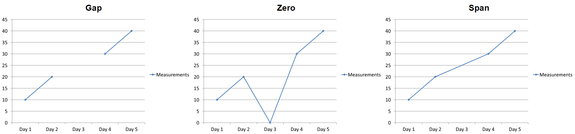
दिखाया गया प्रभाव चार्ट प्रकार पर निर्भर करता है। लाइन चार्ट सभी तीन मोड को आसानी से तुलना करने देता है। बार और कॉलम चार्ट में गायब श्रेणी के ऊपर कोई रेखा नहीं होती, इसलिए Span ऊपर दिखाए गए कनेक्टिंग खंड को उत्पन्न नहीं कर सकता; एक गायब स्तंभ और शून्य‑ऊँचाई वाला स्तंभ भी समान दिख सकते हैं। इसी तरह, केवल मार्कर वाले स्कैटर चार्ट में कोई कनेक्टिंग लाइन नहीं होती। सभी चार्ट प्रकारों में तीन अलग-अलग परिणाम की उम्मीद न रखें; जिस प्रकार का उपयोग कर रहे हैं, उसके लिए आउटपुट की जाँच करें।
सीरीज़ गैप चौड़ाई सेट करें
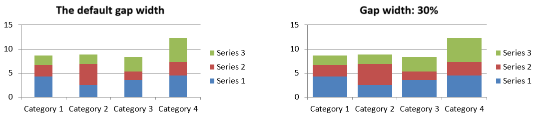
गैप चौड़ाई सन्निहित बार या कॉलम क्लस्टरों के बीच की जगह है, जिसे बार या कॉलम की चौड़ाई के प्रतिशत के रूप में व्यक्त किया जाता है। ओवरलैप की तरह, यह पैरेंट श्रृंखला समूह से संबंधित है, न कि किसी एक श्रृंखला से। समूह के लिए एक बार ChartSeriesGroup.setGapWidth कॉल करें। बड़ी मान क्लस्टरों के बीच अधिक जगह बनाती है; छोटी मान उन्हें अधिक घना बनाती है।
निम्नलिखित उदाहरण गैप चौड़ाई बदलता है और केवल अंतिम प्रस्तुति को सहेजता है:
$firstSlideIndex = 0;
$firstSeriesIndex = 0;
$gapWidthPercent = 30;

$presentation = new Presentation();
try {
    $slide = $presentation->getSlides()->get_Item($firstSlideIndex);

    $chart = $slide->getShapes()->addChart(ChartType::StackedColumn, 20, 20, 500, 200);

    $series = $chart->getChartData()->getSeries()->get_Item($firstSeriesIndex);
    $series->getParentSeriesGroup()->setGapWidth($gapWidthPercent);

    $presentation->save("gap_width_30.pptx", SaveFormat::Pptx);
} finally {
    if (!java_is_null($presentation)) {
        $presentation->dispose();
    }
}
परिणाम:
सामान्य प्रश्न
कौन से चार्ट प्रकार डेटा सीरीज़ का समर्थन करते हैं?
ChartType एन्क्यूमरेशन द्वारा प्रतिनिधित्व किए गए सभी चार्ट प्रकार डेटा का उपयोग करते हैं, लेकिन उनकी श्रृंखलाओं की मूल्य संरचना या सेटिंग्स समान नहीं होती। उदाहरण के लिए, श्रेणी चार्ट श्रेणियाँ और मान उपयोग करते हैं, स्कैटर चार्ट X और Y मान, और बबल चार्ट बबल आकार जोड़ते हैं। श्रृंखला प्रकार से मेल खाते डेटा‑बिंदु निर्माण मेथड का उपयोग करें। ओवरलैप और गैप चौड़ाई जैसे विकल्प केवल संगत बार या कॉलम समूहों पर लागू होते हैं।
चार्ट सीरीज़ समूह क्या है?
ChartSeriesGroup संगत सीरीज़ को सम्मिलित करता है जो समूह‑स्तर की प्लॉट सेटिंग्स साझा करती हैं। एक संयोजन चार्ट में एक से अधिक समूह हो सकते हैं, इसलिए एक सीरीज़ के माध्यम से पहुँचे गए समूह को बदलने से सभी सीरीज़ पर ज़रूरी नहीं कि असर पड़े।
क्या नई बनाई गई चार्ट में डिफ़ॉल्ट डेटा होता है?
हां। डिफ़ॉल्ट रूप से, ShapeCollection.addChart नमूना सीरीज़, श्रेणियाँ और मान बनाता है। आप उन कोशिकाओं को संपादित कर सकते हैं या पूरी तरह से कस्टम डेटा सेट जोड़ने से पहले दोनों सीरीज़ और श्रेणी संग्रह को साफ़ कर सकते हैं। एक ओवरलोड का उपयोग करके डिफ़ॉल्ट डेटा के बिना भी चार्ट बनाया जा सकता है।
चार्ट ऑब्जेक्ट्स वर्कबुक कोशिकाओं से कैसे जुड़े हैं?
शीर्षक, श्रेणी लेबल और डेटा‑बिंदु मान ChartDataWorkbook की कोशिकाओं को संदर्भित करते हैं। संदर्भित कोशिका को बदलने से संबंधित चार्ट तत्व अपडेट होता है। जब आप कस्टम डेटा बनाते हैं, तो श्रेणी पंक्तियों और श्रृंखला‑मान पंक्तियों को इस प्रकार संरेखित रखें कि प्रत्येक बिंदु इच्छित श्रेणी के नीचे प्लॉट हो।
मैं पूरी श्रृंखला के बजाय एक बिंदु कैसे साफ़ करूँ?
संबंधित मान कोशिका को null सेट करें ताकि बिंदु की श्रेणी स्थिति खाली बिंदु के रूप में बनी रहे। ChartDataPointCollection.clear का उपयोग केवल तब करें जब आप पूरी श्रृंखला के सभी बिंदुओं को हटाना चाहते हों। यदि आप श्रेणियों को भी हटाते हैं, तो सभी श्रृंखलाओं को इस प्रकार अपडेट करें कि उनके मान श्रेणी संग्रह के साथ संरेखित रहें।
खाली बिंदु कैसे प्रदर्शित होते हैं?
परिणाम Chart.setDisplayBlanksAs द्वारा कॉन्फ़िगर किए गए चार्ट प्रकार और मान पर निर्भर करता है। समर्थित चार्ट खाली मान को गैप, शून्य मान या निकटवर्ती बिंदुओं को जोड़कर दिखा सकते हैं। अपनी प्रस्तुति में गायब डेटा के अर्थ के अनुसार सेटिंग चुनें। पूर्ण उदाहरण और दृश्य तुलना के लिए देखें खाली कोशिकाओं के प्रदर्शन को नियंत्रित करें।
नकारात्मक मानों का फ़ॉर्मेट क्या है?
समर्थित बार, कॉलम और बबल श्रृंखलाओं के लिए, ChartSeries.setInvertIfNegative को कॉल करें और ChartSeries.getInvertedSolidFillColor द्वारा लौटाए गए रंग को सेट करें। आप व्यक्तिगत बिंदु के लिए ChartDataPoint.setInvertIfNegative के द्वारा व्यवहार को ओवरराइड कर सकते हैं। ये मेथड्स स्वरूपण को प्रभावित करते हैं, न कि संग्रहीत संख्यात्मक मानों को।
जब दोनों श्रृंखला और बिंदु का फ़ॉर्मेट हो, तो कौन जीतेगा?
स्पष्ट डेटा‑बिंदु फ़ॉर्मेट उस बिंदु के लिए प्राथमिकता रखता है। अन्य बिंदु स्पष्ट श्रृंखला फ़ॉर्मेट या, जब श्रृंखला फ़ॉर्मेट परिभाषित नहीं है, तो स्वचालित चार्ट शैली और थीम का उपयोग जारी रखते हैं। समूह सेटिंग्स जैसे ओवरलैप और गैप चौड़ाई लेआउट को नियंत्रित करती हैं और बिंदु‑स्तर के फ़ॉर्मेट ओवरराइड नहीं होतीं।
क्या चार्ट में सम्मिलित किए जाने वाले सीरीज़ की संख्या पर कोई सीमा है?
Aspose.Slides कोई अलग स्थिर सीरीज़‑गणना सीमा नहीं लगाता। व्यवहार में, प्रस्तुति फ़ाइल प्रतिबंध, उपलब्ध मेमोरी, रेंडरिंग समय और चार्ट की पठनीयता उपयोगी सीमा तय करती है।
जब कॉलम बहुत निकट या बहुत दूर हों, तो मुझे क्या बदलना चाहिए?
संबंधित पैरेंट श्रृंखला समूह पर ChartSeriesGroup.setGapWidth को कॉल करें। मान बढ़ाने से क्लस्टरों के बीच अंतराल widen हो जाएगा, और घटाने से क्लस्टर नजदीक आएँगे।