Analyzing your prompt, please hold on...
An error occurred while retrieving the results. Please refresh the page and try again.
Scalable Vector Graphics (SVG) is an XML language for creating two‑dimensional vector and mixed vector/raster graphics. A transformation matrix converts one vector into another through matrix multiplication, making it a convenient way to apply SVG transformations such as translation, rotation, scaling, and skewing. Transformation matrices are rooted in linear algebra, which provides a mathematically elegant way to express complex transformations. This foundation helps developers and designers who are comfortable with math to work with SVG transformations efficiently.
Let’s take a closer look at how it works!
The SVG transformation matrix is a 3 × 3 matrix that combines translation, scaling, rotation, and skewing. Only the first six values are used in the matrix(a,b,c,d,e,f) syntax:
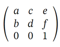
| Parameter | Typical Use | SVG Symbol |
|---|---|---|
| a | Scaling factor in the X-axis or the cosine value of the rotation angle | sx / cos(α) |
| b | Skewing factor in the Y-axis or the sinus value of the rotation angle | tan(α) / sin(α) |
| c | Skewing factor in the X-axis or the sinus value of the rotation angle | tan(α) / ‑sin(α) |
| d | Scaling factor in the Y-axis or the cosine value of the rotation angle | sy / cos(α) |
| e | X-axis translation | tx |
| f | Y-axis translation | ty |
The matrix transforms a point (x prev, y prev) into (x new, y new):
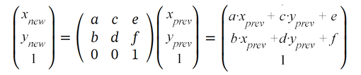
SVG elements use the transform attribute with the matrix syntax. So you provide 6 values to the matrix transformation function to set translation, scaling, rotation, and skewing:
transform="matrix(a,b,c,d,e,f)"
The translation is a transformation in SVG that moves all the points of an object at the same distance along parallel lines. This transformation shifts the origin of the element’s coordinate system. The translation matrix looks like this:
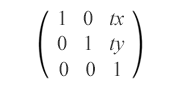
matrix(1,0,0,1,tx,ty)
The translation matrix combines both tx and ty values to move an element horizontally and vertically. It shifts the object by tx along the x-axis and by ty along the y-axis.
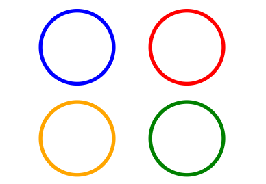
Look at the example with the original blue rectangle that translates along the x-axis (red), y-axis (orange), and both (green):
 1<svg viewBox="0 0 200 200" xmlns="http://www.w3.org/2000/svg">
 2    <g fill="none">
 3        <!-- no translation -->
 4        <circle cx="15" cy="15" r="10" stroke="blue" />
 5        <!-- horizontal translation (tx = 30) -->
 6        <circle cx="15" cy="15" r="10" stroke="red" transform="matrix(1 0 0 1 30 0)" />
 7        <!-- vertical translation (tx = 25) -->
 8        <circle cx="15" cy="15" r="10" stroke="orange" transform="matrix(1 0 0 1 0 25)" />
 9        <!-- both horizontal and vertical translation (tx = 30, ty = 25) -->
10        <circle cx="15" cy="15" r="10" stroke="green" transform="matrix(1 0 0 1 30 25)" />
11    </g>
12</svg>
The action of attribute transform="matrix(1,0,0,1,tx,ty)" means the changing of object coordinates according to the formula:
x(new) = a·x(prev) + b·y(prev) +e = x(prev) + txy(new) = b·x(prev) + d·y(prev) +f = y(prev) + ty
In the code example, <g> element is used to group circles together. The fill attribute applies inside <g> to all shapes once. Here is the resulting image:
Scaling is an SVG transformation that enlarges or reduces an object using a scaling factor. A scaling matrix is used to scale objects uniformly or non-uniformly along the coordinate axes.
sx and sy are the scaling factors for the x and y axes. If sx and sy are greater than 1, the object will be scaled up; if they are between 0 and 1, the object will be scaled down. If the scale factors are set to different values, the scale of the object will be uneven, resulting in a stretching or shrinking effect. The scaling matrix looks like this:
matrix(sx,0,0,sy,0,0)
Look at the example with the original blue rectangle that scales uniformly and non-uniformly, relative to the origin (0, 0) – pictures a and b, and scales uniformly relative to the point (10, 10) – picture c:
 1<svg viewBox="0 0 400 300" xmlns="http://www.w3.org/2000/svg">
 2	<!-- uniform scale is shown in fig.a -->
 3	<g fill="none">
 4	    <rect x="10" y="10" width="20" height="20" stroke="blue" />
 5		 <rect x="10" y="10" width="20" height="20" stroke="red" transform="matrix(1.5,0,0,1.5,0,0)" />
 6		 <rect x="10" y="10" width="20" height="20" stroke="orange" transform="matrix(2,0,0,2,0,0)" />
 7		 <rect x="10" y="10" width="20" height="20" stroke="green" transform="matrix(0.7,0,0,0.7,0,0)" />
 8	 </g>
 9	 <!-- non-uniform scale is shown in fig.b -->
10	 <g transform="translate(70)">
11		<rect x="10" y="10" width="20" height="20" fill="blue" />
12		<rect x="10" y="10" width="20" height="20" fill="red" transform="matrix(1.5,0,0,2,0,0)" />
13		<rect x="10" y="10" width="20" height="20" fill="orange" transform="matrix(3,0,0,2.5,0,0)" />
14		<rect x="10" y="10" width="20" height="20" fill="green" transform="matrix(0.7,0,0,0.5,0,0)" />
15	 </g>
16	 <!-- uniform scale relative to point (10, 10) is shown in fig.c -->
17	 <g fill="none" transform="translate(170)">
18	    <rect x="10" y="10" width="20" height="20" stroke="blue" />
19	    <rect x="10" y="10" width="20" height="20" stroke="red" transform="matrix(1.5,0,0,1.5,-5,-5)" />
20	    <rect x="10" y="10" width="20" height="20" stroke="orange" transform="matrix(2,0,0,2,-10,-10)" />
21	    <rect x="10" y="10" width="20" height="20" stroke="green" transform="matrix(0.7,0,0,0.7,3,3)" />
22	 </g>
23</svg>
Here is the resulting image:
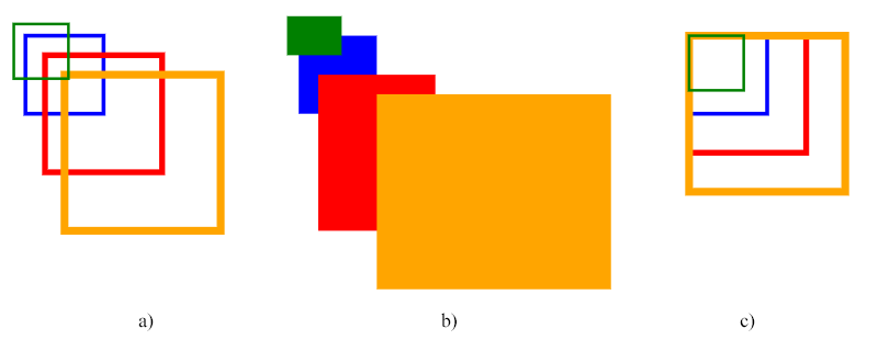
The code above uses the scale matrix. The first group of rectangles on the figure displays an example of uniform scaling (fig. a), the second group illustrates the non-uniform scaling (fig. b), and the third group of rectangles shows the uniform scaling relative to point (10, 10) – the top-left corner for the blue (source) rectangle.
Note: The scaling is performed relative to the origin (0, 0) of the coordinate system. If the point (cx, cy) of the SVG object( it is drawn relative to) is not at the origin, applying a scaling transform will shift the position of the object, which can give the impression of translation. We see the effect of the rectangles’ translation in figures a and b.
In order to scale around a specific pivot point (сx, сy), you need to apply an additional move to the scaled shape to move it to the pivot point (fig. c). Full transformation matrix combining translation and scaling:
matrix(sx,0,0,sy,cx·(1-sx),cy·(1-sy))
This matrix will correctly scale the object around the pivot point (cx, cy) without any translation. The cx·(1-sx) and cy·(1-sy) coefficients handle the necessary translation to ensure the object remains at its original position after scaling.
Let’s calculate these values for the red rectangle (fig. c). The pivot point (cx, cy) in this example is (10, 10) – the top-left corner of the blue (initial) rectangle:
cx·(1-sx)=10·(1-1.5)=10·(-0.5)=-5cy·(1-sy)=10·(1-1.5)=10·(-0.5)=-5
You can resize SVG in C# using Aspose.SVG for .NET API. The
SVG Scaling – C# Examples article covers C# examples for SVG scaling. You will find cases of using the scale() function in the transform attribute as well as a transformation matrix – matrix(a,b,c,d,e,f).
If you like to practice calculating sines and cosines, you are here! The rotation matrix looks like this:
matrix(cos(α),sin(α),-sin(α),cos(α),0,0), where α is the angle around the point with coordinates (0, 0) of the initial coordinate system.
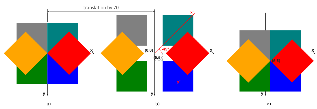
Look at the example with initial blue rectangle, which is rotated on 90° (green), 180° (grey), 270° (teal), -45° (red), and 135° (orange):
 1<svg viewBox="-50 -50 200 200" xmlns="http://www.w3.org/2000/svg">
 2	<!-- rotation around point with coordinates (0, 0) is shown in fig.a -->
 3    <g>
 4	  <rect x="0" y="0" width="20" height="20" fill="blue" />
 5	  <rect x="0" y="0" width="20" height="20" fill="green" transform="matrix(0,1,-1,0,0,0)" />
 6	  <rect x="0" y="0" width="20" height="20" fill="grey" transform="matrix(-1,0,0,-1,0,0)" />
 7	  <rect x="0" y="0" width="20" height="20" fill="teal" transform="matrix(0,-1,1,0,0,0)" />
 8	  <rect x="0" y="0" width="20" height="20" fill="red" transform="matrix(0.7071,-0.7071,0.7071,0.7071,0,0)" />
 9	  <rect x="0" y="0" width="20" height="20" fill="orange" transform="matrix(-0.7071,0.7071,-0.7071,-0.7071,0,0)" />
10	<!-- rotation around point with coordinates (0, 0) is shown in fig.b -->
11    </g>
12	<g transform="translate(70)">
13	  <rect x="5" y="5" width="20" height="20" fill="blue" />
14	  <rect x="5" y="5" width="20" height="20" fill="green" transform="matrix(0,1,-1,0,0,0)" />
15	  <rect x="5" y="5" width="20" height="20" fill="grey" transform="matrix(-1,0,0,-1,0,0)" />
16	  <rect x="5" y="5" width="20" height="20" fill="teal" transform="matrix(0,-1,1,0,0,0)" />
17	  <rect x="5" y="5" width="20" height="20" fill="red" transform="matrix(0.7071,-0.7071,0.7071,0.7071,0,0)" />
18	  <rect x="5" y="5" width="20" height="20" fill="orange" transform="matrix(-0.7071,0.7071,-0.7071,-0.7071,0,0)" />
19	</g>
20    <!-- rotation around point with coordinates (5, 5) is shown in fig.c -->
21	<g transform="translate(140)">
22	  <rect x="5" y="5" width="20" height="20" fill="blue" />
23	  <rect x="5" y="5" width="20" height="20" fill="green" transform="matrix(0,1,-1,0,10,0)" />
24	  <rect x="5" y="5" width="20" height="20" fill="grey" transform="matrix(-1,0,0,-1,10,10)" />
25	  <rect x="5" y="5" width="20" height="20" fill="teal" transform="matrix(0,-1,1,0,0,10)" />
26	  <rect x="5" y="5" width="20" height="20" fill="red" transform="matrix(0.7071,-0.7071,0.7071,0.7071,-2,5)" />
27	  <rect x="5" y="5" width="20" height="20" fill="orange" transform="matrix(-0.7071,0.7071,-0.7071,-0.7071,12,5)" />
28	</g>
29</svg>
Note: If we use a positive angle value, then the rotation will be clockwise, and conversely, a negative angle value gives us counterclockwise spin.
The result of SVG rotation can be seen on the figure:
Note: The following matrix will rotate the object around the pivot point (cx, cy):
matrix(cos(α), sin(α), -sin(α), cos(α), cx·(1-cos(α))+cy·sin(α), cy·(1-cos(α))-cx·sin(α))
The cx·(1-cos(α))+cy·sin(α) and cy·(1-cos(α))-cx·sin(α) coefficients handle the necessary translation to ensure the object remains at its original position after rotation. Let’s calculate these values for the red rectangle (fig. c). The pivot point (cx, cy) in this example is (5, 5) – the top-left corner of the blue (initial) rectangle, and the angle for red rectangle is -45°:
cos(-45°)=0.7071, sin(-45°)=-0.7071
cx·(1-cos(α))+cy·sin(α)=5·(1-0.7071)+5·(-0.7071)=-2cy·(1-cos(α))-cx·sin(α)=5·(1-0.7071)-5·(-0.7071)=5
You can rotate SVG in C# using Aspose.SVG for .NET API. The
Rotate SVG – C# Examples article covers C# examples for SVG rotation. It considers cases of using the rotate() function in the transform attribute and the transformation matrix – matrix(a,b,c,d,e,f).
Skewing is a transformation that rotates one of the axes of the element’s coordinate system by a certain angle α clockwise or counterclockwise. SVG elements can be skewed through the use of the skewing matrix that looks like this:
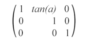
matrix(1,0,tan(α),1,0,0) – This skew matrix specifies a skew transformation along the x-axis by α degrees.
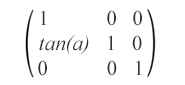
matrix(1,tan(α),0,1,0,0) – This skew matrix specifies a skew transformation along the y-axis by α degrees.
Here is shown an example of the circle with skew transformations:
 1<svg viewBox="0 0 200 200" xmlns="http://www.w3.org/2000/svg">
 2	<g fill="none">
 3		<circle cx="20" cy="20" r="10" stroke="blue" />
 4		<!-- skew transformation along the x-axis by α=45° -->
 5		<circle cx="20" cy="20" r="10" stroke="red" transform="matrix(1,0,1,1,0,0)" />
 6	</g>
 7	<g fill="none" transform="translate(70)">
 8		<circle cx="20" cy="20" r="10" stroke="blue" />
 9		<!-- skew transformation along the y-axis by α=45° -->
10		<circle cx="20" cy="20" r="10" stroke="orange" transform="matrix(1,1,0,1,0,0)" />
11	</g>
12</svg>
The rendered example look like:
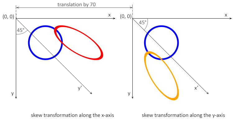
Note: The angle value α represents a skew SVG transformation in degrees along the appropriate axis. The using skew transformation along the x-axis, only the x coordinate of the points of the shape changes, but the y coordinate remains unchanged. The skew transformation along the x-axis makes the vertical lines look like they have been rotated by a given angle. The x coordinate of each point changes on a value proportional to the specified angle and distance to the origin.
| Problem | Cause | Solution |
|---|---|---|
| Transformation works but object moves unexpectedly | Transformations are applied relative to the origin (0,0) | Translate the object to the desired pivot point before applying scale or rotation |
| Rotation happens around the wrong point | Rotation matrix is applied without compensating translation | Combine translation → rotation → reverse translation in a single matrix |
| Scaling distorts position | Scaling is applied without adjusting translation values | Adjust e and f values or scale around a specific point |
| Matrix produces no visible effect | Matrix values are incorrect or equal to the identity matrix | Verify that matrix values differ from 1 0 0 1 0 0 |
| Multiple transforms override each other | Matrix replaces previous transform operations | Combine transformations into a single matrix or apply them in the correct order |
| Unexpected skewing | Incorrect b or c values | Ensure skew values are intentional and match the desired angle |
| Difficult to debug transformations | Matrix values are hard to interpret | Start with simple transformations (translate, scale) and build up gradually |
| Goal | Matrix | Notes |
|---|---|---|
| No transformation (identity) | matrix(1 0 0 1 0 0) | Resets all transformations |
| Translate by (tx, ty) | matrix(1 0 0 1 tx ty) | Moves the object without scaling or rotation |
| Scale uniformly by s | matrix(s 0 0 s 0 0) | Scales relative to the origin |
| Scale by (sx, sy) | matrix(sx 0 0 sy 0 0) | Non-uniform scaling |
| Scale around point (cx, cy) | matrix(s 0 0 s cx*(1-s) cy*(1-s)) | Keeps the center point fixed |
| Rotate by θ (around origin) | matrix(cosθ sinθ -sinθ cosθ 0 0) | θ is in radians |
| Rotate around point (cx, cy) | matrix(cosθ sinθ -sinθ cosθ cx-cx*cosθ+cy*sinθ cy-cx*sinθ-cy*cosθ) | Most common rotation case |
| Skew horizontally by θ | matrix(1 tanθ 0 1 0 0) | Skews along the x-axis |
| Skew vertically by θ | matrix(1 0 tanθ 1 0 0) | Skews along the y-axis |
| Mirror horizontally | matrix(-1 0 0 1 w 0) | w is the object width |
| Mirror vertically | matrix(1 0 0 -1 0 h) | h is the object height |
| Combine scale + rotate | matrix(a b c d e f) | Precompute combined values |
All matrix values are applied in the order they appear and are relative to the SVG coordinate system.
Translate an object by (tx, ty)
1<rect x="50" y="50" width="100" height="60" transform="matrix(1 0 0 1 40 30)" />Scale an object by 2× (uniform)
1<rect x="50" y="50" width="80" height="40" transform="matrix(2 0 0 2 0 0)" />Scale an object around its center (cx, cy)
1<rect x="50" y="50" width="100" height="60" transform="matrix(2 0 0 2 -100 -80)" />(Translation compensates for scaling around the center.)
Rotate an object by 45° around the origin
1<rect x="50" y="50" width="100" height="60" transform="matrix(0.707 0.707 -0.707 0.707 0 0)" />Rotate around a specific point (cx, cy)
1<rect x="50" y="50" width="100" height="60" transform="matrix(0.707 0.707 -0.707 0.707 85 -35)" />Apply horizontal skew
1<rect x="40" y="40" width="120" height="60" transform="matrix(1 0.5 0 1 0 0)" />Combine translation, scaling, and rotation
1<rect x="30" y="30" width="100" height="60" transform="matrix(1.5 0.5 -0.5 1.5 40 20)" />The SVG transformation matrix is a powerful tool for manipulating and animating objects in SVG. It provides a versatile way to apply translation, rotation, scaling, and skew to shapes and elements, allowing you to create visually dynamic and interactive graphics. The matrix allows for both individual and combined transformations, offering the flexibility to achieve complex and intricate visual effects.
By mastering both the theory and practical patterns shown in this guide, you can confidently apply transformation matrices to real-world SVG graphics and compose transformations with full control and clarity.
See Also
To learn more and get SVG code examples for rotating, scaling, moving, and skewing SVG graphics using the SVG transform attribute, please go to the
SVG Transformation article.
Read the
SVG Transformations – C# Examples article to get C# code examples for rotating, scaling, translating, and skewing SVG graphics using Aspose.SVG for .NET library.
Aspose.SVG offers SVG Free Web Applications for converting SVG or image files, merging SVG files, image vectorizing, SVG sprite generating, SVG to base64 data encoding, and more. These online applications work on any operating system with a web browser and don’t require additional software installation. It’s a fast and easy way to efficiently and effectively solve your SVG-related tasks!
Analyzing your prompt, please hold on...
An error occurred while retrieving the results. Please refresh the page and try again.