
जावा का उपयोग कर प्रस्तुतियों में चार्ट अक्षों को अनुकूलित करें
अवलोकन
यह लेख Aspose.Slides for Java के साथ चार्ट अक्षों को अनुकूलित करने के तरीके को समझाता है। इसमें गणना किए गए अक्ष मान, चार्ट पंक्तियों और स्तंभों का स्विच करना, अक्ष की दृश्यता, श्रेणी लेबल और टिक‑मार्क अंतराल, तिथि श्रेणियाँ और फ़ॉर्मेटिंग, शीर्षक घुमाव, अक्ष का स्थान और प्रदर्शित इकाइयाँ शामिल हैं।
चार्ट में लम्बवत अक्ष पर अधिकतम मान प्राप्त करें
एक प्रेज़ेंटेशन बनाएं और डिफ़ॉल्ट डेटा के साथ एक एरिया चार्ट जोड़ें। गणना किए गए अक्ष मान पढ़ने से पहले validateChartLayout को कॉल करें ताकि चार्ट लेआउट अद्यतन हो।
getActualMaxValue और getActualMinValue को अक्ष सीमाओं के लिए पढ़ें, और getActualMajorUnit और getActualMinorUnit को टिक अंतराल के लिए पढ़ें। getActualMajorUnitScale और getActualMinorUnitScale समय‑यूनिट स्केल प्रदान करते हैं, जो तिथि अक्षों के लिए प्रासंगिक होते हैं। उदाहरण इन मानों को स्थानीय वेरिएबल्स में संग्रहीत करता है और चार्ट को सहेजता है।
import com.aspose.slides.*;

Presentation presentation = new Presentation();
try {
    ISlide slide = presentation.getSlides().get_Item(0);

    IChart chart = slide.getShapes().addChart(ChartType.Area, 100, 100, 500, 350);
    chart.validateChartLayout();

    double maxValue = chart.getAxes().getVerticalAxis().getActualMaxValue();
    double minValue = chart.getAxes().getVerticalAxis().getActualMinValue();

    double majorUnit = chart.getAxes().getVerticalAxis().getActualMajorUnit();
    double minorUnit = chart.getAxes().getVerticalAxis().getActualMinorUnit();

    int majorUnitScale = chart.getAxes().getVerticalAxis().getActualMajorUnitScale();
    int minorUnitScale = chart.getAxes().getVerticalAxis().getActualMinorUnitScale();

    presentation.save("AxisValues_out.pptx", SaveFormat.Pptx);
} finally {
    presentation.dispose();
}
अक्षों के बीच डेटा बदलें
चार्ट डेटा में श्रृंखलाओं और श्रेणियों की भूमिकाएँ बदलने के लिए switchRowColumn का उपयोग करें। प्रत्येक पूर्व श्रेणी अब एक श्रृंखला बन जाती है, और प्रत्येक पूर्व श्रृंखला अब एक श्रेणी बनती है। यह डेटा समूह को बदलता है; यह क्षैतिज और लम्बवत अक्षों को नहीं बदलता। उदाहरण डिफ़ॉल्ट डेटा को Sheet1!A1:D5 (हेडर पंक्ति और श्रेणी कॉलम सहित) से बाइंड करने के लिए setRange का उपयोग करता है, फिर पंक्तियों और स्तंभों को स्विच करता है। यह चार श्रृंखलाओं और तीन श्रेणियों वाला चार्ट सहेजता है।
import com.aspose.slides.*;

Presentation presentation = new Presentation();
try {
    ISlide slide = presentation.getSlides().get_Item(0);

    IChart chart = slide.getShapes().addChart(ChartType.ClusteredColumn, 100, 100, 400, 300);
    chart.getChartData().setRange("Sheet1!A1:D5");
    chart.getChartData().switchRowColumn();

    presentation.save("SwitchChartRowColumns_out.pptx", SaveFormat.Pptx);
} finally {
    presentation.dispose();
}
लाइन चार्ट के लिए लम्बवत अक्ष को अक्षम करें
लम्बवत अक्ष को छिपाने के लिए false के साथ setVisible को कॉल करें। उदाहरण डिफ़ॉल्ट डेटा के साथ एक लाइन चार्ट बनाता है और लम्बवत अक्ष छिपा कर सहेजता है।
import com.aspose.slides.*;

Presentation presentation = new Presentation();
try {
    ISlide slide = presentation.getSlides().get_Item(0);

    IChart chart = slide.getShapes().addChart(ChartType.Line, 100, 100, 400, 300);
    chart.getAxes().getVerticalAxis().setVisible(false);

    presentation.save("HiddenVerticalAxis.pptx", SaveFormat.Pptx);
} finally {
    presentation.dispose();
}
लाइन चार्ट के लिए क्षैतिज अक्ष को अक्षम करें
क्षैतिज अक्ष को छिपाने के लिए false के साथ setVisible को कॉल करें। उदाहरण डिफ़ॉल्ट डेटा के साथ एक लाइन चार्ट बनाता है और क्षैतिज अक्ष छिपा कर सहेजता है।
import com.aspose.slides.*;

Presentation presentation = new Presentation();
try {
    ISlide slide = presentation.getSlides().get_Item(0);

    IChart chart = slide.getShapes().addChart(ChartType.Line, 100, 100, 400, 300);
    chart.getAxes().getHorizontalAxis().setVisible(false);

    presentation.save("HiddenHorizontalAxis.pptx", SaveFormat.Pptx);
} finally {
    presentation.dispose();
}
एक श्रेणी अक्ष बदलें
setCategoryAxisType का उपयोग करके तिथि या पाठ श्रेणी अक्ष चुनें। यह उदाहरण ExistingChart.pptx की आवश्यकता रखता है, जिसमें पहली स्लाइड पर पहला आकार एक चार्ट है और श्रेणी सेल्स में संख्यात्मक एक्सेल तिथि मान होते हैं। यह क्षैतिज अक्ष को तिथि अक्ष में बदलता है। setAutomaticMajorUnit को false, setMajorUnit को 1, और setMajorUnitScale को TimeUnitType.Months के साथ कॉल करने से प्रमुख टिक एक‑महिने अंतराल पर स्थापित होते हैं।
import com.aspose.slides.*;

Presentation presentation = new Presentation("ExistingChart.pptx");
try {
    ISlide slide = presentation.getSlides().get_Item(0);

    IChart chart = (IChart) slide.getShapes().get_Item(0);
    chart.getAxes().getHorizontalAxis().setCategoryAxisType(CategoryAxisType.Date);
    chart.getAxes().getHorizontalAxis().setAutomaticMajorUnit(false);
    chart.getAxes().getHorizontalAxis().setMajorUnit(1);
    chart.getAxes().getHorizontalAxis().setMajorUnitScale(TimeUnitType.Months);

    presentation.save("ChangeChartCategoryAxis_out.pptx", SaveFormat.Pptx);
} finally {
    presentation.dispose();
}
श्रेणी अक्ष लेबल अंतराल नियंत्रित करें
जब चार्ट में कई श्रेणियाँ हों, तो श्रेणियों या डेटा बिंदुओं को हटाए बिना दृश्य लेबलों की संख्या कम करें। setAutomaticTickLabelSpacing को false के साथ कॉल करें, फिर वांछित श्रेणी अंतराल को setTickLabelSpacing में पास करें। सामान्य क्रम में पाठ श्रेणियों के लिए गिनती पहले श्रेणी से आरम्भ होती है:
| अंतराल | उदाहरण में प्रदर्शित लेबल |
|---|---|
1 |
श्रेणी 1, श्रेणी 2, श्रेणी 3, … श्रेणी 24 |
2 |
श्रेणी 1, श्रेणी 3, श्रेणी 5, … श्रेणी 23 |
3 |
श्रेणी 1, श्रेणी 4, श्रेणी 7, … श्रेणी 22 |
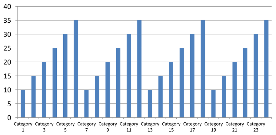
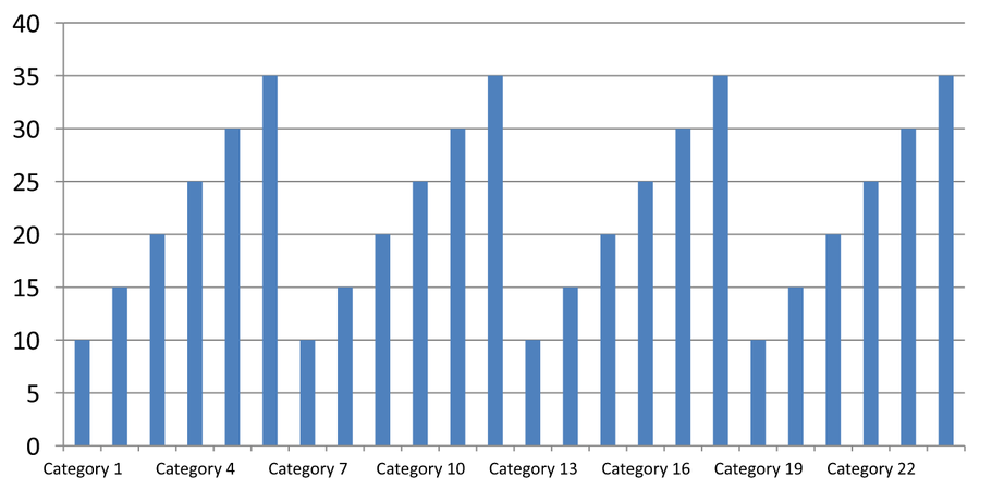
3 का अंतराल हर तीसरा लेबल दिखाता है, प्रदर्शित लेबलों के बीच दो लेबल छिपे रहते हैं। यह संबंधित कॉलम को नहीं हटाता। स्वचालित स्पेसिंग उपलब्ध स्थान के आधार पर अंतराल चुनती है; यह आवश्यकतः हर लेबल नहीं दिखाती।
टिक‑मार्क के अलग नियंत्रण होते हैं। setAutomaticTickMarksSpacing को false के साथ कॉल करें और setTickMarksSpacing से उनका अंतराल सेट करें। उदाहरण के लिए, 1 प्रत्येक श्रेणी अंतराल पर एक टिक‑मार्क रखता है जबकि लेबल केवल हर तीसरी श्रेणी पर दिखाई देते हैं। दृश्य शैली के साथ setMajorTickMark का उपयोग करें ताकि परिणाम दिखे। स्वचालित‑स्पेसिंग सेटर्स को फिर से true करने से चार्ट को वही अंतराल चुनने की अनुमति मिलती है।
निम्न स्वयं‑समाहित उदाहरण 24 श्रेणियों और एक श्रृंखला बनाता है, फिर CategoryAxisIntervals.pptx में तीन स्लाइड सहेजता है: स्वचालित स्पेसिंग, स्वतंत्र टिक‑मार्क के साथ मैनुअल लेबल स्पेसिंग, और पुनः स्वचालित स्पेसिंग। दोनों प्रतियों में मूल चार्ट डेटा रहता है। इनपुट प्रेज़ेंटेशन की आवश्यकता नहीं है। क्षैतिज लेबल टेक्स्ट घनत्व में अंतर को स्पष्ट रूप से दिखाता है।
import com.aspose.slides.*;

Presentation presentation = new Presentation();
try {
    ISlide slide = presentation.getSlides().get_Item(0);

    IChart chart = slide.getShapes().addChart(ChartType.ClusteredColumn, 30, 40, 660, 320);

    chart.setLegend(false);
    chart.getChartData().getCategories().clear();
    chart.getChartData().getSeries().clear();

    IChartDataWorkbook workbook = chart.getChartData().getChartDataWorkbook();
    workbook.clear(0);

    IChartSeries series = chart.getChartData().getSeries().add(ChartType.ClusteredColumn);
    for (int i = 0; i < 24; i++) {
        IChartDataCell categoryCell = workbook.getCell(0, i + 1, 0, "Category " + (i + 1));
        chart.getChartData().getCategories().add(categoryCell);
        IChartDataCell valueCell = workbook.getCell(0, i + 1, 1, 10 + i % 6 * 5);
        series.getDataPoints().addDataPointForBarSeries(valueCell);
    }

    IAxis axis = chart.getAxes().getHorizontalAxis();
    axis.setCategoryAxisType(CategoryAxisType.Text);
    axis.getTextFormat().getTextBlockFormat().setRotationAngle(0);
    axis.getTextFormat().getPortionFormat().setFontHeight(12);
    axis.setMajorTickMark(TickMarkType.Outside);
    axis.setAutomaticTickLabelSpacing(true);
    axis.setAutomaticTickMarksSpacing(true);

    // स्लाइड 2: हर तीसरा लेबल दिखाएँ, लेकिन प्रत्येक श्रेणी के लिए एक टिक‑मार्क रखें।
    ISlide manualSlide = presentation.getSlides().addClone(slide);
    IChart manualChart = (IChart)manualSlide.getShapes().get_Item(0);
    IAxis manualAxis = manualChart.getAxes().getHorizontalAxis();
    manualAxis.setAutomaticTickLabelSpacing(false);
    manualAxis.setTickLabelSpacing(3);
    manualAxis.setAutomaticTickMarksSpacing(false);
    manualAxis.setTickMarksSpacing(1);

    // स्लाइड 3: चार्ट को दोनों अंतराल फिर से चुनने दें।
    ISlide restoredSlide = presentation.getSlides().addClone(manualSlide);
    IChart restoredChart = (IChart)restoredSlide.getShapes().get_Item(0);
    restoredChart.getAxes().getHorizontalAxis().setAutomaticTickLabelSpacing(true);
    restoredChart.getAxes().getHorizontalAxis().setAutomaticTickMarksSpacing(true);

    presentation.save("CategoryAxisIntervals.pptx", SaveFormat.Pptx);
} finally {
    presentation.dispose();
}
स्वचालित स्पेसिंग (स्लाइड 1): इस रेंडरिंग में हर दूसरी श्रेणी लेबल दिखती है और दो पंक्तियों में लिपटती है। स्वचालित परिणाम चार्ट आकार, फ़ॉन्ट और रेंडरर के अनुसार बदल सकता है।
मैनुअल स्पेसिंग (स्लाइड 2): हर तीसरा लेबल एक पंक्ति में दिखता है, जबकि टिक‑मार्क प्रत्येक श्रेणी अंतराल पर बना रहता है। सभी 24 स्तंभ, लेबल रहित सहित, समान मानों के साथ दृश्य रहते हैं। स्लाइड 3 स्वचालित रूप से दिखाए गए रूप को पुनर्स्थापित करता है।
सही अक्ष और अंतराल चुनें
पाठ श्रेणी अक्ष, जैसे कि कॉलम, लाइन, एरिया या बार चार्ट का श्रेणी अक्ष, के लिए इस श्रेणी‑गणना अंतराल का उपयोग करें। कॉलम चार्ट में यह क्षैतिज अक्ष होता है। क्षैतिज बार चार्ट में श्रेणी अक्ष लम्बवत होता है, इसलिए इन सेटिंग्स को getVerticalAxis द्वारा लौटाए गए अक्ष पर लागू करें। टिक‑मार्क स्पेसिंग उन चार्टों में श्रृंखला अक्ष पर भी लागू होती है जिनमें वह मौजूद होता है।
मूल्य अक्ष की संख्यात्मक पैमाना सेट करने के लिए श्रेणी लेबल स्पेसिंग का उपयोग न करें। मूल्य अक्ष पर, setMajorUnit मान अंतर निर्धारित करता है: उदाहरण के लिए, 10 का प्रमुख यूनिट 0, 10, 20 आदि पर टिक बनाता है जब अक्ष शून्य से शुरू होता है। 3 का श्रेणी लेबल अंतराल केवल श्रेणी स्थितियों को गिनता है, उनके डेटा मानों की परवाह किए बिना। स्कैटर और बबल चार्ट मूल्य अक्षों का उपयोग करते हैं, न कि पाठ श्रेणी अक्ष का। तिथि अक्ष के लिए, Change a Category Axis में वर्णित अनुसार समय‑आधारित प्रमुख यूनिट और स्केल का उपयोग करें।
श्रेणी अक्ष मानों के लिए तिथि फ़ॉर्मेट सेट करें
उदाहरण डिफ़ॉल्ट चार्ट डेटा को चार वार्षिक मानों से बदलता है। तिथियाँ पहली कार्यपत्रिका (इंडेक्स 0) में OLE Automation सीरियल नंबर के रूप में संग्रहीत होती हैं, जो 30 December 1899 से दिनों की संख्या के रूप में गणना की जाती हैं। setCategoryAxisType को CategoryAxisType.Date के साथ उपयोग करें, setNumberFormatLinkedToSource को false के साथ कॉल करें, और setNumberFormat को yyyy पास करें ताकि श्रेणी लेबल सेल फ़ॉर्मेट से स्वतंत्र चार अंक का वर्ष दिखाएँ।
import com.aspose.slides.*;
import java.time.LocalDate;

Presentation presentation = new Presentation();
try {
    ISlide slide = presentation.getSlides().get_Item(0);

    IChart chart = slide.getShapes().addChart(ChartType.Line, 50, 50, 450, 300);

    chart.getChartData().getCategories().clear();
    chart.getChartData().getSeries().clear();

    IChartDataWorkbook workbook = chart.getChartData().getChartDataWorkbook();
    workbook.clear(0);

    LocalDate baseDate = LocalDate.of(1899, 12, 30);

    IChartSeries series = chart.getChartData().getSeries().add(ChartType.Line);
    for (int i = 0; i < 4; i++) {
        LocalDate date = LocalDate.of(2015 + i, 1, 1);
        IChartDataCell categoryCell = workbook.getCell(0, i + 1, 0, date.toEpochDay() - baseDate.toEpochDay());
        chart.getChartData().getCategories().add(categoryCell);

        IChartDataCell valueCell = workbook.getCell(0, i + 1, 1, i + 1);
        series.getDataPoints().addDataPointForLineSeries(valueCell);
    }

    chart.getAxes().getHorizontalAxis().setCategoryAxisType(CategoryAxisType.Date);
    chart.getAxes().getHorizontalAxis().setNumberFormatLinkedToSource(false);
    chart.getAxes().getHorizontalAxis().setNumberFormat("yyyy");

    presentation.save("DateAxisFormat.pptx", SaveFormat.Pptx);
} finally {
    presentation.dispose();
}
चार्ट अक्ष शीर्षक के लिए घुमाव कोण सेट करें
लम्बवत अक्ष पर true के साथ setTitle कॉल करें, शीर्षक पाठ प्रदान करें, और setRotationAngle से शीर्षक को घुमाएँ। कोण डिग्री में मापा जाता है; यह उदाहरण मान‑अक्ष शीर्षक को 90 डिग्री घुमा कर कॉलम चार्ट सहेजता है।
import com.aspose.slides.*;

Presentation presentation = new Presentation();
try {
    ISlide slide = presentation.getSlides().get_Item(0);

    IChart chart = slide.getShapes().addChart(ChartType.ClusteredColumn, 50, 50, 450, 300);
    chart.getAxes().getVerticalAxis().setTitle(true);
    chart.getAxes().getVerticalAxis().getTitle().addTextFrameForOverriding("Value");
    chart.getAxes().getVerticalAxis().getTitle().getTextFormat().getTextBlockFormat().setRotationAngle(90);

    presentation.save("RotatedAxisTitle.pptx", SaveFormat.Pptx);
} finally {
    presentation.dispose();
}
श्रेणी या मान अक्ष पर अक्ष स्थिति सेट करें
setAxisBetweenCategories का उपयोग करके निर्धारित करें कि मान अक्ष श्रेणी अक्ष को श्रेणियों के बीच या श्रेणी टिक‑मार्क पर पार करता है। यह सेटिंग केवल श्रेणी अक्षों पर लागू होती है। उदाहरण इसे कॉलम चार्ट के क्षैतिज श्रेणी अक्ष पर true सेट करता है और परिणाम सहेजता है।
import com.aspose.slides.*;

Presentation presentation = new Presentation();
try {
    ISlide slide = presentation.getSlides().get_Item(0);

    IChart chart = slide.getShapes().addChart(ChartType.ClusteredColumn, 50, 50, 450, 300);
    chart.getAxes().getHorizontalAxis().setAxisBetweenCategories(true);

    presentation.save("AxisBetweenCategories.pptx", SaveFormat.Pptx);
} finally {
    presentation.dispose();
}
चार्ट मान अक्ष पर डिस्प्ले यूनिट सेट करें
setDisplayUnit का उपयोग करके मान अक्ष पर लेबलों को स्केल करें बिना मूल डेटा बदले। DisplayUnitType को Millions सेट करने पर 60 000 000 को 60 के रूप में दिखाया जाता है। उदाहरण एक कॉलम चार्ट बनाता है और उसके लम्बवत अक्ष पर मिलियन डिस्प्ले यूनिट लागू करता है।
import com.aspose.slides.*;

Presentation presentation = new Presentation();
try {
    ISlide slide = presentation.getSlides().get_Item(0);

    IChart chart = slide.getShapes().addChart(ChartType.ClusteredColumn, 50, 50, 450, 300);
    chart.getAxes().getVerticalAxis().setDisplayUnit(DisplayUnitType.Millions);

    presentation.save("Result.pptx", SaveFormat.Pptx);
} finally {
    presentation.dispose();
}
अक्सर पूछे जाने वाले प्रश्न
मैं एक अक्ष को दूसरे के पार कहाँ मिलना चाहिए (अक्ष प्रतिच्छेदन) का मान कैसे सेट करूँ?
setCrossType का उपयोग करके प्रतिच्छेदन व्यवहार चुनें। संख्यात्मक प्रतिच्छेदन मान निर्दिष्ट करने के लिए setCrossAt का उपयोग करें। ये सेटिंग्स अक्ष प्रतिच्छेदन को उपयुक्त बेसलाइन पर ले जाने की अनुमति देती हैं।
मैं टिक लेबल को अक्ष के सापेक्ष कैसे स्थित करूँ?
setTickLabelPosition को TickLabelPositionType के साथ प्रयोग करें: Low, High, NextTo या None। टिक‑मार्क स्वयं को नियंत्रित करने के लिए, setMajorTickMark या setMinorTickMark का उपयोग करें; ये लेबल स्थितियों से अलग हैं।