
Java를 사용하여 프레젠테이션의 차트 축 사용자 지정
개요
이 문서는 Aspose.Slides for Java를 사용하여 차트 축을 사용자 지정하는 방법을 설명합니다. 계산된 축 값, 차트 행 및 열 교환, 축 표시 여부, 범주 레이블 및 눈금 간격, 날짜 범주 및 서식, 제목 회전, 축 위치 지정 및 표시 단위에 대해 다룹니다.
차트의 세로 축에서 최대값 가져오기
기본 데이터가 포함된 영역 차트를 추가하려면 Presentation을(를) 생성합니다. 계산된 축 값을 읽기 전에 차트 레이아웃이 최신 상태가 되도록 validateChartLayout을(를) 호출합니다.
축 한계를 얻으려면 getActualMaxValue와 getActualMinValue을(를) 읽고, 눈금 간격을 얻으려면 getActualMajorUnit와 getActualMinorUnit을(를) 읽습니다. 날짜 축과 관련 있는 시간 단위 스케일을 제공하는 getActualMajorUnitScale와 getActualMinorUnitScale도 있습니다. 예제에서는 이러한 값을 로컬 변수에 저장하고 차트를 저장합니다.
import com.aspose.slides.*;

Presentation presentation = new Presentation();
try {
    ISlide slide = presentation.getSlides().get_Item(0);

    IChart chart = slide.getShapes().addChart(ChartType.Area, 100, 100, 500, 350);
    chart.validateChartLayout();

    double maxValue = chart.getAxes().getVerticalAxis().getActualMaxValue();
    double minValue = chart.getAxes().getVerticalAxis().getActualMinValue();

    double majorUnit = chart.getAxes().getVerticalAxis().getActualMajorUnit();
    double minorUnit = chart.getAxes().getVerticalAxis().getActualMinorUnit();

    int majorUnitScale = chart.getAxes().getVerticalAxis().getActualMajorUnitScale();
    int minorUnitScale = chart.getAxes().getVerticalAxis().getActualMinorUnitScale();

    presentation.save("AxisValues_out.pptx", SaveFormat.Pptx);
} finally {
    presentation.dispose();
}
축 사이의 데이터 교환
차트 데이터에서 시리즈와 범주의 역할을 교환하려면 switchRowColumn을(를) 사용합니다. 이전의 각 범주는 시리즈가 되고, 이전의 각 시리즈는 범주가 됩니다. 이는 데이터 그룹화 방식만 변경하며, 가로 및 세로 축을 교환하지는 않습니다. 예제에서는 행과 열을 교환하기 전에 기본 데이터를 Sheet1!A1:D5에 바인딩하기 위해 setRange을(를) 사용합니다(헤더 행 및 범주 열 포함). 그런 다음 4개의 시리즈와 3개의 범주를 가진 차트를 저장합니다.
import com.aspose.slides.*;

Presentation presentation = new Presentation();
try {
    ISlide slide = presentation.getSlides().get_Item(0);

    IChart chart = slide.getShapes().addChart(ChartType.ClusteredColumn, 100, 100, 400, 300);
    chart.getChartData().setRange("Sheet1!A1:D5");
    chart.getChartData().switchRowColumn();

    presentation.save("SwitchChartRowColumns_out.pptx", SaveFormat.Pptx);
} finally {
    presentation.dispose();
}
라인 차트에서 세로 축 비활성화
세로 축을 숨기려면 false와 함께 setVisible를 호출합니다. 예제에서는 기본 데이터가 있는 라인 차트를 생성하고 세로 축을 숨긴 상태로 저장합니다.
import com.aspose.slides.*;

Presentation presentation = new Presentation();
try {
    ISlide slide = presentation.getSlides().get_Item(0);

    IChart chart = slide.getShapes().addChart(ChartType.Line, 100, 100, 400, 300);
    chart.getAxes().getVerticalAxis().setVisible(false);

    presentation.save("HiddenVerticalAxis.pptx", SaveFormat.Pptx);
} finally {
    presentation.dispose();
}
라인 차트에서 가로 축 비활성화
가로 축을 숨기려면 false와 함께 setVisible를 호출합니다. 예제에서는 기본 데이터가 있는 라인 차트를 생성하고 가로 축을 숨긴 상태로 저장합니다.
import com.aspose.slides.*;

Presentation presentation = new Presentation();
try {
    ISlide slide = presentation.getSlides().get_Item(0);

    IChart chart = slide.getShapes().addChart(ChartType.Line, 100, 100, 400, 300);
    chart.getAxes().getHorizontalAxis().setVisible(false);

    presentation.save("HiddenHorizontalAxis.pptx", SaveFormat.Pptx);
} finally {
    presentation.dispose();
}
범주 축 변경
setCategoryAxisType을(를) 사용하여 날짜 또는 텍스트 범주 축을 선택합니다. 이 예제는 ExistingChart.pptx가 필요하며, 첫 번째 슬라이드의 첫 번째 도형에 차트가 있고 범주 셀에 숫자형 Excel 날짜 값이 포함되어 있습니다. 가로 축을 날짜 축으로 변경합니다. setAutomaticMajorUnit을 false로, setMajorUnit을 1로, 그리고 setMajorUnitScale을 TimeUnitType.Months로 설정하면 주요 눈금이 한 달 간격으로 배치됩니다.
import com.aspose.slides.*;

Presentation presentation = new Presentation("ExistingChart.pptx");
try {
    ISlide slide = presentation.getSlides().get_Item(0);

    IChart chart = (IChart) slide.getShapes().get_Item(0);
    chart.getAxes().getHorizontalAxis().setCategoryAxisType(CategoryAxisType.Date);
    chart.getAxes().getHorizontalAxis().setAutomaticMajorUnit(false);
    chart.getAxes().getHorizontalAxis().setMajorUnit(1);
    chart.getAxes().getHorizontalAxis().setMajorUnitScale(TimeUnitType.Months);

    presentation.save("ChangeChartCategoryAxis_out.pptx", SaveFormat.Pptx);
} finally {
    presentation.dispose();
}
범주 축 레이블 간격 제어
차트에 범주가 많이 있을 때 범주나 데이터 포인트를 제거하지 않고 표시되는 축 레이블 수를 줄일 수 있습니다. setAutomaticTickLabelSpacing을 false로 호출한 다음 원하는 범주 간격을 setTickLabelSpacing에 전달합니다. 일반 순서의 텍스트 범주의 경우 첫 번째 범주부터 계산이 시작됩니다:
| 간격 | 예시에서 표시된 레이블 |
|---|---|
1 |
범주 1, 범주 2, 범주 3, … 범주 24 |
2 |
범주 1, 범주 3, 범주 5, … 범주 23 |
3 |
범주 1, 범주 4, 범주 7, … 범주 22 |
3 간격은 세 번째 레이블마다 표시하고, 표시된 레이블 사이에 두 개의 레이블을 숨깁니다. 해당 열은 삭제되지 않습니다. 자동 간격은 사용 가능한 공간을 기준으로 간격을 선택하며, 반드시 모든 레이블을 표시하는 것은 아닙니다.
눈금 표시에는 별도 제어가 있습니다. setAutomaticTickMarksSpacing을 false로 호출하고 setTickMarksSpacing을 사용하여 간격을 설정합니다. 예를 들어 1은 레이블이 매 세 번째 범주에만 표시되지만 눈금은 모든 범주 간격에 유지됩니다. 눈에 보이도록 스타일을 지정하려면 setMajorTickMark을 사용합니다. 자동 간격 설정자를 true로 다시 호출하면 차트가 다시 해당 간격을 선택합니다.
다음 자체 포함 예제는 24개의 범주와 하나의 시리즈를 생성한 다음 CategoryAxisIntervals.pptx에 세 개의 슬라이드를 저장합니다: 자동 간격, 레이블 간격을 수동으로 지정하고 눈금을 독립적으로 유지, 자동 간격 복원. 두 복사본은 원본 차트 데이터를 유지합니다. 입력 프레젠테이션이 필요하지 않습니다. 가로 레이블 텍스트가 밀도를 쉽게 확인하도록 해 줍니다.
import com.aspose.slides.*;

Presentation presentation = new Presentation();
try {
    ISlide slide = presentation.getSlides().get_Item(0);

    IChart chart = slide.getShapes().addChart(ChartType.ClusteredColumn, 30, 40, 660, 320);

    chart.setLegend(false);
    chart.getChartData().getCategories().clear();
    chart.getChartData().getSeries().clear();

    IChartDataWorkbook workbook = chart.getChartData().getChartDataWorkbook();
    workbook.clear(0);

    IChartSeries series = chart.getChartData().getSeries().add(ChartType.ClusteredColumn);
    for (int i = 0; i < 24; i++) {
        IChartDataCell categoryCell = workbook.getCell(0, i + 1, 0, "Category " + (i + 1));
        chart.getChartData().getCategories().add(categoryCell);
        IChartDataCell valueCell = workbook.getCell(0, i + 1, 1, 10 + i % 6 * 5);
        series.getDataPoints().addDataPointForBarSeries(valueCell);
    }

    IAxis axis = chart.getAxes().getHorizontalAxis();
    axis.setCategoryAxisType(CategoryAxisType.Text);
    axis.getTextFormat().getTextBlockFormat().setRotationAngle(0);
    axis.getTextFormat().getPortionFormat().setFontHeight(12);
    axis.setMajorTickMark(TickMarkType.Outside);
    axis.setAutomaticTickLabelSpacing(true);
    axis.setAutomaticTickMarksSpacing(true);

    // Slide 2: 모든 세 번째 레이블을 표시하되, 각 범주마다 눈금은 유지합니다.
    ISlide manualSlide = presentation.getSlides().addClone(slide);
    IChart manualChart = (IChart)manualSlide.getShapes().get_Item(0);
    IAxis manualAxis = manualChart.getAxes().getHorizontalAxis();
    manualAxis.setAutomaticTickLabelSpacing(false);
    manualAxis.setTickLabelSpacing(3);
    manualAxis.setAutomaticTickMarksSpacing(false);
    manualAxis.setTickMarksSpacing(1);

    // Slide 3: 차트가 두 간격을 다시 선택하도록 합니다.
    ISlide restoredSlide = presentation.getSlides().addClone(manualSlide);
    IChart restoredChart = (IChart)restoredSlide.getShapes().get_Item(0);
    restoredChart.getAxes().getHorizontalAxis().setAutomaticTickLabelSpacing(true);
    restoredChart.getAxes().getHorizontalAxis().setAutomaticTickMarksSpacing(true);

    presentation.save("CategoryAxisIntervals.pptx", SaveFormat.Pptx);
} finally {
    presentation.dispose();
}
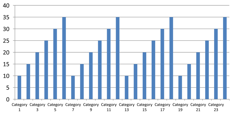
자동 간격 (슬라이드 1): 이 렌더링에서는 두 번째마다 범주 레이블이 표시되고 두 줄로 래핑됩니다. 자동 결과는 차트 크기, 글꼴 및 렌더러에 따라 달라질 수 있습니다.
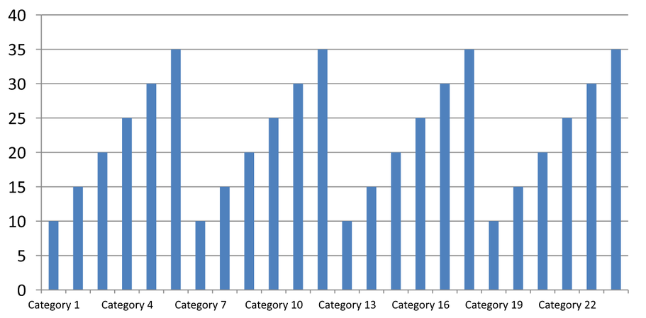
수동 간격 (슬라이드 2): 세 번째 레이블만 한 줄에 표시되고, 눈금은 모든 범주 간격에 유지됩니다. 레이블이 없는 열을 포함한 24개의 모든 열이 동일한 값으로 표시됩니다. 슬라이드 3은 위에서 본 자동 모양을 복원합니다.
올바른 축 및 간격 선택
텍스트 범주 축(예: 열, 라인, 영역 또는 막대 차트의 범주 축)에서 이 범주 개수 간격을 사용하십시오. 열 차트에서는 가로 축이 됩니다. 가로 막대 차트에서는 범주 축이 세로이므로 getVerticalAxis이 반환하는 축에 적용하십시오. 눈금 간격은 하나의 축을 가진 차트의 시리즈 축에도 적용됩니다.
값 축의 숫자 스케일을 설정하려면 범주 레이블 간격을 사용하지 마십시오. 값 축에서는 setMajorUnit이 값 차이를 지정합니다. 예를 들어 10의 주요 단위는 축이 0에서 시작할 때 0, 10, 20 등으로 눈금을 배치합니다. 3의 범주 레이블 간격은 데이터 값과 무관하게 범주 위치를 셉니다. 산점도 및 버블 차트는 텍스트 범주 축이 아닌 값 축을 사용합니다. 날짜 축의 경우 범주 축 변경에서 설명한 바와 같이 시간 기반 주요 단위와 스케일을 사용하십시오.
범주 축 값에 대한 날짜 형식 설정
예제에서는 기본 차트 데이터를 4개의 연도값으로 교체합니다. 날짜는 첫 번째 워크시트(인덱스 0)에 OLE Automation 일련 번호로 저장되며, 1899년 12월 30일 이후 경과 일수로 계산됩니다. setCategoryAxisType을 CategoryAxisType.Date로 사용하고, setNumberFormatLinkedToSource을 false로 호출한 뒤 yyyy를 setNumberFormat에 전달하면 셀 서식과 무관하게 범주 레이블이 4자리 연도로 표시됩니다.
import com.aspose.slides.*;
import java.time.LocalDate;

Presentation presentation = new Presentation();
try {
    ISlide slide = presentation.getSlides().get_Item(0);

    IChart chart = slide.getShapes().addChart(ChartType.Line, 50, 50, 450, 300);

    chart.getChartData().getCategories().clear();
    chart.getChartData().getSeries().clear();

    IChartDataWorkbook workbook = chart.getChartData().getChartDataWorkbook();
    workbook.clear(0);

    LocalDate baseDate = LocalDate.of(1899, 12, 30);

    IChartSeries series = chart.getChartData().getSeries().add(ChartType.Line);
    for (int i = 0; i < 4; i++) {
        LocalDate date = LocalDate.of(2015 + i, 1, 1);
        IChartDataCell categoryCell = workbook.getCell(0, i + 1, 0, date.toEpochDay() - baseDate.toEpochDay());
        chart.getChartData().getCategories().add(categoryCell);

        IChartDataCell valueCell = workbook.getCell(0, i + 1, 1, i + 1);
        series.getDataPoints().addDataPointForLineSeries(valueCell);
    }

    chart.getAxes().getHorizontalAxis().setCategoryAxisType(CategoryAxisType.Date);
    chart.getAxes().getHorizontalAxis().setNumberFormatLinkedToSource(false);
    chart.getAxes().getHorizontalAxis().setNumberFormat("yyyy");

    presentation.save("DateAxisFormat.pptx", SaveFormat.Pptx);
} finally {
    presentation.dispose();
}
차트 축 제목 회전 각도 설정
세로 축에 대해 true와 함께 setTitle을 호출하고 제목 텍스트를 제공한 다음 setRotationAngle을 사용하여 제목을 회전시킵니다. 각도는 도 단위이며, 이 예제는 값 축 제목을 90도 회전시킨 컬럼 차트를 저장합니다.
import com.aspose.slides.*;

Presentation presentation = new Presentation();
try {
    ISlide slide = presentation.getSlides().get_Item(0);

    IChart chart = slide.getShapes().addChart(ChartType.ClusteredColumn, 50, 50, 450, 300);
    chart.getAxes().getVerticalAxis().setTitle(true);
    chart.getAxes().getVerticalAxis().getTitle().addTextFrameForOverriding("Value");
    chart.getAxes().getVerticalAxis().getTitle().getTextFormat().getTextBlockFormat().setRotationAngle(90);

    presentation.save("RotatedAxisTitle.pptx", SaveFormat.Pptx);
} finally {
    presentation.dispose();
}
범주 및 값 축의 축 위치 설정
[value 축이] 범주 축과 교차하는 위치를 범주 사이에 둘지 범주 눈금에 둘지 제어하려면 setAxisBetweenCategories을 사용합니다. 이 설정은 범주 축에 적용됩니다. 예제에서는 컬럼 차트의 가로 범주 축에 true로 설정하고 결과를 저장합니다.
import com.aspose.slides.*;

Presentation presentation = new Presentation();
try {
    ISlide slide = presentation.getSlides().get_Item(0);

    IChart chart = slide.getShapes().addChart(ChartType.ClusteredColumn, 50, 50, 450, 300);
    chart.getAxes().getHorizontalAxis().setAxisBetweenCategories(true);

    presentation.save("AxisBetweenCategories.pptx", SaveFormat.Pptx);
} finally {
    presentation.dispose();
}
차트 값 축에 표시 단위 설정
setDisplayUnit을 사용하면 기본 데이터를 변경하지 않고 값 축의 레이블을 스케일링할 수 있습니다. DisplayUnitType을 Millions로 설정하면 60,000,000 값이 60으로 표시됩니다. 예제에서는 컬럼 차트를 만들고 세로 축에 백만 단위를 적용합니다.
import com.aspose.slides.*;

Presentation presentation = new Presentation();
try {
    ISlide slide = presentation.getSlides().get_Item(0);

    IChart chart = slide.getShapes().addChart(ChartType.ClusteredColumn, 50, 50, 450, 300);
    chart.getAxes().getVerticalAxis().setDisplayUnit(DisplayUnitType.Millions);

    presentation.save("Result.pptx", SaveFormat.Pptx);
} finally {
    presentation.dispose();
}
FAQ
한 축이 다른 축을 교차하는 값(축 교차점)을 어떻게 설정합니까?
setCrossType을 사용하여 교차 동작을 선택합니다. 숫자형 교차값을 지정하려면 setCrossAt을 사용합니다. 이러한 설정을 통해 축 교차점을 적절한 기준선으로 이동할 수 있습니다.
축에 대해 눈금 레이블을 어떻게 배치합니까?
TickLabelPositionType을 사용하여 setTickLabelPosition을 호출합니다: Low, High, NextTo, 또는 None. 눈금 자체를 제어하려면 setMajorTickMark 또는 setMinorTickMark을 사용합니다; 이는 레이블 위치 지정과 별개입니다.